


The Unanet logo is the visual identity of one of the most focused ERP and CRM software providers in the government contracting and professional services space. Founded in 1998 by Fran Craig in Northern Virginia, the company grew from a basement startup called Computer Strategies into a full-blown project-based enterprise platform.
The current logo, refreshed in 2020, features a distinctive trimark symbol paired with a custom wordmark. It has gone through a handful of changes over the years, but the green-forward color scheme has been a constant anchor. Unanet now serves over 3,700 customers, and the brand mark shows up across proposals, dashboards, and client presentations daily.
The logo itself is a combination mark. The trimark icon sits alongside the Unanet wordmark, and the two pieces work together or independently depending on the context. It is a deliberate design choice for a B2B software company that needs to appear on everything from mobile app icons to conference booth signage.
What Is the Unanet Logo?
The Unanet logo is a combination mark featuring a trimark icon alongside a custom sans-serif wordmark. Introduced during a 2020 brand refresh, it was designed by ecollective design studio. The trimark represents three overlapping shapes symbolizing projects, people, and financials, with their intersection conveying integrated insight.
Here is a breakdown of its key attributes:
- Design Type: Combination mark (icon + wordmark)
- Primary Elements: Trimark symbol composed of three overlapping shapes, plus custom letterforms spelling “Unanet”
- Official Introduction Date: 2020 (brand refresh)
- Designer/Agency: ecollective design (creative direction and design)
- Trademark Status: Registered under Unanet Inc., headquartered in Sterling, Virginia
- Color Palette: Unanet Green (brightened from previous iterations), Dark Blue (foundation color), and supporting neutrals including dark gray and white
- Usage Context: ERP software interfaces, marketing collateral, government proposals, client-facing presentations, conference materials, digital platforms, and merchandise
How Has the Unanet Logo Evolved Over Time?
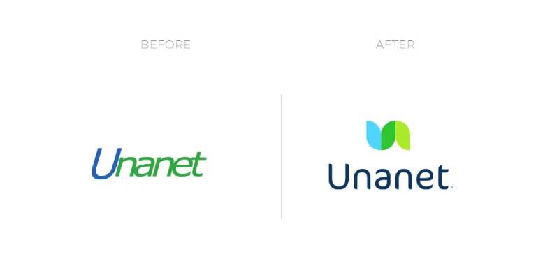
Unanet’s visual identity has shifted in stages, from a utilitarian early mark to a refined, purpose-driven brand system. The company originally operated under the name Computer Strategies before rebranding. Each version reflected where the product was at that point.
The biggest leap came in 2020, when the current trimark and wordmark combination was introduced.
Original Unanet Logo (Early 2000s – 2019)
- Years Active: Early 2000s through 2019
- Design Description: A straightforward wordmark with basic green coloring. The original mark leaned heavily on technical precision rather than any trendy design approach. It looked like what you’d expect from a government-focused software company at the time.
- Color Scheme: Primary green with standard corporate blue accents
- Designer: Internal branding efforts
- Context: The logo was introduced as Unanet moved away from the Computer Strategies name and established itself as an independent product brand. This was a period when the company focused almost entirely on web-based timesheets and project accounting for GovCon firms.
- Cultural Significance: It signaled “we are serious enterprise software” to government contracting clients who needed visual credibility markers. Nothing flashy, nothing risky. That was the point.
Refreshed Unanet Logo (2020 – Present)
- Years Active: 2020 to present
- Design Description: A trimark icon combining U and N letterforms into overlapping shapes, paired with a modern sans-serif typeface. The icon creates a visual flow from left to right, suggesting data moving through the platform.
- Color Scheme: Brightened Unanet Green, a darker foundational blue, and supporting neutrals
- Designer: ecollective design studio
- Context: The rebrand coincided with Unanet’s acquisition of Cosential and JMI Equity’s investment. The company was expanding from pure GovCon ERP into architecture, engineering, construction, and broader professional services. The new tagline became “Where Information Means Insight.”
- Key Changes from Previous: The addition of the trimark icon was the biggest shift. Previous versions were wordmark-only. The typography moved to a cleaner, more contemporary style. Green was brightened to feel more energetic. A darker blue was introduced to create better contrast across the palette.
- Cultural Significance: The new identity represented a company outgrowing its original niche. It told existing customers that Unanet was still the same trusted partner, while signaling to new markets that this was a modern, capable platform.
What Do the Design Elements of the Unanet Logo Mean?

Every part of the Unanet logo was designed to communicate something specific about the company’s mission. The trimark icon is the centerpiece. Three shapes overlap and blend, representing projects, people, and financials converging into one view.
Where the shapes meet in the center, they create the brand’s signature green. That intersection is meant to represent insight, the idea that when you combine data from different business areas, you see things more clearly.
Why Did Unanet Choose These Specific Colors?
Green has been part of Unanet’s identity since the beginning. During the 2020 refresh, the team kept the green but made it slightly brighter to add energy. The psychology behind color choices in corporate branding matters, and green signals growth, reliability, and forward motion.
The darker blue was a new addition. It serves as the foundation of the palette, providing a serious, grounded base that plays well next to the brighter green. This kind of blue reads as trustworthy in enterprise software contexts. Your mileage may vary in consumer branding, but for B2B? It works.
Here are the approximate color specifications:
- Unanet Green: A brightened medium green (close to #00A651). RGB values approximately (0, 166, 81). CMYK approximately (100, 0, 51, 35).
- Dark Blue: A deep navy used as the foundation color for text and structural elements
- White: Used for reversed logo applications and digital backgrounds
- Dark Gray: Supporting neutral for body text and secondary elements
The interplay between green and blue follows basic color theory principles. They sit close on the color wheel as analogous tones, which means they feel harmonious without competing for attention.
What Typography Style Is Used in the Unanet Logo?
The wordmark uses Mona Sans, a modern sans-serif font that balances approachability with professional weight. The rounded curves of the U and N letterforms mirror the shapes in the trimark icon, which creates visual consistency between the two pieces.
The letter spacing is generous enough to breathe but tight enough to feel cohesive on screen. That matters when your logo is going to live primarily inside software dashboards and digital interfaces. Took me a while to appreciate how much space between characters affects readability at small sizes, but it really does.
What Are the Hidden Meanings in the Unanet Logo?
The U and N shapes in the trimark are not immediately obvious. You have to look for them. That kind of embedded letterform is a common technique in logo design, but Unanet’s version does it with a purpose. The left-to-right flow of the shapes represents data going in and insight coming out.
The overlapping area where the colors mix to form the signature green is probably the most intentional hidden element. It literally shows what happens when you bring separate pieces of information together. Not every viewer catches that on the first glance, and that is fine. It is a detail for those who look closer.
How Does the Unanet Logo Compare to Competitor Logos?

Most ERP and project management software companies play it safe with their logos. Blue dominates the space. Look at the Salesforce logo with its cloud icon, or the Workday logo with its warm orange circle. Then there is the SAP logo, which has barely changed in decades.
Unanet stands apart by leading with green. In a sea of blue tech company brand marks, that is a smart move. It creates immediate differentiation.
Compared to other GovCon-adjacent software brands like Leidos or even general enterprise tools like HubSpot, Unanet’s trimark is more abstract. It does not rely on a literal object or mascot. That keeps it flexible across contexts but requires more brand investment to build recognition.
The Monday.com logo and the Atlassian logo both use bold colors and simple geometric shapes for instant recall. Unanet’s approach is subtler, which fits its audience. Government contractors are not looking for playful branding. They want to see stability.
What Are the Technical Specifications of the Unanet Logo?
Official Color Codes
- Primary Color – Unanet Green: Hex: approximately #00A651, RGB: (0, 166, 81), CMYK: (100, 0, 51, 35)
- Secondary Color – Dark Blue: A deep navy foundation color used for text and structural elements
- Neutral – White: Hex: #FFFFFF, used for reversed applications
- Neutral – Dark Gray: Used for body copy and secondary UI elements
Dimensions and Proportions
The logo comes in horizontal and vertical lockups. The horizontal version places the trimark to the left of the wordmark. The vertical version stacks the trimark above the wordmark with the tagline “Where Information Means Insight” below.
The trimark icon can also be used independently as an app icon or favicon. Minimum size requirements exist to make sure the overlapping shapes remain readable. Clear space around the logo should equal at least the height of the “U” in the wordmark on all sides.
The logo is available in vector formats (SVG, EPS, PDF) for scalability and pixel-based formats (PNG) for web and screen use. High-resolution files at 300 DPI or above are provided for print applications.
What Cultural Impact Has the Unanet Logo Had?
Look, Unanet is not Nike. The logo is not going to be on t-shirts at the mall. But within the government contracting and professional services world, the brand mark carries real weight.
It shows up on proposals worth millions of dollars. It appears in federal procurement presentations. When GovCon firms evaluate ERP platforms, the visual identity is part of the trust equation whether people realize it or not.
The 2020 rebrand also mattered because it came at a moment when Unanet was growing fast. The Cosential acquisition, new investment from JMI Equity, and expansion into the AEC market all needed a brand that could carry the weight. The trimark did that job. It gave the company a symbol that felt bigger than a niche project accounting tool.
How Does the Unanet Logo Fit Into the Overall Brand Identity?

The logo is one piece of a broader brand system. Unanet’s brand guidelines connect the trimark, wordmark, color palette, typography, and tone of voice into a cohesive identity. The green carries through the website, product UI, marketing materials, and event presence.
The tagline “Where Information Means Insight” directly ties back to the trimark’s overlapping shapes. That kind of consistency between visual storytelling and messaging is what separates a solid brand from a company that just has a nice logo.
Unanet’s brand style documentation governs how the logo interacts with partner brands, co-marketing materials, and product interfaces. The identity scales from a favicon in a browser tab to a banner at an industry conference. That kind of range is exactly what you need in enterprise software.
How Should the Unanet Logo Be Used?
If you are a partner, customer, or media outlet looking to use the Unanet logo, there are some ground rules.
Do:
- Use official logo files sourced directly from Unanet’s marketing team or approved brand asset portals
- Maintain required clear space around the logo
- Use approved color variations (full color, single color, reversed on dark backgrounds)
- Keep the trimark and wordmark in their correct proportions
Don’t:
- Stretch, distort, or rotate the logo
- Change the logo colors to unapproved values
- Place the logo on busy backgrounds that reduce legibility
- Separate the trimark from the wordmark in unapproved configurations
- Recreate the logo using substitute fonts or shapes
For official logo files, reach out to Unanet’s marketing department directly through their website at unanet.com. The logo is a registered trademark of Unanet Inc. Unauthorized modifications or usage outside of approved contexts may violate trademark protections.
Third-party logo download sites exist, but they are not guaranteed to have the most current version. When accuracy matters (and in government contracting, it always does), go straight to the source.
FAQ on The Unanet Logo
What does the Unanet logo look like?
The Unanet logo is a combination mark featuring a trimark icon next to a custom wordmark. Three overlapping shapes form the icon, representing projects, people, and financials. The shapes blend together in the center, creating the brand’s signature green.
What colors are used in the Unanet logo?
The primary color is a brightened Unanet Green, close to hex #00A651. A dark blue serves as the foundation color for structure and text. White and dark gray round out the palette for reversed applications and secondary elements.
What font is used in the Unanet logo?
The Unanet wordmark uses Mona Sans, a modern sans-serif typeface. Its rounded letterforms match the curves of the trimark icon. The font was chosen during the 2020 brand refresh to feel both established and approachable for enterprise software clients.
When was the Unanet logo redesigned?
The current logo was introduced during a 2020 brand refresh. ecollective design studio handled creative direction. The redesign coincided with the Cosential acquisition and JMI Equity investment, marking Unanet’s expansion into AEC and broader professional services markets.
What does the Unanet trimark symbol mean?
The trimark represents three core areas of the Unanet ERP platform converging. Projects, people, and financials overlap to create a single point of insight at the center. The left-to-right flow suggests data input becoming actionable output.
Who designed the Unanet logo?
The 2020 rebrand was designed by ecollective design studio. They created both the trimark icon and the updated wordmark. The design built on existing color equity while adding new meaning through the overlapping U and N letterforms in the icon.
Can I download the Unanet logo in vector format?
Official Unanet brand assets are available through the company’s marketing team. The logo comes in SVG, EPS, and PNG formats. Third-party download sites exist, but contacting Unanet directly at unanet.com is the best way to get current, approved files.
Why is the Unanet logo green?
Green has been part of Unanet’s corporate identity since the company’s early days. The color signals growth and reliability, which matters for government contractor clients. During the 2020 refresh, the green was slightly brightened to add energy and modern appeal.
How has the Unanet logo changed over the years?
Early versions were simple wordmarks focused on technical precision. The 2020 redesign added the trimark icon and updated the typography to a cleaner sans-serif style. The biggest shift was moving from a text-only mark to a full combination mark.
What is the Unanet logo used for?
The logo appears across Unanet’s ERP software interfaces, marketing materials, government proposals, conference displays, and partner co-branding. It works in horizontal and vertical lockups, plus the trimark icon functions independently as a favicon and app icon.
Conclusion
The Unanet logo does exactly what a B2B brand mark should do. It communicates trust, signals industry focus, and scales cleanly across every touchpoint from a software dashboard to a federal proposal cover page.
The 2020 trimark redesign gave Unanet a visual identity that matches its growth into GovCon ERP, architecture, engineering, and professional services automation.
Green stays at the core. The overlapping shapes tell a story about integrated project management without saying a word. And the custom wordmark in Mona Sans keeps things clean and readable at any size.
For a company serving over 3,700 project-driven organizations, that kind of brand consistency is not optional. It is the baseline.

Renowned for his expertise in logo design and visual branding, Bogdan has developed a multitude of logos for various clients.
His skills extend to creating posters, vector illustrations, business cards, and brochures. Additionally, Bogdan's UI kits were featured on marketplaces like Visual Hierarchy and UI8.
He also wrote in the past years on sites like Design Your Way, WebDesignerDepot, WPDean, Designmodo, Speckyboy, Slider Revolution, and more.
- The Windsurf Logo History, Colors, Font, And Meaning - 10 October 2026
- How to Remove Background From Product Photos (No Photoshop) - 10 October 2026
- How Designers can Build a Stronger Online Creative Identity - 9 October 2026

Bogdan Sandu is a seasoned designer who has been designing websites since 2008. Renowned for his expertise in logo design and visual branding, Bogdan has developed a multitude of logos for various clients. His skills extend to creating posters, vector illustrations, business cards, and brochures. Additionally, Bogdan's UI kits were featured on marketplaces like Visual Hierarchy and UI8. He also wrote in the past years on sites like Design Your Way, WebDesignerDepot, WPDean, Designmodo, Speckyboy, Slider Revolution, and more.
You Might Also Like


