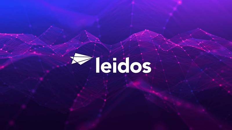
The Leidos logo represents one of the nation’s largest defense contractors and technology services companies. Founded in 1969 as Science Applications International Corporation (SAIC), the company underwent a major transformation in 2013 when it split into two entities.
The new entity retained the technical and engineering divisions under the fresh Leidos brand. This rebrand marked a strategic shift to emphasize scientific innovation and technical capabilities across defense, intelligence, health, and civil sectors.
The current logo reflects decades of evolution in corporate identity within the aerospace and defense industry. Leidos has maintained a presence serving government agencies, from the Department of Defense to NASA, requiring brand recognition that conveys trust and technological expertise to federal decision-makers.
What is the Leidos Logo?
The Leidos logo is a modern wordmark featuring custom sans-serif typography paired with a distinctive circular symbol. Introduced in September 2013 during the company’s spin-off from SAIC, it was designed by Siegel+Gale to reflect scientific precision and forward-thinking innovation in the technology services sector.
Design Type: Combination mark (wordmark with abstract symbol)
Primary Elements:
- Custom sans-serif typeface with geometric letterforms
- Circular icon positioned to the left of the wordmark
- Clean, minimalist design language
- Horizontal layout optimized for digital and print applications
Official Introduction Date: September 27, 2013
Designer/Agency: Siegel+Gale (New York-based brand strategy and design firm)
Trademark Status: Registered trademark of Leidos Holdings, Inc., protected under U.S. trademark law with multiple class registrations covering technology services, engineering, and scientific research
Color Palette:
- Primary Blue: #0033A0 (Pantone 286 C)
- Secondary Gray: #53565A (neutral supporting tone)
- White: #FFFFFF (used in reversed applications)
Usage Context: Corporate communications, government proposal documents, digital platforms, employee materials, trade show displays, vehicle graphics, building signage, and investor relations materials
How Has the Leidos Logo Evolved Over Time?
The Leidos brand identity emerged from a corporate restructuring that separated the original SAIC into two independent companies. This split created Leidos as the technical services entity and retained SAIC as the government IT contractor.
The transition represented more than a name change. It signaled a strategic repositioning in the defense and technology marketplace.
SAIC Corporate Identity (1969-2013)
Years Active: 1969-2013
Design Description: The original Science Applications International Corporation used a straightforward acronym-based wordmark with traditional corporate styling. The design featured blocky serif typography that communicated institutional stability.
Color Scheme: Navy blue and white dominated the palette, reflecting conservative government contractor aesthetics common in the defense industry during this period.
Designer: Internal design team (specific designer not publicly documented)
Context: Introduced during the company’s founding in La Jolla, California, the SAIC identity served a growing technology consultancy focused primarily on defense and intelligence contracts during the Cold War era.
Key Changes from Previous: N/A (original identity)
Cultural Significance: The SAIC brand became synonymous with government technology services, recognized within federal procurement circles but largely unknown to general consumers. It represented the behind-the-scenes nature of defense contracting work.
Leidos Launch Identity (2013-Present)
Years Active: 2013-Present
Design Description: A complete departure from the SAIC aesthetic, featuring a custom sans-serif font with rounded terminals and an abstract circular icon. The mark suggests both technological precision and human-centered innovation.
Color Scheme: Vibrant blue (#0033A0) paired with neutral gray, creating a more contemporary and approachable appearance while maintaining professional credibility.
Designer: Siegel+Gale, a firm known for corporate rebranding projects including Dell and eBay
Context: Created during the 2013 corporate separation to establish a distinct identity separate from SAIC. The company needed immediate market recognition while communicating continuity of technical capabilities to existing government clients.
Key Changes from Previous: Shifted from acronym to coined name, adopted modern sans-serif typography, introduced abstract symbol, brightened color palette, embraced minimalist design principles
Cultural Significance: The rebrand positioned Leidos as a forward-thinking technology leader rather than a traditional government contractor. It reflected the company’s expansion into commercial markets and international operations beyond its defense-focused origins.
What Do the Design Elements of the Leidos Logo Mean?

The circular icon represents both scientific precision and the orbital paths studied in aerospace engineering. Its clean geometry suggests technical accuracy while maintaining visual simplicity.
The open circle also symbolizes collaboration and connection, values that matter when coordinating complex government projects across multiple agencies and contractor teams.
What Symbolic Meaning Does the Leidos Icon Carry?
The circular element functions as a conceptual bridge between scientific rigor and human innovation. According to Siegel+Gale’s design rationale, the symbol suggests both a lens (observation and analysis) and a target (mission focus and precision).
This dual meaning works for a company operating across defense systems, healthcare technology, and civil infrastructure. The incomplete nature of the circle creates forward motion, implying progress and continuous advancement.
Why Did Leidos Choose These Specific Colors?
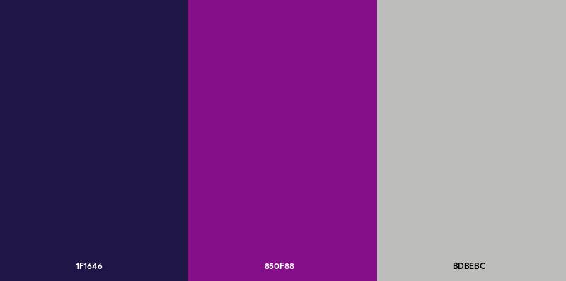
Primary Blue (#0033A0):
- Symbolic meaning: Trust, reliability, technological expertise
- Psychological impact: Conveys professionalism and stability required for government contracts
- Brand connection: Common in tech company logos and defense sector branding, blue signals security and competence
- Pantone equivalent: 286 C
Secondary Gray (#53565A):
- Symbolic meaning: Neutrality, sophistication, technical precision
- Psychological impact: Provides visual balance without competing with primary blue
- Brand connection: Supports readability across various applications from proposals to signage
White (#FFFFFF):
- Symbolic meaning: Clarity, simplicity, innovation
- Psychological impact: Creates breathing room in layouts, suggesting transparency
- Brand connection: Functions in reversed applications on dark backgrounds
What Typography Style Is Used in the Leidos Logo?
The wordmark employs a custom geometric sans-serif typeface with consistent stroke weights and rounded terminals. This creates approachability while maintaining the clean lines expected in technical industries.
The lowercase treatment feels modern and accessible compared to traditional all-caps corporate identities. Letter spacing remains tight but legible, working across sizes from business cards to building facades.
What Are the Hidden Meanings in the Leidos Logo?
The name “Leidos” itself derives from the Greek word “eidos,” meaning “to see” or “form.” This linguistic root connects to the company’s mission in data analytics, intelligence, and systems engineering where seeing patterns matters.
The circular icon’s orientation suggests both an eye and an orbit, reinforcing themes of observation and aerospace work. Whether intentional or not, some observers note the symbol’s resemblance to electron orbits, linking to the company’s scientific heritage and quantum computing initiatives.
How Does the Leidos Logo Compare to Competitor Logos?
The Leidos identity occupies a middle ground between traditional defense contractors and modern tech companies. Compared to Lockheed Martin’s star-based emblem or Northrop Grumman’s geometric chevron, the Leidos mark feels more contemporary and less militaristic.
It shares design DNA with civilian tech firms while maintaining the professional restraint government clients expect.
Lockheed Martin: Uses a five-pointed star within a circular badge, evoking military insignia and aerospace heritage. More traditional and emblem-based than Leidos’s minimalist approach.
Northrop Grumman: Features an angular chevron suggesting flight and forward motion. More abstract than Leidos but similarly modern in execution.
Raytheon Technologies: Wordmark-focused with horizontal lines suggesting radar waves. Shares Leidos’s preference for clean typography but uses more literal technological imagery.
Booz Allen Hamilton: Simple wordmark without icon, prioritizing name recognition. More conservative than Leidos’s combination mark approach.
General Dynamics: Traditional serif-based identity suggesting institutional longevity. Contrasts sharply with Leidos’s contemporary aesthetic.
The Leidos logo positions the company as technically sophisticated yet approachable, bridging the gap between old-school defense contractors and Silicon Valley aesthetics. This reflects the company’s strategy to compete for both traditional government contracts and emerging commercial opportunities in areas like autonomous systems and artificial intelligence.
What Are the Technical Specifications of the Leidos Logo?

Official Color Codes:
Primary Color: Leidos Blue
Secondary Color: Leidos Gray
- Hex: #53565A
- RGB: (83, 86, 90)
- CMYK: (8, 4, 0, 65)
- Pantone: Cool Gray 11 C
Accent Color: White
- Hex: #FFFFFF
- RGB: (255, 255, 255)
- CMYK: (0, 0, 0, 0)
Dimensions and Proportions:
- Aspect ratio: Approximately 4:1 (width to height) for horizontal lockup
- Minimum size requirements: 0.5 inches width for print, 60 pixels width for digital to maintain legibility
- Clear space specifications: Minimum clear space equals the height of the circular icon on all sides
- Official usage guidelines: Available through Leidos brand portal for authorized users, including vector graphics in EPS, SVG, and PDF formats
What Cultural Impact Has the Leidos Logo Had?
The Leidos rebrand represented one of the largest corporate identity changes in defense industry history. With over 30,000 employees transitioning from SAIC heritage to new brand recognition, the logo became a symbol of corporate transformation during a period of defense budget uncertainty.
Within government procurement circles, the mark quickly gained recognition. Yet outside those specialized communities, Leidos remains relatively unknown compared to consumer-facing brands, reflecting the nature of B2G (business-to-government) operations.
The logo appears on projects ranging from air traffic control systems to biomedical research facilities. This breadth makes it less culturally iconic than consumer brands but deeply embedded in critical infrastructure most people never see.
How Does the Leidos Logo Fit Into the Overall Brand Identity?
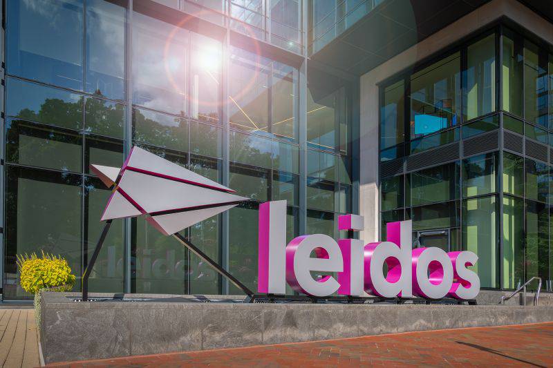
The logo anchors a broader visual system including brand guidelines for photography, illustration, data visualization, and presentation design. This system emphasizes clarity, precision, and human-centered technology across all touchpoints from career sites to congressional testimony documents.
Supporting brand elements include a library of technical imagery showing engineers, scientists, and systems in action. The company avoids overly militaristic visuals despite significant defense work, instead highlighting problem-solving and innovation.
How Should the Leidos Logo Be Used?

Official Usage Do’s:
- Use approved logo files from official brand portal
- Maintain specified clear space around logo
- Use primary blue on white backgrounds when possible
- Scale proportionally, never stretching or condensing
- Use reversed white logo on dark backgrounds
- Apply to approved materials like proposals, presentations, and marketing
Official Usage Don’ts:
- Never recreate or redraw the logo
- Never alter colors, proportions, or spacing
- Never add effects like shadows, glows, or outlines
- Never place logo on busy or low-contrast backgrounds
- Never rotate or skew the logo
- Never combine with other company logos without approval
Where to Access Official Logos:
Authorized users can download logo files through the Leidos brand center portal, requiring employee credentials or partner authorization. Files are provided in multiple formats including JPEG, PNG, EPS, and SVG for various applications.
Licensing Information:
The Leidos name and logo are registered trademarks owned by Leidos Holdings, Inc. Use by external parties requires written permission through formal licensing agreements. Unauthorized use may result in legal action under trademark protection laws.
Trademark Protection Details:
The company actively monitors and enforces trademark rights across multiple jurisdictions. Registration covers technology services, engineering, scientific research, and related classifications. Questions about proper usage should be directed to Leidos legal or brand management teams.
FAQ on The Leidos Logo
When Did Leidos Introduce Its Current Logo?
The current Leidos logo debuted on September 27, 2013, during the company’s spin-off from SAIC.
Siegel+Gale designed the new corporate identity to establish brand recognition in the defense contractor marketplace. The timing coincided with the strategic separation that created two independent technology services companies.
What Does the Circular Symbol in the Leidos Logo Represent?
The circular icon suggests both scientific precision and orbital motion found in aerospace engineering.
It functions as a visual metaphor for observation, analysis, and mission-critical focus. The incomplete circle implies forward momentum and continuous innovation across defense, healthcare technology, and civil infrastructure projects.
Who Designed the Leidos Logo?
Siegel+Gale, a New York-based brand strategy firm, created the Leidos visual identity system.
The agency has handled major corporate rebranding initiatives for companies like Dell and eBay. Their approach emphasized modern design language while maintaining professional credibility required for government contracts and federal agencies.
What Font Does the Leidos Logo Use?
The wordmark employs a custom geometric sans-serif typeface with rounded terminals and consistent stroke weights.
This proprietary design creates approachability while maintaining technical precision. The lowercase treatment differs from traditional all-caps corporate identities common among Fortune 500 defense contractors during previous decades.
Can I Download the Leidos Logo for Personal Use?
No. The Leidos name and logo are registered trademarks protected under U.S. trademark law.
Unauthorized use violates intellectual property rights. Access to official logo files requires employee credentials or formal licensing agreements through Leidos Holdings, Inc. legal and brand management teams.
What Colors Are in the Leidos Logo?
The primary color palette features Leidos Blue (Hex #0033A0, Pantone 286 C) paired with neutral gray (#53565A).
White serves as the tertiary color for reversed applications. This combination conveys trust, technological expertise, and professional stability expected in government technology services and systems integration work.
How Does the Leidos Logo Differ from the Old SAIC Logo?
The transformation shifted from acronym-based serif typography to a coined name with modern sans-serif styling.
SAIC used conservative navy blue and blocky letterforms. Leidos adopted vibrant blue, introduced an abstract circular symbol, and embraced minimalist graphic design principles reflecting contemporary brand identity standards.
What File Formats Are Available for the Leidos Logo?
Authorized users access vector graphics in EPS, SVG, and PDF formats through the brand portal.
Raster versions include JPEG and PNG files optimized for various applications. Minimum size requirements specify 0.5 inches width for print and 60 pixels for digital to maintain brand consistency across proposal documents and marketing materials.
Why Did SAIC Change Its Name to Leidos?
The 2013 corporate restructuring separated technical services (Leidos) from government IT contracting (retained SAIC name).
This strategic split allowed each entity to pursue distinct market opportunities. The name “Leidos” derives from Greek “eidos” meaning “to see,” connecting to data analytics and intelligence capabilities across national security sectors.
What Industries Does the Leidos Brand Serve?
Leidos operates across defense, intelligence, healthcare technology, civil engineering, and cybersecurity sectors.
Major clients include the Department of Defense, NASA, Pentagon, Veterans Affairs, and Centers for Disease Control. The company also serves commercial markets through cloud computing, artificial intelligence research, and digital transformation initiatives beyond traditional government contracts.
Conclusion
The Leidos logo represents a bold departure from traditional defense industry branding, blending scientific precision with contemporary design thinking.
Since its 2013 introduction by Siegel+Gale, the mark has helped position the company beyond typical government contractor perceptions.
Its clean geometric typography and symbolic circular icon communicate innovation across cybersecurity, aerospace engineering, and healthcare technology sectors. The brand identity proves that companies serving federal agencies can maintain visual systems as sophisticated as any Silicon Valley tech firm.
From NASA projects to Department of Homeland Security initiatives, the logo anchors a Fortune 500 company operating at the intersection of national security and cutting-edge research.

Renowned for his expertise in logo design and visual branding, Bogdan has developed a multitude of logos for various clients.
His skills extend to creating posters, vector illustrations, business cards, and brochures. Additionally, Bogdan's UI kits were featured on marketplaces like Visual Hierarchy and UI8.
He also wrote in the past years on sites like Design Your Way, WebDesignerDepot, WPDean, Designmodo, Speckyboy, Slider Revolution, and more.
- The Windsurf Logo History, Colors, Font, And Meaning - 10 October 2026
- How to Remove Background From Product Photos (No Photoshop) - 10 October 2026
- How Designers can Build a Stronger Online Creative Identity - 9 October 2026

Bogdan Sandu is a seasoned designer who has been designing websites since 2008. Renowned for his expertise in logo design and visual branding, Bogdan has developed a multitude of logos for various clients. His skills extend to creating posters, vector illustrations, business cards, and brochures. Additionally, Bogdan's UI kits were featured on marketplaces like Visual Hierarchy and UI8. He also wrote in the past years on sites like Design Your Way, WebDesignerDepot, WPDean, Designmodo, Speckyboy, Slider Revolution, and more.
You Might Also Like