The Sony Logo History, Colors, Font, and Meaning

Ever glanced at the Sony logo and felt a jolt of recognition, an immediate connection to a universe of relentless creativity and innovation?
It’s the silent ambassador of the tech sphere, standing testament to a legacy that hums through every pixel and policy of the Sony brand. In this piece, we’re diving into the very marrow of that iconic emblem.
Picture it: the sleek simplicity of the Sony logo anchoring your design, a beacon calling forth visions of the Bravia spectrum and the audacious spirit of the PlayStation.
It’s a narrative of evolution, a curve that traces Sony’s ascent from a Tokyo startup to a colossal Japanese multinational, shaping the face of consumer electronics.
By the finish line, you’ll have unraveled the art and science that breathes life into a logo. And not just any logo.
We’re mapping the frontier of the Sony emblem—its roots, its zenith, its influence. Understand the sway of visual identity in business, decode the subtleties of Sony’s branding strategy, and catch the silent tunes of its graphic elements. Buckle up; it’s a journey through design, legacy, and the pulse of a corporate giant.
The Meaning Behind the Sony Logo

You know, there’s a certain magic hidden in the shapes and curves of a logo. It’s not just about looking good. It’s about telling a story. And let’s dive into the story of the Sony logo, shall we?
The Simplicity in Brilliance
The Sony logo is as straightforward as it gets – simple, straight and unadorned. This isn’t a coincidence, my friends.
It’s a nod to the Japanese principle of Kanso – the elimination of clutter. Like a zen garden, the logo has been pruned down to only what’s necessary.
The Power of Legacy
But let’s not forget, this logo is also a tribute to Sony‘s roots. The typeface used in the logo comes from the tradition of Japanese brush strokes. You can see it in the flowing lines of the logo.
It’s a mark of respect to the company’s origins, and a reminder of the artistic heritage that Sony is built upon.
The History of the Sony Logo

Now, let’s travel back in time and explore how the Sony logo came to be. You might find this tale interesting!
The Birth of the Icon
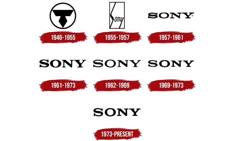
The Sony logo was first introduced in 1957. It was a bold move. Remember, this was a time when Japan was rebuilding itself after the Second World War.
Sony took the opportunity to represent a new, forward-looking Japan with their logo. And they certainly did that.
Evolution of the Logo
Over the years, the logo has seen subtle modifications, but its essence has remained the same. It’s like a good song that gets remixed over and over, but still keeps its original melody.
The Colors of the Sony Logo

The colors in a logo aren’t chosen randomly. They’re chosen with a purpose, a mission, a strategy.
Black – The Bold and the Powerful
The Sony logo, for most of its life, has been presented in a black hue. Black exudes sophistication, authority, and power. It’s the perfect color to represent a company that’s at the forefront of technology.
White – The Canvas of Possibilities
The white background, on the other hand, speaks volumes about Sony’s philosophy. It’s a symbol of possibilities, of a clean canvas waiting to be filled with innovations.
The Font Used in the Sony Logo
Let’s talk about the star of the Sony logo, the font. The typeface of Sony’s logo is distinctive, unique and tells a tale of its own.
Sony’s Custom Typeface
The Sony logo doesn’t use any commercially available font. No sir, it uses a custom typeface, developed specifically for Sony.
It’s got these curves and edges that are influenced by the strokes of a traditional Japanese paintbrush. This unique style, folks, is what sets the Sony logo apart.
The Logo and Global Recognition
Ever wondered how a logo gains worldwide recognition? Well, it’s a mix of good design, smart branding, and great products. Sony is a brilliant example of this.
A Logo Known Around the Globe
Whether you’re strolling down the streets of Tokyo or sipping a cup of coffee in a café in Paris, it’s hard to miss the Sony logo. It’s instantly recognizable, and that’s not by chance. It’s the result of consistent branding, innovative products, and a lot of hard work.
How Sony’s Logo Built Trust
The logo is more than just a design. It’s a seal of quality, a promise that the product you’re holding is top-notch. That’s the power of consistent branding, it creates trust.
The Impact of the Logo on Pop Culture
Sure, logos are about business, but they also become a part of our lives, our culture. Sony’s logo has made its mark in pop culture in a way few other logos have.
The Sony Logo on the Big Screen

Let’s start with the movies, shall we? Sony Pictures is a major player in Hollywood, and the logo has graced the big screen in countless films.
From high-octane action flicks to heart-warming animated movies, Sony’s logo has played a role in setting the stage for many cinematic journeys.
Sony Music – Grooving with the Logo
Then there’s Sony Music, one of the biggest record labels out there. From vinyl to CDs, from streaming platforms to concert stages, the Sony logo has been a constant companion to some of the biggest names in the music industry.
The journey of the logo is far from over, but its impact so far is undeniable. It’s a testament to the power of good design, clear vision, and the magic that can be woven into a logo.
FAQ On The Sony Logo
Who designed the Sony logo?
You’d think it was some famous designer, right? Nah, it was actually tinkered with by Sony’s in-house team.
A triumph of minimalism over fussiness, the logo’s been updated over time, preserving that spark of brand recognition while reflecting changes in corporate identity. It’s Sony’s visual handshake, the constant amidst evolution.
What does the Sony logo represent?
Visual identity — that’s the core. It’s all about sleekness, reliability, and pushing boundaries. Think about how those clean lines suggest modernity. The solid font? Stability.
Every design choice reinforces Sony’s rep for cutting-edge consumer electronics and that narrative of brand image prowess.
Why is the Sony logo so simple?
Simplicity isn’t just a design choice—it’s a statement. In a world of sensory overload, Sony’s logo cuts through the noise. It’s a nod to the company’s Japanese roots, where there’s beauty in austerity.
Basically, it’s saying, “Look, we’re straightforward, reliable, and here to stay. No fluff needed.”
Has the Sony logo changed over time?
Yep, but subtly. Since its inception, the logo’s had a few polish-ups — think tweaks, not overhauls. The logo evolution echoes Sony’s ethos of continuous improvement. By refining without losing the essence, Sony shows they’re all for branding strategy that ages like fine wine.
When was the Sony logo created?
The story began back in 1955. Picture this: post-war Japan, a burst of growth, and out pops the Sony logo, solidifying the foundation of a global brand.
It was the quiet herald of an age when Sony would become synonymous with home entertainment, etching its branding into households.
Can the Sony logo be used freely?
Oh, tread carefully here! Short answer? No. It’s safeguarded like a dragon’s hoard. The Sony logo is Sony’s intellectual armor, and using it without permission steps on some serious trademark toes.
Always check with Sony’s licensing department before even thinking of using it, especially commercially.
What are the color specifications for the Sony logo?
Precision is key. The iconic monochromatic theme is classic Sony — black and white, no muss, no fuss.
This stark palette has hugged the company insignia tightly, though occasionally Sony dabbles in color for special marketing campaigns. But the specs? Non-negotiable, for that consistent branding strategy.
Where can I find the official guidelines for using the Sony logo?
Straight from the horse’s mouth — Sony’s corporate website. They’ve got a stash of branding guidelines that’s like a treasure map for designers, marketers, and partners. It’s the bible for logo redesign, usage, and everything that sanctifies the visual identity of Sony.
What material types can the Sony logo be placed on?
Think of it as the chameleon of logos, versatile and adaptive. From silky TV screens of the Bravia lineage to the tactile wonders of their PlayStation consoles, it gracefully resides on nearly any material.
Be it print, digital or even the conceptual business logo skywriting, it’s omnipresent.
Which Sony division logos are most recognized?
The master logo reigns supreme, but oh, the Sony PlayStation emblem rides high on global fame. With its iconic four-color motif, it’s earned its spot in the pop culture constellation.
Each division, like Sony Pictures and Sony Music, also sports a tailored badge, weaving diversity into unity.
Conclusion
And there we rest our case on the Sony logo. It’s more than a sliver of corporate skin. It breathes. It evolves. Glance over its journey, from the audacious marks of its inception to the bold simplicity we know today. It’s been a beacon of brand identity, unwavering in its essence amidst an odyssey of subtle shifts.
- Culled from an ambitious Tokyo venture,
- Embraced by Sony Group Corporation’s global presence,
- Perched atop the kaleidoscopic world of PlayStation,
- And woven into the fabric of Sony Music and Sony Pictures.
The logo’s essence stays loyal to a promise – delivering that same innovation and quality without veering off the charted course. It’s more than graphics; it’s the legacy etched in monochrome, a shorthand for excellence. The bite-sized envoy of Sony’s mammoth groove. Take this knowledge, and let it guide every pixel you craft, in the pursuit of that same stirring simplicity that defines epochal design.
If you liked this article about the Sony logo, you should check out this article about the eBay logo.
There are also similar articles discussing the LG logo, the HP logo, the Adobe logo, and the Intel logo.
And let’s not forget about articles on the Dell logo, the Oracle logo, the Cisco logo, and the NVIDIA logo.
- The Amstel Logo History, Colors, Font, And Meaning - 3 May 2024
- Deep Dive: Sea Color Palettes for Tranquil Designs - 3 May 2024
- The Stella Artois Logo History, Colors, Font, And Meaning - 2 May 2024


