

The HP Logo History, Colors, Font, and Meaning

Imagine unlocking the secrets behind one of the most recognizable symbols in the tech world: the HP logo.
This seemingly simple insignia is more than just an emblem; it’s the heart of Hewlett-Packard’s visual identity, encapsulating its rich heritage in the Silicon Valley origin story—an inception that sparked revolutions across the personal computing and printing landscapes.
Here, we dive deep into the fabric of this iconic trademark design, tracing its evolution against the backdrop of HP Inc.’s storied chronicle. Ready for a journey through time?
From dissecting the DNA of HP’s logotype to understanding how HP’s brand guidelines have curated an indelible brand identity, every angle will be explored.
The experience? Think of it as a backstage pass into the high-stakes world of corporate branding and graphic design in tech—domains where aesthetics meet algorithms, and marketing collateral transcends mere visuals.
As we unravel the thread, you’ll glean insights into crafting enduring symbols that anchor mega brands—an invaluable treasure for any creator navigating the vast digital expanse. Curious? Let’s delve into the emblem that’s more than just a logo; it’s a legend.
The Meaning Behind the HP Logo
A Deeper Gaze
You’d think it’s just two simple letters, H and P, but it’s not just that. It’s an insignia, a stamp, an emblem of an idea that has stood the test of time. The HP logo is synonymous with progress, technology, and quality – a promise from a company that’s been around for decades.
Symbolism in Simplicity
So, it’s not just an H and a P. It’s a signal, an assurance. When you see that logo, you know you’re in for a blend of quality, innovation, and trust. It’s like a handshake – brief, but carries so much weight. It’s simple, but not ordinary. It’s modest, but still daring.
The History of the HP Logo
Origins and Evolution
Get this. The first logo, it was nothing like what we see today. The original insignia was a product of its time – a blend of the founders’ names, Hewlett and Packard, written in full in an intricate font.
Fast forward a bit, and the logo evolved into the simpler, more direct one we see today. Just HP. Snappy, catchy, and impossible to forget.
The Power of Transition
The change didn’t just happen overnight. It was a measured transition, a metamorphosis. It’s like a caterpillar turning into a butterfly. Same soul, different body.
The brand matured, became sleeker, more modern. The transformation echoes the company’s growth and expansion. It’s a testament to adaptability.
The Colors of the HP Logo

Boldness in Blue
The HP logo, it’s all about that royal blue. It’s not just a color, it’s an attitude. Blue is tranquil yet commanding, peaceful but robust.
It’s like staring at the ocean – calm on the surface, but there’s so much power beneath.
Symbolism in the Shade
And it’s not just any blue, it’s a specific shade – Pantone 300. The choice wasn’t arbitrary.
The hue speaks for itself – it’s reliable, like a clear sky on a sunny day. It’s consistent, like the company it represents.
The Font Used in the HP Logo
Simplicity and Sophistication
Do you see those letters? Clear, sharp, and no frills. The font they used, it’s called ‘Sans Serif’. Sans Serif means ‘without a line’. It’s modern, clean, and straightforward – just like the company’s approach.
The Impact of Type
Type, it speaks volumes. The choice of Sans Serif – it’s a statement. It’s about moving forward without forgetting the core. The font is unassuming, yet bold. It’s like a whisper that still echoes.
The Impact of the Logo
A Global Influence
This isn’t just a logo. It’s a universal symbol, a global icon. It’s made its mark everywhere – on products, billboards, and screens across the world. It’s not just a representation, it’s a commitment.
The Logo as a Leader
What’s a logo? It’s the flag bearer, the vanguard. The HP logo leads the charge, inviting us into the future. It’s not just a picture; it’s the spirit of the brand, encapsulated.
The Controversies of the HP Logo
The Flip Side
Alright, nothing’s perfect. Not even a logo. There have been critics, disagreements, and debates. Some people found the shift too drastic, and the design too simplistic. But hey, no risk, no reward.
Turning Criticism into Strength
So, there were conversations. But the beauty of it? HP didn’t just shy away, it stood its ground. Every critique, every controversy – it only added to the logo’s narrative. It’s a testimony to resilience.
The Designers Behind the HP Logo
The Creative Minds
Let’s give credit where it’s due. The HP logo, it’s not a fluke. It’s the result of countless hours of thought, design, and iteration by some of the most talented minds. It was crafted meticulously, like a painter working on a masterpiece.
An Art of Balance
Designing a logo, it’s not just an art, it’s a science too. It’s about balancing form and function.
It’s about creating something aesthetically pleasing that still communicates a message. The HP logo is an embodiment of this fine balance.
And there you have it, folks. The HP logo, it’s not just a graphic, it’s a symbol of legacy, of change, of resilience.
It’s a story that keeps unfolding. It’s a snapshot of the past, an impression of the present, a glimpse of the future.
FAQ On The HP Logo
What’s the meaning behind the HP logo?
The HP emblem, that minimalist slash atop a circle, represents more than just Hewlett-Packard. It stands for simplicity, innovation, and the forward-thinking ethos that propels technology.
It’s a physical manifestation of HP’s commitment to user-friendly products—like those legendary HP DeskJet printers we all rely on.
Has the HP logo changed over time?
Oh, for sure. The HP logo has evolved, reflecting the brand’s growth and the ever-shifting tech landscape.
Like a chameleon, it’s been through some redesigns—the most dramatic being the shift to a sleeker, more modern look that nods to HP’s future while honoring its Silicon Valley roots.
Who designed the current HP logo?
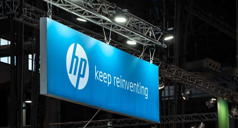
The current iteration of the HP logo, with its sharp lines and minimalist flair, was crafted by the famed design agency Moving Brands. It was part of a proposed rebranding back in 2011, but it wasn’t until later that HP opted to adopt this stylized emblem.
Why does the HP logo only have 4 lines?
Those four lines are no arbitrary design—they symbolize the literal letters “H” and “P” while embodying elegance and cutting-edge simplicity.
It’s this kind of ingenuity that reflects the chic, modern values of HP’s brand identity, appealing directly to the digital generation thirsty for streamlined aesthetics.
Is the HP logo among the most recognized in the tech industry?
You bet. The HP insignia stands tall among the pantheon of tech giants. Just like Apple’s orchard fruit or the windows in Microsoft’s flag, HP’s logo is a beacon of innovation, quality, and reliability in a crowded market of personal systems and enterprise solutions.
What color is the HP logo?
Primarily, the HP logo is decked out in a distinct blue hue—a color synonymous with trust, stability, and depth.
This indigo colorway resonates with the company’s brand guidelines, casting a vibe of professionalism and cool confidence that speaks to tech aficionados and casual consumers alike.
Does the HP logo reflect the company’s products?
Absolutely, it does. Think about it. The logo’s simplicity mirrors HP’s sleek and intuitive product lines, from their Envy laptops to the Omen gaming rigs.
It echoes the ease of use and technological prowess that HP has famously embedded into every printer, scanner, and personal computing device.
Are there any hidden meanings in the HP logo?
Hidden meanings? Not overtly. But the logo’s design incorporates negative space, a visual play that draws your eyes to the ‘H’ and ‘P’ in a seamless meld.
It’s symbolic of the synergy between HP’s varied products and services—an unspoken promise of interconnectedness and integration.
How does the HP logo impact the brand’s market value?
A strong logo like HP’s is more than mere ornamentation—it’s the cornerstone of brand recognition and market perception.
This visual calling card is intrinsic to the brand’s image, an insignia that bolsters credibility and instills a sense of quality in its user base with every sighting.
Can the HP logo be used by anyone for any purpose?
Not just anyone can slap the HP logo on any old thing. It’s a trademarked design, fiercely protected by legal safeguards. Using it without permission would be transgressing those brand guidelines, potentially leading to a stern talking to from HP Inc.’s legal team, to put it mildly.
Conclusion
We’ve circled back to where we began, anchored by that dynamic sliver of design—the HP logo. Simple at first glance, yet it’s anything but. This emblem, steeped in the lore of Silicon Valley innovation, signifies more than a company. It speaks to a legacy—a narrative woven into every pixel and curve.
- Blue swatches paint stories of trust.
- Four crisp lines whisper a tale of minimalistic sophistication.
- Silicon bounds reflect a saga of growth and evolution.
It’s the artful convergence of history and modernity, a graphical lighthouse that steers HP’s vast fleet of personal systems, printers, and enterprise solutions. Through the unveiling of this logo’s true essence, one thing is crystal clear: a logo carries the weight of an entire brand on its humble shoulders.
So, whenever you look at that familiar emblem on your laptop or DeskJet, remember: it’s not just a logo; it’s a legend carved in design and shaded in corporate identity. It’s the face of Hewlett-Packard—a beacon of reliability to the world.
If you liked this article about the HP logo, you should check out this article about the eBay logo.
There are also similar articles discussing the LG logo, the Adobe logo, the Intel logo, and the Dell logo.
And let’s not forget about articles on the Oracle logo, the Sony logo, the Cisco logo, and the NVIDIA logo.
Bogdan Sandu, a seasoned designer with 15 years of diverse experience, has been designing websites since 2008.
Renowned for his expertise in logo design and visual branding, Bogdan has developed a multitude of logos for various clients.
His skills extend to creating posters, vector illustrations, business cards, and brochures. Additionally, Bogdan's UI kits were featured on marketplaces like Visual Hierarchy and UI8.
Latest posts by Bogdan Sandu (see all)
- Think Pink: Soft and Strong Pink Color Palettes - 14 May 2024
- Fashion Typography: What Font Does Vogue Use? - 14 May 2024
- The Kirin Logo History, Colors, Font, And Meaning - 13 May 2024