Fanta ads sell a fruit flavored soda with three tools: one flat color field, one oversized wordmark, and a jingle you cannot shake.
That formula has run since the 1955 Naples relaunch, through Ogilvy’s Fantanas, More Fanta Less Serious, What the Fanta, and the 2026 Xbox collection.
This page collects the campaigns with the agency, year and market behind each one.
You also get the design analysis most ad galleries skip:
- Typography, from Colophon Foundry’s custom cut to the 2023 Jones Knowles Ritchie system
- Color logic that holds across 100-plus flavors
- Layout rules that let a can read from across a store aisle
- Where the TV commercials break from the print work
Fanta advertising spans 7 decades, 6 lead agencies and more than 6 flagship global campaigns, from the 1955 Naples relaunch of Fanta Orange to the 2026 Xbox collection. The work runs on one repeated device: flat saturated color, an oversized wordmark, and a hook you can sing back after one listen.
Most of it reaches people through TV, out-of-home and the can itself rather than long-form print.
This page covers the named campaigns, the agency and market behind each one, and the layout, color and type decisions that let a Fanta ad read from across a store aisle.
Fanta Advertising at a Glance
Fanta has advertised globally since 1955, working mainly with Ogilvy and, since 2019, with WPP Open X. Its best-known campaigns are Wanta Fanta, More Fanta Less Serious, and What the Fanta. The visual signature combines flat flavor-coded color, an extruded white wordmark and fruit illustration.
| Attribute | Value |
|---|---|
| First major campaign | Fanta Orange relaunch, Naples, Italy, 1955 |
| Lead agencies | Ogilvy (2001 to present), Mother London (2005), WPP Open X led by Majority (2024 to present) |
| Best-known taglines | “Wanta Fanta” (2001), “More Fanta, Less Serious” (2007), “Do More of What You Wanta” (2024) |
| Primary media | TV, out-of-home, packaging, cinema, TikTok, connected TV |
| Design partners | Koto Studio (2017), Jones Knowles Ritchie (2023), Colophon Foundry (type) |
| Visual signature | Flavor-coded flat color, white uppercase wordmark with blue offset shadow, hand-drawn fruit |
| Markets | 180+ markets, 100+ flavors |
| Core audience | Teens and young adults, roughly 13 to 25 |
Which Fanta Ad Campaigns Are the Most Famous?
Six Fanta campaigns carry global recognition: Wanta Fanta with the Fantanas (2001), More Fanta Less Serious (2007), the tastable print ad (2013), What the Fanta (2021), Do More of What You Wanta (2024), and the Xbox 25th anniversary collection (2026).
Wanta Fanta and The Fantanas (2001 to 2006)

Ogilvy New York created the Fantanas for the US relaunch of Fanta in 2001. Four casted performers each fronted a single flavor and sang the jingle.
The tagline came out of a brainstorm by the Ogilvy creative team of Andrea Scaglione, Andrew Ladden and Bill Davaris.
Every frame sits on a flat single-flavor color field. Costume, set and background match the can, so the color palette does the product identification before the logo ever enters frame.
The broadcast campaign ran to October 2006, returned in June 2009, and went on hiatus in 2011.
More Fanta, Less Serious (2007 to 2013)

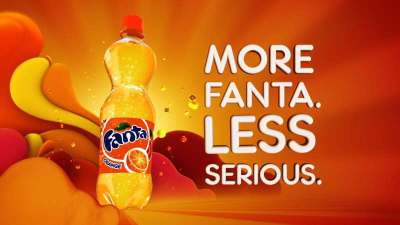
Fanta’s first unified worldwide platform. Animated multicultural teen characters, one creative idea, local flexibility underneath it.
- Agencies: Ogilvy & Mather with animation studio Psyop, music by Human Worldwide
- Reach: 190 markets, covering regions worth 90% of Fanta’s 2011 global sales volume (MediaPost)
- US debut: the “Chase” spot, 30 March 2011, on American Idol
That market count beat Coca-Cola’s own 2010 World Cup campaign. The concept Coca-Cola briefed in was “a giggle in a bottle,” which tells you everything about the animation style.
World’s First Tastable Print Ad (2013)

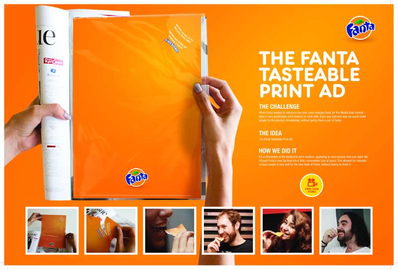
OgilvyOne Middle East printed a Fanta ad on rice paper infused with orange flavoring and told readers to tear off a piece and eat it.
Published in a Dubai lifestyle magazine in January 2013, ahead of a regional relaunch. Art direction by Rodrigo Mavu, creative direction by Fabian Roser and Sally Tambourgi (Ads of the World).
The layout is unusual for the brand: a long body copy block over an orange gradient, small illustrations breaking the text, product shot pushed to the corner. Copy carries the weight because the paper is the product sample.
What the Fanta (2021 to present)

Launched as #WhatTheFanta in 2021 in Europe and rolled out in the US in 2022, the platform sells unlabelled mystery flavors and asks people to guess.
The mechanic: the pack gives nothing away. Consumers scan a QR code to reach clues, and the reveal lands weeks later.
Colors on the blue, green, peach and orange variants were chosen to fight the flavor rather than describe it, which is a deliberate inversion of how color psychology normally works on a soda shelf.
Beverage Digest coverage in CNN’s 2022 report noted that Coca-Cola declined to release sales figures for the mystery line but credited these launches with contributing to trademark Coke’s 7% second-quarter growth.
Fanta Halloween Campaigns (2016 to present)

Halloween is now Fanta’s single biggest commercial season, run as a global platform since 2024 after roughly a decade of fragmented local activity.
| Year | Partner or hook | Result |
|---|---|---|
| 2022 | Limited-edition ghoulish packs | 19.1% value sales increase in GB (CCEP) |
| 2023 | QR game, 70,000 GBP prize pool | 1 in 4 flavoured carbonates sold was a Fanta (CCEP) |
| 2024 | Beetlejuice Beetlejuice, Afterlife Train | First globally executed Halloween campaign |
| 2025 | Universal partnership, Chucky’s Punch flavor | US Halloween spend hit 11.6 billion USD (NRF) |
The 2024 UK activity added a physical Afterlife Train pop-up at Westfield Stratford City, plus cinema and out-of-home. Packaging carried the campaign, not a hero film.
Do More of What You Wanta (2024 to present)

Fanta revived the 2001 jingle with new lyrics on 25 April 2024, positioning the drink against Gen Z’s functional-beverage fatigue.
Guy Shelmerdine directed the 30 and 60 second films for connected TV. WPP Open X built the campaign, led by Majority, with Ogilvy, VML, BCW, EssenceMediacom, Goat and Subvrsive (PRNewswire).
Ibrahim Khan, global VP of marketing for Fanta, framed the insight bluntly in Marketing Dive: supermarket aisles had gone all-in on function, so Fanta went after want instead of need.
The out-of-home work is dynamic rather than fixed, which changed how the layouts were built. Type scales, the wordmark does not.
Fanta x Xbox 25th Anniversary Collection (2026)

Fanta’s first global campaign built around gaming. Announced 31 March 2026, live across more than 60 markets.
Ogilvy led the work through WPP Open X. Limited-edition cans carry Master Chief, Ghost, Mephisto, the Paladin, Xal’atath and the Forza Horizon 6 Land Cruiser, alongside a new flavor, Fanta Crimson Sour Cherry.
Sue Murphy, senior director of global design at Fanta, told DesignRush the pack collection went viral before launch on the strength of the artwork alone.
Each pack carries a QR code into in-game challenges. The packaging design is the media buy here, which is the clearest statement yet of where Fanta puts its money.
Fanta Print Ads From Europe and the Middle East
Outside the global platforms, Fanta’s regional print work sits with local shops.
- McCann Madrid produced Spanish print and outdoor in 2013 and 2017
- Jung von Matt/Elbe Hamburg made German work in 2013, including “Official sponsor of Fantasy”
- Ogilvy & Mather Amsterdam and Sydney handled Dutch and Australian print in 2015 and 2018
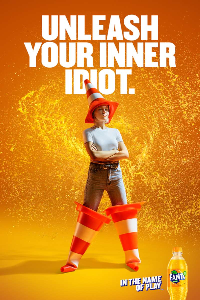
- Wunderman Thompson produced the “Snack in the Name of Play” work
These ads share a habit: one visual idea, almost no body copy, wordmark bottom right (AdsSpot archive).
How Do Fanta Print Ads Work Visually?
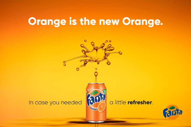
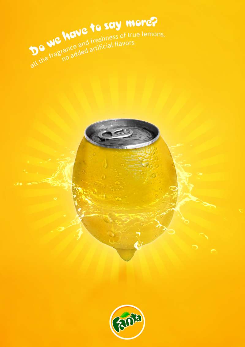
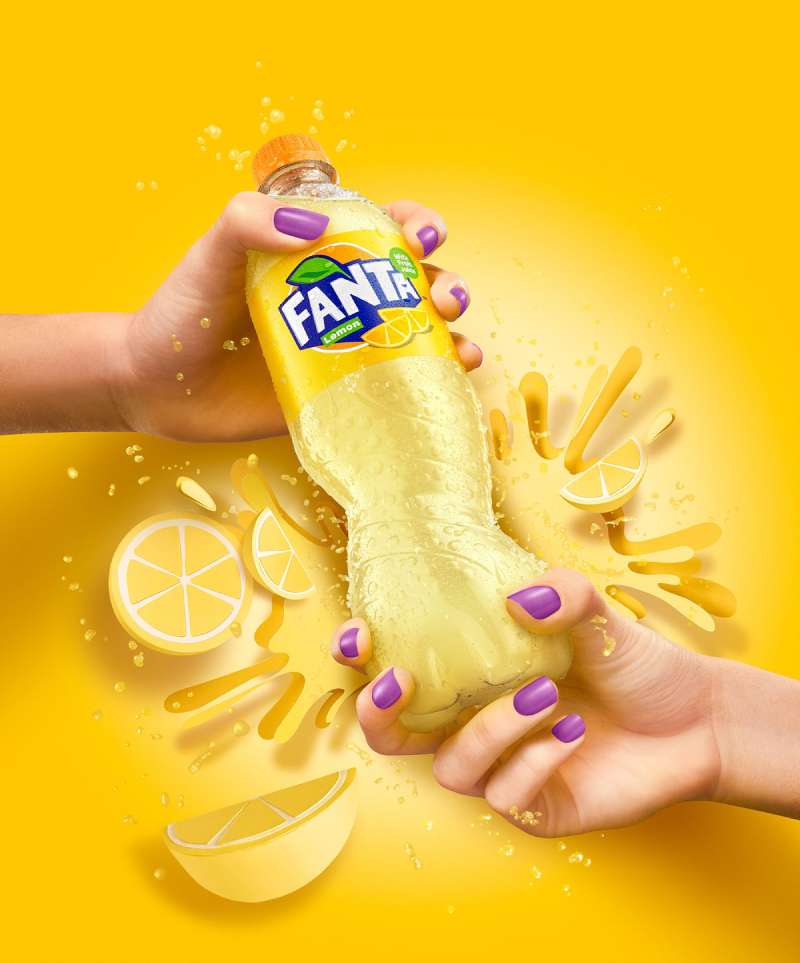
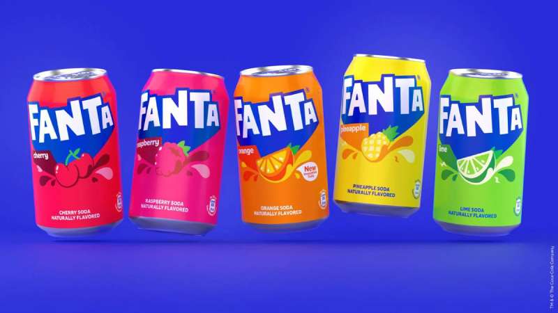
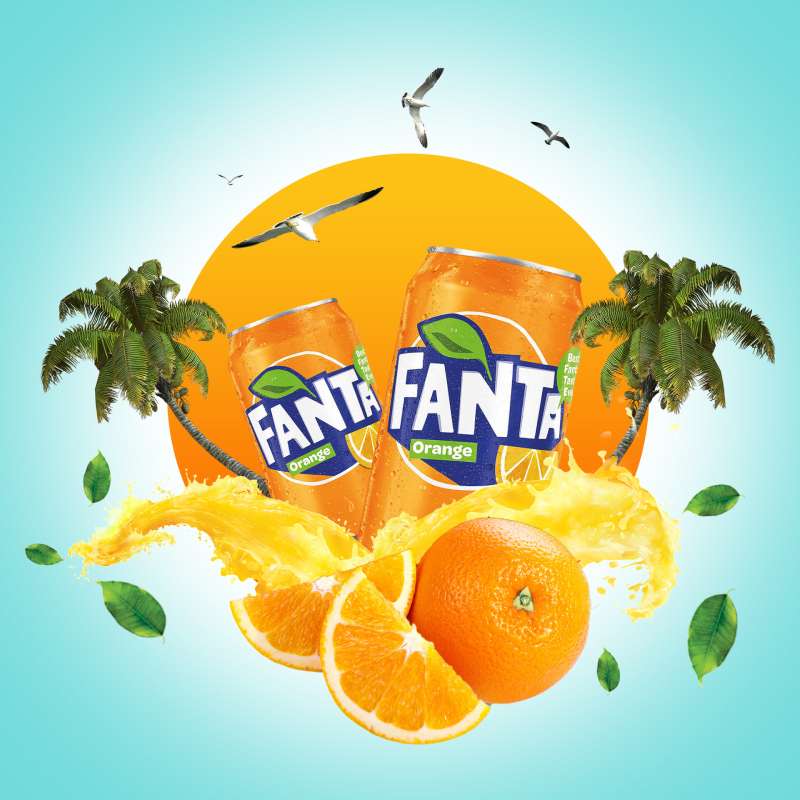
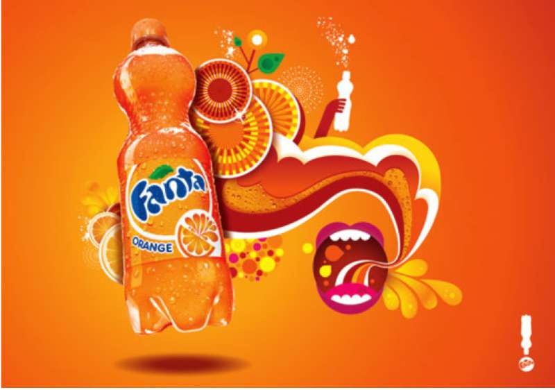
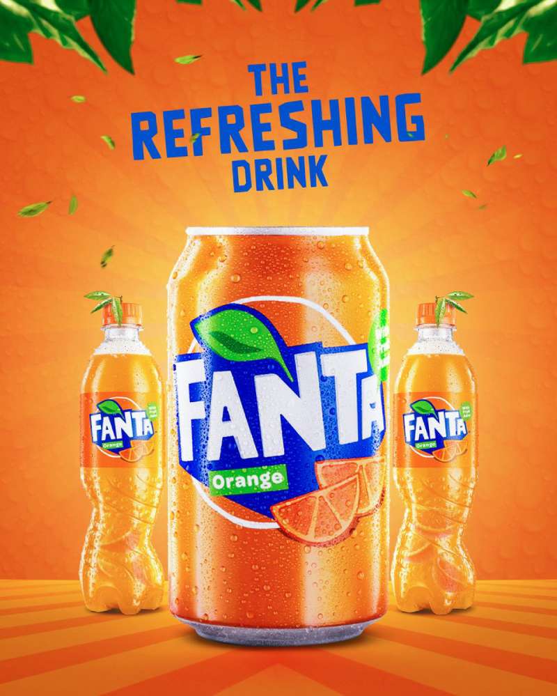
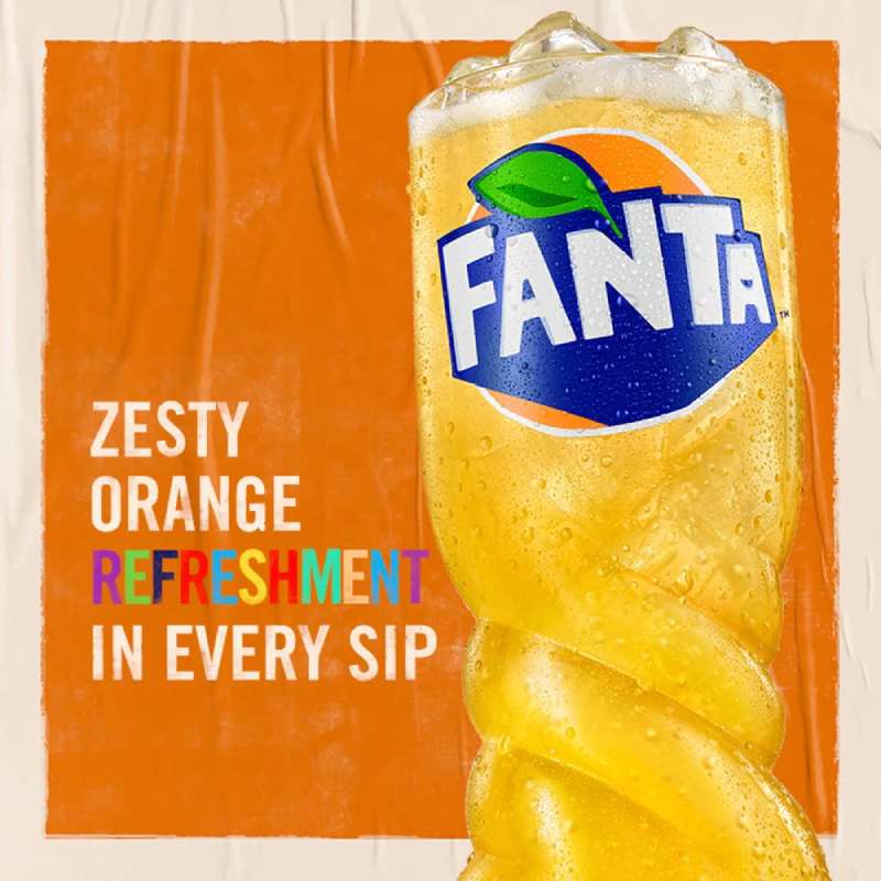
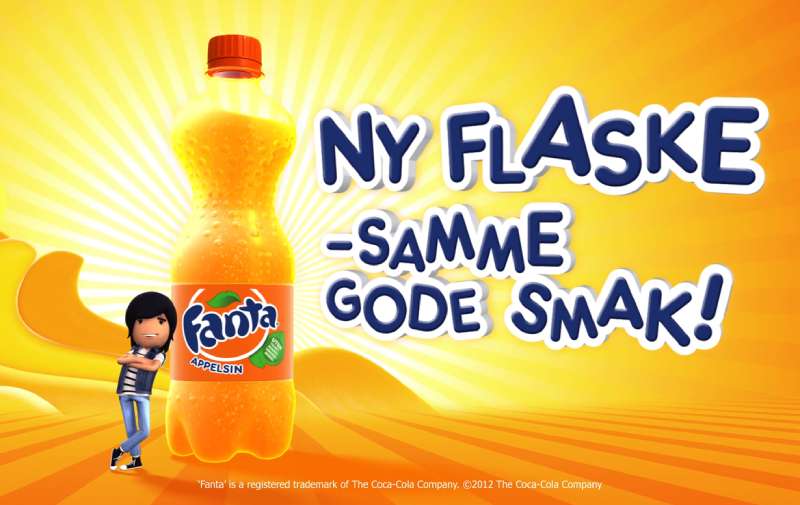
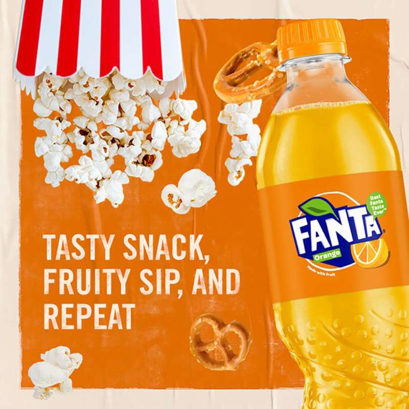
Fanta print ads use a flat single-color field, an oversized white uppercase wordmark with a blue offset shadow, and one product or fruit element. Copy rarely exceeds 8 words. The layout is built for 2-second recognition at distance, not for reading.
The visual hierarchy is unusually flat for a beverage brand. Product, wordmark and headline often sit at similar weight, so nothing competes for the eye in a strict order.
Type: since 2023 the brand runs Fanta Pop Regular for primary messaging and Fanta Pop Condensed for secondary, with Fanta Sans in two weights underneath. Colophon Foundry cut the original in 2017 and customized it with JKR six years later (Design Week).
Fanta Pop is a geometric sans-serif font with subtle tapering and open counters. It reads as friendly without going soft, which matters when the same letterforms have to work in Japanese, Thai, Arabic, Korean and Amharic.
Color: each flavor gets a primary, a lighter and a darker tone. That three-step system is what allows 100-plus flavors to share one identity without the shelf turning into noise.
The blue-on-orange pairing is near-complementary color scheme territory, and it delivers the contrast that keeps the wordmark legible on any flavor background.
Negative space is tight. Fanta layouts fill the frame, which is the opposite of what most premium brands do with white space, and it is a deliberate volume choice.
How Do Fanta TV Commercials Differ From Its Print Ads?
Fanta TV commercials carry narrative and music that print cannot. Spots run 15 to 60 seconds, use animation or high-saturation live action, and end on the jingle. Print carries a single frozen idea. Film carries a joke with a setup and a payoff.
Chase (2011, Ogilvy & Mather and Psyop). Animated teen characters in a stylised chase sequence, built to the level of detail of a feature animation. It debuted in the US on American Idol and rolled into 190 markets.
Fanta Z spitting ad (2005, Mother London). People spit the drink out on camera. Parents complained, and the ASA restricted it to post-9pm broadcast. It stands as the moment Fanta let self-mockery into its advertising.
Wanta Fanta film (2024, directed by Guy Shelmerdine). A remixed jingle over a needs-versus-wants gag structure, cut at 30 and 60 seconds for connected TV, then chopped further for TikTok creators.
Afterlife Train (2024, CCEP GB). A young man says WantaFanta three times at an underground vending machine and boards a train full of ghouls. It ran in cinema and out-of-home, tied to Beetlejuice Beetlejuice.
The film work leans on rhythm and motion graphics to carry brand assets that print delivers through static layout.
How Has Fanta Advertising Evolved Since 1955?
Fanta advertising moved through 4 phases: decentralised local creative (1955 to 2000), jingle-led US relaunch (2001 to 2006), the first unified global platform (2007 to 2013), and design-led global consistency with entertainment partnerships (2017 to 2026).
| Period | Strategic shift | Representative work |
|---|---|---|
| 1955 to 2000 | Market autonomy, no shared identity | Italian and German press, regional jingles |
| 2001 to 2006 | Sound before image | Wanta Fanta, The Fantanas (Ogilvy NY) |
| 2007 to 2013 | One global creative idea | More Fanta, Less Serious (Ogilvy and Psyop) |
| 2017 to 2022 | Identity as the campaign | Koto rebrand, spiral bottle, What the Fanta |
| 2023 to 2026 | One global system plus licensed IP | JKR rebrand, Beetlejuice, Xbox collection |
The 2017 Koto work was the pivot. Koto hand-cut the logo from paper, hid a smile inside the letterforms, built a typography system for five writing systems and drew 42 fruit illustrations.
Drink Works spent close to two years on the asymmetrical spiral bottle that shipped alongside it in April 2017.
The 2023 JKR rebrand finished the job by dropping the orange roundel and the leaf, unifying 180 markets under one system. Rapha Abreu, global VP of design at Coca-Cola, told Dezeen the goal was to stop the redesigns from happening again.
Anyone tracking the evolution of logos in the soft drink category will notice Fanta went from the most fragmented major brand to one of the most consistent inside 6 years.
Which Agencies Created Fanta Advertising?
Ogilvy has held the largest share of Fanta creative since 2001. Design work sits separately with Koto Studio and Jones Knowles Ritchie, and since 2019 global campaign delivery runs through WPP Open X, Coca-Cola’s dedicated marketing partnership.
| Agency or studio | What it made | Year |
|---|---|---|
| Ogilvy New York | Wanta Fanta tagline and the Fantanas broadcast campaign | 2001 |
| Mother London | Fanta Z spitting commercial, restricted by the ASA | 2005 |
| Ogilvy & Mather with Psyop | More Fanta, Less Serious animated global platform | 2007 |
| OgilvyOne Middle East, Dubai | World’s first tastable print ad | 2013 |
| Koto Studio with Colophon Foundry | Global visual identity, custom three-weight typeface | 2017 |
| Jones Knowles Ritchie | First truly global identity, Fanta Pop type system | 2023 |
| WPP Open X led by Majority | Do More of What You Wanta | 2024 |
Lisa Smith served as global ECD on the JKR rebrand. Brazilian illustrator Lucas Wakamatsu drew the bespoke fruit illustrations, and Gretel handled the motion system.
Coca-Cola was named Creative Brand of the Year at Cannes Lions 2024, with Ogilvy taking Creative Network of the Year the same week (WPP).
That agency map explains a lot about the visual identity being sharper than the champaign creative for most of the last decade.
What Can Designers Learn From Fanta Ads?
Fanta’s work offers 5 transferable lessons for anyone building a high-volume consumer brand system.
- Set the wordmark at a size that survives a 3-meter viewing distance, then build the layout around what is left
- Assign every product variant a three-step color set (primary, lighter, darker) so a large range stays coherent
- Cut the headline to under 8 words and let the color field carry the category signal
- Commission a custom typeface when the brand has to work across five writing systems, not just two
- Treat the pack as primary media before buying a single impression
The last one is the least obvious and the most useful. Fanta’s Halloween and Xbox campaigns both put the creative idea on the can first and used paid media to point at it.
If you write brand guidelines for a client with a sprawling product range, the Fanta three-step color rule is worth stealing outright.
How Do Fanta Ads Compare to Sprite and Pepsi Ads?
Fanta, Sprite and Pepsi all chase the same teen and young adult audience, and all three lean on music. The difference is where the idea lives.
Sprite ads run on cultural credibility, mostly through hip-hop, with a restrained green-and-silver system and a lot of black in the layouts. Sprite got its first global platform, Heat Happens, only a year before Fanta’s 2023 rebrand.
Pepsi ads buy celebrity and spectacle. Fanta almost never uses a global celebrity, which keeps production costs low enough to run in 180 markets at once.
Inside the same portfolio, Coca-Cola ads own emotion and seasonal ritual at Christmas. Fanta took Halloween instead, which was open territory and cheaper to claim.
Against outside rivals, Red Bull ads replace advertising with content entirely. Fanta stays a conventional advertiser that puts unusual weight on packaging.
What Makes Fanta Advertising Work?
Fanta advertising works because it stopped competing on production value and started competing on recognition speed.
A flat color field, an oversized wordmark and a three-note hook clear a store aisle faster than a cinematic 60-second film clears a living room.
The second reason is discipline about where the idea lives. Since 2017 the pack has carried the creative concept and paid media has pointed at it, which is why the same budget stretches across 180 markets and 100 flavors without thinning out.
Designers can copy the mechanics without the budget. Pick one color per variant, size the wordmark for distance, cut the copy, and put the idea on the product itself.
Fanta Ads Examples





FAQ on Fanta Ads
What is Fanta’s most famous tagline?
“Wanta Fanta” is the one people still sing. Ogilvy New York wrote it in 2001 for the US relaunch, and Coca-Cola revived it in April 2024 for the global “Do More of What You Wanta” campaign.
What typeface do Fanta ads use?
Fanta Pop, a custom typeface cut by Colophon Foundry. Regular handles primary messaging, Condensed handles secondary. Fanta Sans sits underneath in two weights for body copy across the full flavor range.
Who created the Wanta Fanta jingle?
The Ogilvy creative team of Andrea Scaglione, Andrew Ladden and Bill Davaris landed the line in a brainstorm. It became the broadcast anthem for the Fantanas campaign, which ran from summer 2001 to October 2006.
Who are the Fantanas?
Four casted performers, each fronting one Fanta flavor in the US television campaign. Talent searches picked later members, including Shakira Barrera in 2009. The group went on hiatus in 2011 when Coca-Cola switched to its global platform.
Why does Fanta advertise so heavily at Halloween?
Because the season is open commercial territory and it pays. Fanta posted 19.1% value sales growth during Halloween 2022 in Great Britain, and accounted for one in four flavoured carbonates sold in the four weeks to Halloween 2023 (CCEP).
What is the What the Fanta campaign?
A mystery-flavor platform launched as #WhatTheFanta in 2021 and rolled into the US in 2022. Packs give nothing away. Consumers scan a QR code for clues, guess the flavor, and wait weeks for the reveal.
Which colors do Fanta ads use?
Since 2023, every flavor carries a three-step set: a primary, a lighter tone and a darker one. The wordmark stays white with a blue offset shadow, which keeps it legible on any flavor-coded background.
Did Fanta ever run an edible print ad?
Yes. OgilvyOne Middle East printed a Fanta ad on flavored rice paper for a Dubai magazine in January 2013 and told readers to tear off a piece and eat it.
Does Fanta use celebrities in its advertising?
Rarely at global level, often in India. Rani Mukerji, Genelia D’Souza, Shruti Haasan and Sara Ali Khan have all fronted Indian Fanta commercials. The worldwide campaigns lean on animation, jingles and licensed characters instead.
Which brands compete with Fanta in advertising?
Sprite and Coca-Cola inside the same portfolio, plus Pepsi, Mirinda and Sunkist outside it. Fanta avoids the celebrity spectacle Pepsi buys and the seasonal ritual Coca-Cola owns, taking Halloween and gaming instead.
Conclusion
Fanta ads reward study because the brand solved a hard problem on a modest budget. One orange soda, over 100 flavors, 180 markets, and a single system holding all of it together.
The lesson sits in where the work lives. Koto Studio and Jones Knowles Ritchie fixed the brand identity first, and the campaigns since have treated limited edition packaging, QR codes and out-of-home as primary media rather than support.
Any brand with a wide product range and no celebrity budget can copy that order of operations.
Three things worth watching next:
- How the Xbox and Blumhouse tie-ins hold up once the licenses lapse
- Whether creator content keeps outperforming broadcast with Gen Z
- Whether the 2023 system survives the next marketing director

Renowned for his expertise in logo design and visual branding, Bogdan has developed a multitude of logos for various clients.
His skills extend to creating posters, vector illustrations, business cards, and brochures. Additionally, Bogdan's UI kits were featured on marketplaces like Visual Hierarchy and UI8.
He also wrote in the past years on sites like Design Your Way, WebDesignerDepot, WPDean, Designmodo, Speckyboy, Slider Revolution, and more.
- Canva vs PowerPoint: Which Is Better for Presentations? - 22 September 2026
- How to Install Fonts on Mac (Step-by-Step Guide) - 20 September 2026
- From Mockup to Code: How AI-Augmented Development Speeds Up the Design Handoff - 19 September 2026

Bogdan Sandu is a seasoned designer who has been designing websites since 2008. Renowned for his expertise in logo design and visual branding, Bogdan has developed a multitude of logos for various clients. His skills extend to creating posters, vector illustrations, business cards, and brochures. Additionally, Bogdan's UI kits were featured on marketplaces like Visual Hierarchy and UI8. He also wrote in the past years on sites like Design Your Way, WebDesignerDepot, WPDean, Designmodo, Speckyboy, Slider Revolution, and more.
You Might Also Like