A bookkeeper’s handwriting from 1886 is still the most valuable design asset on the planet.
Coca-Cola ads have run for 140 years on a fixed set of parts: Coca-Cola Red, the Spencerian wordmark and the contour bottle. Everything else moved.
Illustrated Santa paintings gave way to CGI polar bears, then to name-printed labels, then to AI-generated holiday trucks.
This page pulls the work together campaign by campaign, with the agency, year and market attached to each one.
You will get:
- The famous campaigns dated and credited, from Hilltop to Share a Coke
- Layout, type and color analysis of the print work
- How the TV spots break the print rules on purpose
Coca-Cola advertising spans 140 years, 4 lead agencies and more than a dozen flagship campaigns, from a five-cent newspaper notice in The Atlanta Journal in 1886 to the AI-produced holiday films of 2025.
The work runs on one repeated move. Put the bottle at the center, hold the palette to red and white, and let a human moment carry the selling.
This page covers the campaigns by name, with the agency, year and market behind each one, plus the layout, type and color decisions that hold a century of work together.
Coca-Cola Advertising at a Glance
Coca-Cola has advertised since 1886, working primarily with D’Arcy Advertising from 1906 to 1956 and McCann Erickson from 1956 onward. Its best-known campaigns are Hilltop, Share a Coke and Holidays Are Coming. The visual signature combines Coca-Cola Red, the Spencerian wordmark and the contour bottle silhouette.
| Attribute | Value |
|---|---|
| First major campaign | The Pause That Refreshes (1929), D’Arcy Advertising |
| Lead agencies | D’Arcy (1906-1956), McCann Erickson (1956-), Wieden+Kennedy (2009-2016), WPP Open X (2021-) |
| Best-known taglines | The Pause That Refreshes (1929), It’s the Real Thing (1969), Always Coca-Cola (1993), Open Happiness (2009), Taste the Feeling (2016), Real Magic (2021) |
| Primary media | Print, TV, out-of-home, cinema, packaging, digital |
| Awards | Clio (1979), Cannes Gold Lion (Mean Joe Greene), Cannes Creative Effectiveness Lions (Share a Coke), D&AD 2023 (Masterpiece) |
| Visual signature | Pantone 484 red, hand-drawn script lettering, dynamic ribbon device (1969), contour bottle |
| Annual ad spend | $5.01 billion in 2023, up from $4.319 billion in 2022 (WallStreetZen) |
Which Coca-Cola Ad Campaigns Are the Most Famous?
The 6 most famous Coca-Cola campaigns are The Pause That Refreshes (1929), Hilltop (1971), Have a Coke and a Smile (1979), Always Coca-Cola with the polar bears (1993), Share a Coke (2011) and Real Magic (2021). Each one changed the brand’s visual language, not just its tagline.
The Pause That Refreshes (1929 to the 1950s)

Archie Lee at D’Arcy Advertising wrote the line in 1929 after softening his own 1923 attempt, and it stayed in rotation for roughly two decades across magazine spreads, calendars and store signage.
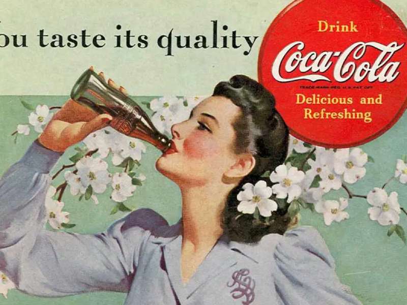
The layout formula was fixed: a warm illustrated scene occupying the top two thirds, the tagline set below in a light serif, and the red disc anchoring a bottom corner. Norman Rockwell and N.C. Wyeth both painted for the account, which gave the printed work the finish of magazine cover art rather than trade advertising.
D’Arcy took Coca-Cola on as its first client in 1906, a relationship that ran 50 years.
Hilltop (1971)

McCann Erickson creative director Bill Backer sketched the line on a napkin at Shannon Airport in January 1971 after a fog diversion, and the finished spot aired that July.
- Cast: more than 60 performers filmed on an Italian hillside
- Art director: Harvey Gabor
- Budget: a proposed $100,000, the highest production cost in Coca-Cola advertising at that point
- Music: the jingle was rewritten into a full song that charted in the UK and US
Backer’s composition put no product hero shot in the frame for most of its runtime, an unusual bet for 1971. The bottle in hand does the work a logo normally does, and that decision is the whole reason the ad reads as narrative rather than sales copy.
Have a Coke and a Smile / Hey Kid, Catch! (1979 to 1982)
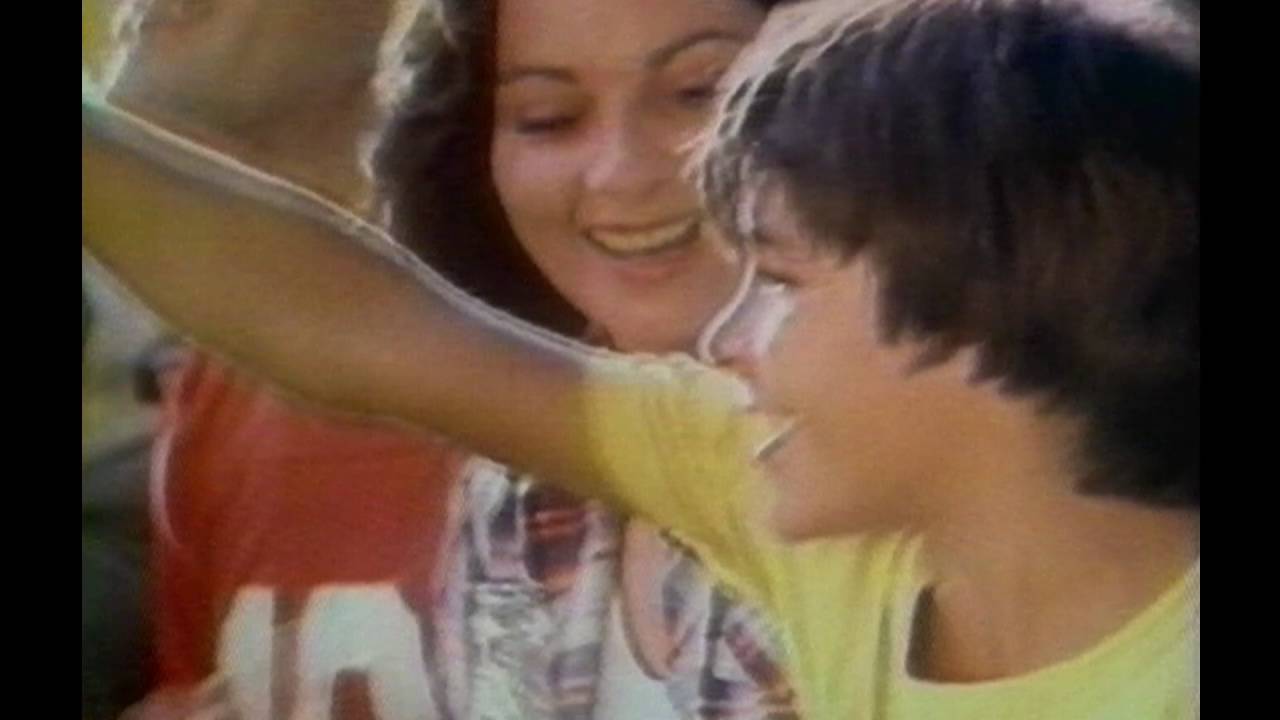
Sixty seconds, two actors, one tunnel.
McCann Erickson built the spot around Pittsburgh Steelers tackle Joe Greene and child actor Tommy Okon, written by Penny Hawkey and shot in Mount Vernon, New York in May 1979. It debuted October 1, 1979 and reached mass audience during Super Bowl XIV.
Awards: a Clio for best television commercial of 1979 and a Cannes Gold Lion.
Greene has said he drank 24 Cokes in one shooting day, and the jersey toss took 18 takes.
Always Coca-Cola and the Polar Bears (1993)

The setup: Creative Artists Agency built the Always Coca-Cola platform as a set of 27 commercials aimed at different audiences, replacing the single global spot model.
- Ken Stewart wrote and directed Northern Lights, the debut polar bear spot
- Rhythm & Hues Studios animated it from clay models and 3D scans over roughly 12 weeks
- Storyboards came from illustrator Eugene Yelchin
- Stewart ran the spot without dialogue so the score carried it
The bears returned during the 1994 Olympic Games and again in a 2012 Super Bowl ad. Their first print appearance predates all of this: a French Coca-Cola ad from 1922.
Share a Coke (2011 to present)

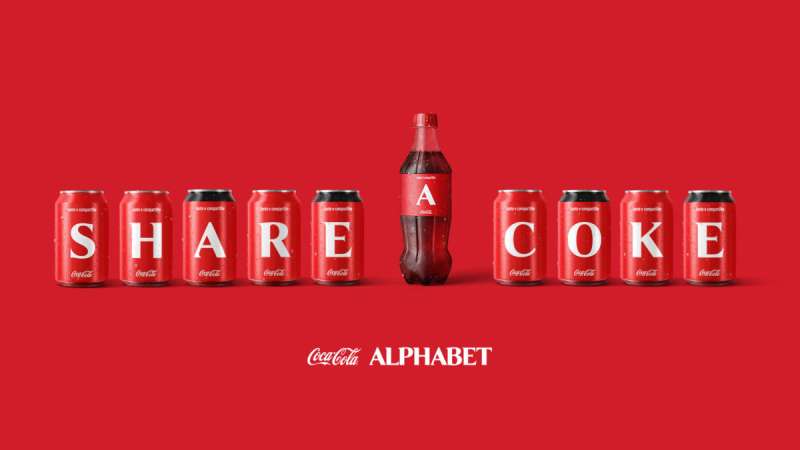
Ogilvy Sydney replaced the wordmark on Australian bottles and cans with 150 common first names, under the internal code name Project Connect. The idea moved into more than 70 markets and stayed in rotation for years.
Removing the logo from the label is the boldest package design decision the brand has ever made. The red field, the dynamic ribbon and the bottle contour carried the recognition load on their own, which is only possible because those three assets had been drilled into audiences for a century.
| Market | Result | Source |
|---|---|---|
| Australia, 2011-12 | 7% rise in young adult consumption, 4% category share gain | Ogilvy |
| Australia, summer 2011-12 | 250 million named bottles and cans sold in a country of 23 million | Ogilvy |
| United States, 2014 | Sales up more than 2%, ending an 11-year decline | Wall Street Journal |
Real Magic and Masterpiece (2021 to 2023)
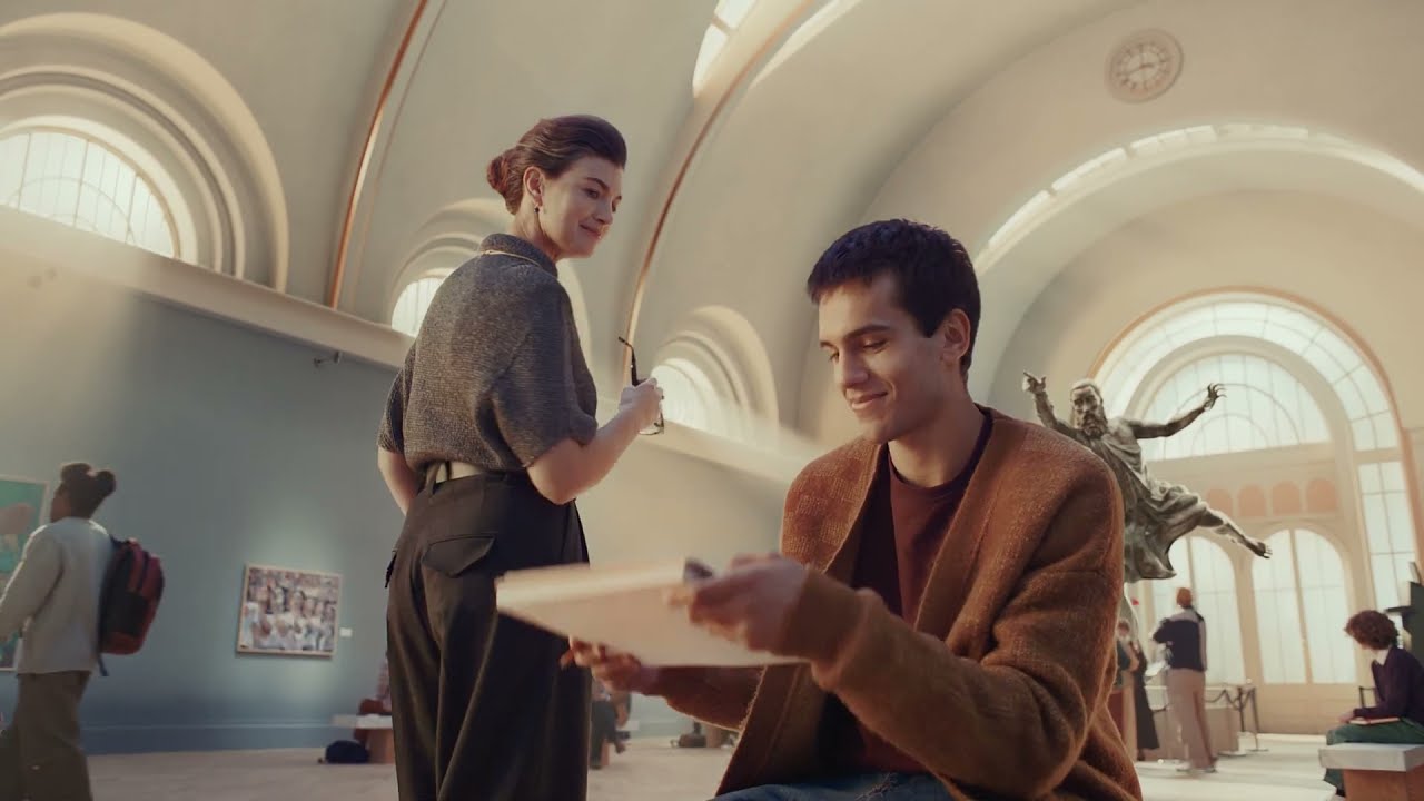
Real Magic arrived in 2021 as the successor to Taste the Feeling and refreshed the brand’s art direction without touching the wordmark.
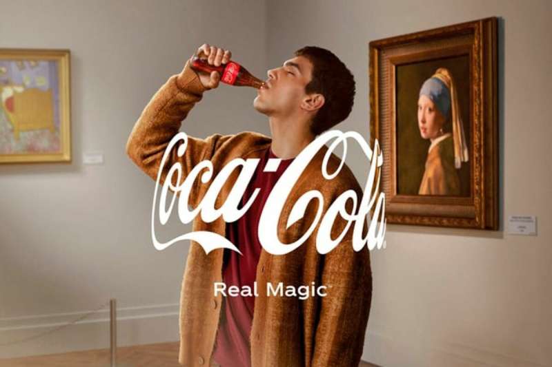
Its strongest execution is Masterpiece, a two-minute film from Blitzworks with WPP’s David and Open X, directed by Henry Scholfield for Academy Films. A Coke bottle lifted from Andy Warhol’s 1962 canvas travels through works by Vermeer, Van Gogh, Munch and JMW Turner before reaching a stalled art student.
- Extended into 3D billboards, an online gallery and digital collectibles
- Recognized at D&AD in 2023
Coca-Cola Christmas Print Ads by Haddon Sundblom (1931 to 1964)

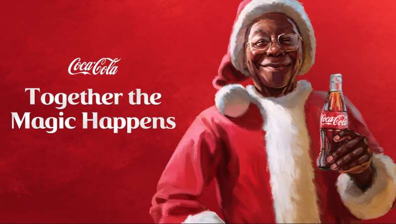
Archie Lee commissioned Michigan illustrator Haddon Sundblom in 1931 to paint a Santa who was a person rather than a man in costume, drawing on Clement Clark Moore’s 1823 poem for the physical description.
Where the work ran: The Saturday Evening Post, Ladies Home Journal and National Geographic, then store displays, billboards, calendars and posters.
Run length: 33 years, ending with Sundblom’s final Santa in 1964. Coca-Cola kept using adaptations of the originals for decades after.
Why the paintings hold up: Sundblom worked in oil at full tonal range, so the red suit and the red disc share a vintage advertising warmth that flat process printing could not fake.
How Do Coca-Cola Print Ads Work Visually?
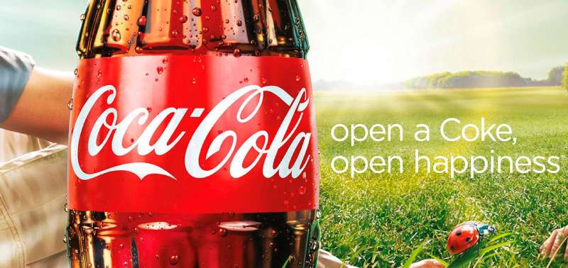
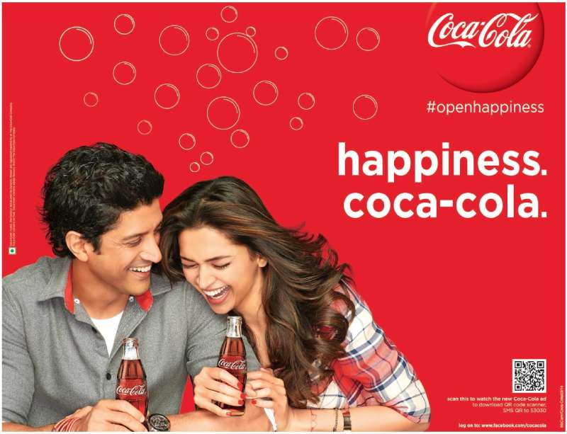
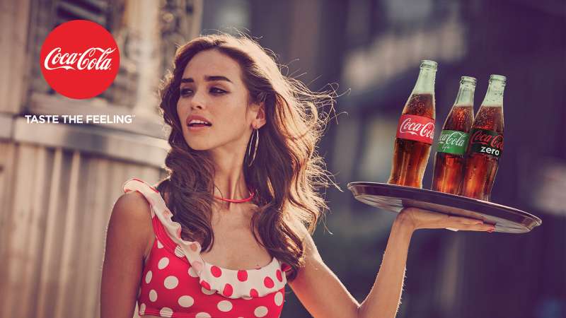
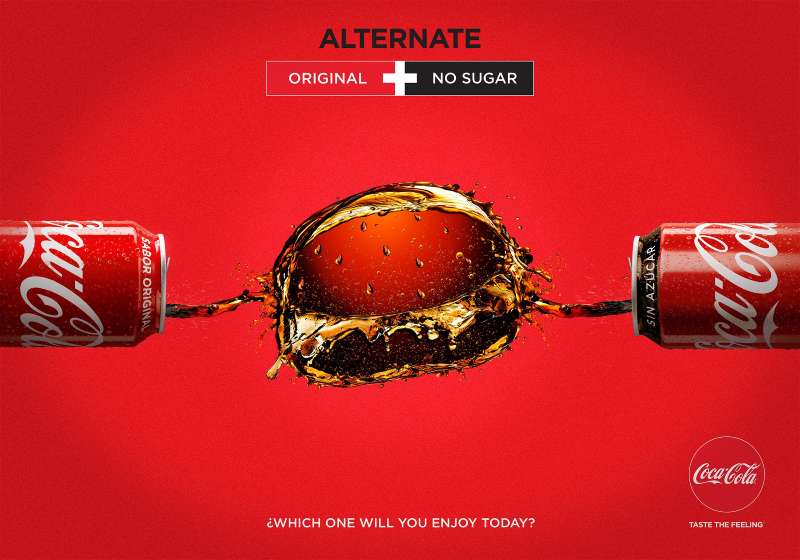
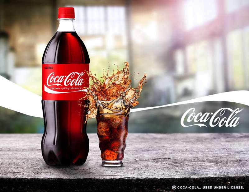
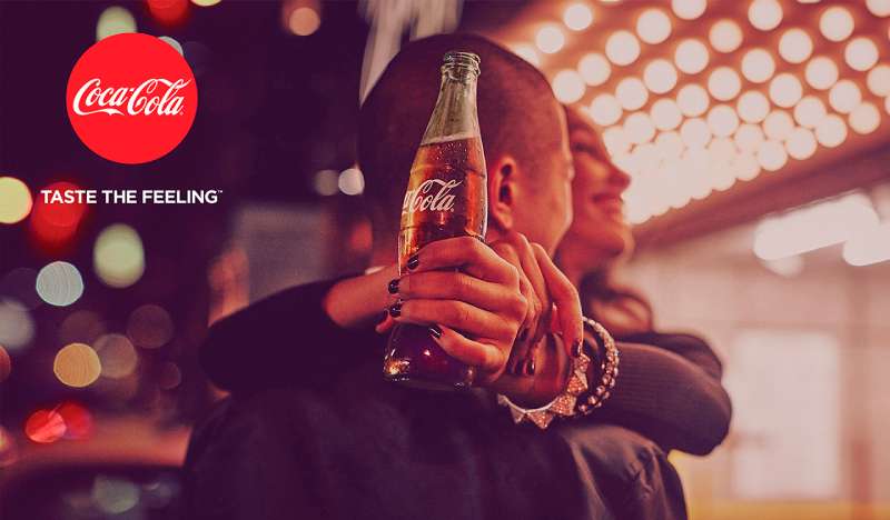
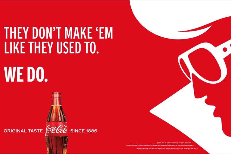
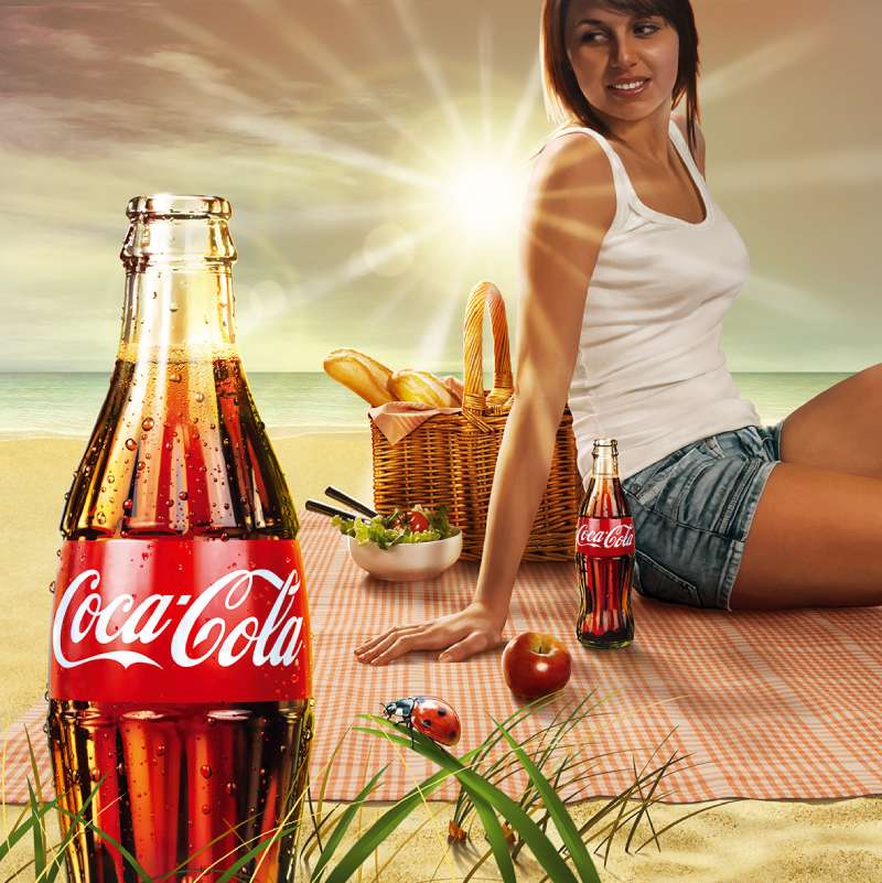
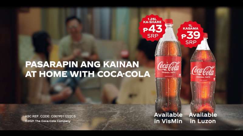
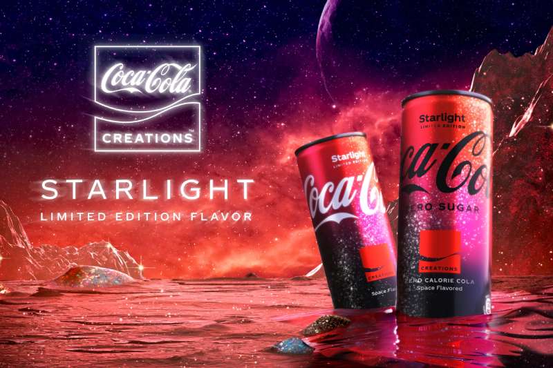
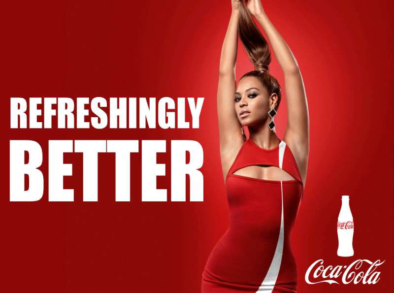
Coca-Cola print ads use a two-color system, a single product focal object and a low copy-to-image ratio. Red fills the field, white carries the type and the ribbon, and the bottle or glass sits at the optical center with condensation rendered in high detail.
The order the eye travels almost never changes across decades: product first, tagline second, wordmark last. Reversing that order is what most competitor work does, and it is the single clearest difference between a Coke layout and a generic beverage layout.
The bottle serves as the anchor point that holds attention because its silhouette is trademarked and readable at any scale. Earl R. Dean designed that contour for the Root Glass Company in 1915 from a cocoa pod illustration, and the brief was that it stay identifiable in the dark or in pieces.
Color: the working set of brand colors is red plus white plus black, with a fourth accent only in special editions. Red on Coca-Cola barrels started as a customs marker to separate syrup from alcohol, and the shade was standardized later.
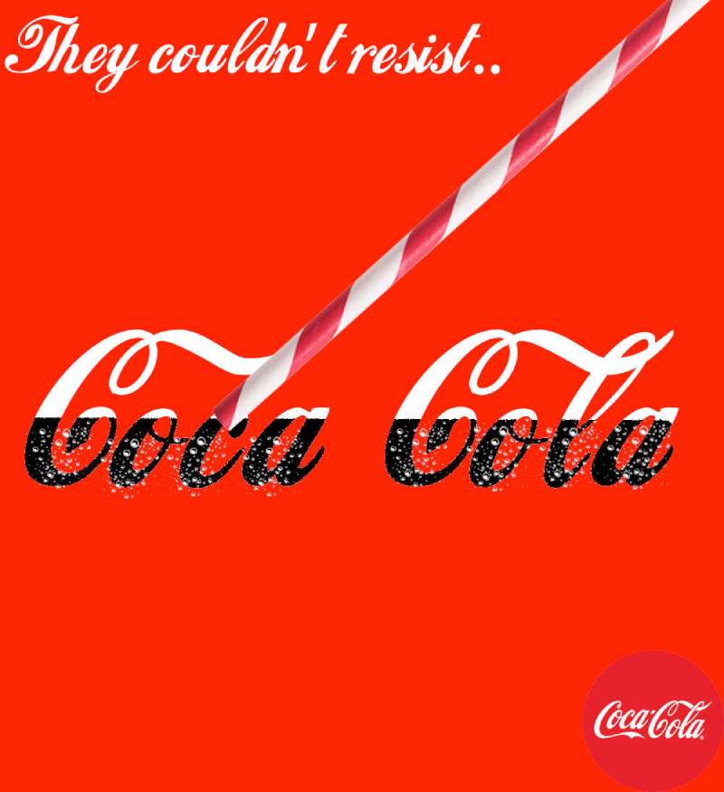
Type: the Spencerian wordmark is hand-drawn lettering, not a typeface, which is why the type system across brand materials pairs it with plain sans faces in body copy. Nothing competes with the script.
Post-1990 executions lean hard on open space around the subject, sometimes running a single bottle against flat red with no headline at all. That approach is closer to reduced, stripped-back layout work than to the illustrated storytelling of the 1940s.
How Do Coca-Cola TV Commercials Differ From Its Print Ads?
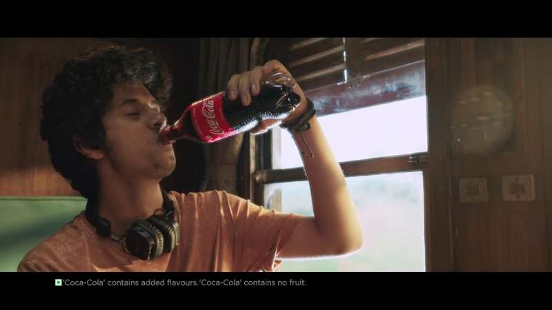
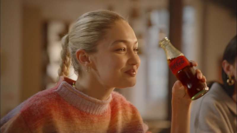
Coca-Cola TV spots trade the product hero shot for a narrative arc, delaying the logo until the final 3 to 5 seconds. Print puts the bottle first. Film puts the relationship first and lets the bottle resolve it.
Hilltop (1971, McCann Erickson). A crowd on an Italian hillside sings a rewritten jingle. No voiceover, no product demonstration, and the logo appears only in the closing card.
Hey Kid, Catch! (1979, McCann Erickson). A limping athlete accepts a bottle from a young fan and throws his jersey in return. Directed by N. Lee Lacy, shot on 35mm for a cinematic grade.
Northern Lights (1993, Rhythm & Hues). CGI polar bears watch the aurora and drink from glass bottles. Silent except for score, and the first major CGI character work in Coca-Cola advertising.
Holidays Are Coming (1995, W.B. Doner). Three real 40-foot trucks carrying about 30,000 bulbs each move through a snow landscape. The original used physical vehicles, not effects.
Holidays Are Coming, AI versions (2024 and 2025). Secret Level, Silverside AI and The Wild Card rebuilt the truck convoy with generative tools. The 2024 version drew heavy criticism from designers and illustrators while scoring 5.9 stars on System1’s Test Your Ad platform.
How Has Coca-Cola Advertising Evolved Since 1886?
Coca-Cola advertising moved through 4 strategic phases: product claim (1886-1928), lifestyle context (1929-1962), social and cultural positioning (1963-2008), and emotional platform advertising (2009-present). The visual identity barely changed while the message changed completely.
| Decade | Strategic shift | Representative campaign |
|---|---|---|
| 1890s-1920s | Price and product claim | Five-cent glass notices, Thirst Knows No Season (1922) |
| 1930s-1940s | Illustration and seasonal ownership | Sundblom Santa, The Pause That Refreshes |
| 1960s-1970s | Social connection over product benefit | Things Go Better With Coke, Hilltop |
| 1990s | Character animation and global platform | Always Coca-Cola, Northern Lights |
| 2010s-2020s | Personalization, then one-brand consolidation | Share a Coke, Taste the Feeling, Real Magic |
The 1930s and 1940s magazine work sits closest to the geometric framing and stylized figure work of Art Deco layout conventions, though the illustration itself stayed representational rather than abstract.
One visual element did change. The dynamic ribbon arrived in 1969 inside the Arden Square lockup, was reworked in 2003, and simplified to a single white wave in 2007.
Which Agencies Created Coca-Cola Advertising?
D’Arcy Advertising held the Coca-Cola account from 1906 to 1956. McCann Erickson took it in 1956 and produced Hilltop and Hey Kid, Catch!. Wieden+Kennedy created Open Happiness in 2009. WPP consolidated the global account into Open X in 2021.
- D’Arcy Advertising created The Pause That Refreshes in 1929 under Archie Lee, who also commissioned Haddon Sundblom in 1931.
- McCann Erickson created Hilltop in 1971 and Hey Kid, Catch! in 1979, both under Bill Backer’s creative direction.
- Creative Artists Agency built the Always Coca-Cola platform in 1993 and commissioned Rhythm & Hues Studios for Northern Lights.
- Ogilvy Sydney created Share a Coke in 2011 for Coca-Cola South Pacific, with Chris Ford as executive creative director.
- Wieden+Kennedy created Open Happiness in 2009, which ran until January 2016.
- Mercado McCann produced the lead Taste the Feeling spot in 2016, alongside Sra. Rushmore, Santo and Ogilvy New York.
- Blitzworks created Masterpiece in 2023 with WPP’s David and Open X.
Coca-Cola spent about $4.6 billion on marketing in 2024, roughly 10.2% of total revenue, against PepsiCo’s 4.37% share of revenue that year.
What Can Designers Learn From Coca-Cola Ads?
Coca-Cola’s advertising rewards 5 transferable decisions, all of them about restraint rather than invention. The brand has run essentially the same three assets for 140 years and changed only the story wrapped around them.
- Lead with the product silhouette, not the brand mark, and let recognition do the rest
- Hold the palette to two colors plus black, then defend that decision for decades
- Treat the wordmark as a fixed asset and never redraw it to chase a trend
- Build the layout so repeated visual elements carry across print, packaging and film without translation
- Place the copy block below the optical center so the product owns the top of the frame
- Pick a color for ownership, not meaning, because what a color signals to an audience is built through repetition rather than theory
The counterexample matters too. New Coke in 1985 changed the product and the packaging at once, and the reversal came within months.
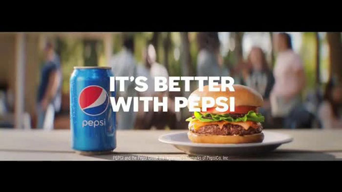
How Do Coca-Cola Ads Compare to Pepsi Ads?
Coca-Cola advertising builds on continuity. Pepsi advertising builds on disruption, which is why the two brands produce work that looks nothing alike even when they run in the same magazine spread.
Pepsi’s approach since the 1960s has been generational: name a demographic, sign a celebrity, redraw the identity every few years. Coca-Cola has held one wordmark since 1887 and one red since the barrel-marking era, and its campaigns work by adding meaning to fixed assets rather than replacing them.
The spend gap reinforces the difference. Coca-Cola put $5.01 billion into advertising in 2023 while Pepsi spent $3.8 billion, and Coca-Cola holds a 44.9% share of the US carbonated soft drink category.
Inside Coca-Cola’s own portfolio the contrast is just as sharp. Sprite campaigns lean on street culture and typographic energy, while Fanta’s advertising runs on saturated flat color and cartoon logic. Neither could carry the Coke layout system, and neither is trying to.
For the opposite end of the spectrum, compare any Coke print ad to Absolut Vodka’s print work, where the bottle silhouette becomes the entire concept and the brand name appears only in the caption.
What Makes Coca-Cola Advertising Work?
Three assets carry everything: the red field, the script wordmark and the bottle contour.
Every campaign named on this page changes the story around those three and leaves the assets alone. That discipline is why a crushed can still reads as Coca-Cola, why a label with a stranger’s name on it still reads as Coca-Cola, and why a hillside crowd holding bottles needed no logo until the final frame.
The lesson for anyone building a recognizable visual system is unglamorous. Pick the small number of elements you will never change, then spend the next century changing everything else.
Most brands do the reverse. They protect the campaign and redraw the identity, which is how a 140-year head start gets thrown away in a single rebrand.
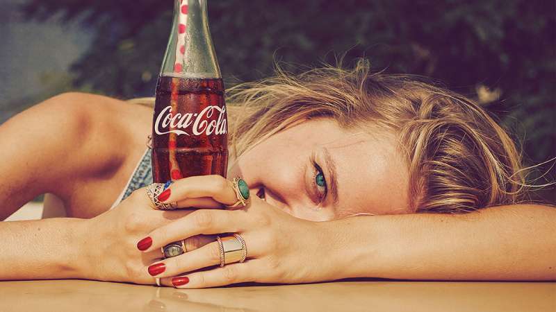
Coca-Cola Ads Examples
FAQ on Coca-Cola Ads
What is Coca-Cola’s longest-running slogan?
The Pause That Refreshes, written by Archie Lee at D’Arcy in 1929 and softened from his 1923 draft.
It stayed in rotation for roughly two decades across magazine spreads, calendars and store signage, outlasting every tagline that followed.
Who wrote the Hilltop jingle?
Bill Backer of McCann Erickson, with British songwriters Roger Cook and Roger Greenaway and producer Billy Davis.
Backer scribbled the napkin line at Shannon Airport in January 1971. The finished song charted in the UK and the US.
What font do Coca-Cola ads use?
None, strictly speaking. The wordmark is hand-drawn lettering in Spencerian style, not a licensed typeface you can install.
Body copy in print ads runs in plain sans faces so nothing competes with the script.
Why are Coca-Cola ads red?
Syrup barrels were painted red so customs agents could tell them apart from alcohol shipments.
The shade was standardized much later and is now cited as close to Pantone 484. A logistics fix became the brand’s strongest recognition asset.
What is the dynamic ribbon device?
The white wave running under the wordmark, introduced in 1969 inside the Arden Square lockup.
Coca-Cola reworked it in 2003 and simplified it to a single white ribbon in 2007. The script itself never changed.
Which illustrators painted Coca-Cola print ads?
Haddon Sundblom painted the Santa Claus series from 1931 to 1964.
Norman Rockwell and N.C. Wyeth both worked on the account during the D’Arcy years, and Fred Mizen painted the 1930 department-store Santa that preceded Sundblom.
How many names appeared on Share a Coke bottles?
Ogilvy Sydney started with 150 popular Australian first names in 2011.
The US run expanded to 1,000 in 2015, adding nicknames like “bro” and “sidekick” to keep the personalization idea working past its first season.
Did Coca-Cola advertise New Coke in 1985?
Yes, and the campaign lasted months.
New Coke changed the formula and the packaging at once, breaking the visual continuity the brand had held since 1887. Public reaction forced a reversal the same year.
Does Coca-Cola run separate campaigns for Diet Coke and Coke Zero?
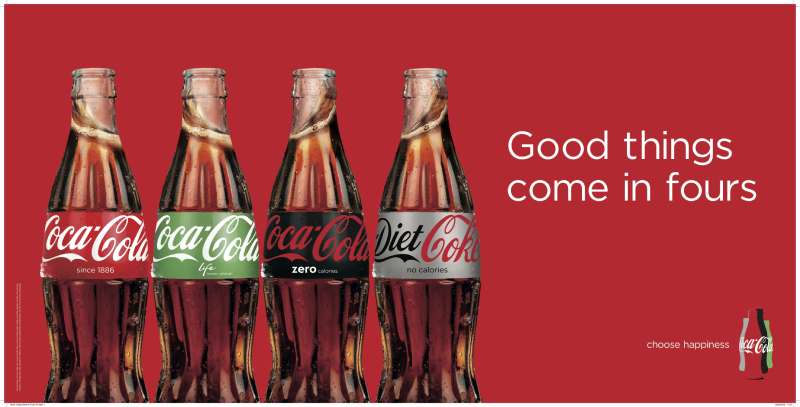
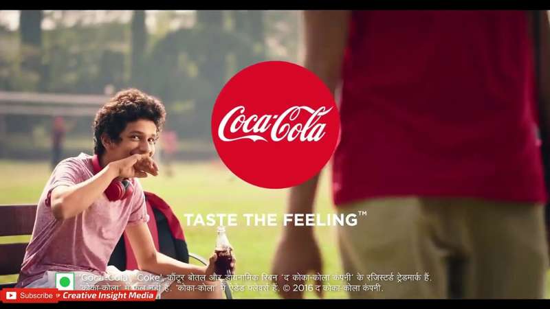
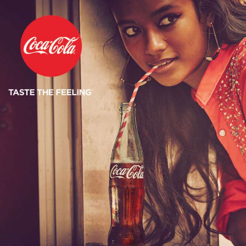
Not since 2016. The One Brand strategy folded Classic, Diet Coke, Coke Zero and Coca-Cola Life into a single message under Taste the Feeling, closing each spot on the shared red disc.
When did the Coca-Cola polar bears first appear in a print ad?
A French Coca-Cola advertisement from 1922, showing a bear squirting Coke into the mouth of a personified sun.
The characters stayed occasional for 70 years until Northern Lights put them on television in 1993.
Conclusion
Coca-Cola ads are worth studying because the constraints are visible. Two colors, one wordmark, one bottle, and roughly 140 years of people finding new things to do inside that box.
D’Arcy sold refreshment. McCann Erickson sold connection. Ogilvy Sydney sold your own name back to you on a label.
The craft sits in the details: Sundblom’s oil tonality, the copy-to-image ratio on a 1940s magazine spread, the decision to run Northern Lights without dialogue.
Recycle Me proved the point in 2024 by wrecking the logo on purpose and still winning at Cannes Lions.
Steal the discipline, not the aesthetic. Pick your untouchable assets early, then argue about everything else for the next hundred years.

Renowned for his expertise in logo design and visual branding, Bogdan has developed a multitude of logos for various clients.
His skills extend to creating posters, vector illustrations, business cards, and brochures. Additionally, Bogdan's UI kits were featured on marketplaces like Visual Hierarchy and UI8.
He also wrote in the past years on sites like Design Your Way, WebDesignerDepot, WPDean, Designmodo, Speckyboy, Slider Revolution, and more.
- Canva vs PowerPoint: Which Is Better for Presentations? - 22 September 2026
- How to Install Fonts on Mac (Step-by-Step Guide) - 20 September 2026
- From Mockup to Code: How AI-Augmented Development Speeds Up the Design Handoff - 19 September 2026

Bogdan Sandu is a seasoned designer who has been designing websites since 2008. Renowned for his expertise in logo design and visual branding, Bogdan has developed a multitude of logos for various clients. His skills extend to creating posters, vector illustrations, business cards, and brochures. Additionally, Bogdan's UI kits were featured on marketplaces like Visual Hierarchy and UI8. He also wrote in the past years on sites like Design Your Way, WebDesignerDepot, WPDean, Designmodo, Speckyboy, Slider Revolution, and more.
You Might Also Like