American Express ads have run on the same move since 1975: put a real person’s name on the card, then let the card do the talking. Karl Malden did it. So did Ella Fitzgerald, Jerry Seinfeld and Robert De Niro.
Six decades of work sit behind that, running from Ogilvy & Mather to mcgarrybowen, across print, TV, out of home and branded web film.
This page walks through the campaigns by name, with the agency, year and market attached to each one.
You get the design analysis too: layout ratios, the Benton Sans setting, the Blue Box lockup, and what the 2018 Pentagram redraw actually changed.
American Express advertising spans 64 years, 6 lead agencies and 9 flagship campaigns, from “The Company for People Who Travel” in 1962 to “There’s Always More” in 2025. The work runs on one repeated device: a real person’s identity parked next to a charge card, with the product named in the last five seconds.
This page covers the campaigns by name, with the agency, year and market behind each one, plus the layout, typography and color decisions that hold them together.
American Express Advertising at a Glance
American Express has used outside agencies since 1962, working longest with Ogilvy & Mather and, since 2017, with mcgarrybowen. Its best-known campaigns are “Don’t Leave Home Without It,” “Portraits” and “Small Business Saturday.” The visual signature combines the Blue Box, cropped portraiture and a fixed lower-right card lockup.
| Attribute | Value |
|---|---|
| First major campaign | “The Company for People Who Travel” (1962, Ogilvy & Mather) |
| Lead agencies | Ogilvy & Mather (1962-2017), mcgarrybowen (2017-present), Digitas, Dentsu Creative |
| Best-known taglines | “Don’t Leave Home Without It” (1975), “Membership Has Its Privileges” (1987), “My Life. My Card.” (2004), “Powerful Backing” (2018) |
| Primary media | Print, TV, OOH, cinema, branded web film, retail point of sale |
| Awards | Clio (1987), Ad Age Print Campaign of the Decade (1990), Cannes Lions shortlist (2004), Effie |
| Visual signature | Blue Box, Centurion head, outline lettering, card used as a nameplate |
| Reported marketing budget | Roughly $6 billion for 2025 |
Which American Express Ad Campaigns Are the Most Famous?
The 9 most famous American Express campaigns are “Don’t Leave Home Without It” (1975), “Do You Know Me?” (1976), “Portraits” (1987), “Membership Has Its Privileges” (1987), “Do More” (1996), “My Life. My Card.” (2004), “The Adventures of Seinfeld & Superman” (2004), “Small Business Saturday” (2010) and “Powerful Backing” (2018).
Don’t Leave Home Without It (1975-1997)

“Don’t Leave Home Without Them” launched in 1975 for American Express Travelers Cheques, with the line credited to David Ogilvy himself. Karl Malden fronted it for around 20 years. The phrase went singular when the charge card became the hero product.
Layout was blunt on purpose. One object, one hard-left copy block, the Blue Box locked bottom right, and enough white space around the cheques that nothing competed with them.
Amex brought the exact wording back into its marketing in 2018, which makes it one of the longest-serving lines in financial services.
Do You Know Me? (1976-1987)

Ogilvy & Mather built “Do You Know Me?” around famous names attached to unfamiliar faces. Each spot opened with the question, gave a few hints, then revealed the name printed on a Green Card. Announcer Peter Thomas closed every one.
The cast worked because nobody recognized them:
- Stephen King, novelist
- Mel Blanc, voice of Bugs Bunny
- Jim Henson, puppeteer
- Mikhail Baryshnikov, dancer
- Benny Goodman, bandleader
The card itself carried the reveal, so the embossed name became the headline. Sample cards in print used “C.F. Frost,” named after an Ogilvy account executive.
Portraits (1987-1990)

Annie Leibovitz shot the entire campaign. “Portraits” followed “Do You Know Me?” and showed cardholders in their own worlds rather than in a studio: Ella Fitzgerald posed with a Mercedes, Tom Selleck, Elmore Leonard, Luciano Pavarotti, Tip O’Neill.
The photographs ran full bleed with a small card reproduction and a two-line caption. No headline, no body copy, no product claim. The color palette came from whatever the sitter’s environment supplied, which kept the work from looking like a series of retouched ads.
Leibovitz won a Clio in 1987 for the work. Advertising Age named it Print Campaign of the Decade in 1990.
Membership Has Its Privileges (1987-1996)

The tagline ran for 9 years and reframed a payment product as a club. It landed between the Gold Card (introduced 1966) and the invitation-only Centurion (1999), and it did the positioning work for both.
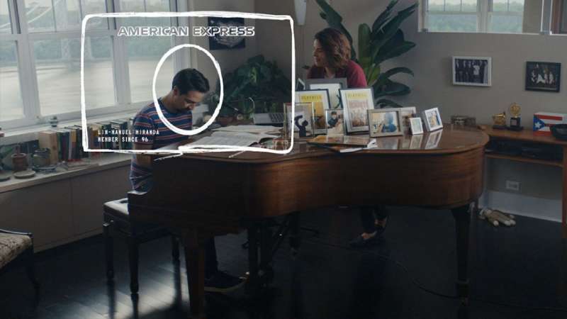
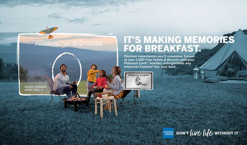
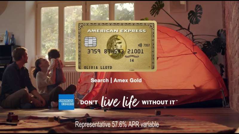
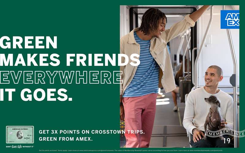
Design cue: the “member since” date on the card face turned into the campaign’s proof point. Print ads scaled that date up, which is why Amex creative still treats the card as a piece of typography rather than as a product shot.
Do More (1996-2000)

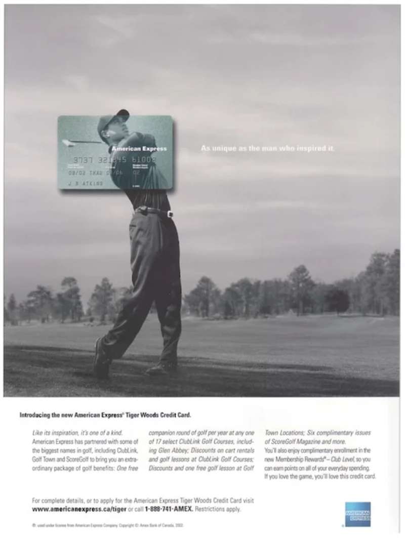
“Do More” ran in 23 countries at once, with Ogilvy adjusting local details rather than reshooting. Tiger Woods carried the global executions, including a spot where he golfs across Manhattan from Central Park to the Brooklyn Bridge.
Amex purchase volume rose 15.6% in 1996, and domestic card market share climbed after years of decline, according to trade coverage of the campaign at the time.
My Life. My Card. (2004-2007)

Ogilvy & Mather New York launched “My Life. My Card.” in late 2004 to modernize the brand while Amex opened up to co-branded issuers. Each spot was a first-person autobiography that named the product only at the end.
Robert De Niro: 60 seconds through New York, directed by Martin Scorsese, shot by Robert Richardson, scored by Philip Glass.
Wes Anderson: a two-minute film about directing a film, aired during the Oscars, built on the centered symmetry and lateral dolly moves he is known for.
Kate Winslet: directed by Roger Michell, with David Apicella as chief creative officer across the campaign.
Print used handwritten-style headlines over a single portrait, which pushed the storytelling ahead of the offer.
The Adventures of Seinfeld & Superman (2004)

Two four-minute webisodes, co-written by Jerry Seinfeld and directed by Barry Levinson, with Patrick Warburton voicing an animated Superman. “A Uniform Used to Mean Something” went live 29 March 2004; “Hindsight Is 20/20” followed on 20 May.
Results reported to Cannes Lions, where the work was shortlisted:
- 1.5 million site visitors in just over two weeks
- 7.6% clicked through to apply for a card, against a 3% forecast
- Around 150,000 email addresses captured
Small Business Saturday and Shop Small (2010-Present)

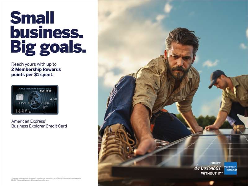
American Express created Small Business Saturday in 2010, the Saturday after Thanksgiving. The SBA has co-sponsored it since 2011. Merchants get free signage kits, which is where the campaign’s poster design does the heavy lifting.
| Metric | Figure |
|---|---|
| Consumer-reported spend, 2024 edition | About $22 billion |
| Cumulative reported spend since tracking began | An estimated $241 billion |
| Share of annual revenue owners tie to the day | Nearly 20% |
| Shop Small Grants with Main Street America | 250 grants of $20,000 |
Amex reported hitting its goal of driving $100 billion in consumer-reported small business spending between 2021 and 2025.
Powerful Backing (2018-Present)
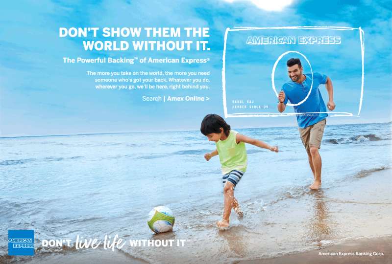
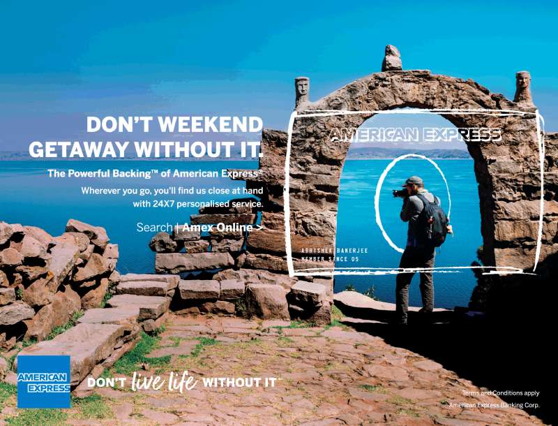
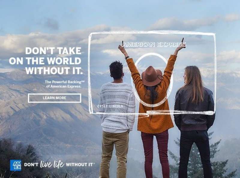
“Powerful Backing: Don’t Do Business / Don’t Live Life Without It” launched in April 2018 and dropped celebrity spokespeople. Elizabeth Rutledge, who became CMO that February, pointed out that close to 40% of Amex business came from other businesses.
Who made it: mcgarrybowen led creative, Pentagram handled identity, with Ogilvy, Mindshare and Digitas contributing. Lance Acord directed film; Mathieu Young shot stills.
Where it ran: TV plus a heavy OOH push through transit hubs in New York, Los Angeles, Chicago and San Francisco, including geo-aware taxi-top units that swapped copy by neighborhood.
American Express Print Ads for the Platinum and Centurion Tiers
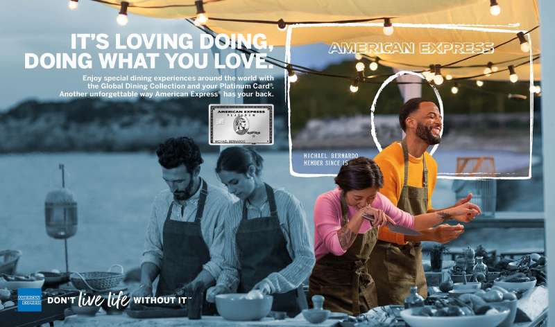
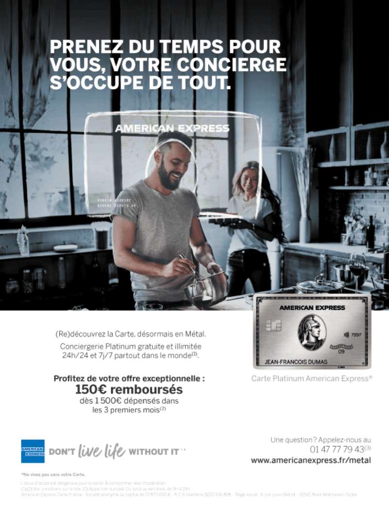
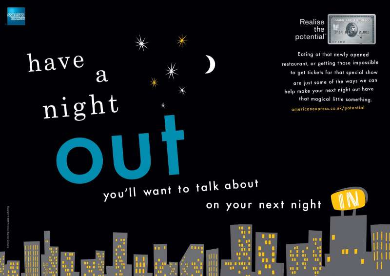
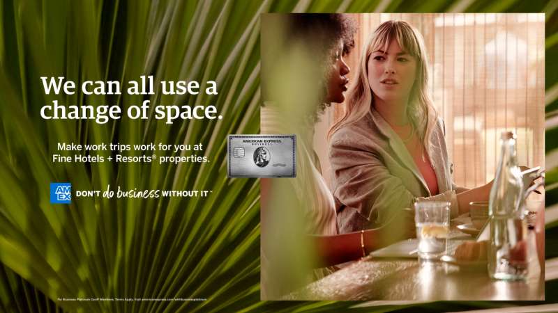
Card-tier advertising is its own visual track. Platinum and Centurion work drops portraiture almost entirely and shoots the card as an object: metal edge lit hard, black or charcoal ground, minimal copy.
The fall 2025 Platinum refresh was described by Amex as its largest-ever investment in updating a card product, aimed at Gen Z and millennial cardholders who already account for about 35% of US consumer spending.
How Do American Express Print Ads Work Visually?
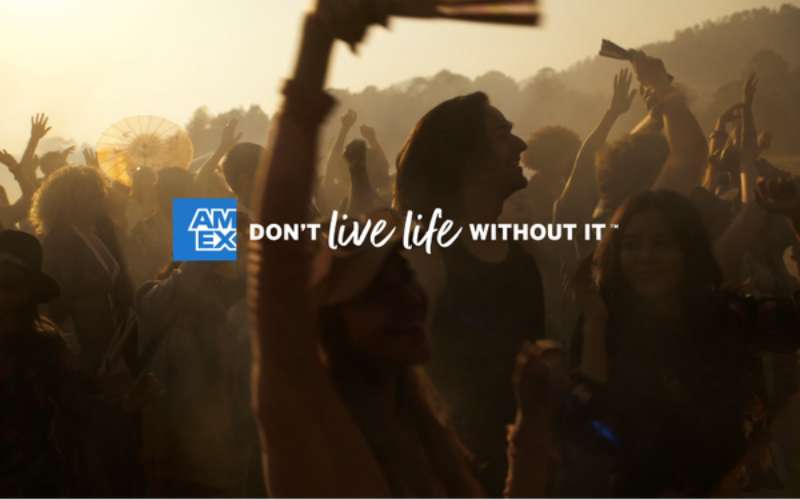
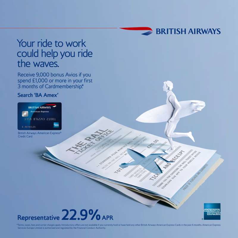
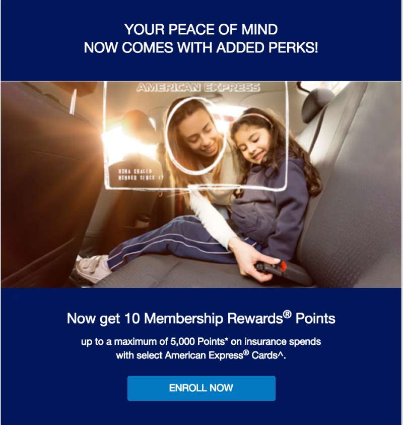
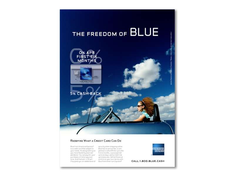
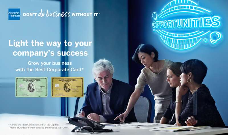
American Express print ads use a 3-part structure: one dominant image, one short copy block, and the Blue Box locked in a fixed corner position. Type is set in a single sans-serif weight. Color stays inside a narrow band of blue, black, white and whatever the photograph brings.
Composition and image-to-text ratio
Most Amex print runs at roughly 70% image, 15% copy, 15% clear space. That ratio has barely moved since “Portraits.”
The Blue Box almost never floats. Fixing it to the bottom right corner across decades gave the brand a reliable visual hierarchy: image first, line second, mark third.
Card reproductions sit at an angle in maybe a quarter of executions, flat in the rest. Flat reads cleaner at small sizes.
Typography
The brand runs almost entirely on sans-serif setting, and headline weight rarely changes within a single ad. Amex builds emphasis through size, not through mixing families.
The Blue Box lettering is not a typeface at all. Pentagram, working with the MCKL type foundry, redrew the wordmark in 2018 because the original outlined letters had no true counters and fell apart once pulled out of the box.
That redraw also produced a shorthand “AmEx” mark that crops the wordmark for app icons and social avatars.
Color and contrast
Amex blue does the identifying. Everything else in the frame is allowed to be neutral.
The 2018 refresh dropped the radial gradient the logo had carried since around 2000 and went back to flat blue. Flat color holds contrast better at 24 pixels, which was the point.
Centurion black and Platinum silver operate as separate palettes with their own rules, and they rarely appear in the same layout as consumer green.
Grid and spacing
Amex layouts are built on tight grid systems with generous outer margins, closer to Swiss design practice than to the busy financial advertising of the same decades.
Copy blocks align left and stay ragged right. Justified setting shows up almost never.
How Do American Express TV Commercials Differ From Its Print Ads?
American Express TV commercials delay the product reveal, while print states it immediately. Spots run 30 to 120 seconds, use a single narrating voice, and hold the card back until the final beat. Print puts the Blue Box in the layout from the first glance.
The reveal is the format
“Do You Know Me?” (1976): 30 seconds. The celebrity gives clues, the card carries the name, the tagline lands. The whole spot is a delayed identification.
“Wes Anderson” (2005, Ogilvy & Mather NY): two minutes on a working film set, ending on “My life is about telling stories. My card is American Express.” The product line takes four seconds of a 120-second film.
“De Niro” (2004, directed by Martin Scorsese): 60 seconds of New York cut to Philip Glass. No product until the end card.
Casting versus framing
Print leans on a single held frame, so it needs a face doing something specific. Film can build across shots, which is why Amex hired directors rather than commercial specialists for the 2004 to 2007 run.
Beyonce, Tina Fey and Jerry Seinfeld all worked in both media. The print versions of those campaigns consistently used tighter crops than the film stills.
Current TV work
The Platinum and US Open spots sell benefits directly: lounge access, dining credits, event access. That is a break from the delayed-reveal tradition.
Dentsu Creative launched “There’s Always More” in September 2025, built around everyday moments and rewards rather than around a named celebrity.
How Has American Express Advertising Evolved Since 1962?
American Express advertising has moved through 4 strategic phases since 1962: travel utility (1962-1975), celebrity identity (1976-2007), branded content and community (2004-2017), and unified brand platform (2018-present). Agencies changed 3 times. The Blue Box changed twice.
| Decade | Strategic shift | Representative campaign |
|---|---|---|
| 1960s | Travel expertise, one-stop positioning | “The Company for People Who Travel” |
| 1970s-80s | Identity and status through celebrity | “Do You Know Me?”, “Portraits” |
| 1990s | Everyday utility, global rollout | “Do More” |
| 2000s | Autobiography and branded web film | “My Life. My Card.”, Seinfeld webisodes |
| 2010s-20s | Community, small business, one platform | “Small Business Saturday”, “Powerful Backing” |
The 2018 identity refresh was the first in 37 years. Pentagram’s Abbott Miller kept the Blue Box composition, two bars of lettering crossing a blue square, while rebuilding the letterforms underneath.
Amex also launched Amex Ads in October 2025, moving the company from buying media to selling it.
Which Agencies Created American Express Advertising?
Ogilvy & Mather created American Express advertising from 1962 to 2017, replacing Benton & Bowles. mcgarrybowen won the global creative account in 2017 and launched “Powerful Backing” in 2018. Pentagram redesigned the identity. Universal McCann took global media from Mindshare in 2018.
| Agency | Years | Contribution |
|---|---|---|
| Ogilvy & Mather | 1962-2017 | “Don’t Leave Home Without It”, “Portraits”, “My Life. My Card.” |
| mcgarrybowen | 2017-present | “Powerful Backing” global creative |
| Pentagram | 2018 | Blue Box redraw, brand system |
| Universal McCann | 2018-present | Global media planning and buying |
| Dentsu Creative | 2025 | “There’s Always More” |
David Ogilvy wrote the 1975 travelers cheques line. Aldo Papone, a 40-year Amex executive, oversaw “Do You Know Me?”, “Portraits” and “Membership Has Its Privileges,” and in 1994 became the first client ever given Ogilvy’s own founder’s award.
Clayton F. Ruebensaal, then SVP of global brand management and design, ran the Pentagram project on the client side. The resulting brand guidelines govern everything from card face lettering to the Centurion and World Service patterns.
What Can Designers Learn From American Express Ads?
American Express ads teach 6 transferable rules: fix the mark, let the product carry the type, hold the palette, delay the claim, design the sign kit, and keep one line for decades.
- Lock the logo to one corner and leave it there across every execution
- Treat the product surface as a typographic element, not a product shot
- Hold the palette to one brand color plus neutrals drawn from the photograph
- Delay the product claim in film, state it immediately in print
- Design the merchant-facing kit, since Shop Small signage reaches more eyes than the TV buy
- Keep a line long enough for people to finish it themselves
The wordmark redraw is the sharpest lesson in the set. Anyone applying logo design principles to a legacy mark should test whether the letterforms survive outside their container before touching anything else.
Amex also shows what happens when color psychology gets applied with restraint. One blue, used consistently for 50 years, now does identification work that no amount of new palette would replace.
How Do American Express Ads Compare to Visa and Mastercard Ads?
American Express advertising sells membership. Visa ads sell acceptance, and have run variations of “Everywhere You Want To Be” for roughly 40 years, including a 2025 Ryan Reynolds spin. The difference shows up in the layouts.
Visa work puts the merchant environment in frame. Amex work puts the cardholder in frame and treats the merchant as background.
Mastercard ads took a third route with “Priceless,” which built around a price list set as type and closed on an unpriceable item. That campaign is typographic where Amex is photographic.
Amex also runs the narrowest palette of the three. Visa uses blue and gold, Mastercard uses overlapping red and yellow circles, and Amex holds a single blue with black and white support.
Reading these alongside the vintage ads of the 1970s makes the split clearer. Amex was already selling status while its rivals were still explaining what a credit card did.
What Makes American Express Advertising Work?
The discipline is in what stays fixed. One blue, one mark position, one card lockup, one line held long enough for people to finish it without prompting.
Everything else moves. Spokespeople rotate, formats jump from magazine spread to two-minute film to a merchant window sticker, and the strategy shifts from travel utility to status to small business support.
That split is the reason a 1987 portrait and a 2018 transit poster read as the same brand without sharing a single visual element beyond the box.
For designers, the takeaway sits in the visual identity rather than the campaigns. Build a system rigid enough to survive 50 years of creative churn, then let the churn happen.
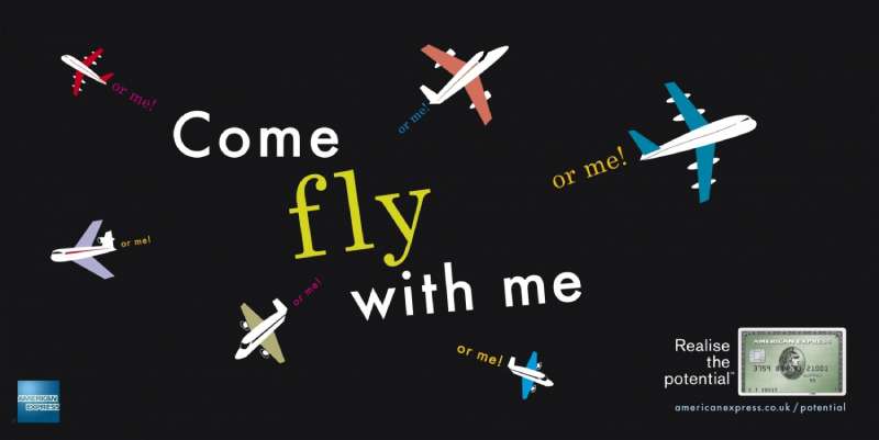
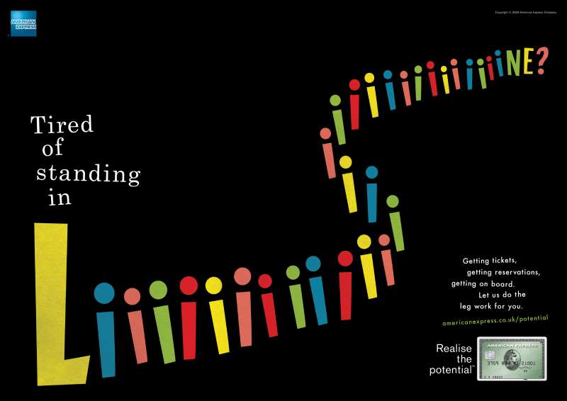
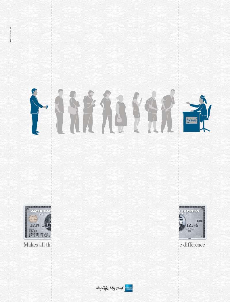
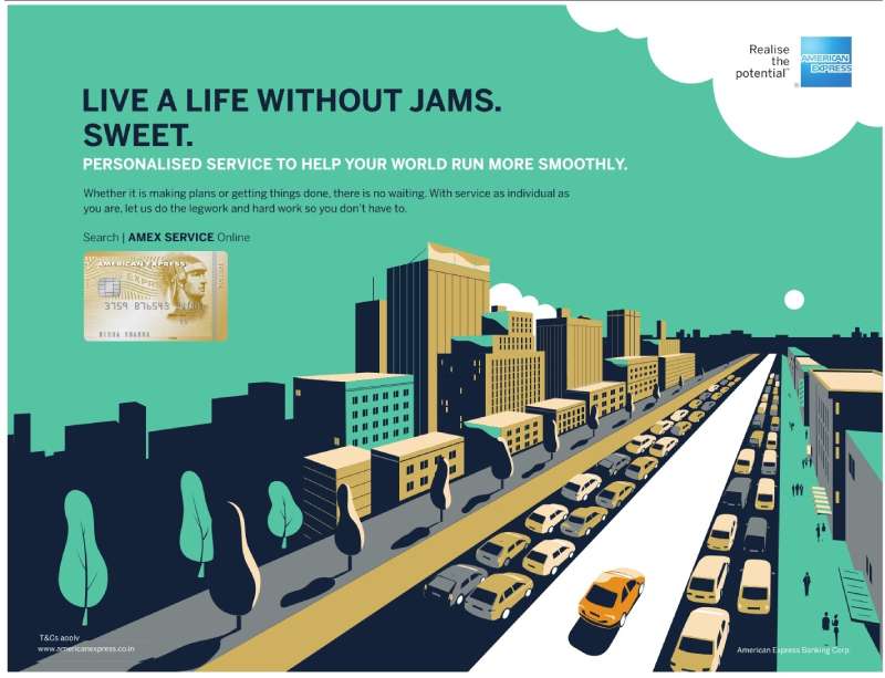
American Express Ads Examples
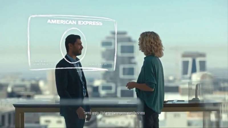

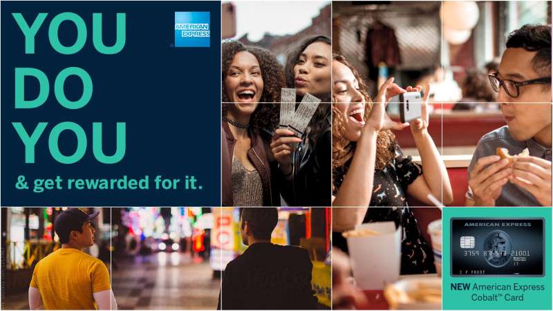
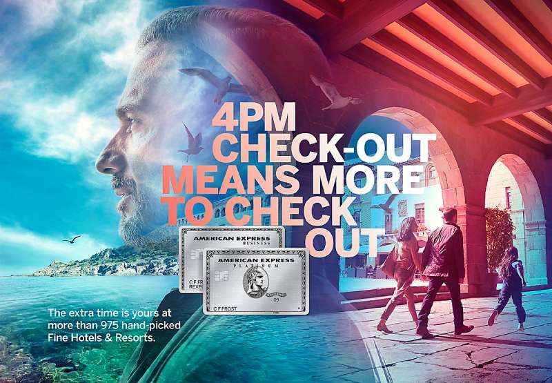
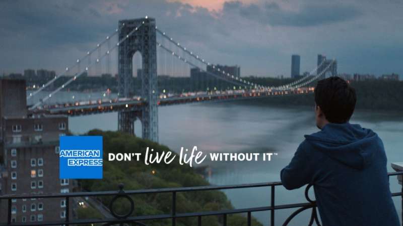



FAQ on American Express Ads
What is American Express’s current advertising slogan?
“Powerful Backing” has been the master platform since April 2018, paired with “Don’t Do Business Without It” and “Don’t Live Life Without It.”
Newer lines like “There’s Always More” sit underneath it rather than replacing it.
Why did American Express stop using celebrity spokespeople in 2018?
Close to 40% of Amex business came from other businesses by then. Ordinary customers on screen covered both audiences at once, which a single famous face could not do.
The change arrived with the “Powerful Backing” launch.
Who leads American Express marketing?
Elizabeth Rutledge, chief marketing officer since February 2018 and the first woman in the role.
She oversees global media, sponsorships, brand planning and customer insights, and has spent her whole 35-year career at the company.
Which events does American Express advertise around?
The US Open, where Amex has been a partner since 1994, plus Coachella, Stagecoach and multiple Formula 1 races.
Card member lounges and fan experience builds rack up more brand contact hours than the broadcast spots do.
What is Amex Ads?
A commerce media network launched in October 2025 that lets merchants buy targeted placements in front of US card members.
It puts American Express on the selling side of the advertising business for the first time.
Does American Express still run print ads?
Yes, though volume sits well below the 1980s peak. Platinum and Centurion work still turns up in travel and lifestyle titles.
Shop Small merchant kits also keep the brand in physical print design at street level.
Why does a Centurion head appear in American Express advertising?
The Roman centurion traces back to the company’s money order and travelers cheque business, where it signaled security.
Pentagram kept and refined the mark in 2018, and that kind of symbolism still runs alongside the World Service pattern.
What does the “member since” date do in Amex ads?
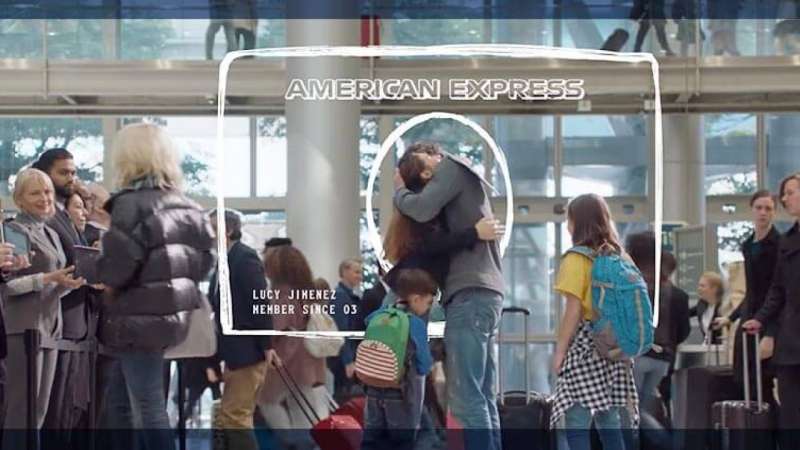
It turns tenure into a status claim.
Print work has scaled that date up since the late 1980s, and TV spots like “Dates” from 2008 built an entire script around it.
Does American Express run different ads outside the United States?
The global platform stays fixed while local agencies adapt it. Ogilvy and Mindshare reworked “Powerful Backing” for India.
The earlier “Do More” campaign ran in 23 countries with local detail changes only.
How do Amex Offers reach card members?
Through the app and account pages rather than paid media.
The program drove $24 billion in spend worldwide in 2025 with 464 million US enrollments, and 56% of redeemers were Gen Z or millennial card members.
Conclusion
American Express ads reward a second look. Put the Annie Leibovitz “Portraits” work next to a Shop Small merchant kit and the same discipline shows up in both.
One is a Clio winner shot for magazines. The other is a window decal printed by the thousand.
Both hold the tagline in the same spot, both keep copy off the image, and both trust the reader to finish the thought without help.
That is the part worth stealing. Not the celebrity casting, which took a budget almost nobody has, but the art direction rules sitting underneath it.
Pick three constraints. Hold them for a decade.
Let everything else move.

Renowned for his expertise in logo design and visual branding, Bogdan has developed a multitude of logos for various clients.
His skills extend to creating posters, vector illustrations, business cards, and brochures. Additionally, Bogdan's UI kits were featured on marketplaces like Visual Hierarchy and UI8.
He also wrote in the past years on sites like Design Your Way, WebDesignerDepot, WPDean, Designmodo, Speckyboy, Slider Revolution, and more.
- The Windsurf Logo History, Colors, Font, And Meaning - 10 October 2026
- How to Remove Background From Product Photos (No Photoshop) - 10 October 2026
- How Designers can Build a Stronger Online Creative Identity - 9 October 2026

Bogdan Sandu is a seasoned designer who has been designing websites since 2008. Renowned for his expertise in logo design and visual branding, Bogdan has developed a multitude of logos for various clients. His skills extend to creating posters, vector illustrations, business cards, and brochures. Additionally, Bogdan's UI kits were featured on marketplaces like Visual Hierarchy and UI8. He also wrote in the past years on sites like Design Your Way, WebDesignerDepot, WPDean, Designmodo, Speckyboy, Slider Revolution, and more.
You Might Also Like