One line has carried Visa ads for four decades: “It’s Everywhere You Want to Be.” BBDO New York wrote it in 1985, and a shortened version was still on air in 2026.
That kind of continuity is rare in payment card advertising, and it shows up in the layouts.
This page collects the campaigns by name, with the agency, year and market behind each one, from the Olympic work to the FIFA World Cup spots.
You also get the design read most ad galleries skip:
- Grid, typeface and logo placement across the print campaigns
- How the TV commercials differ from the page
- What actually changed in the 2021 brand identity refresh
Six campaigns. Five agencies. One argument, repeated.
Visa advertising spans 41 years, 5 lead agencies and 8 flagship campaigns, from “It’s Everywhere You Want to Be” in 1985 to “Tap In” in 2026. The work runs on a single idea wearing different clothes: acceptance.
The media mix covers print, national TV, cinema, out-of-home, and now creator-led social.
This page covers the campaigns by name, with the agency, year and market behind each one, plus the layout, type and copy decisions that make them hold up on a page.
Visa Advertising at a Glance
Visa has advertised under a named campaign line since October 1985, working mainly with BBDO New York, TBWAChiatDay and Wieden+Kennedy. Its best-known campaigns are “It’s Everywhere You Want to Be”, “Go World” and “Meet Visa”. The visual signature combines Visa Blue, wide open space and a small bottom-right logo.
| Attribute | Value |
|---|---|
| First major campaign | “Visa. It’s Everywhere You Want to Be”, launched October 1, 1985 |
| Lead agencies | BBDO New York (1985-2005, 2012-2014), TBWAChiatDay (2006-2012), Wieden+Kennedy (2014-present), Anomaly (2026 World Cup), Maximum Effort (2025) |
| Best-known taglines | It’s Everywhere You Want to Be (1985), Life Takes Visa (2006), More People Go With Visa (2009), Meet Visa (2021) |
| Primary media | Network TV, magazine print, Super Bowl, Olympic broadcast, OOH, YouTube, creator social |
| Awards | 54 major awards for the 1985 campaign, Cannes Gold Lion for the Bob Dole spot (1998), 3 Clio Awards (1998), EFFIE financial services winner (1998), Bronze EFFIE Sustained Success (2004) |
| Visual signature | Visa Blue (#1434CB), a custom humanist typeface called Visa Dialect, minimal copy, product or person centered |
| Measurable results | US card market share up from 43.8% (1985) to 52% (2004); Visa Check Card annual charges up from $20.2bn (1995) to $537bn (2004) |
| Marketing spend | $1.336bn (2022), $1.341bn (2023), $1.560bn (2024), per Visa’s 2024 annual report |
Which Visa Ad Campaigns Are the Most Famous?
Six Visa campaigns carry the brand’s advertising history: “It’s Everywhere You Want to Be” (1985), “Works Like a Check, Only Better” (1995), “Life Takes Visa” (2006), “Go World” (2008), “Meet Visa” (2021) and “Tap In” (2026). Each one shifted the strategic target.
It’s Everywhere You Want to Be (1985-2006)
BBDO New York launched the campaign on October 1, 1985 across US television, radio, print and billboards. Every execution named a real restaurant, hotel or shop that took Visa and refused American Express. The budget opened at $20 million and reached $335 million by the time it ended.
The design device is subtraction. The print ads gave the frame to a single location photograph, dropped a short line of copy underneath, and parked the wordmark in the lower right at maybe 4% of the page area.
Visa’s US market share climbed from 43.8% in 1985 to 52% in 2004, an increase the company credited to the campaign. Adweek called it a pure example of insightful strategy, and it collected 54 major advertising awards.
Works Like a Check, Only Better (1995-2005)

Product: Visa Check Card, the debit product that needed a personality.
Agency: BBDO New York.
Casting device: straight-faced celebrities failing at everyday tasks, including Bob Dole returning to Russell, Kansas without ID, and Deion Sanders alongside Daffy Duck.
The Dole spot took a Gold Lion at Cannes in 1998. BBDO also won the EFFIE in the financial services category that June, and Visa picked up three Clio Awards for individual executions the same year.
Card circulation went from 9.2 million in 1991 to roughly 70 million in 1998.
Life Takes Visa (2006-2009)

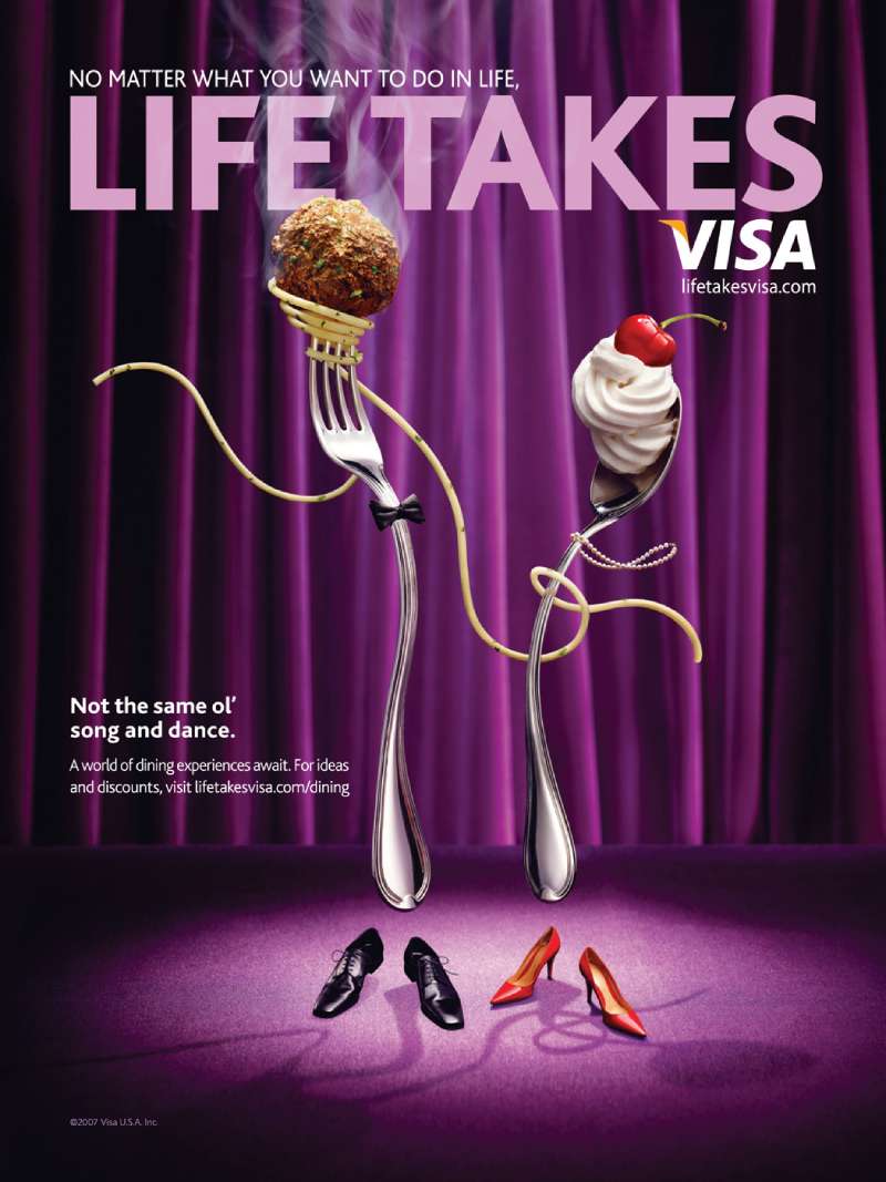
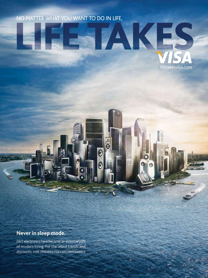
TBWAChiatDay Los Angeles launched the first new Visa tagline in two decades on February 10, 2006, timed to the Turin Winter Olympics. The full line ran: “no matter what it takes, life takes Visa”. Launch delivered over 4 billion consumer impressions in three months.
The print work is the reason designers still pull this campaign. Each ad borrowed the structure of a magazine cover, complete with a nameplate at the top of the page, cover lines down the left rail and a full-bleed hero image behind it.
Creative directors Patrick O’Neill and Joe Shands ran it with art director John Dwight and copywriter Steve Zumwinkel. Photography came from Staudinger+Franke and Zachary Scott.
Go World (2008-2012)

Sepia. That was the whole art direction brief.
TBWAChiatDay built the Olympic platform around archival competition footage graded to a single warm tone, with Morgan Freeman narrating. Athletes included Michael Phelps, Kerri Strug, Cheri Blauwet and Derek Redmond, whose 1992 Barcelona finish with his father remains the campaign’s best-known 60 seconds.
The “Difference” spot was directed by Joaquin Baca-Asay through MJZ. By London 2012, Visa’s 162 Olympic videos had drawn 25.7 million YouTube views, and its Facebook cheer app generated 38 million cheers worldwide, according to Digiday.
Meet Visa (2021-2023)
Wieden+Kennedy launched “Meet Visa” on July 21, 2021 with a 60-second film directed by Malik Hassan Sayeed, shot with a rug merchant in Morocco, weavers in the Atlas Mountains and a family tapas restaurant in Barcelona.
Brand design firm Mucho handled the identity underneath it: a redrawn wordmark, a brighter blue, a three-bar symbol standing for access, equality and inclusion, and a custom humanist typeface named Visa Dialect.
The photographic style is cut-out portraiture on flat color, which is a real departure from the location photography Visa ran for 35 years. Camilla Falquez shot the stills. Rollout covered 200-plus countries and territories across 2021.
Tap In (2026)
Agency: Anomaly. Event: FIFA World Cup 2026, hosted across the United States, Mexico and Canada.
The hook is a pun that does two jobs at once. A tap-in is the easiest goal in football, and a tap is how you pay contactless, so every commentator on the tournament reinforced the line for free across 39 days.
Jason Sudeikis anchors the hero film alongside Lamine Yamal, Erling Haaland, Christian Pulisic, Jorge Campos and commentator Andres Cantor. MediaRadar tracked $3.7 million in spend on the flagship flight from its May 26 debut, running across network TV, cable, AVOD and Spanish-language broadcast.
Visa Super Bowl Ads From 1997 to 2005

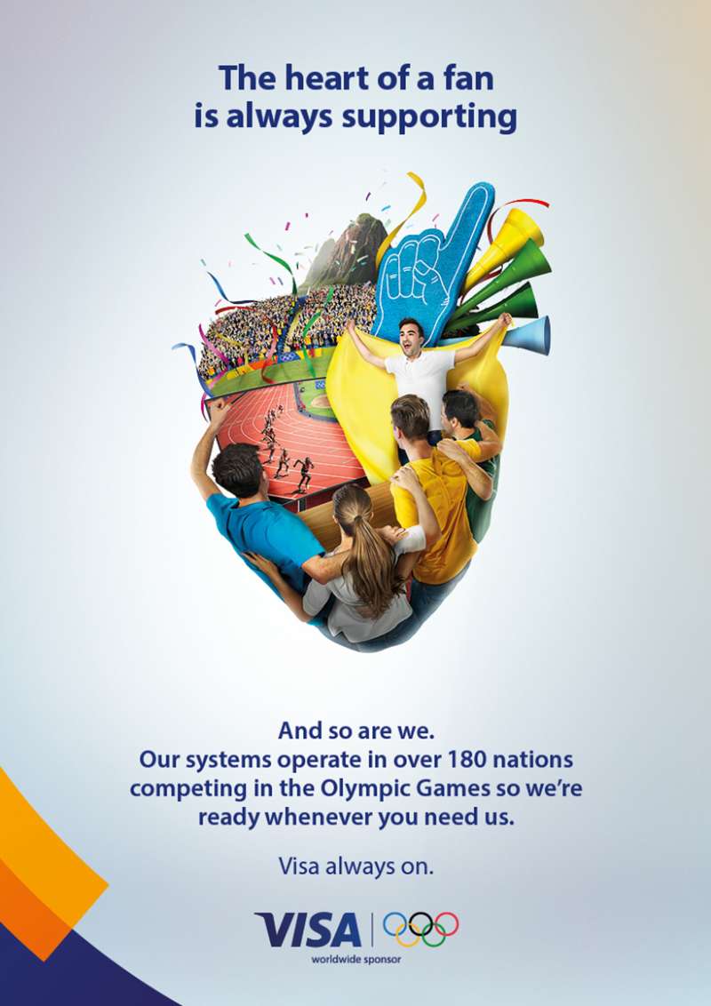
Visa treated the Super Bowl as a debut slot rather than a repeat buy, premiering new work most years between 1997 and 2005.
- 1997: Bob Dole in Russell, Kansas (reported talent fee of $500,000 to $750,000)
- 1999: “Nigel” and “Romance”, both BBDO New York
- 2001: “Bunny Love” and “Vacuum”, directed by David McNally through Omaha Pictures
- 2005: Marvel heroes Spider-Man, Captain America, Wolverine, Storm and Thor, on a fraud protection message
How Do Visa Print Ads Work Visually?
Visa print ads use one dominant image, under 12 words of body copy, and a logo occupying roughly 3% to 5% of the page in the lower right. The layout builds a clear reading order through scale contrast rather than through rules, boxes or color blocking.
Grid behavior: most executions sit on a simple 3-column or 4-column structure with generous outer margins. Nothing fancy. The restraint is the point, and it survives every agency change.
Copy blocks land below the optical center, which keeps the eye moving image first, line second, mark third.
Open space on the page does the heavy lifting in the 1985 to 2005 work. Location photography fills the top two thirds, then everything below it stays empty except one sentence.
Color specification: Visa Blue is #1434CB, RGB (20, 52, 203), and maps to a spot ink reference of PMS 2736 C for print production. Gold (#F7B600) appears as a secondary accent on card art rather than in layouts.
On the type side, Visa Dialect replaced Myriad-based lettering in the 2021 system. It is a humanist sans drawn for screen legibility, with a large x-height and open apertures, and Mucho weighted the whole identity toward creative use of the typeface instead of adding decorative graphic elements.
One honest limitation: the pre-2021 print work leans hard on stock-feeling location photography, and a lot of it has aged badly. The layouts hold up better than the images do.
How Do Visa TV Commercials Differ From Its Print Ads?
Visa TV spots carry narrative and celebrity; Visa print ads carry a single claim. Broadcast work uses voiceover, athlete footage and comedy, while print strips the message down to one image plus one line. The two formats share a palette and a logo position, nothing else.
Go World: “The Difference” (2012, TBWAChiatDay)
Sepia-graded archive footage of the closest finishes in Olympic history, closing on Michael Phelps taking the 100m butterfly in Beijing by one hundredth of a second. Directed by Joaquin Baca-Asay through MJZ, narrated by Morgan Freeman.
Meet Visa (2021, Wieden+Kennedy)
A 60-second travel film directed by Malik Hassan Sayeed, cutting between merchants in Morocco, Spain and beyond. No product demo. The card appears for maybe two seconds total.
And Some Places You Don’t (2025, Maximum Effort)
Ryan Reynolds narrates a Fyre Festival sendup that inverts the 40-year-old tagline, putting the viewer in the position of a stranded festivalgoer. Visa’s SVP and head of global brand Jeff Cha told Campaign that humor gives finance an edge in an attention economy, which is a fair read on why a payments network hired a Deadpool production company.
Level Up Your Game (2024, Visa Europe)
A Paris 2024 hero film produced by Salomon Ligthelm with Team Visa athletes Sasha Zhoya, Davide Morana and Desiree Vila, backed by docu-series in the UK, Italy, Spain, Germany, France and Poland. It ran across social, VOD, cinema and experiential in 20 European countries.
How Has Visa Advertising Evolved Since 1985?
Visa advertising moved through 4 strategic phases in 41 years: acceptance versus American Express (1985-2005), everyday utility (2006-2012), global network identity (2014-2023), and behavioral participation tied to live sport (2024-2026). The target of the argument changed at each step; the tagline architecture barely did.
| Period | Strategic shift | Representative campaign |
|---|---|---|
| 1985-1994 | Attack the rival card on acceptance | It’s Everywhere You Want to Be |
| 1995-2005 | Sell a new product category (debit) | Works Like a Check, Only Better |
| 2006-2012 | Position against cash, not against cards | Life Takes Visa / Go World |
| 2014-2023 | Reframe Visa as a network, not a card | Meet Visa |
| 2024-2026 | Turn payment into event participation | Tap In |
The 2021 identity overhaul was the sharpest break. Mucho split the wordmark from the symbol, lifted the blue for screen, and pushed the system toward digital-first application after seven years without a refresh.
Kantar valued the Visa brand at over $169 billion in 2023 and ranked it first among financial services brands, with the brand indexing 43% above the category average on being meaningful and 53% above on salience.
Which Agencies Created Visa Advertising?
Five agencies have led Visa creative since 1985. BBDO New York created “It’s Everywhere You Want to Be” in 1985 and held the account until 2005. TBWAChiatDay created “Life Takes Visa” in 2006 and “Go World” in 2008. Wieden+Kennedy has held global creative since 2014.
| Agency | Years on Visa | Campaign created |
|---|---|---|
| BBDO New York | 1985-2005, 2012-2014 | It’s Everywhere You Want to Be, Works Like a Check |
| TBWAChiatDay | 2006-2012 | Life Takes Visa, Go World, More People Go With Visa |
| Wieden+Kennedy | 2014-present | Everywhere reprise, Meet Visa |
| Mucho | 2020-2022 | Visual identity system and Visa Dialect typeface |
| Anomaly | 2026 | Tap In, for FIFA World Cup 2026 |
Two account moves were both led by Antonio Lucio, Visa’s global CMO from 2007: TBWA won the business in 2009, and BBDO took it back in 2012.
Leo Burnett India produced “Celebrating Team Visa” for the Indian market in July 2024, and Maximum Effort handled the 2025 US comedy spot. Regional agencies still execute inside the global identity rules Visa publishes for partners and issuers.
What Can Designers Learn From Visa Ads?
Visa’s advertising offers 6 transferable design decisions, all of which survive across 5 agencies and 41 years. They apply to any single-product brand working in a category where the product itself photographs badly.
- Give the frame to the place or person, not to the card
- Keep the wordmark under 5% of page area and fix it bottom right
- Limit the palette to one blue plus white, and hold the gold for card art
- Set the tagline in a single weight of the brand typeface, no italic
- Drop the copy block below the optical center so the image reads first
- Write the line so a commentator can repeat it without being paid to
That last one is underrated. “Tap in” earned free reinforcement every time an announcer described an easy goal, which no media budget buys.
The typographic lesson is narrower. Visa runs a two-level type structure in almost every print execution, headline and mark, with no subhead, no kicker and no legal cluttering the composition.
Worth borrowing for any identity built around a mark that has to work at 8mm on a card and at 8 meters on a stadium board.
How Do Visa Ads Compare to Mastercard Ads?
The two networks argue from opposite ends. Visa spends its 30 seconds on where the card works; Mastercard spends its 30 seconds on what the moment is worth. “Priceless” launched in 1997 and has outlived every Visa line except the original.
Spend tells the same story. Visa reported $1.560 billion in marketing expense for fiscal 2024 against $35.9 billion in net revenue, while Mastercard’s advertising and marketing line came in at roughly $815 million for the same year.
Design-wise, the Mastercard creative approach leans on the interlocking circles as a compositional object, often oversized and cropped. Visa keeps its mark small and lets photography carry the layout, which is the more conservative choice and, in my view, the less interesting one on a page.
Amex advertising sits somewhere else again, selling membership rather than acceptance, and it has never had to fight the ubiquity argument. For a category comparison outside payments, the FedEx campaign history shows a similar pattern of one durable claim repeated for decades.
What Makes Visa Advertising Work?
The strategic claim never moved. Acceptance in 1985, acceptance in 2026, argued through whatever the culture happened to be watching that decade.
The design system carries the rest. One blue, one weight of type, one small mark in the lower right, and a photograph or a face taking the whole remaining frame.
Five agencies came and went. The layout logic did not.
Designers borrowing from this should copy the discipline, not the look. Find the single thing a product does better than its rivals, then say it the same way for forty years while the medium underneath keeps changing.
That is the argument for stripping a layout back to one image and one line. Fewer elements, longer shelf life.
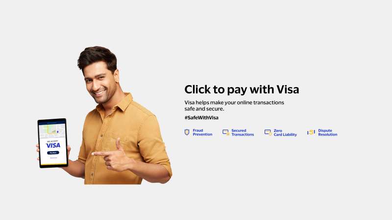
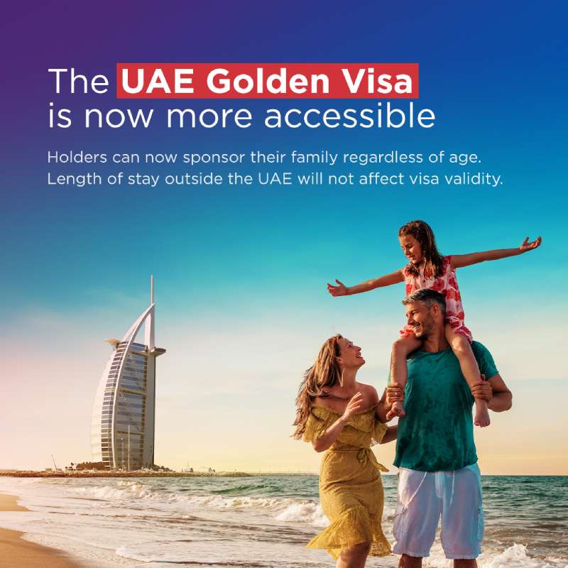
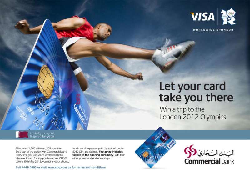
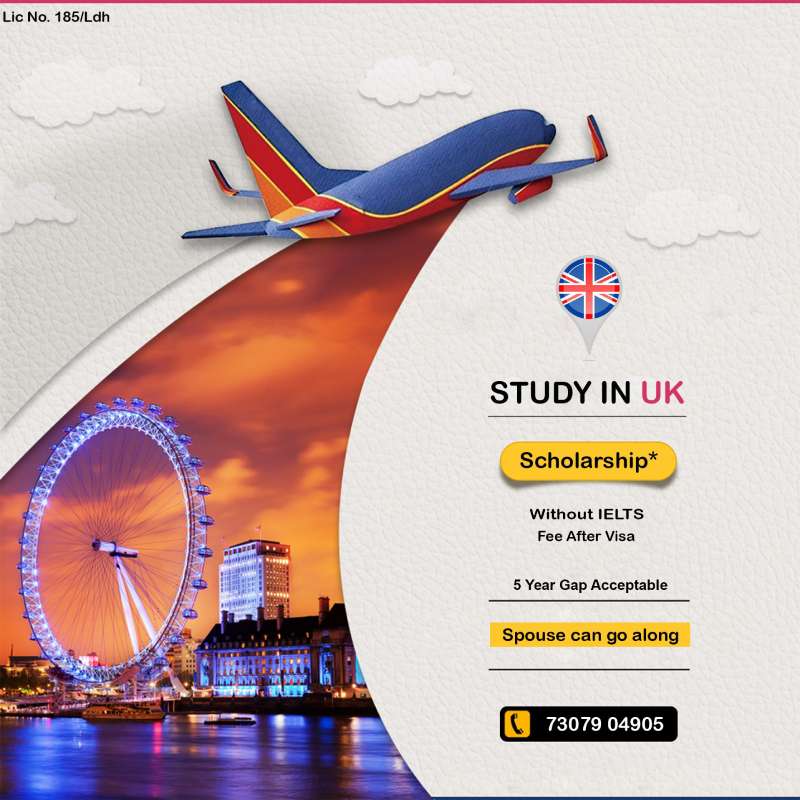
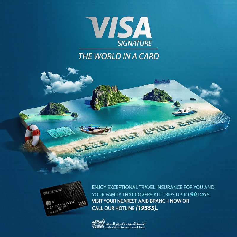
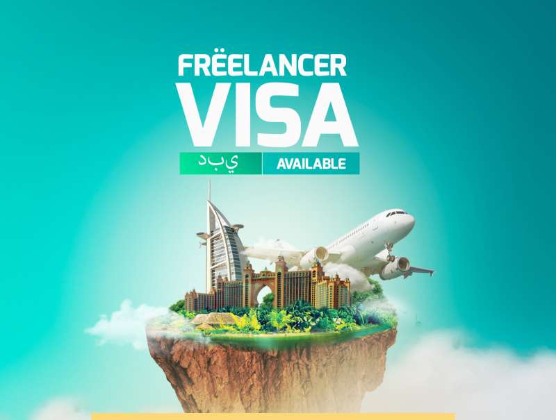
Visa Ads Examples











FAQ on Visa Ads
What is Visa’s advertising slogan?
Visa’s longest-running slogan is “It’s Everywhere You Want to Be,” launched in 1985 and shortened in 2014. Later lines include “Life Takes Visa” (2006), “More People Go With Visa” (2009) and “Meet Visa” (2021).
What was the first Visa ad campaign?
BBDO New York launched Visa’s first branded campaign on October 1, 1985 with a $20 million budget. Every execution named a restaurant or hotel that took Visa and refused American Express, making acceptance the entire argument.
How much does Visa spend on advertising?
Visa reported $1.560 billion in marketing expense for fiscal 2024, up from $1.341 billion in 2023, per its annual report. Marketing has held at roughly 4% to 5% of net revenue. The 2024 rise tracked Paris Olympic spending.
Which celebrities have appeared in Visa ads?
Bob Dole, Deion Sanders, Daffy Duck, Morgan Freeman, Ryan Reynolds and Jason Sudeikis have all fronted Visa work. Athlete casting runs through Team Visa, with Michael Phelps, Simone Biles and Erling Haaland among the names attached to the brand.
Who narrated Visa’s Olympic commercials?
Morgan Freeman narrated the Go World campaign from 2008 through 2012, reading over sepia-graded archive footage of Michael Phelps, Kerri Strug and Derek Redmond. He also voiced the 2010 Go Fans Super Bowl spot.
Has Visa won advertising awards?
The 1985 campaign collected 54 major advertising awards. The Bob Dole check card spot took a Gold Lion at Cannes in 1998, the same year Visa won three Clio Awards and BBDO won an EFFIE.
What colors do Visa ads use?
Visa Blue (#1434CB) carries almost every layout, with white type and gold (#F7B600) held back for card art. That tight two-color set maps to Pantone 2736 C in print production.
Why did Visa change its logo in 2021?
Mucho split the wordmark from the three-bar symbol and brightened the blue for small screens, Visa’s first refresh in seven years. The mark’s latest revision reframed Visa as a payments network, not a card issuer.
What is Team Visa?
Team Visa is the athlete sponsorship program Visa started in 2000, which has backed close to 700 Olympians and Paralympians. The Paris 2024 roster carried 147 athletes from 67 countries across 40 sports.
Does Visa still run print ads?
Print stays in the mix, but broadcast, digital video and creator social now carry most of the weight. The 2024 European campaign ran across social, VOD, cinema and experiential in 20 countries.
Conclusion
Visa ads reward a second look. Strip away the athletes and the contactless payment messaging and the same page structure sits underneath, from TBWAChiatDay’s sepia Olympic work to Wieden+Kennedy’s cut-out portraits.
One image. One line. One small mark, bottom right.
Watch where the category moves next. Sponsorship activation has shifted from logo visibility toward tap-to-pay behavior, and the creative followed it into creator content and live-moment promotions.
For designers, the useful lesson is not the blue or the Visa Dialect typeface. It is the nerve to leave most of a page empty and trust one photograph to carry the whole argument.
Steal that part. Leave the rest.

Renowned for his expertise in logo design and visual branding, Bogdan has developed a multitude of logos for various clients.
His skills extend to creating posters, vector illustrations, business cards, and brochures. Additionally, Bogdan's UI kits were featured on marketplaces like Visual Hierarchy and UI8.
He also wrote in the past years on sites like Design Your Way, WebDesignerDepot, WPDean, Designmodo, Speckyboy, Slider Revolution, and more.
- The Windsurf Logo History, Colors, Font, And Meaning - 10 October 2026
- How to Remove Background From Product Photos (No Photoshop) - 10 October 2026
- How Designers can Build a Stronger Online Creative Identity - 9 October 2026

Bogdan Sandu is a seasoned designer who has been designing websites since 2008. Renowned for his expertise in logo design and visual branding, Bogdan has developed a multitude of logos for various clients. His skills extend to creating posters, vector illustrations, business cards, and brochures. Additionally, Bogdan's UI kits were featured on marketplaces like Visual Hierarchy and UI8. He also wrote in the past years on sites like Design Your Way, WebDesignerDepot, WPDean, Designmodo, Speckyboy, Slider Revolution, and more.
You Might Also Like