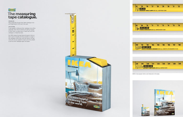
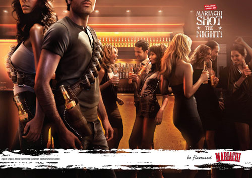
You cannot photograph a network. Verizon ads have spent 26 years working around that problem.
From Test Man in a grey windbreaker to Beyonce trying to break the internet on Super Bowl Sunday, the campaigns turn an invisible product into something legible in a single frame.
This page covers the campaigns, taglines and agencies behind them, plus the layout and typography choices that make each execution hold up at billboard scale.
What you get:
- 6 flagship campaigns with years, markets and agency credits
- Design analysis of the print work: palette, type, negative space
- How the TV commercials differ from the print ads
- A side-by-side read against AT&T advertising
Verizon advertising spans 26 years, 5 lead creative agencies and 6 flagship campaigns, from the Bell Atlantic renaming print ads of August 2000 to the “Can’t B Broken” Super Bowl spot of February 2024.
The work runs on one repeated device: a network claim proved through demonstration rather than described.
Verizon disclosed $3.4 billion in worldwide advertising spending for 2021, making it the largest telecom advertiser on the planet (Ad Age). Most of that went to television.
This page covers the campaigns, the agencies behind them, the taglines with their years, and the layout and typography decisions that make the print work legible at 60 mph.
Verizon Advertising at a Glance
Verizon has advertised since 2000, working primarily with Bozell, McCann Erickson and Ogilvy. Its best-known campaigns are “Can You Hear Me Now?”, “Droid Does” and “Can’t B Broken”. The visual signature combines Neue Haas Grotesk type, a red-and-black palette, and coverage-map graphics.
| Attribute | Value |
|---|---|
| First major campaign | Bell Atlantic-to-Verizon renaming print ads, August 2000 |
| Lead agencies | Bozell (2002), Lowe (2003), McCann Erickson (to 2009 and again 2015-2023), mcgarrybowen (2010-2013), Ogilvy (2023-present) |
| Best-known taglines | “Can you hear me now? Good.” (2002), “Droid Does” (2009), “Rule the Air” (2010), “It’s Your Verizon” (2023) |
| Primary media | National TV, print, out-of-home billboards, cinema, TikTok and YouTube |
| Awards | Cannes Lions Gold 2024, Cannes Bronze 2024, 4 US Effie Awards 2025 |
| Visual signature | Neue Haas Grotesk Bold, red #CD040B, black field, coverage-map graphic |
Which Verizon Ad Campaigns Are the Most Famous?
Six Verizon campaigns define the brand’s advertising record: “Can You Hear Me Now?” (2002-2011), “There’s a Map for That” (2009), “Droid Does” (2009-2013), “Rule the Air” (2010-2013), “It’s Your Verizon” (2023) and “Can’t B Broken” (2024). Each one sells network reliability through a different creative device.
Can You Hear Me Now? (2002-2011)
Bozell New York launched “Can You Hear Me Now?” on January 14, 2002, casting actor Paul Marcarelli as Test Man. The campaign ran roughly nine years and produced over 100 television spots.
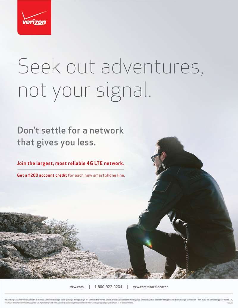
Print executions kept Marcarelli small in frame against a wide empty landscape, so the horizontal void carried the coverage message before the copy did.
The horn-rimmed glasses and grey Verizon windbreaker functioned as a costume signature, doing the work a mascot usually does. Bozell merged with Lowe in 2003, and Lowe & Partners Worldwide carried the campaign forward.
Nielsen measured a 9% lift in brand recognition, and the catchphrase entered the Oxford English Dictionary.
There’s a Map for That (2009)

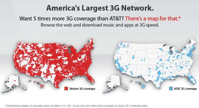
The premise: two side-by-side United States maps, Verizon 3G coverage in red, AT&T 3G coverage in blue.
The device: a parody of Apple’s “There’s an app for that” line, aimed at the iPhone’s exclusive carrier.
The fallout: AT&T filed a false-advertising suit on November 4, 2009 in the Northern District of Georgia. Both sides dropped their claims in December 2009.
Verizon’s court filing answered with one line that got quoted everywhere: AT&T sued because the ads were true.
Design-wise, this is the purest thing Verizon has ever made. Two data graphics, a headline, no models, no lifestyle photography. The contrast between the two color fields does 100% of the persuading.
Droid Does (2009-2013)

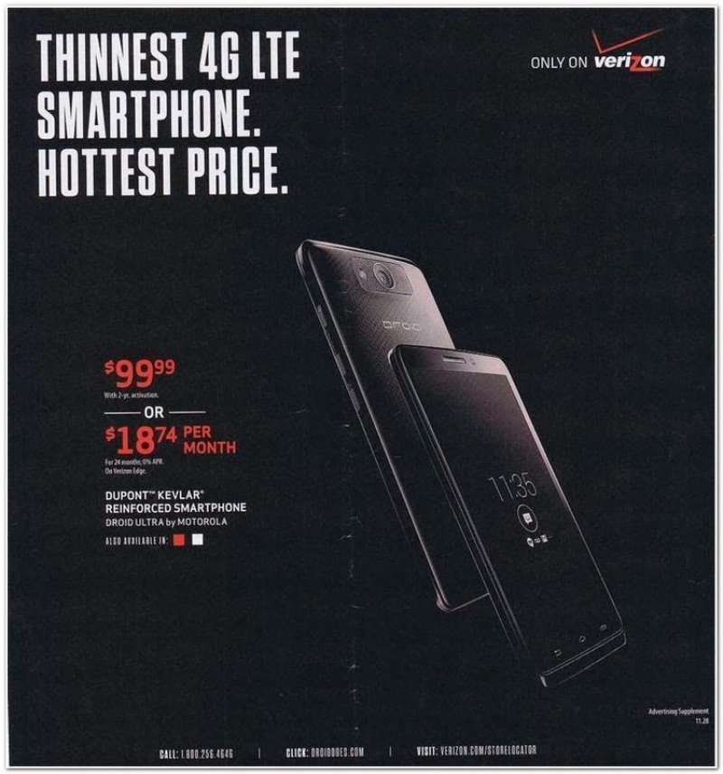
Verizon put roughly $100 million behind the Motorola Droid launch, one of the largest single-handset campaigns in US mobile history.
The first teaser aired October 17, 2009 and never showed the phone. It listed what the iPhone could not do, in a stacked column of “iDon’t” lines set in cold mechanical type.
- Black field, red glowing robot eye, licensed Droid mark from Lucasfilm
- Industrial sound design and machine voiceover instead of music
- Lowercase sans type, tightly tracked, aligned hard left
The Droid sold 100,000 units its opening weekend and 1.05 million in 74 days. Time named it 2009 Gadget of the Year.
Rule the Air (2010-2013)

mcgarrybowen took the account in 2010 and replaced the coverage argument with an ownership argument.
The spots turned ordinary objects into antennas, and the manifesto voiceover claimed air has no prejudice. Print and out-of-home ran the tagline over lightning-bolt graphics rendered in a hot red-to-white gradient.
It also caught real criticism. TechCrunch pointed out the awkwardness of a net-neutrality opponent running an anti-discrimination manifesto. Fair hit, honestly.
Can’t B Broken (2024)

Ogilvy New York produced “Can’t B Broken” for Super Bowl LVIII on February 11, 2024, with Beyonce attempting to overload the network while Tony Hale narrates the attempts.
MJZ and Parkwood Entertainment handled production. Beyonce dropped “Texas Hold ‘Em” and “16 Carriages” minutes after the spot aired.
The numbers: 29 billion impressions, one-third of all Super Bowl 2024 ad conversation, and a 35% increase in sign-ups.
A 30-second slot cost $7 million that year. Cannes gave it a Gold Lion in Entertainment for Music, and the campaign took four Effie Awards in the 2025 US competition.
Verizon Print Ads From the Rebrand Years (2015-2024)

Two identity systems govern every Verizon layout published in the last decade.
2015 (Pentagram, Michael Bierut): black lowercase wordmark, small red checkmark, Neue Haas Grotesk customized by Christian Schwartz. Print ads ran as bold white type on black.
2024 (Turner Duckworth): checkmark removed, wordmark flipped to red, warm yellow-gold glow added to the V. Beige and yellow entered as support colors.
Bierut said openly that the 2015 mark was not meant to be clever. It was meant to reproduce cleanly at any size, which is exactly what a logo for a company with 100,000 physical signs needs to do.
How Do Verizon Print Ads Work Visually?
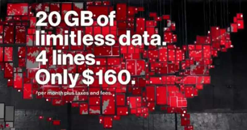
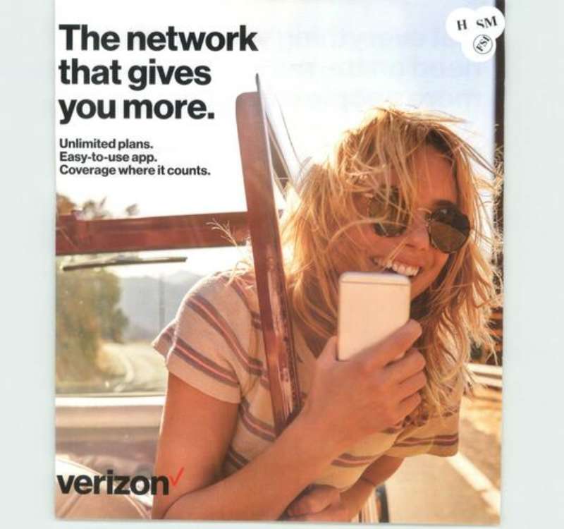
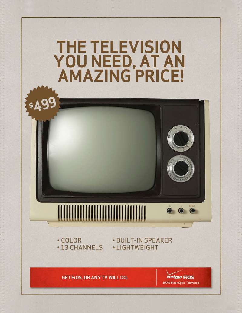
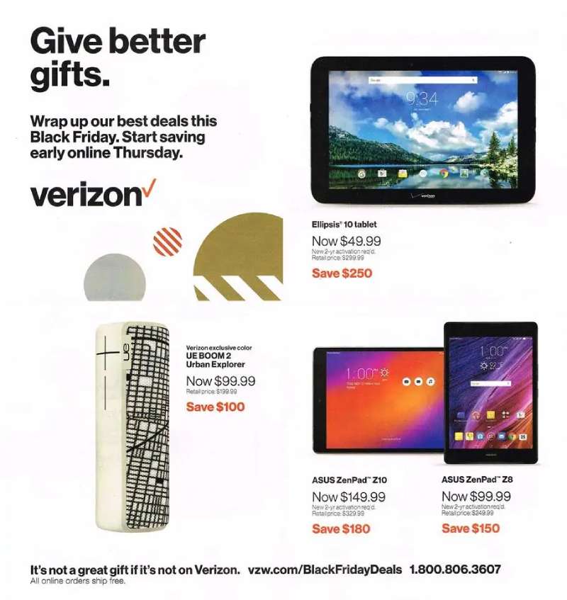
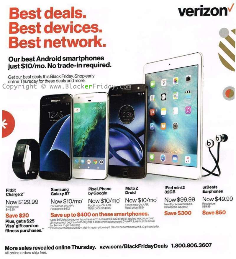
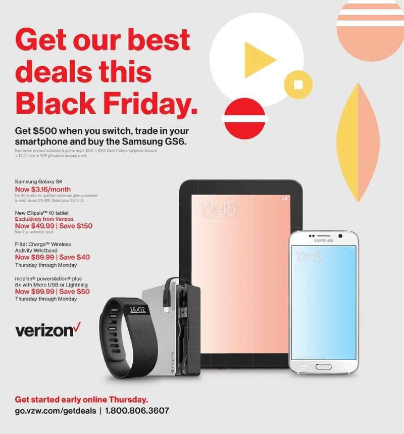
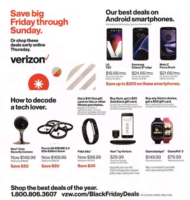
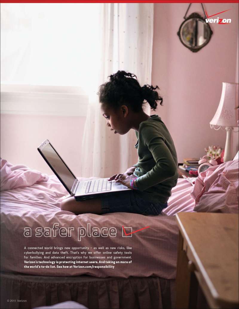
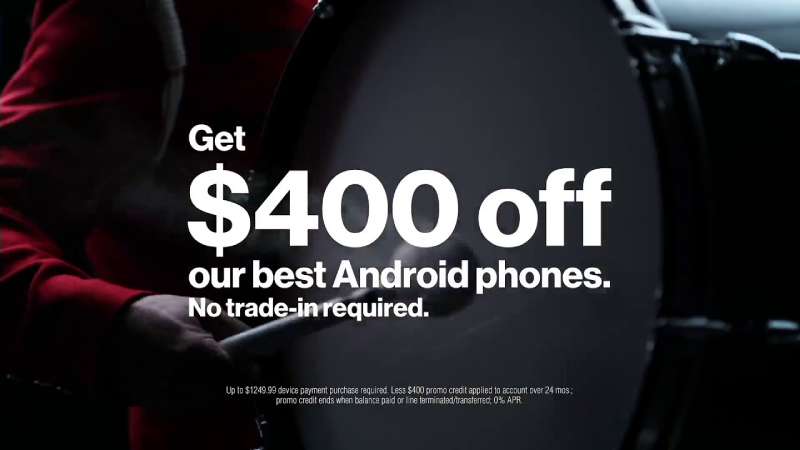
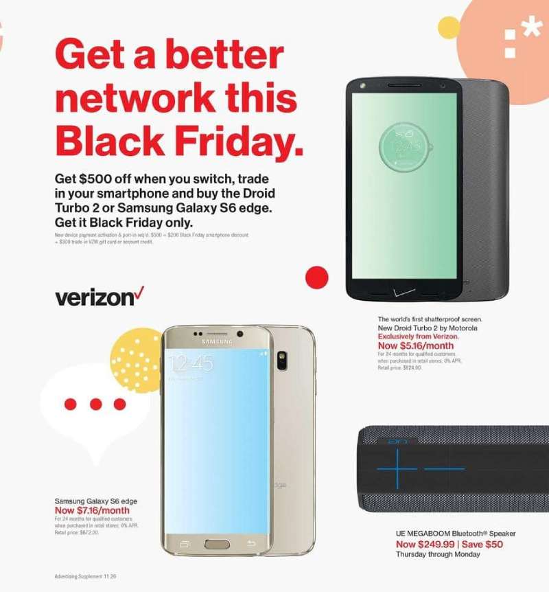
Verizon print ads use a 3-part structure: one dominant graphic device, a short headline set in Neue Haas Grotesk Bold, and the logo locked bottom-right at small scale. Copy blocks sit below the optical center. Red appears in one element per layout, never two.
The palette discipline
Red carries a single job per ad. It marks the coverage area, the checkmark, or the headline. Never all three.
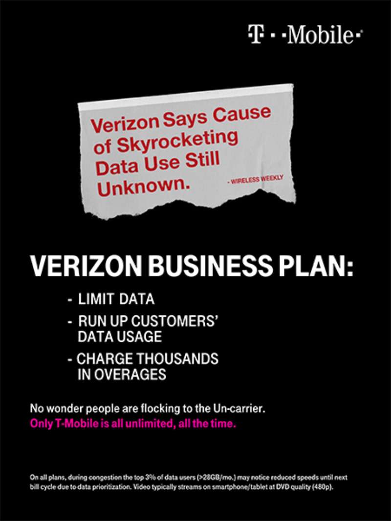
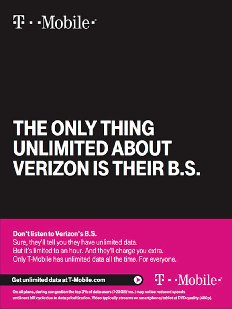
That restraint is the whole reason the red reads as proprietary. Compare it to T-Mobile magenta, which floods entire layouts and gets read as decoration instead of information.
The 2024 addition of a yellow-to-orange glow gave the system a second temperature. Warm accents suggest approachability, which tracks with the shift from a black-dominant to a red-forward palette and reads as a deliberate move in how color shapes perception.
Type and hierarchy
Typeface: Neue Haas Grotesk Display 75 Bold, a Helvetica revival from Linotype, customized by Christian Schwartz.
Weight strategy: one weight per layout, size doing the ranking work instead of weight contrast.
Spacing: tight tracking on headlines, loose leading on body copy.
The single-weight rule makes the ranking of type levels depend entirely on scale and position, which is Swiss-school thinking applied to a telecom account.
Negative space as the coverage argument
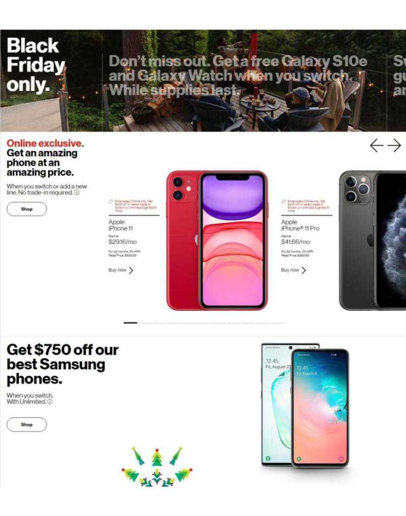
Verizon layouts are unusually empty for a category that normally crams in plan pricing.
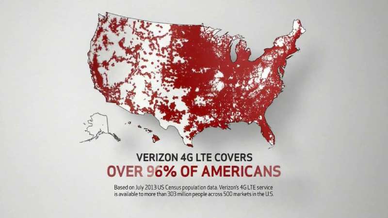
The empty field is not decoration. In the map ads, blank space literally means no coverage, so the unused area of the page becomes the message rather than the frame around it.
The 2024 identity extends the same logic to the mark, where the glow inside the V works as shaped emptiness inside a letterform.
How Do Verizon TV Commercials Differ From Its Print Ads?
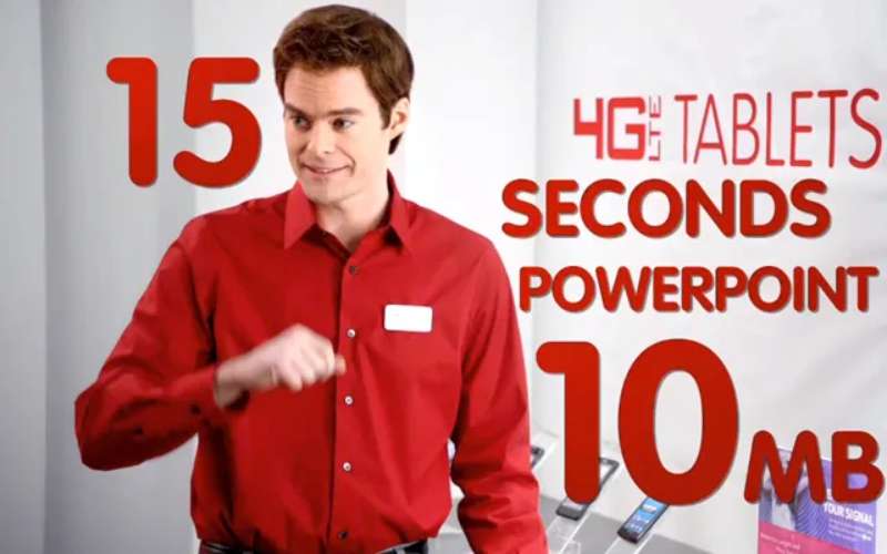
Verizon TV spots run on narrative and celebrity. Print runs on data graphics. Television carries the emotional case for the network through characters like Test Man, Beyonce and Jim Carrey. Print carries the technical proof through maps, charts and comparison layouts.
Test Man, original run
The first Bozell spots are structurally boring on purpose. One man, one phone, one line, repeated across parking lots, wheat fields and mountain roads.
Repetition was the mechanic. Marcarelli appeared in over 100 commercials, and the narrative built through repetition made a technical claim feel like a running joke the audience was in on.
Can’t B Broken, 60-second Super Bowl cut
Beyonce launches a lemonade stand, appears in pink as Bar-Bey, spins up an AI clone and performs in space. Tony Hale keeps checking whether the network broke.
Each stunt is a hard cut with a different set, palette and costume. Roughly 8 distinct worlds in 60 seconds. Company 3 and Method Studios handled the finishing.
Verizon Now, brand refresh film
The 90-second refresh film launched June 26, 2024 alongside the new identity.
It moves from homes to concerts to offices to stadiums, with Roger Goodell, Myles Garrett, Paige Bueckers and creator Analisse appearing throughout. A real Verizon network engineer takes the Test Man role.
Ricardo Aspiazu, Verizon’s VP of creative and brand, told Campaign US the tagline was a nod to history rather than a revival. The campaign led on TikTok, which is a first for a Verizon brand film.
Conquering Dead Zones with Satellite
Verizon brought Paul Marcarelli back in 2025 and paired him with Buzz Aldrin to sell satellite messaging.
The spot aired during the Grammy Awards broadcast on February 2, 2025 and had few airings after that, according to iSpot data reported by Wave7 Research. A one-night placement, essentially.
How Has Verizon Advertising Evolved Since 2000?
Verizon advertising moved through 4 strategic eras: reliability proof (2000-2009), competitive attack (2009-2013), lifestyle and value (2015-2023), and cultural spectacle (2024-present). The medium shifted from network television to social-first video across the same period.
| Era | Strategic shift | Representative campaign |
|---|---|---|
| 2000-2009 | Prove coverage exists | Can You Hear Me Now? |
| 2009-2013 | Attack the iPhone and AT&T directly | There’s a Map for That, Droid Does |
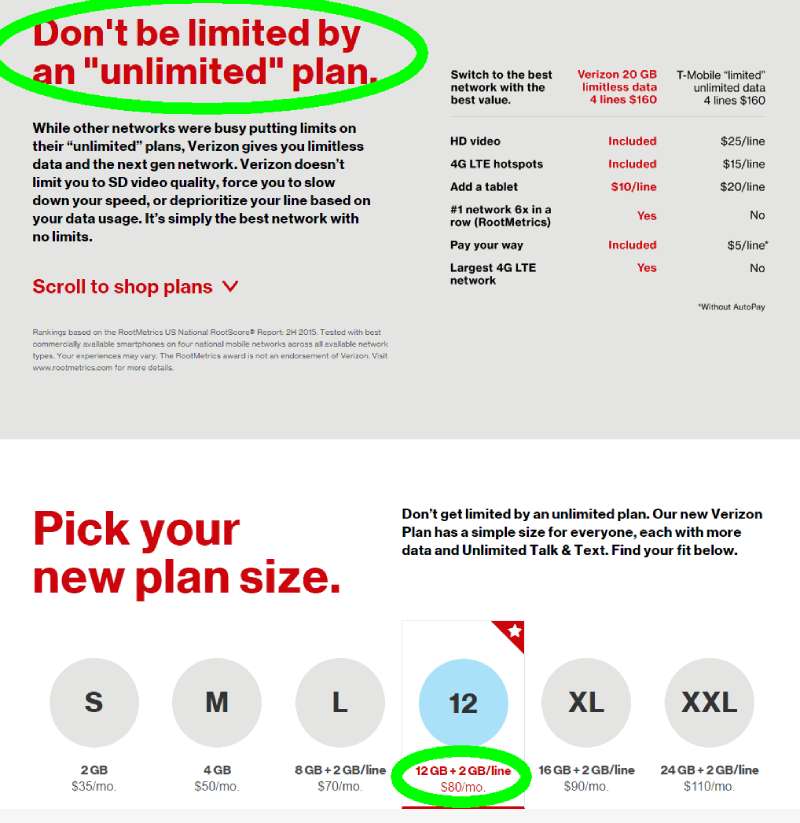
| 2015-2023 | Sell plans, bundles and value | It’s Your Verizon, myPlan |
| 2024-present | Buy cultural moments outright | Can’t B Broken |
The 2000 launch is the forgotten one. Bell Atlantic merged with Vodafone in 2000 to form a partnership with 32 million subscribers, and the renaming campaign that August used print ads featuring actual Verizon employees promising continuity of service.
Employees as models, then an actor as employee, then a global pop star. That is the arc in three moves.
Which Agencies Created Verizon Advertising?
Five agencies built the Verizon body of work. Bozell created “Can You Hear Me Now?” in 2002. mcgarrybowen created “Rule the Air” in 2010. McCann Erickson held the account from 2015 to 2023. Ogilvy won the consumer business in September 2023. Turner Duckworth designed the 2024 identity.
| Agency | Years | Work |
|---|---|---|
| Bozell (IPG) | 2002-2003 | Can You Hear Me Now? |
| McCann Erickson | to 2009, 2015-2023 | There’s a Map for That, myPlan |
| mcgarrybowen | 2010-2013 | Rule the Air, Droid spots |
| Ogilvy (WPP) | 2022-present | Can’t B Broken, NFL Sunday Ticket |
Ogilvy took the B2B account in December 2022, then won the consumer business in September 2023, with the handover completing in 2024. Devika Bulchandani led Ogilvy globally through both wins.
Verizon’s wider roster includes FCB, R/GA, Golin, MRM, Momentum Worldwide and The Community. Publicis Groupe consolidated media planning and buying after the TracFone acquisition.
One detail worth noting: Rob Reilly, WPP’s global chief creative officer, previously ran creative at McCann on this exact account. The account changed holding companies. Some of the people did not.
What Can Designers Learn From Verizon Ads?
Verizon layouts offer 5 transferable rules for commercial layout work: restrict the accent color, let one graphic carry the argument, keep type to a single weight, place the logo small, and build the claim into the composition rather than the copy.
- Assign your accent color one job per layout, then stop using it
- Build the proof into a graphic device, not a headline adjective
- Set the entire ad in one weight and rank levels by size and position
- Lock the mark bottom-right at a scale that survives a 300-foot billboard
- Give the empty area a meaning, or it reads as an unfinished layout
The billboard point matters more than designers expect. Verizon out-of-home runs a 4-word maximum in most markets, which is roughly where typefaces built for large-format reading stop failing at highway distance.
Every rule above is documented in Verizon’s own published identity standards, which is why the work stays consistent across 5 agencies and 26 years.
How Do Verizon Ads Compare to AT&T Ads?
Verizon and AT&T have run the same argument at each other since 2009, using opposite visual strategies.
Verizon builds ads around a proof device. The coverage map, the Test Man, the unbreakable-network stunt. The layout carries the claim.
AT&T builds ads around a character or a comic premise, then states the claim in copy. Luke Wilson in 2009, the “Just OK Is Not OK” office sketches from 2019, Lily Adams in the retail store spots. AT&T advertising leans on dialogue where Verizon leans on graphics.
The palette split is just as clean. Verizon red against black, AT&T blue-and-white with a globe mark built on banded shifts of a single hue.
Both approaches work. Verizon’s scales better across print and out-of-home because a map needs no script. AT&T’s scales better across 15-second social cutdowns because a joke lands faster than a chart.
The pattern repeats across hardware brands that advertise on capability rather than personality. Sony ads and Intel advertising campaigns use the same product-as-proof structure, while LG ads sit closer to the AT&T end with lifestyle scenarios doing the persuading.
What Makes Verizon Advertising Work?
Verizon sells an invisible product. You cannot photograph a network.
Every campaign that worked solved that problem by inventing a visible stand-in: a man in a windbreaker, two colored maps, a robotic eye, a pop star failing to break something.
The layouts stay disciplined because the identity system leaves almost no room to improvise. One accent color, one type weight, a mark locked small in the corner.
That restraint reads as conservative next to T-Mobile magenta or AT&T’s comic sketches. It also survives translation to a billboard, a phone screen and a stadium banner without redrawing anything.
The lesson for designers is narrow and useful: pick one proof device per campaign, then build the entire composition around making that device legible.
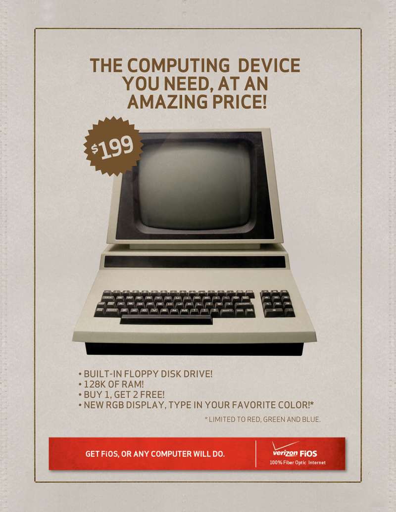
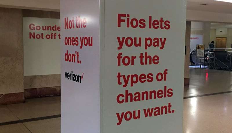
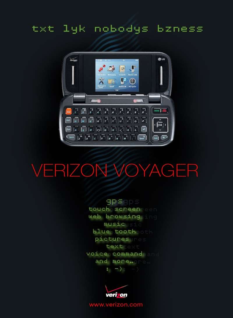
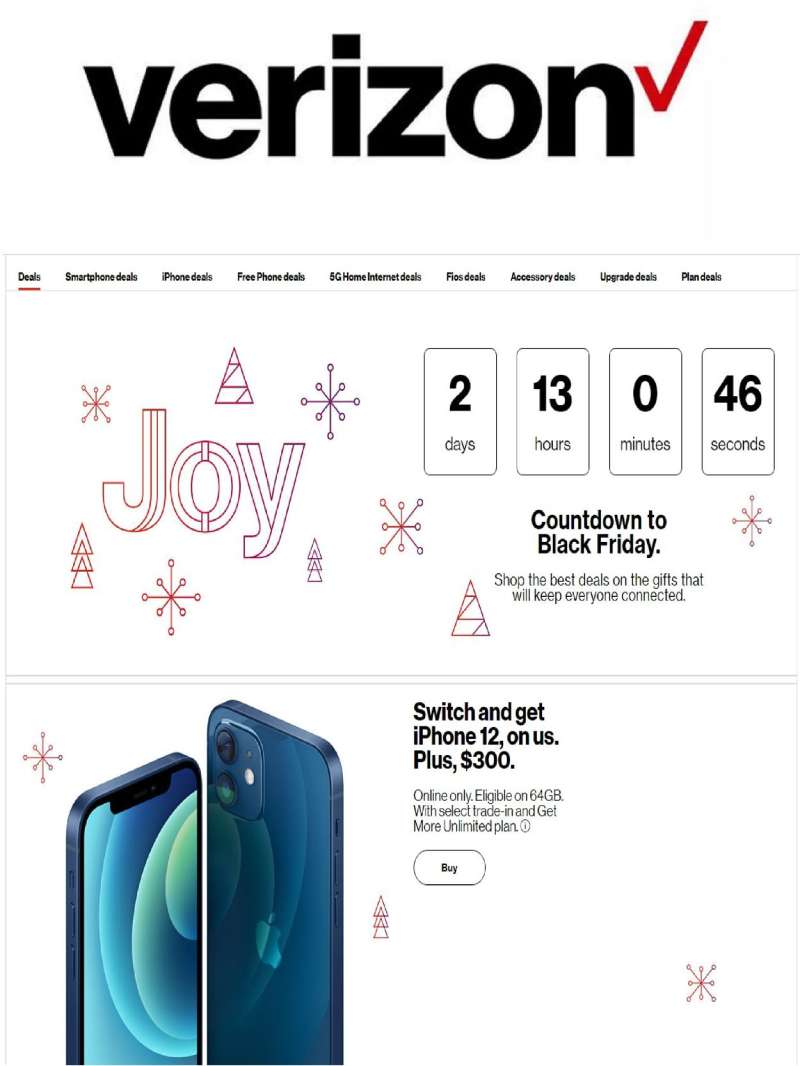
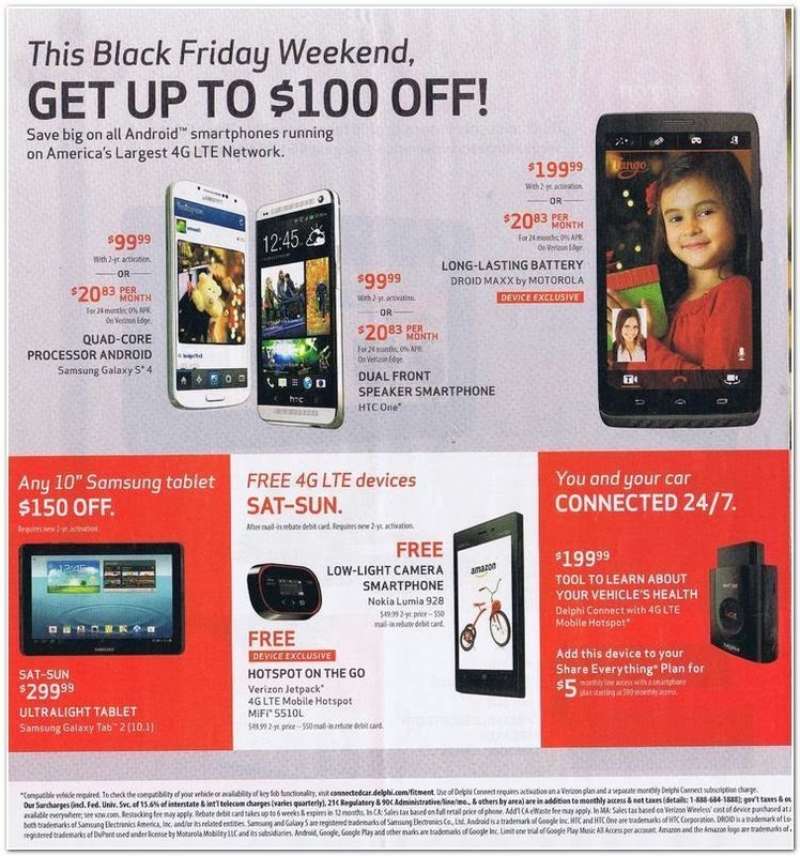
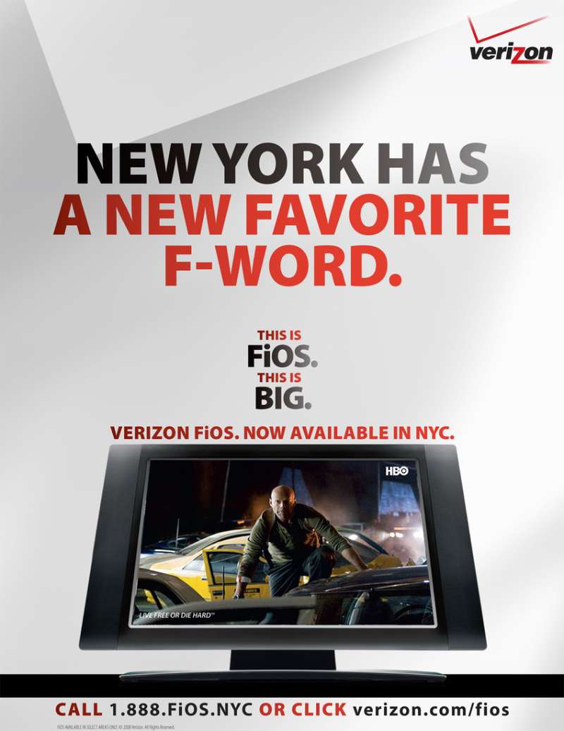
Verizon Ads Examples



FAQ on Verizon Ads
How much does Verizon spend on advertising each year?
Verizon disclosed $3.4 billion in worldwide advertising spending for 2021, which made it the largest telecom advertiser globally and the 29th biggest advertiser overall, according to Ad Age. Television takes the largest single share.
What does the name Verizon actually mean?
Verizon is a portmanteau of veritas, Latin for truth, and horizon. The 2024 identity leaned into the second half by adding a yellow-gold glow to the V, meant to read as a sunrise.
How many Super Bowl commercials has Verizon aired recently?
Three in-game spots since 2022: Jim Carrey reprising his Cable Guy role (16th on the USA Today Ad Meter), “Can’t B Broken” at Super Bowl LVIII, and a 2025 spot at Super Bowl LIX through Ogilvy.
Why did Verizon remove the checkmark from its logo?
Verizon concluded the checkmark had failed to create emotional engagement with customers. Turner Duckworth replaced it with a glowing V in June 2024, making color the distinguishing element in the progression of the mark over time.
Which production companies make Verizon commercials?
“Can’t B Broken” credits MJZ and Parkwood Entertainment on production, Company 3 New York and Method Studios New York on post and VFX, Cabin Edit on editorial, and Sonic Union on music and sound.
Did a Verizon ad ever launch a hit song?
Yes. Beyonce released “Texas Hold ‘Em” and “16 Carriages” minutes after the 2024 spot aired.
The single passed 30 million streams within days and made her the first Black woman to top the country charts.
Who owns the “Droid” name used in Verizon advertising?
Lucasfilm. Verizon licensed the trademark in 2009 for its Android handset line, the first significant commercial use of the term outside Star Wars merchandising. The glowing red robotic eye came from the same launch.
Does Verizon advertise on TikTok?
Yes, and heavily since 2024. Verizon’s brand refresh ran across all major social platforms with TikTok as the lead channel, chosen for a younger and more diverse audience, per Ricardo Aspiazu.
Is Verizon still using the “Can you hear me now?” line?
Not as an active tagline. Aspiazu told Campaign US the 2024 refresh used the phrase as a nod to brand history rather than a revival, with a real network engineer replacing the original actor.
How does Verizon’s TV ad spending compare with AT&T and T-Mobile?
All three carriers ranked among the top three US brands for national TV ad spending during the week of January 8 to 15, 2025, based on iSpot data reported by Wave7 Research. NFL playoff inventory drove the spike.
Conclusion
Verizon ads reward close study because the constraints are visible. One accent color, one type weight, and a coverage claim that has to survive a magazine spread and a 15-second social cutdown.
The agency of record has changed hands five times since 2002, from Bozell through mcgarrybowen to Ogilvy, and the work still reads as one brand.
That continuity comes from the brand identity system rather than any single campaign or tagline.
Worth borrowing: pick one proof device, set the headline in a single grotesque weight, leave most of the page empty, and let the graphic carry the argument.
The Cannes Lion and the Effie hardware followed that discipline. Not the reverse.

Renowned for his expertise in logo design and visual branding, Bogdan has developed a multitude of logos for various clients.
His skills extend to creating posters, vector illustrations, business cards, and brochures. Additionally, Bogdan's UI kits were featured on marketplaces like Visual Hierarchy and UI8.
He also wrote in the past years on sites like Design Your Way, WebDesignerDepot, WPDean, Designmodo, Speckyboy, Slider Revolution, and more.
- The Windsurf Logo History, Colors, Font, And Meaning - 10 October 2026
- How to Remove Background From Product Photos (No Photoshop) - 10 October 2026
- How Designers can Build a Stronger Online Creative Identity - 9 October 2026

Bogdan Sandu is a seasoned designer who has been designing websites since 2008. Renowned for his expertise in logo design and visual branding, Bogdan has developed a multitude of logos for various clients. His skills extend to creating posters, vector illustrations, business cards, and brochures. Additionally, Bogdan's UI kits were featured on marketplaces like Visual Hierarchy and UI8. He also wrote in the past years on sites like Design Your Way, WebDesignerDepot, WPDean, Designmodo, Speckyboy, Slider Revolution, and more.
You Might Also Like