A jazz musician who died in 1991 sold more khakis than any model Gap ever hired.
That is the strange logic behind Gap ads: put an interesting person on a white background, keep the blue box logo small, and let the casting do the persuading.
The formula has survived 5 decades, 4 agencies and one catastrophic logo redesign.
This page walks through the named campaigns with their years, agencies and markets, then breaks down what actually holds them together as design.
You will find:
- Individuals of Style, Who Wore Khakis, Khaki Swing, Dress Normal and Better in Denim
- Credits for the photographers, directors and choreographers behind each one
- The layout, typography and palette rules Gap has reused since 1988
- Six takeaways you can apply to your own print and campaign work
TITLE: Gap Ads: 8 Campaigns, Taglines and Print Examples
META DESCRIPTION: 8 Gap ads from Who Wore Khakis, Khaki Swing and Better in Denim, made by Laird+Partners and Wieden+Kennedy. Analysis of layout, type and copy.
URL: /blog/gap-ads/
Gap advertising spans 5 decades, 4 lead agencies and 8 flagship campaigns, from the “Fall Into the Gap” jingle of the mid-1970s to “Better in Denim” in 2025.
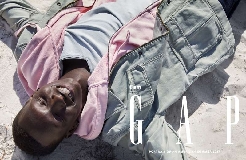
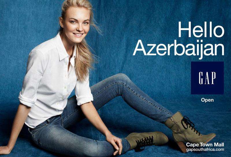
The work runs on one device repeated for half a century: bodies moving against a white void, shot in black and white or flat colour, with the logo held small.
This page covers the named Gap ad campaigns with the agency, year and market behind each one, plus the layout, typography and palette decisions that make them hold up decades later.
Gap Advertising at a Glance
Gap has advertised since 1969, working with its San Francisco in-house creative team, Laird+Partners and Wieden+Kennedy New York. Its best-known campaigns are Individuals of Style, Who Wore Khakis and Khaki Swing. The visual signature combines white seamless backgrounds, black and white portraiture and a small blue box logo.
| Attribute | Value |
|---|---|
| First major campaign | “Fall Into the Gap” jingle, mid-1970s |
| Lead agencies | Gap in-house (1970s to 2002), Laird+Partners (2003 to 2013), Wieden+Kennedy New York (2014 to 2016), Invisible Dynamics (2024 to present) |
| Best-known taglines | “Fall Into the Gap”, “Who wore khakis”, “Dress Normal”, “Get Loose”, “Better in Denim” |
| Primary media | Magazine print, TV, cinema, bus shelters, billboards, TikTok, Instagram |
| Recognition | Ad Age Marketer of the Year, 1998; The New York Times named Khakis Swing one of the year’s best ads |
| Visual signature | White cyclorama, monochrome photography, centred figure, small logo lockup |
Which Gap Ad Campaigns Are the Most Famous?
The 8 most recognised Gap ad campaigns are Fall Into the Gap (1970s), Individuals of Style (1988), Who Wore Khakis (1993 to 1995), Khakis and Khaki Swing (1997 to 1999), Into the Hollywood Groove (2003), Dress Normal (2014), Linen Moves and Get Loose (2024), and Better in Denim (2025).
Fall Into the Gap (mid-1970s to 1987)

Gap’s first mass-market campaign sold Levi’s on price, not identity. The “Fall Into the Gap” jingle ran on US radio and television alongside store promotions offering “three tons of Levi’s”, according to Berkeley Haas.
The print work of this era is plain retail layout: product photography, a price, and a wordmark set large. No portraiture, no negative space discipline, no restraint. It matters mainly as the baseline everything after 1988 reacted against.
Individuals of Style (1988 to 2007)
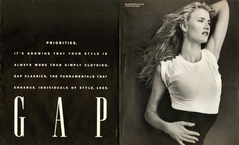
What it did: replaced fashion models with writers, directors and musicians photographed in a Gap pocket tee plus their own clothes.
Who shot it: Herb Ritts, Annie Leibovitz and Matthew Rolston, among others. Jody Watley, Spike Lee, Joan Didion and Whoopi Goldberg sat for it.
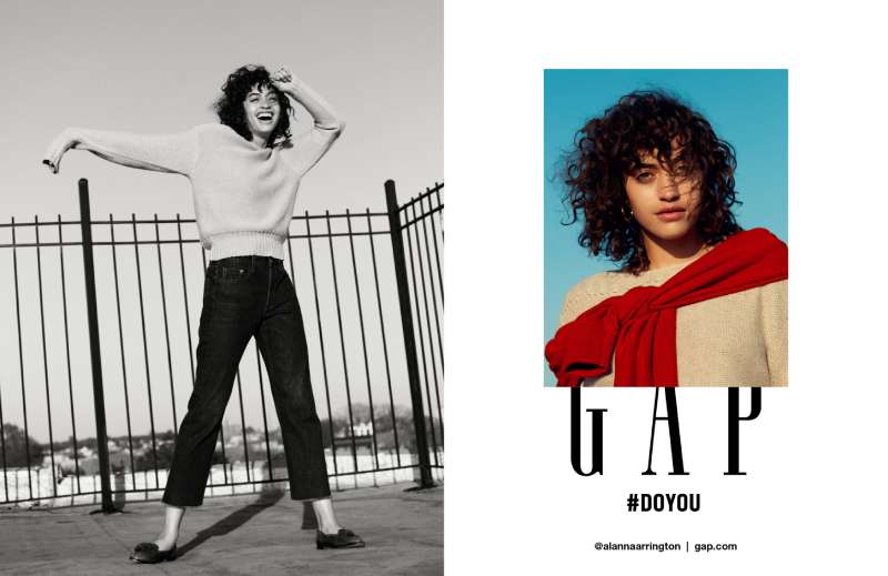
How it looks: full-bleed black and white portrait, subject centred, one caption line naming the person and their trade. The contrast is pushed hard, so skin and fabric carry the whole frame and the logo shrinks to a footnote.
The National Portrait Gallery in London displayed 20 portraits from the Gap collection in 2007, nearly 20 years after launch. Very few retail campaigns end up in a museum.
Who Wore Khakis (1993 to 1995)
Gap ran archival photographs of dead celebrities in khakis that Gap did not make. Fortune described the formula as extraordinary people in ordinary clothes.
Miles Davis on a folding chair. Amelia Earhart. Ernest Hemingway, Andy Warhol, James Dean, Sammy Davis Jr. Each ad carried a name, a caption reading “wore khakis”, and nothing else.
- The focal point is always the subject’s face, never the trousers
- Type sits in the lower third at one weight, roughly 4% of the page area
The phrase entered New Yorker cartoons and Doonesbury strips, which is the rarest outcome any tagline can have.
Khakis and Khaki Swing (1997 to 1999)

Gap’s in-house team under creative director Lisa Prisco built a series of 30-second spots, each set to a different music genre: rock, funk, soul, country and swing. Matthew Rolston directed the swing spot for HSI Productions in 1998, set to Louis Prima’s “Jump, Jive an’ Wail”.
The frame is a white cyclorama with no horizon, no props and no set dressing. Dancers in khaki trousers and white shirts read as dark shapes on an empty field, which is minimalist design used as a merchandising tool rather than a style.
Gap stores posted a 24% gain in same-store sales during the campaign, per Wall Street Journal reporting at the time. Business Insider put the production budget at $20 million to $30 million.
Into the Hollywood Groove (2003)

Laird+Partners developed Gap’s fall 2003 corduroy campaign around a Madonna and Missy Elliott remix of “Into the Groove”. Paul Hunter directed the TV spots. Regan Cameron shot the print.
The spots ran on US networks from July 30 to August 31, 2003, then in Canada, the UK and Japan. It was the first time the two performers appeared together.
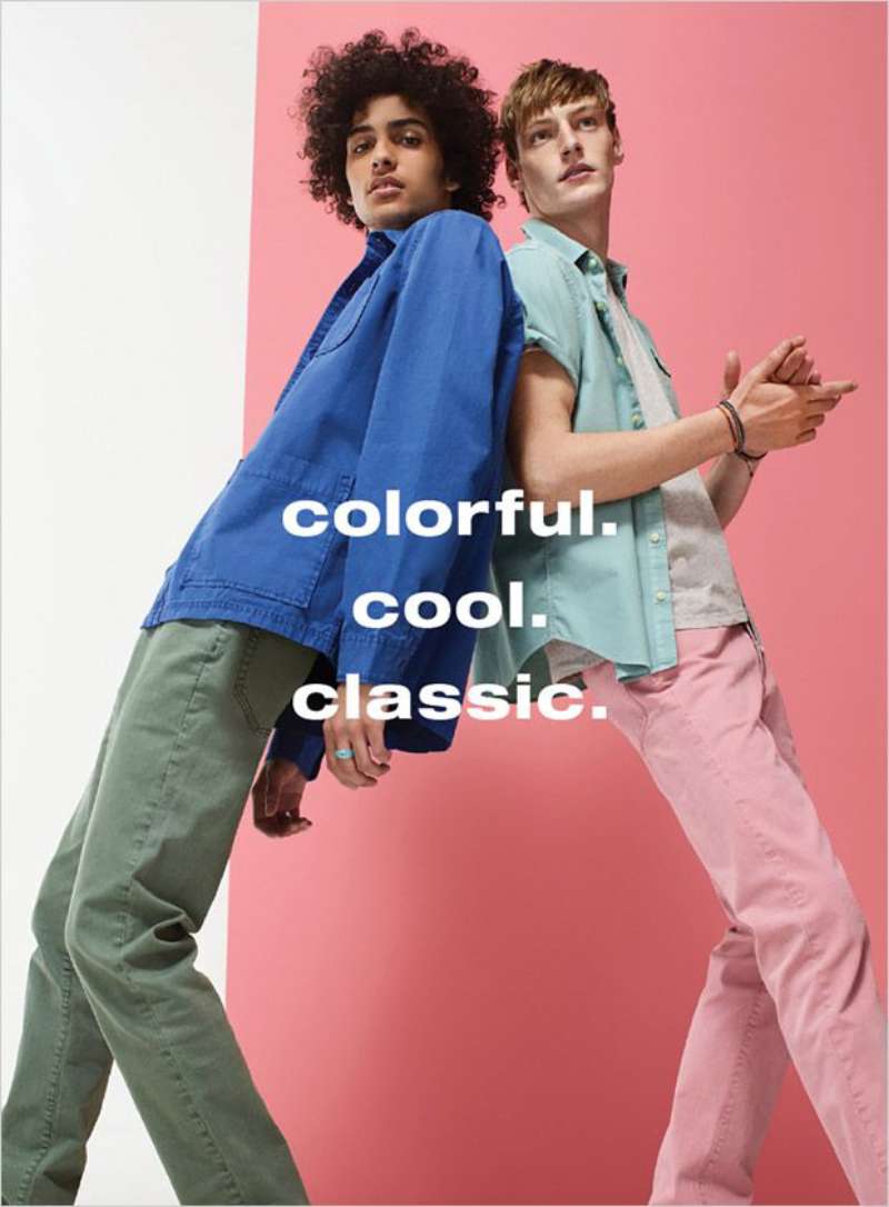
Print used the same white ground as 1998 but swapped monochrome for saturated colour blocks. The pairing of a 1985 track with a 2003 rapper is the brand narrative device Gap keeps returning to: two generations in one frame, neither one apologising.
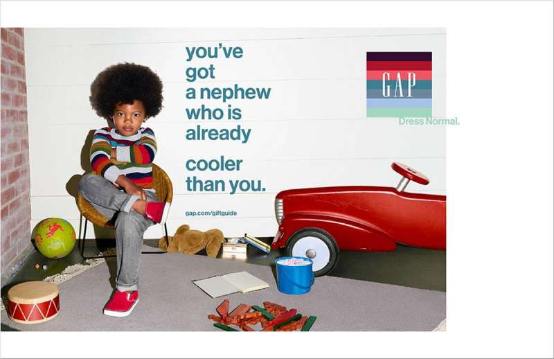
Dress Normal (2014 to 2015)

Wieden+Kennedy New York took the global Gap account in 2014 and marked the brand’s return to television after years away. Executive creative directors Susan Hoffman and David Kolbusz ran the work.
Fincher chapter (August 2014): 4 black and white films, Kiss, Drive, Golf and Stairs, built on black denim and film noir framing. Each centres a woman and withholds the plot.
Coppola chapter (November 2014): 4 colour holiday vignettes shot by The Directors Bureau, awkward family scenes, tagline “You don’t need to get them, to give them Gap.”
The campaign leaned on storytelling instead of product, which is also why it struggled commercially. Great films. Thin retail signal.
Linen Moves, Get Loose and Better in Denim (2024 to 2025)

Gap rebuilt the 1998 formula for vertical video. Spring 2024 put Tyla in linen against Jungle’s “Back on 74” with choreography by Shay Latukolan. Fall 2024 put Troye Sivan and the CDK Company against Thundercat. Fall 2025 put KATSEYE against Kelis.
- Get Loose: nearly 30 million TikTok views and over 400,000 likes within weeks, per Marketing Brew
- Better in Denim: 20 million views in the first 3 days, more than the previous 4 releases combined (Gap Q2 FY25 earnings call)
- Full run: 8 billion media impressions and over 500 million views, reported by Marketing Dive in November 2025
- Sales effect: Gap brand comparable sales up 7% year over year in fiscal Q3 2025
Choreographer Robbie Blue was hired months ahead. Bethany Vargas directed, Bjorn Iooss shot it.
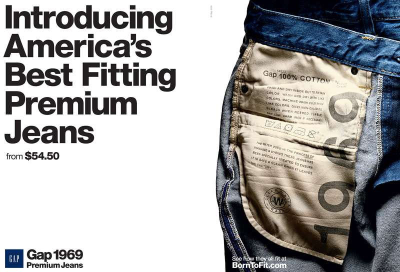
Gap Print Ads for Denim, 1991 to 1999

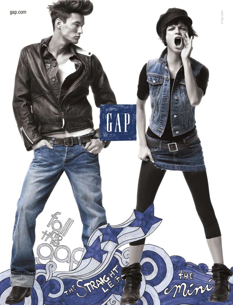
Outside the named campaigns, Gap ran a monthly magazine cadence through the 1990s built almost entirely on one denim silhouette per page.
Same grid, same crop, different wash. That repetition across 100-plus placements is what made the layout recognisable at a glance from across a newsstand.
How Do Gap Print Ads Work Visually?
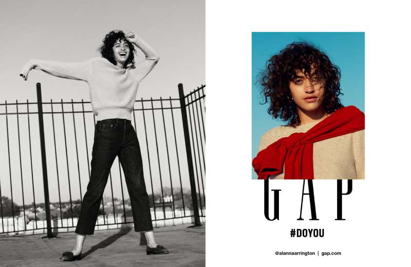
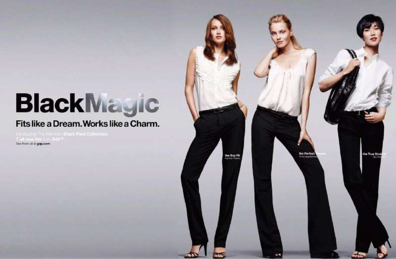
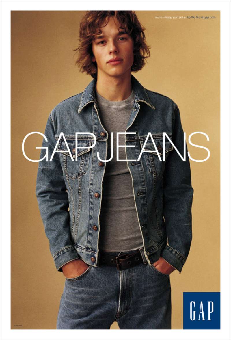
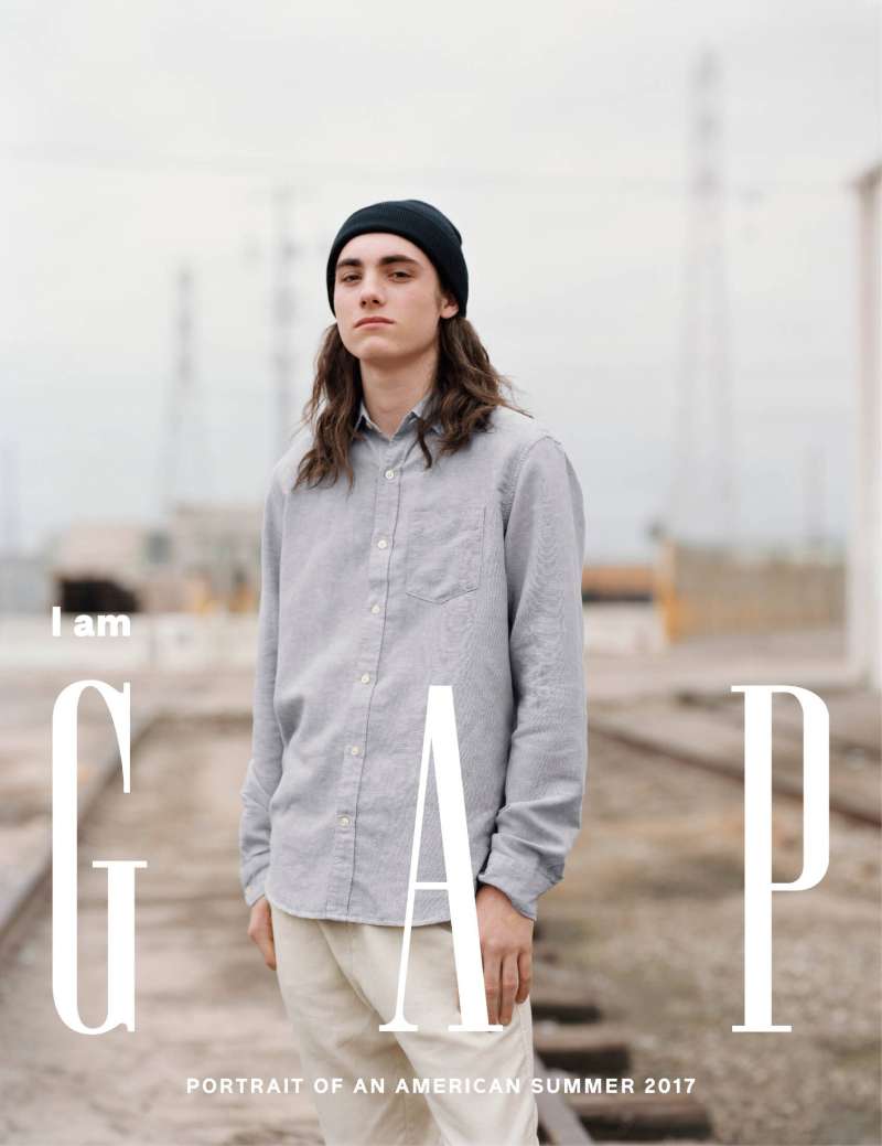
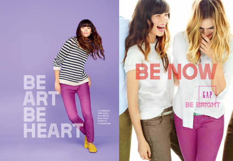
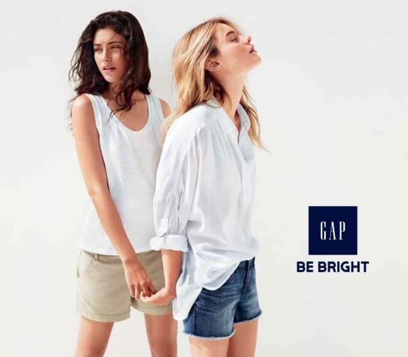
Gap print ads use a single-figure composition on a white or paper-white ground, a monochrome or two-colour palette, one line of copy set in a neutral grotesque, and a logo placed at under 5% of the page area. Image-to-text ratio runs roughly 90:10.
The layout is closer to Swiss design than to fashion advertising. Left-aligned type, generous margins, no decoration, no gradient, no illustration.
The four moves that repeat across 30 years:
- White space carries 60 to 70% of the page, which forces the eye to the subject
- The colour palette stays at two values plus black, with the blue box reserved for the logo alone
- Copy sits below the optical centre, never above the figure’s head
- The visual hierarchy runs face, then garment, then wordmark, in that order every time
The wordmark itself is a condensed serif in the current mark and was a sans-serif setting during the 2010 redesign that Gap withdrew within a week after public backlash. Tight kerning inside the blue square is the detail most reproductions get wrong.
Gap’s grid systems stay simple across formats: one column for magazine, one for bus shelter, one for the 40-foot wall. The same file scales without redesign, which is the practical reason the identity survived four decades of media change.
How Do Gap TV Commercials Differ From Its Print Ads?
Gap TV commercials add music, choreography and duration to the same white-void composition. Print holds one still figure. TV holds 6 to 20 dancers moving through the frame for 30 to 60 seconds. The palette, the ground and the logo treatment stay identical.
Khakis Swing (1998, Gap in-house, dir. Matthew Rolston). Lindy hop dancers in khakis on white, shot with an early multi-camera freeze effect that predates most bullet-time imitators. Louis Prima soundtrack. 30 seconds.
A New Groove, A New Jean (2003, Laird+Partners, dir. Paul Hunter). Madonna and Missy Elliott trade verses in Gap corduroy on a white stage. Ran in 30 and 60-second cuts, with a director’s cut premiered on VH1.
Kiss (2014, Wieden+Kennedy New York, dir. David Fincher). Black and white, black denim, a couple in a doorway, no resolution. Gap’s first TV work in years and the least product-forward film in the archive.
Better in Denim (2025, dir. Bethany Vargas). KATSEYE dance to “Milkshake” in low-rise denim inside a white box set. Robbie Blue choreographed it. Gap later rebuilt the set inside its Embarcadero headquarters atrium.
| Dimension | Gap print | Gap TV |
|---|---|---|
| Subject count | 1 figure | 6 to 20 dancers |
| Copy load | 1 line plus logo | Tagline card at end only |
| Primary driver | Portrait and stillness | Music and choreography |
The rhythm of the edit does what type does in the print work: it sets the pace at which the eye moves and decides what gets weight.
How Has Gap Advertising Evolved Since 1969?
Gap advertising moved through 5 strategic phases: price-led retail in the 1970s, cultural portraiture in the 1980s, archival wit in the early 1990s, music and choreography from 1997, and short-form social video from 2024. The white background survives every phase.
| Decade | Strategic shift | Representative campaign |
|---|---|---|
| 1970s | Price and volume, Levi’s reseller | Fall Into the Gap |
| 1980s | Lifestyle over product, celebrity portraiture | Individuals of Style |
| 1990s | Cultural shorthand, then music and dance | Who Wore Khakis, Khaki Swing |
| 2000s to 2010s | Pop collaborations, then normcore auteur film | Into the Hollywood Groove, Dress Normal |
| 2020s | Vertical video, licensed tracks, Gen Z casting | Better in Denim |
The 2002 to 2023 stretch is the weak link. Gap Inc. reported $15bn in sales and $844m in profit across 4 brands last year, a 5.6% margin, and in real terms the company sits roughly 30% below its peak, according to Mark Ritson writing in The Drum.
Richard Dickson arrived as CEO in August 2023. Zac Posen joined as creative director in February 2024. Fabiola Torres came in as global CMO from PepsiCo in May 2024, filling a seat that had been empty for 18 months.
Which Agencies Created Gap Advertising?
Gap’s in-house San Francisco creative team produced the 1988 to 2002 campaigns under Lisa Prisco. Laird+Partners created the 2003 Madonna and Missy Elliott campaign. Wieden+Kennedy New York created Dress Normal in 2014. Invisible Dynamics created the 2024 and 2025 dance campaigns.
| Agency | Years | Work |
|---|---|---|
| Gap in-house, San Francisco | 1970s to 2002 | Individuals of Style, Who Wore Khakis, Khaki Swing |
| Laird+Partners, New York | 2003 to 2013 | A New Groove, A New Jean; print art direction |
| Wieden+Kennedy New York | 2014 to 2016 | Dress Normal, Fincher and Coppola films |
| Invisible Dynamics | 2024 to present | Linen Moves, Get Loose, Better in Denim |
Lisa Prisco directed the in-house team that made Khaki Swing, and Ad Age named Gap its Marketer of the Year in 1998.
Invisible Dynamics is a small LA, Tokyo and London shop run by Oli Walsh. It won Ad Age Small Agency of the Year in 2025.
The through-line across all four is the same set of brand guidelines: white ground, small logo, one idea per frame. Agencies changed. The rules did not.
What Can Designers Learn From Gap Ads?
Gap ads teach 6 transferable rules: subordinate the logo, hold the palette to two values, cast for meaning rather than beauty, set one line of copy, keep the ground empty, and repeat the format until it becomes recognisable without the name attached.
- Shrink the logo until it reads as a signature, not a headline
- Limit the palette to two values plus black, and reserve the brand colour for the mark alone
- Cast people whose biography does the persuading, the way Miles Davis did in 1993
- Set the tagline at one weight in the brand typeface, no italics, no second size
- Place the copy block below the optical centre so the face keeps priority
- Reuse the same layout for 50 placements before changing it
The last one is the hard part. Most brands redesign the template before audiences have learned it, which is why brand typography so rarely becomes recognisable on its own.
How Do Gap Ads Compare to H&M and Zara Ads?
Gap, H&M ads and Zara ads all sell basics, and all three use celebrity casting. The execution differs sharply.
H&M builds around named designer collaborations and seasonal drops, with dense product grids and price flags carried into the creative. Zara runs closer to editorial: hard shadows, location shoots, models cropped at odd angles, and almost no copy at all.
Gap sits between them. Studio-lit, product-visible, but with a portrait discipline neither competitor keeps. The white cyclorama is Gap’s, and it has been for 35 years.
Against luxury, the gap widens further. Calvin Klein ads trade on tension and skin. Ralph Lauren ads build an American aristocracy that never existed. Gap sells the tee shirt, and puts an interesting person in it.
What Makes Gap Advertising Work?
Gap advertising works because the format never changes and the casting always does.
One person or one group. White ground. Two values in the palette. A licensed record doing the emotional work. The mark held small enough that it reads as a signature rather than a claim.
That restraint is what lets the casting carry meaning. A jazz musician in 1993, a girl group in 2025, and the layout underneath them stays identical.
The lesson for anyone building a visual identity is that consistency is not repetition of content. It is repetition of structure, with the emphasis moved to whoever happens to be standing in the frame this decade.
Hold the frame. Change the person. Repeat for 50 years.
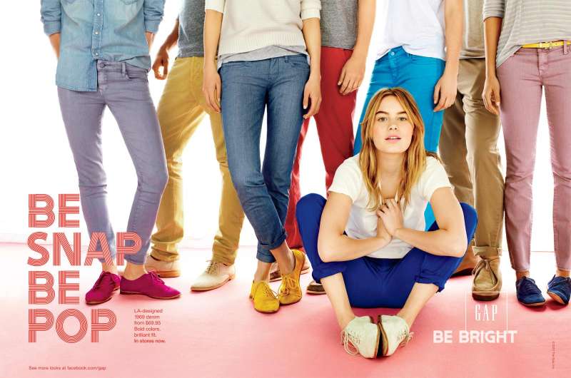
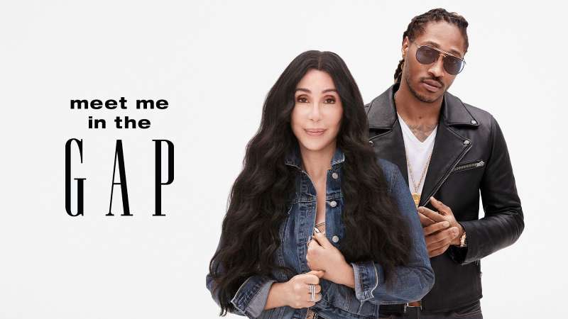
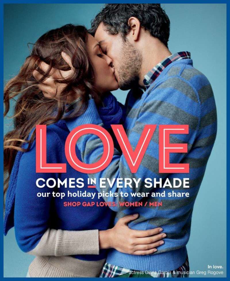
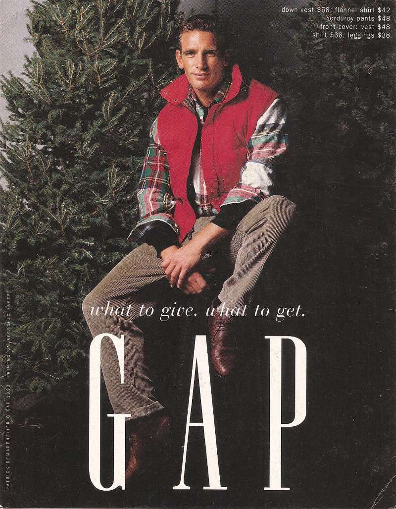
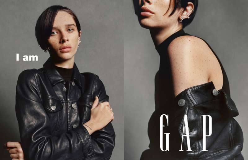
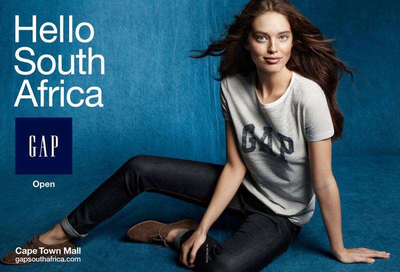
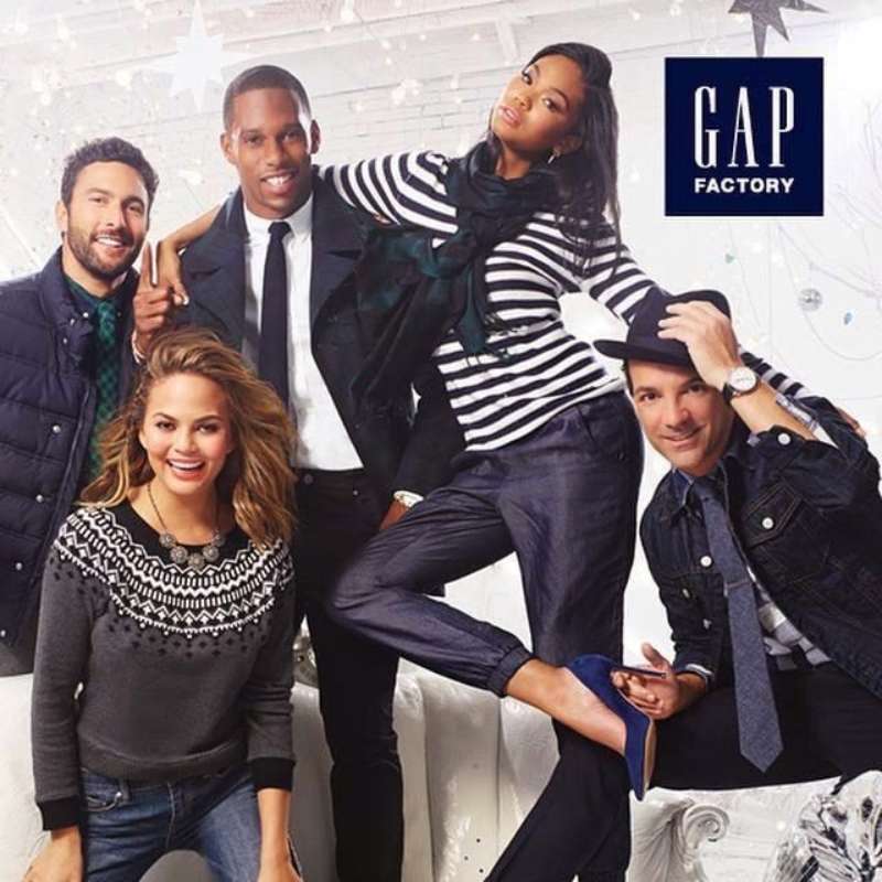
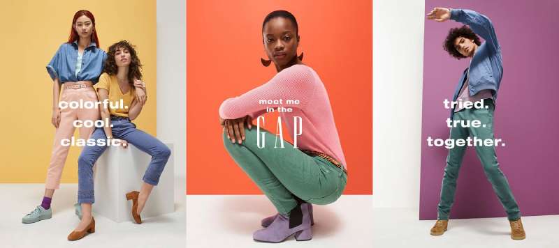
Gap Ads Examples



FAQ on Gap Ads
What is the most famous Gap ad?
Khaki Swing, the 1998 television commercial set to Louis Prima’s “Jump, Jive an’ Wail.”
Matthew Rolston directed it for Gap’s in-house team. The New York Times named it one of the year’s best ads.
Who makes Gap ads?
Gap’s San Francisco in-house team made the 1988 to 2002 work. Laird+Partners followed, then Wieden+Kennedy New York in 2014.
Invisible Dynamics handles the current campaigns and won Ad Age Small Agency of the Year in 2025.
What song is in the Gap khakis commercial?
Louis Prima’s 1956 recording of “Jump, Jive an’ Wail.”
Gap licensed existing records instead of commissioning jingles, a habit that runs through Thundercat, Jungle and Kelis in the recent dance campaigns.
When did the Gap Khaki Swing ad come out?
1998, as part of a wider Khakis campaign that ran genre-specific spots covering rock, funk, soul and country.
Gap stores posted a 24% gain in same-store sales during the run, per Wall Street Journal reporting.
Who appeared in the Who Wore Khakis campaign?
Archival photographs of Miles Davis, Amelia Earhart, Ernest Hemingway, Andy Warhol, James Dean and Pablo Picasso, all in khakis Gap never made.
The 1993 to 1995 print run carried a name and three words of copy.
Why are Gap ads shot on a white background?
The white cyclorama removes location, era and price signals, so the clothing and the person carry the frame.
It also scales without redesign from a magazine page to a 40-foot billboard.
What is the Better in Denim campaign?
Gap’s Fall 2025 denim campaign starring KATSEYE dancing to Kelis’s “Milkshake,” choreographed by Robbie Blue and directed by Bethany Vargas.
It generated 8 billion media impressions and over 500 million views, according to Marketing Dive.
Have Gap ads always used celebrities?
No. The 1970s work sold Levi’s on price with the “Fall Into the Gap” jingle.
Celebrity casting started with Individuals of Style in 1988, and Gap has relied on famous brand ambassadors ever since.
Why did the 2010 Gap logo change fail?
Gap replaced its blue box with black Helvetica and a gradient square, then reversed the decision after six days.
The mark had no distinctiveness, which is the first thing a good logo needs.
Where can you find old Gap print ads?
Scanned magazine pages circulate on collector blogs and Pinterest boards organised by year.
The National Portrait Gallery in London displayed 20 portraits from the Gap collection in 2007, which remains the best-documented set.
Conclusion
Fifty years of Gap ads come down to one decision made in 1988 and never revisited: put a person in front of a white void and shrink everything else.
The agencies rotated. Laird+Partners, Wieden+Kennedy New York, Invisible Dynamics.
The music rotated too, from Louis Prima to Kelis. The composition did not.
What changes is who stands in the frame, and that choice has always carried the message. Herb Ritts photographing Jody Watley in 1989. KATSEYE in low-rise denim in 2025.
Study the print work if you want to understand negative space as a commercial tool rather than a stylistic preference.
Then study the 2010 logo reversal, which proves how little room a brand has once its audience has learned the frame.

Renowned for his expertise in logo design and visual branding, Bogdan has developed a multitude of logos for various clients.
His skills extend to creating posters, vector illustrations, business cards, and brochures. Additionally, Bogdan's UI kits were featured on marketplaces like Visual Hierarchy and UI8.
He also wrote in the past years on sites like Design Your Way, WebDesignerDepot, WPDean, Designmodo, Speckyboy, Slider Revolution, and more.
- The Windsurf Logo History, Colors, Font, And Meaning - 10 October 2026
- How to Remove Background From Product Photos (No Photoshop) - 10 October 2026
- How Designers can Build a Stronger Online Creative Identity - 9 October 2026

Bogdan Sandu is a seasoned designer who has been designing websites since 2008. Renowned for his expertise in logo design and visual branding, Bogdan has developed a multitude of logos for various clients. His skills extend to creating posters, vector illustrations, business cards, and brochures. Additionally, Bogdan's UI kits were featured on marketplaces like Visual Hierarchy and UI8. He also wrote in the past years on sites like Design Your Way, WebDesignerDepot, WPDean, Designmodo, Speckyboy, Slider Revolution, and more.
You Might Also Like