The Twitter Logo History, Colors, Font, and Meaning
You spot it in a nanosecond—the Twitter logo, that unmistakable blue bird becoming ever more synonymous with global conversation. Such icons aren’t just thrown together in a digital melting pot; no, it’s a well-stirred symphony of graphic design, brand identity, and quintessential visual branding elements.
We’re swimming in a sea of emblems, yet, why does this particular branding symbol stand perched atop the proverbial social media tree?
Let’s pluck out the secrets from its nest.
By the end of this deep dive, the nuances of this digital emblem—a masterpiece binding digital assets and visual communication—will echo in your design thoughts.
From its birth, a mere pixel, to its reign as a trademarked icon; unravel the threads of its brand guidelines and the subtleties that make it, well, tweet.
What’s more? We’ll examine digital marketing assets and their power play in the realm of social network icons. Prepare to spread your wings into a sky of design philosophies that shape how brands like Twitter, Inc. resonate worldwide.
The Meaning Behind the Twitter Logo
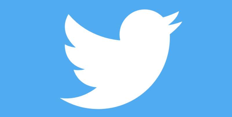
Twitter, that buzzing blue bird that’s come to be the symbol of instant news and quick-fire communication. Have you ever paused to ponder, what’s the story behind it? Let’s take a fly-through.
A Tiny Blue Bird Takes Flight
Twitter’s logo, fondly named ‘Larry the Bird’ (after basketball player Larry Bird), is more than a cute avatar. It embodies the core essence of the platform – freedom of speech. Twitter is a space where words can take flight, much like a bird soaring through the open sky.
Why a Bird, though?
We’ve seen many brands adopt animals in their logos, each with a unique reason. The Twitter bird, in particular, has a significance that goes beyond aesthetics. It’s all about the symbolism.
Think about it – birds ‘tweet’, right? And ‘tweeting’ is what we do on Twitter. The logo and the platform’s functionality are harmoniously synced!
The History of the Twitter Logo
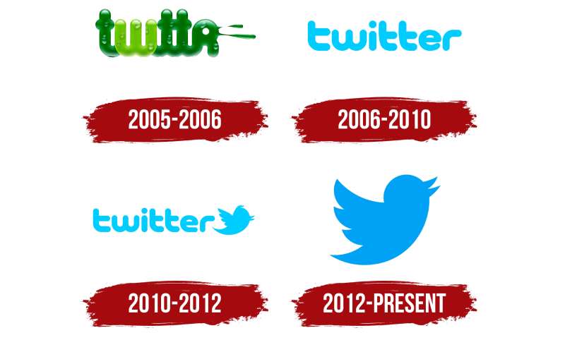
Twitter’s logo has seen a fascinating journey, much like the brand itself. Let’s trace its flight path, shall we?
The Birth of Larry
In 2006, the world was introduced to the Twitter logo for the first time – a simple typeface on a green backdrop. A year later, the famous bird made its debut, with the name ‘Twitter’ spelled out beneath it. The logo was an amalgamation of expressive typography and an illustration of a bird.
Growing Wings
As Twitter grew in popularity, Larry also evolved. By 2010, the bird had assumed a more streamlined look.
The name ‘Twitter’ had been dropped from the logo, with Larry the Bird now the sole symbol of the brand. By simplifying its logo, Twitter emphasized its global recognition.
The Colors of the Twitter Logo
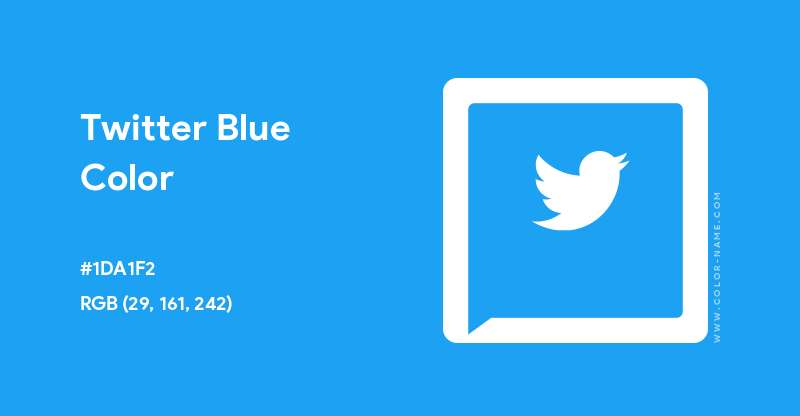
Color can evoke emotions, and Twitter’s choice of hues does just that.
Sky High in Blue
Twitter’s logo basks in a radiant shade of blue. Blue stands for trust, loyalty, and confidence. It’s a calm and soothing color, often associated with depth and stability.
Twitter’s choice of blue subtly communicates reliability and a sense of calm amidst the hustle and bustle of constant updates.
White – A Vision of Purity
The white bird etched against the blue backdrop stands for purity, innocence, and simplicity. It reinforces the idea of uncomplicated, straightforward communication.
The Font Used in the Twitter Logo

While the bird remains the visual cornerstone of Twitter, let’s not forget the importance of the font in its earlier incarnations.
As Simple as it Gets
The Twitter wordmark, in its initial stages, used a sans-serif typeface. Sans-serif fonts, characterized by their simplicity and readability, are a common choice for tech companies. This typeface embodied Twitter’s premise of ease and accessibility.
The Evolution of the Twitter Logo
Delving into how Twitter’s logo has evolved over time gives us intriguing insights into the brand’s journey.
From Type to Symbol
The shift from using both text and symbol to relying solely on the symbol underscores Twitter’s growing global footprint. It’s fascinating how Twitter has condensed its identity into a simple, universally recognizable symbol.
Streamlined for the Future
As Twitter has grown, Larry the Bird has become more streamlined, more ‘modern’. This reflects Twitter’s ongoing commitment to adapt, evolve, and stay at the forefront of social media trends.
The Impact of the Twitter Logo
The story of Twitter’s logo wouldn’t be complete without a nod to the impact it has made in the digital world.
Transcending Language Barriers
One of the key powers of a logo is its ability to transcend language barriers. A picture, or in this case, a bird, really is worth a thousand words. Larry, the Twitter bird, has become a universal symbol for the platform, instantly recognizable regardless of language or culture.
A Symbol for Social Movements
The Twitter logo has become a beacon for global movements. It’s a symbol that often represents the start of important conversations.
From #BlackLivesMatter to #MeToo, the blue bird has been the mascot for these impactful dialogues, making Twitter a go-to platform for social change.
The Future of the Twitter Logo
Even though we can’t predict with certainty, it’s fun to imagine what the future might hold for the Twitter logo.
A Dynamic Logo?
As brands continue to embrace dynamism, could we see Larry take on a dynamic persona too? Dynamic logos can adapt and evolve based on context, enhancing user engagement. Larry could, for example, change colors based on trending topics or user moods. Sounds fun, right?
Augmented Reality (AR) Integration
With AR and Virtual Reality (VR) being the next frontier in tech, it wouldn’t be surprising if Twitter incorporated this into their logo somehow. Imagine an interactive AR Larry that could fly off your screen. The possibilities are endless!
Through its iconic logo, Twitter has truly carved out a unique identity for itself in the digital landscape. Larry the Bird symbolizes freedom, openness, and the limitless possibilities of communication in the digital age. As Twitter continues to evolve, we can look forward to seeing how its logo will soar to new heights.
FAQ On The Twitter Logo
What’s The Story Behind the Twitter Logo?
It’s folklore in digital design communities! The logo, affectionately dubbed the ‘Twitter bird,’ was born from a mountain of sketches.
Originally named ‘Larry the Bird’ after a basketball legend, it epitomizes the essence of chirping—sharing brief updates globally, like birds warbling to one another.
Has the Twitter Logo Changed Over Time?
Oh, absolutely. Like a phoenix, it’s been reborn, repeatedly. From its initial twee inception, it’s morphed into a sleeker, more iconic silhouette.
It’s all about evolution, isn’t it? With every tweak, the bird sheds details for a minimalist design that captures Twitter’s brand identity even better.
Why Is the Twitter Logo Blue?
The shade’s called Twitter Blue, a hue that’s both sky and tech-flavored. Why blue? It stands for freedom of speech and reliability. It’s no random pick; colors are part of a brand’s visual communication strategy—blue’s the trusty steed for the swift bluebird.
Who Designed the Twitter Logo?
That’d be graphic artist Linda Gavin, and she crafted it in 2006 during Twitter’s nascent stage. A true testament to nailing it right, early. Later refinements came from Doug Bowman in 2012, smoothing it into the shape we instantly recognize today in our feeds.
Can I Use the Twitter Logo for My Project?
Tread carefully, friend. Twitter has strict brand guidelines. While the icon is available for use, it’s within limits—mainly to indicate sharing options or that you’ve got a Twitter presence. Anything beyond, and you’re in choppy trademark waters. Always check their policy first.
What Does the Twitter Logo Symbolize?
It’s the DNA of digital conversation, a beacon of modern chitchat. Sure, it’s a bird, but it’s flying high, embodying the freedom and speed of sharing thoughts in a heartbeat. It nods to how social media platforms shrink the globe, offering a perch for every voice.
Is the Twitter Logo Copyright Protected?
Absolutely, it’s fortified behind a wall of trademark laws. The logo is a legally recognized representation of Twitter, Inc. Misuse it and you might as well send yourself a cease-and-desist. It’s a cardinal sin in digital marketing assets to borrow without permission.
What Font Does the Twitter Logo Use?
Trick question! There’s no font, because the Twitter logo is now purely pictorial. In the salad days, ‘Twitter’ was indeed typed out next to Larry, but they’ve since let the bird fly solo. Now, it’s all visual, no text, leading the flocks of brand identity.
How Can I Download the Twitter Logo?
Direct from the bird’s beak: Twitter’s brand guidelines webpage is your go-to. They serve up their branding symbols in various formats, ensuring you snag the quality needed for crisp display.
Remember to stick to their playbook, or you’ll have their legal eagles swooping down on you!
What is the Significance of the Twitter Logo’s Simplicity?
It’s genius, isn’t it? The logo stands as a paragon of minimalist design, capturing the simplicity of social media icons.
In an era where less is more, it communicates everything Twitter stands for, no frills. A masterclass in visual branding elements—efficient, memorable, and universally recognized.
Conclusion
Circling back, the Twitter logo, that sprightly blue bird, remains ever so ingrained in our digital lives—almost an involuntary reflex when you spot it. It’s a stamp of instant connection, isn’t it? A nifty passport to the colossal agora of tweets and global dialogues.
Reflect on how it’s evolved—pared down to the bare essentials. Now, doesn’t that resonate? In this pixel-thin form, it’s more than a logo. It’s the very embodiment of brevity, Twitter’s brand identity, carved into our collective consciousness.
Leaving you with this. If anything, remember that the minimalist design shapes the tapestry of engagements across social media platforms. And isn’t that the cornerstone of great design? To elicit that innate response to connect, to engage, to share?
As we roll down the curtains, let that little blue bird flex its wings in your mind. Let it inspire: Less is often the storyboard for more. Keep that lesson snug under your creative wing, and watch your visual stories soar.
If you liked this article about the Twitter logo, you should check out this article about the new Patreon logo.
There are also similar articles discussing the Facebook logo, the Amazon logo, the Apple logo, and the Netflix logo.
And let’s not forget about articles on the Microsoft logo, the Samsung logo, the Airbnb logo, and the IBM logo.
- The Bethesda Logo History, Colors, Font, And Meaning - 28 April 2024
- Out of This World: Space Color Palettes for Cosmic Designs - 28 April 2024
- The Bungie Logo History, Colors, Font, And Meaning - 27 April 2024


