The Unanet logo is a three-shape symbol in light blue, green and lime above a navy wordmark. Unanet, which makes ERP and CRM software for project-based businesses such as government contractors and architecture, engineering and construction firms, announced it on March 3, 2020.
The company traces its roots to Computer Strategies, a consulting firm founded by Fran Craig in 1988, which moved into web-based timesheet software in 1997.
What Is the Unanet Logo?
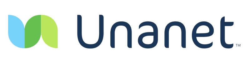
The Unanet logo is a combination mark: a “trimark” symbol of three overlapping rounded shapes next to the name “Unanet” in navy. Unanet introduced it in a brand refresh on March 3, 2020. The company says the trimark stands for projects, people and financials in one solution, and that the rounded U and N suggest a company that is established but approachable.
| Symbol | Trimark of three overlapping rounded shapes (light blue, green, lime) |
| Designer/agency | Not named in Unanet’s announcement |
| Current version since | March 2020 |
| Colors (hex) | Approx. navy #1B3556, light blue #77D3FA, green #66C04F, lime #BAE65B, sampled from the current logo |
| Typeface | Custom rounded sans-serif, not publicly named |
| Previous major version | Italic blue-to-green “Unanet” wordmark, used until 2020 |
How Has the Unanet Logo Evolved Over Time?
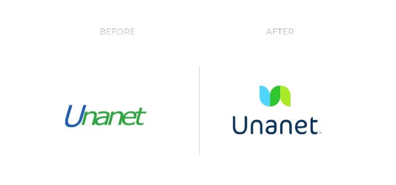
Unanet has had two main logos that I could confirm: the wordmark that came before 2020 and the trimark logo from 2020.
Original Unanet Logo (before 2020)
The earlier logo was a wordmark only, with “Unanet” in italic lettering that shifts from blue on the “U” to green on the rest. I could not find a date for when it was introduced or who drew it.
Current Unanet Logo (2020–Present)
The 2020 refresh added the trimark, a new typeface, a brighter green and the tagline “Where Information Means Insight.” Unanet said the new look would reach its website, advertising and product over the following months. I found no later change to the logo.
What Do the Design Elements of the Unanet Logo Mean?

What Does the Unanet Symbol Represent?
Unanet describes the trimark as projects, people and financials combined in one solution. Where the integrated data overlaps in the center, it shows insights, which is the idea behind the tagline “Where Information Means Insight.”
What Are the Unanet Logo Colors?
The green was kept from the earlier logo and brightened to suggest energy, Unanet says. The navy wordmark is new to the logo. Unanet has not published hex codes that I could find, so the values in the table are sampled from the logo file and are approximate.
What Font Is Used in the Unanet Logo?
Unanet describes the 2020 wordmark as a new typeface meant to convey “established charisma and character,” but has not named it. The letters are rounded and geometric, and the U and N echo the curves of the symbol.
How Does the Unanet Logo Fit Into the Overall Brand Identity?

The tagline “Where Information Means Insight” ties the wording to the symbol’s overlapping shapes, and the navy and green carry through the rest of the identity.

Unanet now serves about 4,000 government contractor, architecture, engineering and construction firms, according to its own site, and the logo sits on its product screens and event materials.
How Should the Unanet Logo Be Used?
The Unanet name and logo are trademarks of Unanet. Customers and partners should use the logo from Unanet itself and should not stretch, recolor or redraw it.
FAQ on the Unanet Logo
What does the Unanet logo look like?
It is a symbol of three overlapping rounded shapes in light blue, green and lime, placed above or beside the name “Unanet” in navy.
When did Unanet change its logo?
Unanet announced a new logo and brand refresh on March 3, 2020. It added the trimark symbol, a new typeface, a brighter green and a new tagline.
What did the old Unanet logo look like?
It was an italic wordmark with the “U” in blue and the rest of the name in green, with no separate symbol.
What does the Unanet logo mean?
The trimark combines projects, people and financials into one solution, and the center where the shapes overlap represents insight.
What colors are in the Unanet logo?
Navy, light blue, green and lime. Approximate values sampled from the logo are #1B3556, #77D3FA, #66C04F and #BAE65B.
What font does the Unanet logo use?
Unanet has not named the font. It is a rounded sans-serif that was introduced with the 2020 refresh.
Who designed the Unanet logo?
Unanet’s announcement does not name a designer or agency, so the designer is not publicly credited.
What is the Unanet tagline?
“Where Information Means Insight,” introduced alongside the new logo in 2020.
When was Unanet founded?
The company began as Computer Strategies, founded by Fran Craig in 1988, and turned to web-based timesheet software in 1997, according to George Mason University. Sources differ on the date of the Unanet company itself.
Conclusion
The Unanet logo moved from an italic blue-and-green wordmark to a three-shape symbol with a navy wordmark in March 2020. Unanet explains the symbol as projects, people and financials meeting at insight, and it kept the green from the earlier logo.
The designer and the typeface were not named in the announcement, so those two details remain unconfirmed.
Sources
- Unanet, With New Logo and Brand Refresh, Unanet Shows How Information Means Insight – https://unanet.com/news/with-new-logo-and-brand-refresh-unanet-shows-how-information-means-insight
- George Mason University School of Business, Fran Craig – https://business.gmu.edu/node/23437
- Unanet, We are Unanet – https://www.unanet.com/about/

Renowned for his expertise in logo design and visual branding, Bogdan has developed a multitude of logos for various clients.
His skills extend to creating posters, vector illustrations, business cards, and brochures. Additionally, Bogdan's UI kits were featured on marketplaces like Visual Hierarchy and UI8.
He also wrote in the past years on sites like Design Your Way, WebDesignerDepot, WPDean, Designmodo, Speckyboy, Slider Revolution, and more.
- Logo Quiz - 22 November 2026
- The LinkedIn Logo History, Colors, Font, and Meaning - 20 November 2026
- How to Design Landing Pages That Convert Visitors into Email Subscribers - 20 November 2026

Bogdan Sandu is a seasoned designer who has been designing websites since 2008. Renowned for his expertise in logo design and visual branding, Bogdan has developed a multitude of logos for various clients. His skills extend to creating posters, vector illustrations, business cards, and brochures. Additionally, Bogdan's UI kits were featured on marketplaces like Visual Hierarchy and UI8. He also wrote in the past years on sites like Design Your Way, WebDesignerDepot, WPDean, Designmodo, Speckyboy, Slider Revolution, and more.
You Might Also Like