


24 Colorful logos to inspire you (Must see)

Imagine a world awash in monochrome—dull, right? Now splash it with a kaleidoscope of hues. That’s the power of colorful logos. They’re not just eye candy; they’re the silent ambassadors of your brand’s soul.
You’re in the right spot if you’re curious about the magic these vibrant mascots wield. Here, we unravel the mysteries of color psychology in branding and how hues work together to say more with less.
You’ll discover how bold and bright designs can transform a mere logo into a memorable beacon for your brand. From hue dynamics to color harmony, gain insights that go beyond the aesthetic appeal—into the realm of emotional resonance.
We’ll dive into the science that makes color a pivotal player in marketing campaigns and visual identity. Your takeaway? The savvy to weave color into a logo that not only stands out but also stands for something.
By the end, you’ll be ready to craft or critique colorful logos with the eye of a pro. Let’s paint the town with your brand’s true colors.
Why choose colorful designs?
Colorful logos help a brand to communicate a message. This is because every color will communicate a different message to an audience.
Orange logos will give a different message to gold logos, despite the closeness in color.
When colour is used in company logos, it will help an organization to communicate with and attract clients.
Here are some messages connected with colorful logos
- Red logos: appear youthful, bold and exciting.
- Orange logos: will appear cheerful, friendly and confident.
- Yellow logos: are sunny, warm and optimistic.
- Green logos: are seen to be peaceful and healthy. They are often used to promote wellness or sustainability.
- Blue logos: will make a company seem trustworthy, strong and dependable.
- Purple logos: may seem luxurious, creative and even prudent.
- Gray logos: are seen to be subtle, balanced and harmonious.
As you can see, your color choice will determine the message communicated and the clients you attract. Colorful logos are an important part of your brand.
By choosing the best logo colors for your brand, you will communicate your company’s culture, strengths and values. You will also be able to attract the right audience for your business.
When you select the wrong choices for your colored logo, your business will attract the wrong clients.
Color schemes for colorful logos
Analogous colors
If you would like to make your logos feel harmonious, analogous colors may appeal to you.
These colors fall next to each other on the color wheel, and create a great logo colors scheme.
When you use analogous colors, you’ll create a design which is seen to be well put together. This is true even across cultures.
Using complementary colors
Complementary colors will give you a vibrant and eye-catching effect. Although these colors are called complementary, they contrast brightly.
To create a complementary color, you would combine one primary color with the remaining two colors. This means that orange is the complementary color for blue, green for red, and purple for yellow.
If you are looking for eye-catching colorful logos, complimentary colors make a vibrant choice.
Triadic color schemes
If you don’t wish to limit your designs to two colors, a colorful logo using a triadic color scheme might be the best for you.
A triadic color scheme can be bright and vibrant, as complementary colors can. However, it will also give you harmonious or analogous colors to create company logos. By increasing your color choice, you can increase your range.
When you use a triadic color scheme, you don’t need to limit yourself to three colors. Four colors make a good color choice too.
However, if you don’t want to create a rainbow logo, simply divide your color choices into sets of two. Choose two sets of complementary colors and space them evenly to add flow to your colored logo.
Naturalistic color logos
If you would like to create a naturalistic color scheme for your colorful logos, you could always draw on the colors of the object or image you are depicting.
You can adjust or tint your colors until they really stand out on your page.
Rainbow color schemes
If you would love to have a rainbow logo, you can use as many colors as you want to create cheerful and colorful designs.
When you create a rainbow color scheme, you can literally flood your logo with color.
However, you can still carefully connect your logo color scheme.
Use the knowledge shared above, creating harmonious pairs and contrasting shades. You could even use a range of colors to create a naturalistic image.
This will give your colorful logos structure even while you use a wide selection of colors.
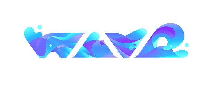
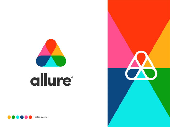
Here are some colorful logos to inspire you
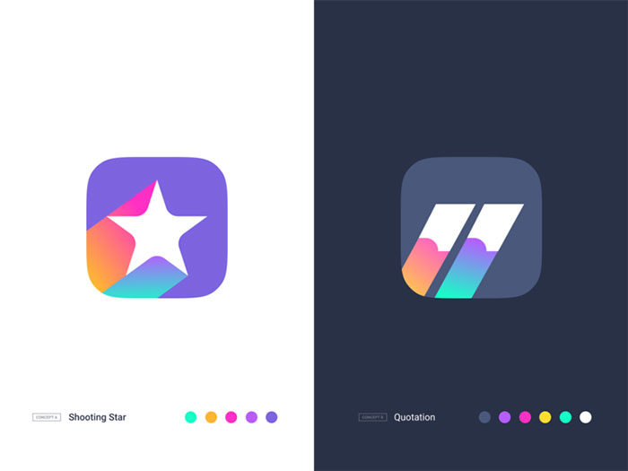
Shooting star & Quotation
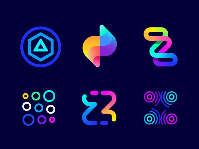
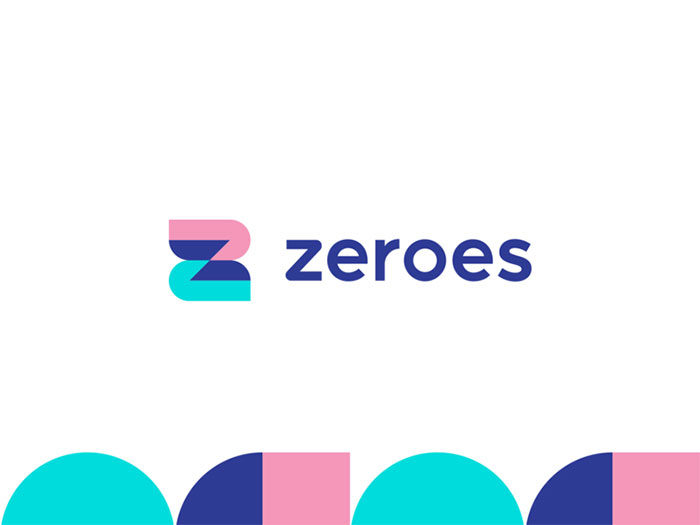
ZEROES – smart banking alternative
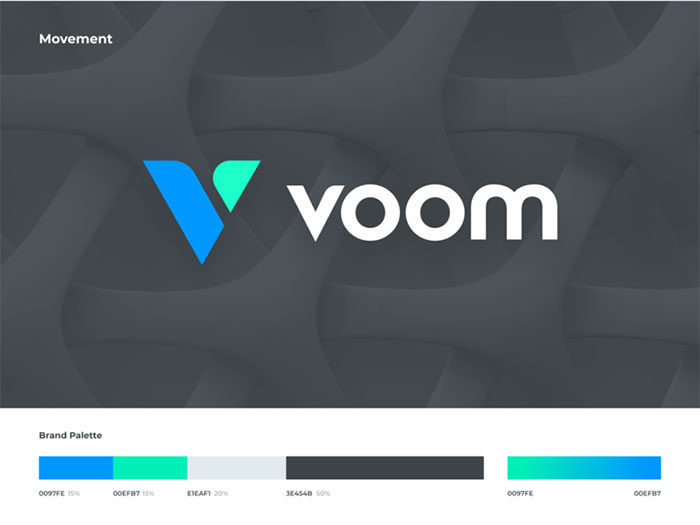
Voom
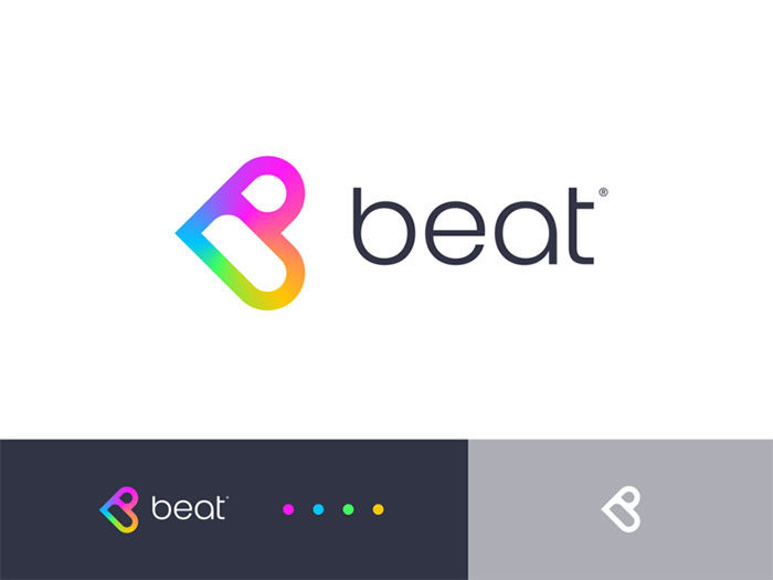
♡ beat
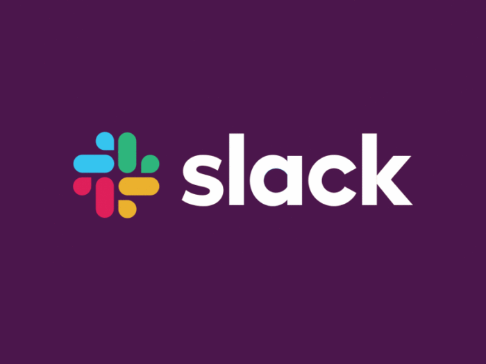
Slack
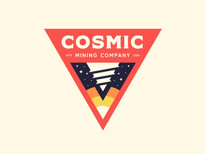
Cosmic Mining
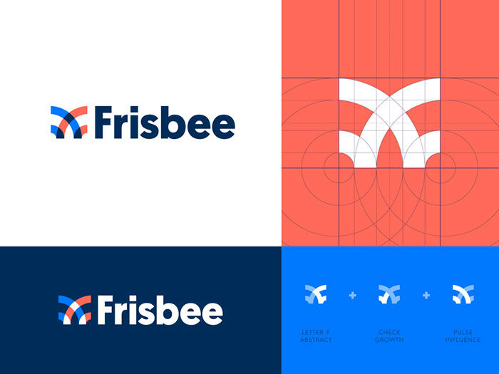
Frisbee
PlayStation logo redesign
![]()
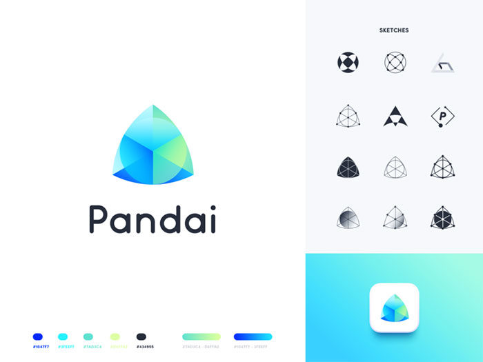
Garbanzo
![]()
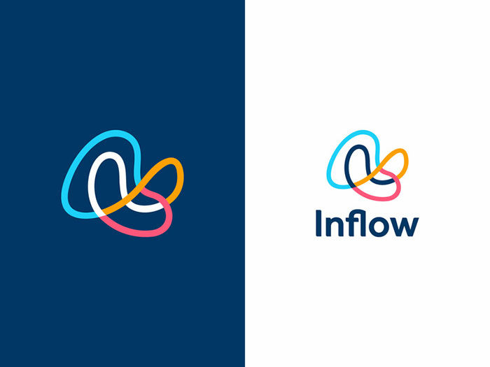
Inflow
Primary
![]()
Primary has used color and emotions to resemble marble or a classic artwork. This logo uses colors and gradients for dynamic effect.
This logo example pairs very well with simple lettering to create an attractive logo which communicates a clear message.
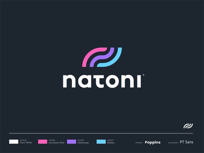
Natoni
Z Logo
![]()
Z has made excellent use of the psychology of colors in business to create a pink- to – purple logo design which stands out against a black background.
The result is striking use of logo colors for an attractive design.
Popfn
![]()
Popfn has used a colorful logo design is visually attractive to viewers.
Bold colors and gradients combine to create this neon – style mark. This logo has style and depth.
Chrislago
If you have ever wondered how colorful logos bring style to life, have a look at Chrislago’s logo.
Two colors combine with striking effect in this stunning colorful logo design.
VW Aloha By elevencreative
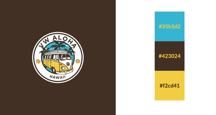
Did you imagine you could add brown to a blue and yellow logo?
It’s a unique but very smart combination which gives a relaxed vibe to this colorful logo design.
Petals
Petals have combined gradients and 3D techniques to create this eye-catching logo color scheme.
What an impressive result.
Ups
![]()
Brown must be one of the best logo colors to use to stand out from the competition. Although the color may not seem bright and bold, UPS has used the color to create an attractive and very warm design.
In 2003, this company added yellow to its logo, adding richness to this warm and friendly design.
FAQ on creating colorful logos
Why do logos need to be colorful?
Color injects life into logos. It’s about brand identity; a well-chosen palette can communicate your story without words. Think of it as the visual elements branding your company needs. Colorful logos grab attention and connect emotionally, making your brand unforgettable.
Can color choice affect consumer behavior?
Absolutely. There’s this whole psychology behind it. Colors influence feelings and actions. Vibrant branding resonates differently than muted tones. For instance, red screams ‘urgency’—great for a sale. Blue exudes trust. Knowing these subtleties in color dynamics can sway customer engagement. It’s powerful stuff.
What’s the best color combination for a logo?
“Best” is subjective, right? But, it comes down to branding palette choices. For clarity and impact, logo color harmony matters—a blend that sets the right mood. Take into account your brand’s values and goals. A winning combo is one that feels as authentic as it looks smart.
How does culture impact color perception in logos?
Culture’s huge. It shapes our response to colors. Red may mean luck in one place, danger in another. Graphic design in logos must be culturally sensitive. When expanding globally, a deep-dive into local market color psychology is smart. It ensures your colorful logo resonates well everywhere.
Do logos always have to be colorful to be effective?
Not always, no. Effectiveness hinges on conveying your brand’s essence, whether through a burst of colors or a single hue. Saturated logos stand out. Meanwhile, a simple black-and-white logo might symbolize elegance. It’s about what aligns with your brand’s heart. That’s what breathes life into brand recognition.
What’s the role of color in logo redesign?
When you hit the refresh button on a logo, color plays a starring role. It’s a chance to inject modernity, vibrancy, and relevance. A new color scheme can signal evolution without losing the recognizable core of your corporate logo design. It’s less about a total makeover, more a strategic color shift.
How do I choose the right color for my logo?
Start with your brand’s personality—is it playful, serious, innovative? Now, pick colors that match. For creativity, maybe it’s bold purples or oranges. Professionalism? Navy or grey. It’s like mixing a unique brand color palette — a cocktail of colors that says ‘you’ in a glance.
How many colors are too many in a logo?
Think of it as the spice in cooking—enough to taste, not overwhelm. Two to three colors maintain logo color psychology without clutter. Any more begins to dilute focus and impact. You want to keep that eye-catching logo crisp, memorable. It’s a balancing act of colorful visual identity, not a rainbow explosion.
Does logo color trend matter?
Trends offer inspiration but don’t chase them blindly. What’s on trend today might be tomorrow’s news. Instead, align colors with your timeless brand identity. Logo design trends can guide you, but authenticity in your branding journey is what makes you stand out in the long run.
How can color make a logo more memorable?
Color amps up recognition—think about the iconic golden arches. Your goal? A memorable business logo, and color is the shortcut. Unique and relevant color choices can stick in minds more than any clever design. Leverage colorful trademark design to hook your audience’s memory. That’s free advertising, my friend.
Conclusion
So, we’ve journeyed through the whole spectrum, right? From the psychology that makes colorful logos pop to how they send silent but oh-so-loud messages about who you are. It’s clear, colors in logos are no afterthought – they’re the heartbeat of branding.
Now, let’s break it down:
- Colors tell your tale. They’re the whispers of your brand identity before you say hello.
- Matching palette choices to your vibe? Critical. It’s like picking the perfect outfit for a first date.
- And remember, logo color psychology? That’s the secret sauce for connecting with folks on a gut level.
In wrapping up, just remember—vibrant branding isn’t just about standing out; it’s about being true to you and talking straight to the hearts of your audience. So go ahead, choose those hues with courage. Blend them with purpose. Make that logo a mirror of your brand’s colorful soul.
If you enjoyed reading this article about colorful logos, you should read these as well:
- The Adidas logo: What makes it so special
- Logomark Vs Logotype: Understanding the Difference
- Superhero logos: The symbols of the comic book universe
- Music logo design: Tips and examples to inspire you
Bogdan Sandu, a seasoned designer with 15 years of diverse experience, has been designing websites since 2008.
Renowned for his expertise in logo design and visual branding, Bogdan has developed a multitude of logos for various clients.
His skills extend to creating posters, vector illustrations, business cards, and brochures. Additionally, Bogdan's UI kits were featured on marketplaces like Visual Hierarchy and UI8.
Latest posts by Bogdan Sandu (see all)
- Deep Dive: Sea Color Palettes for Tranquil Designs - 3 May 2024
- The Stella Artois Logo History, Colors, Font, And Meaning - 2 May 2024
- Sky Color Palettes for Fresh Designs: 40 Examples - 2 May 2024