Imagine walking into a room bathed in sunlight, the walls adorned with the subtle yet striking hues of lemon yellow and goldenrod. It’s not just a feast for the eyes; it’s a warm embrace that exudes energy and happiness.
Yellow, often underappreciated, holds a spectrum of possibilities-from the softest pastel to the most vibrant canary.
In this exploration of shades of yellow, we’ll dive deep into the nuances of this primary color, unraveling its impact on color psychology and its role in home decor and fashion trends.
You’ll discover how interior designers use yellow tones to create inviting spaces, the significance of yellow in art history with masterpieces like Van Gogh’s Sunflowers, and practical tips for incorporating these hues into your own projects.
By the end, you’ll have a rich understanding of yellow’s versatility and how to make it work for you. Get ready to transform your perception of yellow from ordinary to extraordinary.
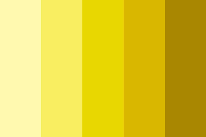
Popular Shades of Yellow
| Shade Name | HEX Code | RGB Values | Description |
|---|---|---|---|
| Lemon Yellow | #FFF700 | (255, 247, 0) | A bright and vivid yellow, like the color of lemons. |
| Goldenrod | #DAA520 | (218, 165, 32) | A medium yellow with a slight brown tint, similar to the goldenrod flower. |
| Gold | #FFD700 | (255, 215, 0) | A rich and bright yellow, reminiscent of gold. |
| Light Yellow | #FFFFE0 | (255, 255, 224) | A very pale and soft yellow, like a light ray of sunshine. |
| Canary Yellow | #FFEF00 | (255, 239, 0) | A bright and vibrant yellow, similar to the feathers of a canary. |
| Mustard Yellow | #FFDB58 | (255, 219, 88) | A medium yellow with a brownish tint, like mustard. |
| Amber | #FFBF00 | (255, 191, 0) | A medium to dark yellow, like the color of amber resin. |
| Pale Goldenrod | #EEE8AA | (238, 232, 170) | A soft and pale yellow with a golden hue. |
| Khaki | #F0E68C | (240, 230, 140) | A light yellow with a brownish tint, often used in military uniforms. |
| Mellow Yellow | #F8DE7E | (248, 222, 126) | A soft and warm yellow, often associated with relaxation. |
| Dandelion | #FED85D | (254, 216, 93) | A bright and cheerful yellow, like the color of dandelion flowers. |
| Banana Yellow | #FFE135 | (255, 225, 53) | A bright and vivid yellow, similar to the color of bananas. |
| Goldfinch | #E2BC00 | (226, 188, 0) | A medium yellow with a slight brown tint, like the feathers of a goldfinch. |
| Cream | #FFFDD0 | (255, 253, 208) | A very pale yellow with a hint of white, like the color of cream. |
| Butter | #FFFF99 | (255, 255, 153) | A light and soft yellow, similar to the color of butter. |
| Flax | #EEDC82 | (238, 220, 130) | A pale yellow with a hint of brown, like the color of flax seeds. |
| Jasmine | #F8DE7E | (248, 222, 126) | A soft and warm yellow, like the color of jasmine flowers. |
| Sunglow | #FFCC33 | (255, 204, 51) | A bright and vibrant yellow, like the color of sunlight. |
| Yellow | #FFFF00 | (255, 255, 0) | The purest form of yellow, very bright and vivid. |
| Light Goldenrod | #FAFAD2 | (250, 250, 210) | A soft and pale yellow with a golden hue. |
| Maize | #FBEC5D | (251, 236, 93) | A medium yellow, like the color of corn. |
| Golden Yellow | #FFDF00 | (255, 223, 0) | A bright and rich yellow, similar to gold. |
| Yellow Orange | #FFAE42 | (255, 174, 66) | A bright yellow with a strong orange tint. |
| Hunyadi Yellow | #FFC300 | (255, 195, 0) | A rich yellow, like the color of ripe fruit. |
| Safety Yellow | #EED202 | (238, 210, 2) | A bright yellow, often used for safety equipment. |
| Light Khaki | #F5F5DC | (245, 245, 220) | A very pale yellow with a slight brown tint. |
| Corn Yellow | #FFF8DC | (255, 248, 220) | A soft yellow, similar to the color of corn kernels. |
| Naples Yellow | #FADA5E | (250, 218, 94) | A medium yellow with a slight orange tint, like the color of Naples tiles. |
| Harvest Gold | #DA9100 | (218, 145, 0) | A medium yellow with a brown tint, like the color of ripe wheat. |
| Lemon Chiffon | #FFFACD | (255, 250, 205) | A very pale yellow, like the color of lemon chiffon cake. |
| Mikado Yellow | #FFC40C | (255, 196, 12) | A bright and deep yellow, often used in traditional Japanese art. |
Using a yellow color palette and the universal meanings of yellow
- Throughout the world, yellow symbolizes the return of the sun. It has been associated with warmth and happiness.
- In Ancient Egypt as well as in the Hindu faith, yellow shades have been associated with gods and goddesses.
- All around the world, the color yellow is used in traffic lights to symbolize the need to slow down or be cautious.
- In Egypt the yellow color was used to symbolize mourning, and during the Middle Ages yellow was worn to symbolize death.
- Although yellow is symbolic of cowardice in western countries, in Japan yellow symbolizes courage.
- In India, yellow is worn as a color of peace.
The color yellow in nature and culture

Using a yellow color will always feel warm and sunny. However, like red, yellow has two different meanings. From one perspective yellow is about sunny warmth, enjoyment and celebration. From a different perspective cowards are described as being ‘yellow’. Yellow is also the color of deceit.
The color yellow is very bright and highly visible. Despite some negative connotations, it remains a very warm color. It is because yellow is so visible that it is often used to symbolize danger as well as for emergency vehicles.
Throughout time, yellow has been used as a symbol of hope – a symbol that the sun will return out of the darkness. Women wore yellow ribbons in the hope that their men would return from war, and yellow ribbons are still a sign used as a welcome for loved ones who have gone away. However, although yellow is soft and welcoming, there is no doubt that it may also signal danger or caution (although yellow is not as threatening as red).
Using shades of yellow in digital and print design
Using a yellow color palette can help you to create exciting designs. Although shades of yellow can be used alone in digital and print media, yellow works best when combined with other colors. Yellow will give your designs a fresh, sunny and even fruity atmosphere.
If you are looking for a warm color without the intensity or darkness of red and orange, yellow makes a great substitute. You can also use a bright shade of golden yellow to substitute for a gold color palette.
Yellow color combinations you can use:

- If your color palette is using subdued tones, sunny yellow will lift your designs.
- If you’re interested in creating a warm summer theme, yellow and orange make great color combinations.
- Combine rich, dark colors with pale yellows to add a vivid contrast.
- If you want to create a striking color combination, yellow and blue make great choices.
- Neutrals such as grey and a yellow color make a sophisticated combination. You could combine blacks for a strikingly modern appeal.
- If you want your designs to be warm and exciting, combine red with the color yellow.
- Add shades of yellow to olive green or brown to create an earthy palette which symbolizes harvest colors and landscapes as summer turns to fall.
- When you combine shades of yellow with lime greens you’ll create an upbeat, fruity design which feels fresh and clean. Keep colors different enough so that they look alive rather than pale and washed out.
How to create yellow color palettes
When you create a yellow color palette, you’ll be able to combine the color yellow with other colors (obviously). You’ll be able to mix shades of yellow with neutrals, or shades of reds, greens and blues. The result can be earthy, sophisticated, fresh, psychedelic or rich. Here are some attractive color combinations using the color yellow:
- 2 colors: shades of blue combined with the color yellow.
- 3 colors: mix the primary colors blue, red and yellow.
Some familiar phrases associated with yellow
Positive phrases
A yellow ribbon symbolizes the hope of a love returning, as in the song “Tie a yellow ribbon round the old oak tree.”
The phrase ‘mellow yellow’ refers to feeling completely at ease and relaxed.
Negative phrases:
Yellow-bellied refers to cowardliness. Cowards are considered to be yellow, and are sometimes called ‘cowardly custard’ after the yellow pudding.
Yellow journalism is seen to be unethical or irresponsible journalism which is used for drama or sensationalism rather than a sharing of stories or information.
Using a yellow color palette in your designs
When you use shades of yellow in your graphic design projects it’s worth noticing the subtle variations which exist. There is no single yellow color. Instead, there are shades of gold, mustard colors, ochre’s and bright yellows. There are deep yellow shades but no dark yellows. Although many colors become more intense when combined with the color black, yellow reacts badly, becoming an unappealing, sickly green color.
Points to think about when you design using shades of yellow?
Yellow is a bright and very eye catching color which attracts a great deal of attention. People are able to see yellow in at a glance. We are also far more likely to see yellow in our peripheral vision than any other color.
Yellow offers a source of light and reflexivity, which is why rooms painted in yellow often have a vivid appearance. Used carefully, yellow can be illuminating. However, too much yellow can be overwhelming.
Although yellow has been related to both sunny warmth and even associations with cowardliness, yellow can also be aggressive. Yellow is very intense and might sometimes appear too demanding or even aggressive. When yellow is used in large quantities it can become irritating.
The various shades of yellow
Yellow shades can range from deep mustard to bright golden yellow. Paler yellow colors such as cream or lemon are very popular.
Mellow Yellow Color
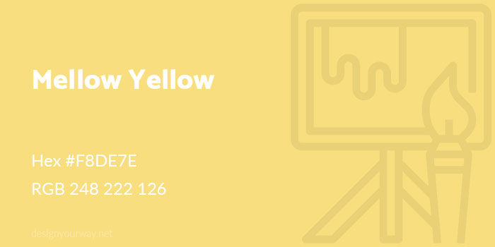
Hex #F8DE7E
RGB 248 222 126
Royal Yellow Color
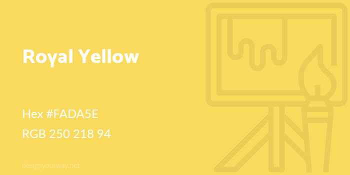
Hex #FADA5E
RGB 250 218 94
Gold Color
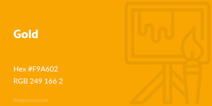
Hex #F9A602
RGB 249 166 2
Cyber Yellow Color
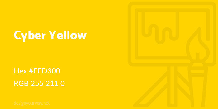
Hex #FFD300
RGB 255 211 0
Trombone Color
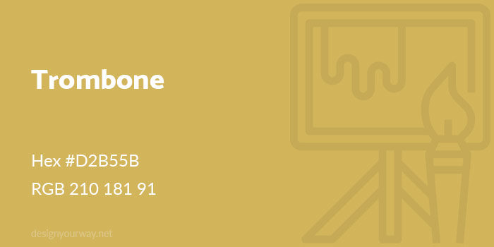
Hex #D2B55B
RGB 210 181 91
Khaki Color
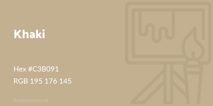
Hex #C3B091
RGB 195 176 145
Goldenrod Color
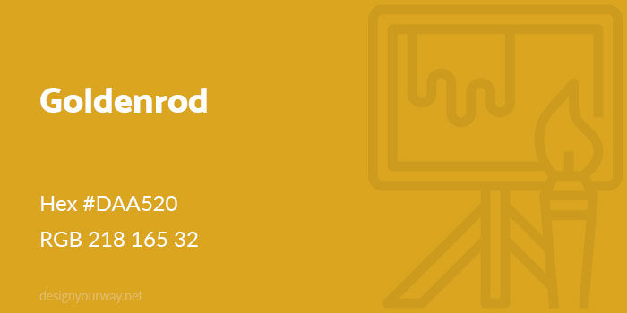
Hex #DAA520
RGB 218 165 32
Banana Color
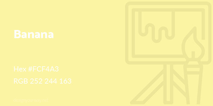
Hex #FCF4A3
RGB 252 244 163
Tuscany Color
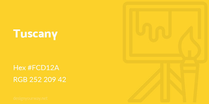
Hex #FCD12A
RGB 252 209 42
Honey Color
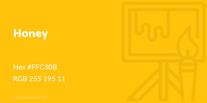
Hex #FFC30B
RGB 255 195 11
Dijon Color
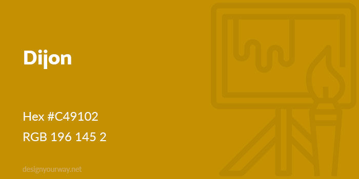
Hex #C49102
RGB 196 145 2
Bumblebee Color
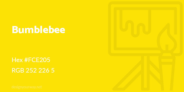
Hex #FCE205
RGB 252 226 5
Fire Yellow Color
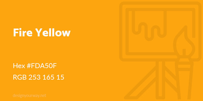
Hex #FDA50F
RGB 253 165 15
Ochre Color
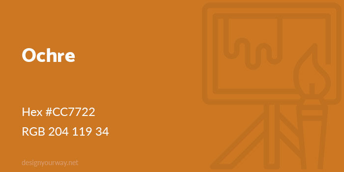
Hex #CC7722
RGB 204 119 34
Amber Color
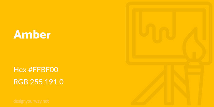
Hex #FFBF00
RGB 255 191 0
Flax Color
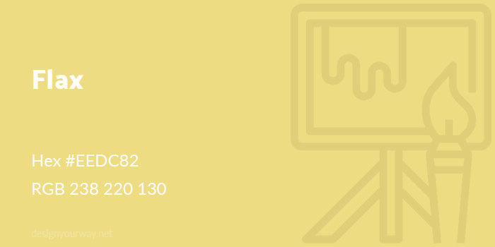
Hex #EEDC82
RGB 238 220 130
Cream Color
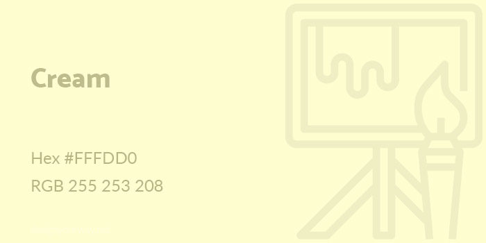
Hex #FFFDD0
RGB 255 253 208
Beige Color
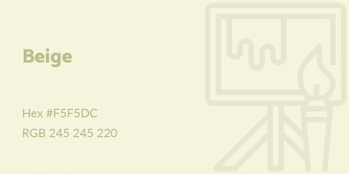
Hex #F5F5DC
RGB 245 245 220
Peach Color
Hex #FFE5B4
RGB 255 229 180
Lemon Color
Hex #EFFD5F
RGB 239 253 95
Laguna Color
Hex #F8E473
RGB 248 228 115
Mustard Color
Hex #FEDC56
RGB 254 220 86
Navajo Color
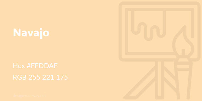
Hex #FFDDAF
RGB 255 221 175
Ecru Color
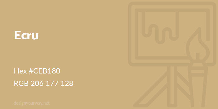
Hex #CEB180
RGB 206 177 128
Creating yellow color combinations
Now that you have an idea of the subtle shades of yellow available, you’ll be able to think of how to add shades of yellow into your designs. Yellow makes a sunny companion to darker colors, adding warmth as well as an eye catching appeal to your designs.
As mentioned earlier, yellow and blue make an attractive color combination, with the warmth of yellow contrasting with peaceful blues.
Purple contrasts highly with yellow, creating an attractive and vibrant effect.
Yellow mixed with deep greens remind us of buttercups or daffodils, giving an earthy appearance. Deep moss or olive greens will add an earthy touch.
Draw on lemon, orange and lime for a fresh, fruity palette.
Black, when combined with a bright yellow color, can create a modern, very striking look. Think of the industrial appeal of a bumble bee.
FAQ on shades of yellow
What are the different shades of yellow?
Yellow offers a spectrum of shades. Golden yellow exudes warmth, while lemon yellow brings a zesty brightness. Mustard yellow has a rich, earthy tone, and pastel yellow offers a soft, calming effect. Each shade, from sunflower yellow to amber yellow, carries its unique charm and energy.
How can I use shades of yellow in home decor?
In home decor, shades of yellow can create inviting and lively spaces. Light yellow walls can brighten a room, while dark yellow accents add depth. Yellow curtains, throw pillows, or a mustard yellow sofa can introduce warmth and vibrancy, enhancing your interior design with color harmonies.
What emotions are associated with yellow?
Yellow is often linked with feelings of happiness, energy, and warmth. It can uplift moods and evoke a sense of optimism. Color psychology suggests that bright yellow can stimulate mental activity, while soft yellow tones create a more relaxed and cheerful ambiance, perfect for home decor or fashion.
How does yellow impact fashion trends?
In fashion, yellow is a bold statement. Yellow dresses, handbags, and shoes can add a pop of color and exude confidence. Fashion designers often use shades like canary yellow or mustard yellow to create standout pieces that capture attention and convey a sense of fun and individuality.
What are some popular yellow paint colors?
Popular yellow paint colors include Benjamin Moore’s Hawthorne Yellow, Behr’s Honey Locust, and Sherwin-Williams’ Daisy. These shades range from soft and subtle to bold and bright, offering a variety of options to match any design aesthetic, from modern to rustic interiors.
Can yellow be used in branding and marketing?
Absolutely. Yellow can evoke feelings of happiness and positivity, making it a great choice for brands aiming to attract a cheerful and energetic audience. Companies like McDonald’s and Crayola use yellow in their branding to convey warmth and friendliness, leveraging the color psychology of yellow.
What are the complementary colors to yellow?
Complementary colors to yellow include purple and lavender, which create a striking contrast. In color theory, pairing yellow hues with these colors can produce visually appealing and balanced designs. Blue and green also work well, adding harmony and depth to color palettes.
How do I choose the right shade of yellow for my project?
Choosing the right shade of yellow depends on the mood and style you want to achieve. For a calming effect, opt for pastel yellow. If you want to make a bold statement, go with bright yellow or golden yellow. Consider the lighting and surrounding colors to find the perfect match.
What is the significance of yellow in different cultures?
In many cultures, yellow holds various significances. In Chinese culture, it symbolizes royalty and power. In the West, yellow often represents happiness and energy. Understanding these cultural associations can help in using yellow effectively in design and branding.
How does yellow affect user experience in web design?
In web design, yellow can draw attention and highlight key elements. It’s effective for call-to-action buttons and accents. However, it should be used sparingly to avoid overwhelming the user. Color psychology in web design suggests balancing yellow with neutral tones for an engaging and user-friendly experience.
Conclusion
Exploring the shades of yellow reveals a vibrant tapestry of hues, each carrying its unique essence and impact. From the cheerful brightness of canary yellow to the sophisticated depth of mustard yellow, these colors offer endless possibilities for home decor, fashion, and design.
Incorporating these yellow tones can transform spaces, evoke emotions, and create visual interest. Whether you’re aiming to brighten a room with light yellow walls or make a bold statement with golden yellow accents, understanding the versatility of yellow is key.
By embracing the color psychology of yellow, you can enhance moods and create inviting environments. Interior designers and fashion enthusiasts alike can benefit from the warmth and energy that yellow brings.
Incorporate the essence of yellow hues in your projects, and watch as they bring light, joy, and a touch of boldness to your creative endeavors. Embrace yellow, and let its brilliance illuminate your world.
If you enjoyed reading this article about using a yellow color palette, you should check out these about HTML color names, shades of blue, shades of red, green color palettes, orange color palettes, and shades of pink.
Renowned for his expertise in logo design and visual branding, Bogdan has developed a multitude of logos for various clients.
His skills extend to creating posters, vector illustrations, business cards, and brochures. Additionally, Bogdan's UI kits were featured on marketplaces like Visual Hierarchy and UI8.
He also wrote in the past years on sites like Design Your Way, WebDesignerDepot, WPDean, Designmodo, Speckyboy, Slider Revolution, and more.
- The Airtable Logo History, Colors, Font, And Meaning - 12 July 2026
- How to Blur Background in Canva: A Quick Tutorial - 11 July 2026
- Typography Trends - 10 July 2026
Bogdan Sandu is a seasoned designer who has been designing websites since 2008. Renowned for his expertise in logo design and visual branding, Bogdan has developed a multitude of logos for various clients. His skills extend to creating posters, vector illustrations, business cards, and brochures. Additionally, Bogdan's UI kits were featured on marketplaces like Visual Hierarchy and UI8. He also wrote in the past years on sites like Design Your Way, WebDesignerDepot, WPDean, Designmodo, Speckyboy, Slider Revolution, and more.
You Might Also Like