In the world of design, few colors evoke as much emotion and versatility as shades of pink. From the soft blush of dawn to the vibrant splash of fuchsia, pink has a unique ability to transform spaces, inspire fashion trends, and infuse art with life.
This article will delve into the enchanting spectrum of pink hues, uncovering their role in color theory, their impact on interior design, and their presence in fashion and branding.
Imagine decorating a room with peach pink walls, accessorized with flamingo pink cushions and a touch of mauve in the decor-each shade tells a story.
By the end of this journey, you’ll master the art of incorporating pink in your designs, ensuring your work is both captivating and harmonious.
Popular Shades of Pink
| Shade Name | HEX Code | RGB Values | Description |
|---|---|---|---|
| Baby Pink | #F4C2C2 | (244, 194, 194) | A very light and delicate pink, often associated with babies. |
| Blush | #DE5D83 | (222, 93, 131) | A medium pink with a slight red tint, like the color of flushed cheeks. |
| Carnation Pink | #FFA6C9 | (255, 166, 201) | A bright and cheerful pink, like the color of carnation flowers. |
| Cherry Blossom Pink | #FFB7C5 | (255, 183, 197) | A soft and pale pink, like the color of cherry blossoms. |
| Coral Pink | #F88379 | (248, 131, 121) | A medium pink with a slight orange tint, similar to coral. |
| Deep Pink | #FF1493 | (255, 20, 147) | A very bright and strong pink, often associated with boldness. |
| Hot Pink | #FF69B4 | (255, 105, 180) | A bright and intense pink, often associated with fun and playfulness. |
| Light Pink | #FFB6C1 | (255, 182, 193) | A very pale and soft pink, often associated with delicacy. |
| Magenta | #FF00FF | (255, 0, 255) | A very bright and vivid pink, leaning towards purple. |
| Misty Rose | #FFE4E1 | (255, 228, 225) | A very pale pink, with a slight hint of peach. |
| Orchid | #DA70D6 | (218, 112, 214) | A bright and vibrant pink with a purple tint, similar to the flower. |
| Pink | #FFC0CB | (255, 192, 203) | A classic, bright and cheerful pink. |
| Salmon Pink | #FF91A4 | (255, 145, 164) | A soft pink with a slight orange tint, like the color of salmon flesh. |
| Fuchsia | #FF00FF | (255, 0, 255) | A bright and vivid pink, leaning towards purple, similar to the flower. |
| Thulian Pink | #DE6FA1 | (222, 111, 161) | A medium pink with a slight purple tint, named after Thule. |
| Pale Pink | #FADADD | (250, 218, 221) | A very soft and pale pink, almost white. |
| Lavender Pink | #FBAED2 | (251, 174, 210) | A light pink with a hint of lavender. |
| Bubblegum Pink | #FFC1CC | (255, 193, 204) | A bright and playful pink, reminiscent of bubblegum. |
| Rose Pink | #FF66CC | (255, 102, 204) | A bright pink with a hint of purple, like the color of roses. |
| Ultra Pink | #FF6FFF | (255, 111, 255) | An extremely bright and vivid pink. |
| Shocking Pink | #FC0FC0 | (252, 15, 192) | A very bright and intense pink, almost neon. |
| Raspberry Pink | #E25098 | (226, 80, 152) | A medium pink with a slight red tint, like the color of raspberries. |
| Flamingo Pink | #FC8EAC | (252, 142, 172) | A bright and warm pink, similar to the color of flamingos. |
| Amaranth Pink | #F19CBB | (241, 156, 187) | A light pink with a hint of purple, named after the amaranth flower. |
| Tickle Me Pink | #FC89AC | (252, 137, 172) | A bright and playful pink, often associated with fun. |
| Brilliant Rose | #FF55A3 | (255, 85, 163) | A bright and vivid pink, like the color of rose petals. |
| Barbie Pink | #E0218A | (224, 33, 138) | A bright and playful pink, often associated with the Barbie brand. |
| Watermelon Pink | #FC6C85 | (252, 108, 133) | A bright pink with a hint of red, like the color of watermelon flesh. |
| Cerise Pink | #EC3B83 | (236, 59, 131) | A medium pink with a strong red tint, similar to the cerise fruit. |
| Blush Pink | #DE5D83 | (222, 93, 131) | A medium pink with a slight red tint, like the color of blushing cheeks. |
Using pink as a color palette
The pink color is associated with little girls, sweetness, cuteness, and softness. Pink has been associated with feminine charm, babies, sugary treats, bubble gum, and delicate flowers.
Using the color pink represents care and nurture, community, tenderness, friendship, inner peace, and harmony.
Using a pink color palette in design
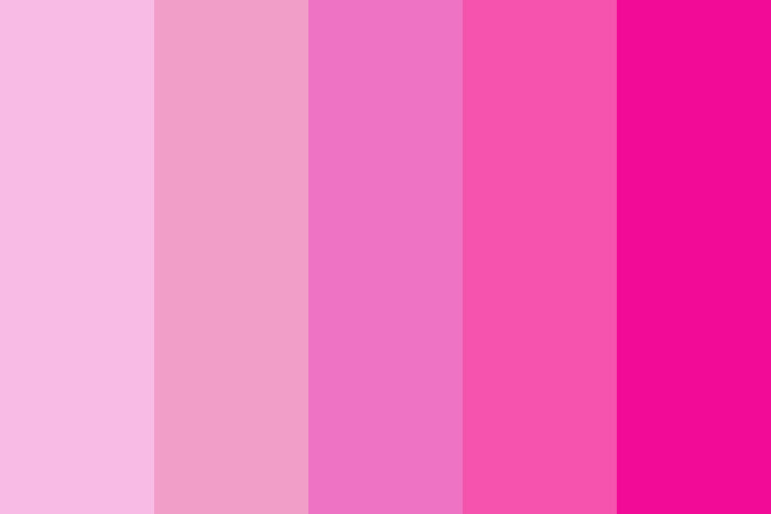
Pink has gentle connotations and a nurturing element. The pink color communicates compassion and unconditional love. Compassion means tenderness or taking action to tend to the needs of another. Pink combines the action color red with the light, insight, and understanding of white.
White mixed with red tames the passions of red, combining them with the inclusiveness, insight, and purity of white. The deeper the color pink, the more passionate and alive it becomes. A hot pink color would be more passionate than a rose pink color. The more pastel the color pink, the sweeter it will become.
As a representation of femininity, pink is relationship bound, caring, romantic, intimate and considerate. More gentle than red, it is loving and kind.
Pink gemstones are equally poetic or meaningful and are said to represent contentment, serenity, acceptance and relaxation. Wearing a pink gemstone is meant to soothe frustration and keep anxiety at bay.
When you use a pink color what does it represent in graphic design?
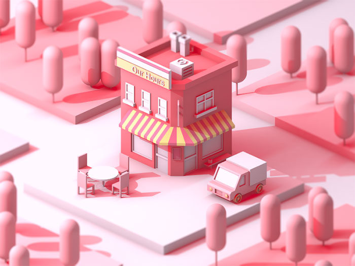
Unconditional love: a soft pink palette represents kindness, nurturing, romance and unconditional love.
Compassion: unconditional love is always compassionate and empathic and will offer nurture no matter what.
Nurturing: compassion is an action word, representing tenderness or nurturing. It is no surprise then that pink is seen as a nurturing color.
Hope: when compassion, love, and understanding are all present a positive future could be the only outcome. Pink is, therefore, representative of hope.
Other meanings behind a pink color scheme
- Pink represents health and the saying ‘in the pink’ stands for good health.
- To be ‘tickled pink’ is to be extremely happy or satisfied with an event.
- To be a ‘pink collar’ worker means to be a woman in the corporate world. The term is sometimes used negatively.
- To pink or use pinking shears means to create a cut out in a zigzag fashion.
Shades of Pink
If you are trying to select a pink color by looking at a pink color chart you’ll have found a long list of pink color choices. We’ll look at some of the more popular pink hex codes that you could use in your graphic design projects.
Salmon Color
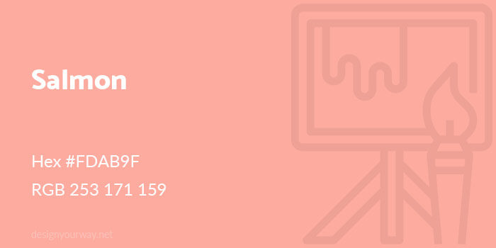
Hex #FDAB9F
RGB 253 171 159
Watermelon Color
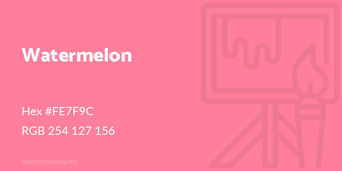
Hex #FE7F9C
RGB 254 127 156
Fandango Color
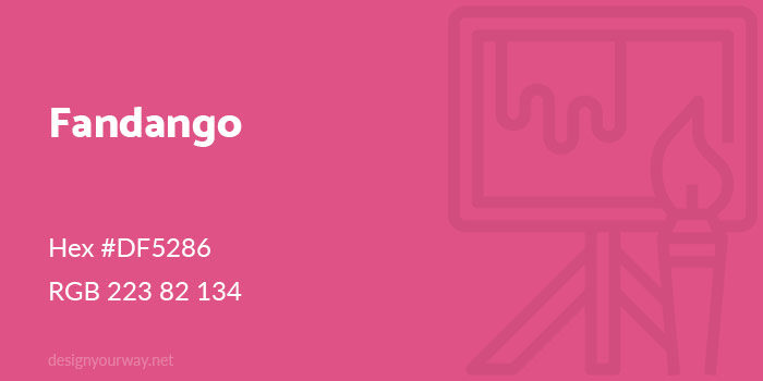
Hex #DF5286
RGB 223 82 134
Baby Pink Color
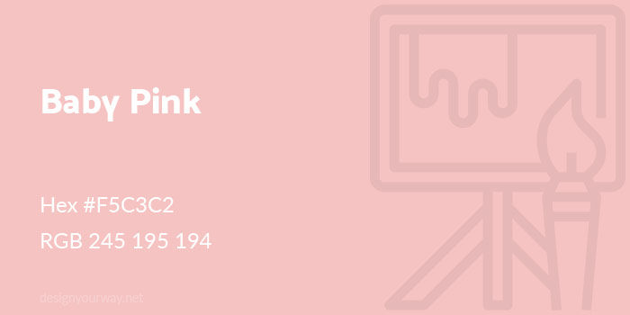
Hex #F5C3C2
RGB 245 195 194
Bubble Gum Color
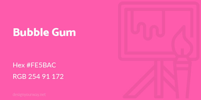
Hex #FE5BAC
RGB 254 91 172
Creamy Pink Color
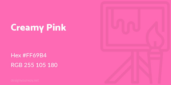
Hex #FF69B4
RGB 255 105 180
Taffy Pink Color
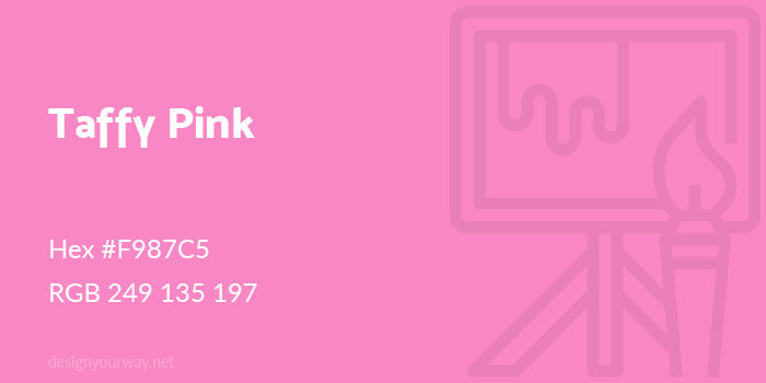
Hex #F987C5
RGB 249 135 197
Lavender Color
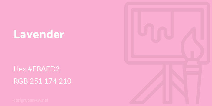
Hex #FBAED2
RGB 251 174 210
Amaranth Color
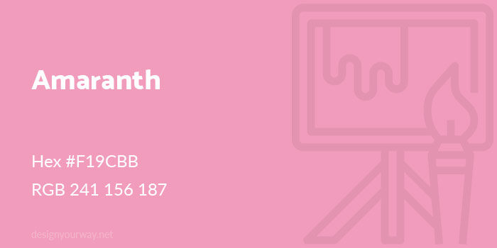
Hex #F19CBB
RGB 241 156 187
Rose Pink Color
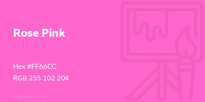
Hex #FF66CC
RGB 255 102 204
Brick Color
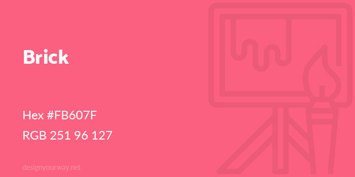
Hex #FB607F
RGB 251 96 127
Magenta Color
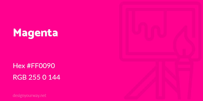
Hex #FF0090
RGB 255 0 144
Flamingo Color
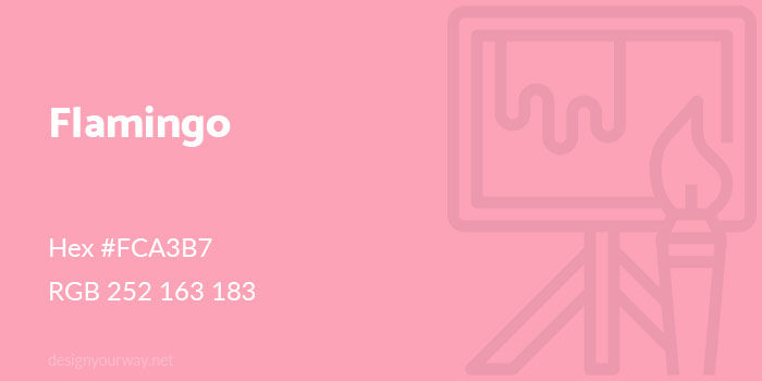
Hex #FCA3B7
RGB 252 163 183
Carnation Color
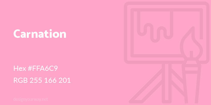
Hex #FFA6C9
RGB 255 166 201
Thulian Color
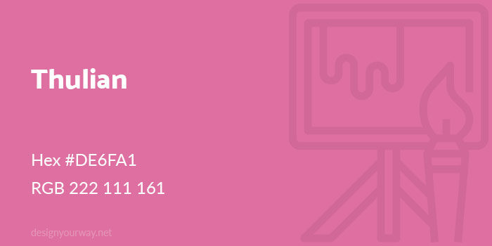
Hex #DE6FA1
RGB 222 111 161
Lemonade Color
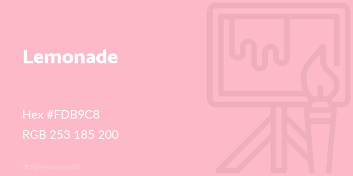
Hex #FDB9C8
RGB 253 185 200
Cerise Color
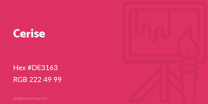
Hex #DE3163
RGB 222 49 99
Ultra Pink Color
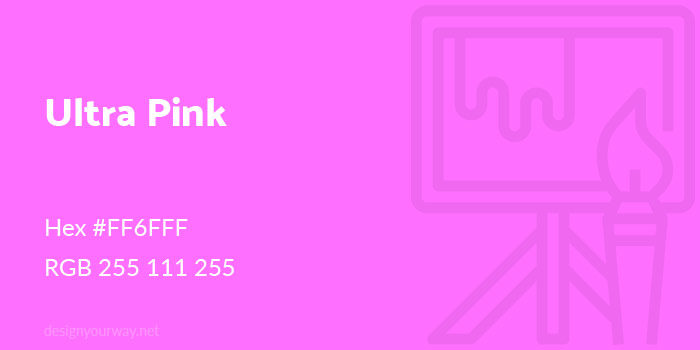
Hex #FF6FFF
RGB 255 111 255
Punch Color
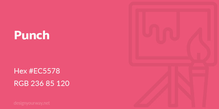
Hex #EC5578
RGB 236 85 120
French Rose Color
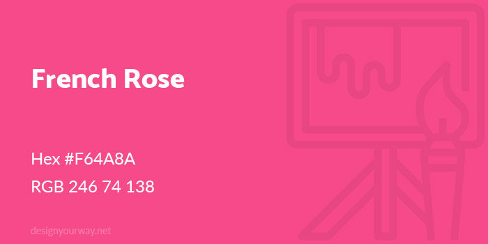
Hex #F64A8A
RGB 246 74 138
Ruby Color
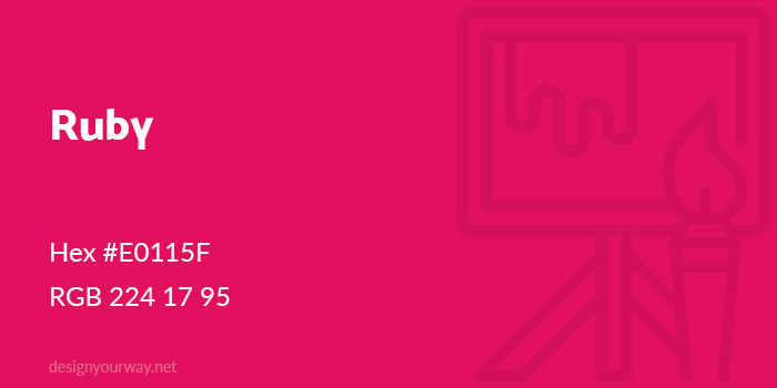
Hex #E0115F
RGB 224 17 95
Hot Pink Color
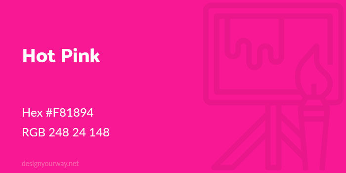
Hex #F81894
RGB 248 24 148
Fuchsia Color
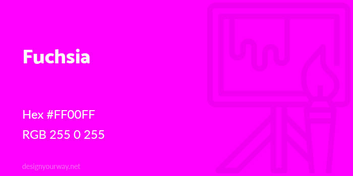
Hex #FF00FF
RGB 255 0 255
Pink Color
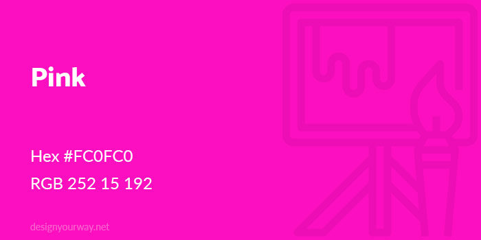
Hex #FC0FC0
RGB 252 15 192
Hot Pink hex code #F81894
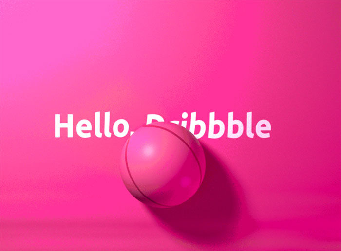
A hot pink color is closer to red than rose. As a result it is warm and passionate and is associated with warmth, love and happiness.
Carnation Pink
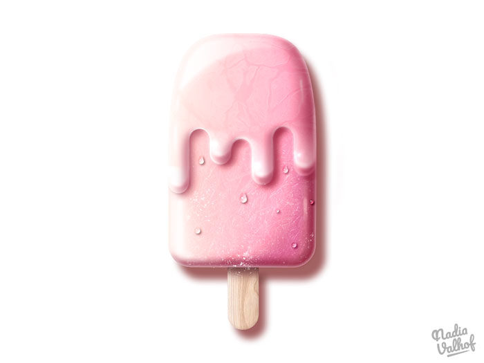
Can you believe that this beautiful color was actually created by crayon manufacturer Crayola? That’s right. This soft pink color resembles the beautiful carnation flower and has a delicate appeal.
Piggy Pink
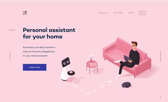
Did you know that pigs have their own unique pink color? It’s true, and this color now forms part of the pink palette available to designers.
Baby pink
Who can think of pink without a baby pink color coming to mind? Baby pink is exceptionally light and is often more white than pink. Baby pink shades can be traced back to 1928. In western culture, baby girls are often dressed in pink clothes or swaddled in pink blankets while baby boys use blue.
Light pink
Light pink is a deeper pink color than baby pink.
Cherry blossom pink
This beautiful pink colour is related to the gorgeous cherry blossom so celebrated in Japanese culture. Cherry blossoms are pale and fragile in colour and are a very valuable part of Japanese culture.
Lavender Pink
Beautiful lavender is a very popular scented plant. It is also considered to be a pink color. Sometimes the color is simply known as lavender. As part of the pink palette, it remains a favorite amongst girls.
Fuchsia Pink
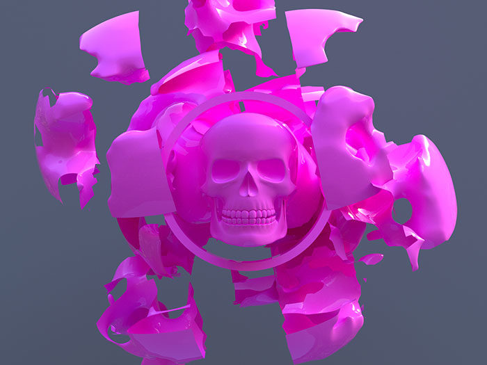
The fuchsia pink color is one of the purple-pink shades. It was named after the popular fuchsia plant and remains a favorite pink color amongst women.
China Pink
We don’t know why this pink color was called ‘China’ but this is one of the different shades of pink which have been added to the Plochere Color System.
Congo Pink
This pink is different from the other pink shades because it is more orange in tone. This pink color is more than a century old, having been introduced in 1912.
Mexican Pink
Which pink shades could be more vibrant than Mexican pink? This pink color is extremely popular in costumes as well as in art. Mexican pink rose to popularity in the 1940s when it was used by Ramon Valdiosera.
Pink Lace
A new addition to the pink color palette, Pink Lace was introduced in 2001. Despite being new, pink lace is incredibly popular with girls. It is also one of the popular pink shades used in women’s lingerie.
FAQ on Shades of Pink
What are the most popular shades of pink?
Some of the most popular shades include blush pink, baby pink, rose pink, and hot pink. These hues are often featured in fashion trends, interior design, and even branding. Pantone and Sherwin-Williams often highlight these in their color palettes, emphasizing their timeless appeal.
How can I use pink in interior design?
Incorporate pale pink for a soothing effect in bedrooms or coral pink for vibrant living spaces. Sherwin-Williams offers a range of pinks suitable for any decor. Balance pink walls with neutral furniture or use pink accents like cushions and throws to add a pop of color.
Which shades of pink are best for weddings?
Blush pink, dusty pink, and lavender pink are popular choices for weddings. These shades create a romantic and elegant atmosphere. Incorporate them into bouquets, table settings, and bridesmaid dresses to enhance the overall aesthetic. Pinterest is a great source for wedding inspiration.
What does the color pink symbolize?
Pink often symbolizes love, compassion, and nurturing. In color psychology, it’s associated with warmth and calmness. Different shades can evoke different feelings; for instance, baby pink feels gentle and comforting, while hot pink can feel bold and energetic.
How can I wear pink without it looking too overwhelming?
Start with small accents like a bubblegum pink scarf or rose pink shoes. Gradually introduce larger pieces like a fuchsia dress or mauve blouse. Vogue often showcases how to incorporate pink into outfits stylishly, making it approachable for everyday wear.
Are there any shades of pink that work well in branding?
Yes, magenta and raspberry pink are vibrant choices often used in branding for their bold and memorable impact. Companies like Victoria’s Secret use these shades to stand out. Color theory suggests these hues can attract attention and convey confidence.
Can pink be used in professional settings?
Absolutely. Peach pink or dusty pink can add a sophisticated touch to office spaces without being too bold. Use pink in accent walls, office decor, or accessories. HGTV often features professional settings using pink tastefully, demonstrating its versatility.
How do different shades of pink affect mood?
Lighter shades like baby pink and pale pink can create a calming and nurturing environment, ideal for bedrooms or relaxation areas. Brighter shades like hot pink and magenta can energize and uplift, making them great for creative spaces or accent pieces.
Are pink gemstones popular?
Yes, pink gemstones like rose quartz and pink sapphires are highly valued for their beauty and rarity. These stones are often used in jewelry, adding a touch of elegance and femininity. Sephora even features beauty products inspired by these precious stones.
What are some unique ways to use pink in art?
Experiment with watermelon pink and cherry blossom pink in paintings or digital art. These shades can add depth and interest to your work. Many artists explore the full spectrum of pink to convey different emotions and themes. Pinterest is a great platform for discovering innovative pink art.
Conclusion
In conclusion, exploring the vast shades of pink opens up a world of creative possibilities. From the delicate blush pink that adds subtle elegance to any room, to the vibrant fuchsia that commands attention in fashion, pink is a color that transcends boundaries.
Whether you’re incorporating peach pink into your interior design for a warm, inviting space, or using magenta in branding to create a bold statement, the versatility of pink is unmatched. Sherwin-Williams and Benjamin Moore provide the perfect palettes to experiment with these hues, while platforms like Pinterest and Instagram offer endless inspiration.
By understanding the significance and emotional impact of different pinks, you can make informed choices that resonate with your audience.
Pink isn’t just a color-it’s an expression, a mood, a statement. Embrace the full spectrum and let the shades of pink elevate your design projects, leaving a lasting impression that’s both captivating and sophisticated.
If you enjoyed reading this article about using a pink color palette, you should check out these about HTML color names, shades of blue, shades of red, green color palettes, orange color palettes, and shades of yellow.

Renowned for his expertise in logo design and visual branding, Bogdan has developed a multitude of logos for various clients.
His skills extend to creating posters, vector illustrations, business cards, and brochures. Additionally, Bogdan's UI kits were featured on marketplaces like Visual Hierarchy and UI8.
He also wrote in the past years on sites like Design Your Way, WebDesignerDepot, WPDean, Designmodo, Speckyboy, Slider Revolution, and more.
- Canva vs PowerPoint: Which Is Better for Presentations? - 22 September 2026
- How to Install Fonts on Mac (Step-by-Step Guide) - 20 September 2026
- From Mockup to Code: How AI-Augmented Development Speeds Up the Design Handoff - 19 September 2026

Bogdan Sandu is a seasoned designer who has been designing websites since 2008. Renowned for his expertise in logo design and visual branding, Bogdan has developed a multitude of logos for various clients. His skills extend to creating posters, vector illustrations, business cards, and brochures. Additionally, Bogdan's UI kits were featured on marketplaces like Visual Hierarchy and UI8. He also wrote in the past years on sites like Design Your Way, WebDesignerDepot, WPDean, Designmodo, Speckyboy, Slider Revolution, and more.
You Might Also Like