The Apple logo stands as one of the most recognized corporate symbols on the planet. That simple bitten apple silhouette has become shorthand for innovation, premium design, and the tech industry itself.
Within the history of technology company branding, few marks carry this kind of weight. The current monochrome version was introduced in 1998, though designer Rob Janoff created the original bitten apple shape back in 1977.
Apple Inc. was founded in 1976. Since then, the company has used roughly six major logo variations. Each one reflected where Apple stood at that moment in time, and where they wanted to go next.
What is the Apple Logo?
The Apple logo is a stylized apple silhouette with a bite taken from the right side and a leaf extending from the top. Rob Janoff designed it in 1977 for the Regis McKenna advertising agency. It symbolizes knowledge, discovery, and accessible technology.
Design Attributes
- Design Type: Abstract icon (pictorial mark)
- Primary Elements: Apple silhouette, bite mark, single leaf
- Official Introduction Date: 1977 (original rainbow version)
- Designer: Rob Janoff, Regis McKenna Agency
- Trademark Status: Registered trademark of Apple Inc., protected globally across multiple classes
- Current Color Palette: Monochrome black (#000000) or white (#FFFFFF), with gradient variations for specific applications
- Usage Context: Products, retail stores, packaging, digital platforms, marketing materials, Apple Park signage
How Has the Apple Logo Evolved Over Time?
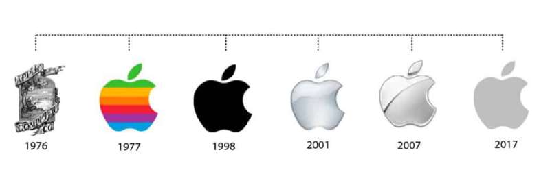
The Apple logo has gone through six major versions since 1976. It started as a complex illustration, became a rainbow icon, then shifted to monochrome and eventually gained depth through gradient effects.
Today it exists as a flat, single-color mark.
Original Newton Logo (1976-1977)
- Years Active: 1976-1977
- Design Description: Intricate pen-and-ink illustration showing Isaac Newton sitting beneath an apple tree, framed by a ribbon banner reading “Apple Computer Co.”
- Color Scheme: Black and white line drawing
- Designer: Ronald Wayne (Apple co-founder)
- Context: Created for Apple’s founding. Wayne wanted to reference Newton’s apple and the discovery of gravity as a metaphor for intellectual discovery.
- Cultural Significance: It represented Apple’s early identity as a company for thinkers and hobbyists. Too complex for commercial use, though.
Rainbow Apple Logo (1977-1998)
- Years Active: 1977-1998
- Design Description: Simplified apple silhouette with horizontal rainbow stripes in green, yellow, orange, red, purple, and blue
- Color Scheme: Six-color rainbow palette
- Designer: Rob Janoff
- Context: Steve Jobs commissioned a simpler, more modern logo. The rainbow colors highlighted the Apple II’s color display capabilities.
- Key Changes from Previous: Complete departure from illustration to clean iconography
- Cultural Significance: Became synonymous with the personal computer revolution and later, unintentionally, with LGBTQ+ pride
Monochrome Apple Logo (1998-2000)
- Years Active: 1998-2000
- Design Description: Same silhouette, single solid color (typically black)
- Color Scheme: Black or white depending on background
- Designer: Apple internal design team
- Context: Steve Jobs returned to Apple and initiated a brand overhaul. The iMac G3 launch called for something cleaner.
- Key Changes from Previous: Rainbow stripes removed entirely
- Cultural Significance: Signaled Apple’s shift toward minimalist design philosophy
Aqua/Glossy Apple Logo (2001-2007)
- Years Active: 2001-2007
- Design Description: Three-dimensional appearance with glossy, gel-like finish matching Mac OS X Aqua interface
- Color Scheme: Various colors with reflective highlights, often blue or silver
- Designer: Apple internal design team
- Context: Mac OS X introduced the Aqua design language. The logo followed suit.
- Key Changes from Previous: Added dimensionality and shine
- Cultural Significance: Represented the early 2000s trend of skeuomorphic design
Chrome/Glass Apple Logo (2007-2013)
- Years Active: 2007-2013
- Design Description: Metallic chrome finish with reflections and depth, often appearing silver or gunmetal
- Color Scheme: Chrome silver with gradient reflections
- Designer: Apple internal design team under Jony Ive
- Context: iPhone launch era. Hardware design became more premium, logo matched.
- Key Changes from Previous: More sophisticated metallic rendering
- Cultural Significance: Aligned with Apple’s luxury tech positioning
Flat Apple Logo (2013-Present)
- Years Active: 2013-Present
- Design Description: Completely flat, no gradients, no shadows, pure silhouette
- Color Scheme: Single color, typically black, white, or silver
- Designer: Apple internal design team
- Context: iOS 7 brought flat design. The logo stripped away all ornamentation to match.
- Key Changes from Previous: Removed all dimensional effects
- Cultural Significance: Set the standard for modern corporate identity in tech
What Do the Design Elements of the Apple Logo Mean?
The bitten apple carries layers of meaning. It references knowledge, from the biblical fruit to Newton’s discovery.
The bite mark makes the shape instantly recognizable as an apple rather than a cherry or tomato.
It also creates a visual pun on “byte,” the computing term.
Why Did Apple Choose These Specific Colors?
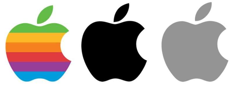
The original rainbow colors served a practical purpose. They showed off the Apple II’s ability to display color graphics.
Green sat at the top because, according to Janoff, that’s where the leaf was. Jobs wanted the stripes ordered logically, but not perfectly.
Today’s monochrome color approach reflects something different entirely. Black (#000000) projects sophistication and authority. White (#FFFFFF) suggests purity and simplicity.
Both work on any background. Both print cheaply. Both feel timeless in a way rainbow stripes never could.
What Typography Style Is Used in the Apple Logo?
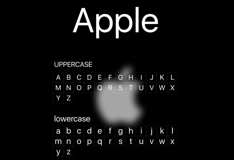
The Apple logo itself contains no text. It’s a pure symbol.
But when paired with the company name, Apple has used several typefaces over the years. The Mott font appeared early on. Then came Apple Garamond, which stuck around for decades.
Since 2017, San Francisco (Apple’s custom sans-serif typeface) handles all brand typography. It was built specifically for screen readability across Apple devices.
What Are the Hidden Meanings in the Apple Logo?
Some people claim the logo follows the golden ratio perfectly. Rob Janoff has said that’s not true. He designed it by eye.
The bite mark? Just to show scale and make the fruit identifiable. No deeper meaning there.
Theories about Alan Turing (who died eating a cyanide-laced apple) have been debunked. Janoff didn’t know about Turing when designing it. Happy coincidence, maybe. Intentional tribute, no.
How Does the Apple Logo Compare to Competitor Logos?
Most tech companies lean on wordmarks or abstract shapes. Microsoft has its four-color window. Google uses a multicolored wordmark. Samsung sticks to blue text.
Apple stands alone with its pictorial approach. The symbol works without any text at all.
This gives Apple an advantage in global markets. The logo needs no translation. Compare this to the Salesforce logo or the Zoom logo, both of which rely heavily on their wordmarks for recognition.
The SpaceX logo takes a similar wordmark-dependent approach. Apple’s icon-first strategy remains unusual in the industry.
What Are the Technical Specifications of the Apple Logo?
Official Color Codes
- Primary Black
- Hex: #000000
- RGB: (0, 0, 0)
- CMYK: (0, 0, 0, 100)
- Primary White
- Hex: #FFFFFF
- RGB: (255, 255, 255)
- CMYK: (0, 0, 0, 0)
- Apple Gray (Secondary)
- Hex: #A2AAAD
- RGB: (162, 170, 173)
- Pantone: Cool Gray 6C
Dimensions and Proportions
- Aspect Ratio: Approximately 1:1.22 (width to height)
- Minimum Size: 10mm height for print, 40 pixels for digital
- Clear Space: Minimum padding equal to the height of the leaf on all sides
- File Formats: Available as vector files (SVG, EPS, AI) and raster formats (PNG, JPG) through official channels
What Cultural Impact Has the Apple Logo Had?
The logo transcends its corporate origins. It appears in street art, tattoos, and counterfeit goods worldwide.
People display it as a status symbol. Seeing a glowing Apple logo on a laptop lid became a cultural moment in cafes everywhere during the 2000s.
Apple eventually flipped the orientation so the logo appeared right-side-up to observers rather than to the user. That decision said everything about how the brand viewed public perception.
How Does the Apple Logo Fit Into the Overall Brand Identity?
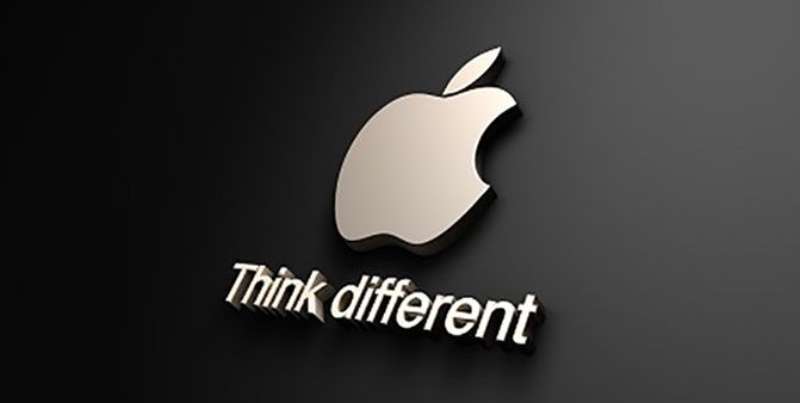
The logo anchors Apple’s entire visual system. Every product, every store, every ad references it.
Apple’s brand guidelines treat the logo with almost religious care. Consistent application across touchpoints creates instant recognition.
The retail stores feature giant backlit logos. Product packaging shows small embossed versions. Digital interfaces use it as a navigation element. Everything connects back to that single shape.
How Should the Apple Logo Be Used?
Official Usage Guidelines
- Do: Use official artwork from Apple’s media resources
- Do: Maintain proper clear space around the logo
- Do: Use approved color variations only
- Don’t: Stretch, rotate, or distort the logo
- Don’t: Add effects like shadows, outlines, or gradients
- Don’t: Place on busy backgrounds that reduce legibility
Accessing Official Logos
Apple provides official logo files through the Apple Identity Guidelines and press resources portal. Third-party use requires explicit licensing agreements.
Trademark Protection
The Apple logo is registered in virtually every country. Apple actively defends the trademark, having famously disputed uses by small businesses, bands, and even other fruit-related companies.
Unauthorized commercial use will attract legal attention. Educational or editorial use (like this article) falls under fair use in most jurisdictions.
FAQ on The Apple Logo
Who Designed the Apple Logo?
Rob Janoff created the iconic bitten apple symbol in 1977. He worked at Regis McKenna Agency at the time.
Steve Jobs commissioned the redesign after rejecting Ronald Wayne’s original Newton illustration. Janoff completed the logo design process in just two weeks.
Why Does the Apple Logo Have a Bite Taken Out of It?
The bite exists for scale and proportion reasons. Without it, the silhouette could be mistaken for a cherry or tomato.
Rob Janoff added it purely for recognition. The “byte” pun? Happy accident. He didn’t plan that connection to computing terminology.
What Does the Apple Logo Symbolize?
The bitten apple meaning connects to knowledge and discovery. Think Isaac Newton. Think forbidden fruit.
Apple Inc built their brand style around making technology accessible. The logo reflects that mission through its simple, approachable shape.
When Was the Apple Logo First Created?
The original Newton logo appeared in 1976. Ronald Wayne designed it. Lasted about a year.
The bitten apple we know today debuted in 1977 during the Apple II computer launch. That rainbow version defined Silicon Valley branding for two decades.
Why Did Apple Stop Using the Rainbow Logo?
Steve Jobs returned to Apple in 1997. He wanted a cleaner corporate aesthetic.
The rainbow stripe design felt dated. The 1998 iMac G3 launch brought the monochrome emblem. It matched the new product design language and signaled Apple’s visual identity evolution.
Is the Apple Logo Based on the Golden Ratio?
No. This myth keeps circulating, but Rob Janoff has denied it multiple times.
He designed the iconic tech symbol by eye, not mathematical formulas. The Fibonacci sequence connection is pure internet speculation. Good brand storytelling, though.
What Font Does Apple Use With Its Logo?
The logo itself contains no typography. It’s a standalone symbol.
For brand communications, Apple currently uses San Francisco typeface. Before that, they relied on Myriad Pro font. Apple Garamond handled font duties during the rainbow logo era.
What Color Is the Official Apple Logo?
The current Apple logo uses black or white depending on context. No fixed hue anymore.
Product packaging often shows silver or space gray versions. The logo color scheme adapts to whatever surface it sits on. Brand consistency comes from shape, not color.
How Much Did the Apple Logo Cost to Design?
Rob Janoff’s agency charged standard rates for the project. No exact figure exists publicly.
Compare this to the Pepsi logo redesign (reportedly $1 million) or BP’s rebrand ($211 million). Apple got extraordinary brand recognition value from relatively modest marketing identity investment.
Can I Use the Apple Logo for My Project?
Probably not legally. Apple holds trademark registration globally through the USPTO and international bodies.
They enforce trademark protection aggressively. Editorial use is fine. Commercial use without licensing? Expect a cease and desist letter from Cupertino, California.
Conclusion
The Apple logo proves that simplicity wins. Rob Janoff’s 1977 creation has outlasted countless design trends while maintaining instant brand recognition worldwide.
From rainbow stripes to monochrome, each evolution reflected where Apple stood culturally. The bitten apple silhouette now appears on everything from the iPhone to Apple Park headquarters.
Few corporate symbols achieve this level of icon status. The principles behind effective logo design are on full display here: clean shape, memorable form, endless adaptability.
Steve Jobs understood something fundamental. A logo isn’t just a mark. It’s a promise.

Renowned for his expertise in logo design and visual branding, Bogdan has developed a multitude of logos for various clients.
His skills extend to creating posters, vector illustrations, business cards, and brochures. Additionally, Bogdan's UI kits were featured on marketplaces like Visual Hierarchy and UI8.
He also wrote in the past years on sites like Design Your Way, WebDesignerDepot, WPDean, Designmodo, Speckyboy, Slider Revolution, and more.
- The Arc Browser Logo History, Colors, Font, And Meaning - 14 September 2026
- Canva vs Photoshop: When Does Each Make Sense? - 12 September 2026
- Briefing 3D Game Animation: Rigs, Clip Lists and Engine Handoffs - 11 September 2026

Bogdan Sandu is a seasoned designer who has been designing websites since 2008. Renowned for his expertise in logo design and visual branding, Bogdan has developed a multitude of logos for various clients. His skills extend to creating posters, vector illustrations, business cards, and brochures. Additionally, Bogdan's UI kits were featured on marketplaces like Visual Hierarchy and UI8. He also wrote in the past years on sites like Design Your Way, WebDesignerDepot, WPDean, Designmodo, Speckyboy, Slider Revolution, and more.
You Might Also Like