The Netflix Logo History, Colors, Font, and Meaning
Imagine a splash of bold color, A symbol that ignites recognition — Instantly transporting you to a world of drama, comedy, and storytelling.
This insignia isn’t just about catching your eye; it’s a portal into the streaming service phenomena that’s redefined our viewing experience.
Yes, I’m talking about the Netflix logo. It’s not just a brand mark; it’s an entity that encapsulates the essence of an entire digital entertainment empire.
Together, we’ll delve into the genesis of this iconic emblem, exploring its evolution, dissecting the brand identity it conveys, and unveiling the immense role it plays in brand recognition.
I’ll unravel the threads of design theory embedded within — the psychological play of its signature red color, the careful consideration of typography, and the adaptability that keeps it fresh yet familiar across streaming devices.
Stepping through this doorway, you’ll learn the intricacies that transform a simple graphical element into a visual language synonymous with binge-worthy content. Prepare to view the Netflix logo through a new lens.
The Meaning Behind the Netflix Logo
![]()
Dive in with me, let’s uncover some layers here. Netflix’s logo has got a lot more to say than you’d initially think, and that’s the fun part about design!
A Sea of Possibilities
First off, you see that clean, crisp “N”? Netflix makes a bold statement with it. It stands tall, reaching out to you, right? It’s as if it’s saying, Hey, we’ve got stories taller than skyscrapers, wider than oceans.
Simple Yet Deep
Then there’s the simplicity. Simple, clean lines, nothing extra. It’s all about the content, baby. It tells you Netflix is like a clear canvas, a fresh start, opening a world of stories for you to dive into.
The History of the Netflix Logo
![]()
Let’s take a walk down memory lane, folks. The Netflix logo’s journey is a story of adaptability and staying relevant.
From DVDs to Digital
Once upon a time, back in 1997, the logo was a film reel. But Netflix didn’t stay a DVD rental service forever, right? So, the logo evolved with the company. The reel turned into text as Netflix went digital.
Onward and Upward
Then, as Netflix climbed its way to being a global streaming service, the logo took on a more mature, refined look. It’s like watching a startup grow up into a global company. They held on to their roots with the red, but added a new spin to the whole story.
The Colors of the Netflix Logo
Color is everything, ain’t it? It speaks without words. So let’s see what the Netflix logo colors are saying.
Red is the New Black
Netflix’s signature red? That’s a shout-out to its early days as a DVD service. It’s also the color of passion, energy, and excitement – everything that Netflix wants you to feel.
Back in Black
And the black? It’s bold, it’s powerful. It means business. It tells you Netflix is serious about entertainment.
The Font Used in the Netflix Logo
![]()
Ah, the font. Fonts speak volumes, and the Netflix font is no different.
Bold and Beautiful
Netflix’s font is bold. It’s got this strength, this power. It’s like it’s saying Yeah, we’re here, and we’re here to stay. It’s got a voice that speaks loud and clear.
Modern and Classy
Then there’s the style. It’s modern, yet it’s got this timeless class about it. It’s telling you Netflix is all about pushing boundaries, but without forgetting its roots.
How the Logo Reflects Netflix’s Vision
Ever wondered how the Netflix logo mirrors the company’s vision? Let’s find out.
Global Ambitions
The sleek and modern Netflix logo stands for global ambitions. It’s all about making it big, reaching out to every corner of the world.
The Content King
The logo’s focus on simplicity underlines the company’s belief in ‘Content is King’. It’s as if it’s telling you, Hey, we don’t need any fancy stuff. Our content speaks for itself.
The Logo’s Role in Branding
Netflix’s logo plays a crucial role in branding, setting the stage for its relationship with viewers.
Creating an Identity
First, it creates an identity. That red ‘N’ on your screen is as recognizable as a best friend’s face. You see it, and you know you’re about to dive into a sea of stories.
Evolving with Viewers
The logo’s evolution also reflects the company’s growth alongside its viewers. It’s Netflix telling us, We’re evolving, just like you.
The Netflix Logo: A Cultural Icon
Let’s talk about how the Netflix logo has become a cultural icon in today’s world.
It’s Everywhere
Seeing that red ‘N’ is like spotting a celebrity in a crowd. It’s everywhere, from billboards to screens, becoming a part of our everyday lives. It’s like Netflix is a constant companion, telling you it’s always there when you need a break.
Shaping the Streaming Conversation
The Netflix logo has also shaped the conversation around streaming services. When you think streaming, you think Netflix. The logo stands as a symbol of the streaming revolution.
So, there you have it, folks! The Netflix logo is so much more than a bunch of lines and colors. It’s a story, an identity, a cultural icon. It’s Netflix telling us their story, in their own unique language of design.
FAQ On The Netflix Logo
What does the Netflix logo represent?
The Netflix logo is more than a visual stamp; it’s the heart of the brand’s identity. It’s that red N that stands tall like a beacon, beckoning viewers to dive into an ocean of films and original series.
It encapsulates Netflix’s promise to deliver endless entertainment directly to your favorite streaming devices.
Has the Netflix logo changed over time?
Absolutely. Just like a caterpillar to a butterfly, the logo evolution reflects Netflix’s growth. It’s moved from a cinematic marquee to a cleaner, more digital-friendly image.
This rebranding mirrors Netflix’s own transformation from a DVD rental service to a streaming powerhouse.
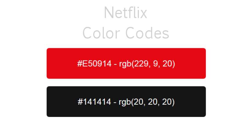
What color is the Netflix logo?
That’s the kind of red you can’t miss—the bold, confident hue that screams “Netflix.” It’s more than just color psychology; it’s an icon in the digital branding space. Technically, it’s this zesty RGB: 229, 9, 20. But emotionally? It’s the warm glow of your next movie night.
Can the Netflix logo be used freely?
Not exactly – it’s a trademark, guarded like a dragon does its gold. Netflix has brand guidelines tighter than a drum.
They put down rules for intellectual property use, so unless you’ve got Netflix, Inc. giving the nod, best to keep hands off for any commercial or public use.
Why is the Netflix logo so simple?
Simplicity is king in the digital realm. Modern graphic design leans towards minimalism, and Netflix got the memo. A typographic logo, clean lines—it’s all about standing out without shouting out. Think of it as a whisper that manages to drown out the noise.
What is the significance of the Netflix “N”?
That singular “N” isn’t just a letter; it’s a symbol loaded with brand equity. It brings to mind every Netflix show you’ve ever loved. It’s not a stretch to say it’s become nearly as iconic as the golden arches or the swoosh. It’s Netflix’s visual shorthand and its digital emblem.
Is there meaning behind the Netflix logo font?
Every stroke of that font is a calculated move. The custom typography—called Netflix Sans, by the way—is unique to them, reducing licensing costs and maintaining brand consistency. It’s also highly versatile, crucial for a global brand as ubiquitous as Netflix.
What guidelines exist for using the Netflix logo in marketing?
Netflix offers a whole roadmap of branding consistency for its logo. They encapsulate the do’s and don’ts, from size and color to spacing and placement.
Following these brand guidelines ensures the logo design maintains its integrity across various marketing materials and platforms.
Does the Netflix logo play a role in its user interface design?
Big-time. In user experience (UX), every detail counts, and the Netflix logo sets the stage. It’s the visual cue that you’re in the right place—a familiar friend in the vast sea of content. That “N”, sitting snug in the corner, anchors the user experience with poise.
How does the Netflix logo impact its brand recognition?
That logo’s like a secret handshake—it’s the visual identity system that sets Netflix apart. In a sea of competitors, it’s the brand image that cuts through the static, capturing user attention. One glance and you’ve got the whole story: quality entertainment at a click.
Conclusion
We’ve taken quite the journey, pacing through the contours of that distinct Netflix logo. It’s not just an emblem; it’s the flag under which an armada of digital media sails, making waves in our cultural landscape.
- It stands out, a red beacon calling to endless stories, original content, and experiences.
- It’s testament to how a visual identity can be both whisper and shout in the vast realm of streaming services.
- It shows how brand consistency carves corporate identity into the public consciousness.
As the screen dims and the credits roll on our exploration, keep these flashes of insight close. The next time that red “N” flares to life on a screen, remember the intricate dance of design, brand equity, and digital branding at play. It’s a lesson in how branding consistency, visual elements, and an iconic color scheme can etch an identity deep into the heart of viewing habits, worldwide.
For every tap on a Netflix app, for every cursor hovering over that N-shaped beacon, there’s a recognition that shoots beyond understanding—it’s branding woven into the very fabric of entertainment.
If you liked this article about the Netflix logo, you should check out this article about the new Patreon logo.
There are also similar articles discussing the Facebook logo, the Amazon logo, the Apple logo, and the Twitter logo.
And let’s not forget about articles on the Microsoft logo, the Samsung logo, the Airbnb logo, and the IBM logo.
Bogdan Sandu, a seasoned designer with 15 years of diverse experience, has been designing websites since 2008.
Renowned for his expertise in logo design and visual branding, Bogdan has developed a multitude of logos for various clients.
His skills extend to creating posters, vector illustrations, business cards, and brochures. Additionally, Bogdan's UI kits were featured on marketplaces like Visual Hierarchy and UI8.
Latest posts by Bogdan Sandu (see all)
- The Bethesda Logo History, Colors, Font, And Meaning - 28 April 2024
- Out of This World: Space Color Palettes for Cosmic Designs - 28 April 2024
- The Bungie Logo History, Colors, Font, And Meaning - 27 April 2024