The Monday.com logo represents one of the most recognizable marks in the project management software industry. This vibrant brand identity sits at the heart of a platform that’s transformed how teams collaborate and manage workflows since its launch in 2014.
The current Monday.com logo features a bold wordmark paired with their signature color palette, introduced during their 2019 rebrand. Designer and branding agency Sagmeister & Walsh crafted this iteration, moving away from the company’s original dapulse identity.
Founded by Roy Mann and Eran Zinman in Tel Aviv, Monday.com has undergone three major logo iterations. Each redesign reflected the platform’s evolution from a simple task tracker to a comprehensive Work OS serving millions of users globally.
What is the Monday.com Logo?
The Monday.com logo is a lowercase sans-serif wordmark featuring the company name in a custom typeface, officially introduced in 2019 during a comprehensive rebrand by Sagmeister & Walsh. The design incorporates bright, energetic colors and clean typography that symbolizes the platform’s approachable, user-friendly nature in simplifying complex work processes.
Design Type: Wordmark with color accent elements
Primary Elements:
- Lowercase typography
- Custom sans-serif typeface
- Multi-color dot accents (variable placement)
- Clean, geometric letterforms
Official Introduction Date: September 2019
Designer/Agency: Sagmeister & Walsh (New York-based design studio)
Trademark Status: Registered trademark owned by monday.com Ltd., Tel Aviv, Israel
Color Palette:
- Primary Pink: #FF3D57
- Primary Purple: #6C6CFF
- Accent Green: #00D647
- Accent Orange: #FDAB3D
- Accent Blue: #0086C0
- Text Black: #323338
Usage Context: Digital platforms, marketing materials, product interface, merchandise, investor presentations, corporate communications, app icons, social media profiles
How Has the Monday.com Logo Evolved Over Time?

The Monday.com logo has undergone three distinct phases since the company’s founding in 2014. Each transformation marked a significant shift in the company’s positioning, from a simple productivity tool to a comprehensive work operating system serving enterprise clients and small teams alike.
The most dramatic change came in 2019 when the company completely rebranded from dapulse to Monday.com. This wasn’t just a logo tweak but a fundamental reimagining of the brand’s visual language and market positioning.
Original dapulse Logo (2014-2017)
Years Active: 2014-2017
Design Description: The original dapulse logo featured a circular pulse icon combined with lowercase typography in a standard sans-serif font. The mark emphasized the “pulse” concept with concentric circles suggesting activity and movement.
Color Scheme: Deep blue (#2E5C8A) as the primary color with white text
Designer: In-house design team
Context: Launched when the platform was a simple team collaboration tool, the dapulse name and logo reflected the company’s focus on keeping teams “in sync” with their project pulse.
Key Changes from Previous: This was the inaugural brand identity
Cultural Significance: Represented the early wave of visual-first project management tools competing against text-heavy platforms like Basecamp and traditional enterprise software
Transitional dapulse Logo (2017-2019)
Years Active: 2017-2019
Design Description: A refined version that introduced brighter colors and a more playful aesthetic. The pulse icon became more stylized, and the typography shifted to a friendlier, rounder sans-serif.
Color Scheme: Introduced multiple accent colors including pink (#FF0077), purple (#6C6CFF), and green (#00CA72)
Designer: Internal creative team with external consultants
Context: As the platform expanded features and user base, the brand needed to feel more dynamic and less corporate. This transitional period tested elements that would later appear in the Monday.com rebrand.
Key Changes from Previous: Brightened color palette, softer typography, more compact logo lockup
Cultural Significance: Reflected the shift toward “delightful” software design popularized by companies like Slack and Dropbox
Current Monday.com Logo (2019-Present)
Years Active: 2019-Present
Design Description: A complete departure featuring the new “monday.com” wordmark in lowercase letters with a custom geometric sans-serif typeface. Colorful dots or shapes often accompany the wordmark in various configurations, though the core logo can stand alone in black.
Color Scheme: Multi-color system with pink, purple, green, orange, and blue as primary brand colors, with black for the primary wordmark
Designer: Sagmeister & Walsh in collaboration with Monday.com’s internal team
Context: The rebrand coincided with aggressive expansion into enterprise markets and international growth. The name change to Monday.com made the brand more memorable and eliminated confusion around pronunciation of “dapulse.”
Key Changes from Previous: Complete name change, elimination of icon-based mark, introduction of flexible color system, custom typography, lowercase styling
Cultural Significance: Positioned Monday.com alongside tech giants with simple, confident wordmarks. The playful color system maintained approachability while the clean typography signaled enterprise readiness.
What Do the Design Elements of the Monday.com Logo Mean?
The Monday.com logo’s design elements communicate accessibility, energy, and the joy of getting work done. The lowercase wordmark deliberately breaks from traditional corporate styling to signal that this isn’t your typical enterprise software.
Each color in the palette represents different aspects of work and collaboration. The vibrant hues echo the platform’s customizable color-coding system, where users assign colors to task statuses, creating visual clarity in complex projects.
What Does the Lowercase Typography Symbolize?
The all-lowercase treatment creates an approachable, friendly feeling that contrasts with formal business software. This design choice reflects Monday.com’s mission to make work tools feel less intimidating and more human.
Lowercase typography has roots in Bauhaus design movements that emphasized functionality over formality. Modern tech brands like facebook (pre-Meta), adidas, and ebay have similarly used lowercase styling to appear accessible and contemporary.
The choice connects directly to the platform’s core value proposition: simplifying complex workflows. Just as lowercase letters feel less formal than capitals, Monday.com positions itself as less rigid than traditional project management systems.
Why Did Monday.com Choose These Specific Colors?

Primary Pink (#FF3D57)
Pink represents energy, creativity, and approachability. In color psychology, pink balances the passion of red with the calmness of white.
The shade establishes brand recognition in a sea of blue tech company logos. Pink is uncommon in enterprise software, making Monday.com memorable.
Primary Purple (#6C6CFF)
Purple traditionally symbolizes creativity, wisdom, and innovation. This color bridges the reliability of blue with the energy of red, suggesting both stability and forward-thinking.
Tech companies increasingly use purple to signal innovation without the corporate staleness of navy blue.
Accent Green (#00D647)
Green indicates growth, progress, and completion. Within the Monday.com platform, green often marks completed tasks, creating a positive association.
The bright, saturated green avoids the institutional feel of darker greens used in finance or government.
Accent Orange (#FDAB3D)
Orange communicates enthusiasm, creativity, and warmth. It’s energizing without being as aggressive as red.
This shade adds vibrancy to the color palette while maintaining readability across digital and print applications.
Accent Blue (#0086C0)
Blue suggests trust, stability, and professionalism. While Monday.com avoids making blue dominant, including it acknowledges business software expectations.
The specific shade leans toward cyan, maintaining the brand’s energetic feel rather than corporate conservatism.
What Typography Style Is Used in the Monday.com Logo?
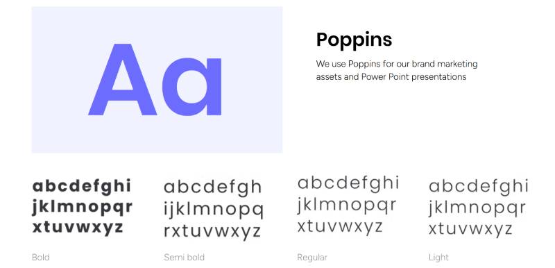
The Monday.com wordmark uses a custom geometric sans-serif typeface created specifically for the brand. The letters feature consistent stroke weights, rounded terminals, and carefully balanced spacing that creates a cohesive, modern appearance.
Geometric sans-serifs like this share DNA with typefaces such as Futura and Avenir. They’re built on simple geometric shapes (circles, squares, triangles), which gives them a clean, rational appearance that works beautifully at any size.
The rounded letterforms and open apertures (the openings in letters like ‘a’ and ‘e’) maximize readability even at small sizes. This matters for app icons and mobile interfaces where the logo appears in constrained spaces.
What Are the Hidden Meanings in the Monday.com Logo?
The colorful dots that often accompany the Monday.com wordmark reference the platform’s signature feature: customizable color-coded status columns. These dots aren’t random decoration but visual shorthand for the product itself.
The spacing between letters creates a sense of breathing room and clarity. This mirrors the platform’s interface design philosophy of reducing visual clutter to help users focus on what matters.
Some designers note that the overall visual system (not the logo alone) subtly references Swiss design principles through its emphasis on grid systems, clear hierarchy, and functional color use. While the palette is far brighter than traditional Swiss design, the underlying structure shares that movement’s love of order.
How Does the Monday.com Logo Compare to Competitor Logos?
The Monday.com logo stands out in the project management space through its unapologetically colorful approach. While competitors like Asana use minimal color (three pink dots on white), and Trello relies on a single blue, Monday.com embraces a full spectrum.
Compared to Atlassian’s corporate blue or Basecamp’s muted green, Monday.com’s vibrant palette signals a fundamentally different approach. The brand positions itself as the antidote to boring enterprise software.
Design Approach Comparison:
- Asana: Minimalist icon (three dots) + wordmark, limited color palette, emphasizes simplicity
- Trello: Blue wordmark with icon, playful but restrained, friendly professionalism
- Jira: Blue geometric icon + wordmark, technical/developer-focused aesthetic
- ClickUp: Colorful but icon-focused, playful mascot energy
- Notion: Black-and-white minimalism, emphasizes sophistication and flexibility
- Monday.com: Color-forward wordmark, energetic, approachable, breaks category conventions
The lowercase styling also differentiates Monday.com. Most competitors use title case or all-caps, reinforcing professional credibility. Monday.com’s choice signals confidence that they don’t need traditional markers of authority.
What Are the Technical Specifications of the Monday.com Logo?
Official Color Codes:
Primary Pink
- Hex: #FF3D57
- RGB: (255, 61, 87)
- CMYK: (0, 76, 66, 0)
- Pantone: 1787 C
Primary Purple
- Hex: #6C6CFF
- RGB: (108, 108, 255)
- CMYK: (58, 58, 0, 0)
- Pantone: 2655 C
Accent Green
- Hex: #00D647
- RGB: (0, 214, 71)
- CMYK: (100, 0, 67, 16)
- Pantone: 2270 C
Accent Orange
- Hex: #FDAB3D
- RGB: (253, 171, 61)
- CMYK: (0, 32, 76, 1)
- Pantone: 150 C
Accent Blue
- Hex: #0086C0
- RGB: (0, 134, 192)
- CMYK: (100, 30, 0, 25)
- Pantone: 7461 C
Text Black
- Hex: #323338
- RGB: (50, 51, 56)
- CMYK: (11, 9, 0, 78)
- Pantone: Black 6 C
Dimensions and Proportions:
Aspect Ratio: Approximately 5:1 (width to height) for the standard wordmark
Minimum Size Requirements:
- Digital: 120px width minimum
- Print: 0.75 inches (19mm) width minimum
Clear Space Specifications: Minimum clear space equal to the height of the lowercase ‘m’ on all sides
Official Usage Guidelines:
- Primary lockup: Black wordmark on light backgrounds
- Reversed: White wordmark on dark backgrounds
- Color accents: Dots or shapes in brand colors may accompany wordmark
- File formats: SVG (preferred for digital), EPS (for print), PNG (for general use)
What Cultural Impact Has the Monday.com Logo Had?
The Monday.com rebrand influenced how SaaS companies approach brand identity. The success of their colorful, approachable aesthetic encouraged other B2B software companies to move away from conservative blue-and-gray palettes.
Within two years of the rebrand, Monday.com went public on NASDAQ with a $7.6 billion valuation. The distinctive visual identity played a role in brand recognition during their aggressive marketing campaigns across billboards, podcasts, and digital advertising.
The logo’s flexibility became a case study in modern brand systems. Unlike rigid legacy brands, Monday.com created a visual language where color and shape can adapt while maintaining recognition. This approach has been studied in design programs and emulated by startups.
The rebrand also demonstrated the business value of cohesive visual identity. When the company changed from dapulse to Monday.com, the memorable name combined with the vibrant logo helped the brand stick in users’ minds, contributing to word-of-mouth growth.
How Does the Monday.com Logo Fit Into the Overall Brand Identity?
The Monday.com logo serves as the foundation for a comprehensive brand system that extends into product design, marketing, and company culture. The multi-color palette from the logo directly informs the platform’s interface, where users interact with the same vibrant colors when customizing their workflows.
The brand’s typography system uses similar geometric sans-serif fonts throughout marketing materials and product UI. This creates seamless recognition whether someone sees a billboard, watches a demo video, or uses the actual software.
Monday.com’s visual language embraces playfulness through illustration styles, animation, and even their office design. The logo’s energetic colors appear in everything from employee swag to conference booth designs, creating a cohesive brand experience.
How Should the Monday.com Logo Be Used?

Official Usage Do’s:
- Use the official logo files provided by Monday.com
- Maintain proper clear space around the logo
- Use the black wordmark on light backgrounds
- Use the white wordmark on dark backgrounds
- Scale proportionally without distortion
- Follow minimum size requirements
- Use approved color variations only
Official Usage Don’ts:
- Don’t recreate or redraw the logo
- Don’t change the colors to non-approved shades
- Don’t rotate or skew the logo
- Don’t add effects (shadows, glows, outlines)
- Don’t place on busy backgrounds that reduce legibility
- Don’t alter spacing between letters
- Don’t use old dapulse logos
Where to Access Official Logos:
Monday.com provides official logo files through their brand resources page for partners, press, and authorized users. The package typically includes vector graphics (SVG, EPS) and raster formats (PNG) in various configurations.
Licensing Information:
The Monday.com logo and brand assets are protected intellectual property. Usage requires permission for commercial applications, though press and editorial use typically follows standard fair use guidelines. Partners and integrators receive specific usage rights through partnership agreements.
Trademark Protection Details:
Monday.com Ltd. holds registered trademarks for their wordmark and visual brand elements in multiple jurisdictions. The “monday.com” name is protected, as are specific visual configurations of the brand identity. Unauthorized use in ways that could create confusion with the official brand may constitute trademark infringement.
FAQ on The Monday.com Logo
Where Can I Download the Official Monday.com Logo?
Official Monday.com logo files are available through the company’s brand resources page for approved partners and press.
Download packages include vector formats like SVG and EPS for scalable designs, plus PNG files with transparent backgrounds.
Unauthorized downloads from third-party sites may contain outdated dapulse branding.
Can I Use the Monday.com Logo on My Website?
You can use the Monday.com logo if you’re an official partner, integration developer, or authorized reseller.
Editorial and press usage typically follows fair use guidelines when discussing the platform in reviews or news articles.
Commercial use requires permission through partnership agreements or licensing arrangements with monday.com Ltd.
What Font Does the Monday.com Logo Use?
The Monday.com wordmark uses a custom geometric sans-serif typeface designed specifically for the brand.
This proprietary font isn’t publicly available for download.
Similar alternatives include Circular, Gordita, or other rounded geometric fonts, though none match the exact letterforms.
Why Did Monday.com Change from dapulse?
The rebranding from dapulse to Monday.com in 2019 made the company name more memorable and pronounceable across global markets.
“Monday” references starting the work week with clarity and organization.
The name change coincided with aggressive expansion into enterprise solutions and international team collaboration markets beyond their initial startup audience.
What File Formats Are Available for the Monday.com Logo?
Official Monday.com logo packages include SVG files for digital applications, EPS for professional print design, and PNG with transparent backgrounds.
Vector formats maintain quality at any size for billboards or business cards.
Pixel-based PNGs work for presentations and web usage where vector support is limited.
How Do I Maintain Proper Logo Clear Space?
Maintain clear space equal to the height of the lowercase ‘m’ on all sides of the Monday.com wordmark.
This ensures the logo remains visible and uncluttered in any application.
Proper spacing prevents visual interference from other design elements or competing brand marks in co-marketing materials.
Can I Change the Colors of the Monday.com Logo?
The Monday.com logo should only appear in approved color variations: black on light backgrounds, white on dark backgrounds, or the official multi-color version.
Changing colors violates brand guidelines and trademark usage rules.
The vibrant color palette is central to brand recognition and shouldn’t be altered.
What Makes the Monday.com Logo Different from Competitors?
Monday.com’s logo embraces multiple bright colors while competitors like Asana, Trello, and Basecamp use minimal, conservative palettes.
The lowercase styling and energetic aesthetic position Monday.com as approachable rather than corporate.
This differentiation helps the work operating system stand out in crowded project management markets.
Who Designed the Current Monday.com Logo?
Sagmeister & Walsh, the renowned New York design studio, created the Monday.com logo and comprehensive brand system in 2019.
The studio collaborated with Monday.com’s internal creative team throughout development.
Stefan Sagmeister is known for bold, unconventional approaches to corporate brand identity across multiple industries.
What Resolution Should I Use for the Monday.com Logo?
Digital applications require minimum 120px width for the Monday.com wordmark to maintain legibility.
Print materials need 300 DPI resolution at final size, with 0.75 inches minimum width.
Vector formats like SVG eliminate resolution concerns since they scale infinitely without quality loss for any application.
Conclusion
The Monday.com logo represents a bold departure from traditional enterprise software branding, proving that B2B platforms can embrace personality without sacrificing credibility.
Sagmeister & Walsh’s 2019 design transformed how team collaboration tools present themselves in crowded markets.
The vibrant color system and custom typography created instant recognition while the lowercase wordmark signaled approachability. This visual identity supported Monday.com’s growth from startup to publicly traded company with a multi-billion dollar valuation.
The shift from dapulse demonstrated how strategic rebranding strengthens market position. Looking at other tech company logos, few match Monday.com’s commitment to breaking category conventions while maintaining professional legitimacy across workflow automation and project management spaces.

Renowned for his expertise in logo design and visual branding, Bogdan has developed a multitude of logos for various clients.
His skills extend to creating posters, vector illustrations, business cards, and brochures. Additionally, Bogdan's UI kits were featured on marketplaces like Visual Hierarchy and UI8.
He also wrote in the past years on sites like Design Your Way, WebDesignerDepot, WPDean, Designmodo, Speckyboy, Slider Revolution, and more.
- Death Note Font Generator - 26 October 2026
- Versatile Georgia Font Pairing for Timeless Layouts - 24 October 2026
- How to Turn Inconsistent UI into One Design System (Without a Full Redesign) - 24 October 2026

Bogdan Sandu is a seasoned designer who has been designing websites since 2008. Renowned for his expertise in logo design and visual branding, Bogdan has developed a multitude of logos for various clients. His skills extend to creating posters, vector illustrations, business cards, and brochures. Additionally, Bogdan's UI kits were featured on marketplaces like Visual Hierarchy and UI8. He also wrote in the past years on sites like Design Your Way, WebDesignerDepot, WPDean, Designmodo, Speckyboy, Slider Revolution, and more.
You Might Also Like