


The CapCut logo represents a mobile video editing platform created by ByteDance in 2020.
This brand identity serves millions of content creators worldwide who produce videos for social media platforms like TikTok and YouTube.
The design elements reflect modern video editing capabilities through a minimalist approach that communicates creativity and accessibility.
ByteDance launched CapCut globally in April 2020, though the app first appeared in China as Jianying in April 2019, and the logo has evolved through several iterations since its inception.
What is the CapCut Logo?

The CapCut logo is a combination mark featuring a stylized camera icon paired with modern sans-serif lettering, officially introduced in April 2020 when ByteDance rebranded Viamaker for global markets. The design uses clean geometric shapes and bold typography to convey the app’s focus on accessible video editing tools.
Design Type: Combination mark (icon plus wordmark)
Primary Elements:
- Stylized camera/scissors icon
- Bold sans-serif typography
- Shortened crossbar on the letter “t”
Official Introduction Date: April 2020 (global launch), originally as Viamaker in early 2020
Designer/Agency: ByteDance in-house design team
Trademark Status: Registered trademark owned by Lemon Inc. (ByteDance subsidiary), filed June 2020, registered September 2022
Color Palette:
- Primary: Black (#000000)
- Background: White (#FFFFFF)
Usage Context: Mobile app icon, desktop software branding, web platform, marketing materials, social media assets, product packaging
How Has the CapCut Logo Evolved Over Time?

The logo underwent significant transformations from its 2020 Viamaker origins to its current refined iteration. Each redesign reflected the app’s expanding global reach and evolving feature set.
The original Viamaker version featured crossed rings symbolizing video integration, while later versions simplified the icon and strengthened the wordmark for better recognition across platforms.
Original Viamaker Logo (Early 2020)
Years Active: Early 2020 (pre-April 2020)
Design Description: Horizontal camera icon resembling scissors, uppercase wordmark with erased horizontal bars on both “A” letters, geometric shapes
Color Scheme: Black icon and text on white background
Designer: ByteDance internal design team
Context: Created during initial development phase, designed specifically for video editing app serving Douyin (Chinese TikTok) users
Key Changes from Previous: First iteration, no previous version
Cultural Significance: Represented ByteDance’s entry into standalone video editing tools market
First CapCut Logo (April 2020)
Years Active: April 2020 – 2022
Design Description: Enlarged camera/scissors emblem positioned left of wordmark, classy sans-serif font with sharpened tails on vertical bars, smooth character contours
Color Scheme: Black (#000000) on white background
Designer: ByteDance design team
Context: Introduced during global rebranding from Viamaker to CapCut, aligned with international market expansion
Key Changes from Previous: New name, enlarged icon, more professional typography, improved legibility
Cultural Significance: Marked app’s transformation into global video editing platform competing with Adobe and other established tools
Refined CapCut Logo (2022-Present)
Years Active: 2022 – Present
Design Description: Thicker icon lines, flatter camera shape, fuller character contours, more distinctive bars, bold title case lettering, shortened crossbar on letter “t”
Color Scheme: Classic black (#000000)
Designer: ByteDance design team
Context: Refined for better scalability across mobile, desktop, and web platforms as user base exceeded 500 million active users
Key Changes from Previous: Thicker lines for better visibility, refined contours, improved proportions for digital displays
Cultural Significance: Represents CapCut’s evolution into comprehensive creative suite with AI features
What Do the Design Elements of the CapCut Logo Mean?

The camera icon symbolizes video capture and editing, while its scissors-like appearance represents cutting and trimming footage. This dual meaning communicates the app’s core functionality in a single visual element.
The intertwined ribbons suggest continuity and flow, reflecting smooth transitions between video clips.
The bold, geometric design conveys professionalism and modernity, aligning with current graphic design principles that favor minimalist design approaches.
The shortened crossbar on the “t” adds uniqueness and memorability, creating a distinctive mark that differentiates CapCut from competitors in the crowded video editing software market.
Why Did CapCut Choose These Specific Colors?
Black (#000000):
- Hex Code: #000000
- RGB: (0, 0, 0)
- CMYK: (0, 0, 0, 100)
- Pantone: Process Black C
The black color creates strong contrast against light backgrounds.
It evokes professionalism, sophistication, and technical precision. Black connects to filmmaking traditions, where darkness represents the canvas upon which content creators paint their visions.
The monochromatic approach ensures versatility across different platforms and backgrounds without compromising brand recognition.
What Typography Style Is Used in the CapCut Logo?
The font resembles Filson Pro or Nexa with significant modifications.
It features a bold sans-serif font design with clean contours and stable proportions. The smooth curves create an inviting, approachable feel while maintaining professional standards.
The shortened crossbar on the “t” serves as a signature detail that enhances brand recognition.
What Are the Hidden Meanings in the CapCut Logo?
The camera icon doubles as scissors, subtly communicating both capture and editing functions. This dual representation wasn’t accidental but intentional design strategy.
The infinity-like quality of the intertwined ribbons suggests unlimited creative possibilities. The compressed letterforms reflect efficient, streamlined editing processes.
Some viewers interpret the icon as film reels, connecting to cinema history. The geometric precision mirrors the mathematical precision required in video rendering and effects.
How Does the CapCut Logo Compare to Competitor Logos?
CapCut’s minimalist black design contrasts sharply with Adobe Premiere Pro’s blue gradient and Final Cut Pro’s star icon. While competitors use color to establish brand identity, CapCut relies on form and negative space.
The camera/scissors hybrid icon is more literal than competitor symbols. Epic Games logo and Unity Software logo similarly use geometric abstraction but for gaming rather than video editing.
InShot uses colorful design elements, while KineMaster employs a play button motif. CapCut’s monochrome approach positions it as a professional tool despite its free accessibility.
The shortened “t” crossbar creates uniqueness similar to how the Coca-Cola logo uses distinctive script lettering.
What Are the Technical Specifications of the CapCut Logo?
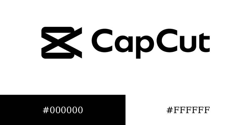
Official Color Codes:
Primary Color: Black
- Hex: #000000
- RGB: (0, 0, 0)
- CMYK: (0, 0, 0, 100)
- Pantone: Process Black C
Background Color: White
- Hex: #FFFFFF
- RGB: (255, 255, 255)
- CMYK: (0, 0, 0, 0)
- Pantone: White
Dimensions and Proportions:
- Aspect ratio: Varies by version (square for app icon, horizontal for wordmark)
- Minimum size requirements: 16×16 pixels (app icon), 120 pixels width (wordmark)
- Clear space specifications: Minimum padding equal to height of letter “C”
- Official usage guidelines: Available through ByteDance brand resources
What Cultural Impact Has the CapCut Logo Had?
The CapCut branding became synonymous with accessible video editing for creators without professional training. Its recognizable icon appears in millions of social media videos daily.
The logo’s simplicity influenced other mobile editing apps to adopt minimalist approaches. Content creators often display the CapCut watermark as a badge showing they created content themselves rather than hiring editors.
The black icon became a visual shorthand for “edited video” in social media contexts. TikTok creators specifically associate the logo with trending edit styles and effects.
How Does the CapCut Logo Fit Into Overall Brand Identity?

The logo anchors CapCut’s broader visual system that includes interface design, color palette choices, and user experience patterns. Black and white create consistency across all touchpoints.
The geometric icon style extends to in-app icons and buttons. Clean typography mirrors the app’s interface fonts, creating cohesive visual language.
The minimalist aesthetic reinforces CapCut’s value proposition: powerful editing without overwhelming complexity. This aligns with parent company ByteDance’s design philosophy seen across TikTok and other properties.
How Should the CapCut Logo Be Used?
Official Usage Guidelines:
Do not modify logo colors or proportions. Maintain specified clear space around all sides.
Do not add effects, shadows, or outlines. Never rotate, skew, or distort the logo.
Always use official vector files when available. Ensure adequate contrast with background colors.
Where to Access Official Logos:
Official assets available through CapCut’s brand resources portal and media kit downloads from capcut.com
Licensing Information:
CapCut logo and trademark owned by Lemon Inc., a ByteDance subsidiary. Commercial use requires written permission.
Materials created using CapCut app may include logo watermark unless removed through premium features.
Trademark Protection Details:
Registered U.S. trademark (Serial Number 88959492, registered September 2022). Protected under international trademark laws.
Unauthorized commercial use or domain registration using “CapCut” trademark subject to legal action.
FAQ About the CapCut Logo
When was the CapCut logo created?
The CapCut logo was created in April 2020 when ByteDance rebranded the Viamaker app for global markets. The original Viamaker logo existed earlier in 2020, but the recognizable CapCut branding launched with the international version of the app.
Who designed the CapCut logo?
ByteDance’s in-house design team created the CapCut logo. The company does not publicly credit individual designers, maintaining that brand development occurred through collaborative internal processes involving multiple creative professionals and stakeholders.
What do the colors in the CapCut logo mean?
The black color (#000000) represents professionalism, sophistication, and technical precision. It connects to filmmaking traditions and provides maximum versatility across platforms. Black creates strong contrast for visibility while maintaining a neutral, professional appearance that works in any context.
How many times has the CapCut logo been redesigned?
The CapCut logo has been redesigned twice since inception. The original Viamaker version (early 2020) transitioned to the first CapCut logo (April 2020), which then received refinements in 2022. The core concept remained consistent across all versions.
Where can I download the official CapCut logo?
Official CapCut logo files are available through the company’s brand resources portal and media kit at capcut.com. High-resolution vector files in various formats can be accessed for approved usage. Always use official sources to ensure accurate brand representation.
Is the CapCut logo trademarked?
Yes, CapCut is a registered trademark owned by Lemon Inc. (ByteDance subsidiary). The trademark was filed in June 2020 and officially registered in September 2022 under Serial Number 88959492. It receives protection under U.S. and international intellectual property laws.
What font is used in the CapCut logo?
The CapCut logo uses a custom sans-serif font that resembles Filson Pro or Nexa with significant modifications. The most distinctive feature is the shortened crossbar on the letter “t,” which creates a unique signature element not found in standard typefaces.
Why did CapCut choose a camera icon for their logo?
CapCut chose a stylized camera that also resembles scissors to represent both video capture and editing functions. This dual symbolism communicates the app’s core purpose in a single icon. The intertwined ribbon design suggests continuous creative flow and unlimited editing possibilities.
Conclusion
The CapCut logo exemplifies effective modern logo design principles through its minimalist approach and dual-meaning iconography.
The combination of camera and scissors imagery, paired with bold typography, creates instant recognition across digital platforms. Its monochromatic color palette ensures versatility while maintaining professional credibility.
As video content creation continues dominating social media, the CapCut logo will likely maintain its cultural relevance among creators worldwide. The design successfully bridges accessibility and professionalism, positioning CapCut as both beginner-friendly and capable of advanced editing tasks.

Renowned for his expertise in logo design and visual branding, Bogdan has developed a multitude of logos for various clients.
His skills extend to creating posters, vector illustrations, business cards, and brochures. Additionally, Bogdan's UI kits were featured on marketplaces like Visual Hierarchy and UI8.
He also wrote in the past years on sites like Design Your Way, WebDesignerDepot, WPDean, Designmodo, Speckyboy, Slider Revolution, and more.
- The Cursor Logo History, Colors, Font, And Meaning - 24 September 2026
- Top 7 Web Design Subscription Services That Replace Full-Time Hires - 24 September 2026
- Canva vs PowerPoint: Which Is Better for Presentations? - 22 September 2026

Bogdan Sandu is a seasoned designer who has been designing websites since 2008. Renowned for his expertise in logo design and visual branding, Bogdan has developed a multitude of logos for various clients. His skills extend to creating posters, vector illustrations, business cards, and brochures. Additionally, Bogdan's UI kits were featured on marketplaces like Visual Hierarchy and UI8. He also wrote in the past years on sites like Design Your Way, WebDesignerDepot, WPDean, Designmodo, Speckyboy, Slider Revolution, and more.
You Might Also Like


