The TikTok logo has become one of the most recognizable symbols in social media since its global debut in 2017.
Created by an in-house ByteDance designer, the logo features a stylized musical note that doubles as a lowercase “d”, referencing the platform’s original Chinese name, Douyin. The vibrant neon cyan and fuchsia colors layered over black create a distinctive 3D effect that captures the platform’s energetic, music-focused identity.
Since launching in China as Douyin in 2016, the app has undergone three major logo iterations while maintaining its core visual elements.
What is the TikTok Logo?
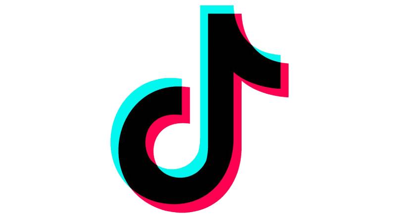
The TikTok logo is a combination mark featuring a stylized musical note symbol alongside the wordmark “TikTok”, introduced globally in 2017 when ByteDance launched the platform internationally. The musical note, shaped like a lowercase “d”, is rendered with a chromatic aberration effect using cyan and fuchsia shadows over black, creating a vibrant 3D appearance inspired by live concert lighting and stage effects.
Design Type: Combination mark (symbol + wordmark)
Primary Elements:
- Musical note symbol shaped as lowercase “d”
- Sans-serif wordmark “TikTok”
- Chromatic aberration effect with layered colors
- 3D glitch-style visual treatment
Official Introduction Date: 2017 (global launch), 2016 (China as Douyin)
Designer/Agency: In-house ByteDance designer (name undisclosed)
Trademark Status: Registered with the U.S. Patent and Trademark Office in April 2018 (Registration Number 5653614)
Color Palette:
- Turquoise: #25F4EE (RGB: 37, 244, 238)
- Red/Fuchsia: #FE2C55 (RGB: 254, 44, 85)
- Black: #000000 (RGB: 0, 0, 0)
- White: #FFFFFF (RGB: 255, 255, 255)
Usage Context: Mobile app icon, web design interfaces, marketing materials, merchandise, social media presence, broadcast media
How Has the TikTok Logo Evolved Over Time?

The TikTok logo has maintained remarkable consistency since its inception, undergoing only subtle refinements rather than major redesigns. The core musical note symbol has remained essentially unchanged since 2016, though wordmark treatments and color applications have been adjusted to improve readability and brand cohesion across different platforms and screen sizes.
Original Douyin Logo (2016-2017)
Years Active: 2016-2017 (China only)
Design Description: Stylized musical note in lowercase “d” shape with neon pink-red color palette on white background
Color Scheme: Neon cyan and fuchsia/red with black wordmark
Designer: Unnamed in-house ByteDance designer
Context: Created for the Chinese market launch as Douyin, meaning “shaking sound” or “trembling music”
Key Changes from Previous: First iteration, no predecessor
Cultural Significance: Represented ByteDance’s entry into short-form video content, inspired by live music concerts and rock performances
TikTok Global Logo (2017-2018)
Years Active: 2017-2018
Design Description: Musical note symbol with “Tik Tok” spelled as two separate words below in basic sans-serif font
Color Scheme: Black note with cyan and fuchsia chromatic aberration effect
Designer: In-house ByteDance team
Context: International expansion following Musical.ly acquisition
Key Changes from Previous: Added English wordmark for global markets, standardized color application
Cultural Significance: Marked TikTok’s emergence as a global competitor to established social media platforms
Current TikTok Logo (2018-Present)
Years Active: 2018-present
Design Description: Refined musical note with “TikTok” as single word in custom typography, featuring color accents on letter “o”
Color Scheme: Black core with cyan and fuchsia layered shadows, optional gradient versions
Designer: In-house team with custom font development by Grilli Type
Context: Introduced custom TikTok Sans typeface for better brand consistency
Key Changes from Previous: Unified wordmark spelling, custom typeface, improved readability at small sizes
Cultural Significance: Solidified TikTok’s position as a dominant social media platform with over 1 billion users
What Do the Design Elements of the TikTok Logo Mean?
The musical note at the center of the TikTok logo carries multiple layers of symbolism, representing both the platform’s musical roots and its Chinese heritage. The note shape functions as a lowercase “d” referencing Douyin, while simultaneously suggesting rhythm, movement, and sound waves that define the short-form video experience.
Why Did TikTok Choose These Specific Colors?
The color choices weren’t arbitrary but deliberately inspired by live concert experiences.
Black creates the foundation, representing a dark concert venue or theater stage. This color choice differentiates TikTok from competitors using brighter primary colors.
Turquoise (#25F4EE) symbolizes energy, creativity, and youthfulness. The vibrant cyan tone suggests stage lighting cutting through darkness.
Fuchsia/Red (#FE2C55) represents passion, excitement, and the dynamic nature of content creation. Together with cyan, these complementary colors create optical depth.
The layered color effect mimics chromatic aberration seen in analog photography and creates the signature 3D glitch aesthetic that became synonymous with TikTok’s brand identity.
What Typography Style Is Used in the TikTok Logo?
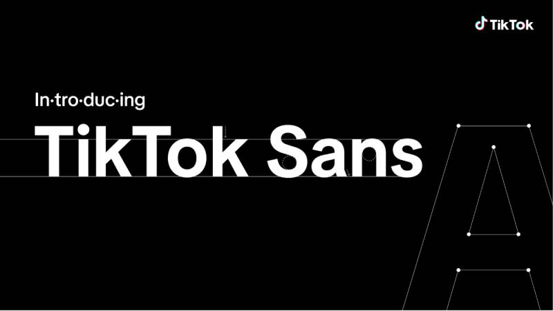
TikTok uses a custom typeface called TikTok Sans, developed in collaboration with Swiss foundry Grilli Type and introduced in 2018.
The typeface replaced the original Proxima Nova font with a proprietary design featuring rounded edges, clearer strokes, and improved readability on mobile screens. TikTok Sans includes two subfamilies: TikTok Sans Text for in-app interfaces and TikTok Sans Display for marketing materials.
The sans-serif font features geometric characteristics with slightly condensed letterforms, optimized for small-screen viewing. In 2023, TikTok released TikTok Sans as an open-source font under the SIL Open Font License, making it freely available through Google Fonts.
What Are the Hidden Meanings in the TikTok Logo?
The dual nature of the musical note symbol serves as the logo’s most clever hidden element.
While appearing as a simple eighth note to Western audiences, the “d” shape directly references Douyin’s Chinese spelling. The trembling or vibrating visual effect created by the layered colors represents “douyin” (trembling sound), perfectly capturing the app’s musical foundation.
The chromatic aberration technique, typically considered a photographic flaw, was intentionally adopted to suggest digital disruption and breaking conventions. This aligned with TikTok’s positioning as a platform challenging traditional social media norms.
How Does the TikTok Logo Compare to Competitor Logos?
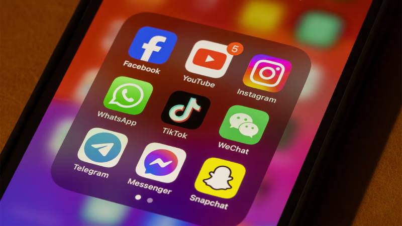
TikTok’s logo stands apart from tech company logos through its bold use of black as the primary background color and its distinctive chromatic aberration effect. While Instagram uses gradient pastels and YouTube employs red and white simplicity, TikTok’s neon-on-black approach creates immediate visual distinction.
The musical note symbol provides instant category recognition, unlike the more abstract symbols used by competitors like Snapchat (ghost) or Instagram (camera). Famous graphic designers have noted that TikTok’s logo successfully balances cultural specificity (the Douyin reference) with universal understanding (musical note).
Compared to streaming platforms like Netflix or Hulu, TikTok’s logo feels more energetic and youth-oriented. The 3D effect and vibrant colors align more closely with gaming brand aesthetics than traditional social media, helping TikTok appeal to Gen Z audiences who view the platform as entertainment rather than just communication.
What Are the Technical Specifications of the TikTok Logo?

Official Color Codes:
Primary Color: Turquoise/Cyan
- Hex: #25F4EE
- RGB: (37, 244, 238)
- CMYK: (54, 0, 18, 0)
- Pantone: PMS 319 C
Secondary Color: Fuchsia/Red
- Hex: #FE2C55
- RGB: (254, 44, 85)
- CMYK: (0, 93, 56, 0)
- Pantone: PMS 1787 C
Accent Color: Black
- Hex: #000000
- RGB: (0, 0, 0)
- CMYK: (70, 35, 40, 100)
- Pantone: PMS Black C
Additional: White
- Hex: #FFFFFF
- RGB: (255, 255, 255)
- CMYK: (0, 0, 0, 0)
Dimensions and Proportions:
- App icon aspect ratio: 1:1 (square format)
- Minimum size: 200 x 200 pixels for digital applications
- Profile picture dimensions: 100 x 100 pixels displayed
- Clear space: Minimum padding equal to the height of the musical note symbol
- The wordmark width is approximately 2.5 times the height of the musical note
- Maintain aspect ratio when scaling to prevent distortion
Official Usage Guidelines:
TikTok provides specific brand guidelines requiring approval for commercial use. The logo must appear in approved color combinations (black background with colored accents, white background with black note, or full-color versions). Distortion, rotation beyond approved angles, or recoloring outside the official palette is prohibited.
What Cultural Impact Has the TikTok Logo Had?
The TikTok logo became a cultural phenomenon that transcended typical brand recognition. By 2020, the logo appeared in memes, street art, and fashion, becoming shorthand for youth culture and viral content.
The chromatic aberration effect popularized by TikTok’s logo influenced broader graphic design movements, appearing in everything from album covers to advertising campaigns. This glitch aesthetic became synonymous with Gen Z design preferences.
The logo’s visibility extended beyond digital spaces into mainstream media, appearing on television programs discussing viral trends and news coverage about social media’s cultural impact. Its recognition rivals that of legacy platforms despite TikTok’s relatively recent emergence.
How Does the TikTok Logo Fit Into The Overall Brand Identity?
The logo serves as the anchor for TikTok’s comprehensive brand identity system, which emphasizes creativity, authenticity, and self-expression.
TikTok Sans typography extends the logo’s personality throughout the app interface and marketing materials, creating visual hierarchy and consistency. The custom typeface supports over 460 languages, reflecting TikTok’s global reach while maintaining brand cohesion.
The color system derived from the logo appears throughout the platform’s UI design, video editor tools, and creator badges. TikTok’s brand style guide specifies how the logo interacts with photography, illustration, and motion graphics, ensuring consistent application across all touchpoints.
The logo’s energetic, slightly rebellious aesthetic aligns with TikTok’s positioning as a platform for authentic, unpolished content rather than highly curated feeds.
How Should the TikTok Logo Be Used?

Official Usage Do’s and Don’ts:
Do:
- Use official logo files provided by TikTok
- Maintain minimum clear space around the logo
- Use approved color variations only
- Scale proportionally to prevent distortion
- Place on approved background colors
- Follow spacing and sizing specifications
Don’t:
- Alter colors or add effects to the logo
- Rotate beyond approved orientations
- Distort or stretch the proportions
- Place over busy or low-contrast backgrounds
- Combine with other brand logos without approval
- Use outdated logo versions
- Remove or modify the chromatic aberration effect
Where to Access Official Logos:
Official TikTok logo files and brand guidelines are available through TikTok’s Brand Resources page for approved partners and creators. Media organizations can access press kits through TikTok’s newsroom.
Licensing Information:
Commercial use of the TikTok logo requires written permission from TikTok Inc. The logo is protected under trademark law in multiple jurisdictions globally. Unauthorized commercial use may result in trademark infringement claims.
Trademark Protection Details:
TikTok’s name and logo are registered trademarks owned by TikTok Inc. and its affiliates, with primary registration filed in April 2018. The trademark covers software applications, entertainment services, and related digital media products. Font licensing for TikTok Sans is separate and available under open-source terms.
FAQ About the TikTok Logo
When was the TikTok logo created?
The TikTok logo was created in 2016 for the Chinese market as Douyin, then adapted for global markets in 2017 when ByteDance launched TikTok internationally. The current version with refined typography and the TikTok Sans custom font was introduced in 2018, though the core musical note symbol has remained essentially unchanged since the original 2016 design.
Who designed the TikTok logo?
An unnamed in-house designer at ByteDance created the TikTok logo, drawing inspiration from live rock concerts and the contrast between dark venues and bright stage lighting. The designer, reportedly a music and concert enthusiast, developed the musical note concept and chromatic aberration effect without hiring an external agency, though Swiss foundry Grilli Type later collaborated on the custom TikTok Sans typeface.
What do the colors in the TikTok logo mean?
The black background represents a dark concert hall or performance venue, while the cyan (#25F4EE) symbolizes creativity and youthful energy like stage lighting effects. The fuchsia/red (#FE2C55) conveys passion and excitement, and together these complementary colors create the signature 3D chromatic aberration effect. The color combination was specifically chosen to evoke the visual experience of attending a live music performance.
How many times has the TikTok logo been redesigned?
The TikTok logo has undergone three major iterations since 2016, though calling them redesigns overstates the changes. The original Douyin version (2016-2017) introduced the core musical note design. The first global TikTok version (2017-2018) added the English wordmark spelled as two words. The current version (2018-present) refined the typography into a single word using custom TikTok Sans font while maintaining the iconic musical note symbol virtually unchanged.
Where can I download the official TikTok logo?
Official TikTok logo files are available through TikTok’s Brand Resources page for approved commercial partners, creators, and media organizations. The TikTok Sans font is freely available through Google Fonts as open-source software under the SIL Open Font License. Unauthorized commercial use of the TikTok logo requires written permission, though media coverage and editorial use follow standard fair use guidelines for trademarked materials.
Is the TikTok logo trademarked?
Yes, the TikTok logo is a registered trademark owned by TikTok Inc. and its parent company ByteDance. The trademark was filed with the U.S. Patent and Trademark Office in April 2018 under registration number 5653614, covering downloadable software, entertainment services, and multimedia content creation tools. The trademark protects both the musical note symbol and the TikTok wordmark in various jurisdictions globally.
What font is used in the TikTok logo?
The TikTok logo uses TikTok Sans, a custom typeface developed in collaboration with Swiss foundry Grilli Type and introduced in 2018. TikTok Sans replaced the earlier Proxima Nova font with a proprietary design featuring improved readability, rounded edges, and support for over 460 languages. The font family includes two subfamilies (Text and Display) and was released as open-source software in 2023, making it freely available through Google Fonts.
Why did TikTok choose a musical note for their logo?
TikTok chose a musical note to represent the platform’s roots in music-based content and lip-syncing videos, following its acquisition of Musical.ly in 2017. The note shape also functions as a lowercase “d” referencing Douyin (meaning “shaking sound” in Chinese), the app’s original Chinese name. This dual symbolism connects TikTok’s musical foundation with its Chinese heritage while creating a universally recognizable symbol that transcends language barriers.
Conclusion
The TikTok logo represents a masterclass in creating memorable logo that balances cultural specificity with universal appeal.
Its core attributes include the dual-purpose musical note/”d” symbol, the distinctive chromatic aberration effect using cyan and fuchsia, and the custom TikTok Sans typography that extends brand consistency across platforms. The logo successfully conveys energy, creativity, and youthfulness while maintaining professional sophistication.
Within the broader context of social media branding, TikTok’s logo stands out through its bold use of black, rejection of conventional color schemes, and embrace of glitch aesthetics that resonated with Gen Z audiences.
As TikTok continues evolving as a platform, the logo’s strong foundation and flexible color system position it to adapt while maintaining its iconic status in digital culture.

Renowned for his expertise in logo design and visual branding, Bogdan has developed a multitude of logos for various clients.
His skills extend to creating posters, vector illustrations, business cards, and brochures. Additionally, Bogdan's UI kits were featured on marketplaces like Visual Hierarchy and UI8.
He also wrote in the past years on sites like Design Your Way, WebDesignerDepot, WPDean, Designmodo, Speckyboy, Slider Revolution, and more.
- The Windsurf Logo History, Colors, Font, And Meaning - 10 October 2026
- How to Remove Background From Product Photos (No Photoshop) - 10 October 2026
- How Designers can Build a Stronger Online Creative Identity - 9 October 2026

Bogdan Sandu is a seasoned designer who has been designing websites since 2008. Renowned for his expertise in logo design and visual branding, Bogdan has developed a multitude of logos for various clients. His skills extend to creating posters, vector illustrations, business cards, and brochures. Additionally, Bogdan's UI kits were featured on marketplaces like Visual Hierarchy and UI8. He also wrote in the past years on sites like Design Your Way, WebDesignerDepot, WPDean, Designmodo, Speckyboy, Slider Revolution, and more.
You Might Also Like