The CyberArk logo represents a global leader in privileged access management and identity security solutions. Founded in 1999 by Udi Mokady and Alon Cohen in Israel, CyberArk has established itself as a trusted name in cybersecurity, protecting organizations from cyber threats targeting privileged accounts and credentials.
The company’s visual identity has evolved alongside its growth from a Tel Aviv startup to a publicly traded corporation serving Fortune 500 companies worldwide. The current CyberArk logo, introduced in 2019, reflects the company’s modern approach to cloud security and zero trust architecture. Through three major design iterations, the brand has maintained recognition while adapting to changing security landscapes and expanding from vault technology to comprehensive identity security platforms.
What is the CyberArk Logo?
The CyberArk logo is a combination mark featuring a distinctive shield-like icon paired with custom sans-serif typography. Introduced in 2019 during a comprehensive brand refresh, the design was developed by Siegel+Gale, a global branding agency. The emblem symbolizes protection and security through geometric abstraction, representing the company’s commitment to defending privileged access across hybrid cloud environments.
Design Type: Combination mark (icon + wordmark)
Primary Elements:
- Abstract shield geometry suggesting layers of protection
- Angular, forward-leaning design implying proactive defense
- Custom sans-serif typeface with modified letterforms
- Integrated “Ark” reference through arched visual elements
Official Introduction Date: March 2019
Designer/Agency: Siegel+Gale
Trademark Status: Registered trademark in the United States (USPTO) and international markets, protecting both the icon and wordmark configurations
Color Palette:
- Primary: CyberArk Blue (#0066CC)
- Secondary: Deep Navy (#001F3F)
- Accent: Bright Cyan (#00B4D8)
Usage Context: Enterprise software interfaces, marketing collateral, conference presentations, partner certification materials, security documentation, digital platforms, and corporate communications across the PAM industry
How Has the CyberArk Logo Evolved Over Time?
The CyberArk brand identity has undergone three distinct phases since 1999, each reflecting the company’s maturation from specialized vault provider to comprehensive identity security platform. The original design emphasized literal security imagery, while subsequent iterations embraced abstraction and digital-first thinking. The 2019 rebrand marked the most significant departure, aligning visual identity with the company’s expanded cloud capabilities.
Original CyberArk Logo (1999-2010)
Years Active: 1999-2010
Design Description: The inaugural design featured a literal vault door illustration with metallic gradients and dimensional shading. The wordmark used a serif typeface with traditional letterforms, conveying established financial security associations.
Color Scheme: Metallic silver, dark gray, and conservative blue tones suggesting banking infrastructure
Designer: Internal design team
Context: Introduced during the early days of privileged account security, when the market barely understood PAM concepts. The literal imagery helped communicate the product’s protective function to IT departments unfamiliar with credential vault technology.
Key Changes from Previous: N/A (inaugural design)
Cultural Significance: Represented the nascent PAM industry’s reliance on physical security metaphors to explain digital protection concepts
Second-Generation CyberArk Logo (2010-2019)
Years Active: 2010-2019
Design Description: A simplified shield icon with gradient effects replaced the vault imagery. The wordmark transitioned to a modern sans-serif font with increased spacing, signaling the company’s evolution toward enterprise software positioning.
Color Scheme: Bright blue (#0080FF) with gradient transitions to lighter tones, suggesting digital transformation
Designer: External branding consultancy (name not publicly disclosed)
Context: Coincided with CyberArk’s NASDAQ IPO in 2014 and global expansion. The refresh supported the company’s transition from niche security vendor to publicly traded enterprise software provider.
Key Changes from Previous: Removed literal vault imagery, adopted gradient techniques popular in SaaS branding, modernized typography for digital readability
Cultural Significance: Reflected the broader cybersecurity industry’s shift from hardware-centric solutions to software-defined security architectures
Current CyberArk Logo (2019-Present)
Years Active: 2019-Present
Design Description: A flat, geometric shield abstraction with sharp angles and negative space creating an implicit “A” shape. The wordmark features custom letterforms with subtle modifications to the “A” and “R” characters, creating brand distinctiveness without sacrificing legibility.
Color Scheme: Solid CyberArk Blue (#0066CC) without gradients, supporting flat design principles and digital-first applications
Designer: Siegel+Gale
Context: Launched alongside the company’s strategic repositioning from PAM vendor to identity security platform, coinciding with increased focus on cloud-native architectures and DevOps security workflows.
Key Changes from Previous: Eliminated all gradient effects, introduced geometric precision, created more versatile icon suitable for small-scale digital applications, strengthened connection between icon and wordmark
Cultural Significance: Aligned with contemporary SaaS design trends emphasizing simplicity, scalability, and mobile-first considerations across the broader tech company logos landscape
What Do the Design Elements of the CyberArk Logo Mean?

The CyberArk logo’s geometric shield represents multilayered defense strategies inherent to privileged access management, where security depends on nested protection mechanisms. The angular, forward-leaning orientation suggests proactive threat detection rather than reactive security postures. Negative space within the icon subtly forms an “A” shape, creating a visual bridge between symbol and company name while reinforcing brand recall.
What Is the Symbolic Meaning of the CyberArk Shield?
The shield archetype carries centuries of protective symbolism, but CyberArk’s interpretation abstracts this into digital territory. Rather than depicting a traditional defense barrier, the geometric fragments suggest encryption layers and segmented security zones.
The forward tilt implies movement and adaptation, countering the static imagery common in earlier security branding. This dynamic posture reflects modern threat landscapes requiring continuous monitoring rather than perimeter-based defense.
Why Did CyberArk Choose These Specific Colors?

CyberArk Blue (#0066CC):
This specific shade balances trust associations (common across financial services and bank logos) with technological sophistication. Blue carries psychological weight in security contexts, suggesting reliability and professional competence.
The hex value sits between royal blue and primary blue, avoiding the oversaturation of consumer tech brands while maintaining sufficient vibrancy for digital applications.
Deep Navy (#001F3F):
Used in supporting materials and secondary applications, this darker tone provides contrast for text readability while maintaining color family cohesion. Navy reinforces enterprise credibility, a consideration when selling to Fortune 500 security teams.
Bright Cyan (#00B4D8):
The accent color introduces energy without compromising professional tone. Cyan suggests innovation and cloud computing, aligning with CyberArk’s expansion into SaaS delivery models and container security.
What Typography Style Is Used in the CyberArk Logo?
The wordmark employs a custom sans-serif design based on geometric principles, with modifications to specific letterforms that create brand distinctiveness. The “A” features a slightly elevated crossbar, while the “R” includes a shortened leg that mirrors angles found in the shield icon.
Letter spacing is generous, improving legibility in small-scale digital applications like mobile interfaces and conference badge printing. The weight sits between medium and semibold, ensuring visibility without overwhelming the icon component in combination mark configurations.
What Are the Hidden Meanings in the CyberArk Logo?
The negative space within the shield creates an implicit “A” shape, though this wasn’t the primary design intention according to Siegel+Gale. The agency focused on geometric harmony rather than letterform integration, but the happy accident reinforces brand recognition.
Some security professionals interpret the fragmented shield as representing the principle of least privilege, where access segmentation creates security through division. While not explicitly stated in brand guidelines, this reading aligns with CyberArk’s core product philosophy.
The forward tilt measures approximately 15 degrees from vertical, a subtle choice that creates dynamism without sacrificing stability. This angle appears calculated rather than arbitrary, suggesting intentional design thinking about balance and movement.
How Does the CyberArk Logo Compare to Competitor Logos?
Within privileged access management, CyberArk’s geometric abstraction differs from competitors who often rely on literal lock imagery or overtly shield-based designs. BeyondTrust uses a circular emblem suggesting global reach, while Delinea employs a more conservative wordmark with minimal iconography.
The CyberArk shield’s angular geometry aligns more closely with modern SaaS companies like Cloudflare and Datadog than traditional enterprise security vendors. This positions the brand alongside cloud-native infrastructure companies rather than legacy security appliance manufacturers.
Compared to broader cybersecurity firms like Palo Alto Networks (which uses literal flame imagery) or CrowdStrike (featuring a falcon), CyberArk’s abstraction offers greater versatility across application contexts. The shield doesn’t limit brand associations to specific security domains, supporting the company’s expansion beyond credential vaulting into secrets management and DevOps security.
Interestingly, CyberArk’s blue palette places it among the majority of security vendors, where color differentiation proves challenging. Few competitors venture into warmer hues, creating a sea of blues, grays, and blacks across security conference exhibition halls.
What Are the Technical Specifications of the CyberArk Logo?
Official Color Codes
Primary Color: CyberArk Blue
Secondary Color: Deep Navy
- Hex: #001F3F
- RGB: (0, 31, 63)
- CMYK: (100, 85, 40, 60)
- Pantone: 289 C
Accent Color: Bright Cyan
- Hex: #00B4D8
- RGB: (0, 180, 216)
- CMYK: (75, 10, 0, 0)
- Pantone: 306 C
Dimensions and Proportions
Aspect Ratio: The combination mark maintains a 3:1 width-to-height ratio, with the icon occupying approximately 30% of total width
Minimum Size Requirements:
- Digital applications: 120 pixels wide minimum
- Print applications: 0.75 inches wide minimum at 300 DPI
- Icon-only usage: 32×32 pixels minimum (digital), 0.25 inches (print)
Clear Space Specifications: Minimum clear space equals the height of the “A” in the wordmark, applied on all sides of the logo to prevent visual crowding
Official Usage Guidelines:
- Never rotate or distort the logo beyond provided orientation
- Do not apply gradients, shadows, or effects to the flat design
- Maintain specified color values; approved alternatives include white on dark backgrounds and single-color applications in navy
- Icon and wordmark should not be separated beyond approved lockup configurations
What Cultural Impact Has the CyberArk Logo Had?
Within enterprise security circles, the CyberArk shield has become synonymous with privileged access management, appearing in security architecture diagrams and compliance documentation across industries. IT professionals often use the logo as shorthand for PAM concepts in presentations, even when discussing vendor-neutral security strategies.
The 2019 rebrand influenced visual trends among identity security vendors, with several competitors subsequently moving toward geometric abstraction and flat design principles. This ripple effect demonstrates how market leaders shape aesthetic expectations within specialized B2B sectors.
At security conferences like RSA and Black Hat, the CyberArk blue has achieved recognition comparable to consumer tech brands, though within a narrower professional audience. Security operations center analysts and CISOs recognize the mark immediately, a form of professional credential in identity governance discussions.
How Does the CyberArk Logo Fit Into the Overall Brand Identity?

The logo serves as the cornerstone of CyberArk’s broader visual system, which extends to UI design patterns, marketing templates, and certification badges. The shield geometry appears as subtle background elements in product interfaces, creating cohesion between brand identity and user experience.
CyberArk’s brand guidelines specify iconography styles that echo the logo’s angular geometry, ensuring consistency across hundreds of product feature icons and marketing illustrations. This systematic approach reflects enterprise software expectations, where visual consistency signals product maturity.
How Should the CyberArk Logo Be Used?
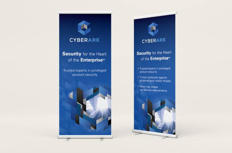
Official Usage Do’s and Don’ts
Approved Uses:
- Partner co-marketing materials with written authorization
- Editorial coverage in technology publications
- Security conference presentations by certified partners
- Product integration documentation showing compatibility
Prohibited Uses:
- Modification of colors, proportions, or typography
- Implication of official partnership without certification
- Placement in contexts suggesting product endorsement of unrelated services
- Use in comparative advertising without legal review
Where to Access Official Logos
CyberArk provides approved logo files through their Partner Portal and Press Kit section of the corporate website. Files are available in multiple formats including vector graphics (SVG, EPS) for print applications and optimized raster files (PNG) with transparent backgrounds for digital use.
Licensing Information
The CyberArk name and logo are registered trademarks owned by CyberArk Software Ltd. Usage requires explicit permission except in editorial contexts covered by fair use provisions. Certified partners receive limited licensing rights as outlined in partnership agreements, typically restricted to specific marketing activities and co-branded materials.
Trademark Protection Details
CyberArk actively enforces trademark rights, particularly against usage that might create customer confusion regarding official partnerships or product certifications. The company monitors security industry events and digital channels for unauthorized brand usage, sending cease-and-desist notices when appropriate. Proper attribution should include the registered trademark symbol (®) on first reference in marketing materials.
FAQ on The CyberArk Logo
Where Can I Download the Official CyberArk Logo?
Official logo files are available through the CyberArk Partner Portal and media resources section on their corporate website.
Vector formats like SVG and EPS work best for print, while PNG files with transparent backgrounds suit digital applications and marketing materials.
What Font Does the CyberArk Wordmark Use?
The wordmark employs a custom sans-serif typeface developed by Siegel+Gale during the 2019 rebrand.
Modified letterforms in the “A” and “R” create brand distinctiveness while maintaining readability across privileged access management documentation and security platforms.
Can I Use the CyberArk Logo on My Website?
Usage requires explicit permission unless you’re a certified partner with licensing rights outlined in your partnership agreement.
Editorial coverage falls under fair use provisions, but commercial applications need written authorization to avoid trademark violations and potential legal issues.
What Does the Shield Symbol in the CyberArk Logo Represent?
The geometric shield represents multilayered defense strategies inherent to identity security and credential vault technology.
Angular fragments suggest encryption layers and segmented security zones, while the forward tilt implies proactive threat detection rather than static perimeter-based approaches.
Has CyberArk Ever Changed Its Logo Design?
CyberArk has undergone three major logo iterations since 1999, evolving from literal vault imagery to geometric abstraction.
The current version launched in 2019, coinciding with the company’s strategic repositioning from PAM solution provider to comprehensive identity governance platform.
What File Formats Are Available for the CyberArk Logo?
Official assets include vector graphics (SVG, EPS, AI) for scalable print applications and raster formats (PNG, JPEG) for digital use.
High-resolution files maintain quality at various sizes, from mobile app icons to conference booth displays and partner certification materials.
Why Did CyberArk Choose Blue as Its Primary Brand Color?
Blue conveys trust and professional competence, attributes valued by Fortune 500 security teams evaluating enterprise security software.
The specific shade (#0066CC) balances technological sophistication with reliability associations common across financial services and cloud security platforms.
Is the CyberArk Logo Trademarked?
Yes, both the shield icon and wordmark are registered trademarks owned by CyberArk Software Ltd.
The company actively enforces trademark protection through the USPTO and international markets, monitoring unauthorized usage at security conferences and across digital channels.
What Are the Minimum Size Requirements for the CyberArk Logo?
Digital applications require a minimum width of 120 pixels, while print materials need at least 0.75 inches at 300 DPI.
Icon-only configurations work down to 32×32 pixels for favicons and mobile interfaces, maintaining legibility through simplified geometric elements.
Who Designed the Current CyberArk Logo?
Siegel+Gale, a global branding agency, developed the 2019 logo refresh alongside a comprehensive brand identity system.
The design process focused on creating versatile assets suitable for cloud-native security platforms, DevOps workflows, and SaaS delivery models.
Conclusion
The CyberArk logo exemplifies how enterprise security branding has evolved from literal imagery to sophisticated geometric abstraction.
Siegel+Gale’s 2019 design captures the company’s transformation from credential vault specialist to comprehensive identity security platform.
The shield’s angular geometry and strategic color palette position CyberArk alongside cloud-native infrastructure providers rather than legacy security appliance manufacturers.
From official brand guidelines to trademark protection, the visual identity system supports global recognition across cybersecurity conferences and enterprise software deployments.
The combination mark’s versatility ensures consistent representation whether printed on partner certification materials or displayed in privileged access management interfaces.

Renowned for his expertise in logo design and visual branding, Bogdan has developed a multitude of logos for various clients.
His skills extend to creating posters, vector illustrations, business cards, and brochures. Additionally, Bogdan's UI kits were featured on marketplaces like Visual Hierarchy and UI8.
He also wrote in the past years on sites like Design Your Way, WebDesignerDepot, WPDean, Designmodo, Speckyboy, Slider Revolution, and more.
- Canva vs PowerPoint: Which Is Better for Presentations? - 22 September 2026
- How to Install Fonts on Mac (Step-by-Step Guide) - 20 September 2026
- From Mockup to Code: How AI-Augmented Development Speeds Up the Design Handoff - 19 September 2026

Bogdan Sandu is a seasoned designer who has been designing websites since 2008. Renowned for his expertise in logo design and visual branding, Bogdan has developed a multitude of logos for various clients. His skills extend to creating posters, vector illustrations, business cards, and brochures. Additionally, Bogdan's UI kits were featured on marketplaces like Visual Hierarchy and UI8. He also wrote in the past years on sites like Design Your Way, WebDesignerDepot, WPDean, Designmodo, Speckyboy, Slider Revolution, and more.
You Might Also Like