The xAI logo represents Elon Musk’s artificial intelligence venture, founded in March 2023. It’s a geometric mark that compresses the company name into just three strokes. Pretty clever, honestly. Or confusing, depending on who you ask.
The design landed in a crowded space where tech company logos compete for attention and recognition. xAI chose to go abstract rather than literal. No robot heads. No brain imagery. Just angles and lines.
Musk officially announced the company on July 12, 2023. The logo appeared that same day. Black parallelograms and trapezoids arranged to hide three letters in plain sight. The current version remains unchanged since launch, which is unusual for a startup still finding its footing.
xAI was incorporated in Nevada as a public-benefit corporation. The San Francisco Bay Area serves as headquarters. One logo iteration so far. That’s it.
What is the xAI Logo?
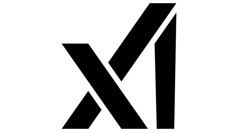
The xAI logo is a geometric wordmark that spells out “xAI” using three connected strokes. Introduced on July 12, 2023, the design uses black parallelograms and trapezoids to create an abstract representation of the company name. The designer remains unconfirmed, though it aligns with the visual language of other Musk ventures.
Here’s what makes this logo tick:
- Design Type: Abstract wordmark, combination of letterforms
- Primary Elements: Three geometric shapes (parallelograms, trapezoids) forming stylized “x,” “A,” and “I”
- Official Introduction Date: July 12, 2023
- Designer/Agency: Not publicly confirmed
- Trademark Status: Protected under xAI brand guidelines, separate from X (formerly Twitter)
- Color Palette: Primary Black (#000000), White (#FFFFFF), Accent Dodger Blue (#2196F3)
- Usage Context: Company website, Grok AI chatbot interface, marketing materials, X platform integration
How Has the xAI Logo Evolved Over Time?
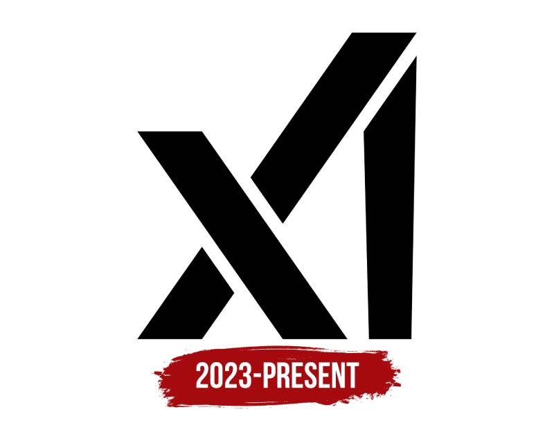
Short answer: it hasn’t. The xAI logo has remained constant since its July 2023 debut.
No major redesigns. No color shifts. No typography tweaks.
The company launched with this mark and stuck with it. That said, the Grok product line has seen its own visual evolution, separate from the parent company identity.
Original xAI Logo (2023-Present)
- Years Active: July 2023 to present
- Design Description: Three geometric strokes forming abstract letterforms. The left portion shows a stylized “X” with angular cuts. The center creates an “A” shape. The right vertical element represents the “I,” though it tapers slightly outward as it rises.
- Color Scheme: Monochrome black on white backgrounds, white on dark backgrounds
- Designer: Unconfirmed
- Context: Launched alongside company announcement. Musk’s return to AI after departing OpenAI. Positioned as an alternative approach to existing models.
- Key Changes from Previous: Not applicable. First and only version.
- Cultural Significance: Sparked immediate design debate. Some praised its efficiency. Others found it unreadable. Comparisons to the Algorand cryptocurrency logo surfaced within hours.
Grok Logo Evolution (2023-2025)
While the xAI corporate mark stayed fixed, the Grok chatbot branding went through changes.
The initial Grok icon matched xAI’s aesthetic. A forward slash inside a black square. Clean, minimalist design thinking.
By early 2025, Grok adopted a stylized “X” and “I” within a rounded square. Then came the Saturn-inspired monogram “G” in February 2025, meant to evoke black holes and cosmic themes.
What Do the Design Elements of the xAI Logo Mean?
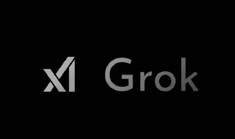
The xAI logo uses geometric abstraction to compress three letters into one unified mark.
It’s a visual puzzle that rewards close inspection.
The shapes create multiple readings. Some see the “A” in the lower portion of the “X.” Others interpret it differently. This ambiguity was either intentional or a happy accident.
What Does the Shape Symbolize?
The angular forms suggest precision and mathematical thinking. Sharp lines communicate technological focus.
There’s nothing soft here. No curves. No organic shapes.
The psychology of shapes tells us that angles and straight lines convey logic, stability, and order. Perfect for a company promising “maximally truth-seeking” AI.
The upward extension of the “I” creates a sense of growth or progression. Some interpret this as intelligence expanding. Others think it’s just optical correction to make the letters read properly.
Why Did xAI Choose These Specific Colors?
Black and white. That’s the core palette. Nothing flashy.
- Black (#000000): Authority, sophistication, technological seriousness. Brands in the black logo category often aim for timeless appeal. Black provides weight and anchors the design.
- White (#FFFFFF): Clarity, simplicity, negative space. The white background approach ensures the mark reads clearly at any size.
- Dodger Blue (#2196F3): Used as an accent in some applications. Blue connects to tech industry conventions and suggests trustworthiness.
The psychology of color in branding matters. Monochrome palettes signal confidence. You don’t need color tricks when the form does the work.
What Typography Style Is Used in the xAI Logo?
The xAI logo doesn’t use a traditional typeface. It’s custom letterforms built from geometric shapes.
That said, the Grok wordmark pairs with the icon using a clean sans-serif font. Bold weight. No decorative elements.
The typography choices reflect modern tech sensibilities. Legibility at small sizes. Neutral personality. Nothing that dates quickly.
What Are the Hidden Meanings in the xAI Logo?
People love finding hidden messages in logos. The xAI mark invites that kind of reading.
The tapering “I” sparked theories about intelligence growing or expanding upward. Probably overthinking it. The taper likely exists to separate the base of the “I” from the diagonal stroke of the “X.”
Some see visual echoes of the SpaceX logo. Not surprising given Musk’s involvement in both.
The triple-letter compression into three strokes mirrors the company’s stated goal: understanding complex reality through efficient means.
How Does the xAI Logo Compare to Competitor Logos?
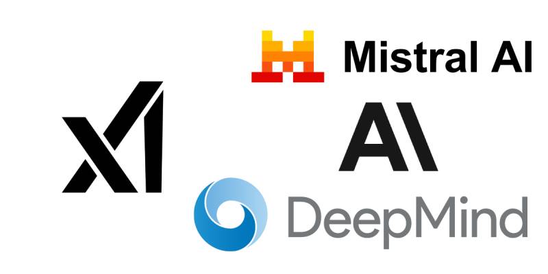
The AI industry has a visual language problem. Too many companies default to similar imagery.
Neural networks. Gradient blobs. Abstract brain shapes. The xAI logo sidesteps all of that.
Where Anthropic’s logo uses a stylized “A” with warm, approachable colors, xAI goes stark and geometric.
DeepMind’s logo relies on flowing, interconnected shapes that suggest neural pathways. xAI chose rigid angles instead.
OpenAI uses a hexagonal knot pattern. Cohere has a flowing wordmark. Mistral AI’s logo features a distinctive swirl pattern.
xAI’s approach stands out by being harder to read at first glance. That’s either a differentiator or a liability, depending on your perspective.
What Are the Technical Specifications of the xAI Logo?
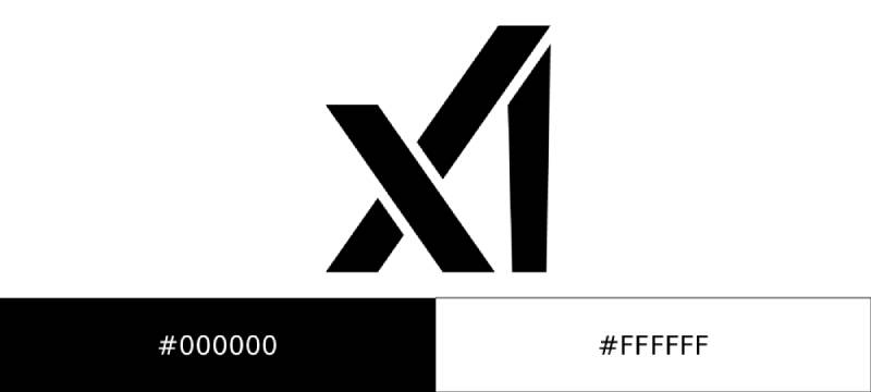
Official Color Codes
- Primary Black: Hex #000000, RGB (0, 0, 0), CMYK (0, 0, 0, 100)
- White: Hex #FFFFFF, RGB (255, 255, 255), CMYK (0, 0, 0, 0)
- Accent Blue: Hex #2196F3 (Dodger Blue), RGB (33, 150, 243), CMYK (86, 38, 0, 5)
Dimensions and Proportions
The logo uses precise geometric ratios. The parallelograms and trapezoids follow calculated angles.
Exact aspect ratio specifications aren’t publicly documented. The company provides official assets through their brand guidelines page for approved use cases.
Minimum size requirements ensure the three-letter form remains readable. At very small sizes, the mark becomes an abstract shape rather than identifiable text.
Clear space rules apply. The logo shouldn’t be crowded by other elements. Standard practice for vector graphics in corporate identity systems.
What Cultural Impact Has the xAI Logo Had?
The logo sparked immediate online debate when it launched. Reddit threads dissected every angle.
Designers argued about whether the “mistake” in the tapering “I” was intentional or an oversight.
Some praised the efficiency of spelling three letters in three strokes. Others called it unreadable without context.
The comparisons to Algorand’s logo raised questions about originality. Both use similar geometric approaches, though the companies operate in completely different industries.
How Does the xAI Logo Fit Into the Overall Brand Identity?
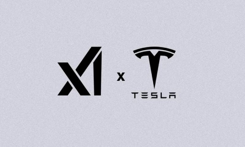
xAI positions itself as an alternative to OpenAI and other established players. The logo reflects that positioning.
Cold. Precise. Unapologetic about prioritizing form over instant readability.
The Grok chatbot serves as the consumer-facing product. Its evolving visual identity shows more warmth than the parent company mark.
xAI connects to Musk’s broader corporate ecosystem. Tesla, SpaceX, X (Twitter), Neuralink. Each has distinct visual languages, but they share a preference for bold, simple forms.
The brand’s stated mission involves “understanding the true nature of the universe.” The logo’s puzzle-like quality mirrors that ambition. You have to look closely to see what’s there.
How Should the xAI Logo Be Used?
xAI maintains trademark protection over its marks. The company separates itself legally from X (formerly Twitter), despite Musk’s involvement in both.
Official Usage Guidelines
- Do: Use official logo files from xAI’s brand page without modification
- Do: Attribute Grok-generated content to “xAI and Grok” with appropriate phrasing
- Don’t: Use the marks in app titles or domain names
- Don’t: Modify, combine with other marks, or create derivative versions
- Don’t: Imply endorsement or partnership without written permission
Where to Access Official Logos
xAI provides downloadable assets through their official brand guidelines page at x.ai/legal/brand-guidelines.
Press inquiries require contacting legal@x.ai before using xAI marks in media materials.
Licensing and Trademark Details
The company owns intellectual property rights in “xAI,” “Grok,” related combinations, and all logos. Permission can be revoked at any time, requiring immediate cessation of use.
For any commercial application or partnership branding, direct contact with xAI’s legal team is required before proceeding.
FAQ on The xAI Logo
What Does the xAI Logo Look Like?
The xAI logo consists of three geometric strokes forming the letters “x,” “A,” and “I” in an abstract arrangement.
Black parallelograms and trapezoids create the mark. The design appears as a unified symbol rather than separate letterforms.
It’s a wordmark that doubles as an icon.
Who Designed the xAI Logo?
The designer of the xAI logo has not been publicly confirmed. Elon Musk announced the company and logo simultaneously in July 2023.
The visual style aligns with other Musk ventures like Tesla and SpaceX.
No design agency has claimed credit.
When Was the xAI Logo Introduced?
The logo debuted on July 12, 2023, the same day Musk officially announced xAI’s formation.
The company was actually incorporated earlier, on March 9, 2023, in Nevada.
The mark has remained unchanged since launch.
What Do the Colors in the xAI Logo Mean?
The logo uses a monochrome color scheme. Black (#000000) and white (#FFFFFF) dominate.
Black suggests authority and technological seriousness. White provides clarity and negative space.
Dodger Blue (#2196F3) appears as an accent in some applications.
Is the xAI Logo the Same as the X (Twitter) Logo?
No. xAI and X are legally separate companies, despite both having Musk’s involvement.
The xAI brand identity uses geometric letterforms. The X platform uses a different stylized “X” symbol.
Their brand style guides are distinct.
What Font Is Used in the xAI Logo?
The xAI logo doesn’t use a standard font. The letterforms are custom geometric shapes.
The Grok product wordmark pairs with a bold, clean typeface. No decorative serifs or flourishes.
Everything stays minimal.
Can I Use the xAI Logo for My Project?
Usage requires following xAI’s official guidelines. The company protects its trademark and intellectual property rights.
Don’t use the mark in app titles or domain names. Don’t modify or combine it with other logos.
Contact legal@x.ai for press inquiries.
Why Is the xAI Logo Controversial Among Designers?
The design sparked debate because it’s hard to read without context. Some see “X1” or “XI” instead of “xAI.”
The tapering vertical line irritated some designers. Others praised the efficient three-stroke approach.
Comparisons to Algorand’s logo raised originality questions.
What Is the Connection Between the xAI Logo and Grok?
Grok is xAI’s AI chatbot product. Initially, Grok’s icon matched the parent company’s visual language.
By 2025, Grok developed its own Saturn-inspired monogram “G” logo. The branding evolved separately from the corporate mark.
Where Can I Download the Official xAI Logo?
Official logo files are available through xAI’s brand guidelines page at x.ai/legal/brand-guidelines.
The company provides approved logo assets for permitted use cases only. Don’t source files from unofficial third-party sites.
Always use unmodified versions.
Conclusion
The xAI logo represents a deliberate break from typical AI company branding. Three strokes. One unified mark. No apologies for being hard to read.
Elon Musk’s artificial intelligence venture chose geometric abstraction over literal imagery. The monochrome palette and sharp angles reflect the company’s focus on precision and mathematical reasoning.
Whether you find it clever or confusing, the design does its job. It sparks conversation and sticks in memory.
That’s what strong logo design principles achieve. Recognition through distinction, not decoration.

Renowned for his expertise in logo design and visual branding, Bogdan has developed a multitude of logos for various clients.
His skills extend to creating posters, vector illustrations, business cards, and brochures. Additionally, Bogdan's UI kits were featured on marketplaces like Visual Hierarchy and UI8.
He also wrote in the past years on sites like Design Your Way, WebDesignerDepot, WPDean, Designmodo, Speckyboy, Slider Revolution, and more.
- Canva vs PowerPoint: Which Is Better for Presentations? - 22 September 2026
- How to Install Fonts on Mac (Step-by-Step Guide) - 20 September 2026
- From Mockup to Code: How AI-Augmented Development Speeds Up the Design Handoff - 19 September 2026

Bogdan Sandu is a seasoned designer who has been designing websites since 2008. Renowned for his expertise in logo design and visual branding, Bogdan has developed a multitude of logos for various clients. His skills extend to creating posters, vector illustrations, business cards, and brochures. Additionally, Bogdan's UI kits were featured on marketplaces like Visual Hierarchy and UI8. He also wrote in the past years on sites like Design Your Way, WebDesignerDepot, WPDean, Designmodo, Speckyboy, Slider Revolution, and more.
You Might Also Like