A sticker on a laptop palm rest sold more processors than any spec sheet ever did.
Intel ads turned an invisible component into a household name, starting with the Red X billboards of 1989 and the Intel Inside co-op program that followed in 1991.
The campaigns since then run through Dahlin Smith White, Euro RSCG, Venables Bell + Partners and Pereira & O’Dell, with three Cannes Lions Grand Prix and a Daytime Emmy along the way.
This page covers them campaign by campaign, with the agency, year and market attached to each one, plus the layout and typography choices underneath.
What you get by the end:
- Every flagship campaign from 1989 to 2025, dated and credited
- Print layout, palette and type analysis behind the work
- The five-note bong, the swirl logo and how they were built
Intel advertising spans more than 35 years, 5 lead agencies and 8 flagship campaigns, from the Red X billboards of 1989 to “That’s the power of Intel Inside” in 2025. The work runs on a single device: make an invisible component visible. Most of it reached people through co-op print ads, TV spots and a sticker on the laptop palm rest.
This page covers those campaigns by name, with the agency, year and market behind each one, plus the layout, type and color decisions that made a microprocessor legible to people who never bought one directly.
- Campaign-by-campaign breakdown, 1989 to 2025
- Print layout and typography analysis
- The agencies, composers and directors behind the work
Intel Advertising at a Glance
Intel has advertised to end consumers since 1989, working primarily with Dahlin Smith White, Euro RSCG and Venables Bell + Partners. Its best-known campaigns are Intel Inside, Bunny People and Sponsors of Tomorrow. The visual signature combines Intel Blue, the swirl logo and a five-note audio mnemonic.
| Attribute | Value |
|---|---|
| First major campaign | “Red X,” 1989 (Denver pilot, billboards) |
| Lead agencies | Dahlin Smith White (1990-1998), Euro RSCG (1996-2008), Venables Bell & Partners (2009-2012), Pereira & O’Dell (2011-2013), Projector Tokyo (2011) |
| Best-known taglines | “Intel Inside” (1991), “Leap Ahead” (2006), “Sponsors of Tomorrow” (2009), “Look Inside” (2013), “Experience What’s Inside” (2015), “That’s the power of Intel Inside” (2025) |
| Primary media | Print, TV, OOH, cinema, co-op OEM advertising, social film |
| Awards | 3 Cannes Lions Grand Prix and a Daytime Emmy for The Beauty Inside (2013); Grand Clio Interactive and 3 Cannes Golds for The Museum of Me (2012) |
| Visual signature | Intel Blue, swirl logo lockup, heavy negative space, geometric sans type |
| Recurring copy device | Two-word claims, ingredient branding, humor built on engineers |
| Direct advertising rivals | AMD, NVIDIA, Qualcomm, Apple Silicon |
Which Intel Ad Campaigns Are the Most Famous?
Intel’s 8 defining campaigns are Red X (1989), Intel Inside (1991), Bunny People (1997), Blue Man Group (2000), Sponsors of Tomorrow (2009), the social film trilogy (2011-2013), Go PC (2021) and That’s the power of Intel Inside (2025).
| Campaign | Years | Agency | Medium |
|---|---|---|---|
| Red X | 1989-1990 | Intel end-user marketing | Billboard, print |
| Intel Inside | 1991-2005 | Dahlin Smith White | Print, TV, sticker |
| Bunny People | 1997-2000 | Dahlin Smith White | TV, live events |
| Sponsors of Tomorrow | 2009-2012 | Venables Bell & Partners | TV, print, digital |
| The Beauty Inside | 2012 | Pereira & O’Dell | Social film |
Red X (1989-1990)

Red X ran as a billboard pilot in Denver, built by Intel’s own end-user marketing group under Dennis Carter. The ads crossed out “286” with a spray-painted red X and paired it with a nearby ad explaining the Intel386 SX.
The layout is contrast at its bluntest: one number, one mark of negation, no product photography. Two adjacent placements do the work of a single complex ad, which is why the pairing mattered more than either unit alone.
Intel says buyers began asking for the 386 by name shortly afterward, which convinced Carter that technical information could be sold to non-engineers.
Intel Inside (1991-2005)

Intel Inside launched in 1991, created with Salt Lake City agency Dahlin Smith White after a San Jose court ruled that chip numbers like “386” could not be trademarked. IBM ran one of the first ads carrying the shortened tag in The Wall Street Journal.
The mark itself is a swirl containing two lines of type set inside an oval. It was designed to survive at sticker scale, which is the real constraint here: a mark that works at 25mm on a palm rest works everywhere else by default.
Mechanics of the co-op program:
- Funding: Intel routed 3 percent of microprocessor revenue into a fund PC makers could draw on
- Match rate: up to 50 percent of an OEM’s advertising cost, provided the ad carried the logo
- Uptake: 300 PC makers had signed on by the end of 1991 (EE Times)
A 2002 Harvard Business Review case study recorded roughly 150 million Intel Inside stickers printed in 2001 alone and more than $1.5 billion in Intel Inside advertising generated that year.
The Intel Bong (1994)

Dennis Carter commissioned Austrian composer Walter Werzowa in 1994 to write a three-second audio mnemonic, after concluding that a logo held on screen for 30 seconds would look ridiculous.
Five notes. The rhythm maps directly onto the syllables of “In-tel In-side,” which is the whole trick: the sound is the wordmark read aloud.
Bunny People (1997-2000)

The Bunny People debuted during Super Bowl XXXI in a spot for the Pentium MMX processor, with cleanroom technicians dancing to “Play That Funky Music” in colored jumpsuits.
The bunny suit had existed inside Intel fabs since 1973 as contamination control. Turning workwear into a costume gave the brand a human silhouette without ever showing a chip.
Response was large enough that Intel produced hundreds of thousands of Bunny People dolls, and the characters got their own touring van with a Pentium-themed door (Deseret News).
Blue Man Group (2000-2003)

Intel handed its worldwide TV campaign to the performance trio Blue Man Group around the Pentium III and Pentium 4 launches.
One spot has them painting the three strokes of the III on a wall. Another has them playing the five-note mnemonic on an oversized keyboard, which is a rare case of an audio logo becoming the visual premise.
The reception was rough. The Register called the work directionless in October 2000, and enthusiast forums at the time complained the group was unknown outside a handful of US cities.
Sponsors of Tomorrow (2009-2012)

Sponsors of Tomorrow launched 11 May 2009 in the United States, Germany and the United Kingdom, created by Venables Bell + Partners in San Francisco after the agency won Intel’s master brand account that January.
Scope: expanded to more than two dozen countries, with Brazil and Japan added in Q3 2009.
Lifespan: planned at 3 to 5 years, Intel’s largest marketing push since Multiply in September 2006.
Hero spot: USB co-inventor Ajay Bhatt, played by actor Sunil Narkar, mobbed in the company cafeteria under the line “Our rock stars aren’t like your rock stars.”
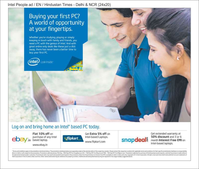
The Indian print adaptation reversed the joke, setting a Bollywood dance sequence against two men in lab coats.
The Social Film Trilogy (2011-2013)
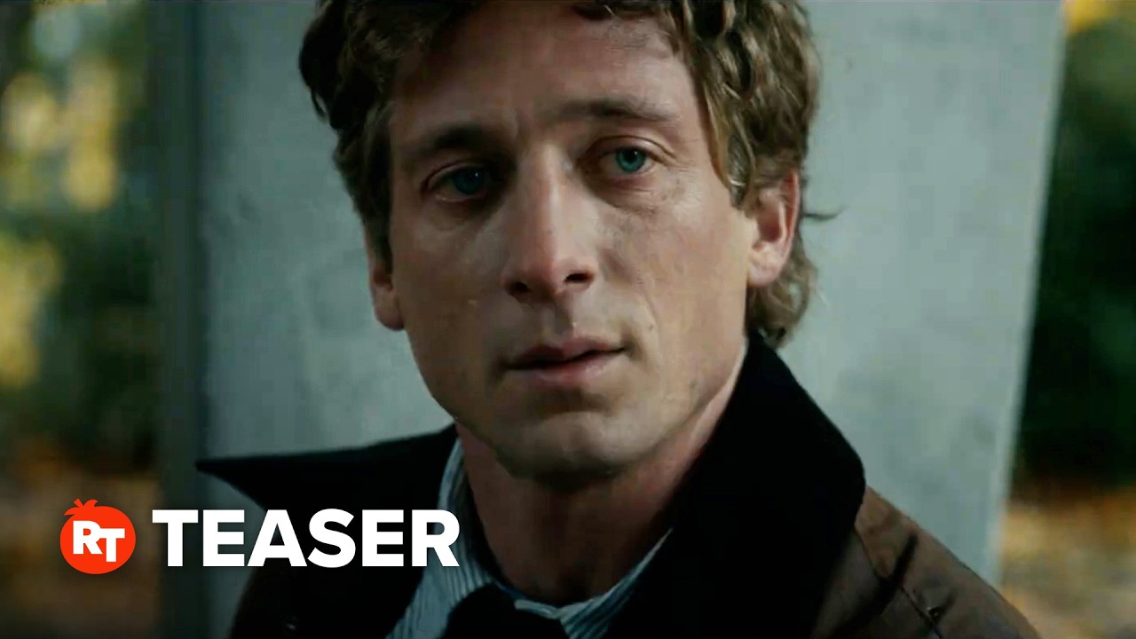
Intel produced three long-form branded films with Toshiba between 2011 and 2013: Inside (2011), The Beauty Inside (2012) and The Power Inside (2013), all through Pereira & O’Dell.
The Beauty Inside is the one that mattered. Directed by Drake Doremus, six episodes, a protagonist who wakes in a different body each morning, with fans cast in the lead role through Facebook auditions.
- 70 million views
- Daytime Emmy for Outstanding New Approach
- 3 Cannes Lions Grand Prix (Cyber, Film, Branded Content)
- 2 Webby Awards and the SXSW Interactive Best Film/TV award
The product is a Toshiba Portege Ultrabook with Intel inside, on screen as a diary device rather than a hero shot. Product placement carried by storytelling instead of specification.
The Museum of Me (2011)

Projector Tokyo built The Museum of Me for the Intel Core i5 processor: a generated gallery walkthrough assembled from a visitor’s own Facebook data.
Awards: Cannes Lions Gold in Branded Content, Cyber and Film, a Grand Clio in Interactive, and FWA Site of the Year 2011.
The art direction is museum-white throughout, which lets user photographs supply every color in the piece.
Go PC (2021-2022)
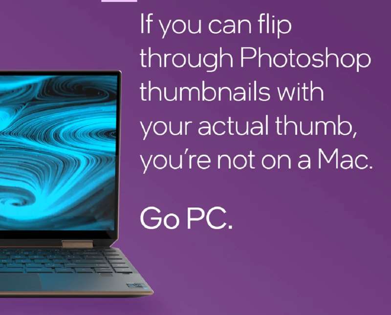
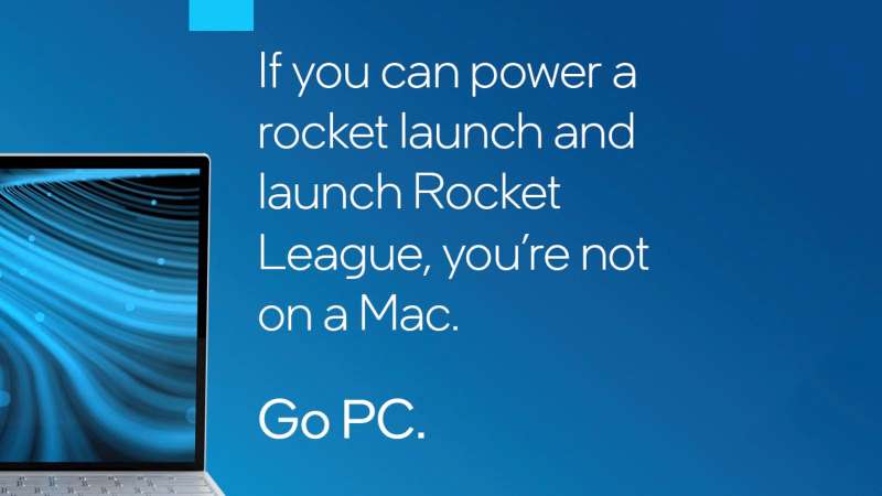
Go PC ran as five short social spots starring Justin Long, the actor who played the Mac in Apple’s Get a Mac campaign between 2006 and 2009.
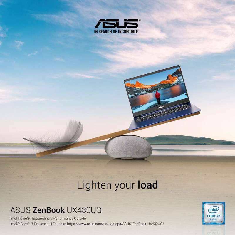
What the spots argued: touchscreens, 2-in-1 form factors, multi-monitor support and PC gaming libraries, staged against real hardware including the ASUS ZenBook Duo 14, Lenovo Yoga 9i and MSI Stealth 15M.
How it landed: Macworld and Daring Fireball both read the casting as defensive, arriving months after Apple moved the Mac to its own M1 silicon.
Worth saying plainly: the concept is the casting. Nothing else in the spots would survive without it.
That’s the Power of Intel Inside (2025)

Intel introduced its current brand platform at Intel Vision 2025 in Las Vegas, led by the line “That’s the power of Intel Inside” and a hero film titled Superpower.
CMO Brett Hannath framed the platform around the idea that Intel ignites the greatness within, applied to employees, customers, communities and partners.
The revival is deliberate. Intel had wound down its OEM advertising match years earlier, so the 2025 line borrows the equity of the 1991 program without restoring the funding model behind it.
How Do Intel Print Ads Work Visually?
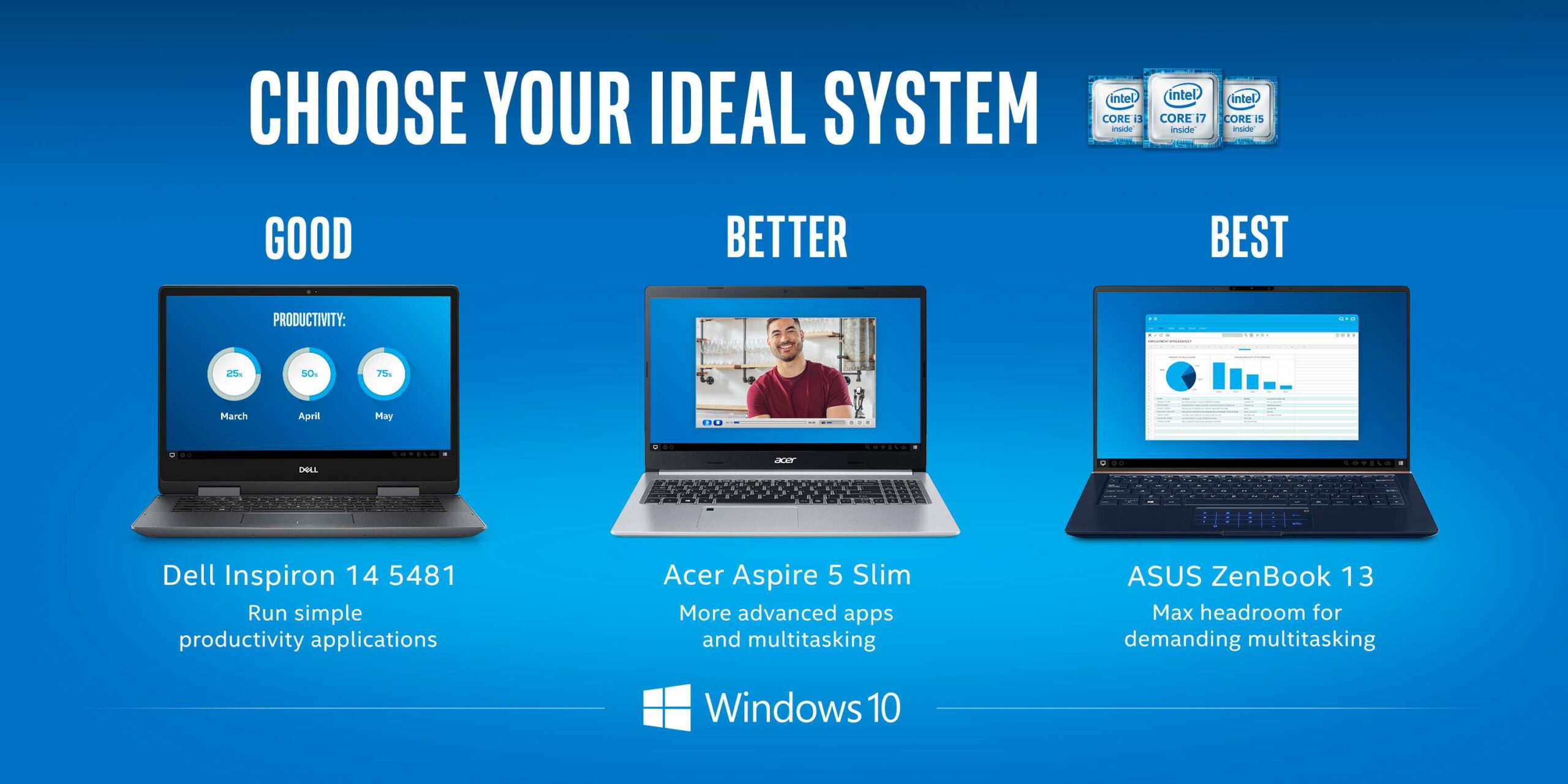
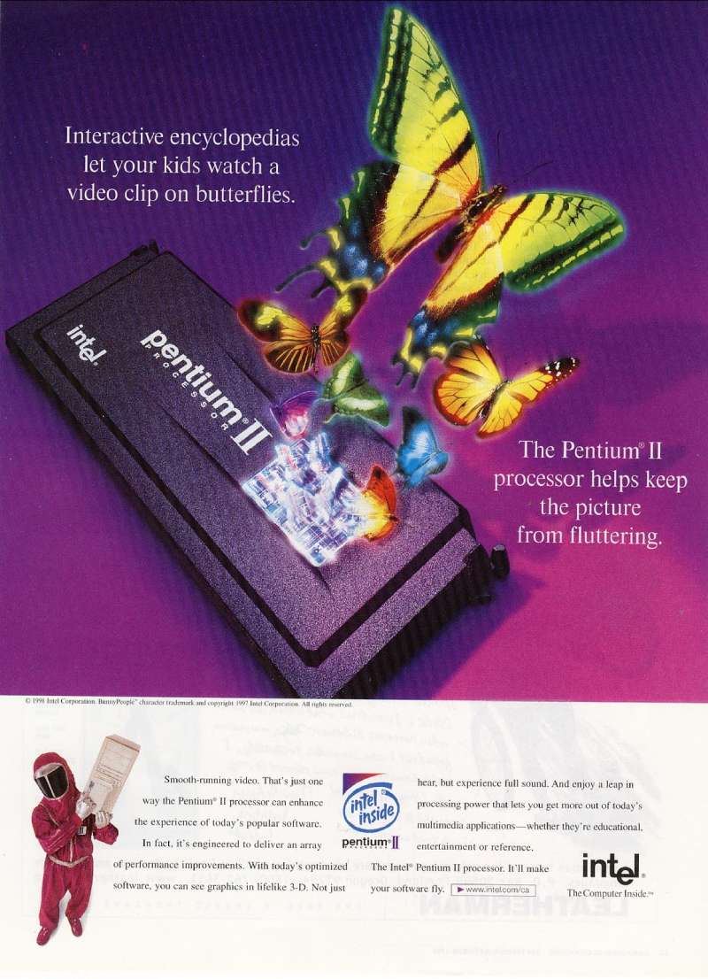
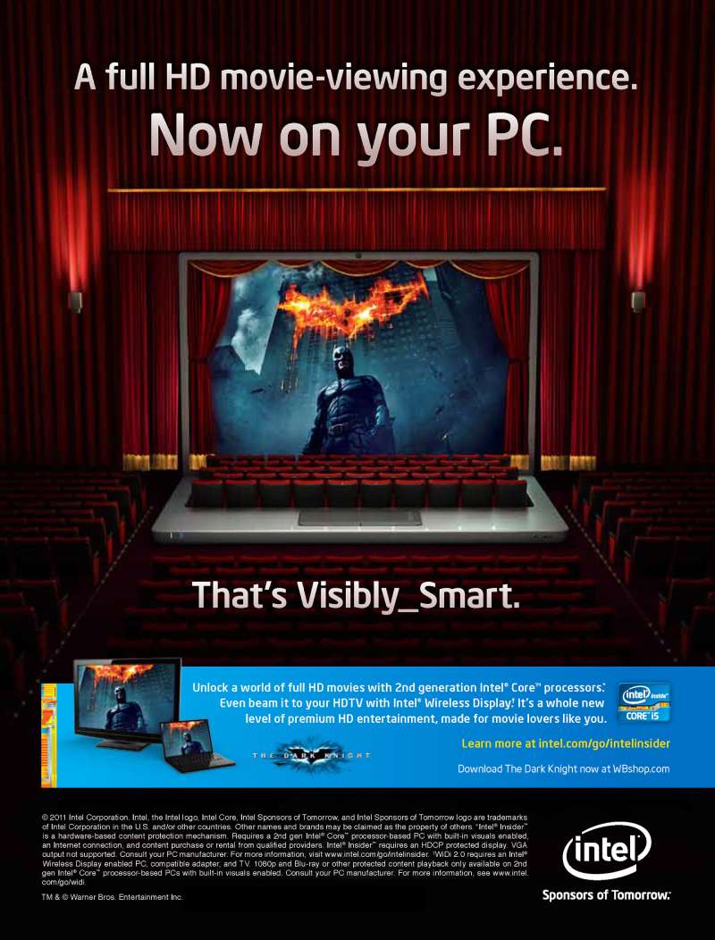
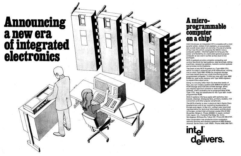
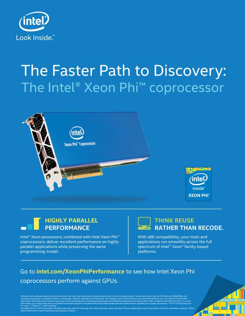
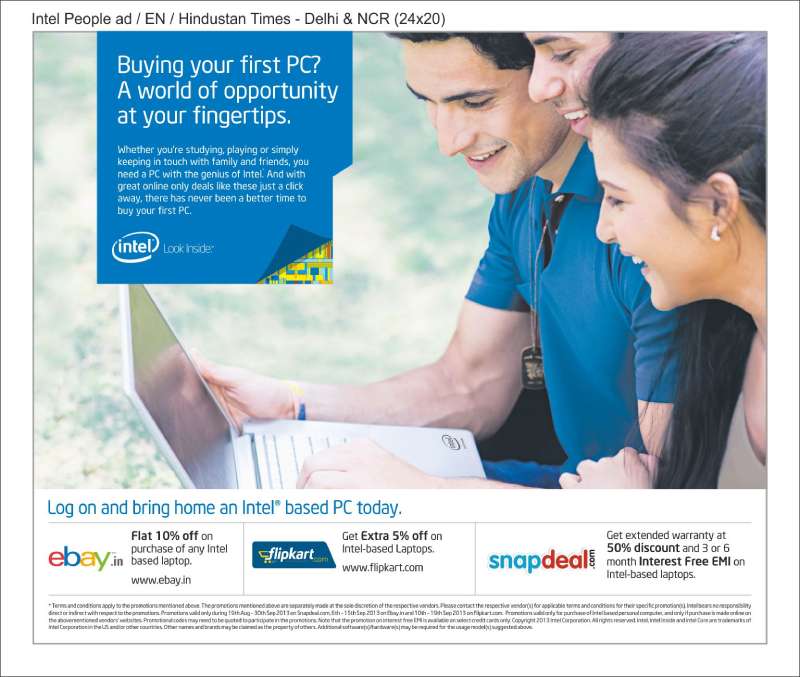
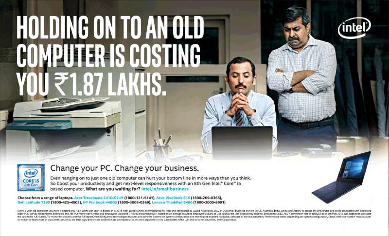
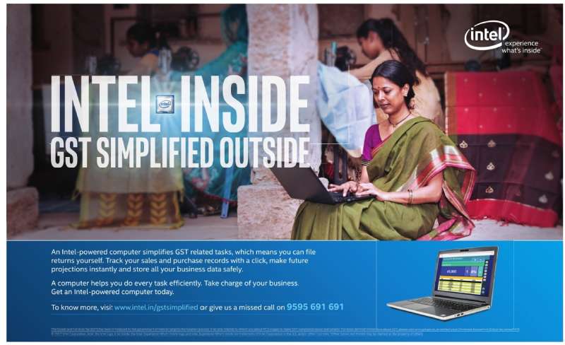
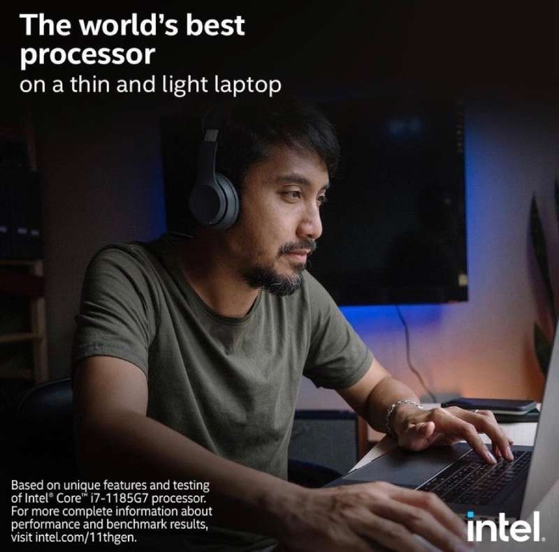
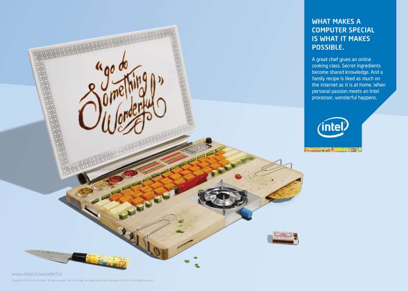
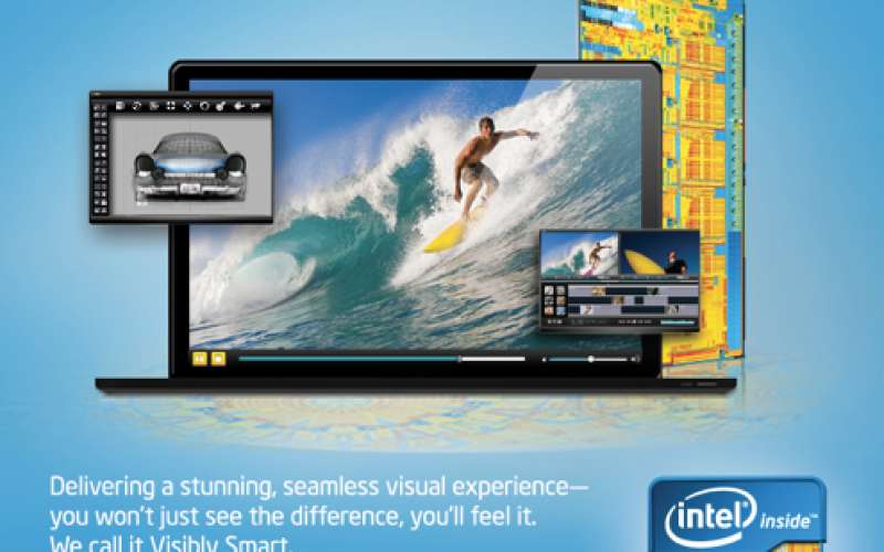
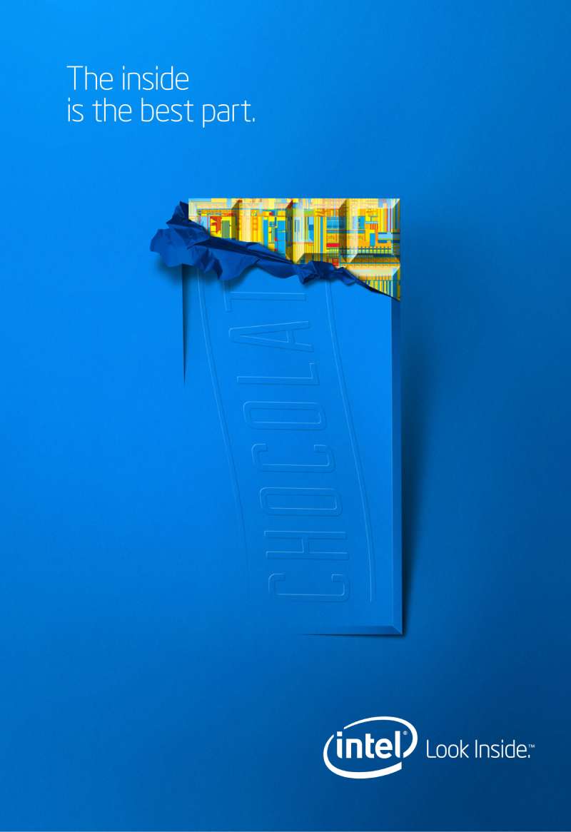
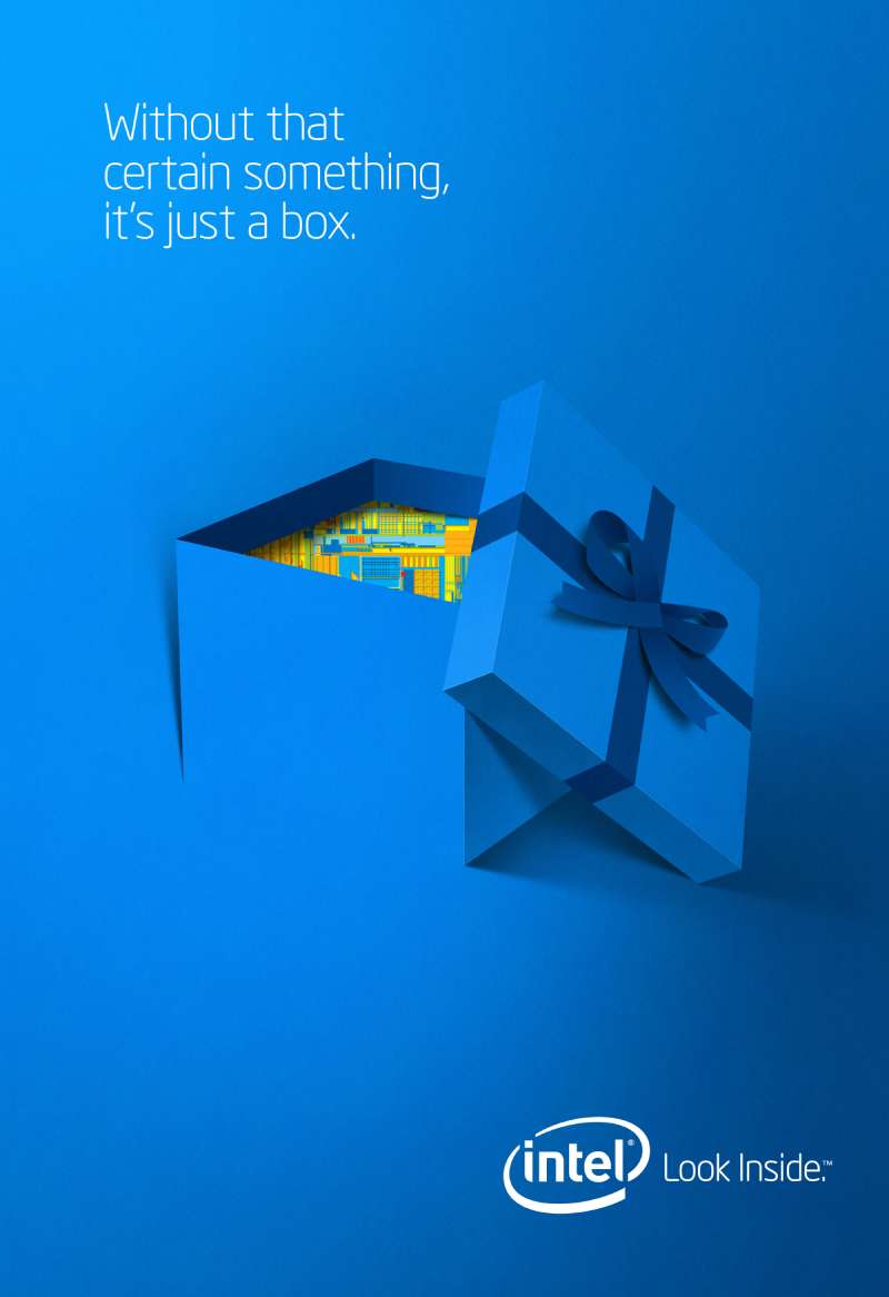
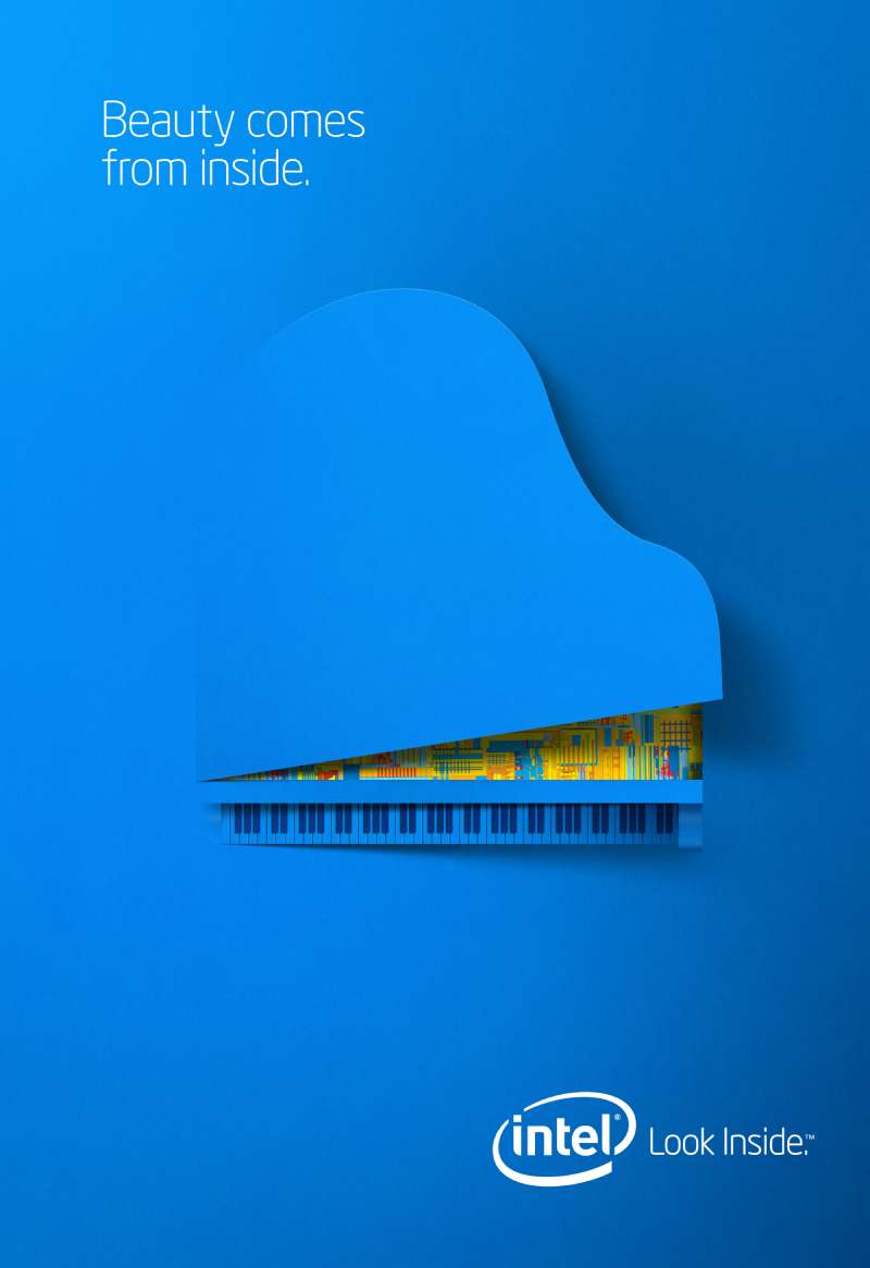
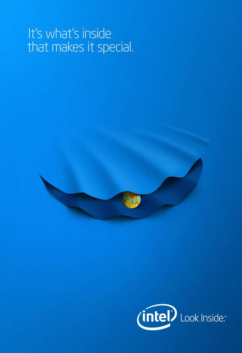
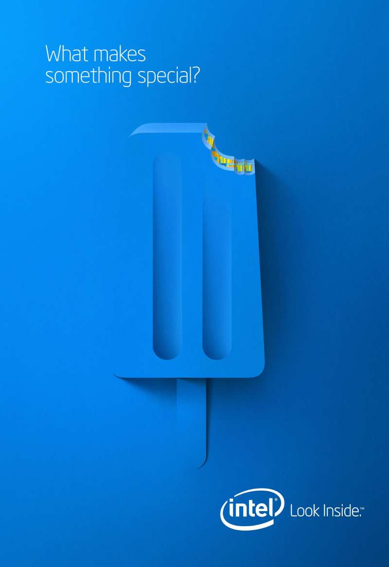
Intel print ads use a fixed formula: one large product or human subject, a single blue field, a short headline in a geometric sans, and the logo lockup anchored bottom right. Body copy rarely exceeds 40 words. The layout is built around the logo, not the product.
The sticker as a layout constraint
Every Intel Inside execution had to reproduce at two scales at once: a full magazine spread and a 25mm adhesive rectangle. That forced high-contrast shapes and killed any fine detail before it reached artwork.
The result reads as minimalist design by engineering necessity rather than by stylistic preference.
Type across four identity eras
Intel has used four wordmark typefaces. The 1968 lowered-e wordmark ran 37 years. FutureBrand introduced Neo Sans Intel in 2006, Red Peak Branding and Dalton Maag delivered Intel Clear in 2014, and the 2020 rebrand shipped the proprietary Intel One family.
Intel One is a geometric sans-serif font with squared terminals, a shortened t crossbar and a square dot on the i. That square dot does the work a logo mark would normally do, which is why the current wordmark needs no container.
Headlines run tight. Display settings in Intel campaign work use negative tracking and manual kerning around the capital I, which otherwise opens a visible gap next to round letterforms.
Blue and almost nothing else
Intel Blue carried the identity alone until 2020, when the rebrand added a wider palette while keeping the brand blue-first. Warmer secondary colors appear in campaign layouts, never in the wordmark.
Single-hue systems like this are cheap to police across 30 markets and hundreds of OEM partners, which is the practical argument behind most brand guidelines built on one dominant color.
Where the eye goes
Intel layouts place the focal point above the optical center and push the logo to the lower right, so the reading path ends on the brand rather than starting there.
Generous white space around the headline gives the visual hierarchy only three levels: image, headline, mark. Anything more collapses at sticker scale.
How Do Intel TV Commercials Differ From Its Print Ads?
Intel TV commercials carry the five-note audio mnemonic, which print cannot. They also use human performers as the subject, where print uses product silhouettes. Television gave Intel a place to sell a component through choreography, comedy and casting rather than specification.
Bunny People, 1997, Dahlin Smith White. Cleanroom technicians in colored jumpsuits dance through a fab to “Play That Funky Music” while a voiceover explains MMX media enhancement technology. First aired during Super Bowl XXXI.
Blue Man Group, 2000, Euro RSCG. Three blue performers paint the roman numeral III on a wall in green pigment. No processor appears on screen at any point.
Rock Star, 2009, Venables Bell + Partners. Ajay Bhatt walks through the Intel cafeteria in slow motion while colleagues swoon and beg for autographs. Conan O’Brien parodied the spot in October 2009.
Superpower, 2025. The launch film for the current brand platform, built around individual capability rather than silicon.
Extending a static identity into moving image is a motion graphics problem, and Intel solved it with sound instead of animation. The bong plays over a still logo. That decision has outlasted every campaign built around it.
How Has Intel Advertising Evolved Since 1989?
Intel advertising has moved through 5 phases: direct product comparison (1989), ingredient branding (1991-2005), platform branding (2006-2008), brand storytelling (2009-2015) and heritage revival (2020-2025). Each shift followed a competitive threat rather than a creative one.
| Period | Strategic shift | Representative campaign |
|---|---|---|
| 1989-1990 | Sell the chip generation directly | “Red X” |
| 1991-2005 | Brand the ingredient, fund the OEMs | “Intel Inside” |
| 2006-2008 | Sell platforms, not part numbers | “Leap Ahead” |
| 2009-2015 | Sell the engineers and the stories | “Sponsors of Tomorrow” |
| 2020-2025 | Reclaim the 1990s equity | “That’s the power of Intel Inside” |
The 2006 break was the sharpest. Intel retired the 37-year-old lowered-e wordmark, replaced the Intel Inside tagline with “Leap ahead,” and kept the co-op program running under the old name.
Interbrand valued the Intel brand at roughly $36 billion and ranked it fifth worldwide at the time of that change.
By 2013 the line had become “Look Inside,” and by 2015 “Experience What’s Inside.” Both kept the preposition and dropped the guarantee, which reads like a company hedging on what exactly was inside.
Which Agencies Created Intel Advertising?
Five agencies produced Intel’s flagship advertising. Dahlin Smith White built Intel Inside and Bunny People. Euro RSCG ran the account through the 2000s. Venables Bell + Partners created Sponsors of Tomorrow. Pereira & O’Dell made the social films. Projector Tokyo made The Museum of Me.
Dahlin Smith White was founded in Salt Lake City in 1986 by John Dahlin, Darrell Smith and Jon White. The agency developed Intel Inside with Dennis Carter in 1990 and produced the 1997 Super Bowl Bunny People spots.
Euro RSCG consolidated Intel’s worldwide account in March 1996, when Havas acquired a majority stake in Dahlin Smith White. The Salt Lake office was renamed Euro RSCG DSW Partners in January 1998, and Intel’s business moved to New York later that year.
Venables Bell + Partners, founded in San Francisco in 2001 by Paul Venables, won Intel’s master brand account in January 2009 and launched Sponsors of Tomorrow four months later.
Pereira & O’Dell created The Beauty Inside for Intel and Toshiba in 2012, then followed it in 2013 with The Power Inside, starring Harvey Keitel and directed by Will Speck and Josh Gordon.
Identity work sat with different firms. FutureBrand led the 2005 rebrand, Red Peak Branding and Dalton Maag drew Intel Clear in 2014, and Andrew Mirakian Design led the 2020 rebrand that produced the Intel One family and the Spark motif.
What Can Designers Learn From Intel Ads?
Intel’s advertising offers 5 transferable lessons, all of them about designing a mark and a layout that survive extreme scale changes, partner reproduction and 30 years of campaign turnover.
- Design the mark at its smallest use case first, then scale up
- Give the brand a sound when the visual can only hold for three seconds
- Limit the palette to one hue plus black until the system is fully adopted
- Set headlines in one weight of one typeface and let scale create hierarchy
- Anchor the logo at the end of the reading path, not the start
The type selection question sits underneath all of these. Choosing fonts for advertising that hold at 25mm and at billboard scale narrows the field to geometric sans faces with open counters, which is exactly where Intel landed three times in a row.
The co-op model carries a lesson too. Intel wrote the layout rules, funded partner production, and got a consistent mark across hundreds of manufacturers who had no reason to care about its brand typography.
How Do Intel Ads Compare to Its Competitors’ Ads?
Intel and AMD sell the same category to the same buyer, and their advertising diverges on one axis: Intel spent 30 years building a consumer-facing mark, while AMD historically advertised benchmarks to enthusiasts. AMD’s “Leaps beyond” line from the mid-2000s was a direct answer to “Leap ahead,” and it stayed in the trade press rather than the Super Bowl.
NVIDIA took the third route. Its advertising leans on demonstration, real-time rendering and developer conference keynotes, so the brand grew through visible output rather than through an ingredient badge. Anyone comparing the two approaches should look at NVIDIA ads next to Intel’s platform-era print work.
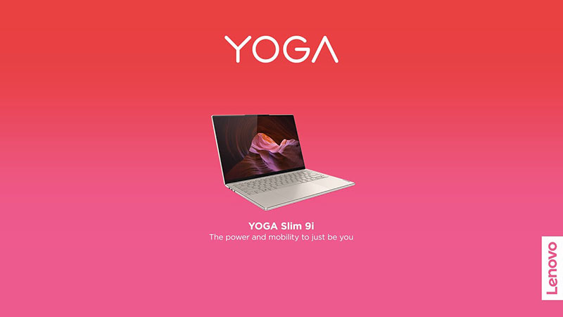
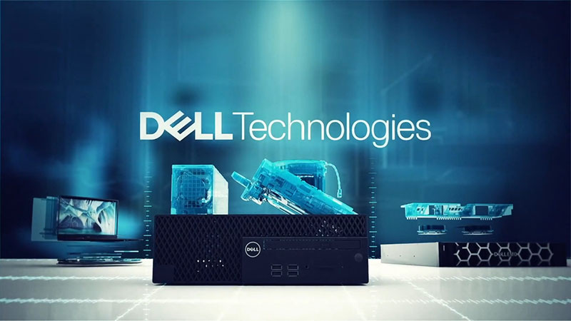
The OEM side is the other useful comparison. Intel funded half the cost of the ads its partners ran, which means the visual language of Dell ads, HP ads and Lenovo ads from the 1990s and 2000s carries Intel’s logo placement rules inside it. IBM ads ran one of the first executions of the Intel Inside tag in 1991, before IBM exited the PC business entirely.
What Makes Intel Advertising Work?
The work solves one problem repeatedly: a component nobody sees, bought by nobody directly, sold through a third party’s product.
Every durable decision follows from that constraint. A mark small enough for a palm rest. A sound short enough to close a 30-second spot. A single hue that survives reproduction by hundreds of manufacturers Intel does not control.
The campaigns that failed are the ones that forgot the constraint and reached for borrowed celebrity instead.
Designers working on any ingredient, component or platform brand can take the method straight across: define the smallest surface you will ever appear on, design there first, then fund the people who own the larger surfaces to carry you.
Intel Ads Examples
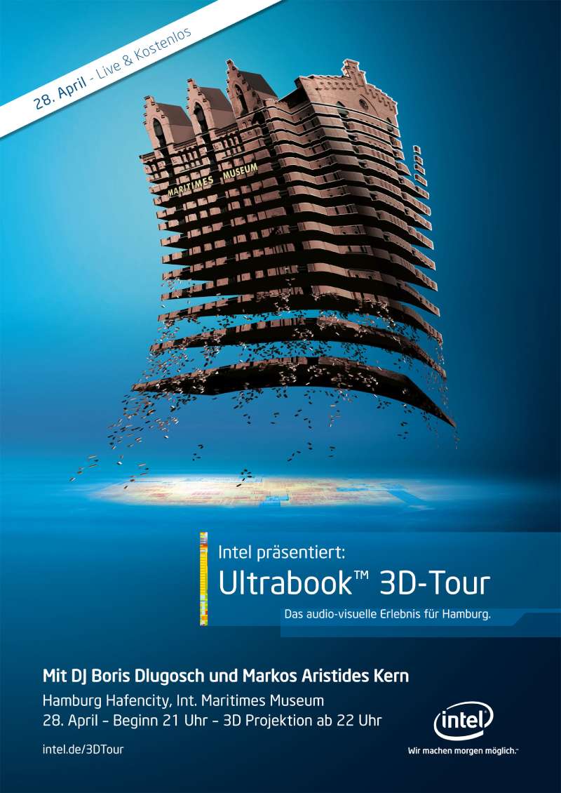
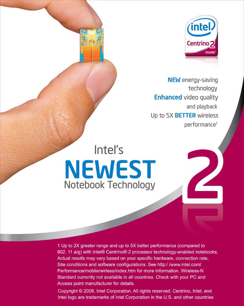
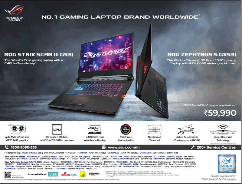
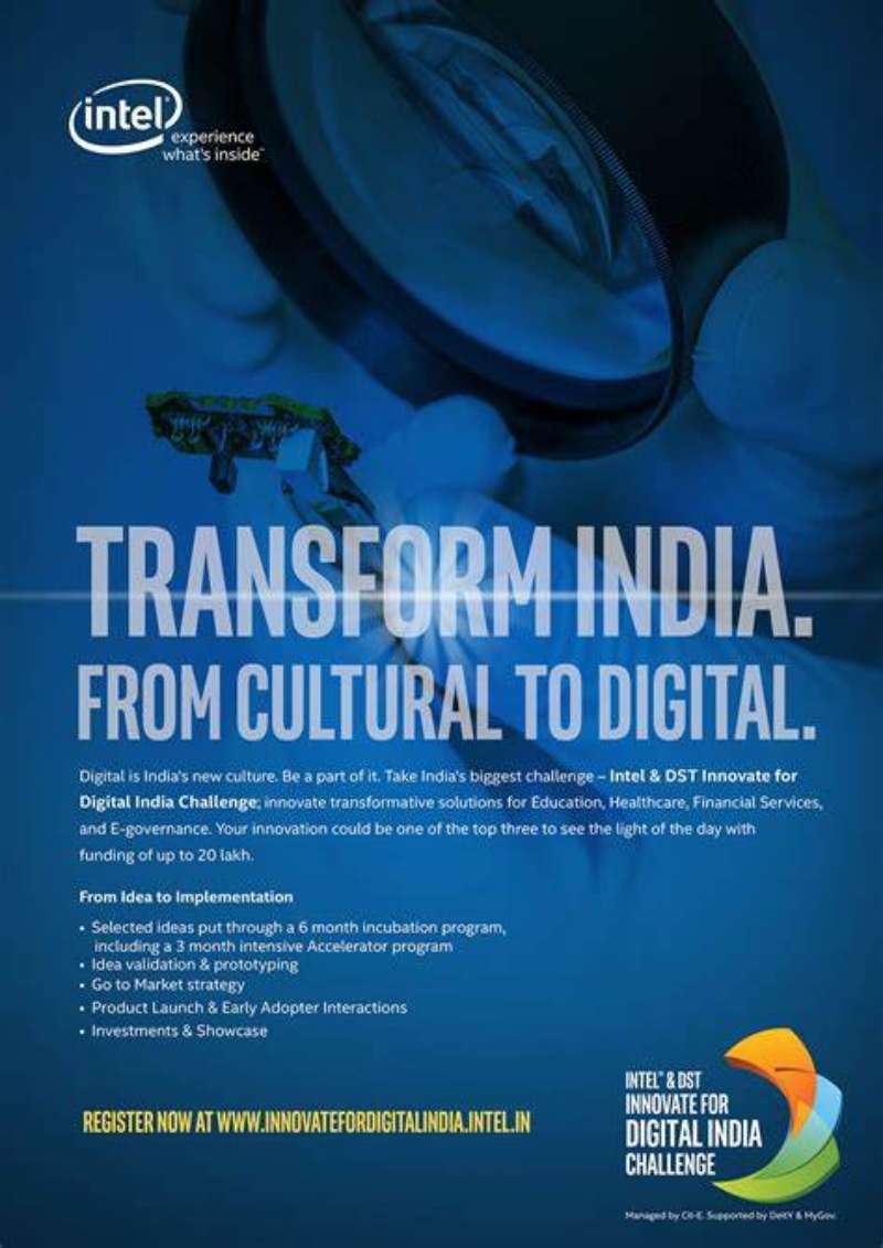




FAQ on Intel Ads
What does the Intel Inside sticker actually mean?
The sticker signals that an Intel microprocessor sits inside the machine.
It carried no performance claim of its own. Intel used it as a quality shortcut, letting buyers judge a PC by its component rather than by the manufacturer’s name on the lid.
What is ingredient branding?
Ingredient branding markets a component directly to end consumers who never buy it separately.
Intel pioneered the model in computing in 1991. The component maker funds the advertising, and the finished-product manufacturer carries the mark.
How much did Intel spend on the Intel Inside program?
Intel routed 3 percent of microprocessor revenue into a fund PC makers could draw on, covering up to half their advertising costs.
A 2002 Harvard Business Review case study counted more than $1.5 billion in Intel Inside advertising generated during 2001 alone.
Why did Intel replace the Intel Inside tagline in 2006?
Intel shifted from selling individual chips to selling platforms, and the old line tied the brand to a single component.
Leap Ahead launched at CES in January 2006. The co-op marketing program kept the Intel Inside name.
Why is Intel advertising almost always blue?
Intel Blue carried the entire identity until the 2020 rebrand added warmer secondary colors, and the brand stayed blue-first.
Single-hue systems reduce reproduction errors across partners. The color psychology argument for trust and reliability came second.
Who was Dennis Carter?
Carter joined Intel in 1981, served as technical assistant to Andy Grove, and became vice president of corporate marketing in 1992.
He built the Red X campaign, the Intel Inside program and commissioned the five-note audio mnemonic.
Did other companies copy the Intel Inside model?
Yes, almost immediately.
Carter told EE Times that Microsoft replicated the approach with its Windows logo, and that disk drive makers and other PC component suppliers followed with mixed results.
Has Intel adapted its ads for regional markets?
Sponsors of Tomorrow launched in three markets in May 2009, then expanded to more than two dozen countries.
The Indian print execution, handled locally by TAG Media Network, staged a Bollywood dance sequence against two engineers in lab coats.
What is the Intel swirl logo?
The swirl is the oval device that enclosed the Intel wordmark from 2006 to 2020, introduced by FutureBrand alongside Neo Sans Intel.
The 2020 rebrand dropped it, leaving the wordmark to carry the visual identity alone.
How long does an Intel campaign usually run?
Longer than most tech advertising.
The Intel Inside tagline ran 14 years, from 1991 to 2005. Venables Bell + Partners planned Sponsors of Tomorrow for a lifespan of 3 to 5 years, and it lasted roughly that long.
Conclusion
Reading Intel ads across four decades, the through line is not a slogan. It is a set of constraints that produced a legible mark, a three-second audio mnemonic and a co-op marketing program strong enough to shape how Dell, HP and Lenovo laid out their own pages.
Cleanroom technicians dancing at Super Bowl XXXI. A USB architect mobbed like a rock star. Six episodes of branded drama that pulled a Daytime Emmy.
None of those look alike, and all of them answer the same brief.
The design lesson holds outside semiconductors. Build the brand identity at its smallest reproduction size, keep the palette narrow, and give partners a reason to carry it.
Everything else in the archive is execution.

Renowned for his expertise in logo design and visual branding, Bogdan has developed a multitude of logos for various clients.
His skills extend to creating posters, vector illustrations, business cards, and brochures. Additionally, Bogdan's UI kits were featured on marketplaces like Visual Hierarchy and UI8.
He also wrote in the past years on sites like Design Your Way, WebDesignerDepot, WPDean, Designmodo, Speckyboy, Slider Revolution, and more.
- Canva vs PowerPoint: Which Is Better for Presentations? - 22 September 2026
- How to Install Fonts on Mac (Step-by-Step Guide) - 20 September 2026
- From Mockup to Code: How AI-Augmented Development Speeds Up the Design Handoff - 19 September 2026

Bogdan Sandu is a seasoned designer who has been designing websites since 2008. Renowned for his expertise in logo design and visual branding, Bogdan has developed a multitude of logos for various clients. His skills extend to creating posters, vector illustrations, business cards, and brochures. Additionally, Bogdan's UI kits were featured on marketplaces like Visual Hierarchy and UI8. He also wrote in the past years on sites like Design Your Way, WebDesignerDepot, WPDean, Designmodo, Speckyboy, Slider Revolution, and more.
You Might Also Like