


You’ve probably spent hours scrolling through Tumblr’s endless dashboard without thinking twice about the text staring back at you. The Tumblr font isn’t just another typeface choice – it’s a carefully crafted design decision that shapes how millions interact with content daily.
This microblogging platform made a bold move by selecting Helvetica Neue as their primary typography solution. While other social media sites chase trends, Tumblr stuck with clean, readable text that actually works.
Font selection impacts everything from user engagement to brand perception. Most people never notice good typography until it’s bad.
You’ll discover why Tumblr chose this specific font family, how it affects your browsing experience, and what makes their typography decisions successful. We’ll break down the technical implementation, explore alternatives, and show you how to replicate their approach in your own projects.
What Font Does Tumblr Use
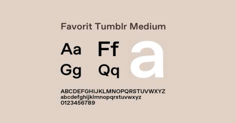
I’ll tell you straight: the heart of Tumblr’s typeface is Favorit-Tumblr. It’s a customized take on the original “Favorit” font from Dinamo, a brand that’s notorious for serving up typographic masterpieces. But what sets Favorit-Tumblr apart?
Creating Unique Shapes
The magic in Favorit-Tumblr is in its Lining style. Here’s the secret: characters with descenders, you know, the bits that dip below the line like the tail of a ‘y’ or ‘g’, they get transformed.
These tails morph into a suave underline, birthing a whole new breed of shapes. This isn’t just eye-candy, folks. This stuff’s practical – like a neon highlighter for your text.
The Dashboard Aesthetic
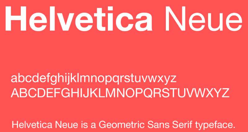
Take a look at your Tumblr dashboard. Notice anything? That sleek typeface you’re reading – that’s Helvetica Neue. Sure, it’s not Favorit-Tumblr, but this font has a story of its own.
It’s a classic, like the perfect black dress or a killer leather jacket. And just like those essentials, it’s all about versatility. From your blog titles to your post descriptions, Helvetica Neue’s got your back.
Alternatives to the Tumblr Font
Now, what if you want to shake things up? Here are a couple of fonts that could give your Tumblr a fresh spin.
The Georgia Glow
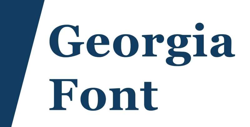
Ever met Georgia? It’s like Favorit Tumblr’s distant cousin. Only, she’s all about serifs and softness. Georgia is a timeless typeface, but she’s got the power to add a dash of elegance to your posts.
Her secret weapon? Readability. Yep, Georgia is easy on the eyes, making your long posts a breeze to read.
The Verdana Vibe
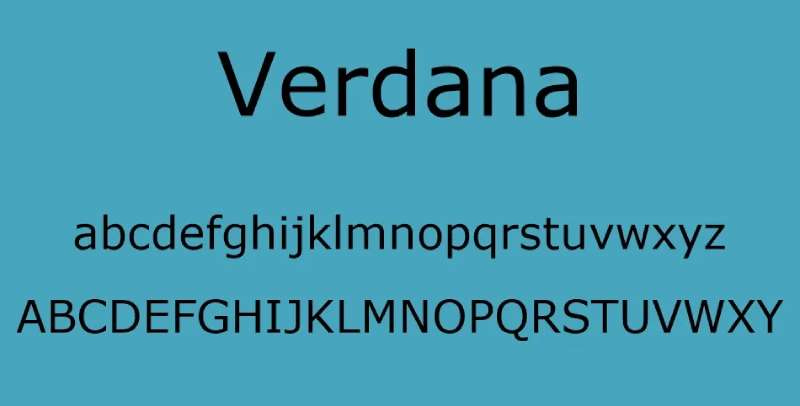
Meet Verdana. Verdana is the life of the party. She’s friendly, she’s readable, and she’s the perfect companion for your screen.
Verdana is optimized for readability on screens, and she shines in small sizes. So if your posts are filled with tiny details, Verdana might be your new best friend.
Favorit-Tumblr: A Deep Dive
Let’s dig a little deeper into Favorit-Tumblr.
Making Favorit Personal
This is Favorit, only better. By adding a dash of Tumblr’s own style, this font has transformed from a basic typeface to a signature script. The result? A font that screams Tumblr in every stroke.
Staying Consistent
Ever noticed how, despite the sea of posts, Tumblr still feels like Tumblr? That’s the Favorit-Tumblr effect. It creates a sense of uniformity across the site, all while giving your own space room to breathe and evolve. A tricky balance to strike, but Favorit-Tumblr nails it.
Playing with Tumblr’s Font Toolbox
Fonts are like colors. You’ve got a whole palette, so why stick to one?
Expressing Your Style
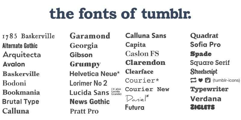
Tumblr is offering a smorgasbord of 33 font options for your blog title. That’s 33 different ways to express your vibe. From punchy, bold scripts to soft, soothing serifs – the choice is yours. Go wild.
Keeping it Fresh
New to the game or just looking for a fresh start? Experimenting with different fonts is a great way to shake things up. Sometimes a new font is all it takes to see your content in a whole new light. So take a chance, switch things up, and let the fonts do the talking.
FAQ on The Tumblr Font
What font does Tumblr actually use?
Tumblr uses Helvetica Neue as their primary font family across the platform. This sans-serif font provides clean readability and modern aesthetics. The platform implements a comprehensive font stack that includes system fallbacks for optimal cross-browser compatibility and performance.
Can I change the Tumblr font on my blog?
Yes, you can customize fonts through CSS modifications in your theme editor. Custom themes allow complete typography control, including font family selection, sizing, and spacing adjustments. However, changing dashboard fonts requires browser extensions or custom stylesheets since Tumblr controls the main interface typography.
Why did Tumblr choose Helvetica Neue?
Helvetica Neue offers excellent legibility across devices and screen sizes. The typeface maintains consistent character spacing and optimal x-height ratios for digital reading. Tumblr prioritized user experience over decorative elements, choosing a font that wouldn’t distract from content consumption and creation.
What’s the exact font size Tumblr uses?
Tumblr typically uses 14px to 16px for body text and larger sizes for headings. Mobile versions adjust dynamically based on device specifications. The platform implements responsive font spacing to maintain readability across different screen resolutions and orientations.
How does Tumblr’s font affect readability?
The font choice significantly improves reading comprehension and reduces eye strain during extended browsing sessions. Helvetica Neue’s balanced letterforms and generous spacing create comfortable reading experiences. Studies show sans-serif fonts perform better on screens compared to traditional serif alternatives.
Can I download Tumblr’s exact font?
Helvetica Neue requires commercial licensing from Monotype or similar foundries. Free alternatives like Inter, Roboto, or System fonts provide similar aesthetics. Many designers use these substitutes to achieve Tumblr-inspired typography without font licensing costs or legal complications.
What font weight does Tumblr prefer?
Tumblr primarily uses regular (400) and medium (500) font weights throughout their interface. Bold weights appear in usernames and post headers for visual hierarchy. This approach maintains consistency while providing necessary emphasis for navigation and content organization.
Does Tumblr use custom fonts anywhere?
The platform occasionally implements custom display fonts for special campaigns or seasonal themes. Logo typography differs from body text, using modified letterforms for brand recognition. However, the core user interface consistently maintains Helvetica Neue for functional purposes and user familiarity.
How does Tumblr’s font compare to other platforms?
Unlike platforms using proprietary typefaces, Tumblr chose a widely recognized font. Twitter uses custom fonts, while Pinterest font selections focus on visual appeal. Tumblr’s approach prioritizes content over branding, creating a neutral reading environment.
What happens if Helvetica Neue isn’t available?
Tumblr’s CSS includes comprehensive fallback options including Arial, system fonts, and generic sans-serif declarations. Modern browsers automatically substitute similar fonts when primary choices aren’t installed. This ensures consistent typography experiences regardless of user device configurations or font availability.
Conclusion
The Tumblr font represents thoughtful platform design prioritizing content over flashy aesthetics. Helvetica Neue’s implementation demonstrates how smart typography choices enhance user engagement without drawing attention away from posts and media.
Understanding web font strategies helps creators make informed decisions about their own projects. Platform typography affects everything from reading speed to brand perception. Tumblr’s approach shows that font psychology extends beyond marketing materials into digital experiences.
Whether you’re building blogs, designing interfaces, or customizing themes, typography fundamentals remain constant. Clean kerning, appropriate font weights, and reliable fallback options create sustainable design systems.
The platform’s font choices reflect broader graphic design principles about clarity and function. Good typography disappears into the background, letting content shine. That’s exactly what Tumblr achieved with their understated yet effective font selection.
If you liked this article about the Tumblr font, you should check out this article about the font that Dior uses.
There are also similar articles discussing the font that National Geographic uses, the font that Jeopardy uses, the font that Dunkin’ Donuts uses, and the TikTok font.
And let’s not forget about articles on the Pinterest font, the Etsy font, the Airbnb font, and the Gmail font.

Renowned for his expertise in logo design and visual branding, Bogdan has developed a multitude of logos for various clients.
His skills extend to creating posters, vector illustrations, business cards, and brochures. Additionally, Bogdan's UI kits were featured on marketplaces like Visual Hierarchy and UI8.
He also wrote in the past years on sites like Design Your Way, WebDesignerDepot, WPDean, Designmodo, Speckyboy, Slider Revolution, and more.
- The Windsurf Logo History, Colors, Font, And Meaning - 10 October 2026
- How to Remove Background From Product Photos (No Photoshop) - 10 October 2026
- How Designers can Build a Stronger Online Creative Identity - 9 October 2026

Bogdan Sandu is a seasoned designer who has been designing websites since 2008. Renowned for his expertise in logo design and visual branding, Bogdan has developed a multitude of logos for various clients. His skills extend to creating posters, vector illustrations, business cards, and brochures. Additionally, Bogdan's UI kits were featured on marketplaces like Visual Hierarchy and UI8. He also wrote in the past years on sites like Design Your Way, WebDesignerDepot, WPDean, Designmodo, Speckyboy, Slider Revolution, and more.
You Might Also Like


