Adidas uses Adineue PRO, a custom geometric sans-serif font developed exclusively for the brand.
The typeface was first created in 2012 by designer Joancarles Casasín as a lowercase-only system in three weights. Adidas later collaborated with MCKL, a Los Angeles-based type foundry, to expand the family into a full type system used across all brand touchpoints, from campaign graphics to product packaging.
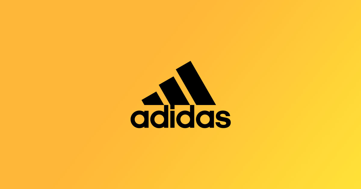
The logo wordmark is set in Adineue PRO Bold, all lowercase, with tight letter spacing and a distinctive square dot above the “i.”
What Type of Font Is Adineue PRO?

Adineue PRO is a geometric sans-serif. It draws directly from the soft, rounded letterforms in the original Adidas wordmark, which dates to the 1960s.
The typeface sits closest to the grotesque and geometric sans-serif categories. Its characters feature rounded shapes, minimal stroke contrast, and consistent weight across letters, all properties that push legibility at large scale.
Key visual traits:
- Lowercase-first design, optimized for the brand wordmark
- Square dot above the “i” (a deliberate brand identifier)
- High x-height for strong readability at small sizes
- Very tight default tracking, creating visual unity in the wordmark
- Soft geometry that references Bauhaus-influenced German design
The font avoids sharp corners or high contrast, which keeps it neutral enough to work across sportswear, lifestyle, and fashion contexts without feeling out of place.
Who Designed Adineue PRO?
Joancarles Casasín designed the initial version of Adineue in 2012 for Adidas’ “all in” campaign, created with agency Sid Lee.
That first release covered only lowercase letters in three weights. In 2012, Adidas also commissioned MCKL founder Jeremy Mickel to expand the system, a project that resulted in Adineue PRO, publicly noted by MCKL in 2015.
The full Adineue PRO family added:
- Uppercase letters
- Italic styles
- Condensed and extended widths
- Hundreds of special ligatures
- Support for the most common Latin languages
MCKL also remastered the Adidas wordmark and the iconic trefoil as part of the same project, keeping typographic consistency across all brand expressions.
In 2017, Adidas and MCKL pushed further and developed Adineue Chop, an octagonal variable font released in summer 2018, used across retail, events, and digital campaigns.
Is Adineue PRO Free to Use?
No. Adineue PRO is proprietary intellectual property owned by Adidas AG.
The typeface is not available for public download and carries strict font licensing restrictions. Unauthorized commercial use could constitute trademark infringement.
If you see download links offering “Adineue PRO” for free, treat them as unauthorized distributions.
What Font Did Adidas Use Before Adineue PRO?
Before 2012, the Adidas wordmark was set in lettering closely modeled on ITC Avant Garde Gothic, a commercial geometric font originally designed by Herb Lubalin and Tom Carnase in the late 1960s for Avant Garde magazine.
That original lettering was adapted to fit Adidas’ brand, but it was never a fully custom typeface in the same way Adineue PRO is today.
The switch to Adineue in 2012 aligned with the clean design of the three-bar mountain logo introduced in 1991. Earlier still, pre-1967 Adidas lettering drew loosely from the handwriting style of founder Adolf “Adi” Dassler.
| Era | Typeface / Style | Notes |
| Pre-1967 | Handwriting-influenced lettering | Loosely based on Adi Dassler’s script |
| 1967–2012 | ITC Avant Garde Gothic (adapted) | Not a fully custom typeface |
| 2012–present | Adineue / Adineue PRO | Fully custom, proprietary system |
What Are the Best Free Alternatives to Adineue PRO?
Since Adineue PRO is not publicly available, these 5 free alternatives come closest in character:
| Font | Closest Similarity | License | Source |
| Montserrat | Geometric structure, rounded forms | Free (OFL) | Google Fonts |
| Nunito | Rounded terminals, soft geometry | Free (OFL) | Google Fonts |
| DM Sans | Low contrast, clean grotesque feel | Free (OFL) | Google Fonts |
| Futura PT | Geometric precision, similar weight | Paid | Adobe Fonts |
| Work Sans | Even stroke weight, high legibility | Free (OFL) | Google Fonts |
Montserrat is the most commonly recommended starting point. It shares Adineue’s geometric construction and is available as a free Google Font.
For anything closer to the Chop variable font, look at octagonal or angular sans-serif options on Adobe Fonts or type foundry catalogs.
How to Use an Adidas-Style Font in Your Projects

In Canva
Montserrat Bold is already in the Canva font library. No upload needed.
Set it in lowercase, tighten the letter spacing to around -50, and use bold weight. That gets you reasonably close to the Adidas wordmark feel without touching proprietary files. You can also upload fonts to Canva if you want to bring in a custom download.
In Figma
Install Montserrat or DM Sans via Google Fonts. Both load automatically in Figma once installed on your system.
Adjust kerning between letter pairs manually if you’re building a logo-style wordmark. Figma’s optical kerning setting is a decent starting point, but manual tweaks matter at large display sizes. If you need a full setup walkthrough, check how to add fonts to Figma.
For Web Use
Embed Montserrat via Google Fonts with this CSS snippet:
“ @import url('https://fonts.googleapis.com/css2?family=Montserrat:wght@700&display=swap');
body { font-family: ‘Montserrat’, sans-serif; font-weight: 700; letter-spacing: -0.03em; text-transform: lowercase; } `
This gets you the geometric boldness and tight spacing the Adidas wordmark is known for.
Why Did Adidas Choose This Font?
The short answer: it fits the brand’s German design roots.
Adidas was founded in 1924 near Weimar, Germany, where the Bauhaus school was reshaping how designers thought about functional, minimal form. The influence is direct. Adineue PRO reflects Bauhaus design principles: clean geometry, no decoration, and form that serves function.
Precision mattered more than personality. A geometric sans-serif with consistent stroke weight reads clearly on a shoe box, a stadium banner, and a phone screen. That range is non-negotiable for a global sportswear brand shipping across 160+ countries.
The all-lowercase wordmark was also a deliberate choice. It reads as approachable and confident without the formality that uppercase branding can carry. Brands like Nike take a different route with a more condensed, aggressive letterform. Adidas sits in contrast: open, geometric, and grounded.
Leon Imas, Adidas’ Senior Director of Identity at the time of the MCKL collaboration, described the goal as building typography that could work across every brand touchpoint without visual tension. A proprietary type system, rather than a licensed commercial font, was the only way to guarantee that level of consistency and control.
It’s also worth noting that commissioning Adineue PRO locked the brand’s visual identity behind IP protection. No competitor, no counterfeit label, and no fan project can legally replicate the exact letterforms. That kind of ownership matters at Adidas’ scale.
Other Brand Fonts Worth Comparing
If you’re researching brand typography beyond Adidas, a few comparisons are useful.
Balenciaga and Off-White both lean into industrial grotesque and condensed styles, reflecting a more aggressive fashion positioning. Gucci and Louis Vuitton go the opposite direction with refined, high-contrast serifs tied to luxury heritage.
Adidas sits between those worlds. Geometric, approachable, and functional. The typography reflects exactly where the brand positions itself: high performance with a lifestyle edge.
The Dior font and Chanel font are also common reference points for understanding how fashion brands use type to communicate identity without a word of copy, just letterform alone.
FAQ on What Font Does Adidas Use
What is the official Adidas font?
Adidas uses Adineue PRO, a custom geometric sans-serif typeface developed exclusively for the brand.
It was first created in 2012 by Joancarles Casasín, then expanded by MCKL type foundry into a full proprietary type system.
Is the Adidas font available for download?
No. Adineue PRO is proprietary and not publicly available. It carries strict font licensing restrictions.
Any free download claiming to offer the real file is an unauthorized distribution.
What font is closest to the Adidas logo font?
Montserrat and Nunito are the closest free alternatives. Both share the soft geometric construction and rounded forms of Adineue PRO.
Neither replicates the square “i” dot or the custom kerning of the original wordmark.
Did Adidas always use the same font?
No. Before 2012, the wordmark used lettering closely based on ITC Avant Garde Gothic, a commercial typeface designed by Herb Lubalin and Tom Carnase in the late 1960s.
Adineue replaced it to give the brand full typographic ownership.
Who designed the Adidas typeface?
Joancarles Casasín created the original Adineue in 2012. Jeremy Mickel of MCKL then expanded it into Adineue PRO, adding uppercase letters, italics, condensed styles, and special ligatures.
What type of font does Adidas use?
Adineue PRO is a geometric sans-serif font. It has consistent stroke weight, rounded forms, and minimal contrast between thick and thin strokes.
The design reflects the functional aesthetic of Bauhaus design, which influenced early Adidas visual identity.
Does Adidas use the same font across all product lines?
Mostly yes. Adineue PRO is the primary brand typeface used across Adidas Originals, Performance, and Sportswear lines.
Adineue Chop, an octagonal variable font released in 2018, is used for specific campaigns and retail contexts alongside Adineue PRO.
How does the Adidas font compare to the Nike font?
The Nike font is more condensed and aggressive. Adineue PRO is wider, rounder, and more open.
Both are proprietary, but they communicate very different brand personalities through font psychology alone.
Can I use an Adidas-style font for commercial projects?
Not using Adineue PRO itself. But free alternatives like Montserrat or DM Sans are licensed under the Open Font License and cleared for commercial use.
What font does Adidas use in its ads and marketing?
Campaign typography primarily uses Adineue PRO and, in some cases, Adineue Chop for display headlines.
The choice between the two depends on context: Adineue PRO for brand consistency, Chop for high-impact visual emphasis in performance-focused campaigns.
Conclusion
If you’ve been wondering what font does Adidas use, the answer is Adineue PRO, a fully custom geometric sans-serif typeface built specifically for the brand’s visual identity system.
It’s proprietary, not downloadable, and the result of a long collaboration between Adidas AG and type foundry MCKL.
For your own projects, free alternatives like Montserrat or Work Sans come closest in terms of geometric structure and brand lettering style.
The Adidas font choice isn’t accidental. It reflects the brand’s Bauhaus-influenced design language, its German engineering roots, and a deliberate push toward owning every detail of its corporate lettering across all touchpoints.

Renowned for his expertise in logo design and visual branding, Bogdan has developed a multitude of logos for various clients.
His skills extend to creating posters, vector illustrations, business cards, and brochures. Additionally, Bogdan's UI kits were featured on marketplaces like Visual Hierarchy and UI8.
He also wrote in the past years on sites like Design Your Way, WebDesignerDepot, WPDean, Designmodo, Speckyboy, Slider Revolution, and more.
- The Windsurf Logo History, Colors, Font, And Meaning - 10 October 2026
- How to Remove Background From Product Photos (No Photoshop) - 10 October 2026
- How Designers can Build a Stronger Online Creative Identity - 9 October 2026

Bogdan Sandu is a seasoned designer who has been designing websites since 2008. Renowned for his expertise in logo design and visual branding, Bogdan has developed a multitude of logos for various clients. His skills extend to creating posters, vector illustrations, business cards, and brochures. Additionally, Bogdan's UI kits were featured on marketplaces like Visual Hierarchy and UI8. He also wrote in the past years on sites like Design Your Way, WebDesignerDepot, WPDean, Designmodo, Speckyboy, Slider Revolution, and more.
You Might Also Like