Nike uses Futura Bold Condensed, a geometric sans-serif font originally designed by Paul Renner and first released by the Bauer Type Foundry in 1927.
For its wordmark, Nike commissioned a custom-modified version of the typeface, sometimes referenced as Futura ND Nike 365, with proprietary kerning adjustments and glyph refinements.
Nike adopted Futura as its primary brand typeface in the mid-1970s, and the “Just Do It” slogan (introduced in 1988) was set in Futura Condensed Extra Black, a heavier weight from the same family.
—
What Type of Font Is Futura Bold Condensed?
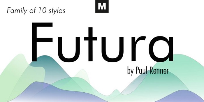
Futura Bold Condensed is a geometric sans-serif typeface. Specifically, it falls into the geometric sub-category, where letterforms are built from basic shapes: circles, triangles, and rectangles, with minimal stroke contrast.
A few defining characteristics:
- Circular bowls on letters like “O,” “C,” and “G”
- Nearly uniform stroke weight throughout each character
- Tall x-height that improves legibility at small sizes
- Condensed proportions that reduce horizontal space without sacrificing readability
The condensed width creates a strong vertical rhythm, which reads well on shoe boxes, jersey prints, and billboard signage at a distance.
Futura sits stylistically close to the Bauhaus design movement, which prioritized function and geometric clarity above all else. That connection gives it historical weight without looking dated.
Why Geometric Over Humanist?
Geometric sans-serifs feel precise and mechanical. Humanist fonts, by contrast, carry warmth and irregularity inspired by calligraphy. Nike clearly wanted the former.
The geometry signals performance, engineering, and speed. That’s not an accident.
—
Who Designed Futura?
Paul Renner designed Futura, beginning development around 1924 and completing it for the Bauer Type Foundry in Frankfurt, Germany, where it was released in 1927.
Renner was a German typographer and educator. He wasn’t formally affiliated with the Bauhaus school, but his design philosophy aligned closely with theirs: strip the letterform down to its geometric essentials.
Today, multiple foundries hold and distribute versions of Futura:
- Monotype publishes Futura Now, the most current digitized version
- URW Type Foundry distributes its own Futura family on MyFonts
- Paratype offers Futura PT on Adobe Fonts
Nike’s proprietary version, Futura ND Nike 365, is not publicly available. It was customized specifically for Nike’s brand system and is not distributed through any foundry.
—
Is Futura Free to Use?
No. Futura is a commercial typeface and requires a paid license for any personal or commercial project.
License type: Proprietary (multiple foundry versions exist, each with separate licensing terms).
Where to purchase: MyFonts, Monotype’s website (as Futura Now), Adobe Fonts (Futura PT via Paratype), and Fontspring.
Licensing costs vary based on usage type. Monotype structures its font licensing into desktop, webfont, digital ad, embedded, and app categories. Each use case requires a separate license, even if you’re using the same typeface.
For most individual designers, a desktop license for a single weight runs roughly $30 to $50. Enterprise and broadcast licensing scales significantly higher.
Nike’s exact version (Futura ND Nike 365) is not available for download, purchase, or licensing anywhere. It is proprietary to Nike.
—
What Font Did Nike Use Before Futura?
Nike’s earliest wordmark, around the time of the brand’s founding as Blue Ribbon Sports in 1964 and its renaming to Nike in 1971, used a script-style typeface with a slanted, flowing character.
That early logotype was a significant departure from what the brand later became. It carried an informal, handwritten quality that didn’t hold up as the company scaled globally.
By the mid-1970s, Nike had transitioned to a more structured, geometric approach, eventually settling on its modified Futura Bold Condensed. This shift matched the company’s move from regional running shoe brand to international athletic powerhouse.
More recently (documented clearly by 2016 via Fonts in Use), Nike’s website shifted heavily toward Trade Gothic Bold Condensed for UI and editorial text, with Helvetica handling body copy.
The wordmark itself remained rooted in Futura, but the broader digital brand system expanded to include Trade Gothic as a secondary workhorse typeface.
—
What Are the Best Free Alternatives to Futura?
Nike’s exact font isn’t accessible, and even standard Futura costs money. Here are 5 free alternatives worth using:
| Font | Similarity to Futura | License | Source |
| Montserrat | Geometric structure, similar weight range | Free (OFL) | Google Fonts |
| Josefin Sans | Geometric proportions, similar x-height | Free (OFL) | Google Fonts |
| Century Gothic | Circular bowls, geometric construction | System font (Windows) | Pre-installed |
| DM Sans | Clean geometric feel, modern proportions | Free (OFL) | Google Fonts |
| Nunito | Rounded geometric structure | Free (OFL) | Google Fonts |
Montserrat is the closest freely available match in terms of overall feel and weight options. It doesn’t have the same condensed cuts that define Nike’s wordmark, but for general geometric sans-serif work it holds up well.
If you want something tighter and more athletic-looking, Josefin Sans and DM Sans are both solid picks for branding work.
Worth noting: none of these will replicate Nike’s custom kerning or the specific character proportions of Futura ND Nike 365. They’re starting points, not exact replicas.
—
How to Use a Futura Alternative in Your Design Tools
In Figma
Step 1: Open Google Fonts in your browser and download Montserrat or Josefin Sans.
Step 2: Install the font files on your system. Figma automatically detects locally installed fonts when the Figma desktop app is running.
Step 3: In your Figma file, select a text layer, open the font picker, and type the font name. It should appear if the desktop app is active.
In Photoshop or Illustrator
Install the font files via your operating system (double-click the .ttf or .otf file and click Install). After installation, restart Photoshop or Illustrator if it was already open.
Adobe also provides Futura PT directly through Adobe Fonts, which is included with most Creative Cloud subscriptions. That’s actually the most accessible legitimate version of Futura for most designers already paying for Adobe tools. Check how to add fonts to Adobe Illustrator if you’re not sure where to look.
For Web Use
Add this to your HTML <head> for Montserrat via Google Fonts:
“ <link href="https://fonts.googleapis.com/css2?family=Montserrat:wght@700;900&display=swap" rel="stylesheet"> `
Then apply it in CSS:
` font-family: 'Montserrat', sans-serif; font-weight: 900; text-transform: uppercase; `
Uppercase + heavy weight gets you the closest feel to Nike’s condensed wordmark treatment without needing custom font files.
—
Why Did Nike Choose Futura?
A few reasons that go beyond “it looked good in 1975.”
Scalability across media. Futura’s geometric construction means it reads clearly at any size, from a 6pt tag inside a shoe to a 60-foot billboard. Nike’s brand needed to work everywhere simultaneously, and Futura held up across all of them.
No cultural baggage. Unlike serif typefaces that carry associations with tradition or academia, Futura felt forward-looking without being tied to a specific decade. That’s a hard quality to find in a typeface, and it’s probably why Futura still doesn’t look outdated in 2026.
Matches the Swoosh’s geometry. Carolyn Davidson’s Swoosh logo is built on curves and diagonal momentum. Futura’s circular letterforms and angled oblique cut echo that geometry. The two elements feel designed for each other, even though they weren’t.
The condensed oblique weight specifically communicates speed. Letters leaning forward, compressed horizontally, tall and vertical. It’s not subtle.
The psychology behind the font choice is also worth thinking about. Geometric sans-serifs read as modern, confident, and efficient. They don’t ask for your attention the way ornate display fonts do. They just declare something. That tone is very Nike.
Nike also benefits from the logo and wordmark working independently. By 1995, Nike dropped the wordmark from most of its marketing and let the Swoosh carry the brand alone. That said, Futura still shows up consistently across product lines, packaging, and campaigns when text is needed.
When you compare Nike’s approach to what font does Adidas use, the contrast is clear. Adidas moved toward a custom grotesque with more humanist qualities, while Nike stayed committed to the colder, more geometric Futura family. Two athletic giants, two very different typographic philosophies.
FAQ on The What Font Does Nike Use
What is the name of the font Nike uses?
Nike’s wordmark is based on Futura Bold Condensed, a geometric sans-serif typeface designed by Paul Renner in 1927.
Nike’s specific version is a proprietary modification sometimes called Futura ND Nike 365, not available to the public.
Is the Nike font free to download?
No. Standard Futura is a commercial typeface requiring a paid font license.
Nike’s custom version is proprietary and cannot be downloaded, purchased, or licensed anywhere.
What font does Nike use for “Just Do It”?
The “Just Do It” slogan uses Futura Condensed Extra Black, a heavier weight from the same Futura typeface family used in the Nike logo.
What type of font is Futura?
Futura is a geometric sans-serif typeface. It uses circular letterforms, uniform stroke weight, and minimal ornamentation, placing it firmly in the geometric font category.
Who designed the Futura typeface?
Paul Renner designed Futura, completing it for the Bauer Type Foundry in Frankfurt in 1927.
Renner’s design philosophy aligned with Bauhaus principles: reduce letterforms to their purest geometric shapes.
What font does Nike use on its website?
Nike’s digital platforms rely heavily on Trade Gothic Bold Condensed for headlines, with Helvetica handling body copy.
The core wordmark still uses the Futura-based proprietary typeface across all brand touchpoints.
What is a good free alternative to the Nike font?
Montserrat is the closest freely available match. It shares Futura’s geometric structure and is available on Google Fonts under an open license.
Josefin Sans and DM Sans are also solid picks for athletic-style branding projects.
Does Nike use the same font as Adidas?
No. Adidas uses a custom grotesque typeface with more humanist qualities, while Nike stays committed to the geometric Futura family. Two different typographic directions entirely.
What font does Nike use for jersey numbers?
Nike developed Nike Gridiron, a proprietary typeface used specifically for NFL jerseys and football-related products.
It is custom-built for legibility at distance and not publicly available for use.
Is Futura the same as Century Gothic?
Not exactly. Both are geometric sans-serif fonts with circular bowls, but Century Gothic has wider proportions and softer spacing. Futura feels more precise and compressed by comparison.
Conclusion
If you’ve been wondering what font does Nike use, the answer is Futura Bold Condensed, a geometric sans-serif with roots going back to 1927 and Paul Renner’s work for the Bauer Type Foundry.
Nike’s custom version, Futura ND Nike 365, stays locked behind proprietary walls. But the broader Futura family is available commercially, and free alternatives like Montserrat cover most use cases.
The font choice isn’t random. The Nike wordmark and its corporate typeface system work together to communicate precision, speed, and athletic identity across every product line, campaign, and digital platform.

Renowned for his expertise in logo design and visual branding, Bogdan has developed a multitude of logos for various clients.
His skills extend to creating posters, vector illustrations, business cards, and brochures. Additionally, Bogdan's UI kits were featured on marketplaces like Visual Hierarchy and UI8.
He also wrote in the past years on sites like Design Your Way, WebDesignerDepot, WPDean, Designmodo, Speckyboy, Slider Revolution, and more.
- NBA Team Color Codes - 26 July 2026
- The Figma Logo History, Colors, Font, And Meaning - 25 July 2026
- Canva for Teams Review: Is It Worth the Business Plan? - 24 July 2026

Bogdan Sandu is a seasoned designer who has been designing websites since 2008. Renowned for his expertise in logo design and visual branding, Bogdan has developed a multitude of logos for various clients. His skills extend to creating posters, vector illustrations, business cards, and brochures. Additionally, Bogdan's UI kits were featured on marketplaces like Visual Hierarchy and UI8. He also wrote in the past years on sites like Design Your Way, WebDesignerDepot, WPDean, Designmodo, Speckyboy, Slider Revolution, and more.
You Might Also Like