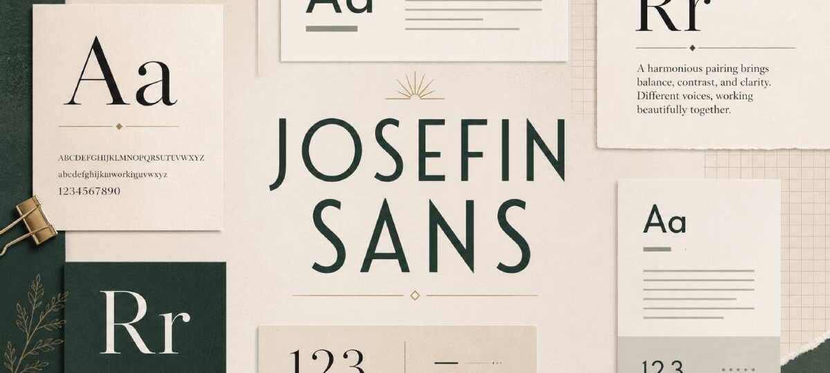
Most geometric sans-serifs play it safe. Josefin Sans does not.
Designed by Santiago Orozco and inspired by 1920s typefaces like Futura and Kabel, it carries a distinct vintage elegance that most modern fonts simply lack. That low x-height. Those tall, clean letterforms. The art deco undertones that show up whether you set it in thin or bold.
But a typeface this specific needs the right companion to work well in a real layout.
This guide covers the best Josefin Sans font pairing options available, from high-contrast serif combinations like Playfair Display and Lora to clean sans-serif duos like Lato and Montserrat.
Each entry includes font roles, size and weight recommendations, best use cases, and what to avoid. Everything you need to build a solid font duo and use it with confidence.
Josefin Sans Font Pairing Examples
Josefin Sans + Playfair Display
What Makes This Pairing Work
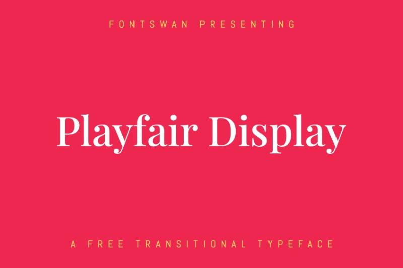
This is one of the strongest geometric sans-serif and serif combinations available on Google Fonts. Josefin Sans brings a low x-height and vintage geometry. Playfair Display responds with high contrast, dramatic serifs, and editorial weight.
The contrast is significant. That is exactly the point.
Font Roles (Heading vs. Body)
- Heading: Josefin Sans Bold or Regular, all caps, tracked out
- Body: Playfair Display Regular at 16-18px
Weight and Size Recommendations
Use Josefin Sans at 700 or 400 for headings. Keep letter-spacing around 3-5px in uppercase. Playfair Display at Regular (400) handles body text cleanly. Avoid Bold for long body copy.
Best Use Cases
Fashion editorials, luxury branding, creative portfolios, poster design, and high-end web typography.
What to Avoid
Do not set Josefin Sans as body text. Its low x-height makes it hard to read at small sizes. Also avoid using both fonts at display size on the same layout. Pick one to lead.
Josefin Sans + Merriweather
What Makes This Pairing Work
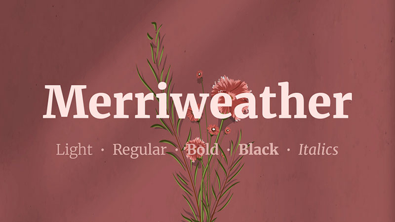
Merriweather was designed for screen readability. Its sturdy serifs and generous proportions contrast well against Josefin Sans’s elegant, narrow geometry.
Where Josefin Sans feels refined and airy, Merriweather feels solid and dependable. Good balance.
Font Roles (Heading vs. Body)
- Heading: Josefin Sans, any weight, works well in all caps
- Body: Merriweather Regular at 16px minimum
Weight and Size Recommendations
Josefin Sans Thin (100) or Light (300) works well for large headings. Merriweather Regular or Light handles body. Set line-height to at least 1.7 for comfortable reading.
Best Use Cases
Blogs, editorial platforms, content-heavy websites, and brochure design. One of the better combinations for long-form reading.
What to Avoid
Merriweather Bold in body copy looks heavy alongside Josefin Sans. Stick to Regular or Light. Also avoid setting both at similar weights. The contrast in font spacing and stroke width should do the visual work.
Josefin Sans + Lora
What Makes This Pairing Work
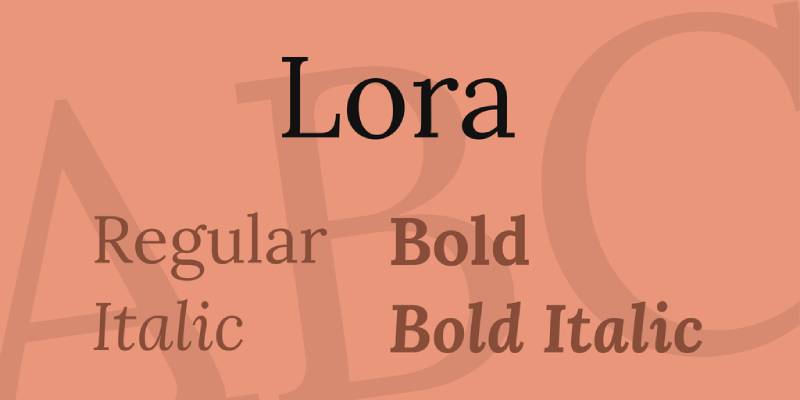
Lora has calligraphic roots. Its brushed curves create a soft, literary quality that pairs well with Josefin Sans’s harder geometric structure.
The result feels warm but still polished. Good fit for lifestyle and boutique design contexts.
Font Roles (Heading vs. Body)
- Heading: Josefin Sans Regular or Bold
- Body: Lora Regular at 16-18px
Weight and Size Recommendations
Lora Bold (700) works for subheadings when Josefin Sans handles H1/H2. Keep body at Regular. Josefin Sans at Light (300) creates a particularly refined pairing with Lora’s warmer texture.
Best Use Cases
Lifestyle brands, boutique e-commerce, wedding sites, and book cover design. Also works well for recipe or food blogs that want an elegant but approachable tone.
What to Avoid
Avoid using Lora Italic for large blocks of body text. And resist the temptation to add a third display font. This pairing has enough character on its own.
Josefin Sans + Montserrat

What Makes This Pairing Work
Both are geometric sans-serif fonts, but they read differently. Josefin Sans has a vintage, Scandinavian quality. Montserrat is more urban and contemporary. The contrast comes from personality, not structure.
This is a same-category pairing that actually works.
Font Roles (Heading vs. Body)
- Heading: Josefin Sans Bold or Regular
- Body: Montserrat Regular or Light at 14-16px
Weight and Size Recommendations
Use significant size contrast to make this work. Josefin Sans at 48px+ for H1, Montserrat at 15-16px for body. Weight difference also helps: Bold for one, Regular for the other.
Best Use Cases
Creative agencies, modern branding, web design projects, and UI layouts. Good for brands that sit between classic and contemporary.
What to Avoid
Do not use both fonts at the same size and weight. Without clear hierarchy, the two geometric fonts blur together. This pairing depends entirely on strong typographic hierarchy.
Josefin Sans + Lato

What Makes This Pairing Work
Lato is a humanist sans-serif font with a generous x-height and warm letter proportions. It grounds Josefin Sans’s more distinctive personality with democratic, readable body text.
Approachable and professional. Works in a lot of contexts without fighting itself.
Font Roles (Heading vs. Body)
- Heading: Josefin Sans, all weights
- Body: Lato Regular or Light
Weight and Size Recommendations
Lato Thin and Light look unexpectedly good alongside heavier Josefin Sans headings. For body copy, Regular (400) is the safe choice. Keep heading sizes 2x or more above body size.
Best Use Cases
Landing pages, business websites, portfolio layouts, and social media design. One of the most flexible combinations on this list.
What to Avoid
Lato Bold in body copy reads too heavy next to Josefin Sans. Keep body text at Regular or Light. And avoid using Lato as a heading font here since that role belongs to Josefin Sans.
Josefin Sans + Raleway
What Makes This Pairing Work
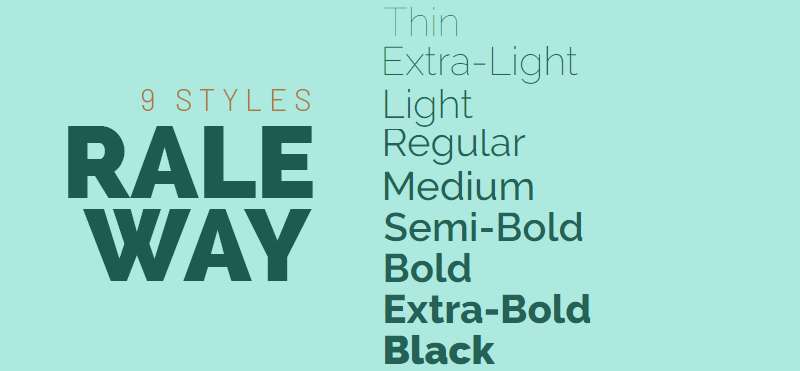
Raleway is another geometric font with refined elegance and distinctive letterforms. Together with Josefin Sans, the pairing shares a similar aesthetic DNA but differs enough in character to create contrast.
Both fonts have a slightly retro, fashion-forward quality. They work together because they belong to the same visual world.
Font Roles (Heading vs. Body)
- Heading: Josefin Sans Bold or Light, depending on tone
- Body: Raleway Regular or Light
Weight and Size Recommendations
Raleway is not ideal for long body copy at small sizes. Keep it at 16px minimum with generous line height. Josefin Sans at Light (300) paired with Raleway Regular creates a particularly clean editorial look.
Best Use Cases
Fashion brands, design studios, minimal websites, and packaging design. Strong choice for projects that prioritize visual refinement over density.
What to Avoid
Avoid using Raleway at very small sizes in body text. Its wide letterforms and even stroke width can tire readers at 13-14px. Also avoid heavy weights for both fonts at the same time.
Josefin Sans + Cormorant Garamond
What Makes This Pairing Work
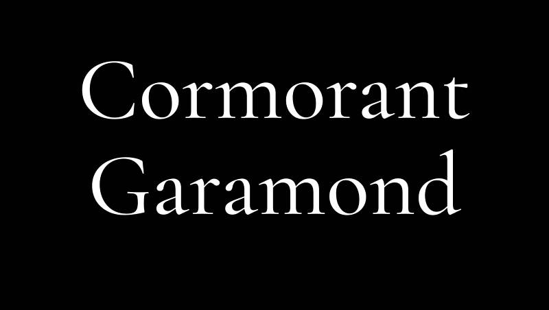
Cormorant Garamond is a high-contrast display serif font with Renaissance roots. Paired with Josefin Sans, it creates a strong historical contrast: 1920s geometric precision meets 16th-century calligraphic refinement.
This is a pairing with real character.
Font Roles (Heading vs. Body)
- Heading: Josefin Sans at any weight
- Body: Cormorant Garamond Regular or Medium at 17-19px
Weight and Size Recommendations
Cormorant Garamond’s low x-height means you need larger body text sizes. 17px minimum on screen, more on mobile. Josefin Sans Bold at large display sizes gives the heading layer the presence it needs.
Best Use Cases
Luxury branding, editorial design, high-end hospitality, and fashion portfolios. Also effective for print design where Cormorant Garamond’s contrast ratio really shows.
What to Avoid
Do not use Cormorant Garamond at small body sizes on screen. The thin strokes disappear. And like Josefin Sans, it was designed for display use first.
Josefin Sans + Cardo
What Makes This Pairing Work
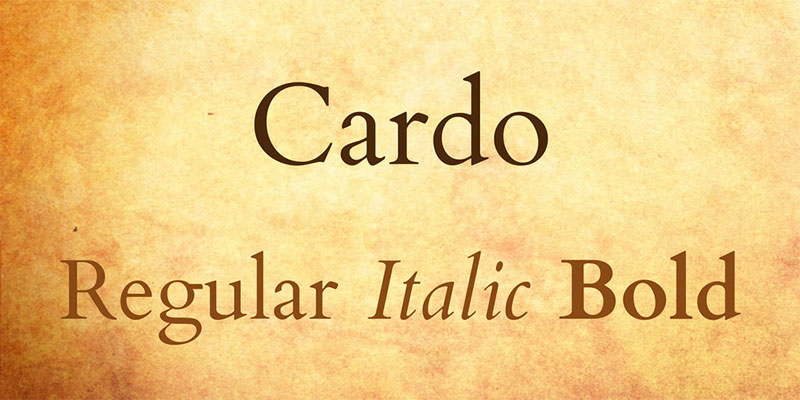
Cardo is a classical typeface with Old Style proportions and a scholarly feel. It pairs naturally with Josefin Sans’s clean geometry without competing for attention.
The contrast is quiet but effective.
Font Roles (Heading vs. Body)
- Heading: Josefin Sans Regular or Bold
- Body: Cardo Regular
Weight and Size Recommendations
Cardo only comes in Regular, Bold, and Italic, so weight flexibility is limited. Use it at 16-18px for body text. Josefin Sans handles all heading weights. Good line-height (1.65-1.75) is important here.
Best Use Cases
Academic sites, editorial blogs, literary magazines, and cultural institutions. Works especially well for content-focused designs where readability is the top priority.
What to Avoid
Cardo Bold is not a great body weight. Use it only for isolated emphasis. The lack of weight options means this pairing relies on size contrast and leading to maintain hierarchy.
Josefin Sans + Yeseva One
What Makes This Pairing Work
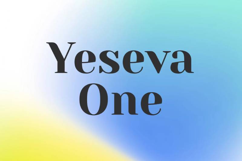
Yeseva One is a bold display font with a slightly feminine, decorative quality. It makes a strong visual statement as a heading when Josefin Sans handles subheadings and supporting text.
This is a role reversal worth trying.
Font Roles (Heading vs. Body)
- Heading: Yeseva One (display/hero only)
- Subheading/Body support: Josefin Sans Regular or Light
Weight and Size Recommendations
Yeseva One is display-only. Use it at 48px or larger. Josefin Sans at Light (300) or Regular (400) handles subheadings and captions well. Do not use Yeseva One for body text.
Best Use Cases
Fashion brands, beauty websites, event branding, and poster design. Good choice when you need a strong, expressive heading with a clean secondary layer.
What to Avoid
Yeseva One has one weight and one style. It cannot carry an entire type system alone. Keep it reserved for hero headings and let Josefin Sans do the structural work throughout the rest of the layout.
Josefin Sans + Prata
What Makes This Pairing Work
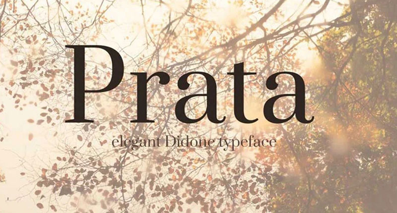
Prata is a high-contrast serif with classical proportions and a refined look. Its thick-thin stroke variation creates strong visual contrast against Josefin Sans’s uniform, geometric letterforms.
Simple to implement. Looks expensive without trying too hard.
Font Roles (Heading vs. Body)
- Heading: Josefin Sans Bold or Regular
- Body: Prata Regular
Weight and Size Recommendations
Prata only comes in Regular weight. Use it at 16-18px minimum. Josefin Sans covers the heading range. Line height around 1.7 keeps Prata body text open and legible.
Best Use Cases
Boutique branding, luxury e-commerce, visual identity projects, and editorial layouts. Prata brings texture and class to any design that pairs it with a clean sans-serif like Josefin Sans.
What to Avoid
Prata’s limited weight range means you cannot lean on font weight for hierarchy. Size, spacing, and color contrast have to do that work instead. Plan your visual hierarchy carefully before committing to this combination.
FAQ on Josefin Sans Font Pairing
What fonts pair best with Josefin Sans?
Playfair Display, Merriweather, and Lora are the strongest serif pairings for Josefin Sans. For sans-serif combinations, Lato and Montserrat work well. Each brings enough contrast to complement Josefin Sans without competing with its geometric character.
Should Josefin Sans be used as a heading or body font?
Josefin Sans works best as a heading font. Its low x-height and distinctive letterforms make it harder to read at small sizes. Use it for H1 and H2 headings, then pair it with a more readable font for body text.
Does Josefin Sans work for body text?
Not ideally. The low x-height reduces readability at 14-16px. If you use it for body copy, set it at 17px minimum with generous letter spacing. Most designers reserve it for display sizes only.
What serif font pairs best with Josefin Sans for web design?
Merriweather is the most practical choice for web font pairing. It was designed for screen readability, handles long-form content well, and contrasts cleanly against Josefin Sans’s geometric structure. Lora is a close second.
Is Josefin Sans a Google Font?
Yes. Josefin Sans is available free through Google Fonts. It includes 7 weights from Thin 100 to Bold 700, each with an italic variant, giving you 14 styles total to work with across any project.
What font weight should I use for Josefin Sans headings?
Bold (700) works for strong display headings. Light (300) or Thin (100) suits editorial and fashion layouts where an airy, refined look is the goal. Font weight choice depends on the tone of the design, not a single rule.
Can Josefin Sans be paired with another sans-serif font?
Yes, but carefully. Montserrat and Lato both work because they differ enough in personality. The key is strong size contrast and clear typographic contrast. Two similar geometric sans-serifs at the same size will look like a mistake.
What design styles suit Josefin Sans best?
Josefin Sans fits minimalist design, fashion branding, editorial layouts, and art deco-influenced projects. Its vintage geometric character also works well for luxury branding, portfolio sites, and any design that needs elegance without ornament.
How does Josefin Sans compare to Montserrat?
Both are geometric sans-serif typefaces from Google Fonts. Montserrat is more versatile and urban. Josefin Sans has a stronger vintage personality and a lower x-height. Montserrat handles body text better. Josefin Sans makes a stronger display statement.
Is Josefin Sans good for branding?
Yes, particularly for fashion, beauty, and lifestyle brands. Its clean geometry and distinctive proportions give logos and brand typography a polished, editorial feel. Pair it with a warm serif font like Lora or Prata to round out a full brand type system.
Conclusion
This conclusion is for an article presenting the strongest Josefin Sans font pairing options across branding, editorial, and web typography.
Every combination covered here works because of contrast. Josefin Sans’s low x-height and geometric precision need a body font with warmth, weight, or readability to balance it out.
Merriweather and Lora for content-heavy layouts. Playfair Display for editorial impact. Montserrat or Lato when the design calls for a clean, modern font duo.
Pay attention to kerning, size contrast, and how each combination reads at both heading and body sizes.
Good font psychology is simple: use typefaces that serve the reader first, and the design second.

Renowned for his expertise in logo design and visual branding, Bogdan has developed a multitude of logos for various clients.
His skills extend to creating posters, vector illustrations, business cards, and brochures. Additionally, Bogdan's UI kits were featured on marketplaces like Visual Hierarchy and UI8.
He also wrote in the past years on sites like Design Your Way, WebDesignerDepot, WPDean, Designmodo, Speckyboy, Slider Revolution, and more.
- Best Visual Regression Testing Tools for Web and App Design in 2026 - 13 October 2026
- Jujutsu Kaisen Font Generator - 12 October 2026
- The Windsurf Logo History, Colors, Font, And Meaning - 10 October 2026

Bogdan Sandu is a seasoned designer who has been designing websites since 2008. Renowned for his expertise in logo design and visual branding, Bogdan has developed a multitude of logos for various clients. His skills extend to creating posters, vector illustrations, business cards, and brochures. Additionally, Bogdan's UI kits were featured on marketplaces like Visual Hierarchy and UI8. He also wrote in the past years on sites like Design Your Way, WebDesignerDepot, WPDean, Designmodo, Speckyboy, Slider Revolution, and more.
You Might Also Like