Most font combinations look fine. A few actually work.
Poppins is one of the most popular geometric sans-serif typefaces on Google Fonts – clean, versatile, and friendly across web and print. But finding the right Poppins font pairing is what separates a decent design from a deliberate one.
The wrong companion font creates visual noise. The right one builds hierarchy, tone, and readability – all at once.
This guide covers the 10 best fonts to pair with Poppins, with specific weight recommendations, use cases, and setup tips for each combination. Whether you’re working on a brand identity, a website, or a print project, you’ll leave with a pairing that actually fits your context.
Poppins + Playfair Display

What This Pairing Does
Poppins is a geometric sans-serif with even, circular strokes. Playfair Display is a high-contrast serif font with delicate hairlines and strong thick strokes.
The contrast between the two is immediate – clean geometry meets editorial elegance. This is one of the most used font pairing approaches on Google Fonts for a reason.
Best Use Cases
- High-end branding and luxury websites
- Editorial layouts, blogs, and digital magazines
- Wedding invitations and upscale print materials
How to Set It Up
- Poppins role: Body text
- Playfair Display role: Headings and display
- Recommended weights: Playfair Display Bold 700 + Poppins Regular 400
- Font spacing tip: Add slight letter-spacing (0.01–0.02em) to Poppins body for better readability at small sizes.
Tone and Style Fit
Sophisticated and editorial. Works well for brands that want to feel premium without being cold.
—
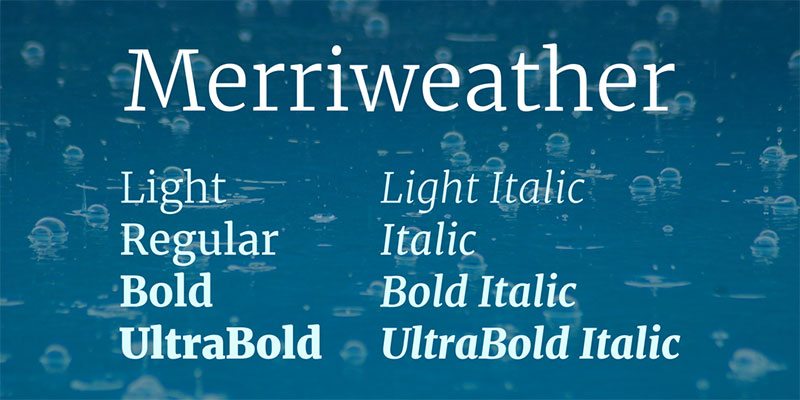
Poppins + Merriweather
What This Pairing Does
Merriweather was specifically designed for screen readability. Its slightly condensed letterforms and sturdy serifs hold up well against Poppins’ open geometric structure.
The contrast between the two is functional, not dramatic. This pairing is approachable and reliable.
Best Use Cases
- Blogs, news sites, and long-form content
- Corporate websites and professional portfolios
- Mobile-first web projects
How to Set It Up
- Poppins role: Headings
- Merriweather role: Body text
- Recommended weights: Poppins SemiBold 600 + Merriweather Regular 400
- Line-height tip: Set Merriweather body at 1.7–1.8 for comfortable reading on screens.
Tone and Style Fit
Warm, readable, and trustworthy. Good for content-heavy sites where the reader spends real time on the page.
—
Poppins + Lora
What This Pairing Does
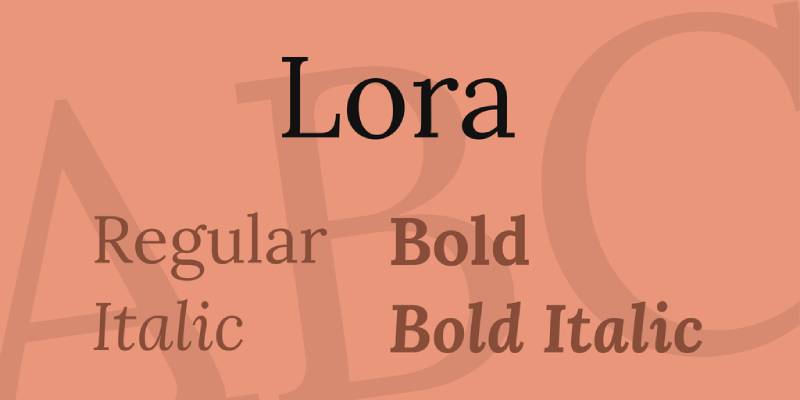
Lora has calligraphic roots – brushed curves, moderate stroke contrast, and a slightly literary feel. Poppins provides the clean, structured counterpoint.
Together they create a global typography combination: Poppins from the Indian Type Foundry, Lora drawing on European calligraphic tradition. Practically speaking, they balance each other well.
Best Use Cases
- Creative agencies and international brands
- Editorial websites and lifestyle publications
- Portfolio sites with long-form content
How to Set It Up
- Poppins role: Body text
- Lora role: Headings
- Recommended weights: Lora Bold 700 + Poppins Regular 400
- Spacing tip: Use 16px minimum for Poppins body, with 1.6 line-height.
Tone and Style Fit
Romantic and modern at the same time. A good pick for brands that want character without going full decorative.
—
Poppins + Inter

What This Pairing Does
Both fonts are sans-serif with geometric roots – so the pairing works through weight contrast, not style contrast. Inter is slightly more neutral and UI-optimized; Poppins is friendlier with more rounded forms.
This is a popular combination in SaaS and tech products. Clean, efficient, and consistent.
Best Use Cases
- SaaS dashboards and product UIs
- Startups and fintech brands
- App interfaces and digital tools
How to Set It Up
- Poppins role: Headings and UI labels
- Inter role: Body text and data-heavy content
- Recommended weights: Poppins SemiBold 600 + Inter Regular 400
- Tip: Differentiate through size more than weight – use at least a 2:1 size ratio between heading and body.
Tone and Style Fit
Modern, functional, and clean. Ideal for products where clarity and speed of reading matter most.
—
Poppins + Roboto

What This Pairing Does
Roboto has a dual nature – mechanical skeleton, but with open and friendly curves. That makes it a comfortable body text partner for Poppins, which brings more personality to the headings.
This combination powers a lot of real-world digital products. Both fonts load fast and render cleanly across devices – a practical advantage worth mentioning.
Best Use Cases
- Android apps and Google ecosystem products
- News aggregators and content-heavy platforms
- E-commerce product pages
How to Set It Up
- Poppins role: Headings and CTAs
- Roboto role: Body text and UI elements
- Recommended weights: Poppins Bold 700 + Roboto Regular 400
- Tip: Roboto handles small sizes well – reliable at 14px and up.
Tone and Style Fit
Neutral and dependable. Not the most exciting pairing visually, but rock solid for performance and readability.
—
Poppins + Montserrat

What This Pairing Does
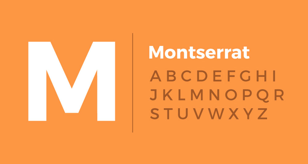
Both Poppins and Montserrat are geometric typefaces – similar in structure, but different in character. Montserrat has slightly wider proportions and a more urban, confident feel. Poppins is rounder and more approachable.
This works as a same-family pairing. The key is using strong weight contrast to keep the hierarchy clear. Without it, the two fonts compete rather than complement.
Best Use Cases
- Branding for tech companies and agencies
- Landing pages and marketing sites
- Bold, modern print materials
How to Set It Up
- Poppins role: Body text
- Montserrat role: Headings
- Recommended weights: Montserrat Bold 700 + Poppins Light 300
- Tip: Use a 2.5:1 or greater size ratio to avoid the fonts looking accidental rather than intentional.
Tone and Style Fit
Contemporary and polished. Best for brands that want a modern look without the serif-based contrast.
—
Poppins + Raleway
What This Pairing Does
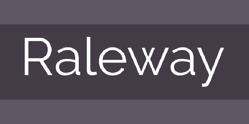
Raleway is a geometric sans-serif with thin strokes and a distinctively elegant feel – especially in its lighter weights. It has a refined, almost architectural character that contrasts nicely with Poppins’ rounder, friendlier forms.
The pairing sits somewhere between minimal and stylish. Neither font dominates; they just work well together.
Best Use Cases
- Portfolio sites and creative studios
- Fashion and lifestyle brands
- Minimalist websites and brochures
How to Set It Up
- Raleway role: Headings (works best at Light 300 or Thin 100 for a sophisticated look)
- Poppins role: Body text
- Recommended weights: Raleway Light 300 + Poppins Regular 400
- Tip: Avoid using Raleway for body text – it causes reading fatigue in long passages.
Tone and Style Fit
Elegant and refined. A strong fit for design-forward projects where aesthetics carry as much weight as function.
—
Poppins + Noto Serif
What This Pairing Does
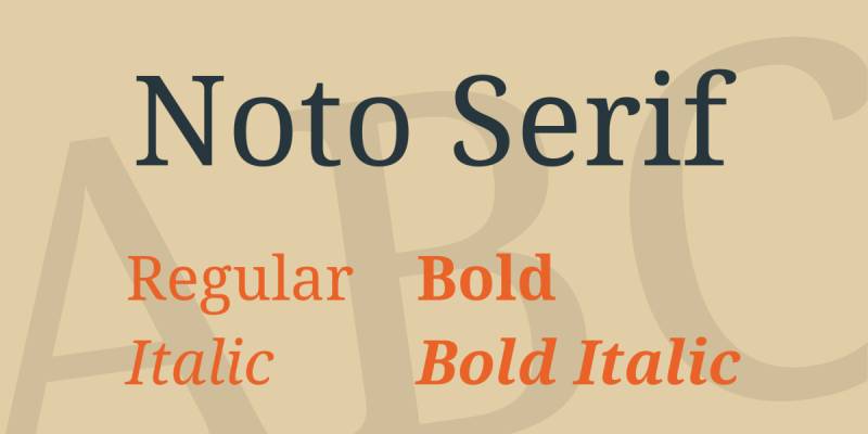
Noto Serif shares a similar x-height and aperture to Poppins, making the transition between heading and body feel natural. The pairing offers solid serif-sans contrast without any jarring size jumps or mismatched proportions.
Noto Serif also supports over 800 languages – useful if the project involves multilingual content.
Best Use Cases
- International publications and multilingual sites
- Academic and research platforms
- Clean editorial blogs
How to Set It Up
- Poppins role: Headings
- Noto Serif role: Body text
- Recommended weights: Poppins SemiBold 600 + Noto Serif Regular 400
- Tip: Both fonts can swap roles. Noto Serif at larger sizes works well as a heading font too.
Tone and Style Fit
Clean, neutral, and dependable. Not flashy, but extremely functional across a wide range of content types.
—
Poppins + Cormorant Garamond
What This Pairing Does
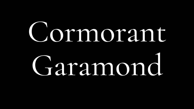
Cormorant Garamond is a high-contrast display serif with extremely fine hairlines and dramatic proportions. Poppins, with its even stroke weight and circular geometry, creates a strong contrast – modern meets classical.
This combination is particularly effective for luxury brands that want to communicate both tradition and contemporary edge.
Best Use Cases
- Luxury brand identity and packaging
- Wedding and event design
- Fashion editorial and high-end e-commerce
How to Set It Up
- Cormorant Garamond role: Headings and display text (at large sizes only – hairlines collapse below 20px)
- Poppins role: Body text, navigation, and UI elements
- Recommended weights: Cormorant Garamond Regular or SemiBold + Poppins Light 300
- Tip: Use Cormorant at 32px minimum. Its fine strokes lose definition at smaller sizes.
Tone and Style Fit
Luxurious and editorial. One of the more distinctive pairings in this list – good for projects that want to stand out visually.
—
Poppins + Oswald
What This Pairing Does
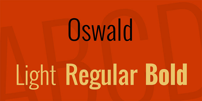
Oswald is a condensed gothic sans-serif – tall, narrow, and built for punchy headlines. Poppins is wider and rounder, making the width contrast between the two immediately visible. That contrast is exactly what makes this pairing work.
The typographic hierarchy is clear and strong. No serif needed – the width difference does the work.
Best Use Cases
- News layouts and sports content
- Poster design and advertising
- Bold brand identities and marketing campaigns
How to Set It Up
- Oswald role: Headings only (not body – readability collapses in long passages)
- Poppins role: Body text and UI elements
- Recommended weights: Oswald Bold 700 + Poppins Regular 400
- Tip: Oswald in all-caps works well for short, high-impact subheadings above Poppins body text.
Tone and Style Fit
Bold and direct. Works well for projects where impact and speed of communication matter more than refinement.
—
FAQ on Poppins Font Pairing
What font goes best with Poppins?
It depends on your project type. For editorial and branding work, Playfair Display or Cormorant Garamond create strong serif-sans contrast with Poppins.
For web and UI design, Inter or Roboto are more practical choices. If readability is the main concern, Merriweather is hard to beat as a body text companion.
Can you pair Poppins with another sans-serif font?
Yes, but you need weight contrast to make it work. Pairing Poppins with Montserrat, Inter, or Raleway only creates a clear visual hierarchy when the size and weight difference between heading and body is significant – at least a 2:1 ratio.
Without that contrast, two geometric sans-serifs at similar weights look like a mistake, not a choice.
Is Poppins good for body text?
It can work, especially at Regular or Light weights with generous leading. But Poppins was designed to shine as a heading font. Its tall x-height and geometric structure are more impactful at display sizes.
For long-form reading, a dedicated body text font like Merriweather, Lora, or Noto Serif will perform better.
What makes a good Poppins font combination?
Two things: contrast and harmony. You want the paired font to look different enough from Poppins to create clear hierarchy, but similar enough in proportion that they don’t clash.
Serif fonts work well because the style difference (serif vs. sans-serif) creates instant contrast. If you go sans-serif plus sans-serif, lean heavily on weight and size differences to do the same job. Understanding font psychology also helps – Poppins reads as friendly and modern, so pairing it with something too traditional or heavy can create a tonal mismatch.
Is Poppins free to use commercially?
Yes. Poppins is published by the Indian Type Foundry and available on Google Fonts under the Open Font License. You can use it in personal and commercial projects, including branding and print, without font licensing fees.
How many weights does Poppins have?
Poppins comes in nine weights – Thin (100) through Black (900) – each with matching italics. That range gives you a lot of flexibility within the font family itself, which is one reason it works well in single-font systems or as part of a two-font pairing.
What is the best Poppins pairing for branding?
For a modern brand identity, Poppins + Playfair Display or Poppins + Cormorant Garamond both deliver strong results. The serif-sans combination creates the kind of contrast that feels intentional and polished across logo usage, website headers, and marketing materials.
For a more minimal, contemporary brand, Poppins + Inter or Poppins + Raleway keeps things clean without relying on serif drama.
Does Poppins work for print design?
Yes. Poppins scales well and maintains clarity in both digital and print design contexts. For print, use it at heavier weights for headings and pair it with a high-contrast serif like Playfair Display or Cormorant Garamond for body text – both handle ink well at smaller point sizes.
Conclusion
This conclusion is for an article presenting the strongest Poppins font pairing options available across web, branding, and print contexts.
The right combination comes down to intent. A serif-sans pairing like Poppins + Merriweather prioritizes readability. Poppins + Cormorant Garamond leans into luxury and contrast.
Neither is wrong. They just serve different purposes.
Poppins has nine weights, solid Google Fonts support, and an open font license – which makes it one of the most flexible geometric typefaces to build around.
Use that flexibility deliberately. Match your companion font to the tone, not just the aesthetic. Pay attention to typographic contrast, x-height compatibility, and weight ratios.
Get those right, and the pairing will hold up everywhere – screen, print, or brand identity.

Renowned for his expertise in logo design and visual branding, Bogdan has developed a multitude of logos for various clients.
His skills extend to creating posters, vector illustrations, business cards, and brochures. Additionally, Bogdan's UI kits were featured on marketplaces like Visual Hierarchy and UI8.
He also wrote in the past years on sites like Design Your Way, WebDesignerDepot, WPDean, Designmodo, Speckyboy, Slider Revolution, and more.
- NBA Team Color Codes - 26 July 2026
- The Figma Logo History, Colors, Font, And Meaning - 25 July 2026
- Canva for Teams Review: Is It Worth the Business Plan? - 24 July 2026

Bogdan Sandu is a seasoned designer who has been designing websites since 2008. Renowned for his expertise in logo design and visual branding, Bogdan has developed a multitude of logos for various clients. His skills extend to creating posters, vector illustrations, business cards, and brochures. Additionally, Bogdan's UI kits were featured on marketplaces like Visual Hierarchy and UI8. He also wrote in the past years on sites like Design Your Way, WebDesignerDepot, WPDean, Designmodo, Speckyboy, Slider Revolution, and more.
You Might Also Like