
Karla Font Pairing
This Karla font pairing tool puts Karla next to 14 partner fonts in real layouts: an article, a landing page, pricing cards or a dashboard. Edit the text, swap the roles, switch to dark mode, then copy the code.
- Designer
- Jonny Pinhorn
- License
- SIL Open Font License
- Weights
- 200 to 800, variable
- Pairings
- 14 tested
Use this pairing
Every Karla pairing side by side
Your heading text in each pairing's heading font, with its body font underneath. Most pairings keep Karla on the body.
Karla usually ends up on body text, with a serif or display face doing the headlines above it. That's the short answer, and it holds for most sites. This free grotesque sans serif from Google Fonts has enough quirk of its own that it doesn't need a loud partner. It just needs a different one.
The right partner depends on what the page is for. Long reading pages want a text serif, while showcase work can carry a display serif. Interfaces are their own case, and there a neutral sans serif on headings is often the better call.
One thing surprised me when I went through real sites. On Typewolf's Karla page, which lists 28 of them, the companion that shows up most often isn't a serif. It's the monospace Inconsolata, on 3 sites. Noe Display, Playfair Display and Montserrat trail at 2 each.
How to use the Karla font pairing tool
This Karla font pairing tool sets Karla next to 14 partner fonts from Google Fonts and shows each pair in layouts you actually ship. Every font on the page is free and licensed under the SIL Open Font License.
- Pick a partner from the list. Filter by serif, display or sans if you already know the mood you want.
- Switch the layout between Specimen, Article, Landing page, Pricing cards and Dashboard. A pairing that looks great in a hero can feel heavy in a dashboard.
- Type your own heading and body text. Real copy shows problems that sample text hides, like long words in a condensed font.
- Swap roles to flip which font takes the headings and which takes the body. Display fonts stay on headings, so the button turns off for them.
- Check dark mode and adjust the heading and body sizes.
- Copy the code as a Google Fonts link, plain CSS or a Tailwind v4 theme.
Karla pairings at a glance
| Partner font | Type | Heading weight | Works as body text |
|---|---|---|---|
| Merriweather | Screen serif | 700 | Yes |
| Playfair Display | High-contrast display serif | 700 | No |
| Lora | Calligraphic serif | 600 | Yes |
| Spectral | Text serif | 600 | Yes |
| Vollkorn | Old-style text serif | 700 | Yes |
| Crimson Pro | Garalde text serif | 700 | Yes |
| Montserrat | Geometric sans | 600 | Yes |
| Lato | Humanist sans | 700 | Yes |
| Source Serif 4 | Transitional serif | 600 | Yes |
| DM Serif Display | High-contrast display serif | 400 | No |
| Fraunces | Soft Old Style display serif | 600 | No |
| Cormorant Garamond | Display Garamond | 600 | No |
| Oswald | Condensed gothic | 600 | No |
| Inconsolata | Monospace, for code | 700 | No |
What Is Karla and What Does It Bring to a Pairing?
Jonny Pinhorn designed it, and Google Fonts added it in 2012. Typewolf says there aren't any other free quirky grotesques like it. I'd mostly agree.
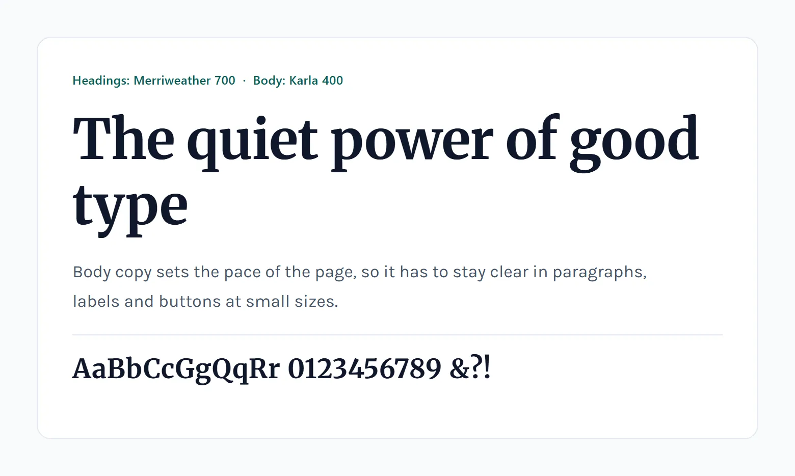
The bones are what you'd expect from a grotesque sans serif, plain and sturdy. BonFX's pairing guide credits subtle irregularities in the letterforms for the warmth, which is the part you notice after a paragraph or two.
Versions and files
The version history is a little messy. Version 1.000 came out on March 11, 2012. On July 1, 2019, Mirko Velimirovic converted Karla to a variable font for version 2.000, according to the project FONTLOG.
Today you get a pair of variable font files, roman and italic, each with one weight axis running from 200 to 800 (Fontsource listing).
Ask how many weights it has and you'll get different numbers. The 2019 changelog says 12 styles. Typewolf and Fontsource both count seven weights with matching italics.
Some package pages never caught up. Debian's fonts-karla description still mentions only Regular and Bold.
The basic facts, for reference:
- First release on March 11, 2012 (v1.000, Karla FONTLOG)
- Converted to variable on July 1, 2019 (v2.000, 12 styles, Karla FONTLOG)
- Current files are roman and italic, weight axis 200 to 800 (Fontsource)
- Licensed under the SIL Open Font License 1.1
- Covers Western, Central and South-Eastern European languages (Fontsource)
The license is generous. You can use, embed, modify and redistribute Karla, and the one firm limit is that the font files can't be sold on their own.
Client and commercial work need no extra permission. SIL's OFL FAQ states that no acknowledgement is required.
What Makes a Pairing With Karla Work?
Different structure, similar proportions. In practice that usually means a serif or display face on headings, with a lowercase height close to Karla's. Mood counts too (Karla is relaxed, so a stiff partner looks wrong next to it), and the wide default spacing decides how much adjusting you'll end up doing.
Contrast in structure
Most Karla pairings lean on serif against sans serif.
BonFX's guide has 15 pairings, and 9 are serifs, from Spectral and Lora to EB Garamond. Typewolf's real-site examples agree. At least 13 of its 28 listed sites put Karla next to a serif such as Canela, Sabon or Noe Display.
A caveat on those 28 sites. They run from 2013 to March 2021, so they show what designers did back then, not what's current. Look through the list yourself before copying anything from it.
Weight is the other lever for contrast. BonFX sets Francois One headlines over Karla body text and keeps the display face large, which is where its proportions still look right.
Matching x-height and proportion
The two main sources seem to disagree here. BonFX calls Karla's proportions slightly condensed, and Typewolf says the default spacing runs a little wide.
They're measuring different things (letter width versus the gaps between letters), so both are true at once.
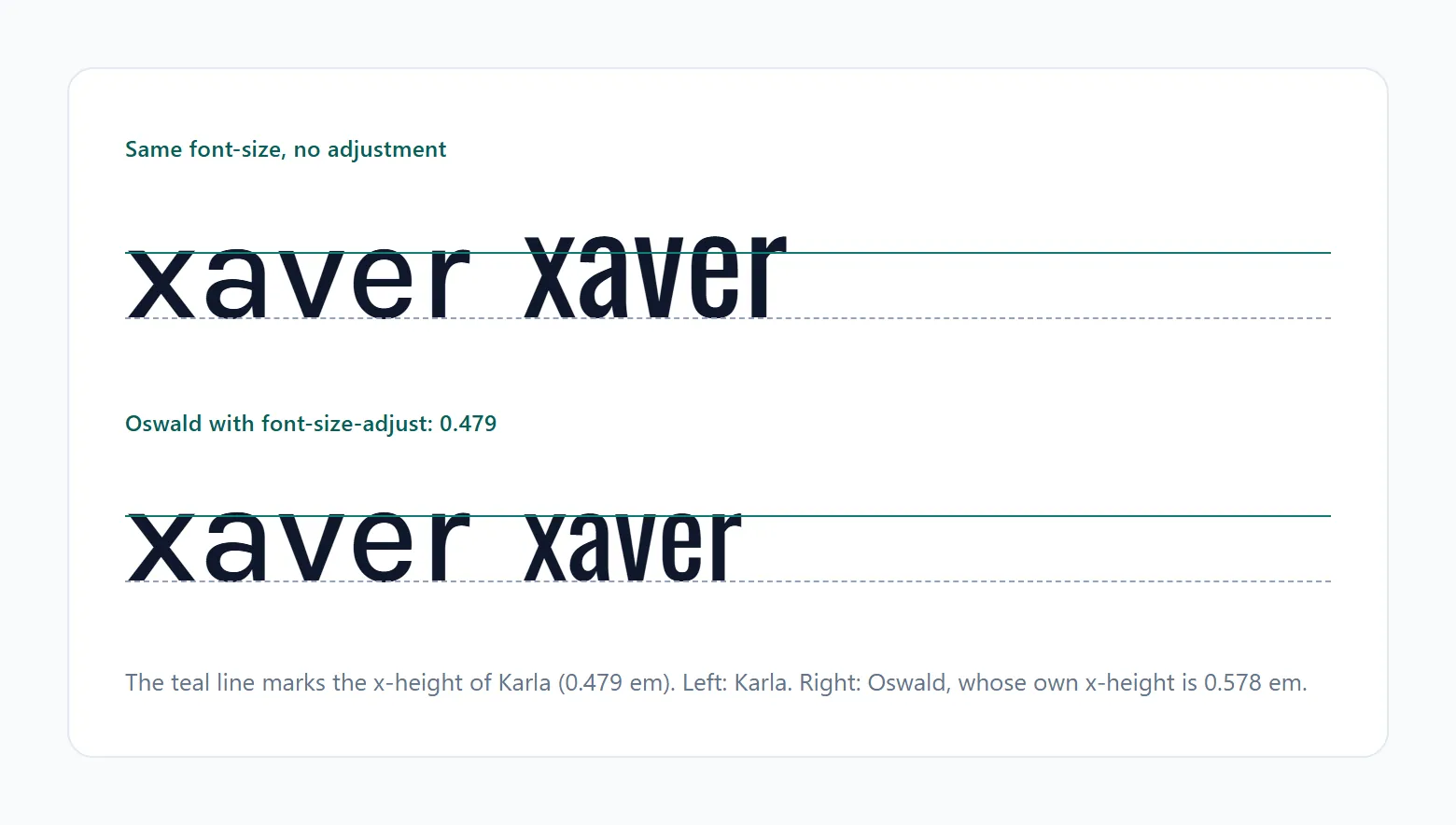
Checking the x-height takes a minute. Set one sentence in Karla and the same sentence in the partner, both at 18px, then adjust the partner until the lowercase letters sit at the same height.
If the partner looks bigger, drop it a pixel or two. Smaller, raise it by about the same. And if Karla itself looks loose next to it, tighten its letter spacing a little.
Mood and personality
BonFX warns that overly formal serifs clash with Karla's approachable feel. Good partners either share the warmth or bring a more classical kind of contrast.
Lora sits on the warm side with its brush-influenced curves, and so does PT Serif, with its humanistic terminals. Libre Baskerville, EB Garamond and Crimson Text go the classical route. All of them are built on older typographic models.
Playfair Display is the loud pick. Its stroke contrast is dramatic enough that the weights on both sides need careful matching, BonFX notes. I like it for short headlines. Anywhere longer, less so.
Should Karla Be the Heading Font or the Body Font?
Body, most of the time. Put a serif or display face on headings and let Karla handle the paragraphs. It also does fine on navigation and buttons. The heading role only makes sense when the partner is a quiet, neutral sans serif.
With Karla on body text, the heading above it can be Lora, Merriweather or Francois One. Use regular weight for running text and italic for emphasis. The heading carries the personality, so the page stays easy to read.
Flip the roles and things change. Karla on headings works over a neutral sans like Source Sans Pro or Open Sans, set at semibold to extra bold (600 to 800) so it separates clearly from the body.
Typewolf describes the default spacing as set a little wide, so large headings benefit from tighter tracking.
Real brands use both roles. HighStakes, as BonFX documents, uses Roboto for body text and keeps Karla for buttons and navigation.
Here's something odd, though. BonFX's image descriptions label Karla as the heading in 13 of 15 specimens, yet its written text puts Karla on body copy in all 13 entries that assign roles.
So don't take the role from a specimen image. Decide from the partner and the page. Either way, the typographic hierarchy only works when there's a clear gap in weight and size between the two faces.
Which Fonts Pair Best With Karla?
Serifs give Karla its clearest contrast, and BonFX's list includes Lora, Merriweather, Spectral and PT Serif. When the heading has to stay quiet, Source Sans Pro or Open Sans will do the job.
| Partner | Type | Karla's role | Character |
|---|---|---|---|
| Lora | Serif | Body text | Warm, calligraphic curves |
| Merriweather | Serif | Body text | Thick, sturdy, screen-friendly |
| Playfair Display | High-contrast serif | Body text | Dramatic stroke contrast |
| Source Sans Pro | Sans serif | Body text | Neutral, UI-optimized |
| Inconsolata | Monospace | Prose around code | Fixed-width, technical |
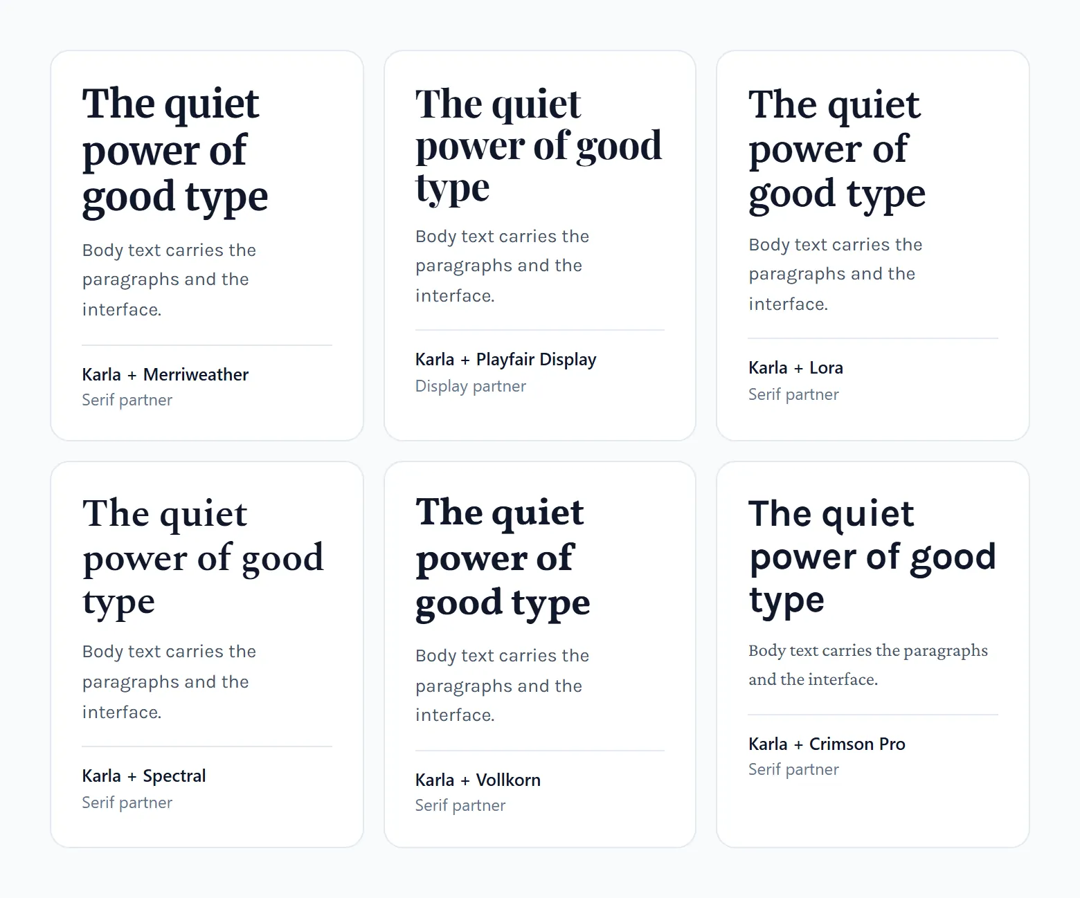
Inconsolata doesn't fit the serif or sans serif split at all. It still appears on 3 of the 28 sites on Typewolf's Karla page (Paragraph, timedropper and District), more than any other companion font.
BonFX lists it third of its 15 and aims it at developer documentation and coding tutorials. That makes sense. A monospaced font handles the code blocks and Karla handles the prose around them.
Serif partners
- Spectral is a screen-first serif from Production Type, and suits design studios and cultural publications
- Merriweather was built as a text face for screens, so long reading stays comfortable
- Libre Baskerville, a transitional serif, fits museums and academic publishing
- PT Serif is a transitional serif with humanistic terminals, and reads as conversational
Check the italics before you commit. Any serif font in a Karla pairing needs a usable italic for quoted material, and BonFX singles out Crimson Text and EB Garamond for theirs.
Outside the Google Fonts catalog, Typewolf's Zirkuss entry (October 2019) pairs the display serif Canela with Karla.
Sans serif partners
Two sans serifs together is the weaker choice unless they clearly differ in weight, width or role. BonFX does it with Open Sans, Source Sans Pro, Roboto and Inter, all on headings, so Karla's body text holds the personality.
The sans serif partners on Typewolf's real sites look nothing like Karla. Women Who Design (May 2017) used Druk, a very heavy condensed face.
Neutral sans is the safest route. It's also the least distinctive, so if the project has room for personality, I'd take a serif.
Which Karla Pairing Fits Which Type of Project?
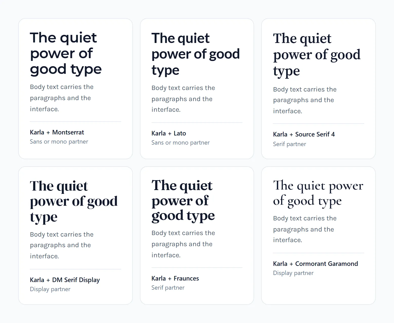
Start from the page's job. BonFX's use-case notes and Typewolf's featured sites back each pick below.
- For a blog or long-form site, Merriweather fits education, nonprofit and journalism pages, and Lora fits literary and cultural writing
- Studios and portfolios get Spectral, which BonFX recommends for design studios and cultural publications
- Editorial and book content splits between Crimson Text (literary journals, book reviews) and EB Garamond (fine art and wine content)
- Brand and product sites in SaaS, documentation or productivity tools do well with Source Sans Pro or Open Sans
- In developer documentation, Inconsolata takes the code blocks and Karla takes the prose
A blog has the most reading hours riding on the choice, so compare the wider field of fonts for blogs before you settle on a pair.
Brand work gets judged differently. Typewolf's entry for Follain (May 2017) pairs Sharp Grotesk with Karla, and that brand site skips the serif entirely.
Once the type has to hold up across logo, packaging and web, general guidance on fonts for branding matters more than any single pair.
If two options fit the same project, say a brand that also runs a blog, take the text serif. Reading time outweighs logo fit.
How to Set Up a Karla Pairing in CSS
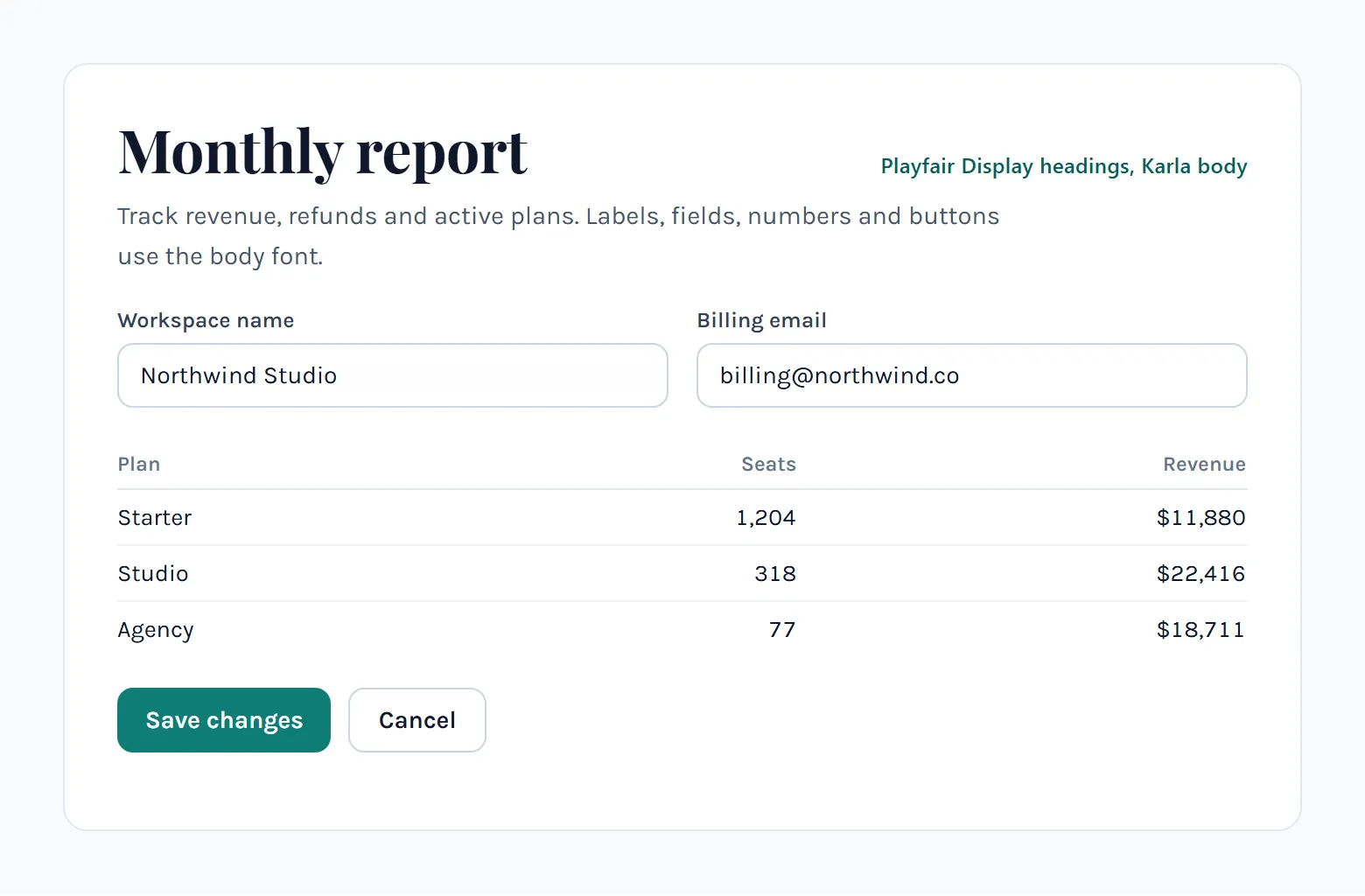
Load only the Karla weights you actually use, roman and italic. Give the partner its own two or three weights. Set font-display to swap and end every font stack with a generic fallback. After that it's body size, line height, letter spacing and a contrast check.
Going through Google Fonts takes one stylesheet link. Per Google's CSS API documentation, the CSS2 API returns the most compact set of files for the styles you request, and the display value goes in as a parameter.
Self-hosting means serving the files from your own domain. Fontsource packages Karla as WOFF2 files, with 400.css and 400-italic.css per weight, and its CDN stylesheet already sets font-display: swap across a 200 to 800 weight range.
More sites have moved that way for performance. The Web Almanac's 2024 Fonts chapter (HTTP Archive) shows exclusive self-hosting growing since 2022 and says cache partitioning removed the old benefit of a shared font CDN.
Privacy pushes in the same direction. A Munich Regional Court ruling of January 20, 2022 (case 3 O 17493/20) awarded 100 euros in damages over a Google-hosted font that sent a visitor's IP address to Google. The ruling pointed to self-hosting as a way to avoid that connection, as The Register reported.
It's one German court decision. Check what applies to your own audience.
- Pick the route: a Google Fonts stylesheet link, or WOFF2 files from Fontsource on your own domain.
- Request only the styles in use. Google's documentation says unused styles add font data and latency.
- Set font-display to swap, so text appears in the fallback font while Karla loads.
- Write the stacks. Karla followed by sans-serif for body text, the partner followed by serif for headings.
- Preload the main file if you self-host, or preconnect to the font service if you use one.
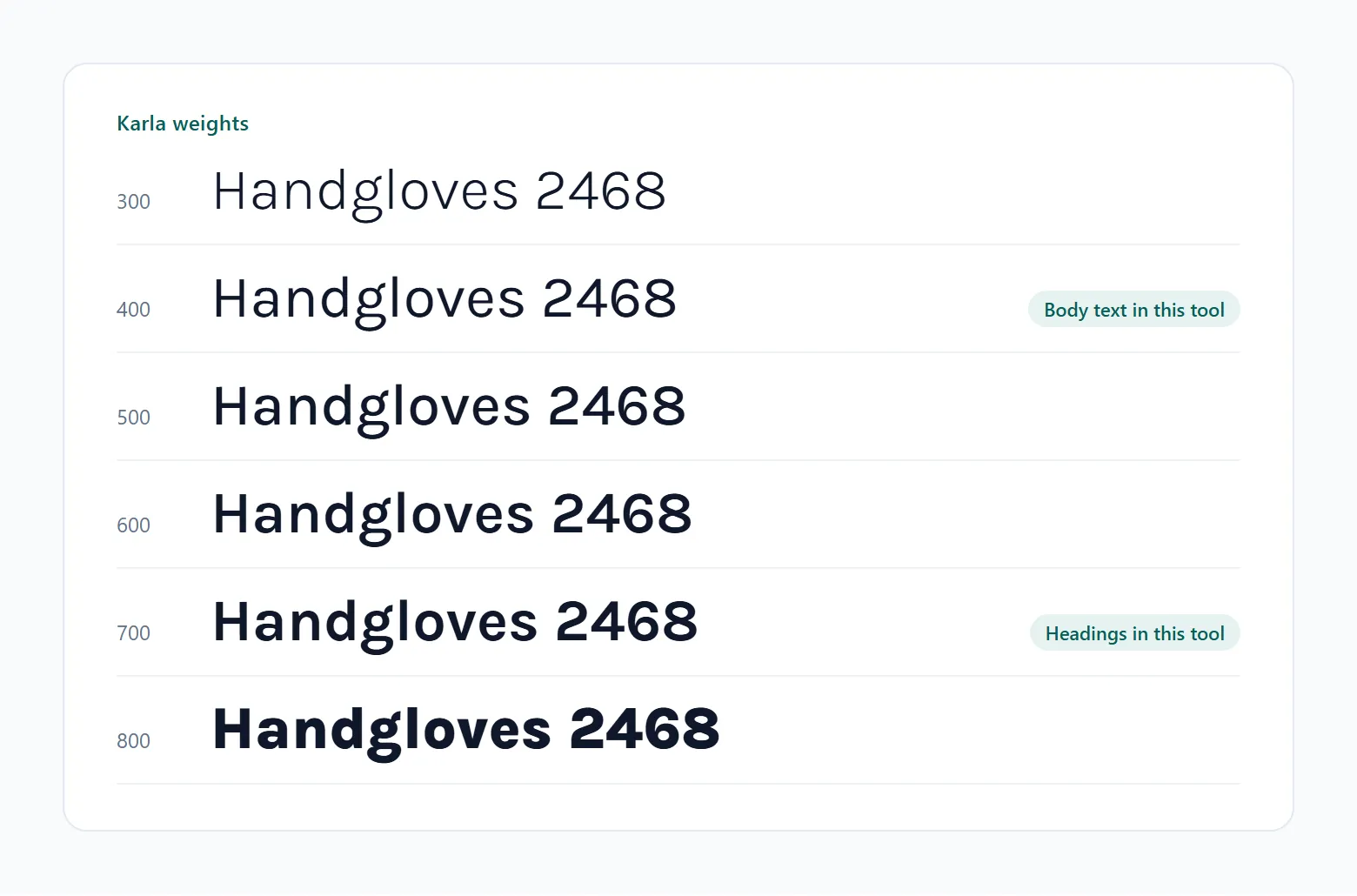
- Assign weights: regular (400) for body, semibold to extra bold (600 to 800) for headings, italic only where the copy needs it.
Swap is common now. The Web Almanac found it on about 45% of pages in 2024, but a font preload on only 11%, and its authors call preload the most effective single step for faster font loading.
Convert the TTF variable files to WOFF2 before serving them yourself.
Size, line height and letter spacing
For body text I'd start at 18px with a line height between 1.5 and 1.6, and leave letter spacing at the default. Headings go semibold to extra bold, with line height near 1.2 and letter spacing slightly negative.
Line height, or leading, is where the W3C text spacing rule comes in. Success Criterion 1.4.12 (Level AA) requires that content survives a user setting line height to 1.5 times the font size and letter spacing to 0.12 times. A fixed-height heading box is the usual thing that breaks.
Then contrast. The W3C asks for at least 4.5:1 on normal text and 3:1 on large text, so keep Karla's thin 200 and 300 weights away from pale gray body copy.
When Does Karla Not Work?
Non-Latin text is the big one, since Cyrillic, Greek and Vietnamese aren't covered. Font files from before the 2019 update cause trouble too. So do large headlines, where kerning shows, and dense interfaces that want no personality at all.
| Failure | Condition | Workaround |
|---|---|---|
| Missing glyphs | Cyrillic, Greek or Vietnamese text | Pick a multi-script family |
| Character set gaps | Static files from before July 2019 | Replace with the current release |
| Uneven kerning | Large headlines | Check each headline at final size |
| Personality without payoff | Data-heavy product interfaces | One neutral sans for the whole UI |
Fontsource lists only the latin and latin-ext subsets for Karla. There are no Cyrillic, Greek or Vietnamese subsets.
For those scripts, the Web Almanac notes that families such as Roboto, Open Sans, Montserrat and Lato register on its top lists for Cyrillic and Greek as well as Latin, meaning they support those scripts.
There's also the Karmilla fork, which adds Bulgarian and Russian Cyrillic characters to Karla. Test the glyphs on real copy before you rely on it.
Older files are a quieter problem. Before the 2019 update the glyph set was incomplete for Western, Central and South-Eastern European languages (Karla FONTLOG). If a 2012-era static file is still sitting on your server, replace it.
Typewolf notes that some of Karla's kerning looks a little off. You'll spot it first in a headline of a few words at display size, so check the kerning of each headline at its final size.
Then there are dashboards. BonFX credits Karla with adding just enough personality to keep neutral sans serifs from feeling sterile, and a data-heavy dashboard has no use for that. One neutral multi-script family across the whole interface is the simpler build.
Karla Font Pairing FAQ
What is the closest alternative to Karla?
Typewolf lists Work Sans and Maple as similar fonts and names Basic Sans as the closest match on Adobe Fonts.
Basic Sans needs an Adobe Fonts subscription. Whatever you swap in, test it at your real sizes, because a pairing that worked with Karla can shift with a different grotesque.
How can I test a Karla pairing before building the page?
Mock up real headline and body copy in each candidate pair at final sizes and put them side by side. Figma lists Karla in its font library, so there's nothing to install.
Do one phone-width frame and one desktop frame. Pairs that agree at 18px can drift apart at 48px.
Can I use Karla in a mobile app?
Yes. The @expo-google-fonts/karla package exposes Karla's seven weights and italic styles for Expo and React Native apps.
Import only the styles the app uses. Same discipline as on the web.
Which monospace fonts besides Inconsolata work with Karla?
Typewolf's gallery has a few. Big Omaha 2017 used Space Mono, Sway Water (2015) used Droid Sans Mono, and Kalyn Nakano (2014) went with Monaco.
Keep the monospace on code, labels and metadata, and let Karla carry the prose.
Which Pairing to Test First With Karla
Start with a text serif: Lora on headlines over Karla body copy, judged at final sizes on one phone-width screen and one desktop screen. That one test covers structural contrast and mood together.
The order I'd go in:
- Lora headline, Karla body
- Same pair, roles swapped
- Source Sans Pro as the partner, no serif
Strongest contrast comes first and the safest fallback comes last, so the first pass that holds ends the search.
The cost is a second family to load, with its own weights and its own request.
Verified in November 2026. Fontsource lists only the latin and latin-ext subsets for Karla, so a Cyrillic or Greek release would change this advice.
Once one pair holds, a font pairing generator can test other partners against the same copy.
Other font pairings
Same idea, different starting font. Each guide lists tested partners with notes on where they work.
- Abril Fatface font pairing
- Baskerville font pairing
- Bodoni font pairing
- Cormorant Garamond font pairing
- DM Sans font pairing
- Futura font pairing
- Garamond font pairing
- Georgia font pairing
- Google Font pairings
- Gotham font pairing
- Helvetica font pairing
- Inter font pairing
- Josefin Sans font pairing
- Lato font pairing
- Libre Baskerville font pairing
- Lora font pairing
- Merriweather font pairing
- Montserrat font pairing
- Nunito font pairing
- Open Sans font pairing
- Playfair Display font pairing
- Poppins font pairing
- Raleway font pairing
- Roboto font pairing
- Source Sans Pro font pairing
- Space Grotesk font pairing
- Work Sans font pairing