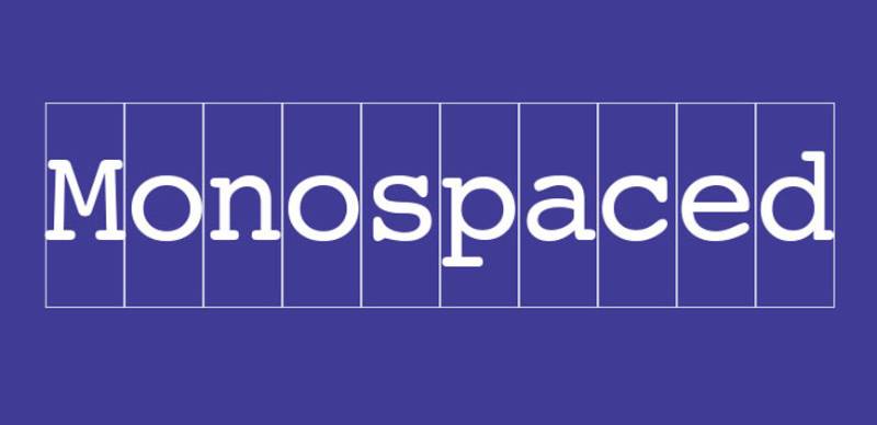
Every code editor, terminal window, and screenplay on the planet uses the same type of font. So what is a monospaced font, and why does it show up in so many places?
A monospaced font is a fixed-width typeface where every character occupies identical horizontal space. The letter “i” gets the same width as “m.” That simple constraint, born from mechanical typewriter limitations, now drives how developers read code, how screenwriters format scripts, and how designers build brutalist layouts.
This guide covers how monospaced fonts differ from proportional fonts, where they’re used in programming and web design, the most popular font families like Courier, Consolas, and JetBrains Mono, and how to load them on websites using CSS and @font-face.
What Is a Monospaced Font
A monospaced font is a typeface where every character occupies the exact same horizontal width. The letter “i” takes up the same space as the letter “m.” That’s it. That’s the whole concept.
Also called fixed-width or fixed-pitch fonts, these typefaces trace back to mechanical typewriters. The Sholes and Glidden typewriter (Remington No. 1), built in 1868, used monospaced characters because the mechanical arms needed uniform spacing to avoid collisions.
Every modern code editor defaults to a monospaced font. GitHub renders code in monospace. Terminal emulators use monospace. It’s the standard across development tools.
But coding isn’t the only use case. Screenwriters still rely on Courier because one page of monospaced text equals roughly one minute of screen time. Legal documents, ASCII art, tabular data, all of these depend on characters lining up in predictable columns.
A 2022 analysis by HTTP Archive found the monospace CSS generic family referenced on roughly 65% of all websites crawled, making it the third most-used generic font family after sans-serif and serif.
Compare that to proportional fonts like Arial, Helvetica, or Times New Roman, where every glyph has a different advance width. In proportional type, a capital “W” might be three times wider than a lowercase “l.” Monospaced fonts lock everything to the same grid.
How Monospaced Fonts Differ from Proportional Fonts
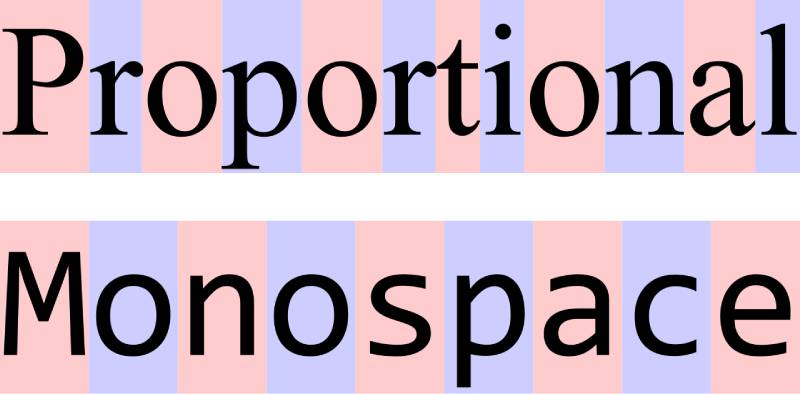
The difference comes down to one thing: character width.
Proportional fonts assign variable widths to each glyph based on its shape. The letter “m” gets more horizontal space than “i” because it’s physically wider. This creates natural reading flow for body text, and it’s why nearly every book, newspaper, and website uses proportional type for paragraphs.
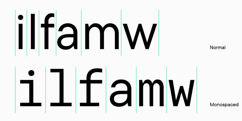
Monospaced fonts do the opposite. Every character sits in a box of identical width. Narrow letters like “i” or “l” get extra padding (often with added serifs at the top and bottom to fill the space), while wide letters like “m” and “w” get compressed.
An analysis of 1,000 websites by Toner Buzz found that 85% use sans-serif proportional fonts as their primary typeface. Monospaced fonts make up a small fraction of primary web text, but they appear on the majority of sites inside <code> and <pre> elements.
| Feature | Monospaced | Proportional | | — | — | — | | Character width | Identical for all glyphs | Varies per glyph | | Common examples | Courier, Consolas, Fira Code | Arial, Helvetica, Georgia | | Primary use | Code, terminals, data | Body text, headings, UI | | Reading speed (long text) | Slower | Faster | | Vertical alignment | Perfect column alignment | No inherent alignment |
How Kerning and Tracking Behave Differently
Kerning adjusts the space between specific letter pairs in proportional fonts. The classic example: “AV” gets pulled closer together because the shapes naturally complement each other. Monospaced fonts don’t use kerning at all. Every character pair maintains the same fixed distance.
Font spacing adjustments like tracking still technically work on monospaced type, but the results look odd. Adding extra space between characters that are already uniformly spaced breaks the visual grid that makes fixed-width fonts useful in the first place.
Why Proportional Fonts Win for Body Text
Proportional type is more space-efficient. A paragraph set in a proportional font like Georgia takes up roughly 20-30% less horizontal space than the same text in Courier.
Reading speed matters, too. The Monotype 2024 Font Use and Forecasting Survey reported that 76% of designers prioritize readability and accessibility when choosing typefaces. For extended reading, proportional fonts win because variable character widths create natural word shapes that the eye recognizes faster.
Monospaced fonts sacrifice that reading speed for precision. When every character lines up in a column, you can spot a missing semicolon, a misplaced bracket, or an extra space instantly. Different tools for different jobs.
Where Monospaced Fonts Are Used
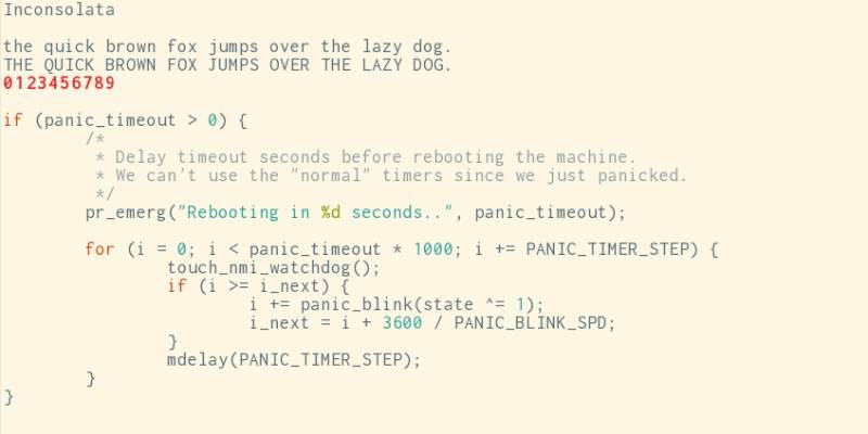
Fixed-width type shows up in more places than most people realize. And not just code editors.
Screenwriting: Courier remains the industry standard. Final Draft and most screenplay software default to Courier 12pt because one page of monospaced text maps to approximately one minute of screen time. That rule has held since the 1930s.
Terminal interfaces: Every command-line environment, from macOS Terminal to Windows PowerShell to Linux bash, uses monospaced rendering. The output assumes fixed character widths for alignment.
Tabular data without tables: If you need columns of numbers to line up in plain text (think README files, log outputs, or receipt formatting), monospaced fonts are the only option that works without markup.
Legal and government forms: Some document standards still require fixed-width characters for precise character counts per line.
ASCII art: The entire medium depends on every character occupying equal space. A proportional font would collapse the visual structure completely.
Monospaced Fonts in Programming
This is where fixed-width fonts do their best work. Every modern code editor, VS Code, Sublime Text, Vim, IntelliJ, defaults to a monospaced typeface. There’s a good reason why.
Code is not prose. Individual characters carry structural meaning. A misread zero (0) confused with a capital O, or a number one (1) mistaken for a lowercase L (l), can break an entire application. Monospaced fonts designed for coding exaggerate the differences between these ambiguous characters.
Indentation becomes visually consistent. Nested code blocks line up vertically. Bracket pairs sit at predictable horizontal positions. According to Crocoblock, the fixed character width is what makes syntax structures readable, because a single incorrect character can break everything.
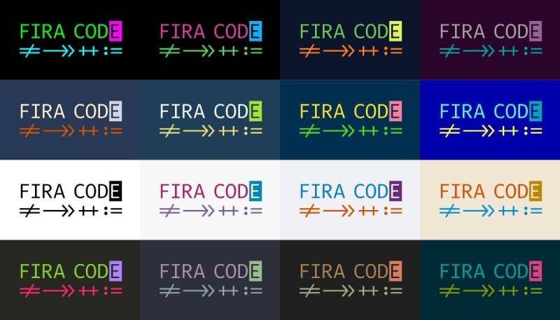
Ligature support has become a major selling point. Fonts like Fira Code and JetBrains Mono combine multi-symbol sequences (like => or !=) into single visual glyphs without changing the underlying characters. JetBrains Mono includes 139 code ligatures across 8 font weights.
Monospaced Fonts in Design and Typography
Fixed-width type has moved well beyond terminals. Designers are using monospaced fonts for aesthetic purposes, especially in brutalist and minimalist design work.
YouWorkForThem reported in early 2025 that monospaced fonts saw a “remarkable resurgence” in design, used increasingly in branding, editorial layouts, and digital interfaces. The uniform spacing creates what designers call an “undesigned” feel, which paradoxically makes layouts feel more intentional.
Some brands have leaned into this. Tech startups and developer-facing companies frequently choose monospaced typefaces for their brand typography because the aesthetic signals precision and technical credibility. It works in poster design and packaging design when you want that raw, mechanical quality.
Common Monospaced Font Families
Not all monospaced fonts are interchangeable. Some were built for terminals in the 1950s. Others were released last year with coding ligatures and variable font support. Here’s what’s actually in use.
Classic System Fonts
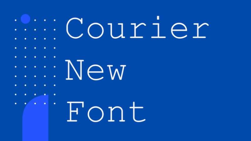
Courier and Courier New: Howard Kettler designed Courier for IBM in 1955, originally for typebar typewriters. IBM never secured exclusive rights, so every competitor copied it. Courier New ships with every Windows install and remains the default in screenplay formatting. It’s the most recognized monospaced font in the world.
Consolas: Lucas de Groot designed this for Microsoft, released in 2007. It’s the default coding font in Visual Studio and Visual Studio Code on Windows. Clean, readable, with clear character distinction between 0/O and 1/l/I.
Monaco and Menlo: macOS defaults. Monaco was Apple’s terminal font for decades. Menlo replaced it as the default in 2009, based on Bitstream Vera Sans Mono with modifications by Jim Lyles.
Modern Open-Source Options
The last decade brought a wave of purpose-built coding fonts. These aren’t just monospaced. They’re designed specifically for developers staring at screens 8+ hours a day.
JetBrains Mono: Released as open source under the SIL Open Font License. 8 weights, 139 ligatures, maximized lowercase height. In blind testing, developers frequently rate it highest for legibility during extended sessions. It’s the default font in all JetBrains IDEs.
Fira Code: Built on top of Fira Mono with added programming ligatures. It’s widely cited as the most popular programming font for its ligature support, turning character sequences like != and -> into single visual symbols.
Source Code Pro: Adobe’s open-source monospaced font from 2012. It balances personality with neutrality and has aged well. Good character distinction, generous x-height, and thoughtful punctuation spacing.
IBM Plex Mono: Part of IBM’s corporate brand guidelines typeface system. Available on Google Fonts.
Roboto Mono and Space Mono: Both on Google Fonts. Roboto Mono is the monospaced member of Google’s flagship font family. Space Mono leans more editorial, with a quirky, retro-tech personality.
| Font | Ligatures | Weights | Best for |
|---|---|---|---|
| Courier New | No | 2 | Screenplays Documents |
| Consolas | No | 2 | Windows IDEs |
| JetBrains Mono | Yes (139) | 8 | Long coding sessions |
| Fira Code | Yes | 5 | Ligature-heavy workflows |
| Source Code Pro | No | 7 | General-purpose coding |
Google Fonts now hosts over 1,826 font families as of mid-2025, according to Photutorial. The monospaced category is small relative to sans-serif (744 families) but continues growing with additions like SUSE Mono, Atkinson Hyperlegible Mono, and Google Sans Code in 2025.
How to Identify a Monospaced Font
Sometimes you’re looking at a font and you’re just not sure. Is it monospaced or just a tightly tracked sans-serif font?
The fastest test: type two lines of different characters and see if they line up vertically.
Type WWWWWWWWWW on one line and iiiiiiiiii on the next. If both lines are exactly the same width, it’s monospaced. In a proportional font, the W line will be dramatically longer.
Checking Font Metadata
In font files: OpenType and TrueType fonts include an isFixedPitch flag in their metadata. Font inspection tools like FontForge, Glyphs, or even basic font info viewers will show this value. If it’s set to true, the font is monospaced.
In CSS: The generic keyword monospace tells the browser to fall back to the system’s default fixed-width font. If you see font-family: monospace or font-family: 'Courier New', monospace in a stylesheet, the developer intended fixed-width rendering.
Identifying Fonts on Live Websites
Browser DevTools are the quickest way to check. Right-click any text element, select “Inspect,” and look at the computed font-family value. Chrome’s DevTools even show the actual rendered font if the first choices in the stack weren’t available.
Extensions like WhatFont work too. Click on the text, and the extension tells you the font name, size, weight, and color. From there, a quick search tells you whether that font is monospaced.
By the way, if you’re working with fonts in design tools, you might find font finders useful for identifying typefaces from screenshots or images.
How to Use Monospaced Fonts on Websites
The web has solid built-in support for monospaced type. Certain HTML elements default to it, CSS gives you full control, and Google Fonts makes loading custom monospaced families trivial.
HTML Elements That Default to Monospace
Three HTML elements render in monospace by default in every browser:
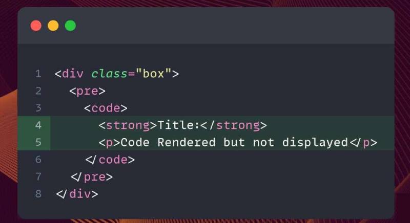
<code>for inline code snippets<pre>for preformatted text blocks that preserve whitespace<kbd>for keyboard input references
You don’t need any CSS for these. Browsers apply font-family: monospace automatically. But most developers override the default with a specific font stack for better visual results.
CSS Font Stacks for Monospaced Type
A good cross-platform monospaced font stack covers macOS, Windows, and Linux defaults before falling back to the generic monospace keyword.
Here’s a practical example:
font-family: 'JetBrains Mono', 'Fira Code', 'Consolas', 'Monaco', 'Courier New', monospace;
The order matters. Put your preferred font first, followed by platform-specific defaults, and always end with monospace as the last resort. The Web Almanac’s 2025 report found that approximately 88% of all websites now use web fonts, but the monospace generic remains important as a fallback.
If you’re using variable fonts, some families like Recursive offer both proportional and monospaced widths in a single variable font file. That’s a performance win, since you load one file instead of two.
Loading Custom Monospaced Fonts
Google Fonts is the easiest route. Add a <link> tag or an @import in your CSS, and you’re done. Roboto Mono, JetBrains Mono, Source Code Pro, Fira Code, Space Mono, and IBM Plex Mono are all available.
Self-hosting is the faster option for production. The HTTP Archive 2025 Fonts chapter reported that roughly one-third of all sites now exclusively self-host their fonts, up from about 30% the year before. This avoids external dependencies and gives you more control over caching.
Use WOFF2 format. It’s the smallest and most widely supported web font format. Subsetting your font file, stripping out character ranges you don’t need, can cut file size dramatically. If you’re only using the font for code snippets, you likely don’t need Cyrillic or Greek character support.
Pairing monospaced fonts with proportional type creates strong visual contrast in layouts. A monospaced heading paired with a serif body, or monospaced code blocks inside sans-serif content, immediately signals a shift in content type. It’s a simple way to build clear typographic hierarchy without relying on size changes alone.
For details on font licensing, keep in mind that most popular monospaced coding fonts (JetBrains Mono, Fira Code, Source Code Pro) are released under the SIL Open Font License. That means free for personal and commercial use, including web embedding. Commercial monospaced fonts like MonoLisa start around $59.50 for a basic license.
Readability and Accessibility of Monospaced Fonts
Monospaced fonts are great for code. For long-form reading? That’s a different story.
Proportional type creates natural word shapes that the eye recognizes quickly. Fixed-width type flattens those shapes because every character takes identical space, forcing the brain to process each letter more individually. The result: slower reading for paragraphs of prose.
But there’s a flip side that most people don’t talk about.
Accessibility Benefits for Readers with Dyslexia
A landmark study by Rello and Baeza-Yates, published through ACM, tested 48 dyslexic subjects reading 12 texts across 12 different fonts using eye-tracking. The findings were clear: sans-serif, monospaced, and roman font styles significantly improved reading performance over serif, proportional, and italic fonts.
The University of Michigan’s DyslexiaHelp program confirmed this, recommending Helvetica, Courier, Arial, Verdana, and Computer Modern as the most accessible typefaces for dyslexic readers.
Roughly 10% of the population has dyslexia, according to the same research. That’s not a small group. The consistent spacing in monospaced fonts reduces visual crowding between characters, which is one of the specific challenges dyslexic readers face.
Character Distinction and Low-Vision Use Cases
Ambiguous characters are the biggest readability risk in any typeface. Monospaced fonts solve this better than most proportional alternatives.
- Zero (0) vs. capital O
- Number one (1) vs. lowercase L (l) vs. capital I
- Pipe character (|) vs. lowercase L vs. capital I
Atkinson Hyperlegible Mono, added to Google Fonts in 2025, was built specifically around this idea. Every glyph is deliberately shaped to avoid ambiguity, even in low-contrast or small-size environments.
Where Monospaced Fonts Hurt Readability
Fixed-width type takes up 20-30% more horizontal space than equivalent proportional text. That means fewer words per line, more line breaks, and longer pages.
For body text on a blog, article, or marketing page, that’s a bad trade-off. The WCAG guidelines don’t specifically prohibit monospaced fonts, but the accessibility standards around text size, contrast, and line length still apply. And hitting a comfortable 45-75 character line length is harder with fixed-width characters on smaller screens.
The practical rule: use monospaced fonts where precision matters (code, data, forms), and proportional fonts where reading speed matters (articles, UI copy, documentation prose).
Monospaced Fonts and the <code>@font-face</code> Rule
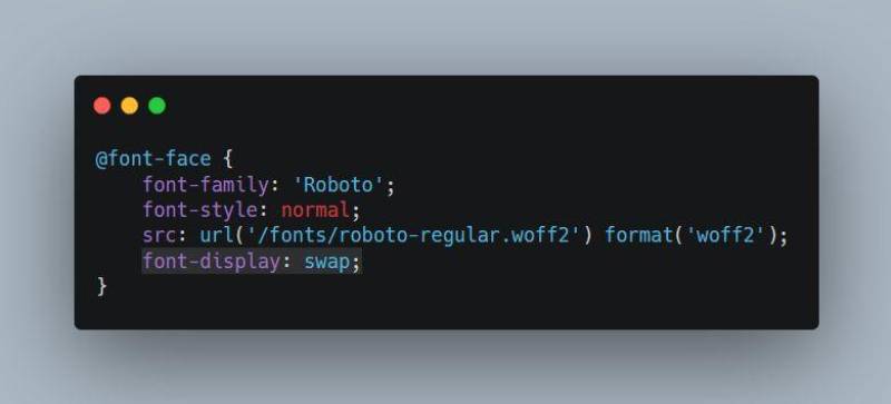
Loading a custom monospaced font on the web means writing an @font-face declaration. The syntax hasn’t changed much over the years, but the best practices around format and performance have.
Basic Syntax and WOFF2 Format
A standard @font-face rule for a monospaced font looks like this:
“ @font-face { font-family: 'JetBrains Mono'; src: url('/fonts/jetbrains-mono.woff2') format('woff2'); font-weight: 400; font-style: normal; font-display: swap; } `
WOFF2 is the only format you need for modern browsers. The HTTP Archive’s 2024 Fonts chapter found WOFF2 used on 81% of desktop sites and 78% of mobile sites, up three percentage points from 2022.
WOFF2 uses Brotli compression, achieving roughly 30% better compression than the older WOFF format. A font file that’s 45KB in WOFF drops to about 30KB in WOFF2 with zero quality loss. Those savings add up fast when loading multiple weights.
Browser support sits at 97%+ as of 2025. The only gaps are browsers most teams stopped supporting years ago.
Subsetting and Performance
Subsetting strips unused characters from a font file. If your site is English-only, you don’t need Cyrillic, Greek, or Vietnamese character ranges. Removing them can cut file size dramatically.
A full Noto Sans file covering all scripts can weigh over 400KB, according to Enepsters. Subset it to Latin-only and you’re looking at a fraction of that. For a monospaced font used only in code blocks, subsetting is almost mandatory.
The OpenType and TrueType source files serve as your starting point. Convert to WOFF2, subset to needed character ranges, and serve with proper cache headers.
The </code>font-display<code> Property and Layout Shift
Key values for monospaced fonts:
| Value | Behavior | Best for |
|---|---|---|
swap |
Shows fallback immediately, swaps when loaded | Body text Most use cases |
optional |
Uses font only if already cached | Non-critical decorative use |
fallback |
Brief invisible period, then fallback | Code blocks Secondary text |
With monospaced fonts, font-display: swap can cause visible layout shift because the fallback monospace generic and your custom font likely have different character widths and leading. The text reflows when the custom font loads. For code-heavy pages, fallback often works better because it limits the swap window.
Licensing for Web Embedding
Most popular monospaced coding fonts are released under the SIL Open Font License, which permits web embedding, modification, and redistribution. JetBrains Mono, Fira Code, Source Code Pro, and IBM Plex Mono all fall under this license.
Commercial options exist too. MonoLisa starts at $59.50 for a basic license. Berkeley Mono and PragmataPro are other paid options popular with developers. Always check the license terms before embedding any font on a production site, even open-source ones have specific conditions about attribution.
How to Choose a Monospaced Font
Picking a monospaced font isn’t really about “which looks best.” It depends on what you’re doing with it.
Choosing for Code
Character distinction is the top priority. Can you instantly tell apart 0O1lI| at your working font size? If not, move on.
Ligature support matters if you work with operators frequently. Fira Code and JetBrains Mono are the two strongest options here. Some developers find ligatures distracting (Matthew Butterick from Practical Typography has argued they create confusion between visual rendering and actual code). Others can’t go back after trying them. It’s personal.
Most developers use 12px-14px font size with a line height around 1.5, according to CSS Author. Test your candidates at those sizes specifically, not in large preview panels.
Choosing for Web Design
The question here is tone. What does the monospaced type communicate about your brand or product?
Technical and precise: JetBrains Mono, IBM Plex Mono, Source Code Pro. Clean, neutral, built for screen rendering.
Retro and editorial: Space Mono, Courier Prime. More personality. Space Mono in particular has that quirky, magazine-tech aesthetic that shows up in design movements like Swiss design and its modern descendants.
Accessible first: Atkinson Hyperlegible Mono. The trade-off is density (it’s wider than most), but if your audience includes readers with visual impairments, it’s the strongest option available on Google Fonts right now.
Choosing for Print and Documents
Courier. Still. After 70 years.
Screenwriting software defaults to Courier 12pt. Legal filings in some jurisdictions still require it. If you need a monospaced font that will render identically across every system, printer, and PDF viewer on the planet, Courier New is the safe choice. Not the exciting choice, but the one that won’t break anything.
Weight, Style, and Family Completeness
Check what weights and styles are available before committing. A monospaced font with only regular and bold is limiting if you need italic for comments, thin for secondary UI text, or extra-bold for headings.
| Font | Weights | Italics | Variable |
|---|---|---|---|
| JetBrains Mono | 8 (Thin–ExtraBold) | Yes | Yes |
| Fira Code | 5 (Light–Bold) | No | Yes |
| Source Code Pro | 7 (ExtraLight–Black) | Yes | Yes |
| Courier New | 2 (Regular & Bold) | Yes | No |
Fira Code’s lack of true italics is a deal-breaker for some developers. Code editors use italics to differentiate comments, keywords, and annotations. Without a dedicated italic, the editor either skips the styling or fakes it with a slant (called an oblique font), which usually looks worse.
If you’re building a full visual identity around a monospaced font, JetBrains Mono and Source Code Pro offer the most flexibility across weights and styles. For a quick code snippet on a blog post? Courier New gets the job done.
FAQ on Monospaced Fonts
What is the difference between monospaced and proportional fonts?
Monospaced fonts give every character the same width. Proportional fonts like Arial or Helvetica assign different widths based on each glyph’s shape. The letter “m” is wider than “i” in proportional type, but identical in a fixed-width typeface.
Why do programmers use monospaced fonts?
Code depends on precise character alignment. Monospaced fonts make indentation consistent, bracket pairs visible, and ambiguous characters like 0, O, 1, and l easy to distinguish. That’s why every IDE defaults to a fixed-pitch font.
What is the most popular monospaced font?
Courier New remains the most widely installed. For coding, Fira Code and JetBrains Mono lead in popularity thanks to ligature support and optimized screen rendering. Source Code Pro and Consolas are also common choices.
Are monospaced fonts good for web design?
Yes, but selectively. They work well for code snippets, data displays, and brutalist or minimalist aesthetics. For body text, proportional fonts are faster to read. Monospaced type works best as a contrast element paired with sans-serif body copy.
What is the CSS code for monospaced fonts?
Use font-family: monospace; for the browser default. For a specific font, write something like font-family: ‘JetBrains Mono’, ‘Consolas’, monospace;. Always end your font stack with the generic monospace keyword as a fallback.
Can monospaced fonts help with dyslexia?
Research by Rello and Baeza-Yates found that monospaced fonts significantly improved reading performance for dyslexic readers compared to proportional and italic fonts. The even character spacing reduces visual crowding, which is a common barrier.
What is the best free monospaced font for coding?
JetBrains Mono is a strong pick. It has 8 weights, 139 ligatures, and maximized lowercase height for better screen readability. Fira Code, Source Code Pro, and IBM Plex Mono are excellent free alternatives available on Google Fonts.
Are all typewriter fonts monospaced?
Traditional typewriter fonts were monospaced because of mechanical constraints. Each key moved the carriage the same distance. Some modern typewriter-style fonts like American Typewriter are actually proportional, keeping the aesthetic without the fixed-width restriction.
What does fixed-width font mean?
Fixed-width is another term for monospaced. It means every character occupies the same horizontal space in a line of text. The terms fixed-pitch, fixed-width, and monospaced all describe the same concept and are used interchangeably.
How do I identify if a font is monospaced?
Type a row of “W” characters and a row of “i” characters on separate lines. If both lines are exactly the same length, the font is monospaced. You can also check the isFixedPitch flag in the font’s metadata using tools like FontForge.
Conclusion
Understanding what is a monospaced font comes down to one rule: every character gets equal horizontal space. That single constraint shapes how millions of developers write code, how screenwriters format scripts, and how designers create layouts with deliberate visual rhythm.
Picking the right fixed-width typeface depends on context. Fira Code and JetBrains Mono handle long coding sessions. Courier New stays reliable for print and legal documents. Newer options like Atkinson Hyperlegible Mono push accessibility forward.
On the web, serve your monospaced fonts in WOFF2 format, subset to only the character ranges you need, and pair them with proportional type for clear content separation.
Whether you’re styling code blocks in CSS, choosing a terminal font, or building a brand identity around fixed-width type, the monospaced font family remains one of the most functional tools in typography.

Renowned for his expertise in logo design and visual branding, Bogdan has developed a multitude of logos for various clients.
His skills extend to creating posters, vector illustrations, business cards, and brochures. Additionally, Bogdan's UI kits were featured on marketplaces like Visual Hierarchy and UI8.
He also wrote in the past years on sites like Design Your Way, WebDesignerDepot, WPDean, Designmodo, Speckyboy, Slider Revolution, and more.
- The Windsurf Logo History, Colors, Font, And Meaning - 10 October 2026
- How to Remove Background From Product Photos (No Photoshop) - 10 October 2026
- How Designers can Build a Stronger Online Creative Identity - 9 October 2026

Bogdan Sandu is a seasoned designer who has been designing websites since 2008. Renowned for his expertise in logo design and visual branding, Bogdan has developed a multitude of logos for various clients. His skills extend to creating posters, vector illustrations, business cards, and brochures. Additionally, Bogdan's UI kits were featured on marketplaces like Visual Hierarchy and UI8. He also wrote in the past years on sites like Design Your Way, WebDesignerDepot, WPDean, Designmodo, Speckyboy, Slider Revolution, and more.
You Might Also Like