Your logo fonts speak before your designs ever do.
Fashion fonts determine whether brands read as haute couture or fast fashion, luxury or accessible, timeless or trendy. Typography creates the invisible architecture that positions Chanel differently from Supreme, Vogue differently from streetwear blogs.
This guide examines 15 typefaces that define fashion branding across luxury houses, editorial magazines, and contemporary clothing brands. You’ll discover why Didot dominates runway typography, when geometric sans-serifs outperform elegant lettering, and which font families work for both print catalogs and mobile interfaces.
From Bodoni’s dramatic stroke contrast to Helvetica Neue’s minimalist neutrality, each typeface carries specific style associations that either reinforce or undermine brand identity.
By the end, you’ll understand exactly which typography choices signal sophistication versus approachability, heritage versus innovation, and how professional designers pair serif and sans-serif fonts for maximum impact across fashion applications.
Fashion Fonts
| Font Name | Classification & Era | Distinctive Characteristics | Fashion Context Usage |
|---|---|---|---|
| Didot | Neoclassical Serif Late 18th century |
Extreme vertical stress, hairline serifs, high stroke contrast, geometric precision | Haute couture branding, Vogue editorial headers, luxury cosmetics packaging |
| Bodoni | Neoclassical Serif Late 18th century |
Dramatic thick-thin contrast, vertical axis, unbracketed serifs, mathematical construction | Fashion magazine mastheads, perfume advertisements, high-end poster design |
| Futura | Geometric Sans-serif 1927 Bauhaus era |
Pure geometric forms, perfect circles, uniform stroke weight, minimal variation | Contemporary streetwear, Supreme branding, minimalist fashion campaigns |
| Helvetica Neue | Neo-grotesque Sans-serif 1983 refinement |
Neutral appearance, tight spacing, closed apertures, multiple weight options | Corporate fashion identity, American Apparel aesthetic, technical sportswear |
| Garamond | Old-style Serif 16th century Renaissance |
Organic stroke modulation, diagonal stress, bracketed serifs, calligraphic influence | Heritage brand narratives, luxury leather goods, timeless fashion catalogs |
| Playfair Display | Transitional Display Serif 2011 digital revival |
High contrast for screens, elegant curves, large x-height, optimized for web display | E-commerce fashion sites, online boutique headers, digital magazine layouts |
| Avant Garde | Geometric Sans-serif 1970 Art Deco revival |
Circular letterforms, exaggerated geometric shapes, distinctive ligatures, retro-futuristic | Vintage fashion branding, 70s-inspired collections, editorial display text |
| Baskerville | Transitional Serif 1757 pre-modern |
Increased contrast versus old-style, wider letterforms, crisp detailing, refined serifs | British heritage brands, traditional tailoring, formal occasion wear marketing |
| Proxima Nova | Humanist Sans-serif 2005 digital age |
Balanced proportions, open apertures, geometric with organic warmth, extensive weight range | Modern fashion websites, startup fashion brands, digital-first retail interfaces |
| Montserrat | Geometric Sans-serif 2011 urban typography |
Buenos Aires signage inspiration, urban letterforms, clean geometry, accessible spacing | Contemporary casual wear, urban streetwear, accessible fashion branding |
| Raleway | Elegant Sans-serif 2012 refined geometric |
Thin weight elegance, sophisticated proportions, balanced negative space, refined terminals | Minimal fashion aesthetics, scandinavian design brands, editorial headlines |
| Cormorant | Display Serif 2015 classical revival |
Garamond-inspired digitally optimized, flowing italics, multiple optical sizes, expressive | Artisanal fashion brands, handmade luxury, romantic fashion narratives |
| Lato | Humanist Sans-serif 2010 warmth-focused |
Warm semi-rounded details, strong structure, transparency in thin weights, versatile | Accessible fashion e-commerce, body text for catalogs, friendly brand voice |
| Bebas Neue | Condensed Display Sans 2010 bold impact |
All-caps construction, narrow width, strong vertical emphasis, high impact headlines | Athleisure branding, promotional fashion banners, bold sale announcements |
| Libre Baskerville | Transitional Serif 2012 web-optimized |
Screen-optimized Baskerville interpretation, larger x-height, improved legibility, open-source | Blog content for fashion sites, editorial body text, accessible luxury branding |
Didot
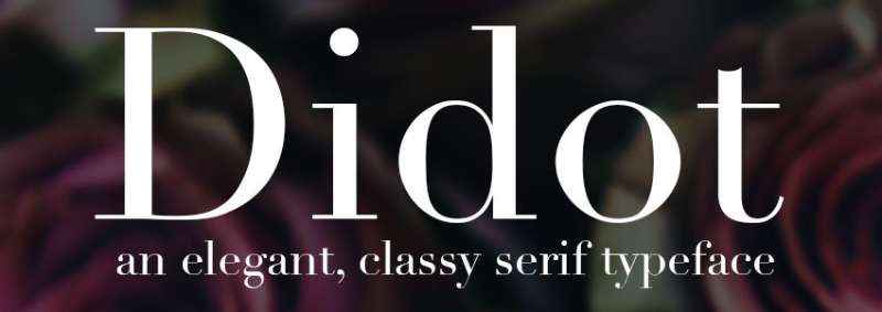
A neoclassical serif font created by Firmin Didot between 1784 and 1811, Didot defines luxury fashion typography. Its extreme stroke contrast and mathematical precision made it revolutionary during the French Revolution.
Character Design
Hairline serifs with zero bracketing create Didot’s signature delicate appearance. Vertical stress and extreme thick-thin stroke modulation demand optical sizing across different point sizes. The high x-height relative to cap height maintains legibility in display applications, though thin strokes can disappear at small sizes.
Fashion Context Usage
Vogue has used Didot since 1947, establishing it as fashion editorial gold standard.
Harper’s Bazaar commissioned Hoefler & Co. to create HTF Didot in 1991 specifically for fashion magazine applications. Giorgio Armani, Zara (2019 rebrand), and CBS television network demonstrate Didot’s crossover from haute couture to mainstream luxury branding.
Style Associations
Didot embodies neoclassical elegance with contemporary edge.
The skeletal letterforms function as typographic veils over photography, perfect for magazine covers where text must float above imagery. Fashion brands choose Didot to signal feminine sophistication, timeless luxury, and refined craftsmanship.
Pairing Recommendations
Proxima Nova balances Didot’s drama with geometric neutrality for body copy. Futura creates modernist tension against Didot’s classical formality. Avoid pairing fonts with other high-contrast serifs, which compete for attention rather than complement.
Technical Specifications
- Family variations: HTF Didot (Hoefler), Linotype Didot (Frutiger), Theano Didot (open source)
- Weights available: Light through Bold in most commercial versions
- Critical consideration: Requires optical sizing; display versions fail at text sizes
- Licensing: Commercial versions require purchase; free alternatives exist but lack refinement
Bodoni
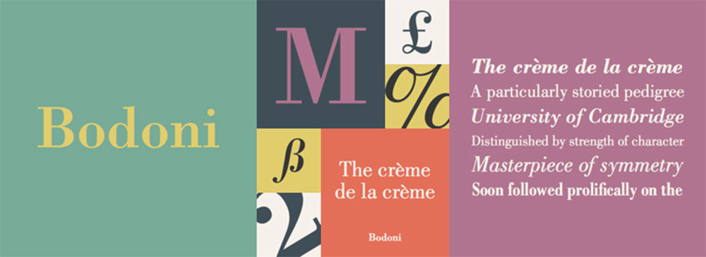
Giambattista Bodoni’s 1790s typeface parallels Didot but pushes geometric precision further. Italian craftsmanship meets neoclassical rationalism in letterforms that dominated 19th-century European printing.
Character Design
Flat, unbracketed serifs with mathematical horizontal alignment distinguish Bodoni from Didot’s subtle curves.
Extreme vertical stress creates “dazzle effect” where thick strokes overwhelm thin ones at small sizes. Slightly condensed structure with geometric construction gives Bodoni its stately presence across fashion applications.
Fashion Context Usage
Calvin Klein built minimalist identity around Bodoni’s clean geometry.
Valentino, Dior, and Elle magazine employ Bodoni variants for editorial sophistication. Zara adopted custom Bodoni for 2019 global rebrand across 2,000+ locations. Nirvana, Bruce Springsteen, and Lady Gaga album covers demonstrate Bodoni’s cultural reach beyond fashion into entertainment.
Style Associations
Bodoni signals high-end positioning through dramatic visual hierarchy.
Less feminine than Didot, Bodoni reads as authoritative and modernist. Fashion brands wanting strength combined with elegance gravitate toward Bodoni’s geometric rationality over Didot’s delicate refinement.
Pairing Recommendations
Works exceptionally with Avenir or Proxima Nova for contemporary luxury branding.
DIN provides industrial counterpoint to Bodoni’s classical forms. Pair Bodoni headlines with generous white space to prevent dazzle effect from overwhelming layouts.
Technical Specifications
- Family variations: ITC Bodoni (12 weights), Bodoni 72 (Apple system), Libre Bodoni (open source)
- Optical sizes: Essential for professional use; ITC offers sizes for 6pt, 9pt, 12pt
- Key distinction: Bodoni 72 has rounded serifs vs. Libre Bodoni’s flat, angular serifs
- Licensing: ITC Bodoni requires purchase; Bodoni 72 included with macOS
Futura

Paul Renner’s 1927 geometric sans-serif embodies Bauhaus ideals without being part of the movement. Near-perfect circles, triangles, and squares form letters that rejected grotesque traditions.
Character Design
Low-contrast strokes with near-even weight throughout distinguish Futura from earlier sans-serifs. Tall ascenders rising above cap line create elegant proportions. Single-story ‘a’ and ‘g’ reference handwriting rather than print traditions, while capitals follow Roman square proportions with considerable width variation.
Fashion Context Usage
Calvin Klein, Louis Vuitton, and Dolce & Gabbana rely on Futura for minimalist logo typography.
Supreme streetwear brand contrasts with Mercedes-Benz luxury, proving Futura’s range across fashion demographics. Chanel uses Futura for body copy paired with custom serif logo lettering, balancing modernity with heritage.
Style Associations
Geometric clarity signals modern sophistication without pretension. Futura bridges luxury and streetwear because its neutrality accepts surrounding context. Fashion brands seeking timeless modernism rather than trendy aesthetics default to Futura’s 90+ year design legacy.
Pairing Recommendations
Garamond creates striking old-style/geometric contrast for editorial layouts.
Bodoni or Didot provide classical counterweight to Futura’s modernist geometry. Works as both headline and body font due to low x-height and balanced proportions.
Technical Specifications
- Family: Futura Now (102 styles), Futura PT, classic Futura
- Weights: Ranges from Light through Black with obliques
- Variable font: Futura Now offers variable font format
- Licensing: Commercial license required; alternatives like Spartan or Montserrat available free
Helvetica Neue
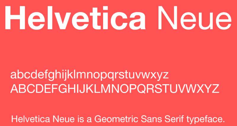
Max Miedinger and Eduard Hoffmann created Neue Haas Grotesk in 1957, renamed Helvetica in 1960. Helvetica Neue (1983) refined the sprawling original family into cohesive system.
Character Design
Tight letter spacing creates dense, solid appearance across all weights.
High x-height maximizes legibility at small sizes. Horizontal and vertical stroke terminals with uniform weight distribution produce neutral, modernist aesthetic that became Swiss Style hallmark.
Fashion Context Usage
Burberry, Balmain, Saint Laurent shifted to Helvetica during recent rebrands signaling new creative directions.
The North Face, American Apparel, and Crate & Barrel demonstrate Helvetica’s accessibility across luxury and mass markets. Fashion brands use Helvetica to mark fresh starts, erasing heritage associations through clean-slate minimalist design.
Style Associations
Neutrality functions as blank canvas for brand personality to emerge through other elements.
Helvetica signals digital-first thinking, millennial targeting, and rejection of ornamental excess. Critics note “blanding” effect where diverse fashion brands become visually indistinguishable through Helvetica adoption.
Pairing Recommendations
Pairs with literally anything due to designed neutrality.
Times New Roman provides traditional counterbalance. Didot or Bodoni add feminine luxury to Helvetica’s industrial utility. Use Helvetica for navigation and UI while reserving display faces for brand expression.
Technical Specifications
- Family: Helvetica Neue (standard), Neue Haas Grotesk (original revival)
- Weights: Thin through Black (typically 8-10 weights)
- Bundled with: macOS, iOS; requires license on Windows
- Alternative: Arial (free but lacks Helvetica’s refined details)
Garamond
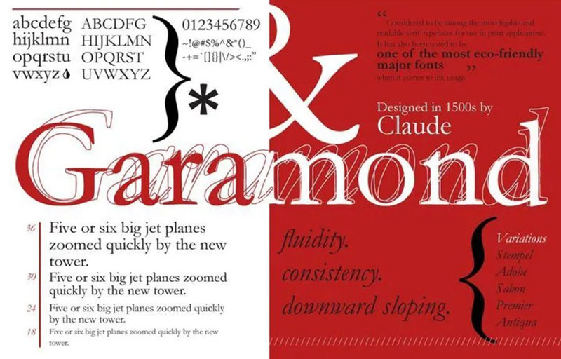
Claude Garamond’s 16th-century typeface represents Renaissance humanism in letterform design. EB Garamond and other revivals bring this classic into digital fashion applications.
Character Design
Old-style serifs with diagonal stress and moderate stroke contrast create warmth absent from modern serifs.
Small x-height with long ascenders and descenders establish elegant, literary proportions. Calligraphic influence shows in curved brackets connecting serifs to stems.
Fashion Context Usage
Apple marketing campaigns employ custom Garamond variants for premium positioning.
Luxury fashion houses reference Garamond’s historical legitimacy when targeting cultured, educated demographics. Fashion editorial uses Garamond for longer-form storytelling where readability trumps dramatic impact.
Style Associations
Renaissance sophistication with scholarly credibility.
Garamond communicates heritage, tradition, and cultural refinement without Didot’s overt femininity or Bodoni’s stark geometry. Fashion brands cultivating intellectual, artistic positioning favor Garamond’s literary associations.
Pairing Recommendations
Helvetica or Futura provide modernist counterpoint to Garamond’s traditional warmth.
Gill Sans shares humanist qualities while offering sans-serif variety. Works beautifully at text sizes where Didot and Bodoni struggle.
Technical Specifications
- Variants: EB Garamond (free), Adobe Garamond Pro, ITC Garamond
- Weights: Regular through Bold in most versions
- Licensing: EB Garamond open source; commercial versions require purchase
- Note: Significant variation exists between different Garamond interpretations
Playfair Display
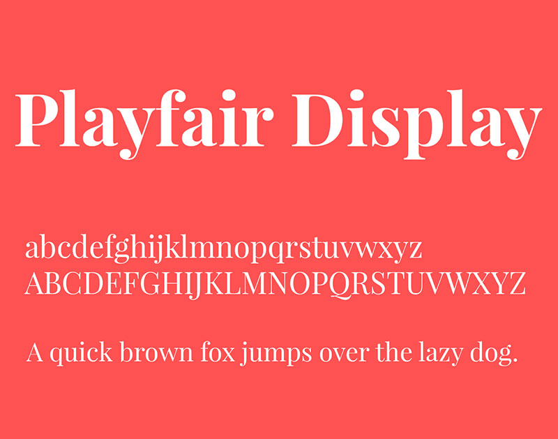
Claus Eggers Sørensen designed Playfair Display in 2011 as transitional serif inspired by 18th-century letterforms. Despite youth, captures period elegance through modern lens.
Character Design
High contrast between thick vertical strokes and delicate hairlines creates dramatic fashion statement.
Extra-short capitals only slightly heavier than lowercase create even typographical color theory. Tall x-height with graceful curves balances classical inspiration with contemporary sensibility.
Fashion Context Usage
Fashion blogs, lifestyle publications, and luxury e-commerce sites favor Playfair for headline drama. Works particularly well for editorial photography layouts where text overlays imagery. Medium blogging platform popularized Playfair Display for long-form fashion writing.
Style Associations
Classical elegance with modern confidence.
Playfair occupies sweet spot between vintage charm and contemporary sophistication. Fashion brands wanting Didot’s drama without overused associations choose Playfair’s fresher interpretation of high-contrast serifs.
Pairing Recommendations
Raleway complements Playfair’s ultra-thin strokes through similar delicate letterforms.
Lato or Source Sans Pro provide readable body copy beneath Playfair headlines. Never use at small sizes; poor readability below 20pt limits Playfair to display applications.
Technical Specifications
- Family: Playfair Display, Playfair Display SC (small caps)
- Weights: Regular, Bold, Black plus italics
- Licensing: Open Font License 1.1 (completely free)
- Languages: Latin and Cyrillic scripts supported
Avant Garde
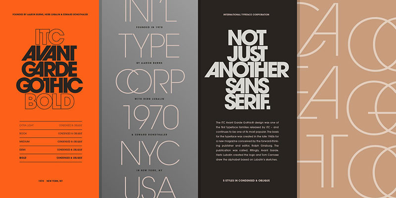
Herb Lubalin created ITC Avant Garde Gothic in the 1970s based on his Avant Garde magazine logo. Geometric sans-serif pushing circle-based construction to extremes.
Character Design
Perfect geometric circles form basis for most letterforms. Tight kerning and numerous ligatures create distinctive, condensed appearance. Very small x-height with tall ascenders gives Avant Garde vertical elegance despite geometric foundation.
Fashion Context Usage
Fashion brands favoring retro-futuristic aesthetic employ Avant Garde for nostalgic 1970s references.
Works particularly well for streetwear and contemporary fashion targeting younger demographics. Less common in luxury fashion due to design-centric associations rather than timeless elegance.
Style Associations
Progressive, design-forward identity with strong 1970s character.
Avant Garde signals artistic credibility and design consciousness. Fashion brands wanting distinctiveness over safety choose Avant Garde’s immediately recognizable geometry.
Pairing Recommendations
Baskerville or Garamond provide traditional counterweight to Avant Garde’s geometric modernism.
Use sparingly; Avant Garde’s strong personality overwhelms if overused. Best reserved for logos and key headlines rather than extended text.
Technical Specifications
- Family: ITC Avant Garde Gothic (full family), AvantGarde Bk BT (free alternative)
- Weights: Book through Bold with obliques
- Licensing: ITC version requires purchase; free alternatives widely available
- Note: Extensive ligature set crucial to authentic Avant Garde character
Baskerville
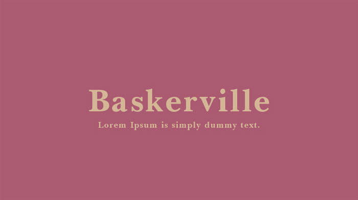
John Baskerville’s 1750s transitional serif bridges old-style and modern serif classifications. Represents Enlightenment rationalism applied to letterform design.
Character Design
Increased stroke contrast over old-style serifs while maintaining slight diagonal stress.
Bracketed serifs with refined curves create sophisticated, authoritative presence. Higher contrast than Garamond but gentler than Bodoni establishes middle ground between warmth and formality.
Fashion Context Usage
Fashion publications seeking literary sophistication without Didot’s overt glamour choose Baskerville.
Works particularly well for heritage brands emphasizing tradition and craftsmanship. Less common in contemporary fashion due to associations with academic and literary publishing.
Style Associations
British sophistication with Enlightenment rationalism.
Baskerville communicates authority, intelligence, and refined taste. Fashion brands targeting educated, mature demographics employ Baskerville’s understated elegance.
Pairing Recommendations
Avenir creates harmonious transitional serif/humanist sans pairing.
Gill Sans shares British design heritage for culturally cohesive combinations. Baskerville works at both display and text sizes unlike Didot, providing greater versatility.
Technical Specifications
- Variants: Libre Baskerville (digital-optimized), Baskerville (system font)
- Weights: Regular, Italic, Bold (Libre Baskerville); more weights in commercial versions
- Licensing: Libre Baskerville free from Google Fonts
- Screen optimization: Libre version features taller x-height for digital readability
Proxima Nova
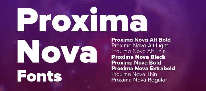
Mark Simonson’s 2005 geometric humanist hybrid bridges pure geometry (Futura) with humanist warmth (Gill Sans). Became ubiquitous in fashion web design.
Character Design
Geometric foundation softened by humanist details creates approachable professionalism.
Wide range of weights (Thin through Black) provides exceptional design flexibility. Excellent tracking and kerning across sizes makes Proxima Nova workhorse for fashion websites.
Fashion Context Usage
Jimmy Choo, Burberry (secondary typeface), and numerous fashion e-commerce sites rely on Proxima Nova for UI.
Bridge between luxury print traditions and digital-first functionality. Fashion brands appreciate Proxima Nova’s ability to scale from mobile interfaces to billboard campaigns.
Style Associations
Modern sophistication without geometric coldness.
Proxima Nova reads as professional but accessible, perfect for fashion brands balancing aspiration with approachability. Lacks strong personality, allowing brand voice to emerge through content rather than typography.
Pairing Recommendations
Didot or Playfair Display provide dramatic display contrast to Proxima Nova’s neutral body copy.
Works well with other geometric sans like Futura when varied through weight rather than typeface. Consider free alternatives Montserrat or Raleway for budget-conscious projects.
Technical Specifications
- Family: Proxima Nova (48 fonts), Proxima Nova Condensed (24 fonts)
- Weights: Thin, Light, Regular, Semibold, Bold, Extrabold, Black plus italics
- Variable font: Proxima Vara offers variable font format
- Licensing: Commercial license required; no free version exists
Montserrat
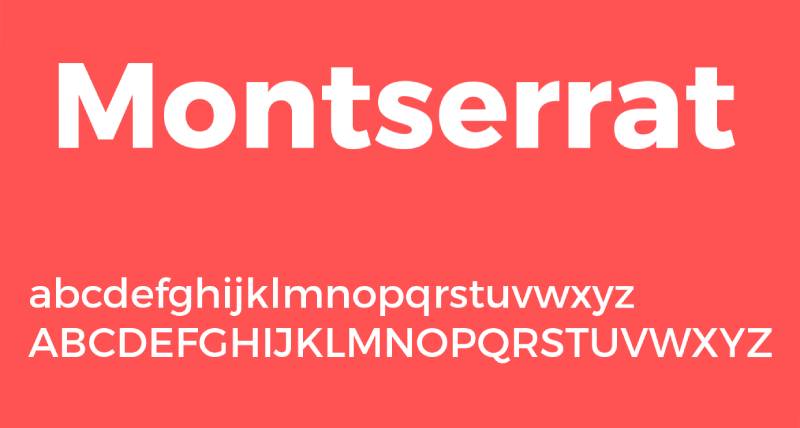
Julieta Ulanovsky created Montserrat in 2011 inspired by Buenos Aires neighborhood signage. Geometric sans-serif offering free Proxima Nova alternative.
Character Design
Geometric letterforms with humanist touches create friendly accessibility. 9 weights from Hairline through Black provide extensive design flexibility. Rounded terminals soften pure geometry, making Montserrat warmer than strict geometric fonts.
Fashion Context Usage
Fashion startups and independent designers favor Montserrat’s combination of sophistication and zero licensing cost.
E-commerce sites, fashion blogs, and social media graphics employ Montserrat for clean, modern aesthetic. Works particularly well for contemporary streetwear and accessible luxury brands.
Style Associations
Urban sophistication with democratic accessibility.
Montserrat signals modern, design-conscious thinking without elitism. Fashion brands wanting geometric cleanliness without Helvetica’s corporate associations choose Montserrat’s Latin American character.
Pairing Recommendations
Playfair Display or Cormorant balance Montserrat’s geometric simplicity with serif elegance.
Montserrat’s extensive weight range allows self-pairing through weight contrast (Hairline headlines with Regular body). Works as both display and text font across fashion applications.
Technical Specifications
- Family: Montserrat (18 fonts), Montserrat Alternates (18 fonts)
- Weights: Thin, ExtraLight, Light, Regular, Medium, SemiBold, Bold, ExtraBold, Black
- Licensing: SIL Open Font License (completely free)
- Availability: Google Fonts, Adobe Fonts
Raleway
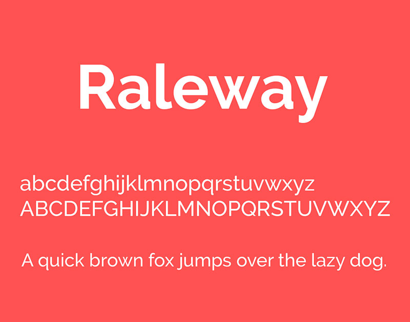
Matt McInerney created original Raleway as single weight in 2010; later expanded by contributors into robust family. Elegant geometric sans with distinctive personality.
Character Design
Thin, high-contrast strokes create elegant, sophisticated presence. Geometric foundation with unique details in ‘w’ and other characters distinguishes Raleway from generic sans-serifs. Large x-height maintains legibility despite delicate construction.
Fashion Context Usage
Fashion blogs, lifestyle brands, and contemporary fashion editorial favor Raleway for refined headlines.
Works particularly well overlaid on photography where delicate strokes create typographic lace over imagery. Independent fashion designers appreciate Raleway’s elegance without licensing costs.
Style Associations
Art Deco elegance meeting contemporary minimalism.
Raleway communicates refinement, creativity, and attention to detail. Fashion brands wanting distinctiveness while maintaining readability choose Raleway’s unique geometric personality.
Pairing Recommendations
Playfair Display creates harmonious pairing where both fonts share delicate ultra-thin strokes.
Lato or Open Sans provide sturdier body copy beneath Raleway’s delicate headlines. Consider OpenType alternates (ss01-ss11) to customize Raleway’s distinctive characters for specific fashion brand identities.
Technical Specifications
- Family: Raleway (18 fonts)
- Weights: Thin through Black with italics
- Variable font: Raleway Variable offers continuous weight adjustment
- Licensing: SIL Open Font License via Google Fonts
Cormorant

Christian Thalmann designed Cormorant in 2015 as high-contrast display serif inspired by Claude Garamond’s Renaissance types. Named after aquatic bird.
Character Design
Dramatic stroke contrast rivals Didot while maintaining Garamond’s warmth.
Tall x-height with sharp, graceful lines creates sophisticated drama. Fine serifs and high-contrast silhouette demand display-size usage; illegible at text sizes.
Fashion Context Usage
Fashion websites, luxury branding, and editorial layouts employ Cormorant for modern take on classical elegance.
Works particularly well for beauty brands and lifestyle fashion targeting feminine, refined aesthetic. Free availability through Google Fonts democratizes high-fashion typography.
Style Associations
Timeless elegance with contemporary edge.
Cormorant occupies middle ground between Didot’s haute couture and Garamond’s scholarly warmth. Fashion brands wanting sophistication without pretension gravitate toward Cormorant’s accessible luxury.
Pairing Recommendations
Montserrat, Open Sans, or Roboto provide clean body copy beneath Cormorant’s dramatic headlines.
Works beautifully with generous white space and large format photography. Never pair with other high-contrast serifs; competition overwhelms layouts.
Technical Specifications
- Family: Cormorant (10 fonts), plus SC, Garamond, Infant, Upright, Unicase variants
- Weights: Light through Bold with italics
- Licensing: SIL Open Font License (completely free)
- Languages: Extended Latin, Cyrillic, Vietnamese support
Lato

Łukasz Dziedzic designed Lato in 2010 as semi-rounded geometric sans combining warmth with structure. Name means “summer” in Polish.
Character Design
Semi-rounded details soften geometric construction.
Strong structure maintains professionalism while rounded elements add approachability. Excellent readability at small sizes makes Lato reliable for fashion website body copy.
Fashion Context Usage
Fashion e-commerce sites, digital magazines, and mobile apps employ Lato for friendly, readable interfaces.
Particularly popular for fashion brands targeting younger demographics wanting accessible sophistication. Works across print and digital without modification.
Style Associations
Professional warmth without corporate coldness.
Lato signals contemporary thinking, user-friendly design, and democratic accessibility. Fashion brands balancing aspiration with approachability choose Lato’s friendly professionalism.
Pairing Recommendations
Georgia or Libre Baskerville add traditional elegance to Lato’s modern functionality.
Works well with Playfair Display or Cormorant for fashion editorial layouts. Lato’s neutrality allows pairing with virtually any display serif without conflict.
Technical Specifications
- Family: Lato (10 fonts)
- Weights: Hairline, Thin, Light, Regular, Medium, Semibold, Bold, Heavy, Black
- Licensing: SIL Open Font License via Google Fonts
- Widespread use: Over 10 million websites employ Lato
Bebas Neue
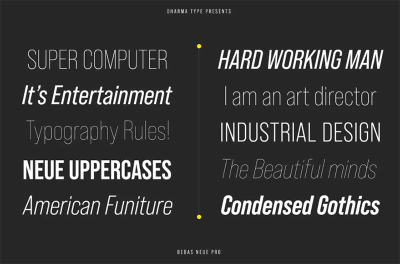
Ryoichi Tsunekawa created original Bebas in 2005; Bebas Neue (2014) added lowercase and weights. Tall, condensed display font with commanding presence.
Character Design
Extreme vertical compression creates tall, narrow letterforms. All-caps original design expanded to include lowercase in Neue version. Bold, confident strokes with minimal variation create impactful headlines and titles.
Fashion Context Usage
Streetwear brands, sports fashion, and youth-oriented lines favor Bebas Neue’s bold authority.
Works particularly well for sale promotions, campaign headers, and social media graphics where attention-grabbing impact matters most. Less appropriate for luxury fashion seeking refinement over impact.
Style Associations
Urban confidence with athletic energy.
Bebas Neue signals bold, unapologetic presence perfect for fashion brands targeting younger, streetwear-influenced demographics. Masculine character limits use in feminine luxury contexts.
Pairing Recommendations
Lato or Open Sans provide readable body copy beneath Bebas Neue’s commanding headlines.
Libre Baskerville creates striking condensed/traditional contrast. Use Bebas Neue sparingly; overpowering personality exhausts viewers if overused.
Technical Specifications
- Family: Bebas Neue (5 weights), original Bebas (regular only)
- Weights: Thin, Light, Regular, Book, Bold
- Licensing: SIL Open Font License (completely free)
- Limitation: Designed primarily for display; avoid extended body copy
Libre Baskerville
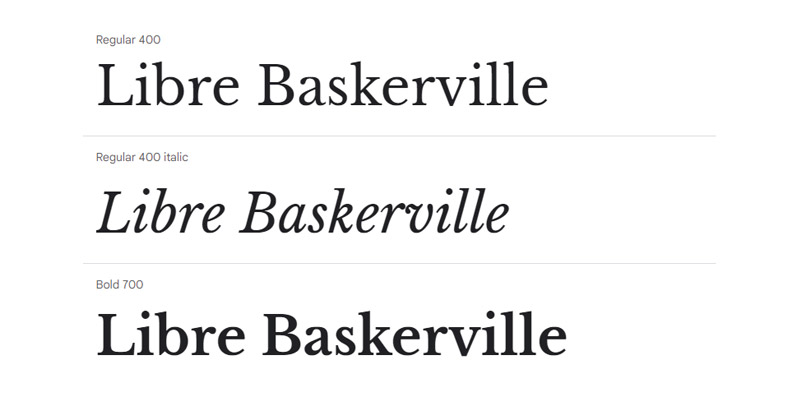
Pablo Impallari designed Libre Baskerville in 2012 as digital-optimized revival of 1941 American Type Founders Baskerville. Free Google Font bringing classical typography to web.
Character Design
Taller x-height and wider letterforms than historical Baskerville improve screen readability.
Transitional serif maintaining original’s elegance while adapting for digital display. Slightly sturdier construction than metal type version prevents thin strokes from disappearing on screens.
Fashion Context Usage
Fashion websites, digital publications, and e-commerce platforms employ Libre Baskerville for classical credibility in digital contexts.
Works particularly well for heritage fashion brands establishing online presence without abandoning traditional values. Editorial fashion blogs favor Libre Baskerville’s literary sophistication.
Style Associations
Traditional elegance optimized for contemporary digital contexts.
Libre Baskerville bridges print heritage and digital functionality. Fashion brands communicating timeless sophistication while embracing technology choose Libre Baskerville’s classical-meets-contemporary positioning.
Pairing Recommendations
Open Sans provides clean, modern body copy beneath Libre Baskerville headlines.
Montserrat or Raleway offer geometric counterpoint to Baskerville’s traditional curves. Works at both display and text sizes, providing design flexibility across fashion applications.
Technical Specifications
- Family: Libre Baskerville (3 fonts)
- Weights: Regular, Italic, Bold (no bold italic)
- Licensing: SIL Open Font License via Google Fonts
- Optimization: Specifically designed for on-screen rendering
FAQ on Fashion Fonts
What fonts do luxury fashion brands use?
Luxury brands favor Didot and Bodoni for their dramatic stroke contrast and elegant sophistication. Chanel, Dior, and Armani employ these high-contrast serifs to signal exclusivity. Helvetica Neue appears in minimalist rebrands by Burberry and Saint Laurent seeking contemporary positioning.
Why do fashion magazines use Didot?
Didot’s hairline serifs create typographic transparency over photography, functioning as elegant overlays rather than visual obstacles. Vogue adopted Didot in 1947 because extreme contrast draws attention while thin strokes recede, letting imagery dominate magazine covers and editorial layouts.
What’s the difference between Didot and Bodoni?
Both are neoclassical serifs with extreme contrast, but Bodoni features flat, unbracketed serifs and more geometric construction. Didot has subtle curves and slightly bracketed serifs. Bodoni reads as more masculine and authoritative; Didot appears more delicate and feminine in fashion applications.
Which fonts work best for fashion websites?
Proxima Nova, Montserrat, and Lato dominate fashion e-commerce because they maintain legibility across screen sizes. Pair geometric sans-serifs for navigation with Playfair Display or Cormorant for headlines. Mobile-first design requires fonts optimized for small displays without sacrificing brand sophistication.
Are serif or sans-serif fonts better for fashion?
Context determines effectiveness. High-fashion editorial favors serif fonts like Didot for luxury associations. Contemporary streetwear uses sans-serif typography like Futura and Helvetica for modern accessibility. Most successful fashion brands combine both, using serifs for brand expression and sans-serifs for functional text.
What font does Vogue magazine use?
Vogue’s logo uses Didot, which the magazine adopted in 1947 and maintains across all international editions. The extreme contrast between thick and thin strokes became synonymous with fashion editorial typography, influencing countless magazines to adopt similar high-contrast serif fonts for masthead design.
Can I use free fonts for fashion branding?
Yes. Playfair Display, Cormorant, Montserrat, and Libre Baskerville offer professional quality without licensing costs. However, custom typography or premium fonts like Didot and Proxima Nova provide distinctiveness that separates luxury brands from competitors using widely available free alternatives on fashion websites.
How do I pair fonts for fashion projects?
Combine high-contrast serif headlines with neutral sans-serif body copy. Didot pairs with Proxima Nova; Playfair Display works with Raleway. Maintain contrast through style (serif/sans-serif) or weight (bold/light) but never pair two high-contrast serifs. Limit combinations to two font families maximum.
What makes a font look expensive?
Thin serifs, high stroke contrast, and delicate hairlines signal luxury through association with quality printing and craftsmanship. Fonts like Didot and Bodoni appear expensive because their fine details require precise rendering. Research shows lighter weights with serifs test as more expensive-looking than bold, rounded typefaces.
Which font is best for fashion logos?
Depends on brand positioning. Luxury brands choose Bodoni or custom serifs for timeless sophistication. Contemporary fashion favors Futura or Helvetica for minimalist modernity. Streetwear brands use Bebas Neue or Avant Garde for bold impact. Logo typography must remain legible at small sizes and distinctive.
Conclusion
Fashion fonts separate forgettable brands from memorable ones through strategic typography choices that reinforce visual identity.
Didot and Bodoni remain dominant in luxury branding because high-contrast serifs communicate craftsmanship and exclusivity. But Futura and Helvetica prove geometric sans-serifs work equally well when brands prioritize modern accessibility over traditional elegance.
Understanding typeface selection transforms amateur design into professional brand identity. The difference between Garamond’s Renaissance warmth and Playfair Display’s contemporary drama determines whether packaging reads as heritage or innovation.
Technical considerations matter as much as aesthetic ones. Optical sizing prevents Didot’s hairlines from disappearing at small sizes, while font licensing protects commercial projects from legal complications.
Start with brand positioning, then choose typography that reinforces rather than contradicts that identity. Pair one display serif with one neutral sans-serif, maintain generous white space, and test legibility across print and digital applications.
Typography builds brand recognition through consistent, strategic font choices across apparel branding, editorial design, and fashion advertising.

Renowned for his expertise in logo design and visual branding, Bogdan has developed a multitude of logos for various clients.
His skills extend to creating posters, vector illustrations, business cards, and brochures. Additionally, Bogdan's UI kits were featured on marketplaces like Visual Hierarchy and UI8.
He also wrote in the past years on sites like Design Your Way, WebDesignerDepot, WPDean, Designmodo, Speckyboy, Slider Revolution, and more.
- The Windsurf Logo History, Colors, Font, And Meaning - 10 October 2026
- How to Remove Background From Product Photos (No Photoshop) - 10 October 2026
- How Designers can Build a Stronger Online Creative Identity - 9 October 2026

Bogdan Sandu is a seasoned designer who has been designing websites since 2008. Renowned for his expertise in logo design and visual branding, Bogdan has developed a multitude of logos for various clients. His skills extend to creating posters, vector illustrations, business cards, and brochures. Additionally, Bogdan's UI kits were featured on marketplaces like Visual Hierarchy and UI8. He also wrote in the past years on sites like Design Your Way, WebDesignerDepot, WPDean, Designmodo, Speckyboy, Slider Revolution, and more.
You Might Also Like