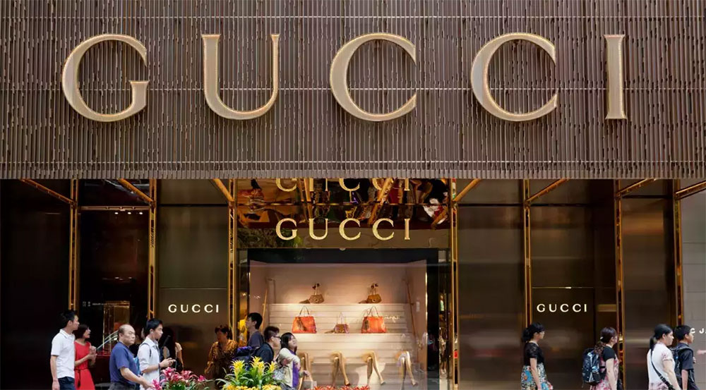
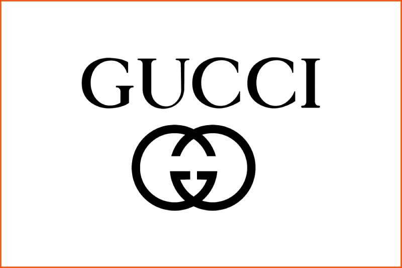
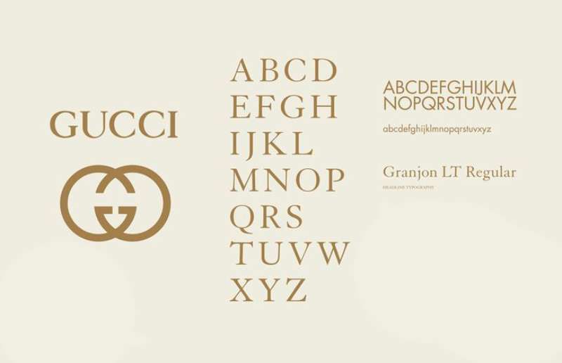
Gucci uses Granjon Roman, an old-style serif font closely matched to the lettering in its wordmark. The typeface was designed by George W. Jones and produced by the British branch of Linotype, first shown publicly in 1924. Gucci has not officially disclosed the exact typeface, but type designers and font identification communities consistently identify Granjon Roman as the closest match to the letterforms in the Gucci logo.
The brand’s logo pairs this wordmark with the iconic interlocking double-G monogram, created by Aldo Gucci in the 1930s to honor his father, Guccio Gucci.
What Type of Font Is Granjon Roman?
Granjon Roman is an old-style serif typeface, rooted in the French Renaissance printing traditions of the 16th century. It sits within the same broad category as Garamond, sharing the characteristic calligraphic stroke modulation, angled stress, and moderate contrast between thick and thin strokes that define humanist serifs.
The letterforms show a clear distinction between uppercase and lowercase, with pronounced bracketed serifs and open counters that give the face strong readability at both small and large sizes.
A few defining visual characteristics:
- Stroke contrast: moderate, with calligraphic thick-thin transitions
- Serifs: bracketed, sharp, with a refined finish
- Stress angle: diagonal, consistent with Renaissance-era type
- x-height: moderate, giving an elegant and open appearance
This classification matters for Gucci. A typography choice like Granjon communicates heritage, craftsmanship, and restraint, exactly the signals a luxury fashion house needs in its brand identity.
Who Designed Granjon Roman?
George W. Jones, a British master printer and typographical advisor to Linotype, designed Granjon around 1924. The roman and italic weights were his work. Chauncey H. Griffith of the American Linotype office later contributed a bold weight to complete the family.
Jones based the design on 16th-century French type by Claude Garamond, specifically the roman, while the italic draws from the work of Robert Granjon, Garamond’s contemporary. Because several other Garamond revivals were already on the market in the 1920s, Jones named the typeface after Granjon to differentiate it.
Linotype published the full family between 1928 and 1931. After Monotype acquired Linotype in 2010, commercial licensing for Granjon moved to Monotype.
The typeface is not custom-made for Gucci. It is a commercial release, licensed through Monotype and available for purchase by any designer.
Is Granjon Roman Free to Use?
No. Granjon Roman is a commercial typeface licensed through Monotype. It is not available on Google Fonts or any open-source platform.
Desktop licenses start at approximately $29.99 per style through MyFonts, with family packs available for broader access. Separate license types exist for web use, app embedding, and digital advertising, each with different terms and pricing.
Using it commercially without a valid license is a font licensing violation. If you want the Gucci aesthetic without purchasing Granjon outright, the free alternatives in the next section are a practical starting point.
What Font Did Gucci Use Before?
Gucci’s wordmark has stayed remarkably consistent throughout the brand’s history. The core lettering style has not undergone a significant typographic rebrand the way many other luxury labels have. The interlocking GG monogram has been a fixture since Aldo Gucci formalized it in the 1930s.
That said, creative direction has shifted the way the logo is applied. Under Alessandro Michele (2015 to 2022), Gucci leaned into maximalism, using the logotype prominently and boldly across campaigns. Under Sabato De Sarno (2023 to present), the application moved toward spaced-out, restrained typography and a deeper color palette, with less reliance on the logo as a visual centerpiece.
The actual letterforms in the wordmark, closely matched to Granjon Roman, have remained consistent. The change has been in how the type is used, not in the typeface itself.
What Are the Best Free Alternatives to Granjon Roman?
All of these are available at no cost and share the old-style serif characteristics that make Granjon Roman work for luxury branding. Good starting points if you’re working on high-end fashion or editorial projects:
| Font | Similarity | License | Source |
| Cormorant Garamond | High contrast old-style serif, display-optimized | OFL (free) | Google Fonts |
| EB Garamond | Faithful Garamond revival, closest to Granjon’s roots | OFL (free) | Google Fonts |
| Garamond | Shares Renaissance structure and moderate contrast | Free variants available | Adobe Fonts / system |
| ITC Galliard | Sharp serifs, refined structure, similar weight | Paid | Adobe Fonts / Monotype |
Cormorant Garamond is the one I keep going back to for anything display-sized. It has a bit more drama than Granjon, but at headline sizes that actually works in its favor. EB Garamond is the safer, more neutral pick for body text situations.
Check the best fonts for luxury brands for a broader view of typefaces that work in premium brand contexts.
How to Use Granjon Alternatives in Design Tools
In Figma and web projects
Cormorant Garamond and EB Garamond are both available directly through Google Fonts. Embed them in a web project using a standard @font-face import or the Google Fonts link tag.
For Figma, install the Figma Font Helper desktop app. Once installed, any locally installed font (including Cormorant Garamond downloaded from Google Fonts) becomes available inside Figma without any plugin required.
In Photoshop and Illustrator
Download the OTF or TTF file from Google Fonts. Install it at the system level by double-clicking the file and selecting “Install.” Both Photoshop and Illustrator pick up system-installed fonts automatically on next launch.
If you have an Adobe Creative Cloud subscription, Granjon Roman itself may be available through Adobe Fonts at no additional cost, depending on your plan tier. Worth checking before purchasing a Monotype desktop license separately.
In Canva
Canva’s free plan does not support custom font uploads. On the Pro plan, you can upload fonts to Canva directly. Download the OTF file from Google Fonts and upload it through Brand Kit settings.
Why Did Gucci Choose This Font?
Granjon Roman is rooted in 16th-century French Renaissance printing. That history is not incidental for Gucci. The brand was founded in Florence in 1921, and the Florentine connection to Renaissance craftsmanship runs through nearly every aspect of its visual identity.
Old-style serif typefaces like Granjon carry specific font psychology signals: longevity, authority, and precision. These are qualities Gucci has always wanted associated with its name. A geometric sans-serif would read as tech-forward. A script would feel overtly decorative. Granjon sits in the space between, legible and confident, without being cold.
The contrast between thick and thin strokes in Granjon also reproduces well across materials. When embossed into leather or printed on matte packaging, those stroke variations hold up in ways that simpler, uniform-weight typefaces do not.
And honestly, consistency matters more than people think. The Gucci wordmark has stayed typographically stable for decades. That kind of visual hierarchy built over time is hard to put a number on, but it is the reason people recognize the name at a glance. Changing the font, even slightly, would cost the brand years of accumulated recognition.
For anyone working on brand identity at this level, the choice of a serif typeface with real historical depth is almost always intentional. Gucci’s use of Granjon Roman is no different. It is a quiet signal that the brand has been here, and plans to stay.
Curious how other fashion labels handle their typography? See how Balenciaga, Dior, and Louis Vuitton approach their brand fonts, or compare luxury brand choices using the overview of luxury brand fonts as a starting point.
FAQ on The What Font Does Gucci Use
What font does Gucci use in its logo?
Gucci’s wordmark closely matches Granjon Roman, an old-style serif typeface designed by George W. Jones for Linotype in the 1920s.
Gucci has never officially confirmed this, but type designers and font identification tools consistently point to Granjon as the nearest match.
Is the Gucci font a custom typeface?
No. Granjon Roman is a commercial typeface, not a proprietary or custom font commissioned exclusively for Gucci.
Any designer can license it through Monotype or Adobe Fonts, assuming they purchase the appropriate commercial license.
What type of font does Gucci use?
Granjon Roman is an old-style serif, rooted in French Renaissance printing traditions from the 16th century.
It features bracketed serifs, moderate stroke contrast, and diagonal stress, all characteristic of humanist serif typefaces in this category.
Can I download the Gucci font for free?
No. Granjon Roman is a paid commercial typeface. Free downloads labeled “Gucci font” online are unofficial recreations, not the actual licensed typeface.
For free alternatives, EB Garamond and Cormorant Garamond are both available on Google Fonts at no cost.
What are the best free alternatives to the Gucci font?
EB Garamond and Cormorant Garamond are the closest free options, both available via Google Fonts under an open-source license.
Garamond (available through Adobe Fonts) and ITC Galliard are solid paid alternatives if you need more typographic precision.
Does Gucci use the same font on its website?
Gucci’s website uses different typefaces for UI and body copy, adapted for screen readability. The Granjon-matched wordmark appears as a graphic element, not as live text.
Luxury brands rarely set their logo font as a live web font, since rendering at small sizes tends to lose the fine serif details.
Who designed the Gucci logo typeface?
George W. Jones designed Granjon Roman for Linotype around 1924, drawing from the 16th-century type work of Claude Garamond and Robert Granjon.
The bold weight was later developed by Chauncey H. Griffith at the American Linotype office.
How does Gucci’s font compare to other luxury brand fonts?
Most high-end fashion houses favor old-style or transitional serifs. Chanel uses a custom sans-serif, while Louis Vuitton leans on Futura.
Gucci’s choice of a Renaissance-era serif positions it as more heritage-driven compared to the geometric minimalism preferred by competitors.
What font pairing works well with the Gucci typeface style?
Granjon Roman pairs well with clean, neutral sans-serif fonts for body copy. The contrast between the ornate serif and a restrained sans creates strong typographic hierarchy.
Think Helvetica, Gill Sans, or Optima as complementary choices for supporting text in luxury brand projects.
Why does Gucci stick with a serif font instead of going modern?
Consistency is the answer. The Gucci wordmark has stayed typographically stable for decades, and that accumulated brand recognition is genuinely difficult to rebuild after a change.
Serif typefaces with historical roots also communicate craftsmanship and longevity, which align directly with Gucci’s positioning in the luxury goods sector.
Conclusion
If you’ve been trying to figure out what font does Gucci use, the answer is Granjon Roman, an old-style serif with roots in 16th-century French Renaissance type design.
The choice is deliberate. A typeface with that kind of historical depth reinforces Gucci’s Italian craftsmanship heritage and luxury brand identity without needing to say a word.
For designers looking to capture a similar feel, EB Garamond and Cormorant Garamond are the most accessible free alternatives, both sharing the humanist serif characteristics that make the Gucci wordmark so recognizable.
Good logo design principles rarely rely on novelty. Gucci proves that typographic consistency, held across decades, is its own kind of brand strategy.

Renowned for his expertise in logo design and visual branding, Bogdan has developed a multitude of logos for various clients.
His skills extend to creating posters, vector illustrations, business cards, and brochures. Additionally, Bogdan's UI kits were featured on marketplaces like Visual Hierarchy and UI8.
He also wrote in the past years on sites like Design Your Way, WebDesignerDepot, WPDean, Designmodo, Speckyboy, Slider Revolution, and more.
- How to Create Product Design Principles That Evolve With Your Product - 29 September 2026
- Canva vs Midjourney: AI Design Tools Compared - 28 September 2026
- A Brand Identity Is Only Finished When Someone Else Can Use It - 28 September 2026

Bogdan Sandu is a seasoned designer who has been designing websites since 2008. Renowned for his expertise in logo design and visual branding, Bogdan has developed a multitude of logos for various clients. His skills extend to creating posters, vector illustrations, business cards, and brochures. Additionally, Bogdan's UI kits were featured on marketplaces like Visual Hierarchy and UI8. He also wrote in the past years on sites like Design Your Way, WebDesignerDepot, WPDean, Designmodo, Speckyboy, Slider Revolution, and more.
You Might Also Like