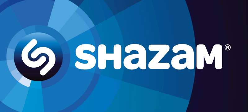
Shazam uses Omnes Bold, a rounded sans-serif typeface designed by Joshua Darden and published by Darden Studio.
The Brand Union adopted this font for Shazam’s visual identity in January 2012, applying it with a distinct biform treatment: capital letters mixed with lowercase “a”s raised to cap height.
What Type of Font Is Omnes?
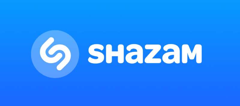
Omnes is a rounded sans-serif typeface. It sits in the humanist-influenced grotesque category, with selectively rounded terminals that avoid the over-engineered “sausage-link” look common to geometric rounded fonts.
Key visual traits of the Shazam wordmark:
- Stroke weight: Bold, consistent across all letterforms
- Terminals: Softly rounded, not geometric circles
- Letterform style: Biform/unicase – capitals and raised lowercase “a”s sit at the same height
- Apertures: Open, which keeps legibility strong at small app icon sizes
That unicase treatment is the part most people notice without realizing it. The “a” is lowercase in form but uppercase in size. It gives the wordmark a distinctive rhythm that a straight all-caps version simply wouldn’t have.
For anyone studying typography and brand identity, the Shazam wordmark is a solid case study in how a single structural decision – the biform treatment – can define a logo’s personality.
Who Designed Omnes?
Joshua Darden designed Omnes, originally conceiving it for Landor Associates as a brand typeface for a national retail chain.
Darden Studio later released it commercially. The development team included Noam Berg, John Hudson, Thomas Jockin, Scott Kellum, Jesse Ragan, Dan Reynolds, and Eben Sorkin, with width expansion later handled by Viktoriya Grabowska.
Omnes is not a custom font built exclusively for Shazam. It is a commercial retail typeface available for licensing. The Brand Union selected it off the shelf and adapted the letterform treatment to create the wordmark.
Designer Dana Killinger led the Shazam wordmark work, collaborating with Sam Becker under the creative direction of Wally Krantz, then Worldwide Creative Director at Brand Union.
Is Omnes Free to Use?
Omnes is a commercial typeface. It is not available for free download.
There are two main ways to access it:
- Darden Studio (dardenstudio.com): Desktop, web, and app licenses available directly from the foundry. Pricing scales by number of users (CPUs) and license type.
- Adobe Fonts: Omnes is included in the Adobe Fonts library, cleared for personal and commercial use with an active Adobe Creative Cloud subscription.
If you need extended licensing – embedding in an app, broadcasting, or web use beyond a basic Adobe CC setup – Darden Studio handles those separately. Educational institutions get a 50% discount on direct licenses.
Worth knowing: if you’re designing with Omnes through Adobe CC and your client needs to install the actual font files, they’ll need their own license from Darden Studio. The Adobe license doesn’t transfer.
Anyone researching font licensing rules before using a brand-adjacent typeface commercially should read Darden Studio’s full terms – the distinctions between desktop, web, and app addenda matter depending on how you deploy the font.
What Font Did Shazam Use Before?
Before the 2012 rebrand, Shazam used a heavy, straight-cut sans-serif with a rigid, almost compressed structure – visually closer to an industrial grotesque than anything rounded.
The original wordmark, in use from around 1999, featured thick strokes with sharply cut edges. Some sources have compared it to Rational Text Extra Bold by René Bieder.
The 2012 switch to Omnes was a significant shift in tone. The old typeface felt dense and utilitarian. Omnes brought warmth and approachability – a deliberate move as Shazam transitioned from a niche utility into a mainstream consumer app.
By 2011, Shazam had become the most downloaded iOS app of all time. That milestone is likely what prompted the full identity overhaul.
Later updates – including a 2013 color refresh and subsequent icon changes – kept the Omnes wordmark intact. The logo evolution changed the icon’s colors from black to gradient blue to solid bright blue, but the typography stayed consistent throughout.
What Are the Best Free Alternatives to Omnes?
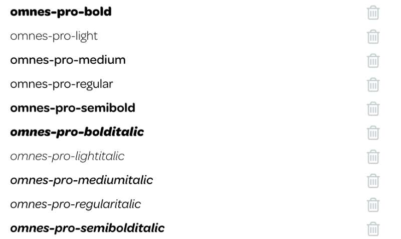
Omnes has a specific character: rounded but not cartoonish, warm but not soft. These free options get reasonably close:
| Font | Similarity to Omnes | License | Source |
| Nunito | Rounded terminals, similar warmth | Free (OFL) | Google Fonts |
| Poppins | Geometric sans-serif, clean weight range | Free (OFL) | Google Fonts |
| Varela Round | Rounded grotesque, close x-height feel | Free (OFL) | Google Fonts |
| Quicksand | Rounded, humanist proportions | Free (OFL) | Google Fonts |
| M PLUS Rounded 1c | Closest to Omnes’s selective rounding approach | Free (OFL) | Google Fontsf |
Nunito is probably the most usable substitute for most projects. Poppins is better if you need a wider weight range and don’t need the rounding to be especially prominent.
For app UI work specifically, Nunito and Poppins both render cleanly at small sizes on mobile – which matters if you’re building something with a similar tone to Shazam’s interface.
If you want to explore Poppins pairings or Nunito pairings for a broader brand system, both have solid companion options documented elsewhere.
How to Use Omnes (or an Alternative) in Your Project
Using Omnes via Adobe Fonts
If you have Adobe Creative Cloud, Omnes is already available. Open the Adobe Fonts panel inside Photoshop, Illustrator, or InDesign, search “Omnes,” and activate the styles you need.
It’ll sync directly to your font menu – no download or installation required on your end.
Using a Free Alternative via Google Fonts
For Nunito or Poppins in a web project, add this to your HTML <head>:
“ <link href="https://fonts.googleapis.com/css2?family=Nunito:wght@700&display=swap" rel="stylesheet"> `
Then apply in CSS:
` font-family: 'Nunito', sans-serif; font-weight: 700; `
For a Figma workflow, just search the font name in the text panel – Google Fonts are available natively inside Figma without any plugin.
Anyone wanting a deeper look at working with these fonts in design tools can find guides on adding fonts to Figma or using Google Fonts across projects.
Why Did Shazam Choose Omnes?
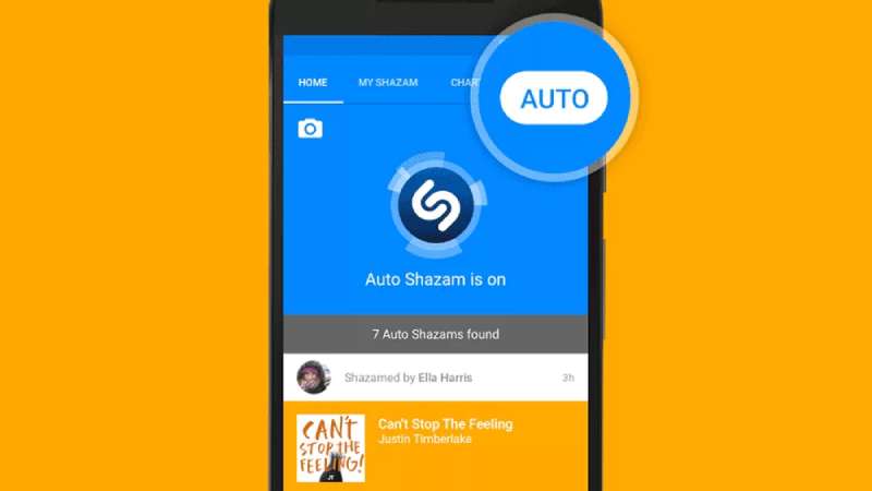
By 2011, Shazam was the most downloaded iOS app globally. That kind of reach demanded a visual identity that felt consumer-friendly, not technical.
The old wordmark looked like software branding from an earlier era – functional, but cold. Omnes solved a specific problem: it reads as approachable without losing authority.
The selective rounding in Omnes (not geometric circles, just slightly softened corners) does something the fully rounded grotesques can’t – it stays legible and structured at small sizes while still feeling warm. For an app icon wordmark that needs to work at 60×60 pixels, that distinction is practical, not just aesthetic.
The biform treatment – mixing cap-height letters with raised lowercase “a”s – added memorability. It made the logotype identifiable even without the blue circle icon. That’s a core principle of strong logo design: the wordmark should function independently of the mark.
Omnes also had the right weight range available. Bold was used for the wordmark, but Omnes Light appeared in Shazam’s advertising campaign – the “Discover. Experience. Share.” tagline used Light. That kind of range within a single family keeps brand materials cohesive without needing multiple typeface systems.
Compared to other apps of the same era, Shazam’s typeface choice aged well. A lot of 2012-era app branding used condensed or display fonts that now feel dated. Omnes doesn’t have that problem – rounded humanist grotesques have only gotten more common in UI design since then, which means the Shazam wordmark still looks current over a decade later.
For anyone interested in how other music and tech platforms handle typography in their brand systems, it’s worth comparing the Shazam approach with how apps like SoundCloud or Spotify handle their own font decisions – each takes a different route to achieve brand recognition through type.
FAQ on What Font Does Shazam Use
What font does Shazam use in its logo?
Shazam uses Omnes Bold, a rounded sans-serif typeface designed by Joshua Darden and published by Darden Studio.
The Brand Union adopted it for the 2012 rebrand, applying a biform treatment that mixes capitals with raised lowercase “a”s.
Is the Shazam font free to download?
No. Omnes is a commercial typeface. It requires a paid license from Darden Studio or access through an active Adobe Creative Cloud subscription via Adobe Fonts.
There is no free version available legally.
What type of font is Omnes?
Omnes is a rounded sans-serif with humanist-influenced proportions. It uses selective rounding on terminals rather than full geometric circles, keeping it structured and legible at small sizes.
Who designed the Omnes typeface?
Joshua Darden designed Omnes, originally conceived for Landor Associates as a retail brand typeface.
Darden Studio later released it commercially, with production support from several collaborators including John Hudson and Eben Sorkin.
Did Shazam always use this font?
No. Before 2012, Shazam used a heavy, straight-cut sans-serif with sharp edges and a rigid structure – closer to an industrial grotesque.
The switch to Omnes came with a full brand redesign by the Brand Union, unveiled in January 2012.
What are the best free alternatives to the Shazam font?
The closest free alternatives are Nunito, Poppins, and Varela Round, all available on Google Fonts.
Nunito is the most similar in warmth and rounding. Poppins suits projects needing a wider font weight range.
Where can I buy or license Omnes?
Directly from Darden Studio at dardenstudio.com, with desktop, web, and app license options available.
It is also accessible through Adobe Fonts with an Adobe CC subscription, covering most personal and commercial use cases.
Why did Shazam choose a rounded font?
Rounded sans-serifs signal approachability – a deliberate choice as Shazam shifted from niche utility to mainstream consumer app.
Omnes stays legible at small pixel sizes, which matters for a sans-serif font used in mobile app branding.
Is the Shazam font the same as the Shazam movie font?
No. The DC Comics film uses a bold display typeface called Franchise, licensed to Warner Bros. – a completely different style from the app’s Omnes wordmark.
The two brands share only a name.
Can I use Omnes in Canva or Figma?
Omnes is not available natively in Canva. In Figma, it can be used if activated through Adobe Fonts and synced locally.
For a free substitute in either tool, Nunito or Poppins work well and are directly accessible without extra steps. Check the guide on how to upload fonts to Canva if you have a licensed copy.
Conclusion
If you’ve been asking what font does Shazam use, the answer is Omnes Bold by Darden Studio, a rounded sans-serif typeface that has defined the app’s visual identity since the Brand Union redesign in January 2012.
The biform wordmark treatment – capitals alongside raised lowercase “a”s – gives the Shazam logotype its distinct character, and it still holds up well over a decade later.
For projects needing a similar feel, Nunito and Poppins are the most practical free alternatives, both available through Google Fonts with open licenses.
If you need the real thing, Omnes is accessible via Adobe Fonts with a Creative Cloud subscription or directly through Darden Studio for extended licensing.

Renowned for his expertise in logo design and visual branding, Bogdan has developed a multitude of logos for various clients.
His skills extend to creating posters, vector illustrations, business cards, and brochures. Additionally, Bogdan's UI kits were featured on marketplaces like Visual Hierarchy and UI8.
He also wrote in the past years on sites like Design Your Way, WebDesignerDepot, WPDean, Designmodo, Speckyboy, Slider Revolution, and more.
- The Windsurf Logo History, Colors, Font, And Meaning - 10 October 2026
- How to Remove Background From Product Photos (No Photoshop) - 10 October 2026
- How Designers can Build a Stronger Online Creative Identity - 9 October 2026

Bogdan Sandu is a seasoned designer who has been designing websites since 2008. Renowned for his expertise in logo design and visual branding, Bogdan has developed a multitude of logos for various clients. His skills extend to creating posters, vector illustrations, business cards, and brochures. Additionally, Bogdan's UI kits were featured on marketplaces like Visual Hierarchy and UI8. He also wrote in the past years on sites like Design Your Way, WebDesignerDepot, WPDean, Designmodo, Speckyboy, Slider Revolution, and more.
You Might Also Like