Medium uses Charter, a transitional serif font designed by Matthew Carter in 1987, as its primary body text typeface. Charter was created for Bitstream Inc. and licensed by Medium in 2015. For its UI, headings, and navigation elements, Medium relies on a sans-serif font stack centered on Inter, with system fallbacks including Helvetica Neue and Arial.
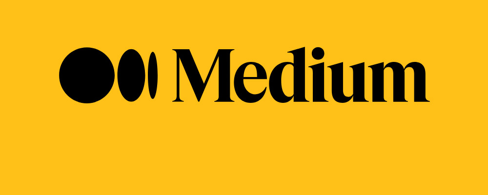
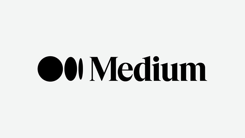
Medium also adopted Söhne, designed by Kris Sowersby and released by Klim Type Foundry in 2019, as part of its interface typography. The wordmark uses Noe Display Bold, a high-contrast serif introduced in Medium’s 2017 brand identity update.
—
What Type of Font Is Charter?
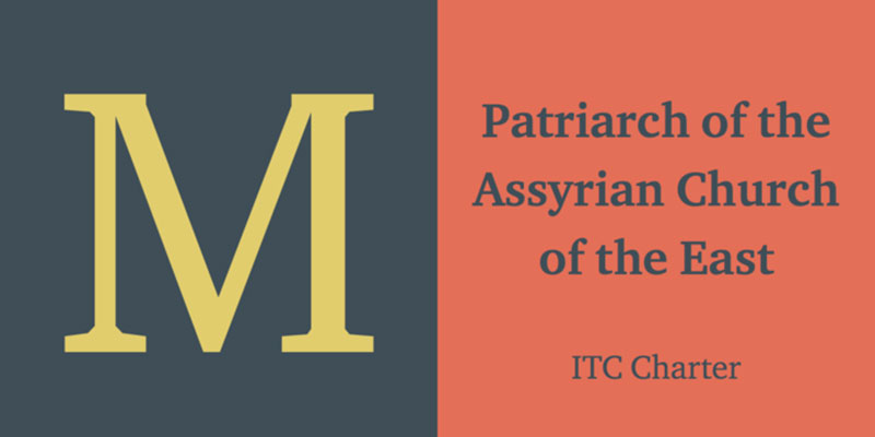
Charter is technically classified as a transitional serif typeface, though it also carries clear slab-serif characteristics. Bitstream’s own classification listed it as “Transitional 801.” In practice, most typographers treat it as a slab serif because of its squared, sturdy serifs and low stroke contrast.
The design is built on a deliberately simplified structure, using minimal curves and more straight-line segments than comparable body text faces like Times New Roman. That economy shows up in the generous x-height, open letterforms, and robust stroke weight, all of which support screen readability at small sizes without falling apart.
Charter’s leading and spacing work well for long-form content. Medium runs article text at a comfortable size (around 21px on desktop), and Charter holds up across that range without feeling heavy or condensed.
That’s exactly the point. Charter was engineered to survive low-resolution output. Screens, even modern ones, sit well below 300 dpi. A font built for 1980s laser printers is, counterintuitively, well-suited to the displays most people read on today.
—
Who Designed Charter?
Matthew Carter designed Charter in 1987 for Bitstream Inc., one of the first major digital type foundries. Carter is also behind Georgia and Verdana, both of which became default web fonts for Microsoft in the 1990s.
Charter was inspired by the 18th-century types of French punchcutter Pierre-Simon Fournier. It was conceived as Bitstream’s first original proprietary typeface, intended to perform reliably on the low-memory, low-resolution devices of the time. The design constraint was tight: minimal memory footprint, minimal curves, maximum legibility.
In 1992, Bitstream donated the core Charter family (Regular, Bold, Italic, Bold Italic) to the X Consortium under permissive open-source terms. That donation is why Charter became freely available and eventually found its way into macOS as a system font in 2017 (OS X High Sierra).
Charter was not designed specifically for Medium. It is a commercial typeface that Medium licensed as part of its 2015 redesign, led by design lead Marcin Wichary.
—
Is Charter Free to Use?
The base Bitstream Charter family is free and open-source. Bitstream released it under a permissive license that allows use, modification, and redistribution, provided the original copyright notice remains intact.
| Version | License | Source |
| Bitstream Charter (original) | Free / Open-source | Practical Typography, GitHub |
| Charter BT Pro | Commercial | MyFonts, Monotype |
| ITC Charter | Commercial | Adobe Fonts, MyFonts |
| XCharter | Free / Open-source | CTAN, GitHub |
The free version covers Regular, Bold, Italic, and Bold Italic. It lacks small caps, old-style figures, and extended language support. Charter BT Pro (released 2004) adds those, along with Black and Black Italic weights, but requires a commercial license.
If you’re looking for a free Charter alternative with a broader character set, XCharter by Michael Sharpe is worth checking out. It’s based directly on the Bitstream original with expanded glyph coverage, including Cyrillic.
Font licensing for Charter is straightforward compared to most commercial typefaces. The open-source version is genuinely usable for both personal and commercial projects.
—
What Font Did Medium Use Before?
Medium’s typography has gone through several distinct phases since the platform launched in 2012. Each switch reflected a different priority, mostly around reading comfort and brand clarity.
| Era | Body Font | UI / Sans Font |
| 2012 | FF Meta Serif | Myriad |
| 2013 (early) | FF Tisa | Freight Sans |
| 2013 (late) | Freight Text | JAF Bernino Sans |
| 2015 | Charter | FF Kievit |
| 2017 | Charter | Marat Sans, Noe Display (brand) |
| 2024+ | Charter | Inter / Söhne stack |
The 2015 redesign was the defining one. Charter replaced a rotating cast of licensed typefaces and stuck. The 2017 update layered Noe Display Bold into the wordmark and Marat Sans into the UI, but Charter remained anchored in article body text across every iteration since.
FF Meta Serif, used in 2012, was co-designed by Erik Spiekermann, Christian Schwartz, and Kris Sowersby. The switch away from it reflected a move toward a more neutral, long-form reading experience rather than the editorial personality Meta Serif carries.
—
What Are the Best Free Alternatives to Charter?
Charter is the ideal body text font for long-form reading, but not everyone needs or wants to license Charter BT Pro. These alternatives cover most of what Charter does well.
| Font | Why It’s Similar | License | Source |
| XCharter | Direct derivative of Bitstream Charter, expanded character set | Free | CTAN / GitHub |
| Charis SIL | Charter-based, multilingual support | Free (OFL) | SIL International |
| Georgia | Same designer (Matthew Carter), similar x-height, screen-optimized | Free (system font) | Built into Windows / macOS |
| Libre Baskerville | Transitional serif, strong on screens, similar weight distribution | Free (OFL) | Google Fonts |
| Merriweather | High x-height, designed for screen reading, similar slab-adjacent feel | Free (OFL) | Google Fonts |
Georgia is probably the closest most people will get without downloading anything. It uses the same design logic as Charter, optimized for low-resolution screens, and it ships with every major OS. Merriweather is the better choice if you’re building a web project from scratch and want something with more weight options.
For pairing suggestions, Merriweather works well with many sans-serif web fonts. If you’re working on a blog or editorial site, it handles long-form reading about as well as Charter does.
—
How to Use Charter (or Alternatives) in Your Projects
CSS Font Stack (Charter with Fallbacks)
Medium’s CSS declaration for body text follows this general pattern, matching what Charter does when it’s unavailable:
“ font-family: Charter, 'Bitstream Charter', 'Sitka Text', Cambria, serif; `
If you want to load Charter via web font, the Bitstream open-source version can be converted to WOFF2 using Font Squirrel’s generator. The total weight for both Roman and Italic comes in around 33KB, which is lightweight for a full serif family.
Using Merriweather on Google Fonts
Embed in HTML:
` <link href="https://fonts.googleapis.com/css2?family=Merriweather:wght@400;700&display=swap" rel="stylesheet"> `
CSS usage:
` body { font-family: 'Merriweather', Georgia, serif; font-size: 18px; line-height: 1.75; } `
If you’d rather skip the setup, check out this font pairing generator to find serif and sans-serif combinations that work together before writing a single line of CSS.
For how to use Google Fonts in general, the embed approach above works across all modern browsers without any additional configuration.
—
Why Did Medium Choose Charter?
Charter was designed to work well under constraints, and Medium’s reading environment is full of them. Variable screen densities, diverse device types, and the challenge of keeping readers engaged through 2,000-word articles all push toward a font that performs reliably without calling attention to itself.
Charter does that. Its open letterforms and generous x-height prevent it from getting cramped at typical reading sizes. The simplified structure means it renders cleanly even when font hinting is inconsistent across browsers. It doesn’t look beautiful in a flashy way. It looks comfortable, which is more useful.
Medium itself acknowledged the choice directly. In a 2024 piece on typography, Medium’s editorial team noted that Charter is “our default story font” and described it as “a very human serif typeface with a few hidden quirks.” That framing is telling. Charter doesn’t try to be neutral. It has a personality, just a quiet one.
The choice also says something about font psychology. Serif fonts carry associations with authority and long-form reading, which maps well onto Medium’s positioning as a platform for serious writing. Georgia would have made the same statement, but Charter is less common, giving Medium a slightly more distinctive reading experience without straying into unfamiliar territory.
The typographic hierarchy Medium uses across body, headings, and UI elements reflects a deliberate system. Charter handles body text, Inter or Söhne handles navigation and metadata, and Noe Display shows up in brand contexts. Each layer has a job. None of them compete.
That kind of structured thinking, where every typeface has a defined role and the overall reading experience stays consistent across devices and contexts, is what makes Medium’s typography worth studying. Other publications with similar audiences, like the New York Times or Vogue, made very different choices for similar reasons.
Charter is also free in its base version. That’s not why Medium chose it, but it does mean the choice is accessible to anyone who wants to replicate a similar reading experience in their own projects.
FAQ on What Font Does Medium Use
What is the main font used on Medium?
Medium uses Charter for article body text. It’s a transitional serif designed by Matthew Carter in 1987 for Bitstream Inc. The UI relies on Inter or Söhne, both sans-serif typefaces, for navigation, buttons, and metadata.
What font does Medium use for headings?
Medium’s headings in articles use Charter as well, styled at larger sizes with adjusted weight. For its wordmark and brand materials, Medium uses Noe Display Bold, a high-contrast serif introduced during the 2017 brand redesign.
Is the Medium font free to download?
The base Bitstream Charter is free and open-source. Bitstream donated it to the X Consortium in 1992. The expanded Charter BT Pro version requires a commercial license. XCharter, a free derivative with a broader character set, is also available.
What sans-serif font does Medium use?
Medium currently uses Inter and Söhne across its UI. Earlier versions relied on FF Kievit (from 2015) and Marat Sans (from 2017). Söhne was designed by Kris Sowersby and published by Klim Type Foundry in 2019.
What font does Medium use for its logo?
The Medium logo uses Noe Display Bold as its base. Schick Toikka designed Noe Display. Medium adopted it in August 2017 when it launched a new brand identity, replacing the previous 3D monogram.
What fonts did Medium use before Charter?
Medium launched in 2012 with FF Meta Serif and Myriad. It then cycled through FF Tisa, Freight Sans, Freight Text, and JAF Bernino Sans before settling on Charter and FF Kievit in the 2015 redesign.
Why did Medium choose Charter for body text?
Charter was built for low-resolution output, which makes it well-suited to screen reading. Its open letterforms and generous x-height keep long-form articles comfortable to read across varying screen densities and device types.
What is the best free alternative to Charter for web use?
Georgia is the closest widely available option, designed by the same person who created Charter. Merriweather and Libre Baskerville are strong blog font alternatives available free on Google Fonts.
What font does Medium use on mobile?
On mobile apps and some web contexts, Medium falls back to the system serif stack, which means Georgia on Android and the native iOS serif on Apple devices. Charter loads when the webfont is served successfully.
Does Medium use a custom font?
Medium does not use a fully custom typeface for body text. Charter is a commercially licensed, publicly available serif font. Noe Display, used in the wordmark, is also a commercially available typeface, not a proprietary in-house design.
Conclusion
If you’ve ever wondered what font does Medium use, the answer comes down to a deliberate system: Charter for body text, Inter and Söhne for UI, and Noe Display for brand contexts.
Each typeface has a specific role in Medium’s typographic hierarchy, and none of them are accidental choices.
Charter’s screen readability, open letterforms, and compact font stack make it a strong pick for any long-form publishing platform. Free alternatives like Merriweather and Bitstream Charter give you the same reading comfort without licensing costs.
The font pairing logic Medium follows is worth borrowing for your own projects.

Renowned for his expertise in logo design and visual branding, Bogdan has developed a multitude of logos for various clients.
His skills extend to creating posters, vector illustrations, business cards, and brochures. Additionally, Bogdan's UI kits were featured on marketplaces like Visual Hierarchy and UI8.
He also wrote in the past years on sites like Design Your Way, WebDesignerDepot, WPDean, Designmodo, Speckyboy, Slider Revolution, and more.
- The Cursor Logo History, Colors, Font, And Meaning - 24 September 2026
- Canva vs PowerPoint: Which Is Better for Presentations? - 22 September 2026
- How to Install Fonts on Mac (Step-by-Step Guide) - 20 September 2026

Bogdan Sandu is a seasoned designer who has been designing websites since 2008. Renowned for his expertise in logo design and visual branding, Bogdan has developed a multitude of logos for various clients. His skills extend to creating posters, vector illustrations, business cards, and brochures. Additionally, Bogdan's UI kits were featured on marketplaces like Visual Hierarchy and UI8. He also wrote in the past years on sites like Design Your Way, WebDesignerDepot, WPDean, Designmodo, Speckyboy, Slider Revolution, and more.
You Might Also Like