The right Libre Baskerville font pairing can be the difference between a website that reads beautifully and one that just looks like someone grabbed two random fonts from Google Fonts.
Libre Baskerville is a humanist serif font built for body text. Large x-height, strong readability, classic proportions. It brings editorial weight to any layout.
But it needs the right companion. Pair it poorly and the typographic hierarchy falls apart. Pair it well and the whole design clicks.
This guide covers the 10 best font combinations for Libre Baskerville, with setup specs, use cases, and clear guidance on which pairing fits your project.
Libre Baskerville Font Pairing
| Pairing | Best For | Heading / Body Roles | Key Watch-Out |
|---|---|---|---|
| Libre Baskerville + Montserrat Transitional serif + Condensed geometric sans |
Portfolio and agency websites, editorial and marketing content, brands bridging traditional and modern aesthetics | H1-H2 Montserrat Bold 700 Body Libre Baskerville 400, 16-18px, lh 1.6-1.7 |
Size ratio must stay at 2:1 to 2.5:1. Below that, heading hierarchy collapses against the wide serif body. |
| Libre Baskerville + Lato Transitional serif + Humanist sans |
Healthcare and education websites, nonprofits, professional services, long-form blog content | H1-H2 Lato Bold / Black Body Libre Baskerville 400, 16-17px, lh 1.6 |
Roles can be flipped for editorial layouts. Size ratio can drop to 1.8:1 given Lato’s friendlier forms. |
| Libre Baskerville + Roboto Transitional serif + Mechanical neo-grotesque |
Blogs and long-form articles, content-heavy websites, apps and digital products with reading-focused interfaces | H1-H2 Roboto Bold Body Libre Baskerville 400, 16-18px, lh 1.6 |
Roboto’s neutrality can feel bland without strong size contrast. Also safe to use for captions and footnotes without a third typeface. |
| Libre Baskerville + Open Sans Transitional serif + Neutral humanist sans |
Corporate and business websites, digital and print design projects, UI elements and content-heavy pages | H1-H2 Open Sans (heading) or Libre Baskerville (editorial heading) Body Libre Baskerville 400 or Open Sans 400, 16px+, lh 1.5-1.6 |
Both role configurations work, but each needs a clear commitment. Mixing roles mid-page creates visual confusion. |
| Libre Baskerville + Proxima Nova Transitional serif + Geometric-humanist hybrid sans |
Premium brand websites, editorial and magazine layouts, design agency portfolios | H1-H2 Proxima Nova SemiBold / Bold Body Libre Baskerville 400, 16-18px, lh 1.6 |
Commercial license required. Factor in per-seat or per-pageview costs before deploying at scale. |
| Libre Baskerville + Work Sans Transitional serif + Screen-optimized grotesque |
Content platforms and productivity apps, blogs with UI-heavy layouts, digital products mixing functional and editorial content | H1-H2 Work Sans Medium / SemiBold Body Libre Baskerville 400, 16-17px, lh 1.6 |
Work Sans covers navigation, labels, and captions cleanly. No need for a third typeface in UI-heavy layouts. |
| Libre Baskerville + Poppins Transitional serif + Circular geometric sans |
Modern websites and landing pages, tech startup branding, bold editorial layouts | H1-H2 Poppins SemiBold / Bold Body Libre Baskerville 400, 16-18px, lh 1.6 |
Poppins runs visually large. Pull heading sizes back slightly compared to other pairings to avoid overshooting the size ratio. |
| Libre Baskerville + Raleway Transitional serif + Thin geometric display sans |
Lifestyle and fashion brands, wine and food websites, luxury editorial content | H1-H2 Raleway, 28px+ only; Bold if stronger contrast needed Body Libre Baskerville 400, 16px, lh 1.6-1.7 |
Thin Raleway strokes break down below 28px. Increase tracking at larger heading sizes to match the airy tone. |
| Libre Baskerville + Libre Franklin Transitional serif + Matched-origin grotesque sans |
Academic and editorial websites, long-form content platforms, news and journalism sites | H1-H2 Libre Franklin Bold / ExtraBold Body Libre Baskerville 400, 16-18px, lh 1.6 |
Shared design origins mean low visual tension. Strong weight contrast in headings is essential to prevent the pair from reading as one undifferentiated system. |
| Libre Baskerville + Source Sans Pro Transitional serif + Open-source humanist sans |
Academic institutions and cultural organizations, professional services firms, government and nonprofit websites | H1-H2 Source Sans Pro SemiBold / Bold Body Libre Baskerville 400, 16px+, lh 1.6 |
Six weights available in Source Sans Pro. Use them for subheadings and labels before reaching for a third typeface. |
Libre Baskerville is a serif font designed by Pablo Impallari, released in 2011 and available free on Google Fonts.
It was built specifically for body text on screens, with a large x-height, short descenders, and slightly rounded serifs. That large x-height is actually what makes it so easy to pair: it gives you room to contrast it against almost any clean sans-serif without losing visual unity.
It comes in regular, italic, and bold. No bold italic, which is a limitation worth knowing upfront.
The pairings below are organized using a consistent structure: what the combination looks like, why it works typographically, where to use it, how to set it up, and who it’s best for.
Libre Baskerville + Montserrat

What This Pairing Looks Like
Classic meets geometric. Montserrat’s tight, condensed letterforms create a strong visual contrast against Libre Baskerville’s wider, traditional serif structure. The combination feels intentional rather than mismatched.
Why It Works
The contrast between Montserrat’s condensed sans-serif geometry and Libre Baskerville’s transitional serif character is the whole point. Both have strong personalities, but they don’t compete. Montserrat anchors the headings, Libre Baskerville carries the reading.
Best Use Cases
- Portfolio and agency websites
- Editorial and marketing content
- Brands bridging traditional and modern aesthetics
How to Set It Up
Use Montserrat Bold (700) for headings and navigation. Use Libre Baskerville Regular (400) for body text. Keep the size ratio at 2:1 to 2.5:1 to maintain clear typographic hierarchy.
Sizing and Spacing
Body text at 16-18px. Line height 1.6-1.7 for body, 1.2 for headlines. The wider serif body benefits from slightly more generous line spacing than most sans-serif pairings.
Who Should Use This Pair
Designers building portfolio sites, marketing pages, or any project where classic elegance needs a modern, punchy heading font. A go-to for agencies and creative studios.
Libre Baskerville + Lato

What This Pairing Looks Like
Warm and professional. Lato’s semi-rounded humanist forms soften Libre Baskerville’s more formal serif character. The result is approachable but never casual.
Why It Works
Lato was designed to feel both serious and friendly at the same time. That duality makes it a natural match for Libre Baskerville’s classic elegance. The font spacing and weight distribution across both typefaces are well-matched, so they read as a coherent system without much adjustment.
Best Use Cases
- Healthcare and education websites
- Nonprofit organizations
- Service industry and professional services
- Long-form blog content
How to Set It Up
Lato Bold or Black for headings, Libre Baskerville Regular for body. You can also flip the roles and use Libre Baskerville as the heading font with Lato handling body text, which works well for more editorial-leaning layouts.
Sizing and Spacing
16-17px body text, line height 1.6. Lato’s friendlier forms work at smaller heading sizes than Montserrat, so you can pull back the size ratio slightly to 1.8:1.
Who Should Use This Pair
Anyone building sites where trust and warmth matter more than visual drama. Works especially well in healthcare, education, and service-focused industries.
Libre Baskerville + Roboto

What This Pairing Looks Like
Clean and structured. Roboto is neutral by design, so it lets Libre Baskerville do the personality work. This is one of the most readable font pairing combinations you can put on a screen.
Why It Works
Roboto’s mechanical skeleton with natural, friendly curves doesn’t compete with Libre Baskerville’s calligraphic heritage. One is clearly modern, the other clearly classical. That distinction is clean enough to read as intentional contrast rather than typographic mismatch.
Best Use Cases
- Blogs and long-form articles
- Content-heavy websites
- Apps and digital products with reading-focused interfaces
How to Set It Up
Roboto Bold for headings and subheadings, Libre Baskerville Regular for body text. Roboto’s versatility across weights means you can also use it for UI labels, captions, and navigation without introducing a third typeface.
Sizing and Spacing
Body text at 16-18px, line height 1.6. Roboto handles smaller sizes well, so it’s fine to use it for captions and footnotes alongside the Libre Baskerville body.
Who Should Use This Pair
Bloggers, content platforms, and developers building reading-focused interfaces. It’s also a safe, practical choice for anyone who needs a reliable pairing without much typographic experimentation.
Libre Baskerville + Open Sans
What This Pairing Looks Like
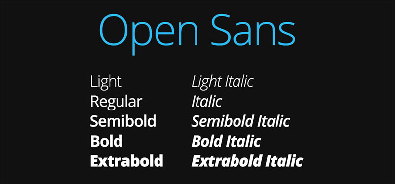
Neutral and versatile. Open Sans is one of the most commonly used sans-serif fonts on the web for a reason: it gets out of the way and lets the content breathe. Paired with Libre Baskerville, the combination reads as polished and accessible.
Why It Works
Open Sans was specifically designed for screen legibility. Its wide apertures and open letterforms create natural visual contrast against Libre Baskerville’s more structured serif forms. The result is a pairing that prioritizes typography readability above everything else.
Best Use Cases
- Corporate and business websites
- Digital and print design projects
- UI elements and content-heavy pages
How to Set It Up
Open Sans for headings and UI elements, Libre Baskerville for the reading body. Or flip: Libre Baskerville headings with Open Sans body for a more editorial look. Both role configurations work cleanly.
Sizing and Spacing
px minimum for body text, line height 1.5-1.6. Open Sans works well in both configurations and doesn’t need much adjustment across sizes.
Who Should Use This Pair
Designers working on business sites, digital products, or any project where broad accessibility and clean design are the priority. A safe default for most professional web contexts.
Libre Baskerville + Proxima Nova
What This Pairing Looks Like
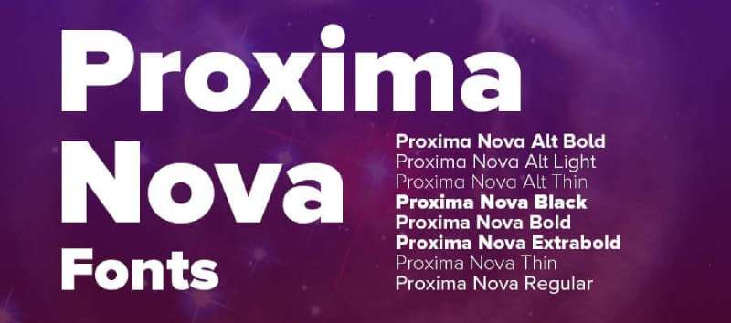
Refined and contemporary. Proxima Nova sits between geometric and humanist sans-serifs, which makes it unusually flexible. Against Libre Baskerville’s classical forms, it reads as polished without being cold.
Why It Works
Proxima Nova’s proportions are close to humanist typefaces but with the clean consistency of a geometric font. That middle-ground character pairs well with Libre Baskerville’s own balance between old-style warmth and modern proportions. The two share enough structural DNA to feel cohesive.
Best Use Cases
- Premium brand websites
- Editorial and magazine layouts
- Design agency portfolios
How to Set It Up
Proxima Nova Semibold or Bold for headings, Libre Baskerville for body. Proxima Nova is a commercial font, so keep in mind font licensing costs if you’re deploying it at scale.
Sizing and Spacing
Body text at 16-18px, line height 1.6. Proxima Nova’s generous metrics mean you don’t need to push sizes too large to maintain readability.
Who Should Use This Pair
Premium brands and design-focused studios. If budget allows for a commercial font, this is one of the strongest Libre Baskerville combinations available.
Libre Baskerville + Work Sans
What This Pairing Looks Like
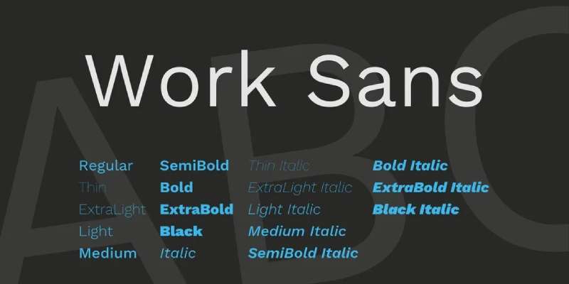
Functional and elegant. Work Sans was built for screen use, with nine weights that cover a huge range of use cases. Against Libre Baskerville’s more literary character, it creates a pairing that feels both efficient and refined.
Why It Works
Work Sans is pragmatic where Libre Baskerville is expressive. That contrast prevents the combination from feeling either too sterile or too decorative. It’s a pairing that works particularly well in product and content interfaces where you need both utility and visual quality.
Best Use Cases
- Content platforms and productivity apps
- Blogs with UI-heavy layouts
- Digital products where functional and editorial content share the same interface
How to Set It Up
Work Sans Medium or Semibold for headings and labels, Libre Baskerville Regular for article or body content. Work Sans handles navigation, UI elements, and captions cleanly without adding a third typeface.
Sizing and Spacing
16-17px body text, line height 1.6. Work Sans is comfortable at small sizes, making it useful for secondary content areas alongside the larger Libre Baskerville body text.
Who Should Use This Pair
Product designers and web designers working on content-heavy platforms. Also a strong choice for personal blogs that want editorial quality without being purely print-inspired.
Libre Baskerville + Poppins
What This Pairing Looks Like
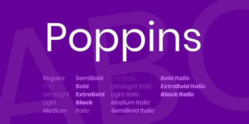
Modern and striking. Poppins has perfectly circular counters and even stroke weights throughout, which creates a stark, geometric contrast against Libre Baskerville’s calligraphic origins. It’s a high-contrast combination that reads as intentionally contemporary.
Why It Works
The extreme stylistic difference is the point. Poppins is as geometric as sans-serifs get. Libre Baskerville is firmly rooted in 18th-century type design. That contrast generates strong visual hierarchy without needing to rely heavily on size differences alone.
Best Use Cases
- Modern websites and landing pages
- Tech startup branding
- Bold editorial layouts
How to Set It Up
Poppins SemiBold or Bold for headings, Libre Baskerville Regular for body. Keep weight contrast high. Poppins Regular as a body font alongside Libre Baskerville headings also works for a softer version of this combination.
Sizing and Spacing
Body text at 16-18px, line height 1.6. Poppins tends to run slightly larger visually, so you may want to pull heading sizes back slightly compared to other pairings.
Who Should Use This Pair
Designers building modern, design-forward websites where visual impact matters. Particularly well-suited for tech brands and startups that want to signal forward-thinking style while retaining editorial credibility.
Libre Baskerville + Raleway
What This Pairing Looks Like
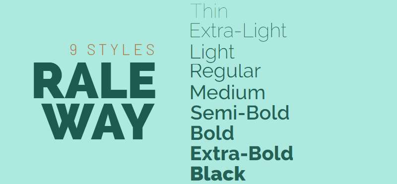
Elegant and airy. Raleway’s thin strokes and geometric forms create a delicate, high-end feel. Against Libre Baskerville’s more grounded serif body, it adds lightness and visual interest without losing legibility.
Why It Works
Raleway is a display font at heart, best used in larger sizes where its fine details are visible. Libre Baskerville handles the reading work. The weight contrast between Raleway’s elegance and Baskerville’s more robust stroke creates a pairing that’s been used in real-world projects including wine and lifestyle brands.
Best Use Cases
- Lifestyle and fashion brands
- Wine and food websites
- Luxury editorial content
How to Set It Up
Raleway for headings at larger sizes (28px+), Libre Baskerville for body text. Avoid using Raleway at very small sizes where its thin strokes break down. Use Raleway Bold rather than Light if you need stronger heading contrast.
Sizing and Spacing
Body text at 16px, line height 1.6-1.7. Raleway headings benefit from slightly increased tracking at larger sizes to match the airy tone of the pairing.
Who Should Use This Pair
Designers working on premium consumer brands, lifestyle blogs, or any project where elegance and refinement are the primary brand attributes.
Libre Baskerville + Libre Franklin
What This Pairing Looks Like
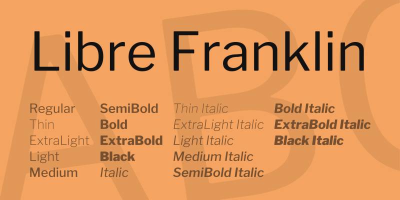
Harmonious and cohesive. Both fonts come from Pablo Impallari, which means they share similar x-heights, proportions, and design principles. The contrast is subtle, but the result is a pairing that feels completely unified.
Why It Works
Shared design origins mean the two fonts are built on compatible structural proportions. Libre Franklin’s modern sans-serif style still contrasts clearly with Libre Baskerville’s classic serif, but the underlying metrics keep them tightly aligned. You won’t need to do much fine-tuning to make this work.
Best Use Cases
- Academic and editorial websites
- Long-form content platforms
- News and journalism sites
How to Set It Up
Libre Franklin Bold or ExtraBold for headings, Libre Baskerville Regular for body. You can also use Libre Franklin for UI elements and captions to keep the entire system within this two-font combination.
Sizing and Spacing
Body text at 16-18px, line height 1.6. The matched proportions mean you can use a slightly lower size ratio between headings and body while still maintaining clear hierarchy.
Who Should Use This Pair
Anyone who values typographic consistency over dramatic contrast. A strong choice for editorial sites, news platforms, and long-form content where the writing itself should take center stage.
Libre Baskerville + Source Sans Pro
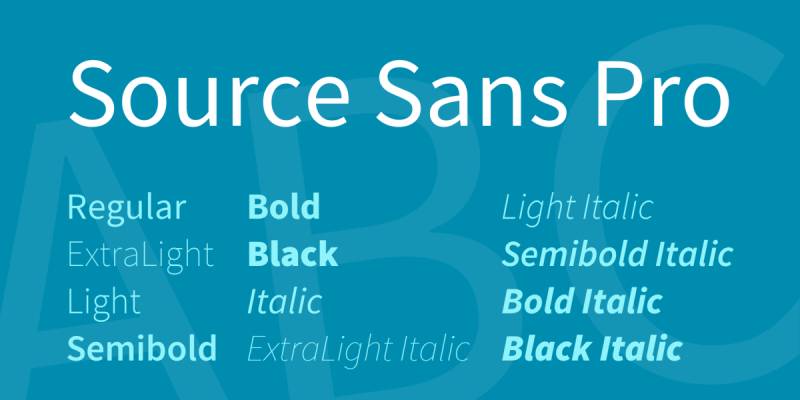
What This Pairing Looks Like
Professional and balanced. Source Sans Pro was Adobe’s first open-source typeface, designed explicitly for screen interfaces. Paired with Libre Baskerville, it brings contemporary clarity to a classical serif base.
Why It Works
Source Sans Pro’s humanist design and excellent screen rendering make it naturally accessible as a companion to Libre Baskerville’s more formal character. The pairing reads as trustworthy and expert, which is exactly why it shows up repeatedly in academic, cultural, and professional service websites.
Best Use Cases
- Academic institutions and cultural organizations
- Professional services firms
- Government and nonprofit websites
How to Set It Up
Source Sans Pro Semibold or Bold for headings, Libre Baskerville Regular for body. Source Sans Pro’s range of six weights gives you flexibility for subheadings, labels, and captions without introducing additional typefaces.
Sizing and Spacing
Body text at 16px minimum, line height 1.6. Source Sans Pro is comfortable at small sizes, which makes it useful for dense information layouts where Libre Baskerville body text needs supporting UI text.
Who Should Use This Pair
Organizations and professionals where credibility and accessibility are the primary design goals. Works well across both digital and print contexts, which is a practical advantage for teams producing content across multiple formats.
FAQ on Libre Baskerville Font Pairing
What fonts pair best with Libre Baskerville?
Montserrat, Lato, Roboto, and Open Sans are the strongest options. They all create clear contrast against Libre Baskerville’s classic serif structure. For something more refined, Proxima Nova and Work Sans also work well in professional web typography layouts.
Should Libre Baskerville be used for headings or body text?
It was built for body text, optimized at 16px and above. Its large x-height and short descenders make long-form content readable on screens. You can use it for headings too, but that’s not where it performs best.
Does Libre Baskerville work with geometric sans-serif fonts?
Yes. Geometric sans-serifs like Montserrat and Poppins create strong visual contrast against Libre Baskerville’s transitional serif character. The style difference is dramatic enough to produce clear visual hierarchy without extra effort.
Is Libre Baskerville free to use on websites?
Yes. It is open-source and available through Google Fonts at no cost. No licensing fees apply for personal or commercial use. You can load it via the Google Fonts API or self-host it directly in your CSS font stack.
What is the best font size for Libre Baskerville body text?
px is the recommended minimum for screen use. The font was specifically designed and optimized for that size. Use a leading of 1.6 to 1.7 to give the serif details enough breathing room between lines.
Can Libre Baskerville be paired with another serif font?
It is possible but tricky. Pairing two serif fonts requires strong contrast in weight, size, or style to avoid visual confusion. Libre Baskerville works better as part of a classic serif and sans-serif combination.
What makes Libre Baskerville different from regular Baskerville?
Libre Baskerville is based on the 1941 American Type Founders version of Baskerville, not the original 18th-century design. It has a taller x-height and adjusted proportions specifically for screen rendering. Standard Baskerville was made for print.
How do I use Libre Baskerville in CSS?
Import it from Google Fonts and apply it via the font-family property. Set font-size to at least 16px and line-height to 1.6. Pair it with a sans-serif as a fallback in the font stack for browsers that fail to load it.
Does Libre Baskerville work for branding and logo design?
It can work in brand typography, particularly for brands that want a classic, editorial identity. However, it has limited weight options: regular, italic, and bold only. No bold italic, which can restrict flexibility in full brand guidelines development.
Which Libre Baskerville pairing works best for blogs?
Libre Baskerville with Roboto or Work Sans is a reliable choice for blog typography. Both sans-serifs handle headings and UI elements cleanly while Libre Baskerville carries the reading. Lato is another solid option for blogs focused on warmth and accessibility.
Conclusion
This article on Libre Baskerville font pairing covers the combinations that actually hold up across real web design projects.
The font itself is one of the best free Google Fonts for websites. Strong x-height, clean rendering, and enough personality to carry long-form content without fatigue.
The pairing you choose depends on your project. Montserrat and Poppins for modern contrast. Lato and Source Sans Pro for warmth and accessibility. Libre Franklin when you want tight structural rhythm across your type system.
None of these combinations require paid fonts or complex setups. They work, they’re free, and they scale across both screen and print contexts.
Pick one, test it at size, and adjust from there.

Renowned for his expertise in logo design and visual branding, Bogdan has developed a multitude of logos for various clients.
His skills extend to creating posters, vector illustrations, business cards, and brochures. Additionally, Bogdan's UI kits were featured on marketplaces like Visual Hierarchy and UI8.
He also wrote in the past years on sites like Design Your Way, WebDesignerDepot, WPDean, Designmodo, Speckyboy, Slider Revolution, and more.
- The Windsurf Logo History, Colors, Font, And Meaning - 10 October 2026
- How to Remove Background From Product Photos (No Photoshop) - 10 October 2026
- How Designers can Build a Stronger Online Creative Identity - 9 October 2026

Bogdan Sandu is a seasoned designer who has been designing websites since 2008. Renowned for his expertise in logo design and visual branding, Bogdan has developed a multitude of logos for various clients. His skills extend to creating posters, vector illustrations, business cards, and brochures. Additionally, Bogdan's UI kits were featured on marketplaces like Visual Hierarchy and UI8. He also wrote in the past years on sites like Design Your Way, WebDesignerDepot, WPDean, Designmodo, Speckyboy, Slider Revolution, and more.
You Might Also Like