The wrong font pairing can quietly ruin a design. The right one makes everything click.
Nunito is a rounded sans-serif typeface built for screens, created by Vernon Adams and extended by Jacques Le Bailly into a full weight range. Its soft terminals and even stroke width make it a natural fit for UI design, dashboards, and web typography.
But Nunito rarely works alone. Knowing which fonts to pair it with, and when, is what separates a polished design from one that just feels off.
This guide covers the best Nunito font pairings available on Google Fonts, including serif and sans-serif combinations, recommended font weights, and the use cases where each pairing performs best.
The Best Nunito Font Pairings
| Pairing | Best For | Heading / Body Roles | Key Watch-Out |
|---|---|---|---|
| Nunito + Merriweather Sans-serif + Slab serif |
Blogs, editorial sites, content-heavy platforms, digital publishing | H1-H2 Nunito Bold 700 / ExtraBold 800 Body Merriweather 400, 16-18px, lh 1.6 |
Min 15px body. Bold blocks get dense fast. |
| Nunito + Playfair Display Sans-serif + High-contrast serif |
Lifestyle brands, boutique sites, wellness, food blogs, fashion editorial | H1-H2 Playfair Display Bold, 32px+ Body Nunito 400 or Light 300, 16px |
Thin strokes vanish on low-res. Italic unreadable below 14px. |
| Nunito + Lora Sans-serif + Calligraphic serif |
Healthcare, education, personal blogs, lifestyle brands, warm print materials | H1-H2 Nunito Bold 700 / ExtraBold 800 Body Lora Regular 400, min 15px |
Cramped in compact UI. Switch to Lora Medium if 400 feels light. |
| Nunito + Libre Baskerville Sans-serif + Scholarly serif |
Law firms, finance, academic content, longform journalism, non-profits | H1-H2 Nunito SemiBold 600 / Bold 700 Body Libre Baskerville 400, 16px+, lh 1.65 |
Heavier stroke weight. Needs lh 1.65+ to breathe. |
| Nunito + Roboto Rounded sans + Mechanical sans |
Dashboards, mobile apps, SaaS products, admin interfaces, Material Design | H1-H2 Nunito ExtraBold 800 / SemiBold 600 Body Roboto Regular 400 / Medium 500 |
Both fonts are neutral. Feels generic for brand-forward projects. |
| Nunito + Open Sans Rounded sans + Neutral sans |
Corporate sites, presentations, reports, general web where readability leads | H1-H2 Nunito Bold 700 Body Open Sans Regular 400, 16px |
Subtle hierarchy. Compensate with size and weight contrast, not color. |
| Nunito + Raleway Rounded sans + Geometric elegant sans |
Fashion, beauty, portfolio sites, creative agencies, event websites | H1-H2 Raleway ExtraLight 200 / Medium 500, 24px+ Body Nunito Regular 400 / SemiBold 600 |
Never use Raleway ExtraLight below 24px. Body must stay Nunito. |
| Nunito + PT Serif Sans-serif + Multilingual-optimized serif |
Government, education, news, multilingual publishing, corporate blogs | H1-H2 Nunito Bold 700 / SemiBold 600 Body PT Serif Regular 400, 16px+, lh 1.7 |
Regular 400 looks light on low-contrast displays. Test dark bg first. |
| Nunito + EB Garamond Modern rounded sans + Old-style serif |
Literary blogs, book publishers, academic sites, cultural institutions | H1 Nunito ExtraBold 800 Body EB Garamond Regular 400, 17-18px, lh 1.7+ |
Small x-height. Min 17px on screen. Print-first design, needs extra size online. |
| Nunito + DM Sans Rounded sans + Geometric low-contrast sans |
Tech startups, SaaS dashboards, health tech, mobile apps, digitally native brands | H1-H2 DM Sans Bold 700 / Medium 500 Body Nunito Regular 400 / SemiBold 600 |
Both fonts are clean and geometric. Add distinct color palette for brand character. |
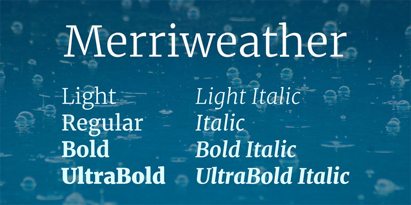
Nunito + Merriweather
Why This Pairing Works
Nunito’s rounded terminals contrast well with Merriweather’s sturdy slab-influenced serifs.
Both fonts were built for screen readability, so they share a large x-height and open counters. That common ground keeps the pairing cohesive even though the two typefaces look very different in style.
Best Use Cases
Blogs, editorial sites, content-heavy platforms, and digital publishing. Merriweather handles long-form reading well, which gives Nunito room to shine in headings without the body text feeling weak.
Recommended Roles
- Nunito as: heading (Bold 700 or ExtraBold 800)
- Merriweather as: body text (Regular 400, 16-18px, line-height 1.6)
Weight Combinations That Work
Nunito Bold or ExtraBold for H1-H2, Nunito SemiBold for H3. Merriweather Regular for paragraphs, Merriweather Bold for pull quotes or inline emphasis.
Potential Issues to Watch
Merriweather can feel heavy at small sizes. Stay at 15px minimum for body text. Avoid using Merriweather Bold for large blocks since it gets dense fast.
Nunito + Playfair Display

Why This Pairing Works
High contrast meets soft curves. Playfair Display has dramatic thick-thin stroke transitions that add sophistication, while Nunito keeps the body text warm and approachable.
The contrast between the two is strong enough to create clear typographic hierarchy without fighting for attention.
Best Use Cases
Lifestyle brands, boutique websites, wellness platforms, food blogs, and fashion editorial. This combination works especially well when you want a polished look without feeling cold.
Recommended Roles
- Playfair Display as: heading (Regular or Bold, 32px+)
- Nunito as: body text (Regular 400 or Light 300, 16px)
Weight Combinations That Work
Playfair Display Bold for main headings, Playfair Display Italic for subheadings or pull quotes. Nunito Regular for body, Nunito SemiBold for UI labels or captions.
Potential Issues to Watch
Playfair Display’s thin strokes can disappear on low-res screens. Always test at mobile sizes. The italic version is elegant but tricky to read below 14px.
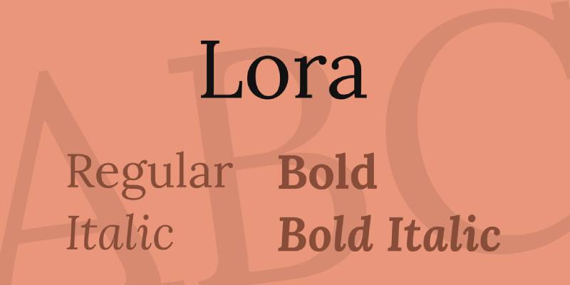
Nunito + Lora
Why This Pairing Works
Both fonts have curves, but in different places. Nunito’s roundness is in its terminals, while Lora’s comes from its calligraphic stroke structure.
That shared warmth creates unity between the two without making them feel like the same font. The combination feels editorial without being stiff.
Best Use Cases
Healthcare sites, educational platforms, personal blogs, and lifestyle brands. Also solid for brochure design or printed materials where a warm but professional tone is needed.
Recommended Roles
- Nunito as: heading (Bold 700 or ExtraBold 800)
- Lora as: body text (Regular 400, 15px minimum)
Weight Combinations That Work
Nunito Bold for H1-H2. Lora Regular for body paragraphs. Lora Italic for pull quotes or article bylines. Nunito Light for captions or secondary labels.
Potential Issues to Watch
Lora needs at least 15px to stay readable. In compact UI layouts, it can look cramped. Switch to Lora Medium if the Regular feels too light at small sizes.
Nunito + Libre Baskerville
Why This Pairing Works
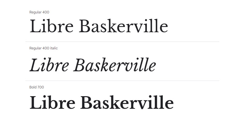
Libre Baskerville is a web-optimized revival of the classic Baskerville design. It brings scholarly authority that balances well against Nunito’s friendlier, rounder character.
Together, they cover a wide tonal range. Nunito adds approachability, Libre Baskerville adds credibility. Useful for brands that need both.
Best Use Cases
Law firms, financial services, academic content, longform journalism, and non-profits. Any project that needs to feel trustworthy without coming across as cold.
Recommended Roles
- Nunito as: heading (SemiBold 600 or Bold 700)
- Libre Baskerville as: body text (Regular 400, 16px+)
Weight Combinations That Work
Nunito Bold for main headings. Libre Baskerville Regular for paragraphs. Libre Baskerville Bold for subheadings or emphasized callouts. Avoid Libre Baskerville at very small sizes since it can feel dense.
Potential Issues to Watch
Libre Baskerville has a slightly heavier stroke weight than some serifs, so line spacing matters. Use at least 1.65 line-height for body text.
Nunito + Roboto
Why This Pairing Works
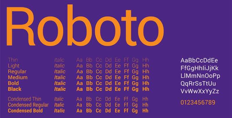
Two sans-serif fonts that read well on screens. Roboto’s mechanical skeleton and Nunito’s rounded terminals create just enough visual difference to establish hierarchy without jarring contrast.
This is one of the cleaner pairings for UI work. Both fonts load fast, render well across devices, and stay legible at small sizes.
Best Use Cases
Dashboards, mobile apps, SaaS products, admin interfaces, and web apps. Also works for any project inside the Material Design ecosystem since Roboto is the default system font there.
Recommended Roles
- Nunito as: heading or display text (SemiBold 600 to ExtraBold 800)
- Roboto as: body, labels, UI text (Regular 400 or Medium 500)
Weight Combinations That Work
Nunito ExtraBold for hero headings, Nunito SemiBold for card titles. Roboto Regular for body, Roboto Medium for button labels and navigation.
Potential Issues to Watch
Both fonts are neutral in personality. For brands that need more character, this pairing can feel generic. It works better for product UI than for editorial or branding work.
Nunito + Open Sans

Why This Pairing Works
Similar x-heights and comparable stroke widths make these two fonts naturally compatible. Open Sans is intentionally neutral, which lets Nunito’s rounded personality lead without competition.
Well, it’s a safe pairing. Maybe a bit too safe for some projects. But for websites and apps where readability is the priority, it does the job reliably.
Best Use Cases
General websites, corporate platforms, presentations, and print materials like reports or guides. Good default choice when the client has no strong typographic preferences.
Recommended Roles
- Nunito as: heading (Bold 700)
- Open Sans as: body text (Regular 400, 16px)
Weight Combinations That Work
Nunito Bold for headings, Nunito SemiBold for subheadings. Open Sans Regular for body, Open Sans SemiBold for UI labels or call-to-action buttons.
Potential Issues to Watch
Because both fonts are similarly proportioned, the visual difference between heading and body can feel subtle. Lean on size and weight contrast to compensate, not color alone.
Nunito + Raleway
Why This Pairing Works
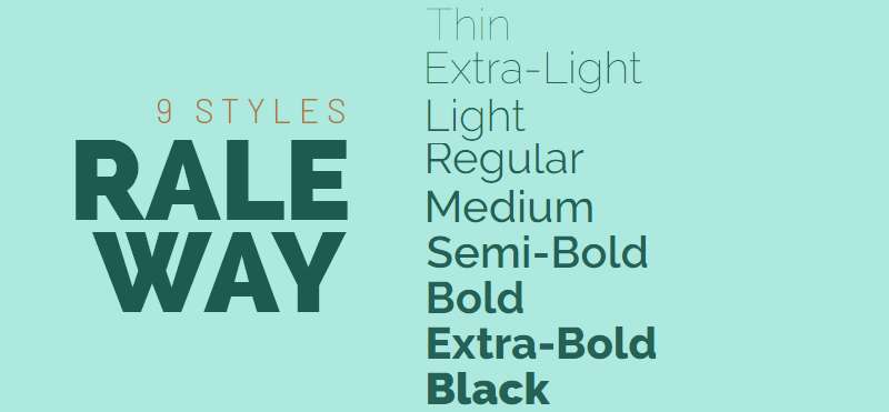
Raleway has elegant, thin strokes and a slightly geometric character that contrasts nicely with Nunito’s rounder, softer forms. The pairing feels modern and refined.
Font weight plays a big role here. Raleway’s Thin and ExtraLight weights work particularly well as large display headings, which makes Nunito’s warmer style stand out in the body.
Best Use Cases
Fashion and beauty brands, portfolio sites, creative agencies, and event websites. Raleway’s elegance pulls the combination upmarket without losing the approachability that Nunito brings.
Recommended Roles
- Raleway as: heading (ExtraLight 200 to Medium 500 at large sizes)
- Nunito as: body text (Regular 400 or SemiBold 600)
Weight Combinations That Work
Raleway Light or ExtraLight for big hero headings. Raleway Medium for H2-H3. Nunito Regular for body text. Nunito SemiBold for captions or UI labels.
Potential Issues to Watch
Raleway’s thinner weights are hard to read at small sizes. Never use ExtraLight below 24px. For body text, always lean on Nunito rather than Raleway.
Nunito + PT Serif

Why This Pairing Works
PT Serif was originally designed for multilingual publishing, so it comes with broad language support and excellent screen rendering. Paired with Nunito, it creates a combination that feels both professional and warm.
The serif structure of PT Serif grounds the pairing, while Nunito’s rounded sans-serif forms keep it from feeling too formal. Good balance overall.
Best Use Cases
Government websites, educational platforms, news sites, and multilingual publishing. Also works for corporate blogs or internal communications where a neutral but readable tone is needed.
Recommended Roles
- Nunito as: heading (Bold 700 or SemiBold 600)
- PT Serif as: body text (Regular 400, 16px+)
Weight Combinations That Work
Nunito Bold for primary headings. PT Serif Regular for body. PT Serif Bold for subheadings or emphasized sections. PT Serif Italic for quotes or secondary callouts.
Potential Issues to Watch
PT Serif’s Regular weight can look light on low-contrast displays. Test on darker backgrounds before finalizing. Increase line-height to 1.7 for longer reading sessions.
Nunito + EB Garamond

Why This Pairing Works
EB Garamond brings a literary, old-style quality that creates strong contrast against Nunito’s modern rounded geometry. The two fonts don’t share much visually, and that’s exactly why the pairing works.
The contrast in font personality creates instant visual hierarchy. Readers immediately understand which is the heading and which is the body text.
Best Use Cases
Literary blogs, book publishers, academic websites, cultural institutions, and editorial design. Any project that wants to feel cultured and thoughtful.
Recommended Roles
- Nunito as: heading (Bold 700 or ExtraBold 800)
- EB Garamond as: body text (Regular 400, 17-18px)
Weight Combinations That Work
Nunito ExtraBold for H1, Nunito Bold for H2-H3. EB Garamond Regular for body. EB Garamond Italic for pull quotes or author attributions.
Potential Issues to Watch
EB Garamond has a small x-height compared to more modern serifs. Use at 17px minimum and generous line-height (1.7+). It looks stunning in print but needs extra size on screen to stay comfortable.
Nunito + DM Sans
Why This Pairing Works
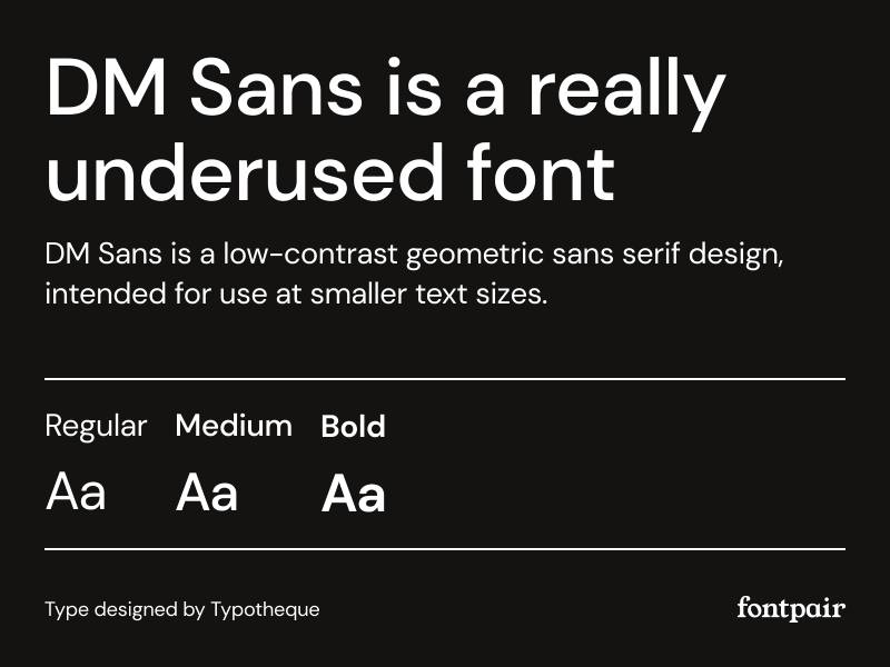
DM Sans is a low-contrast geometric sans-serif with clean, modern forms. Paired with Nunito, the combination hits a professional-but-welcoming tone that works well for product-focused brands.
Both fonts feel contemporary. DM Sans brings structure and precision, Nunito brings softness. Together they’re a strong choice for UI-heavy projects and SaaS interfaces.
Best Use Cases
Tech startups, mobile apps, SaaS dashboards, health tech platforms, and modern web apps. Also good for brands targeting a younger, digitally native audience.
Recommended Roles
- DM Sans as: heading (Medium 500 or Bold 700)
- Nunito as: body text (Regular 400 or SemiBold 600)
Weight Combinations That Work
DM Sans Bold for primary headings, DM Sans Medium for subheadings and navigation. Nunito Regular for body and descriptions. Nunito SemiBold for button labels and badge text.
Potential Issues to Watch
Because both fonts are clean and geometric, the combination can lack personality for brand-forward projects. Consider adding a distinct color palette or using display font weights strategically to inject more character.
FAQ on Nunito Font Pairing
What fonts pair best with Nunito?
Merriweather, Lora, Playfair Display, and Libre Baskerville are strong serif pairings for Nunito. For sans-serif combinations, Roboto, Open Sans, and DM Sans work well. The best choice depends on your project tone and whether you need contrast or harmony.
Should Nunito be used as a heading or body font?
Both. Nunito works as a heading font at Bold or ExtraBold weights and as body text at Regular or Light. Its rounded terminals stay legible at smaller sizes, making it flexible across typographic roles in web and UI design.
Is Nunito a good font for web design?
Yes. Nunito was built for screens. Its uniform stroke width and open counters support strong on-screen readability. It performs well across devices and is freely available through Google Fonts, making it a practical choice for web projects.
What is the difference between Nunito and Nunito Sans?
Nunito has rounded terminals on its letterforms. Nunito Sans uses straight-cut terminals, giving it a cleaner, more neutral look. Nunito feels warmer and more playful. Nunito Sans reads as more professional and is better suited for formal UI contexts.
Does Nunito work for UI and dashboard design?
Yes, it’s a solid choice. Nunito’s consistent stroke weight and friendly character work well for UI design and dashboards. Pair it with Roboto or DM Sans for labels and body text to keep the interface clear and scannable.
What serif font pairs best with Nunito for blogs?
Merriweather and Lora are the top options for blog typography. Both were designed with screen reading in mind. Use Nunito Bold for headings and Merriweather Regular at 16-18px for body text. The contrast between rounded and structured forms reads well on all screen sizes.
What weight should I use when pairing Nunito with a serif font?
Use Nunito Bold (700) or ExtraBold (800) for headings when pairing with a serif body font. This weight difference creates clear typographic hierarchy. For UI labels or secondary text, Nunito SemiBold (600) keeps things readable without competing with the serif.
Is Nunito good for brand typography?
Nunito works well for brands that want to feel approachable, modern, and friendly. It suits education, healthcare, and tech startups. For luxury or high-end brand typography, pair it with a high-contrast serif like Playfair Display to add sophistication.
Can I pair two sans-serif fonts with Nunito?
Yes, but contrast matters. Pairing Nunito with a neutral sans-serif like Roboto or Open Sans works because their different personalities create enough visual separation. Avoid pairing Nunito with fonts that share the same rounded character since the result will lack hierarchy.
Where can I preview Nunito font pairings before using them?
Google Fonts lets you preview combinations directly in the browser. Figma’s font picker is useful for live testing. You can also use a font pairing generator to quickly compare Nunito combinations side by side before committing to a pairing in your design.
Conclusion
Choosing the right Nunito font pairing comes down to understanding what your project needs to communicate.
Pair it with Lora or Merriweather for warmth and editorial depth. Go with Roboto or DM Sans when the priority is clean UI and screen performance.
Nunito’s humanist sans-serif structure and even stroke weight make it adaptable across a wide range of design contexts, from dashboards to lifestyle blogs to brand typography.
Pay attention to font weight combinations and line-height. Those two details alone will determine whether a pairing feels polished or just close enough.
All the options covered here are available through Google Fonts at no cost, so testing them in your actual layout takes minutes, not days.

Renowned for his expertise in logo design and visual branding, Bogdan has developed a multitude of logos for various clients.
His skills extend to creating posters, vector illustrations, business cards, and brochures. Additionally, Bogdan's UI kits were featured on marketplaces like Visual Hierarchy and UI8.
He also wrote in the past years on sites like Design Your Way, WebDesignerDepot, WPDean, Designmodo, Speckyboy, Slider Revolution, and more.
- The Windsurf Logo History, Colors, Font, And Meaning - 10 October 2026
- How to Remove Background From Product Photos (No Photoshop) - 10 October 2026
- How Designers can Build a Stronger Online Creative Identity - 9 October 2026

Bogdan Sandu is a seasoned designer who has been designing websites since 2008. Renowned for his expertise in logo design and visual branding, Bogdan has developed a multitude of logos for various clients. His skills extend to creating posters, vector illustrations, business cards, and brochures. Additionally, Bogdan's UI kits were featured on marketplaces like Visual Hierarchy and UI8. He also wrote in the past years on sites like Design Your Way, WebDesignerDepot, WPDean, Designmodo, Speckyboy, Slider Revolution, and more.
You Might Also Like