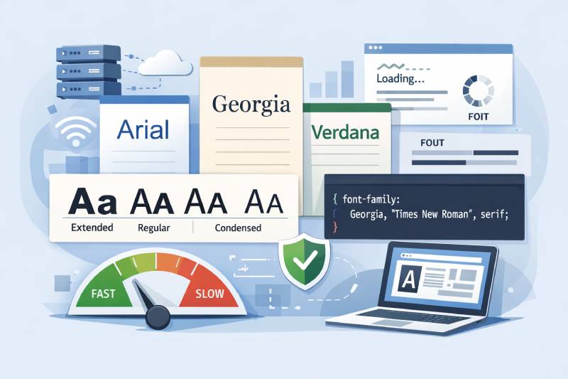
Most of the fonts you pick for a website aren’t actually installed on your visitor’s device. And when that happens, the browser just picks something else.
So what is a web-safe font, and why should you care? A web-safe font is a typeface that ships pre-installed across Windows, macOS, and iOS, meaning it renders without downloading anything. Arial, Georgia, Verdana, Times New Roman. These are the ones you can count on.
With 88% of websites now loading custom web fonts (HTTP Archive, 2025), the term might sound outdated. It’s not. Web-safe fonts still matter for page speed, email rendering, privacy compliance, and fallback stacks in your CSS font-family declarations.
This article covers how web-safe fonts work, which ones are reliable across devices, how to use them in CSS, and when they’re the better choice over Google Fonts or self-hosted alternatives.
What Is a Web-Safe Font
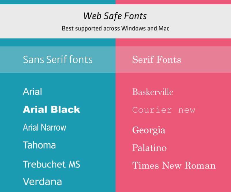
A web-safe font is a typeface that comes pre-installed on most operating systems and devices. Because it already lives on the user’s machine, the browser doesn’t need to download anything extra to display it.
That’s the whole idea. Arial, Georgia, Times New Roman, Verdana. These fonts ship with Windows, macOS, and iOS out of the box. When you declare one in your CSS font-family property, the browser finds it locally and renders it immediately.
The term dates back to the mid-1990s when bandwidth was tight and the @font-face rule barely existed. Designers had maybe a dozen fonts they could count on. If you picked something the visitor didn’t have installed, the browser would just substitute whatever it wanted. That was a bad time for consistent typography.
Things are different now. The 2025 Web Almanac from HTTP Archive reports that roughly 88% of websites use web fonts, up from about 87% in 2024. Custom font loading is mainstream.
But web-safe fonts haven’t disappeared. They still serve a real purpose, and understanding what separates them from web fonts matters if you care about performance, privacy, or email rendering.
How Font Stacks and Fallbacks Work
A font stack is a comma-separated list of fonts inside the CSS font-family declaration. The browser reads left to right and uses the first match it finds installed.
Example stack: font-family: Georgia, "Times New Roman", Times, serif;
If the visitor has Georgia, that’s what renders. If not, the browser tries Times New Roman, then Times. The generic family name at the end (serif, sans-serif, monospace) is the last resort. Every font stack should end with one.
Forgetting the generic fallback is a common mistake. So is not quoting multi-word font names like “Times New Roman” or “Trebuchet MS.” Both can quietly break your intended rendering.
Web-Safe Fonts vs. Web Fonts
Web-safe fonts are already on the device. Zero download. Zero external request. They just work.
Web fonts are loaded from a server, either self-hosted or from a service like Google Fonts or Adobe Fonts. They give you thousands of options but require HTTP requests.
| Feature | Web-safe fonts | Web fonts |
|---|---|---|
| Download required | No | Yes |
| Typographic variety | Limited (~15 options) | Thousands |
| External dependency | None | CDN Self-hosted files |
| Privacy risk | None | Possible (third-party CDNs) |
| Performance impact | None | Adds to page load time |
According to the 2024 HTTP Archive data, 79% of websites used either self-hosted fonts, Google web fonts, or both. Google Fonts usage specifically sat at around 57% of total font hosting, while Adobe Fonts appeared on about 4% of pages.
Web fonts expanded what’s possible with online web design. But they introduced new problems: render-blocking requests, Flash of Invisible Text (FOIT), Flash of Unstyled Text (FOUT), and in Europe, a full-blown legal issue.
Why Web-Safe Fonts Still Matter
Custom web fonts are everywhere now. So why would anyone still reach for Arial or Georgia?
Performance. Privacy. Reliability. Pick any two, and web-safe fonts win.
No Extra HTTP Requests
Every web font your page loads means at least one additional network request. Sometimes more, if you’re pulling multiple weights and styles.
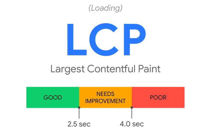
Web-safe fonts skip all of that. The browser already has the files. No DNS lookup, no connection handshake, no file transfer. This directly affects Largest Contentful Paint (LCP), which Google considers a Core Web Vital.
The 2025 Web Almanac data shows only 62% of mobile pages achieve a good LCP score, making it the hardest Core Web Vital to pass. Font loading is one of the known bottlenecks. Upward Engine research found that optimizing web fonts can reduce LCP by up to 40%. Eliminating them removes that variable entirely.
GDPR and Privacy Concerns
In January 2022, a German court ruled that loading Google Fonts from Google’s CDN violates the GDPR. The logic: when a visitor’s browser requests a font file from Google’s servers, it transmits their IP address. That’s personal data under EU law.
The initial fine was just 100 euros. But the court warned the next one could reach 250,000 euros.
According to BuiltWith, Google Fonts is used on over 50 million websites. If any visitor is located in the EU, GDPR applies, regardless of where the site owner is based. Self-hosting fonts or sticking with web-safe options eliminates this exposure completely.
Email Design Reliability
Here’s where web-safe fonts genuinely shine. Email clients are brutal with custom fonts.
Can I Email data shows that @font-face support in email sits at roughly 24%. Omnisend reports that only Apple Mail and Outlook for macOS reliably render custom web fonts. Gmail strips them. Outlook on Windows uses Microsoft Word’s rendering engine, which ignores them.
For newsletters, transactional emails, and any HTML email campaign, web-safe fonts remain the only way to control your typographic hierarchy with any consistency.
The Core Web-Safe Font Families
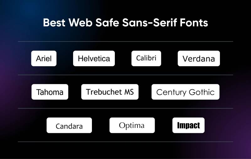
Not every font that ships with Windows qualifies as “web-safe.” The label only sticks if the font is also pre-installed on macOS, and ideally on iOS too. The original list came mostly from Microsoft’s Core Fonts for the Web project, launched in 1996.
Here’s what you can actually count on across platforms.
Serif Web-Safe Fonts
Times New Roman: The default serif font on Windows since forever. Comes pre-installed on macOS and iOS. Tight letter spacing, traditional feel. You’ll find fonts similar to Times New Roman on nearly every operating system.
Georgia: Designed by Matthew Carter specifically for screen readability. Larger x-height than Times New Roman, which makes it easier to read at small sizes. Ships with Windows, macOS, and iOS.
Georgia is often the better pick for body text on screens. Took me a while to appreciate the difference, but once you see it at 14px, you get it.
Sans-Serif Web-Safe Fonts
This is where most of the options live.
- Arial: The most widely installed sans-serif font on the planet. Ships with every major OS. Estimated to appear on over 500,000 websites. It’s not exciting, but it’s safe.
- Verdana: Another Matthew Carter design, built for screens. Large x-height, generous font spacing between characters. Great readability, even at small sizes.
- Helvetica: Pre-installed on macOS and iOS. Not on Windows by default (Windows uses Arial as a substitute). Still referenced in nearly every Helvetica-style font stack.
- Tahoma: Designed for Microsoft in 1994. Narrower than Verdana, which makes it better for tighter layouts. Ships with Windows and macOS.
- Trebuchet MS: A slightly more distinctive sans-serif. Works across Windows and macOS but has less reliable coverage on mobile platforms.
Monospace Web-Safe Fonts
Courier New and Lucida Console are the two reliable options here. Both ship with Windows and macOS.
Courier New is the standard monospaced font for code snippets and preformatted text. Every character takes the same horizontal space, which keeps things aligned.
Lucida Console is a bit more compact. Developers who want their code blocks to look marginally more modern sometimes prefer it, but Courier New has broader coverage when it comes to cross-platform availability.
How Operating Systems Determine Font Availability

A font is “web-safe” only because operating system vendors decided to ship it. There’s no universal standard. No governing body. Just bundling decisions made by Microsoft, Apple, and Google.
Microsoft’s Core Fonts for the Web
In 1996, Microsoft released the Core Fonts for the Web project. It bundled Arial, Courier New, Georgia, Times New Roman, Verdana, Trebuchet MS, and several others as free downloads for any platform.
That single move created the original web-safe font list. It gave designers a small but reliable set of typefaces they could count on across Windows and Mac. The project was discontinued in 2002, but the fonts kept shipping with Windows and macOS ever since.
The Mobile Problem
And then smartphones happened.
Android, which holds roughly 72% of the global mobile OS market as of late 2025 (StatCounter), does not ship with any of the classic web-safe fonts. No Arial. No Georgia. No Times New Roman. Android uses Roboto as its default sans-serif and Noto Serif for serif text.
iOS kept most of the traditional web-safe fonts intact. But Android’s approach broke the old assumption that these fonts would render everywhere.
As Pimp my Type pointed out, none of the classic web-safe fonts come pre-installed on Android devices. With Android powering roughly 3.9 billion devices worldwide (DemandSage, 2025), that’s a significant gap in coverage.
This is why system fonts and the CSS system-ui keyword have become increasingly relevant, and it’s something worth understanding before you build your font stack.
Linux and Licensing
Linux distributions handle fonts differently than Windows or macOS. Most commercial fonts, including the Microsoft core set, can’t be bundled by default due to font licensing restrictions.
Instead, Linux distros often ship with metrically compatible alternatives. Liberation Sans replaces Arial. Liberation Serif replaces Times New Roman. Google also created the Croscore fonts (Arimo, Tinos, Cousine) as drop-in substitutes for the same purpose.
The fonts look nearly identical at a glance. But they aren’t the same files, which means pixel-level rendering differences exist.
How to Use Web-Safe Fonts in CSS

Implementation is straightforward. You declare a font-family in your CSS, list your preferred fonts in order, and end with a generic family name.
Basic Font Stack Syntax
Serif stack: font-family: Georgia, "Times New Roman", Times, serif;
Sans-serif stack: font-family: Arial, Helvetica, "Trebuchet MS", sans-serif;
Monospace stack: font-family: "Courier New", "Lucida Console", monospace;
The generic keyword at the end (serif, sans-serif, monospace, cursive, system-ui) tells the browser what category to fall back to if none of the named fonts are available.
Common Mistakes to Avoid
Not quoting multi-word names. “Times New Roman” needs quotes. If you write font-family: Times New Roman, serif; without them, the browser may misinterpret the declaration.
Skipping the generic fallback. Without it, you give up all control over what renders when your named fonts aren’t available. Always close the stack with a generic family.
Stuffing too many fonts in one stack. Three to four is plenty. Listing ten fonts doesn’t help anyone. Keep it tight: your preferred choice, one close alternative, and the generic.
Applying Font Stacks Across a Layout
Most developers set the primary font stack on the body element and override it for specific elements like headings or code blocks. That approach follows the same logic as building a visual hierarchy in any design project.
For body text, Verdana or Georgia tend to perform best at standard reading sizes because of their generous x-height and open letterforms. Arial works fine for UI elements and sans-serif headings.
If you want to get specific with leading and tracking adjustments, keep in mind that web-safe fonts don’t offer variable font axes. What you see is what you get.
Web-Safe Fonts and Page Performance
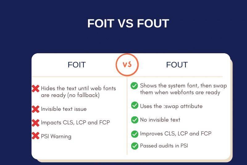
Performance is where web-safe fonts have their strongest argument. They don’t just reduce load time. They eliminate an entire category of rendering problems.
Impact on Core Web Vitals
Google’s Core Web Vitals measure loading speed (LCP), interactivity (INP), and visual stability (CLS). Font loading directly affects two of the three.
When a browser waits for a web font to download before displaying text, it creates either a Flash of Invisible Text (FOIT), where the text is hidden until the font loads, or a Flash of Unstyled Text (FOUT), where a fallback font appears first and then swaps. Both hurt user experience. Both can worsen your CLS and LCP scores.
DebugBear testing showed that preloading a single web font improved LCP from 1.82 seconds to 1.24 seconds. But web-safe fonts need no preloading at all. That delay simply doesn’t exist.
Real-World Performance Difference
A typical page loading two to three Google Font weights adds somewhere between 30 to 80 KB of font data (Pimp my Type estimates). That’s in addition to the DNS lookup, TLS handshake, and download time for each font file.
For users on fast connections, it barely registers. For mobile users in emerging markets or on throttled connections, it matters a lot.
Shopify found in 2024 that using Early Hints to load fonts earlier made LCP 500ms faster for their merchants. That’s a meaningful improvement, but it’s still trying to optimize a problem that web-safe fonts avoid entirely.
When Performance Gains Are Most Significant
- Mobile devices on slow networks: Every saved request counts
- High-traffic pages: Reduced server load from fewer font requests
- Content-heavy sites: Documentation, blogs, and government portals where text is the LCP element
- Email templates: Where external font loading isn’t reliably supported anyway
Sites that pass all three Core Web Vitals thresholds see 24% lower bounce rates, according to Digital Applied research. Font loading strategy is a direct lever for hitting those targets.
When to Choose Web-Safe Fonts Over Custom Fonts

Not every project needs a custom typeface. Sometimes the right call is to skip the font files entirely and work with what’s already installed.
The decision depends on what you’re building, who it’s for, and how much control you need over rendering.
Best Use Cases for Web-Safe Fonts
Email campaigns: Custom font support in email clients sits at roughly 24% (Can I Email). Gmail and Outlook on Windows strip @font-face declarations completely. If your email needs to look consistent, web-safe is the only reliable path.
Documentation and government sites: Content-heavy pages where readability and speed matter more than brand expression. Georgia and Verdana handle long-form text well at standard sizes.
MVP and prototype builds: When you’re testing an idea and every hour counts, skipping font configuration removes one more variable from the stack.
Corporate environments: Many company networks block external resource requests. Web-safe fonts render without any dependency on outside servers.
When Custom Fonts Are Worth It
Brands like Apple (San Francisco), Airbnb (Cereal), and Netflix (Netflix Sans) have all invested in proprietary typefaces. The payoff is a visual identity that no competitor can replicate.
If your brand guidelines specify a custom typeface, web-safe fonts won’t cut it for headings, hero sections, or anything tied to brand recognition.
WhatFontIs reports there are over 300,000 fonts available globally, and that number grows every year. The typographic options are enormous compared to the dozen or so web-safe choices.
The Hybrid Approach
A lot of developers split the difference. Custom font for headings and brand-facing elements. Web-safe font for body text.
This keeps the page load lean while still giving the design a distinct feel. You load one or two font weights instead of five, and the body text renders instantly from the system.
| Scenario | Recommended font strategy |
|---|---|
| Email newsletters | Web-safe only |
| Brand-driven marketing site | Custom headings Web-safe body |
| Developer documentation | Web-safe System-ui |
| E-commerce product pages | Custom font Self-hosted |
| Internal tools, dashboards | System-ui stack |
GitHub, Medium, and WordPress all use system font stacks in their UI. That’s a strong signal that even major platforms find value in skipping custom font loading for functional interfaces.
The CSS <code>system-ui</code> and Generic Font Families
The system-ui keyword is something like a modern successor to the web-safe font concept. Instead of specifying a single typeface by name, you tell the browser to use whatever the operating system defaults to.
On macOS and iOS, that’s San Francisco. On Windows, it’s Segoe UI. On Android, Roboto.
How <code>system-ui</code> Works
When you write font-family: system-ui, sans-serif; the browser doesn’t download anything. It pulls the OS default UI font, which is already loaded in memory.
Key difference from web-safe fonts: Traditional web-safe stacks try to name the same font across platforms (like Arial). system-ui accepts that each platform has its own default and uses it. The text will look slightly different on Windows versus macOS, but it will always look native.
MDN Web Docs notes that system-ui is intended for UI elements, not large paragraphs of body text. Some OS and language combinations (particularly CJK scripts on Windows) can produce unexpected results for Latin characters.
Browser Support
All modern browsers support system-ui. Chrome, Safari, Edge, and Firefox have shipped support across desktop and mobile platforms.
Stefan Judis pointed out in 2025 that the older vendor-specific values (-apple-system, BlinkMacSystemFont) are no longer needed if you’re targeting current browsers. A simple system-ui, sans-serif declaration handles it.
The Modern Font Stacks project on GitHub goes further, organizing system font stacks by typographic classification: transitional, humanist, geometric, neo-grotesque, and more.
The Full Set of Generic Font Families
CSS defines several generic keywords beyond the classic three. Here’s the full picture:
| Generic keyword | Resolves to | Browser support |
|---|---|---|
serif |
Default serif (usually Times) | Universal |
sans-serif |
Default sans-serif (usually Arial) | Universal |
monospace |
Default monospace (usually Courier) | Universal |
system-ui |
OS default UI font | All modern browsers |
ui-serif |
OS serif UI font | Safari only (as of 2025) |
ui-rounded |
OS rounded UI font | Safari only |
cursive |
Script or handwriting style | Universal Unpredictable |
The ui-serif, ui-sans-serif, ui-monospace, and ui-rounded keywords were introduced by Apple in Safari 13.1. Cross-browser adoption for these is still limited, so they work best as part of a longer fallback stack.
Limitations of Web-Safe Fonts

Web-safe fonts solve real problems. But they come with trade-offs that are worth acknowledging, especially if you’re deciding what to use on a project that needs to look distinctive.
Limited Typographic Variety
You’re working with roughly 10 to 15 reliable fonts. That’s it.
Compare that to Google Fonts alone, which offers over 1,700 font families. Or the broader market, which WhatFontIs estimates at over 300,000 fonts globally. The web-safe list gives you one or two options per category (serif, sans-serif, monospace) and nothing for display or script styles.
If your project requires a slab serif, a geometric sans-serif, or anything with real typographic character, web-safe fonts won’t get you there.
The “Web-Safe” Label Has Shrunk
As Pimp my Type explained in 2024, none of the classic web-safe fonts come pre-installed on Android. With Android powering 72% of global mobile devices (StatCounter, late 2025), the original promise of “this font displays everywhere” no longer holds.
iOS kept most of the traditional set. But the gap between desktop and mobile coverage means a font stack that’s “safe” on Windows and macOS might still trigger a fallback substitution on a huge percentage of mobile visitors.
No Pixel-Perfect Consistency
Font rendering engines differ. Windows uses DirectWrite. macOS uses Core Text. Linux uses FreeType. Even when the same font file exists on two systems, the way it looks on screen can vary.
Kerning, anti-aliasing, and subpixel rendering all behave differently. A heading set in Georgia on Windows will not look identical to Georgia on macOS. Close, but not the same.
For projects where brand style consistency down to the pixel matters (and yes, some design teams care about this), self-hosted web fonts with explicit rendering controls give more predictable results.
Brand Identity Constraints
Arial and Times New Roman are everywhere. That’s their strength and their weakness.
Brands like Google (Product Sans), IBM (IBM Plex), and CNN (CNN Sans) have all commissioned custom typefaces specifically to avoid sharing their typographic identity with everyone else. Designity research notes that developing a proprietary font eliminates licensing fees over time and gives complete exclusivity.
Web-safe fonts can’t do that. Every site using Arial looks, at a typographic level, like every other site using Arial. For content-driven projects, that’s fine. For brand-driven projects, it’s a real constraint.
FAQ on Web-Safe Fonts
What is a web-safe font?
A web-safe font is a typeface pre-installed on most operating systems like Windows, macOS, and iOS. Because it already exists on the device, the browser renders it instantly without downloading external files or making additional HTTP requests.
What are the most common web-safe fonts?
The most reliable options include Arial, Georgia, Times New Roman, Verdana, Helvetica, Tahoma, Trebuchet MS, and Courier New. These ship with major operating systems and cover serif, sans-serif, and monospace categories.
Are web-safe fonts still relevant in 2025?
Yes. They remain critical for email design, performance optimization, GDPR-compliant setups, and CSS fallback stacks. Custom web fonts dominate, but web-safe options still serve as the safety net when external fonts fail to load.
What is the difference between web-safe fonts and web fonts?
Web-safe fonts are already installed on the user’s device. Web fonts are downloaded from a server or CDN like Google Fonts. Web-safe fonts need zero network requests. Web fonts add load time but offer far more typographic variety.
Do web-safe fonts work on Android?
Not the classic ones. Android doesn’t ship with Arial, Georgia, or Times New Roman. It uses Roboto and Noto instead. Your CSS font stack’s generic fallback (like sans-serif) determines what actually renders on Android devices.
How do I use web-safe fonts in CSS?
Declare them in the font-family property as a comma-separated list. Always end with a generic family name like serif, sans-serif, or monospace. The browser reads left to right and uses the first available match.
What is a font stack?
A font stack is a prioritized list of fonts in a CSS font-family declaration. The browser tries each font in order and falls back to the next if one isn’t available. It always ends with a generic family keyword.
Are web-safe fonts good for email?
They’re the best option for email. Custom font support via @font-face sits at roughly 24% across email clients. Gmail and Outlook on Windows ignore custom fonts entirely, making web-safe options the only consistent choice.
What is the system-ui keyword in CSS?
The system-ui keyword tells the browser to use the operating system’s default UI font. That’s San Francisco on macOS, Segoe UI on Windows, and Roboto on Android. It loads instantly since the font is already in memory.
Can I combine web-safe fonts with custom fonts?
Absolutely. Many developers use a custom font for headings and a web-safe font for body text. This keeps page load times lower while still giving the design a branded look where it matters most.
Conclusion
Understanding what is a web-safe font comes down to knowing which typefaces you can rely on without external dependencies. These pre-installed fonts still solve real problems that custom web fonts introduce, from render-blocking requests to GDPR compliance risks with third-party CDNs.
The classic list has gotten smaller since Android dropped support for Arial, Georgia, and Times New Roman. But combined with the system-ui` keyword and well-structured font stacks, you can build pages that load fast and render clean on any device.
Use web-safe fonts for email templates, fallback declarations, and performance-critical pages. Pair them with custom typefaces when brand identity demands it.
The right font strategy isn’t about picking one side. It’s about knowing when each option fits. Check your audience’s devices, test your font rendering across operating systems, and build your CSS font-family stacks with purpose.

Renowned for his expertise in logo design and visual branding, Bogdan has developed a multitude of logos for various clients.
His skills extend to creating posters, vector illustrations, business cards, and brochures. Additionally, Bogdan's UI kits were featured on marketplaces like Visual Hierarchy and UI8.
He also wrote in the past years on sites like Design Your Way, WebDesignerDepot, WPDean, Designmodo, Speckyboy, Slider Revolution, and more.
- Free Browser 3D Tools for Designers Who Refuse to Install Anything - 9 September 2026
- Clean DM Sans Font Pairing Ideas for Minimal Design - 8 September 2026
- How to Prepare Before Applying for Graphic Design Jobs - 7 September 2026

Bogdan Sandu is a seasoned designer who has been designing websites since 2008. Renowned for his expertise in logo design and visual branding, Bogdan has developed a multitude of logos for various clients. His skills extend to creating posters, vector illustrations, business cards, and brochures. Additionally, Bogdan's UI kits were featured on marketplaces like Visual Hierarchy and UI8. He also wrote in the past years on sites like Design Your Way, WebDesignerDepot, WPDean, Designmodo, Speckyboy, Slider Revolution, and more.
You Might Also Like