Most users won’t notice the font in your app. But they’ll feel it instantly when it’s wrong.
Typography is one of the most direct drivers of mobile UI readability — it affects how fast users scan, how long they stay, and whether they trust the interface at all. The difference between a font that works and one that doesn’t comes down to measurable attributes: x-height, stroke contrast, optical sizing, and weight range.
This guide covers the best fonts for mobile apps in 2025, with full specs, platform behavior, licensing terms, pairing options, and known limitations for each typeface — across both iOS and Android.
No vague recommendations. Just the information you need to make the right call for your app.
The Best Fonts For Mobile Apps
Choosing the right font for a mobile app isn’t a visual preference call. It’s a technical one. Small screens, variable DPI, dark mode, and cross-platform rendering all place hard constraints on what actually works.
The fonts below are the ones that hold up under those conditions. Each entry includes structural specs, size guidance, known limitations, and pairing options grounded in how mobile UI typography actually behaves.
—
Roboto

Roboto is a neo-grotesque sans-serif font designed by Christian Robertson in 2011, released by Google. It serves as the default system font for Android and the foundation of Material Design’s type system.
Roboto suits Android app UI because its mechanical skeleton with open curves maintains clarity across the full range of Material Design components, from navigation labels to body copy.
By 2024, Roboto and Open Sans together accounted for 51% of all Google Fonts views, with Roboto recorded at over 200 billion views across tens of millions of websites (Wikipedia).
—
What makes Roboto suitable for mobile apps?
Roboto uses a dual-nature construction: geometric skeleton with open, friendly curves. Its x-height is proportioned for comfortable reading at 12px–16px on standard DPI Android screens.
The typeface supports 6 static weights (Thin 100 to Black 900, excluding 200, 600, 800) with matching obliques, plus a variable version, Roboto Flex, with 12 adjustable axes including optical size.
Key attributes:
| Attribute | Value |
| Classification | Neo-grotesque sans-serif |
| Designer | Christian Robertson, 2011 |
| Weight range | Thin 100, Light 300, Regular 400, Medium 500, Bold 700, Black 900 |
| Variable font | Yes (Roboto Flex, 12 axes) |
| Optical sizes | Yes (via Roboto Flex) |
| Recommended sizes | 12px–16px body; 20px+ headings |
| Letter-spacing default | 0 |
| License | OFL (re-licensed from Apache in 2020) |
| Available on | Google Fonts |
| Price | Free |
—
How does Roboto perform in Android mobile UI?
Roboto was purpose-built to replace Droid Sans on higher-resolution Android screens. Its racetrack-shaped rounded letters and straight-sided capitals render cleanly on both low- and high-DPI displays.
In user and lab-based legibility analyses, Roboto ranked comparably to Arial and Open Sans in reading speed and comprehension, with consistent rendering across Android system components.
—
What are the best pairings for Roboto in mobile apps?
Roboto pairs with Roboto Serif for hierarchy within a single type family, and with Open Sans when cross-platform neutrality is needed for shared web and app components.
Within the Roboto family itself, Roboto Condensed works well for space-constrained navigation bars and data tables.
—
What are the limitations of Roboto for mobile apps?
Roboto Flex’s 12-axis variable format adds file size overhead that can affect load time in low-bandwidth environments. The static font lacks weights 200, 600, and 800, which narrows the hierarchy options without switching to the variable version.
—
Roboto — Recommended Use Cases Within Mobile Apps
- Best for: Android native apps, Material Design systems, navigation labels, body copy
- Avoid for: iOS apps where system font consistency is expected
- Optimal weight: Regular 400 for body; Medium 500 for UI labels; Bold 700 for headings
- Optimal size range: 12px–16px body; 20px–32px headings
—
San Francisco (SF Pro)
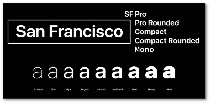
San Francisco (SF Pro) is a neo-grotesque sans-serif typeface designed by Apple Inc., first released in 2015, distributed through Apple’s developer program. It is the system font for iOS, iPadOS, macOS, and tvOS.
SF Pro suits iOS app UI because it uses two distinct optical sizes (Text for below 20pt, Display for above 20pt) that automatically apply size-appropriate letter-spacing and proportions, eliminating manual tuning.
Apple distributes SF Pro under a restricted license: free for use exclusively on Apple platforms, not permitted in non-Apple products or cross-platform apps.
—
What makes SF Pro suitable for mobile apps?
SF Pro has a tall x-height and open apertures that maintain character distinction at small sizes on Retina displays. Its optical size axis (opsz) covers 9pt to 144pt with dedicated design masters at 9, 11, 17, 28, 52, and 144.
The Grade (GRAD) axis allows weight compensation between light and dark mode without altering glyph metrics, which solves a real problem in apps with theme switching.
Key attributes:
| Attribute | Value |
| Classification | Neo-grotesque sans-serif |
| Designer | Apple Inc., 2015 |
| Weight range | Ultralight to Black (9 weights, variable 100–950) |
| Variable font | Yes (weight, width, optical size, grade axes) |
| Optical sizes | Yes: Text (below 20pt), Display (above 20pt) |
| Recommended sizes | 11pt–17pt body; 28pt+ headings |
| Letter-spacing default | Automatically adjusted per optical size |
| License | Apple platform-only; not for cross-platform use |
| Available on | Apple Developer portal (requires Apple ID) |
| Price | Free (Apple platforms only) |
—
How does SF Pro perform in iOS UI?
SF Pro carries zero load time overhead on Apple devices since it ships as a system font. The automatic optical size switching means the font adjusts letter-spacing and stroke weight at the OS level, without any developer configuration.
Apps like iOS system interfaces (Settings, Messages, Mail) use SF Pro as the default, ensuring visual consistency with native UI components. Supports 150+ languages across Latin, Greek, and Cyrillic.
—
What are the best pairings for SF Pro in mobile apps?
SF Pro pairs with New York (Apple’s companion serif) for editorial layouts inside iOS apps where serif-sans contrast improves scannability. For cross-platform components that must match SF Pro’s proportions, Inter is the standard substitute.
—
What are the limitations of SF Pro for mobile apps?
SF Pro is restricted to Apple platforms under its license terms. Cross-platform apps (React Native, Flutter) cannot legally use SF Pro on Android. Developers building shared design systems must maintain two separate type stacks.
—
SF Pro — Recommended Use Cases Within Mobile Apps
- Best for: Native iOS apps, Apple HIG-compliant UI, system-consistent interfaces
- Avoid for: Cross-platform apps, Android builds, any non-Apple deployment
- Optimal weight: Regular 400 for body; Semibold 600 for labels; Bold 700 for headings
- Optimal size range: 11pt–17pt body text; 20pt+ display headings
—
Inter

Inter is a geometric neo-grotesque sans-serif typeface designed by Rasmus Andersson, publicly released in 2017, available through Google Fonts and the designer’s own foundry (RSMS). It was created specifically to improve on-screen readability at small UI sizes.
Inter works best for cross-platform app UI because its tall x-height (approximately 75% of cap height) and open apertures in characters like ‘c’, ‘e’, and ‘a’ reduce misread characters at 10px–14px on both Android and iOS.
For the 12 months ending May 2025, Inter was accessed 414 billion times on Google Fonts, a 57% increase year over year (Wikipedia), making it the default choice for UI-first products.
—
What makes Inter suitable for mobile apps?
Inter uses ink traps at small glyph junctions to improve rasterization below 12px, where stems on letters like ‘E’, ‘F’, and ‘m’ would otherwise render as merged strokes. This is a structural optimization specifically for screen rendering.
The variable font covers Thin 100 to Black 900 on both weight and optical size axes. Figma, Notion, NASA, Mozilla, and GitLab all use Inter as their primary UI typeface.
Key attributes:
| Attribute | Value |
| Classification | Geometric neo-grotesque sans-serif |
| Designer | Rasmus Andersson, 2017 |
| Weight range | Thin 100 – Black 900 (9 weights + matching italics) |
| Variable font | Yes (weight + optical size axes) |
| Optical sizes | Yes: Text and Display |
| Recommended sizes | 11px–16px body; 20px+ headings |
| Letter-spacing default | 0 |
| License | OFL — free for personal and commercial use |
| Available on | Google Fonts, rsms.me/inter |
| Price | Free |
—
How does Inter perform in cross-platform mobile UI?
Inter renders consistently on both Android and iOS due to its screen-first design decisions: open apertures, tabular figures enabled by default, and contextual alternates that improve character distinction in UI contexts.
The Google Fonts distribution removes some OpenType features to reduce file size, which limits access to contextual alternates and stylistic sets. The full feature set is available from rsms.me/inter directly.
—
What are the best pairings for Inter in mobile apps?
Inter pairs with Playfair Display for editorial-style apps that need serif contrast in headings, and with DM Sans for minimal UI systems where two low-contrast sans-serifs create subtle hierarchy without visual noise.
—
What are the limitations of Inter for mobile apps?
The Google Fonts version of Inter strips several OpenType features, including stylistic alternates and contextual forms, to reduce file size. Apps requiring the full feature set must self-host or reference the GitHub release directly.
—
Inter — Recommended Use Cases Within Mobile Apps
- Best for: Cross-platform apps (Flutter, React Native), SaaS dashboards, fintech UIs
- Avoid for: Expressive or brand-forward apps where Inter’s neutrality reads as generic
- Optimal weight: Regular 400 for body; Medium 500 for labels; Semibold 600 for headings
- Optimal size range: 13px–16px body; 20px–28px in-app headings
—
Open Sans
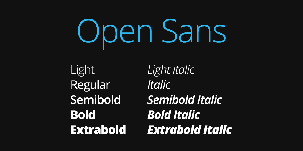
Open Sans is a humanist sans-serif typeface designed by Steve Matteson at Ascender Corp, commissioned by Google and released in 2011. Updated to a variable font format in March 2021.
Open Sans suits content-heavy mobile apps because its wide apertures and large x-height maintain legibility across Latin, Greek, Cyrillic, and Hebrew scripts, making it reliable for multilingual interfaces without fallback font issues.
As of 2025, Open Sans serves billions of views daily across over 20 million websites and ranks as the second most popular font on Google Fonts (Wikipedia).
—
What makes Open Sans suitable for mobile apps?
Open Sans has an upright stress and open letterforms that support readability in body text at 14px–18px. Its 6 weights (Light 300 to ExtraBold 800) with matching italics give enough hierarchy range for most mobile UI systems without a second typeface.
The 897-character set covers ISO Latin 1, Latin CE, Greek, Cyrillic, and Hebrew — broader script coverage than most free alternatives.
Key attributes:
| Attribute | Value |
| Classification | Humanist sans-serif |
| Designer | Steve Matteson, 2011 |
| Weight range | Light 300 – ExtraBold 800 (6 weights) |
| Variable font | Yes (updated March 2021) |
| Optical sizes | No |
| Recommended sizes | 14px–18px body; 22px+ headings |
| Letter-spacing default | 0 |
| License | OFL (relicensed from Apache in 2021) |
| Available on | Google Fonts, Adobe Fonts |
| Price | Free |
—
How does Open Sans perform in mobile app body text?
Open Sans was designed with mobile interfaces in mind, derived from Matteson’s earlier Droid Sans (the original Android system font) but with wider character widths. It renders clearly on mid-range Android devices with lower screen DPI where tighter fonts lose definition.
WordPress adopted Open Sans as its admin UI font in version 3.8 (2013), and Google uses it across web and print advertising, demonstrating consistent cross-context performance.
—
What are the best pairings for Open Sans in mobile apps?
Open Sans pairs with Merriweather for reading-focused apps where body text needs a neutral sans paired with a high-contrast serif, and with Montserrat when the heading layer needs stronger geometric presence.
—
What are the limitations of Open Sans for mobile apps?
Open Sans lacks optical size variants, so letter-spacing and stroke weight do not automatically adjust between small body text and large display headings. Designers must manually manage tracking at different size ranges to maintain visual consistency.
—
Open Sans — Recommended Use Cases Within Mobile Apps
- Best for: Multilingual apps, body copy, content-reading interfaces, cross-platform neutrality
- Avoid for: Display headings at 32px+, where its humanist structure loses impact
- Optimal weight: Regular 400 for body; SemiBold 600 for labels; Bold 700 for headings
- Optimal size range: 14px–18px body; 22px–30px headings
—
Lato
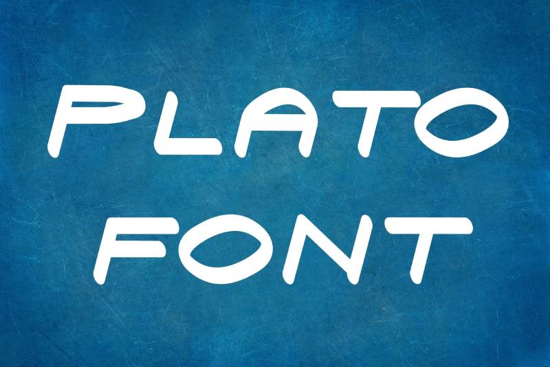
Lato is a humanist-geometric sans-serif typeface designed by Łukasz Dziedzic (tyPoland) in 2010, published under the OFL in December 2010 with support from Google. The name means “summer” in Polish.
Lato suits corporate and productivity mobile apps because its semi-rounded terminal design creates visual warmth at close reading distances while maintaining a structured, businesslike appearance at small navigation sizes.
—
What makes Lato suitable for mobile apps?
Lato blends geometric construction with humanist terminals, giving it consistent stroke rhythm across weights. The family supports 100+ Latin-based languages and 50+ Cyrillic-based languages, with 3000+ glyphs per style added in the 2013–2014 expansion.
It comes in 10 styles spanning Thin 100 to Black 900, including matching italics, covering the full hierarchy range needed in most mobile UI systems.
Key attributes:
| Attribute | Value |
| Classification | Humanist-geometric sans-serif |
| Designer | Łukasz Dziedzic, 2010 |
| Weight range | Thin 100 – Black 900 (5 upright weights + matching italics) |
| Variable font | No |
| Optical sizes | No |
| Recommended sizes | 13px–17px body; 20px+ headings |
| Letter-spacing default | 0 |
| License | OFL |
| Available on | Google Fonts |
| Price | Free |
—
How does Lato perform in productivity and corporate mobile apps?
Lato’s SemiBold 600 renders well for subheadings and navigation labels at 14px–16px, where it produces enough weight contrast against Regular 400 body text without requiring Bold 700. This reduces the need for a second typeface to create hierarchy.
Its broad multilingual glyph set makes it a low-risk choice for enterprise apps serving international user bases across European and Cyrillic script regions.
—
What are the best pairings for Lato in mobile apps?
Lato pairs with Merriweather for reading apps that need editorial serif contrast in long-form content, and with Roboto when building a shared Android-web design system where Material Design compatibility matters.
—
What are the limitations of Lato for mobile apps?
Lato has no variable font version, meaning each weight requires a separate font file. In apps using 4+ weights, this increases total font payload compared to variable alternatives like Inter or Roboto Flex. No optical size variants means manual spacing adjustments at display sizes.
—
Lato — Recommended Use Cases Within Mobile Apps
- Best for: Enterprise apps, productivity tools, multilingual European-language interfaces
- Avoid for: Apps targeting high performance on slow networks (no variable font to reduce payload)
- Optimal weight: Regular 400 for body; SemiBold 600 for labels; Bold 700 for primary CTAs
- Optimal size range: 13px–17px body; 20px–28px section headings
—
Poppins
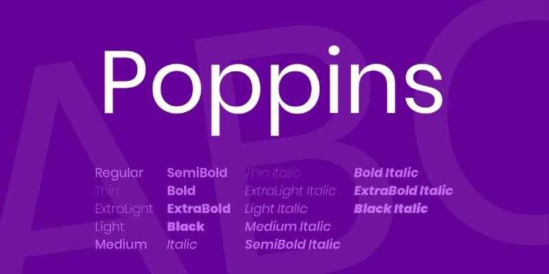
Poppins is a geometric sans-serif typeface developed by the Indian Type Foundry (ITF), released in 2014 via Google Fonts. It is the first major typeface to integrate Latin and Devanagari scripts within a single geometric system.
Poppins works well for consumer and lifestyle mobile apps because its perfectly circular bowls and uniform monolinear stroke width create a consistent visual rhythm across headings, labels, and body text at standard mobile UI sizes.
—
What makes Poppins suitable for mobile apps?
Poppins uses near-perfectly circular letter construction with low stroke contrast throughout its 9 weights. This monolinear structure maintains visual weight consistency across sizes, which matters for apps where typographic hierarchy depends on size and weight rather than stroke contrast.
The family supports both Latin and Devanagari scripts across all 18 styles (9 weights with matching italics), making it one of the few geometric sans-serifs with genuine bilingual Latin-Indic coverage.
Key attributes:
| Attribute | Value |
| Classification | Geometric sans-serif |
| Designer | Indian Type Foundry, 2014 |
| Weight range | Thin 100 – Black 900 (18 styles) |
| Variable font | No |
| Optical sizes | No |
| Recommended sizes | 14px–18px body; 20px+ headings |
| Letter-spacing default | 0 |
| License | OFL |
| Available on | Google Fonts |
| Price | Free |
—
How does Poppins perform in consumer app interfaces?
Poppins renders cleanly at 16px–24px for headings and section labels in consumer-facing apps. Its geometric structure produces predictable line spacing, which simplifies layout calculations in React Native and Flutter when using dynamic type sizes.
The Thin (100) and ExtraLight (200) weights lose definition on lower-resolution screens (below 300 DPI) and are not recommended for body text below 16px on mid-range Android devices.
—
What are the best pairings for Poppins in mobile apps?
Poppins pairs with Lora for apps that need editorial warmth in long-form content sections, and with DM Sans for dual-sans systems where Poppins handles headings and DM Sans handles body text with lower visual weight.
—
What are the limitations of Poppins for mobile apps?
Poppins has no variable font, meaning each of the 18 styles is a separate file. Loading 4–6 weights for a full hierarchy increases total bundle size, which affects first load performance in web-based hybrid apps. The monolinear stroke structure also reduces legibility at small sizes on low-DPI screens.
—
Poppins — Recommended Use Cases Within Mobile Apps
- Best for: Consumer lifestyle apps, wellness platforms, e-commerce apps, startup brand UIs
- Avoid for: Body text below 14px; low-DPI Android devices using Thin or ExtraLight weights
- Optimal weight: Regular 400 for body; SemiBold 600 for labels; Bold 700 for headings
- Optimal size range: 14px–18px body; 20px–32px display headings
—
Montserrat
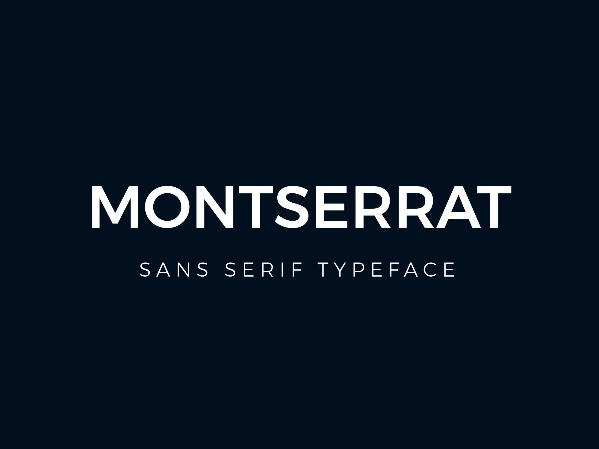
Montserrat is a geometric sans-serif typeface designed by Julieta Ulanovsky, first released in 2011 on Google Fonts, inspired by the painted signage of the Montserrat neighborhood in Buenos Aires. The family has been expanded several times, with the current release offering 18 weights and a variable font implementation.
Montserrat suits branding-forward mobile apps because its assertive geometric proportions and wide weight range produce high visual contrast between heading and body levels without requiring a second typeface.
—
What makes Montserrat suitable for mobile apps?
Montserrat uses a large x-height, wide apertures, and short descenders, which contribute to consistent legibility from small navigation labels at 12px through large hero headings at 40px+. Its 18 weights provide more hierarchy granularity than most free alternatives.
The variable font covers the full weight axis, and Cyrillic and Vietnamese script support is included, which covers a broader multilingual range than Poppins for European and Southeast Asian apps.
Key attributes:
| Attribute | Value |
| Classification | Geometric sans-serif |
| Designer | Julieta Ulanovsky, 2011 |
| Weight range | Thin 100 – Black 900 (18 styles) |
| Variable font | Yes |
| Optical sizes | No |
| Recommended sizes | 13px–16px body; 20px+ headings |
| Letter-spacing default | 0 |
| License | OFL |
| Available on | Google Fonts |
| Price | Free |
—
How does Montserrat perform in branding-heavy app UI?
Montserrat’s geometric construction produces strong visual impact at display sizes (28px+), where its wide letter widths and confident proportions create prominent section headings. At body text sizes (13px–16px), stroke contrast remains consistent on Retina and high-DPI Android screens.
On sub-300 DPI screens, the lighter weights (100–300) can appear thin and lose stroke definition, particularly in reversed-out text on dark backgrounds.
—
What are the best pairings for Montserrat in mobile apps?
Montserrat pairs with Open Sans for body copy in content-heavy apps, where Open Sans’s humanist neutrality balances Montserrat’s assertive heading presence. It also pairs with Source Sans 3 for a more refined editorial look in news or media apps.
—
What are the limitations of Montserrat for mobile apps?
Montserrat’s wide character widths increase horizontal space requirements compared to more compact geometric options like General Sans. Apps with dense data tables or narrow column layouts may find it consumes more horizontal real estate than practical at standard sizes. The Thin (100) weight renders poorly below 16px on low-DPI displays.
—
Montserrat — Recommended Use Cases Within Mobile Apps
- Best for: Brand-forward apps, headings and hero text, onboarding screens, lifestyle and fashion apps
- Avoid for: Dense data interfaces; Thin weight at small sizes on non-Retina screens
- Optimal weight: Regular 400 for body; SemiBold 600 for labels; Bold 700 for headings
- Optimal size range: 13px–16px body; 24px–40px display headings
—
Nunito

Nunito is a rounded-terminal sans-serif typeface originally designed by Vernon Adams, later expanded by Jacques Le Bailly. First released as a display face, the family was extended to a full weight range and updated to a variable font format with four axes in February 2023.
Nunito works best for consumer-facing apps in wellness, education, and children’s categories because its rounded terminals produce a visually approachable, low-tension reading experience at standard mobile UI sizes.
—
What makes Nunito suitable for mobile apps?
Nunito’s rounded terminals on all strokes increase perceived friendliness without sacrificing legibility at 14px–18px. The 2023 update added a variable font with four axes: weight (200–1000), optical size (opsz), width (wdth), and ascender height (YTLC).
The YTLC axis (ascender height control) is unusual and useful for apps needing tight line spacing in compact layout areas like card components or notification previews.
Key attributes:
| Attribute | Value |
| Classification | Rounded-terminal sans-serif |
| Designer | Vernon Adams; expanded by Jacques Le Bailly |
| Weight range | ExtraLight 200 – Black 900 |
| Variable font | Yes (weight, optical size, width, ascender height) |
| Optical sizes | Yes (via opsz axis) |
| Recommended sizes | 14px–18px body; 20px+ headings |
| Letter-spacing default | 0 |
| License | OFL |
| Available on | Google Fonts, Adobe Fonts |
| Price | Free |
—
How does Nunito perform in friendly consumer app interfaces?
Nunito’s rounded terminals render smoothly at both standard and Retina densities without the terminal clipping that affects some rounded fonts at small sizes. The Duolingo app uses a Nunito-adjacent rounded sans aesthetic, and Nunito itself appears frequently in edtech and wellness app UIs.
The width axis in the variable font allows minor condensing for compact layouts without switching to a separate Condensed variant file.
—
What are the best pairings for Nunito in mobile apps?
Nunito pairs with Lora for educational apps that need a warm serif for long-form reading sections, and with Poppins when both typefaces’ geometric roundness creates a cohesive, friendly visual system across heading and body levels.
—
What are the limitations of Nunito for mobile apps?
Nunito’s rounded terminals reduce character distinction in letters like ‘i’, ‘l’, and ‘1’ at sizes below 12px, which can create ambiguity in dense data displays or form field labels. It is not a strong choice for enterprise apps where clinical legibility is prioritized over approachability.
—
Nunito — Recommended Use Cases Within Mobile Apps
- Best for: Wellness, edtech, children’s, and lifestyle apps; onboarding and empty state screens
- Avoid for: Dense data displays; form labels below 13px; enterprise or fintech UIs
- Optimal weight: Regular 400 for body; SemiBold 600 for labels; Bold 700 for headings
- Optimal size range: 14px–18px body; 22px–32px headings
—
Proxima Nova
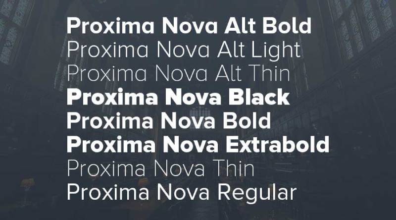
Proxima Nova is a geometric-humanist sans-serif typeface designed by Mark Simonson, released in 2005 through Mark Simonson Studio. It bridges the proportions of geometric sans-serifs like Futura with the neutrality of grotesques like Akzidenz Grotesk.
Proxima Nova suits SaaS and professional mobile apps because its hybrid geometric-humanist construction produces high legibility across weights at 12px–20px, where purely geometric fonts like Futura lose character distinction.
Proxima Nova was the most widely used premium web font through the 2010s and remains a default choice for SaaS product interfaces, used by apps including BuzzFeed, Spotify, and Wired magazine (TypeSmith).
—
What makes Proxima Nova suitable for mobile apps?
Proxima Nova’s x-height is tall relative to its cap height, and its apertures are more open than most geometric sans-serifs. This combination maintains legibility at 12px–14px in UI labels where purely geometric options like Futura close up and lose character differentiation.
The family covers 8 weights from Thin to Black with matching italics, plus a Condensed variant, giving full hierarchy control within a single type family.
Key attributes:
| Attribute | Value |
| Classification | Geometric-humanist sans-serif |
| Designer | Mark Simonson, 2005 |
| Weight range | Thin 100 – Black 900 (8 weights + Condensed variant) |
| Variable font | No |
| Optical sizes | No |
| Recommended sizes | 12px–16px body; 20px+ headings |
| Letter-spacing default | 0 |
| License | Commercial — Adobe Fonts or MyFonts; page-view-based web licensing |
| Available on | Adobe Fonts, MyFonts, Mark Simonson Studio |
| Price | Paid (subscription via Adobe Fonts; per-license via MyFonts) |
—
How does Proxima Nova perform in professional mobile app UI?
Proxima Nova renders with high consistency across Android and iOS due to its open apertures and moderate stroke contrast. It is well-tested across browsers and mobile WebViews from over a decade of production use in high-traffic web products.
The Condensed variant performs well for space-constrained mobile components like tab bars, data table headers, and multi-column layouts where standard-width type creates overflow.
—
What are the best pairings for Proxima Nova in mobile apps?
Proxima Nova pairs well with Freight Text for editorial or long-form reading apps, where the serif provides contrast against Proxima Nova’s clean UI elements. For all-sans systems, DM Sans in body copy creates a lower-contrast complement that keeps the visual weight balanced.
—
What are the limitations of Proxima Nova for mobile apps?
Proxima Nova requires a paid commercial license. Web embedding costs scale with page view volume under the MyFonts model, which adds ongoing cost for high-traffic mobile web or hybrid apps. There is no variable font version, meaning each weight is a separate file, increasing bundle size when 4+ weights are used.
—
Proxima Nova — Recommended Use Cases Within Mobile Apps
- Best for: Premium SaaS apps, fintech, media, and professional productivity interfaces
- Avoid for: Open-source projects or apps with strict zero-cost font requirements
- Optimal weight: Regular 400 for body; SemiBold 600 for labels; Bold 700 for headings
- Optimal size range: 12px–16px body; 20px–32px headings
—
General Sans
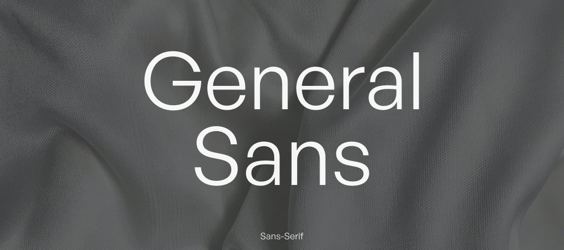
General Sans is a rationalist geometric sans-serif typeface designed by Frode Helland (Norway) for the Indian Type Foundry, originally released in 2017 via Fontstore and moved to Fontshare in March 2021.
General Sans suits compact mobile app layouts because its ascenders match capital letter height exactly, which allows tighter line-height settings without visual crowding, preserving vertical space in content-dense interfaces.
—
What makes General Sans suitable for mobile apps?
General Sans has a compact, rational character construction where ascenders align to cap height. This reduces the effective line-height needed for comfortable reading, which is a structural advantage in card-based or data-dense mobile layouts where vertical space is limited.
The family includes 6 weights (Extralight to Bold) with matching italics and 2 variable fonts. Its double-storey lowercase ‘a’ and circular punctuation dots improve character distinction at smaller sizes relative to single-storey alternatives.
Key attributes:
| Attribute | Value |
| Classification | Rationalist geometric sans-serif |
| Designer | Frode Helland, 2017 |
| Weight range | Extralight – Bold (6 weights) |
| Variable font | Yes (2 variable font files) |
| Optical sizes | No |
| Recommended sizes | 14px–18px body; 22px+ headings |
| Letter-spacing default | 0 |
| License | Free for personal use; commercial license via Indian Type Foundry |
| Available on | Fontshare |
| Price | Free for personal use; paid for commercial use |
—
How does General Sans perform in compact mobile layouts?
General Sans saves horizontal and vertical space compared to wider geometric sans-serifs like Montserrat, without appearing artificially condensed. Typography consultant Oliver Schöndorfer notes that ascenders rising to cap height “is beneficial for compact line-heights” in mobile and app design specifically.
Its closed apertures, however, can reduce legibility in functional UI text at sizes below 13px, particularly in letters like ‘c’ and ‘e’ on standard-DPI Android screens.
—
What are the best pairings for General Sans in mobile apps?
General Sans pairs with Atkinson Hyperlegible for functional UI text (labels, form fields, error messages) where General Sans’s closed apertures underperform, keeping General Sans in the display and heading roles where it excels. For a full-sans system, DM Sans works as a lower-contrast body text companion.
—
What are the limitations of General Sans for mobile apps?
General Sans is free for personal use only. Commercial app deployment requires a paid license from the Indian Type Foundry. Its weight range tops out at Bold (700), which limits heavy display weight options. The closed apertures make it a poor choice for functional small-size text like labels below 13px or form field hints.
—
General Sans — Recommended Use Cases Within Mobile Apps
- Best for: Compact card layouts, branding-forward headings, editorial app sections, startup product UIs
- Avoid for: Functional UI text below 13px; apps requiring very heavy display weights (800+)
- Optimal weight: Regular 400 for body; Medium (or SemiBold if available) for labels; Bold for headings
- Optimal size range: 14px–18px body; 22px–36px display headings
—
How To Choose The Right Font For Your Mobile App
No single font works for every app. The right choice depends on four variables that are often overlooked in favor of visual preference.
Platform Determines The Starting Point
iOS-only apps should default to SF Pro unless there’s a strong brand reason not to. The zero-load-time advantage and automatic optical sizing are hard to match with any third-party typeface.
Android-only apps work best starting with Roboto. Cross-platform apps (React Native, Flutter) need a platform-neutral option. Inter is the most common choice here, and for good reason: it was purpose-built for screen interfaces and renders consistently on both platforms.
Font Licensing Affects Deployment
This catches teams off guard more often than it should. Font licensing rules vary significantly between typefaces.
- OFL fonts (Inter, Roboto, Open Sans, Montserrat, Poppins, Lato, Nunito) can be bundled in commercial app binaries freely.
- SF Pro is restricted to Apple platforms only.
- Proxima Nova requires a paid commercial license with volume-based web pricing.
- General Sans requires a commercial license for deployed products.
Check licensing before finalizing any typeface, especially for hybrid or web-based apps where font embedding rules differ from native app bundling.
Screen DPI Changes What Works
A font that reads well on a Retina display may render poorly on a 220 DPI mid-range Android device. Thin weights (100–200) are the first to fail. Open apertures (Inter, Open Sans) hold up better across the DPI range than closed apertures (General Sans, Montserrat at small sizes).
If your app targets low-to-mid-range Android hardware, test your chosen font at 12px–14px on a physical mid-range device before finalizing. Emulator rendering at high resolution masks real-world rendering issues.
Variable Fonts Reduce Bundle Size
Apps using 4+ weights should prioritize variable fonts. A single variable font file covering the full weight axis replaces 4–8 static files, reducing the font bundle by 60–80% in typical cases.
Inter, Roboto Flex, Nunito, Montserrat, and SF Pro all offer variable font versions. Lato and Proxima Nova do not. For performance-sensitive apps, this is a non-trivial difference, particularly in hybrid or web-based mobile apps where fonts are loaded over the network.
—
Font Pairing Strategies For Mobile App Typography
Most mobile apps need at least two typographic roles: a display or heading face and a body or UI text face. Pairing fonts effectively comes down to contrast on one dimension and consistency on another.
Same Family, Different Weights
The lowest-risk approach. Use a single typeface across the entire app, differentiating hierarchy through weight and size alone.
This works reliably with Inter (Semibold 600 headings, Regular 400 body), Roboto (Medium 500 labels, Regular 400 body), and Montserrat (Bold 700 headings, Regular 400 body). One font, no pairing decision, consistent rendering.
Geometric Heading + Humanist Body
The most common two-typeface strategy for mobile apps. A structured geometric sans in headings paired with a warmer humanist sans in body text. Montserrat + Open Sans, Poppins + Lato, or Nunito + Inter are standard implementations of this approach.
The contrast comes from the structural difference (geometric vs. humanist terminal construction), not from weight or size, which gives the system a built-in visual anchor even at equal font sizes.
Sans + Serif For Editorial Apps
Reading-focused apps (news, books, long-form content) benefit from a serif vs sans-serif contrast between UI chrome and content. Roboto (navigation, labels) + Roboto Serif (body reading text) keeps the system within one type family. Inter + Merriweather or Open Sans + Lora are common cross-family implementations.
Keep the font spacing consistent between the two typefaces when mixing classifications. Mismatched default letter-spacing between a sans and serif at the same point size creates visual tension that undermines the hierarchy.
Use A Font Pairing Generator To Test Options
Before committing to a pairing in production, test visual combinations at actual mobile sizes. A font pairing generator lets you preview combinations across weight and size without building a prototype first.
Test at 13px, 16px, and 24px simultaneously. A pairing that looks good at large display sizes often breaks down at small label sizes where the secondary typeface loses its character.
—
Mobile App Typography Guidelines
Minimum Size Requirements
Apple’s Human Interface Guidelines recommend a minimum body text size of 17pt for iOS. Google’s Material Design guidelines set the minimum readable size at 12sp for Android body text.
In practice: nothing below 12px for any functional text, nothing below 14px for body copy users are expected to read at normal viewing distance. Below these thresholds, even well-optimized fonts like Inter and SF Pro lose character distinction on standard screens.
Font Hierarchy In Mobile UI
A functional mobile type scale typically uses 3–4 size levels, not more. More than 4 levels create visual noise rather than hierarchy clarity.
| Role | Recommended Size | Recommended Weight |
| Display heading | 28px–40px | Bold 700 |
| Section heading | 20px–24px | SemiBold 600 |
| Body text | 14px–17px | Regular 400 |
| Label / caption | 11px–13px | Medium 500 |
Dark Mode Considerations
Light text on dark backgrounds appears heavier than the same weight on light backgrounds due to optical irradiation. A font set at Regular 400 in light mode should drop to Light 300 in dark mode to maintain the same perceived weight, or use the Grade (GRAD) axis on SF Pro to compensate automatically.
Not all fonts behave equally in dark mode. Inter and SF Pro include design adjustments for reversed-out text. Generic fonts like early Roboto versions did not include dark-mode optical compensation in their original static releases.
Accessibility And Legibility Standards
WCAG 2.1 AA requires a minimum contrast ratio of 4.5:1 for body text under 18pt (or 14pt bold). Font choice affects how easily this ratio is achieved. High-stroke-contrast fonts (Playfair Display, Bodoni) can fail contrast requirements at light weights on colored backgrounds even when the color passes.
For apps targeting users with visual impairments, fonts optimized for accessibility provide measurable legibility improvements over standard geometric sans-serifs, particularly for users with low contrast sensitivity or dyslexia. Atkinson Hyperlegible is the benchmark here, with documented legibility improvements in low-vision contexts.
The Best Fonts For Mobile Apps
Choosing the right font for a mobile app isn’t a visual preference call. It’s a technical one. Small screens, variable DPI, dark mode, and cross-platform rendering all place hard constraints on what actually works.
The fonts below are the ones that hold up under those conditions. Each entry includes structural specs, size guidance, known limitations, and pairing options grounded in how mobile UI typography actually behaves.
—
Roboto
Roboto is a neo-grotesque sans-serif font designed by Christian Robertson in 2011, released by Google. It serves as the default system font for Android and the foundation of Material Design’s type system.
Roboto suits Android app UI because its mechanical skeleton with open curves maintains clarity across the full range of Material Design components, from navigation labels to body copy.
By 2024, Roboto and Open Sans together accounted for 51% of all Google Fonts views, with Roboto recorded at over 200 billion views across tens of millions of websites (Wikipedia).
—
What makes Roboto suitable for mobile apps?
Roboto uses a dual-nature construction: geometric skeleton with open, friendly curves. Its x-height is proportioned for comfortable reading at 12px–16px on standard DPI Android screens.
The typeface supports 6 static weights (Thin 100 to Black 900, excluding 200, 600, 800) with matching obliques, plus a variable version, Roboto Flex, with 12 adjustable axes including optical size.
Key attributes:
| Attribute | Value |
| Classification | Neo-grotesque sans-serif |
| Designer | Christian Robertson, 2011 |
| Weight range | Thin 100, Light 300, Regular 400, Medium 500, Bold 700, Black 900 |
| Variable font | Yes (Roboto Flex, 12 axes) |
| Optical sizes | Yes (via Roboto Flex) |
| Recommended sizes | 12px–16px body; 20px+ headings |
| Letter-spacing default | 0 |
| License | OFL (re-licensed from Apache in 2020) |
| Available on | Google Fonts |
| Price | Free |
—
How does Roboto perform in Android mobile UI?
Roboto was purpose-built to replace Droid Sans on higher-resolution Android screens. Its racetrack-shaped rounded letters and straight-sided capitals render cleanly on both low- and high-DPI displays.
In user and lab-based legibility analyses, Roboto ranked comparably to Arial and Open Sans in reading speed and comprehension, with consistent rendering across Android system components.
—
What are the best pairings for Roboto in mobile apps?
Roboto pairs with Roboto Serif for hierarchy within a single type family, and with Open Sans when cross-platform neutrality is needed for shared web and app components.
Within the Roboto family itself, Roboto Condensed works well for space-constrained navigation bars and data tables.
—
What are the limitations of Roboto for mobile apps?
Roboto Flex’s 12-axis variable format adds file size overhead that can affect load time in low-bandwidth environments. The static font lacks weights 200, 600, and 800, which narrows the hierarchy options without switching to the variable version.
—
Roboto — Recommended Use Cases Within Mobile Apps
- Best for: Android native apps, Material Design systems, navigation labels, body copy
- Avoid for: iOS apps where system font consistency is expected
- Optimal weight: Regular 400 for body; Medium 500 for UI labels; Bold 700 for headings
- Optimal size range: 12px–16px body; 20px–32px headings
—
San Francisco (SF Pro)
San Francisco (SF Pro) is a neo-grotesque sans-serif typeface designed by Apple Inc., first released in 2015, distributed through Apple’s developer program. It is the system font for iOS, iPadOS, macOS, and tvOS.
SF Pro suits iOS app UI because it uses two distinct optical sizes (Text for below 20pt, Display for above 20pt) that automatically apply size-appropriate letter-spacing and proportions, eliminating manual tuning.
Apple distributes SF Pro under a restricted license: free for use exclusively on Apple platforms, not permitted in non-Apple products or cross-platform apps.
—
What makes SF Pro suitable for mobile apps?
SF Pro has a tall x-height and open apertures that maintain character distinction at small sizes on Retina displays. Its optical size axis (opsz) covers 9pt to 144pt with dedicated design masters at 9, 11, 17, 28, 52, and 144.
The Grade (GRAD) axis allows weight compensation between light and dark mode without altering glyph metrics, which solves a real problem in apps with theme switching.
Key attributes:
| Attribute | Value |
| Classification | Neo-grotesque sans-serif |
| Designer | Apple Inc., 2015 |
| Weight range | Ultralight to Black (9 weights, variable 100–950) |
| Variable font | Yes (weight, width, optical size, grade axes) |
| Optical sizes | Yes: Text (below 20pt), Display (above 20pt) |
| Recommended sizes | 11pt–17pt body; 28pt+ headings |
| Letter-spacing default | Automatically adjusted per optical size |
| License | Apple platform-only; not for cross-platform use |
| Available on | Apple Developer portal (requires Apple ID) |
| Price | Free (Apple platforms only) |
—
How does SF Pro perform in iOS UI?
SF Pro carries zero load time overhead on Apple devices since it ships as a system font. The automatic optical size switching means the font adjusts letter-spacing and stroke weight at the OS level, without any developer configuration.
Apps like iOS system interfaces (Settings, Messages, Mail) use SF Pro as the default, ensuring visual consistency with native UI components. Supports 150+ languages across Latin, Greek, and Cyrillic.
—
What are the best pairings for SF Pro in mobile apps?
SF Pro pairs with New York (Apple’s companion serif) for editorial layouts inside iOS apps where serif-sans contrast improves scannability. For cross-platform components that must match SF Pro’s proportions, Inter is the standard substitute.
—
What are the limitations of SF Pro for mobile apps?
SF Pro is restricted to Apple platforms under its license terms. Cross-platform apps (React Native, Flutter) cannot legally use SF Pro on Android. Developers building shared design systems must maintain two separate type stacks.
—
SF Pro — Recommended Use Cases Within Mobile Apps
- Best for: Native iOS apps, Apple HIG-compliant UI, system-consistent interfaces
- Avoid for: Cross-platform apps, Android builds, any non-Apple deployment
- Optimal weight: Regular 400 for body; Semibold 600 for labels; Bold 700 for headings
- Optimal size range: 11pt–17pt body text; 20pt+ display headings
—
Inter
Inter is a geometric neo-grotesque sans-serif typeface designed by Rasmus Andersson, publicly released in 2017, available through Google Fonts and the designer’s own foundry (RSMS). It was created specifically to improve on-screen readability at small UI sizes.
Inter works best for cross-platform app UI because its tall x-height (approximately 75% of cap height) and open apertures in characters like ‘c’, ‘e’, and ‘a’ reduce misread characters at 10px–14px on both Android and iOS.
For the 12 months ending May 2025, Inter was accessed 414 billion times on Google Fonts, a 57% increase year over year (Wikipedia), making it the default choice for UI-first products.
—
What makes Inter suitable for mobile apps?
Inter uses ink traps at small glyph junctions to improve rasterization below 12px, where stems on letters like ‘E’, ‘F’, and ‘m’ would otherwise render as merged strokes. This is a structural optimization specifically for screen rendering.
The variable font covers Thin 100 to Black 900 on both weight and optical size axes. Figma, Notion, NASA, Mozilla, and GitLab all use Inter as their primary UI typeface.
Key attributes:
| Attribute | Value |
| Classification | Geometric neo-grotesque sans-serif |
| Designer | Rasmus Andersson, 2017 |
| Weight range | Thin 100 – Black 900 (9 weights + matching italics) |
| Variable font | Yes (weight + optical size axes) |
| Optical sizes | Yes: Text and Display |
| Recommended sizes | 11px–16px body; 20px+ headings |
| Letter-spacing default | 0 |
| License | OFL — free for personal and commercial use |
| Available on | Google Fonts, rsms.me/inter |
| Price | Free |
—
How does Inter perform in cross-platform mobile UI?
Inter renders consistently on both Android and iOS due to its screen-first design decisions: open apertures, tabular figures enabled by default, and contextual alternates that improve character distinction in UI contexts.
The Google Fonts distribution removes some OpenType features to reduce file size, which limits access to contextual alternates and stylistic sets. The full feature set is available from rsms.me/inter directly.
—
What are the best pairings for Inter in mobile apps?
Inter pairs with Playfair Display for editorial-style apps that need serif contrast in headings, and with DM Sans for minimal UI systems where two low-contrast sans-serifs create subtle hierarchy without visual noise.
—
What are the limitations of Inter for mobile apps?
The Google Fonts version of Inter strips several OpenType features, including stylistic alternates and contextual forms, to reduce file size. Apps requiring the full feature set must self-host or reference the GitHub release directly.
—
Inter — Recommended Use Cases Within Mobile Apps
- Best for: Cross-platform apps (Flutter, React Native), SaaS dashboards, fintech UIs
- Avoid for: Expressive or brand-forward apps where Inter’s neutrality reads as generic
- Optimal weight: Regular 400 for body; Medium 500 for labels; Semibold 600 for headings
- Optimal size range: 13px–16px body; 20px–28px in-app headings
—
Open Sans
Open Sans is a humanist sans-serif typeface designed by Steve Matteson at Ascender Corp, commissioned by Google and released in 2011. Updated to a variable font format in March 2021.
Open Sans suits content-heavy mobile apps because its wide apertures and large x-height maintain legibility across Latin, Greek, Cyrillic, and Hebrew scripts, making it reliable for multilingual interfaces without fallback font issues.
As of 2025, Open Sans serves billions of views daily across over 20 million websites and ranks as the second most popular font on Google Fonts (Wikipedia).
—
What makes Open Sans suitable for mobile apps?
Open Sans has an upright stress and open letterforms that support readability in body text at 14px–18px. Its 6 weights (Light 300 to ExtraBold 800) with matching italics give enough hierarchy range for most mobile UI systems without a second typeface.
The 897-character set covers ISO Latin 1, Latin CE, Greek, Cyrillic, and Hebrew — broader script coverage than most free alternatives.
Key attributes:
| Attribute | Value |
| Classification | Humanist sans-serif |
| Designer | Steve Matteson, 2011 |
| Weight range | Light 300 – ExtraBold 800 (6 weights) |
| Variable font | Yes (updated March 2021) |
| Optical sizes | No |
| Recommended sizes | 14px–18px body; 22px+ headings |
| Letter-spacing default | 0 |
| License | OFL (relicensed from Apache in 2021) |
| Available on | Google Fonts, Adobe Fonts |
| Price | Free |
—
How does Open Sans perform in mobile app body text?
Open Sans was designed with mobile interfaces in mind, derived from Matteson’s earlier Droid Sans (the original Android system font) but with wider character widths. It renders clearly on mid-range Android devices with lower screen DPI where tighter fonts lose definition.
WordPress adopted Open Sans as its admin UI font in version 3.8 (2013), and Google uses it across web and print advertising, demonstrating consistent cross-context performance.
—
What are the best pairings for Open Sans in mobile apps?
Open Sans pairs with Merriweather for reading-focused apps where body text needs a neutral sans paired with a high-contrast serif, and with Montserrat when the heading layer needs stronger geometric presence.
—
What are the limitations of Open Sans for mobile apps?
Open Sans lacks optical size variants, so letter-spacing and stroke weight do not automatically adjust between small body text and large display headings. Designers must manually manage tracking at different size ranges to maintain visual consistency.
—
Open Sans — Recommended Use Cases Within Mobile Apps
- Best for: Multilingual apps, body copy, content-reading interfaces, cross-platform neutrality
- Avoid for: Display headings at 32px+, where its humanist structure loses impact
- Optimal weight: Regular 400 for body; SemiBold 600 for labels; Bold 700 for headings
- Optimal size range: 14px–18px body; 22px–30px headings
—
Lato
Lato is a humanist-geometric sans-serif typeface designed by Łukasz Dziedzic (tyPoland) in 2010, published under the OFL in December 2010 with support from Google. The name means “summer” in Polish.
Lato suits corporate and productivity mobile apps because its semi-rounded terminal design creates visual warmth at close reading distances while maintaining a structured, businesslike appearance at small navigation sizes.
—
What makes Lato suitable for mobile apps?
Lato blends geometric construction with humanist terminals, giving it consistent stroke rhythm across weights. The family supports 100+ Latin-based languages and 50+ Cyrillic-based languages, with 3000+ glyphs per style added in the 2013–2014 expansion.
It comes in 10 styles spanning Thin 100 to Black 900, including matching italics, covering the full hierarchy range needed in most mobile UI systems.
Key attributes:
| Attribute | Value |
| Classification | Humanist-geometric sans-serif |
| Designer | Łukasz Dziedzic, 2010 |
| Weight range | Thin 100 – Black 900 (5 upright weights + matching italics) |
| Variable font | No |
| Optical sizes | No |
| Recommended sizes | 13px–17px body; 20px+ headings |
| Letter-spacing default | 0 |
| License | OFL |
| Available on | Google Fonts |
| Price | Free |
—
How does Lato perform in productivity and corporate mobile apps?
Lato’s SemiBold 600 renders well for subheadings and navigation labels at 14px–16px, where it produces enough weight contrast against Regular 400 body text without requiring Bold 700. This reduces the need for a second typeface to create hierarchy.
Its broad multilingual glyph set makes it a low-risk choice for enterprise apps serving international user bases across European and Cyrillic script regions.
—
What are the best pairings for Lato in mobile apps?
Lato pairs with Merriweather for reading apps that need editorial serif contrast in long-form content, and with Roboto when building a shared Android-web design system where Material Design compatibility matters.
—
What are the limitations of Lato for mobile apps?
Lato has no variable font version, meaning each weight requires a separate font file. In apps using 4+ weights, this increases total font payload compared to variable alternatives like Inter or Roboto Flex. No optical size variants means manual spacing adjustments at display sizes.
—
Lato — Recommended Use Cases Within Mobile Apps
- Best for: Enterprise apps, productivity tools, multilingual European-language interfaces
- Avoid for: Apps targeting high performance on slow networks (no variable font to reduce payload)
- Optimal weight: Regular 400 for body; SemiBold 600 for labels; Bold 700 for primary CTAs
- Optimal size range: 13px–17px body; 20px–28px section headings
—
Poppins
Poppins is a geometric sans-serif typeface developed by the Indian Type Foundry (ITF), released in 2014 via Google Fonts. It is the first major typeface to integrate Latin and Devanagari scripts within a single geometric system.
Poppins works well for consumer and lifestyle mobile apps because its perfectly circular bowls and uniform monolinear stroke width create a consistent visual rhythm across headings, labels, and body text at standard mobile UI sizes.
—
What makes Poppins suitable for mobile apps?
Poppins uses near-perfectly circular letter construction with low stroke contrast throughout its 9 weights. This monolinear structure maintains visual weight consistency across sizes, which matters for apps where typographic hierarchy depends on size and weight rather than stroke contrast.
The family supports both Latin and Devanagari scripts across all 18 styles (9 weights with matching italics), making it one of the few geometric sans-serifs with genuine bilingual Latin-Indic coverage.
Key attributes:
| Attribute | Value |
| Classification | Geometric sans-serif |
| Designer | Indian Type Foundry, 2014 |
| Weight range | Thin 100 – Black 900 (18 styles) |
| Variable font | No |
| Optical sizes | No |
| Recommended sizes | 14px–18px body; 20px+ headings |
| Letter-spacing default | 0 |
| License | OFL |
| Available on | Google Fonts |
| Price | Free |
—
How does Poppins perform in consumer app interfaces?
Poppins renders cleanly at 16px–24px for headings and section labels in consumer-facing apps. Its geometric structure produces predictable line spacing, which simplifies layout calculations in React Native and Flutter when using dynamic type sizes.
The Thin (100) and ExtraLight (200) weights lose definition on lower-resolution screens (below 300 DPI) and are not recommended for body text below 16px on mid-range Android devices.
—
What are the best pairings for Poppins in mobile apps?
Poppins pairs with Lora for apps that need editorial warmth in long-form content sections, and with DM Sans for dual-sans systems where Poppins handles headings and DM Sans handles body text with lower visual weight.
—
What are the limitations of Poppins for mobile apps?
Poppins has no variable font, meaning each of the 18 styles is a separate file. Loading 4–6 weights for a full hierarchy increases total bundle size, which affects first load performance in web-based hybrid apps. The monolinear stroke structure also reduces legibility at small sizes on low-DPI screens.
—
Poppins — Recommended Use Cases Within Mobile Apps
- Best for: Consumer lifestyle apps, wellness platforms, e-commerce apps, startup brand UIs
- Avoid for: Body text below 14px; low-DPI Android devices using Thin or ExtraLight weights
- Optimal weight: Regular 400 for body; SemiBold 600 for labels; Bold 700 for headings
- Optimal size range: 14px–18px body; 20px–32px display headings
—
Montserrat
Montserrat is a geometric sans-serif typeface designed by Julieta Ulanovsky, first released in 2011 on Google Fonts, inspired by the painted signage of the Montserrat neighborhood in Buenos Aires. The family has been expanded several times, with the current release offering 18 weights and a variable font implementation.
Montserrat suits branding-forward mobile apps because its assertive geometric proportions and wide weight range produce high visual contrast between heading and body levels without requiring a second typeface.
—
What makes Montserrat suitable for mobile apps?
Montserrat uses a large x-height, wide apertures, and short descenders, which contribute to consistent legibility from small navigation labels at 12px through large hero headings at 40px+. Its 18 weights provide more hierarchy granularity than most free alternatives.
The variable font covers the full weight axis, and Cyrillic and Vietnamese script support is included, which covers a broader multilingual range than Poppins for European and Southeast Asian apps.
Key attributes:
| Attribute | Value |
| Classification | Geometric sans-serif |
| Designer | Julieta Ulanovsky, 2011 |
| Weight range | Thin 100 – Black 900 (18 styles) |
| Variable font | Yes |
| Optical sizes | No |
| Recommended sizes | 13px–16px body; 20px+ headings |
| Letter-spacing default | 0 |
| License | OFL |
| Available on | Google Fonts |
| Price | Free |
—
How does Montserrat perform in branding-heavy app UI?
Montserrat’s geometric construction produces strong visual impact at display sizes (28px+), where its wide letter widths and confident proportions create prominent section headings. At body text sizes (13px–16px), stroke contrast remains consistent on Retina and high-DPI Android screens.
On sub-300 DPI screens, the lighter weights (100–300) can appear thin and lose stroke definition, particularly in reversed-out text on dark backgrounds.
—
What are the best pairings for Montserrat in mobile apps?
Montserrat pairs with Open Sans for body copy in content-heavy apps, where Open Sans’s humanist neutrality balances Montserrat’s assertive heading presence. It also pairs with Source Sans 3 for a more refined editorial look in news or media apps.
—
What are the limitations of Montserrat for mobile apps?
Montserrat’s wide character widths increase horizontal space requirements compared to more compact geometric options like General Sans. Apps with dense data tables or narrow column layouts may find it consumes more horizontal real estate than practical at standard sizes. The Thin (100) weight renders poorly below 16px on low-DPI displays.
—
Montserrat — Recommended Use Cases Within Mobile Apps
- Best for: Brand-forward apps, headings and hero text, onboarding screens, lifestyle and fashion apps
- Avoid for: Dense data interfaces; Thin weight at small sizes on non-Retina screens
- Optimal weight: Regular 400 for body; SemiBold 600 for labels; Bold 700 for headings
- Optimal size range: 13px–16px body; 24px–40px display headings
—
Nunito
Nunito is a rounded-terminal sans-serif typeface originally designed by Vernon Adams, later expanded by Jacques Le Bailly. First released as a display face, the family was extended to a full weight range and updated to a variable font format with four axes in February 2023.
Nunito works best for consumer-facing apps in wellness, education, and children’s categories because its rounded terminals produce a visually approachable, low-tension reading experience at standard mobile UI sizes.
—
What makes Nunito suitable for mobile apps?
Nunito’s rounded terminals on all strokes increase perceived friendliness without sacrificing legibility at 14px–18px. The 2023 update added a variable font with four axes: weight (200–1000), optical size (opsz), width (wdth), and ascender height (YTLC).
The YTLC axis (ascender height control) is unusual and useful for apps needing tight line spacing in compact layout areas like card components or notification previews.
Key attributes:
| Attribute | Value |
| Classification | Rounded-terminal sans-serif |
| Designer | Vernon Adams; expanded by Jacques Le Bailly |
| Weight range | ExtraLight 200 – Black 900 |
| Variable font | Yes (weight, optical size, width, ascender height) |
| Optical sizes | Yes (via opsz axis) |
| Recommended sizes | 14px–18px body; 20px+ headings |
| Letter-spacing default | 0 |
| License | OFL |
| Available on | Google Fonts, Adobe Fonts |
| Price | Free |
—
How does Nunito perform in friendly consumer app interfaces?
Nunito’s rounded terminals render smoothly at both standard and Retina densities without the terminal clipping that affects some rounded fonts at small sizes. The Duolingo app uses a Nunito-adjacent rounded sans aesthetic, and Nunito itself appears frequently in edtech and wellness app UIs.
The width axis in the variable font allows minor condensing for compact layouts without switching to a separate Condensed variant file.
—
What are the best pairings for Nunito in mobile apps?
Nunito pairs with Lora for educational apps that need a warm serif for long-form reading sections, and with Poppins when both typefaces’ geometric roundness creates a cohesive, friendly visual system across heading and body levels.
—
What are the limitations of Nunito for mobile apps?
Nunito’s rounded terminals reduce character distinction in letters like ‘i’, ‘l’, and ‘1’ at sizes below 12px, which can create ambiguity in dense data displays or form field labels. It is not a strong choice for enterprise apps where clinical legibility is prioritized over approachability.
—
Nunito — Recommended Use Cases Within Mobile Apps
- Best for: Wellness, edtech, children’s, and lifestyle apps; onboarding and empty state screens
- Avoid for: Dense data displays; form labels below 13px; enterprise or fintech UIs
- Optimal weight: Regular 400 for body; SemiBold 600 for labels; Bold 700 for headings
- Optimal size range: 14px–18px body; 22px–32px headings
—
Proxima Nova
Proxima Nova is a geometric-humanist sans-serif typeface designed by Mark Simonson, released in 2005 through Mark Simonson Studio. It bridges the proportions of geometric sans-serifs like Futura with the neutrality of grotesques like Akzidenz Grotesk.
Proxima Nova suits SaaS and professional mobile apps because its hybrid geometric-humanist construction produces high legibility across weights at 12px–20px, where purely geometric fonts like Futura lose character distinction.
Proxima Nova was the most widely used premium web font through the 2010s and remains a default choice for SaaS product interfaces, used by apps including BuzzFeed, Spotify, and Wired magazine (TypeSmith).
—
What makes Proxima Nova suitable for mobile apps?
Proxima Nova’s x-height is tall relative to its cap height, and its apertures are more open than most geometric sans-serifs. This combination maintains legibility at 12px–14px in UI labels where purely geometric options like Futura close up and lose character differentiation.
The family covers 8 weights from Thin to Black with matching italics, plus a Condensed variant, giving full hierarchy control within a single type family.
Key attributes:
| Attribute | Value |
| Classification | Geometric-humanist sans-serif |
| Designer | Mark Simonson, 2005 |
| Weight range | Thin 100 – Black 900 (8 weights + Condensed variant) |
| Variable font | No |
| Optical sizes | No |
| Recommended sizes | 12px–16px body; 20px+ headings |
| Letter-spacing default | 0 |
| License | Commercial — Adobe Fonts or MyFonts; page-view-based web licensing |
| Available on | Adobe Fonts, MyFonts, Mark Simonson Studio |
| Price | Paid (subscription via Adobe Fonts; per-license via MyFonts) |
—
How does Proxima Nova perform in professional mobile app UI?
Proxima Nova renders with high consistency across Android and iOS due to its open apertures and moderate stroke contrast. It is well-tested across browsers and mobile WebViews from over a decade of production use in high-traffic web products.
The Condensed variant performs well for space-constrained mobile components like tab bars, data table headers, and multi-column layouts where standard-width type creates overflow.
—
What are the best pairings for Proxima Nova in mobile apps?
Proxima Nova pairs well with Freight Text for editorial or long-form reading apps, where the serif provides contrast against Proxima Nova’s clean UI elements. For all-sans systems, DM Sans in body copy creates a lower-contrast complement that keeps the visual weight balanced.
—
What are the limitations of Proxima Nova for mobile apps?
Proxima Nova requires a paid commercial license. Web embedding costs scale with page view volume under the MyFonts model, which adds ongoing cost for high-traffic mobile web or hybrid apps. There is no variable font version, meaning each weight is a separate file, increasing bundle size when 4+ weights are used.
—
Proxima Nova — Recommended Use Cases Within Mobile Apps
- Best for: Premium SaaS apps, fintech, media, and professional productivity interfaces
- Avoid for: Open-source projects or apps with strict zero-cost font requirements
- Optimal weight: Regular 400 for body; SemiBold 600 for labels; Bold 700 for headings
- Optimal size range: 12px–16px body; 20px–32px headings
—
General Sans
General Sans is a rationalist geometric sans-serif typeface designed by Frode Helland (Norway) for the Indian Type Foundry, originally released in 2017 via Fontstore and moved to Fontshare in March 2021.
General Sans suits compact mobile app layouts because its ascenders match capital letter height exactly, which allows tighter line-height settings without visual crowding, preserving vertical space in content-dense interfaces.
—
What makes General Sans suitable for mobile apps?
General Sans has a compact, rational character construction where ascenders align to cap height. This reduces the effective line-height needed for comfortable reading, which is a structural advantage in card-based or data-dense mobile layouts where vertical space is limited.
The family includes 6 weights (Extralight to Bold) with matching italics and 2 variable fonts. Its double-storey lowercase ‘a’ and circular punctuation dots improve character distinction at smaller sizes relative to single-storey alternatives.
Key attributes:
| Attribute | Value |
| Classification | Rationalist geometric sans-serif |
| Designer | Frode Helland, 2017 |
| Weight range | Extralight – Bold (6 weights) |
| Variable font | Yes (2 variable font files) |
| Optical sizes | No |
| Recommended sizes | 14px–18px body; 22px+ headings |
| Letter-spacing default | 0 |
| License | Free for personal use; commercial license via Indian Type Foundry |
| Available on | Fontshare |
| Price | Free for personal use; paid for commercial use |
—
How does General Sans perform in compact mobile layouts?
General Sans saves horizontal and vertical space compared to wider geometric sans-serifs like Montserrat, without appearing artificially condensed. Typography consultant Oliver Schöndorfer notes that ascenders rising to cap height “is beneficial for compact line-heights” in mobile and app design specifically.
Its closed apertures, however, can reduce legibility in functional UI text at sizes below 13px, particularly in letters like ‘c’ and ‘e’ on standard-DPI Android screens.
—
What are the best pairings for General Sans in mobile apps?
General Sans pairs with Atkinson Hyperlegible for functional UI text (labels, form fields, error messages) where General Sans’s closed apertures underperform, keeping General Sans in the display and heading roles where it excels. For a full-sans system, DM Sans works as a lower-contrast body text companion.
—
What are the limitations of General Sans for mobile apps?
General Sans is free for personal use only. Commercial app deployment requires a paid license from the Indian Type Foundry. Its weight range tops out at Bold (700), which limits heavy display weight options. The closed apertures make it a poor choice for functional small-size text like labels below 13px or form field hints.
—
General Sans — Recommended Use Cases Within Mobile Apps
- Best for: Compact card layouts, branding-forward headings, editorial app sections, startup product UIs
- Avoid for: Functional UI text below 13px; apps requiring very heavy display weights (800+)
- Optimal weight: Regular 400 for body; Medium (or SemiBold if available) for labels; Bold for headings
- Optimal size range: 14px–18px body; 22px–36px display headings
—
How To Choose The Right Font For Your Mobile App
No single font works for every app. The right choice depends on four variables that are often overlooked in favor of visual preference.
Platform Determines The Starting Point
iOS-only apps should default to SF Pro unless there’s a strong brand reason not to. The zero-load-time advantage and automatic optical sizing are hard to match with any third-party typeface.
Android-only apps work best starting with Roboto. Cross-platform apps (React Native, Flutter) need a platform-neutral option. Inter is the most common choice here, and for good reason: it was purpose-built for screen interfaces and renders consistently on both platforms.
Font Licensing Affects Deployment
This catches teams off guard more often than it should. Font licensing rules vary significantly between typefaces.
- OFL fonts (Inter, Roboto, Open Sans, Montserrat, Poppins, Lato, Nunito) can be bundled in commercial app binaries freely.
- SF Pro is restricted to Apple platforms only.
- Proxima Nova requires a paid commercial license with volume-based web pricing.
- General Sans requires a commercial license for deployed products.
Check licensing before finalizing any typeface, especially for hybrid or web-based apps where font embedding rules differ from native app bundling.
Screen DPI Changes What Works
A font that reads well on a Retina display may render poorly on a 220 DPI mid-range Android device. Thin weights (100–200) are the first to fail. Open apertures (Inter, Open Sans) hold up better across the DPI range than closed apertures (General Sans, Montserrat at small sizes).
If your app targets low-to-mid-range Android hardware, test your chosen font at 12px–14px on a physical mid-range device before finalizing. Emulator rendering at high resolution masks real-world rendering issues.
Variable Fonts Reduce Bundle Size
Apps using 4+ weights should prioritize variable fonts. A single variable font file covering the full weight axis replaces 4–8 static files, reducing the font bundle by 60–80% in typical cases.
Inter, Roboto Flex, Nunito, Montserrat, and SF Pro all offer variable font versions. Lato and Proxima Nova do not. For performance-sensitive apps, this is a non-trivial difference, particularly in hybrid or web-based mobile apps where fonts are loaded over the network.
—
Font Pairing Strategies For Mobile App Typography
Most mobile apps need at least two typographic roles: a display or heading face and a body or UI text face. Pairing fonts effectively comes down to contrast on one dimension and consistency on another.
Same Family, Different Weights
The lowest-risk approach. Use a single typeface across the entire app, differentiating hierarchy through weight and size alone.
This works reliably with Inter (Semibold 600 headings, Regular 400 body), Roboto (Medium 500 labels, Regular 400 body), and Montserrat (Bold 700 headings, Regular 400 body). One font, no pairing decision, consistent rendering.
Geometric Heading + Humanist Body
The most common two-typeface strategy for mobile apps. A structured geometric sans in headings paired with a warmer humanist sans in body text. Montserrat + Open Sans, Poppins + Lato, or Nunito + Inter are standard implementations of this approach.
The contrast comes from the structural difference (geometric vs. humanist terminal construction), not from weight or size, which gives the system a built-in visual anchor even at equal font sizes.
Sans + Serif For Editorial Apps
Reading-focused apps (news, books, long-form content) benefit from a serif vs sans-serif contrast between UI chrome and content. Roboto (navigation, labels) + Roboto Serif (body reading text) keeps the system within one type family. Inter + Merriweather or Open Sans + Lora are common cross-family implementations.
Keep the font spacing consistent between the two typefaces when mixing classifications. Mismatched default letter-spacing between a sans and serif at the same point size creates visual tension that undermines the hierarchy.
Use A Font Pairing Generator To Test Options
Before committing to a pairing in production, test visual combinations at actual mobile sizes. A font pairing generator lets you preview combinations across weight and size without building a prototype first.
Test at 13px, 16px, and 24px simultaneously. A pairing that looks good at large display sizes often breaks down at small label sizes where the secondary typeface loses its character.
—
Mobile App Typography Guidelines
Minimum Size Requirements
Apple’s Human Interface Guidelines recommend a minimum body text size of 17pt for iOS. Google’s Material Design guidelines set the minimum readable size at 12sp for Android body text.
In practice: nothing below 12px for any functional text, nothing below 14px for body copy users are expected to read at normal viewing distance. Below these thresholds, even well-optimized fonts like Inter and SF Pro lose character distinction on standard screens.
Font Hierarchy In Mobile UI
A functional mobile type scale typically uses 3–4 size levels, not more. More than 4 levels create visual noise rather than hierarchy clarity.
| Role | Recommended Size | Recommended Weight |
| Display heading | 28px–40px | Bold 700 |
| Section heading | 20px–24px | SemiBold 600 |
| Body text | 14px–17px | Regular 400 |
| Label / caption | 11px–13px | Medium 500 |
Dark Mode Considerations
Light text on dark backgrounds appears heavier than the same weight on light backgrounds due to optical irradiation. A font set at Regular 400 in light mode should drop to Light 300 in dark mode to maintain the same perceived weight, or use the Grade (GRAD) axis on SF Pro to compensate automatically.
Not all fonts behave equally in dark mode. Inter and SF Pro include design adjustments for reversed-out text. Generic fonts like early Roboto versions did not include dark-mode optical compensation in their original static releases.
Accessibility And Legibility Standards
WCAG 2.1 AA requires a minimum contrast ratio of 4.5:1 for body text under 18pt (or 14pt bold). Font choice affects how easily this ratio is achieved. High-stroke-contrast fonts (Playfair Display, Bodoni) can fail contrast requirements at light weights on colored backgrounds even when the color passes.
For apps targeting users with visual impairments, fonts optimized for accessibility provide measurable legibility improvements over standard geometric sans-serifs, particularly for users with low contrast sensitivity or dyslexia. Atkinson Hyperlegible is the benchmark here, with documented legibility improvements in low-vision contexts.
FAQ on The Best Fonts For Mobile Apps
What is the best font for mobile apps?
Roboto for Android and SF Pro for iOS are the strongest defaults. For cross-platform apps, Inter is the most reliable choice — built specifically for screen readability, with open apertures and a tall x-height that holds up at small UI sizes.
What font does Google use in Android apps?
Google uses Roboto as the default Android system font. It powers Material Design across Google Play, YouTube, and Google Maps. Roboto is a neo-grotesque sans-serif designed by Christian Robertson in 2011, available free on Google Fonts under the OFL.
What font does Apple use in iOS apps?
San Francisco (SF Pro) is Apple’s system font for iOS, iPadOS, and macOS. It uses two optical sizes — SF Pro Text for below 20pt and SF Pro Display for above — switching automatically based on context. It is restricted to Apple platforms only.
Is serif or sans-serif better for mobile apps?
Sans-serif fonts perform better in most mobile UI contexts. They render more cleanly at small sizes on variable-DPI screens. Serif fonts work in reading-focused apps — news, books, long-form content — where stroke contrast aids legibility in extended body text.
What font size is best for mobile app body text?
Apple’s Human Interface Guidelines recommend 17pt minimum for body text on iOS. Google’s Material Design sets 14sp as the standard body size on Android. Nothing below 12px should be used for any functional UI text regardless of platform or font choice.
Can I use Google Fonts in a mobile app?
Yes. Most Google Fonts — including Inter, Roboto, Open Sans, Poppins, Lato, and Montserrat — are licensed under the Open Font License, which permits free use in commercial app binaries. Always verify the specific license before bundling any typeface in a deployed product.
What is a variable font and do mobile apps need one?
A variable font stores the full weight axis in a single file, replacing 4–8 static font files. Apps loading multiple weights benefit significantly — reduced bundle size, faster load times. Inter, Roboto Flex, Montserrat, and Nunito all offer variable font versions.
What fonts work for both iOS and Android?
Inter, Open Sans, Lato, Poppins, and Montserrat all render consistently across both platforms. SF Pro is restricted to Apple devices. For React Native or Flutter projects requiring one type system across platforms, Inter is the most widely adopted cross-platform choice.
How many fonts should a mobile app use?
Most apps need only one typeface family, using weight and size to create hierarchy. Two typefaces are justified in editorial or brand-forward apps. More than two creates visual noise and increases font payload — a real performance cost in hybrid and web-based mobile apps.
What fonts are best for mobile app accessibility?
Inter, Open Sans, and SF Pro have open apertures that reduce character confusion at small sizes. Atkinson Hyperlegible, designed by the Braille Institute, shows documented legibility improvements for low-vision users and is a strong choice for accessibility-focused mobile interfaces.
Conclusion
This conclusion is for an article presenting the best fonts for mobile apps — and the core takeaway is simple: font choice is a technical decision, not a stylistic one.
Platform rendering, weight range, optical sizing, and licensing terms all constrain what actually works before aesthetics enter the conversation.
Roboto and SF Pro remain the strongest native choices for Android and iOS respectively. For cross-platform UI, Inter and Open Sans handle variable DPI conditions and multilingual character sets better than most alternatives.
Stick to one typeface family where possible. Use variable fonts to reduce bundle size. Check licensing before deployment.
Good mobile typography doesn’t call attention to itself. It just makes everything easier to read — and that’s exactly the point.

Renowned for his expertise in logo design and visual branding, Bogdan has developed a multitude of logos for various clients.
His skills extend to creating posters, vector illustrations, business cards, and brochures. Additionally, Bogdan's UI kits were featured on marketplaces like Visual Hierarchy and UI8.
He also wrote in the past years on sites like Design Your Way, WebDesignerDepot, WPDean, Designmodo, Speckyboy, Slider Revolution, and more.
- The Windsurf Logo History, Colors, Font, And Meaning - 10 October 2026
- How to Remove Background From Product Photos (No Photoshop) - 10 October 2026
- How Designers can Build a Stronger Online Creative Identity - 9 October 2026

Bogdan Sandu is a seasoned designer who has been designing websites since 2008. Renowned for his expertise in logo design and visual branding, Bogdan has developed a multitude of logos for various clients. His skills extend to creating posters, vector illustrations, business cards, and brochures. Additionally, Bogdan's UI kits were featured on marketplaces like Visual Hierarchy and UI8. He also wrote in the past years on sites like Design Your Way, WebDesignerDepot, WPDean, Designmodo, Speckyboy, Slider Revolution, and more.
You Might Also Like