
The font you pick for your presentation says something before you open your mouth.
Finding the best fonts for Google Slides isn’t about chasing trends. It’s about choosing typefaces that hold up on a projector, stay readable at distance, and match the tone of what you’re presenting.
Google Slides gives you access to hundreds of free options through the Google Fonts library. Most people use three of them. That’s a missed opportunity.
This guide covers 10 fonts that actually work in slide decks, from clean sans-serif choices like Roboto and Lato to high-impact options like Playfair Display. You’ll also learn how to pair them, what sizes to use, and how to expand your font options beyond the default dropdown.
By the end, you’ll know exactly which fonts to use and why.
The Best Fonts For Google Slides
Font choice shapes the entire presentation experience. The wrong typeface kills readability at distance; the right one lets your content do the talking.
Google Slides pulls directly from the Google Fonts library, so every option here is free and available under open-source licensing. No workarounds needed.
Here’s what actually works, and why.
—
Roboto

Roboto is a neo-grotesque sans-serif typeface designed by Christian Robertson in 2011, released by Google. It delivers clean, screen-optimized type across heading and body text at any slide size.
Roboto works best for general-purpose presentations because its mechanical skeleton combined with open curves maintains legibility from 10px body copy up to 96px display headings. By 2024, Roboto and Open Sans together accounted for 51% of all Google Fonts views globally (Wikipedia).
What makes Roboto suitable for Google Slides?
Roboto supports 6 static weights (Thin 100 to Black 900) plus condensed variants, giving presenters full control over typographic hierarchy. Its wide apertures in letters like “c” and “e” reduce character confusion at projected sizes. The 2014 redesign widened and rounded letterforms, improving rendering on high-DPI screens.
Key attributes:
| Attribute | Value |
| Classification | Neo-grotesque sans-serif |
| Designer | Christian Robertson, 2011 |
| Weight range | Thin 100 to Black 900 |
| Variable font | Yes (Roboto Flex, 12 axes) |
| Recommended sizes | 14px+ body; 28px+ headings |
| License | OFL (open-source, free commercial use) |
| Available on | Google Fonts, Adobe Fonts |
| Price | Free |
How does Roboto perform in Google Slides presentations?
Roboto renders clearly at both small body sizes (12pt on-screen) and large projected heading sizes (40pt+). Its condensed variant handles data-heavy slides with narrow columns. The typeface is the default system font for Android and Chrome OS, meaning it renders consistently across devices where presentations are viewed.
What are the best pairings for Roboto in Google Slides?
Roboto pairs with Playfair Display for contrast between a mechanical sans-serif heading and a high-contrast serif body. It pairs with Merriweather when long-form text-heavy slides need a sturdy serif complement. The Playfair pairing is unconventional for slides; the Merriweather combination is standard editorial practice.
What are the limitations of Roboto for Google Slides?
Roboto has narrow apertures compared to humanist sans-serifs like Open Sans, which slightly reduces character distinction at very small sizes below 10px. The oblique styles are not true italics, which can affect emphasis rendering in some slide contexts.
Roboto – Recommended Use Cases Within Google Slides
- Best for: Corporate decks, data slides, body copy at 14pt+
- Avoid for: Creative or editorial presentations requiring personality
- Optimal weight: Regular 400 for body; Bold 700 for slide headings
- Optimal size range: 14pt–18pt body; 32pt–48pt headings
—
Montserrat
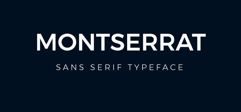
Montserrat is a geometric sans-serif typeface designed by Julieta Ulanovsky in 2011, available through Google Fonts. It handles slide headings and title slides where strong visual hierarchy is needed.
Montserrat suits slide title typography because its large x-height and wide apertures produce high legibility even at reduced sizes, and its 9-weight range covers every hierarchy level from slide subheadings to bold CTAs. The Government of Mexico adopted Montserrat as its official font for presentations in 2018, which is about as close to a real-world endorsement as a typeface gets.
What makes Montserrat suitable for Google Slides?
Montserrat’s short descenders prevent clipping on slides with tight line spacing. Its geometric construction keeps letterforms consistent at large display sizes (48pt+). The typeface is used on over 19 million websites (Wikipedia), which means audience members already associate it with clean, modern design.
Key attributes:
| Attribute | Value |
| Classification | Geometric sans-serif |
| Designer | Julieta Ulanovsky, 2011 |
| Weight range | Thin 100 to Black 900 (9 weights) |
| Variable font | Yes (weight + italic axes) |
| Recommended sizes | 24pt+ for headings; 16pt+ for subheads |
| License | OFL (free commercial use) |
| Available on | Google Fonts, Adobe Fonts |
| Price | Free |
How does Montserrat perform in Google Slides presentations?
At heading sizes (28pt–60pt), Montserrat maintains strong stroke consistency without the strokes thinning unevenly. At body sizes below 14pt, some geometric letter shapes reduce distinctiveness. The Black 900 weight performs well on dark background slides where maximum contrast is needed.
What are the best pairings for Montserrat in Google Slides?
Montserrat pairs with Open Sans for a neutral, highly legible body font that doesn’t compete with Montserrat headings. It pairs with Lora when a warmer serif body is needed for editorial or storytelling slide decks. The Open Sans combination is the most common practice.
What are the limitations of Montserrat for Google Slides?
Montserrat at body text sizes (below 13pt) shows reduced legibility compared to humanist sans-serifs with larger counters. Variable font rendering in some Adobe CC apps has known display issues (GitHub, Montserrat repo); use static font files in Google Slides to avoid inconsistencies.
Montserrat – Recommended Use Cases Within Google Slides
- Best for: Title slides, section dividers, bold heading hierarchy
- Avoid for: Dense body copy below 14pt
- Optimal weight: SemiBold 600 for headings; Regular 400 for subheads
- Optimal size range: 28pt–60pt for titles; 18pt–24pt for slide subheads
—
Open Sans

Open Sans is a humanist sans-serif typeface designed by Steve Matteson, released by Google in 2011. It prioritizes legibility in body text and secondary content across digital presentations.
Open Sans optimizes body text in presentation slides because its open letterform apertures and generous x-height reduce misread characters at the projected sizes typical of conference rooms. With over 18 million websites using it, Open Sans is one of the most widely deployed typefaces in digital design.
What makes Open Sans suitable for Google Slides?
Open Sans carries 10 weights including condensed variants, covering hierarchy from slide captions to headings without switching fonts. Its open apertures in “c”, “a”, and “e” produce higher character distinctiveness than most grotesque sans-serifs. The neutral character of Open Sans prevents it from competing with visual slide elements.
Key attributes:
| Attribute | Value |
| Classification | Humanist sans-serif |
| Designer | Steve Matteson, 2011 |
| Weight range | Light 300 to ExtraBold 800 |
| Variable font | Yes |
| Recommended sizes | 12pt–18pt body; 24pt+ headings |
| License | Apache License 2.0 (free commercial use) |
| Available on | Google Fonts, Adobe Fonts |
| Price | Free |
How does Open Sans perform in Google Slides presentations?
Open Sans renders consistently across projectors, monitors, and screen-shared video calls, where lower effective resolution can degrade thinner typefaces. Its humanist structure keeps letter shapes distinct even at 11pt on screen. The ExtraBold 800 weight works well for callout text and pull quotes on content-heavy slides.
What are the best pairings for Open Sans in Google Slides?
Open Sans pairs with Montserrat to contrast geometric headings with a humanist body, which is standard practice in modern presentation design. It pairs with Playfair Display when an editorial, magazine-style slide deck requires high-contrast serif headings over clean sans-serif body copy.
What are the limitations of Open Sans for Google Slides?
Open Sans lacks the personality needed for brand-forward or creative presentations where typeface character is part of the visual identity. Its neutrality, while a strength for body text, makes it a weak standalone choice for title slides or hero text.
Open Sans – Recommended Use Cases Within Google Slides
- Best for: Body copy, bullet lists, slide captions, data labels
- Avoid for: Title-only slides or brand presentations needing strong type personality
- Optimal weight: Regular 400 for body; SemiBold 600 for emphasis
- Optimal size range: 12pt–18pt body; 22pt–32pt subheadings
—
Lato

Lato is a humanist sans-serif typeface designed by Łukasz Dziedzic in 2010, released under OFL by his foundry tyPoland with Google support. It balances corporate professionalism with readable warmth across heading and body sizes.
Lato works best for professional business presentations because its 9-weight range from Hairline to Black and generous x-height support full typographic hierarchy within a single typeface family. Lato has been downloaded over 10 million times from Google Fonts and is active on 6.8 million websites (fontaxis.com).
What makes Lato suitable for Google Slides?
Semi-rounded letter terminals give Lato a warmer character than strictly geometric sans-serifs, while its classical uppercase proportions maintain authority in corporate slide contexts. The SemiBold 600 weight is specifically strong for subheadings, creating clear hierarchy without needing a second typeface. Lato 2.0 expanded glyph coverage to 3,000+ per style, supporting 100+ Latin and 50+ Cyrillic-based languages.
Key attributes:
| Attribute | Value |
| Classification | Humanist sans-serif |
| Designer | Łukasz Dziedzic, 2010 |
| Weight range | Hairline to Black (9 weights) |
| Variable font | No (static only on Google Fonts) |
| Recommended sizes | 13pt–18pt body; 24pt+ headings |
| License | OFL (free commercial use) |
| Available on | Google Fonts, Font Squirrel |
| Price | Free |
How does Lato perform in Google Slides presentations?
Lato maintains open letterforms at projected body sizes, reducing eye strain across long presentations. Its Hairline and Light weights work for decorative large-size display text on title slides, while Bold and Black weights deliver impact for data callouts and headings. The typeface holds consistent rendering in video-conference shared-screen contexts where effective resolution drops.
What are the best pairings for Lato in Google Slides?
Lato pairs with Merriweather for a serif/sans contrast that suits editorial or research-based slide decks. It pairs with Playfair Display when presentations target premium or high-end audiences and a more elevated typographic tone is needed.
What are the limitations of Lato for Google Slides?
Lato 2.0 (the expanded version) is not available on Google Fonts; only Lato 1.0 loads natively in Google Slides, which limits glyph coverage for some languages. No variable font version exists in the Google Fonts delivery, removing weight interpolation flexibility available in other typefaces.
Lato – Recommended Use Cases Within Google Slides
- Best for: Business presentations, corporate decks, multilingual slide content
- Avoid for: Highly stylized creative decks where personality is needed
- Optimal weight: Regular 400 body; SemiBold 600 subheads; Bold 700 headings
- Optimal size range: 13pt–18pt body; 28pt–44pt headings
—
Poppins
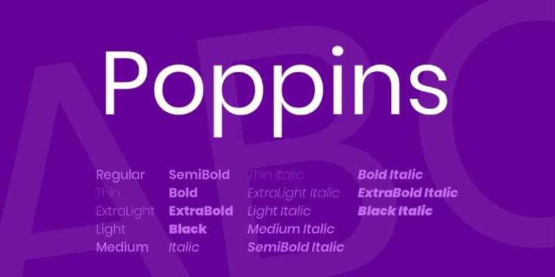
Poppins is a geometric sans-serif typeface designed by Jonny Pinhorn and Ninad Kale at the Indian Type Foundry, released in 2014 via Google Fonts. It delivers a structured, modern look across heading and UI-style slide content.
Poppins suits modern tech and startup presentations because its monolinear strokes and circular letterforms produce even visual weight across all 18 available styles, from Thin to ExtraBold with italics. Poppins consistently ranks in the top 10 most popular families on Google Fonts by weekly view count.
What makes Poppins suitable for Google Slides?
Poppins has a tall x-height and open apertures that improve legibility at medium projected sizes. Its circular geometric forms scale cleanly from 12pt body text to 72pt display headings without stroke degradation. It also supports both Latin and Devanagari scripts, making it useful for multilingual presentations.
Key attributes:
| Attribute | Value |
| Classification | Geometric sans-serif |
| Designer | Jonny Pinhorn / Ninad Kale (Indian Type Foundry), 2014 |
| Weight range | Thin 100 to ExtraBold 800 (18 styles including italics) |
| Variable font | No |
| Recommended sizes | 14pt+ body; 28pt+ headings |
| License | OFL (free commercial use) |
| Available on | Google Fonts, Font Squirrel, Typekit |
| Price | Free |
How does Poppins perform in Google Slides presentations?
Poppins renders with high visual consistency across slides because its monolinear strokes avoid the thin/thick contrast that causes rendering problems on lower-quality projectors. The SemiBold 600 weight reads clearly as a subheading without appearing too heavy. Bold 700 produces strong title impact on both light and dark slide backgrounds.
What are the best pairings for Poppins in Google Slides?
Poppins pairs with Merriweather for contrast between rounded geometric headings and a sturdy screen-optimized serif body, a combination that works for educational and research presentations. It pairs with Open Sans in a sans/sans combination when a clean, neutral body is needed for dense bullet-point slides.
What are the limitations of Poppins for Google Slides?
Poppins is not a variable font, so each weight requires a separate file load. At body sizes below 12pt, the circular letterforms lose some distinctiveness compared to humanist alternatives with larger counters. No condensed variant exists, limiting its usefulness on narrow-column data slides.
Poppins – Recommended Use Cases Within Google Slides
- Best for: Tech, startup, and product decks; heading hierarchy; title slides
- Avoid for: Dense body copy at small sizes; narrow text columns
- Optimal weight: Regular 400 body; SemiBold 600 subheads; Bold 700 titles
- Optimal size range: 14pt–18pt body; 30pt–56pt headings
—
Playfair Display

Playfair Display is a transitional serif font designed by Claus Eggers Sørensen and released in 2011. It delivers high-contrast typographic authority for presentation headings and title slides.
Playfair Display works best for editorial, academic, and premium brand presentations because its strong thick-thin stroke contrast creates immediate visual hierarchy when used at display sizes (28pt+). Playfair Display 2.0 (2022) added variable font axes for Weight, Width, and Optical Size, expanding its flexibility in slide design.
What makes Playfair Display suitable for Google Slides?
Playfair Display has open counters and a large x-height that maintain readability at projected heading sizes. Its strong serifs register clearly even on lower-resolution projectors. The Black weight variant produces bold title-slide impact without requiring weight adjustments in font settings.
Key attributes:
| Attribute | Value |
| Classification | Transitional serif |
| Designer | Claus Eggers Sørensen, 2011 |
| Weight range | Regular to Black (v2: variable weight axis) |
| Variable font | Yes (v2.0+: Weight, Width, Optical Size axes) |
| Optical sizes | Yes: Needlepoint, Hairline, Titling, Display, Headline, Trumpet |
| Recommended sizes | 28pt+ for headings; avoid below 18pt |
| License | OFL (free commercial use) |
| Available on | Google Fonts, Adobe Fonts, Font Squirrel |
| Price | Free |
How does Playfair Display perform in Google Slides presentations?
At heading and title sizes (28pt–72pt), Playfair Display’s high-contrast strokes create strong visual impact. At body sizes below 18pt, the delicate hairline strokes thin significantly and reduce legibility, especially on projectors with lower contrast ratios. The italic variant is particularly strong for pull quotes and highlighted statements on content slides.
What are the best pairings for Playfair Display in Google Slides?
Playfair Display pairs with Lato for a classic serif-heading/sans-body combination that suits editorial and research presentations. It pairs with Source Sans Pro when a UI-oriented, neutral body font is needed for tech or product presentations. The Lato combination is standard editorial practice; Source Sans Pro is a cleaner, more minimal approach.
What are the limitations of Playfair Display for Google Slides?
Playfair Display is unsuitable for body text in slides due to hairline strokes that render poorly below 18pt on projected displays. It has limited weight range in the static version (Regular, Bold, Black), restricting intermediate hierarchy levels without switching to the variable version.
Playfair Display – Recommended Use Cases Within Google Slides
- Best for: Title slides, section header slides, pull quotes, premium brand decks
- Avoid for: Body text, bullet lists, data-heavy slides
- Optimal weight: Bold for headings; Regular italic for pull quotes
- Optimal size range: 28pt minimum; 36pt–72pt for title slides
—
Source Sans Pro
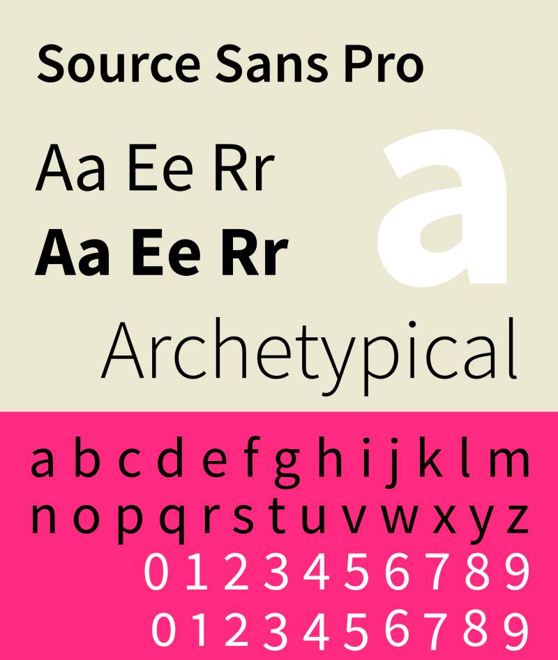
Source Sans Pro is a humanist sans-serif typeface designed by Paul D. Hunt and released by Adobe in 2012 as its first open-source typeface, available via Google Fonts. It handles body text and content-heavy slides where reading comfort at medium sizes matters most.
Source Sans Pro suits text-heavy presentation slides because its large x-height and wide counter spacing reduce visual density in longer passages, making blocks of bullet text less fatiguing to read from a distance. Adobe designed it specifically for UI and body text rendering on screens.
What makes Source Sans Pro suitable for Google Slides?
Source Sans Pro supports 6 weights from ExtraLight 200 to Black 900, each with matching italics. Its wide letter-spacing default prevents crowding in dense slide content without requiring manual tracking adjustments. The ExtraLight and Light weights handle large-size decorative text on title slides, while Regular and SemiBold cover functional body and subheading use.
Key attributes:
| Attribute | Value |
| Classification | Humanist sans-serif |
| Designer | Paul D. Hunt (Adobe), 2012 |
| Weight range | ExtraLight 200 to Black 900 (6 weights + italics) |
| Variable font | No (static weights on Google Fonts) |
| Recommended sizes | 12pt–18pt body; 24pt+ headings |
| License | OFL (free commercial use) |
| Available on | Google Fonts, Adobe Fonts |
| Price | Free |
How does Source Sans Pro perform in Google Slides presentations?
Source Sans Pro renders clearly across both body sizes and heading sizes due to its wide counter spacing and open apertures. It holds legibility at 12pt on screen, which is notable for a sans-serif in Google Slides body copy contexts. BrightCarbon ranks it among the top 10 Google Slides fonts specifically for its body text performance and ability to handle large text blocks without appearing visually intimidating.
What are the best pairings for Source Sans Pro in Google Slides?
Source Sans Pro pairs with Playfair Display to create a strong editorial contrast between a high-contrast serif heading and a clean sans-serif body. It pairs with Montserrat in a geometric-heading/humanist-body combination for tech startup and product decks.
What are the limitations of Source Sans Pro for Google Slides?
Source Sans Pro has no variable font version on Google Fonts, requiring separate weight files for each style used. Its personality is intentionally neutral, making it a weak choice for presentations where typeface character is part of brand expression.
Source Sans Pro – Recommended Use Cases Within Google Slides
- Best for: Body copy, bullet lists, data-heavy slides with text callouts
- Avoid for: Title-only slides or brand presentations needing visual distinction
- Optimal weight: Regular 400 body; SemiBold 600 for subheads
- Optimal size range: 12pt–18pt body; 24pt–36pt headings
—
Merriweather
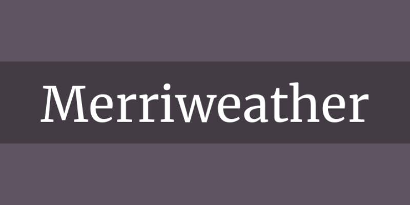
Merriweather is a serif typeface designed by Eben Sorkin, released by Sorkin Type via Google Fonts. It was built specifically for screen readability, targeting body copy legibility at digital display sizes.
Merriweather works best for research, academic, and long-form content slides because its large x-height and strong slab-like serifs maintain character definition at sizes as low as 11pt on screen. It is available in 14 styles including a variable version, which places it among the more versatile serif options in the Google Fonts library.
What makes Merriweather suitable for Google Slides?
Merriweather’s sturdy stroke weight prevents the hairline serif degradation that affects thinner typefaces like Playfair Display at smaller projected sizes. Its open counters and wide letter-spacing default reduce character collision in dense text blocks. The Bold weight registers clearly at 20pt+ for subheadings, making it functional as a single-family solution for slides requiring extensive body text.
Key attributes:
| Attribute | Value |
| Classification | Serif (screen-optimized) |
| Designer | Eben Sorkin (Sorkin Type) |
| Weight range | Light 300 to Black 900 (variable) |
| Variable font | Yes |
| Recommended sizes | 11pt+ body; 24pt+ headings |
| License | OFL (free commercial use) |
| Available on | Google Fonts |
| Price | Free |
How does Merriweather perform in Google Slides presentations?
Merriweather was designed from the ground up for screen rendering, which translates directly to projector performance. Its robust stroke weight survives lower-contrast projection environments where thinner serifs become illegible. The variable version allows fine-tuned weight adjustments for different slide hierarchies without loading multiple font files.
What are the best pairings for Merriweather in Google Slides?
Merriweather pairs with Lato for a classic serif-body/sans-heading inversion that suits professional and editorial presentations. It pairs with Montserrat when bold geometric headings need a grounded, readable serif body to balance visual weight across slides.
What are the limitations of Merriweather for Google Slides?
Merriweather’s sturdy stroke design adds visual weight to body text, which can make content-heavy slides feel dense if line spacing is not increased beyond the default. Its serif character limits its usefulness in minimalist or flat-design presentation styles where sans-serifs are the expected convention.
Merriweather – Recommended Use Cases Within Google Slides
- Best for: Academic, research, and editorial presentations; body copy at 12pt+
- Avoid for: Minimalist design decks; slides with very tight line spacing
- Optimal weight: Regular 400 body; Bold 700 subheadings
- Optimal size range: 12pt–16pt body; 24pt–40pt headings
—
Inter
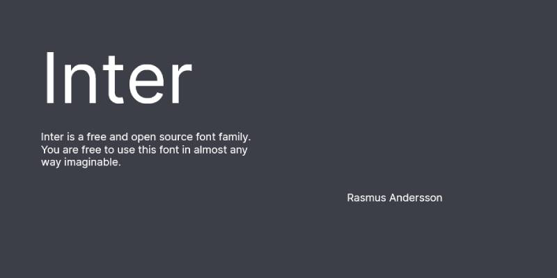
Inter is a humanist sans-serif typeface designed by Rasmus Andersson, available via Google Fonts. It was built specifically for high-legibility rendering in interfaces and digital screens at a wide range of sizes.
Inter works best for data-heavy and dashboard-style presentations because its tall x-height, wide letter-spacing, and 18 available styles (including a variable version) cover every hierarchy level from 10pt data labels to 64pt display headings. Creative Director Leanne Bowers (Creative Cete) calls Inter “neutral enough to fit different businesses, from food or tech to medical industries” while maintaining “soft curves that make slides nice to read” (Visme, 2025).
What makes Inter suitable for Google Slides?
Inter’s open apertures in characters like “a”, “c”, and “e” produce clear character distinction at small projected sizes. Its tabular numeral feature ensures number columns align correctly in data tables on slides. The typeface was also designed with precise vertical metrics to prevent clipping in tight line-height contexts common in slide layouts.
Key attributes:
| Attribute | Value |
| Classification | Humanist sans-serif |
| Designer | Rasmus Andersson |
| Weight range | Thin 100 to ExtraBold 800 (18 styles) |
| Variable font | Yes |
| Recommended sizes | 10pt+ data labels; 14pt+ body; 28pt+ headings |
| License | OFL (open-source, free commercial use) |
| Available on | Google Fonts |
| Price | Free |
How does Inter perform in Google Slides presentations?
Inter maintains high legibility across the full size range used in presentations, from 10pt data annotations to 60pt title text. Its tabular figures prevent number misalignment in financial or analytics slides. The variable font axis allows precise weight control, enabling a single font file to handle every hierarchy level in a slide deck.
What are the best pairings for Inter in Google Slides?
Inter pairs with Playfair Display for editorial contrast between a modern interface sans-serif body and a high-contrast serif heading, which is increasingly used in design-forward pitch decks. It pairs with Libre Baskerville when a warmer, more classical serif heading is needed for academic or professional service presentations.
What are the limitations of Inter for Google Slides?
Inter’s design is optimized for interfaces and may appear too functional or neutral for presentations where expressive typeface character is needed. The Inter Tight variant (designed for contexts without manual letter-spacing control) is not separately available in Google Slides, limiting access to its tighter spacing option.
Inter – Recommended Use Cases Within Google Slides
- Best for: Data slides, financial decks, analytics presentations, dashboard-style layouts
- Avoid for: Brand presentations requiring strong typographic personality
- Optimal weight: Regular 400 body; Medium 500 subheads; Bold 700 headings
- Optimal size range: 10pt–18pt body/data; 28pt–56pt headings
—
Raleway
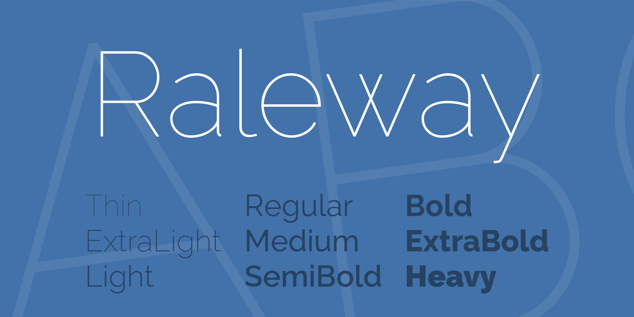
Raleway is a sans-serif typeface originally designed by Matt McInerney as a single thin weight, later expanded by Pablo Impallari and Rodrigo Fuenzalida into an 18-style family, available via Google Fonts. It handles title and heading typography in presentations requiring a distinctive, elegant sans-serif.
Raleway suits creative, lifestyle, and luxury brand presentations because its distinctive letterforms (particularly the unique “w”) and thin-to-bold weight range create strong visual differentiation in headings and title slides. Raleway is a variable font, enabling smooth weight interpolation across all 18 styles.
What makes Raleway suitable for Google Slides?
Raleway’s thin weights produce elegant, airy display text on title slides, while its Bold and ExtraBold weights create high-impact headings. The distinctive letterform design provides visual personality that generic sans-serifs like Open Sans or Roboto lack. Its wide default letter-spacing adds an open, premium feel to heading text at 28pt+.
Key attributes:
| Attribute | Value |
| Classification | Sans-serif (geometric influences) |
| Designer | Matt McInerney; expanded by Pablo Impallari and Rodrigo Fuenzalida |
| Weight range | Thin 100 to Black 900 (18 styles) |
| Variable font | Yes |
| Recommended sizes | 18pt+ for display; avoid below 16pt for body |
| License | OFL (free commercial use) |
| Available on | Google Fonts |
| Price | Free |
How does Raleway perform in Google Slides presentations?
Raleway’s thin weights are nearly unreadable below 18pt on projected displays, which is a real constraint for body copy. At display sizes (24pt+), the wide apertures and distinctive letterforms hold well under projection. Regular 400 and Medium 500 weights are usable for larger body text (18pt+), but the typeface is genuinely better kept to headings and title slides.
What are the best pairings for Raleway in Google Slides?
Raleway pairs with Merriweather for a contrast between a distinctive elegant sans-serif heading and a sturdy screen-optimized serif body, which works for lifestyle and editorial presentations. It pairs with Open Sans in a sans/sans combination where Raleway handles headings and Open Sans manages body copy without competing.
What are the limitations of Raleway for Google Slides?
Raleway’s thin and light weights (100–300) are not suitable for body text at standard slide body sizes, rendering them nearly invisible at under 18pt on projection. Its distinctive style limits its versatility across different industry contexts; it reads as “fashion” or “lifestyle” and can feel out of place in conservative corporate or technical presentations.
Raleway – Recommended Use Cases Within Google Slides
- Best for: Title slides, section dividers, creative and lifestyle brand decks
- Avoid for: Body text below 18pt; conservative corporate or technical presentations
- Optimal weight: Regular 400 or Medium 500 for larger body; Bold 700 for headings
- Optimal size range: 24pt+ headings; minimum 18pt for any body use
—
Quick Comparison: All 10 Fonts At a Glance
| Font | Classification | Best Use in Slides | Variable Font |
| Roboto | Neo-grotesque sans | Body copy, corporate decks | Yes |
| Montserrat | Geometric sans | Title slides, bold headings | Yes |
| Open Sans | Humanist sans | Body text, neutral layouts | Yes |
| Lato | Humanist sans | Business presentations | No |
| Poppins | Geometric sans | Tech/startup decks, headings | No |
| Playfair Display | Transitional serif | Premium headings, editorial | Yes (v2) |
| Source Sans Pro | Humanist sans | Dense body copy, content slides | No |
| Merriweather | Screen serif | Academic, long-form text slides | Yes |
| Inter | Humanist sans | Data slides, dashboard decks | Yes |
| Raleway | Sans-serif | Creative/lifestyle title slides | Yes |
If you’re pairing any of these, the most reliable approach is a serif vs sans-serif combination. One handles headings, the other handles body text. That contrast does most of the hierarchy work for you without requiring manual size and weight adjustments on every slide.
For anyone newer to pairing fonts in presentations, sticking to two typefaces maximum is almost always the right call. Three gets complicated fast, especially across a 30-slide deck.
What Makes a Font Work in Google Slides?
Three structural attributes determine whether a font survives in a presentation context: x-height, weight range, and screen rendering behavior.
Everything else is secondary to those three.
| Attribute | What It Affects | Priority Level |
| X-height | Legibility at projected distance | Critical |
| Weight range | Hierarchy within a single font family | High |
| Screen rendering | Clarity on projectors and monitors | High |
| Letter-spacing default | Crowding in dense slide content | Medium |
Research published at the Society for the Scientific Study of Reading (2024) confirms that x-height is a measurable independent variable in letter recognition. Fonts with higher x-heights produce faster and more accurate character recall, directly improving presentation readability at projected distances.
Projected presentations operate at a fundamentally different resolution than web or print. A room with 30-foot viewing distance requires body text rendered at approximately 58pt to maintain legibility, based on Extron’s display legibility guidelines. Most slide designers apply 14pt–18pt body text, which is adequate only for screens viewed within 10 feet.
Google Slides pulls exclusively from the Google Fonts library. As of May 2025, that library contains 1,826 font families, including 744 sans-serif and 357 serif options (Photutorial, 2025). No local or third-party font files can be uploaded directly.
The licensing advantage is real. Every Google Font ships under the SIL Open Font License or Apache License 2.0, meaning unrestricted use in commercial presentations without tracking or per-seat fees.
Variable fonts offer a practical edge in slide design. A single variable font file covers all weight interpolations, enabling precise hierarchy adjustments (title at 750 weight, subhead at 520, body at 400) without loading separate files for each style.
—
What Is the Difference Between Sans-Serif and Serif Fonts in Presentations?
85% of fonts used on websites are sans-serif, and the same dominance applies to professional slide design, according to Dribbble typography data.
But that number doesn’t mean serif fonts are wrong for slides. It means they require more deliberate application.
| Font Type | Strengths in Slides | Weakness in Slides |
| Sans-serif | Clean at any size, projector-safe, body copy | Less personality, risk of blandness |
| Serif | Authority, editorial weight, heading impact | Hairline strokes degrade below 18pt on projectors |
When does a sans-serif font outperform a serif in presentations?
Sans-serif fonts dominate body copy in slides for a structural reason, not an aesthetic one.
Without decorative stroke contrast, letters like “i”, “l”, and “1” remain distinct even at 12pt under low-contrast projection. Roboto, Open Sans, and Lato all maintain open apertures that prevent character confusion at small projected sizes.
93% of paragraph text on the web uses sans-serif fonts, and slide body copy follows the same logic (Dribbble). The convention is rooted in rendering performance, not trend.
Humanist sans-serifs (Lato, Open Sans) perform better than geometric sans-serifs (Montserrat, Poppins) for long body copy, because their letterforms are more varied and easier for the eye to distinguish in sequence.
When does a serif font work in a Google Slides presentation?
Serif fonts serve one specific slide context well: large-scale headings above 28pt.
At that size, the high stroke contrast of Playfair Display or Merriweather registers as authority rather than visual noise. The thick-thin variation catches the eye on title slides and section dividers in a way that uniform-weight sans-serifs cannot replicate.
Below 18pt on a projector, serif hairlines thin to the point of disappearing. Research on distance legibility (Academia.edu review of font design studies) confirms that for optimal distance reading, letterforms benefit from open counters and large x-height, both of which favor the screen-optimized serifs (Merriweather) over the high-contrast ones (Playfair Display).
The practical rule: use a serif for headings only, pair it with a sans-serif body, and never apply a thin or light weight serif below 20pt.
—
How Do Font Pairings Work in Google Slides?
A font pairing in slides has one job: create visual hierarchy without requiring size differences alone to communicate it.
Two fonts maximum. One for headings, one for body. Three fonts in a single deck almost always produces visual noise that competes with slide content.
Which font combinations work for professional presentations?
Contrast drives every effective pairing. The contrast can come from classification (serif vs. sans-serif), stroke weight, or x-height difference. It cannot come from two fonts that share the same visual DNA.
- Playfair Display + Lato: High-contrast serif heading over a warm humanist sans body. Standard editorial practice. Suits finance, consulting, and research decks.
- Montserrat + Open Sans: Geometric heading over neutral humanist body. The x-height difference creates clear hierarchy. Most common in corporate and tech presentations.
- Inter + Merriweather: Interface-optimized sans for body, screen-safe serif for headings. Effective for academic and data-heavy decks where credibility signals matter.
Google’s Material Design system uses Roboto paired with Roboto Slab for exactly this reason: same design DNA, different classification, clean hierarchy without font-switching cognitive load.
To apply a pair consistently across all slides, set it in Slide Master (View > Theme Builder). Any font change in Slide Master propagates to every layout in the deck automatically, preventing per-slide inconsistency.
The Monotype 2024 Font Use Survey found that 83% of designers consider typography critical to brand identity. In presentations, that extends directly to how an audience perceives the presenter’s authority before the first word is spoken.
Which font combinations work for creative presentations?
Creative pairings prioritize distinction over neutrality, while keeping body copy legible.
Structure first: even expressive heading choices need a readable body companion. Raleway Light at 48pt makes a striking title slide. Merriweather Regular at 16pt handles the body copy without competing.
Combinations that work for creative decks:
- Raleway (heading) + Merriweather (body): elegant thin strokes above a sturdy screen serif
- Poppins Bold (heading) + Source Sans Pro (body): circular geometry above a neutral utility sans
Avoid: pairing two expressive or display-style fonts. Raleway + Playfair Display creates competition at heading sizes, not contrast.
For pairing fonts in any context, the principle holds: one font sets the personality, the other stays out of the way.
—
How Do Font Size and Weight Affect Readability in Google Slides?
Font choice matters less than font size at projection distance. A well-chosen typeface at 12pt is less readable than Arial at 20pt on any projector.
Optimizing spacing can make smaller characters up to 20% easier to read compared to default letter-spacing settings, according to legibility research by Arditi (2004) cited in the International Journal of Research and Innovation in Social Science.
What size should slide text be for maximum legibility?
Recommended sizes by slide element:
- Slide title: 32pt minimum, 40pt–56pt preferred
- Section subhead: 24pt–32pt
- Body copy: 18pt preferred, 14pt absolute minimum
- Data labels and captions: 10pt–12pt (only for monitor-viewed slides)
- Footnotes: 9pt–10pt, only acceptable for shared-screen or PDF output
Presentationcorner research on presentation font psychology notes that font choice influences perceived credibility by up to 35% depending on context. Size is the delivery mechanism for that effect. A credible typeface at too-small a size reads as an oversight.
How does font weight create hierarchy in slide typography?
Weight lets you build hierarchy within a single font family, reducing the need to switch fonts entirely.
Effective weight distribution in a single-family slide deck:
- Thin 100 or Light 300: large-scale decorative title text on minimalist slides
- Regular 400: body copy and captions
- Medium 500 or SemiBold 600: subheadings and callout labels
- Bold 700: slide headings and data highlights
- Black 900: single-word or short-phrase impact statements
Designers prefer larger font sizes over heavier weights by a ratio of 94% vs. 82%, according to Toner Buzz 2024 font design survey data. In slides, this translates to increasing point size before increasing weight when you want to signal importance.
For font spacing in all-caps heading text, increase letter-spacing by 5%–10% above the default. All-caps letterforms lose their word-shape cues and require wider tracking to remain readable at projected scale.
—
How to Add Custom Fonts to Google Slides
Google Slides offers access to the full Google Fonts library through the built-in font picker. Most users don’t know about it because the default dropdown shows only a limited set.
How to access the Google Fonts library in Google Slides
The process takes under 60 seconds:
- Click the font name dropdown in the toolbar
- Select More fonts at the top of the dropdown
- Browse, search by name, or filter by classification (Serif, Sans Serif, Display, Handwriting, Monospace)
- Click any font to add it to your personal font list
- Click OK to confirm
Added fonts persist in your Google account’s font list across sessions and devices. They appear in the font dropdown immediately after being added.
As of May 2025, Google Fonts contains 1,826 font families, all accessible through this panel (Photutorial, 2025). The default dropdown shows a small fraction of that.
Does the Extensis Fonts add-on still work?
Extensis Fonts has accumulated over 9 million installs from the Google Workspace Marketplace. Its reliability has been inconsistent.
Digital Trends reported in 2024 that Extensis Fonts failed to install across two different browsers during testing, and the publication stopped recommending it as a result.
The add-on provides a sidebar panel for browsing Google Fonts by style and popularity. It does not support uploading custom or third-party fonts. For most users, the native “More fonts” panel accomplishes the same result without the add-on overhead.
For a full guide, see how to add fonts to Google Slides with step-by-step instructions.
What are the actual limits of Google Slides font support?
What Google Slides cannot do:
- Upload local font files (.ttf, .otf, .woff) directly
- Use fonts from Typekit, Adobe Fonts, or other third-party libraries
- Guarantee third-party font rendering when files are shared across platforms
Cross-platform warning: Google Slides files exported to PowerPoint format substitute fonts not available in PowerPoint’s library. A presentation built on Poppins may render in Calibri when opened in Microsoft Office. For cross-platform decks, stick to fonts that exist in both the Google Fonts library and Microsoft’s default font set (Arial, Georgia, Tahoma, Trebuchet MS).
—
How Does Font Choice Affect Presentation Design Across Different Use Cases?
Three-quarters of Fortune 500 companies use sans-serif fonts in their logos, and the same convention extends to their internal and external presentation design (Toner Buzz, 2024).
But convention differs by industry and audience. The right font for a McKinsey client deck is not the right font for a product launch or a university lecture.
What fonts work best for corporate and business presentations?
Roboto, Lato, and Open Sans dominate corporate presentation typography for the same reason they dominate the web: proven rendering, wide weight range, and no visual personality that could distract from content.
Lato has been downloaded over 10 million times from Google Fonts and is used on 6.8 million websites (fontaxis.com). Its corporate origin (originally designed for a Polish bank in 2010) shapes its character directly: readable, stable, and professional without signaling a specific industry.
Standard weight configuration for business decks:
- Heading: Bold 700 at 32pt–44pt
- Subheading: SemiBold 600 at 24pt
- Body: Regular 400 at 16pt–18pt
What fonts work best for academic and research presentations?
Academic presentations require fonts that signal rigor without sacrificing legibility on dense, text-heavy slides.
Merriweather performs here because it was designed specifically for screen readability. Its sturdy stroke weight survives lower-contrast projection environments where thin serifs become invisible. It has over 10 billion total views on Google Fonts, reflecting how broadly it serves screen-reading contexts (UMA Technology, 2024).
Playfair Display suits academic title slides and chapter dividers, where its high-contrast strokes read as scholarly weight. Keep it above 28pt. Below that, use Merriweather or a screen-optimized sans for all slide body copy.
What fonts work best for tech, startup, and product presentations?
Poppins and Inter both emerged from interface design contexts, which is exactly why they work for product and tech decks.
Inter was built by Rasmus Andersson for high-legibility interface rendering. Its tabular numeral feature aligns number columns in financial and analytics slides without manual kerning. Creative Director Leanne Bowers of Creative Cete describes it as neutral enough for any industry “from food or tech to medical” while maintaining soft curves that make slides comfortable to read (Visme, 2025).
Poppins ranks consistently in the top 10 Google Fonts by weekly view count, with over 7 billion total views (UMA Technology, 2024). Its perfectly circular letterforms and monolinear strokes render cleanly on the wide variety of screens encountered in remote and hybrid presentations.
What fonts work best for creative and lifestyle presentations?
Raleway is the answer. With one caveat.
Its thin weights (100–300) disappear on any projector below 24pt. Stick to Regular 400 or Medium 500 for any text that needs to be readable, and reserve the dramatic thin weights for large-format title slides only.
Raleway pairs with Merriweather for a distinctive heading over a grounded screen-safe body. For anyone comparing Google Slides presentation design with fonts for PowerPoint presentations, the same pairing logic applies across both platforms. The structural principles are identical even if the font delivery method differs.
Font psychology research (Whitepage Studio, 2026) confirms that modern sans-serif fonts signal innovation and efficiency, while traditional serif fonts convey stability and authority. Raleway occupies a distinct third position: elegant restraint, best suited for lifestyle, fashion, and creative agency audiences who read thin-weight typography as a deliberate aesthetic choice rather than a legibility oversight.
Understanding font psychology is what separates presenters who choose fonts by feel from those who choose them by intent.
FAQ on The Best Fonts For Google Slides
What is the best font for Google Slides?
Roboto is the most reliable all-purpose choice. It handles body copy and headings equally well, renders cleanly on projectors, and comes in enough weights to build a complete typographic hierarchy without switching to a second typeface.
What font size should I use in Google Slides?
Use at least 18pt for body text and 32pt or higher for slide titles. Anything smaller becomes difficult to read from more than 10 feet away, which is a common mistake in otherwise well-designed presentation decks.
Can I use serif fonts in Google Slides presentations?
Yes, but keep them above 28pt. Playfair Display and Merriweather work well for headings and title slides. Below 18pt, serif hairlines thin out under projection and reduce legibility significantly, especially in lower-contrast room environments.
How many fonts should I use in a single Google Slides deck?
Two. One for headings, one for body text. Three fonts in a single presentation almost always creates visual competition that pulls attention away from your content rather than supporting it.
What is the best font pairing for Google Slides?
Montserrat paired with Open Sans is the most common professional combination. For a more editorial tone, Playfair Display with Lato works well. Both pairings follow the core contrast principle: one expressive font, one neutral one.
How do I add more fonts to Google Slides?
Click the font dropdown in the toolbar, then select More fonts at the top. This opens the full Google Fonts library. Browse by classification, search by name, click to add, and the font appears in your dropdown immediately.
Can I upload custom fonts to Google Slides?
No. Google Slides does not support uploading local font files. You are limited to the Google Fonts library. If you need a specific brand font not available there, the workaround is to export text as an image and insert it into the slide.
Which Google Slides fonts work best for business presentations?
Roboto, Lato, and Open Sans are the standard choices for corporate slide decks. All three are humanist sans-serifs with wide weight ranges, clean screen rendering, and a neutral professional tone that suits finance, consulting, and internal reporting contexts.
What is the most readable font for Google Slides body text?
Open Sans and Source Sans Pro are the strongest options for dense body copy. Both have large x-heights, wide letter-spacing defaults, and open apertures that keep characters distinct at small projected sizes, even in lower-contrast projection environments.
Do Google Slides fonts transfer correctly to PowerPoint?
Not always. Fonts unavailable in Microsoft Office get substituted automatically, often replacing Poppins or Inter with Calibri. For cross-platform decks, stick to fonts available in both ecosystems, such as Arial, Georgia, or Trebuchet MS, to avoid layout shifts.
Conclusion
This conclusion is for an article presenting the best fonts for Google Slides, and the core takeaway is simple: presentation typography is a functional decision, not a decorative one.
Roboto handles corporate decks. Playfair Display commands a title slide. Poppins fits product presentations. Inter aligns number columns without manual kerning.
Each typeface in this guide serves a specific use case, and knowing which one to reach for is what separates a readable slide deck from a forgettable one.
Stick to two fonts per deck. Prioritize x-height and weight range over visual appeal. Test at projected scale before the room fills up.
The Google Fonts library gives you everything you need at no cost. Use it with intention.

Renowned for his expertise in logo design and visual branding, Bogdan has developed a multitude of logos for various clients.
His skills extend to creating posters, vector illustrations, business cards, and brochures. Additionally, Bogdan's UI kits were featured on marketplaces like Visual Hierarchy and UI8.
He also wrote in the past years on sites like Design Your Way, WebDesignerDepot, WPDean, Designmodo, Speckyboy, Slider Revolution, and more.
- The Windsurf Logo History, Colors, Font, And Meaning - 10 October 2026
- How to Remove Background From Product Photos (No Photoshop) - 10 October 2026
- How Designers can Build a Stronger Online Creative Identity - 9 October 2026

Bogdan Sandu is a seasoned designer who has been designing websites since 2008. Renowned for his expertise in logo design and visual branding, Bogdan has developed a multitude of logos for various clients. His skills extend to creating posters, vector illustrations, business cards, and brochures. Additionally, Bogdan's UI kits were featured on marketplaces like Visual Hierarchy and UI8. He also wrote in the past years on sites like Design Your Way, WebDesignerDepot, WPDean, Designmodo, Speckyboy, Slider Revolution, and more.
You Might Also Like