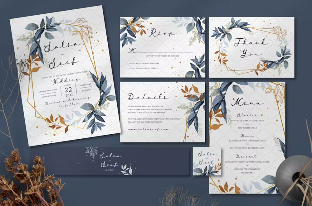
The font on your invitation says something before a single word is read.
Choosing the best fonts for invitations is one of those decisions that looks simple until you’re staring at 400 options on Google Fonts at midnight. Script or serif? Elegant or modern? Legible at 10pt or just beautiful at 72px?
This guide cuts through that. You’ll find the top 10 typefaces used in wedding invitation and event stationery design, with honest detail on weight ranges, print performance, pairing logic, and licensing.
No filler. No vague “timeless elegance” descriptions.
Just the structural facts that help you pick the right calligraphy font, serif, or sans-serif for the occasion, the print method, and the card.
The Best Fonts For Invitations
Picking the right font for an invitation isn’t just a style choice. It sets the tone before a guest reads a single word. A calligraphic script signals a black-tie affair. A clean geometric sans-serif font says modern and minimal.
Most well-designed invitations use two typefaces: one expressive font for names and one neutral font for the supporting details. Getting that pairing right is what separates a polished invitation from a generic one.
Below are ten of the best fonts for wedding invitations, party cards, and formal stationery, with structural details so you can make an informed choice.
—
Playfair Display

Playfair Display is a transitional serif typeface designed by Claus Eggers Sørensen in 2011, available through Google Fonts and Adobe Fonts. It delivers high-contrast strokes with short descenders suited to formal display text at large sizes.
Playfair Display works best for formal wedding invitations and upscale event stationery because its high stroke contrast and large x-height create strong visual hierarchy at headline sizes. It has been featured regularly in Vogue and other fashion publications, which confirms its standing in premium print design.
—
What makes Playfair Display suitable for invitations?
Playfair Display has a high x-height and short descenders, which produce a compact, uniform look that reads well in tight print layouts. Its high stroke contrast, thick downstrokes against hairline upstrokes, references 18th-century pointed-pen calligraphy and reads as formal without being stiff. Updated in 2022 to a variable font format, it now supports Weight and Width axes, giving designers more control over how the face renders across different card sizes.
Key attributes:
| Attribute | Value |
| Classification | Transitional serif |
| Designer | Claus Eggers Sørensen, 2011 |
| Weight range | Regular 400 to Black 900 (variable) |
| Variable font | Yes (Weight + Width axes, v2.0+) |
| Optical sizes | Yes: Needlepoint, Hairline, Titling, Display, Headline, Trumpet |
| Recommended sizes | 24px+ for names; 12px–16px for body details |
| License | OFL (free for personal and commercial use) |
| Available on | Google Fonts, Adobe Fonts |
| Price | Free |
—
How does Playfair Display perform on printed invitations?
At 24px and above, Playfair Display renders with strong stroke differentiation on both matte and glossy card stock. Below 12px, the delicate hairlines can fill in on lower-quality printers, reducing legibility.
The italic variant carries added flourish from its curved terminals, which makes it well suited for accent phrases like “reception to follow” or “& together with their families.”
—
What are the best pairings for Playfair Display in invitations?
Playfair Display pairs with Lato for strong contrast between a decorative serif heading and a neutral body, and with Montserrat when a more geometric, contemporary feel is needed for supporting text. The Playfair Display + Lato combination is standard practice for editorial-style wedding stationery. You can also explore the Playfair Display font pairing guide for more options.
—
What are the limitations of Playfair Display for invitations?
The hairline strokes degrade at sizes below 12px on low-DPI printers, which makes it unsuitable for fine-print details on budget card stock. It is not recommended for extended body copy at small sizes on digital invitations.
—
Playfair Display – Recommended Use Cases Within Invitations
- Best for: Couple names, event headings, and formal wedding stationery at 24px+
- Avoid for: Body text below 14px; budget inkjet-printed cards
- Optimal weight: Regular 400 for accents; Bold 700 for primary names
- Optimal size range: 24px–72px for display; 14px–18px for secondary text
—
Great Vibes
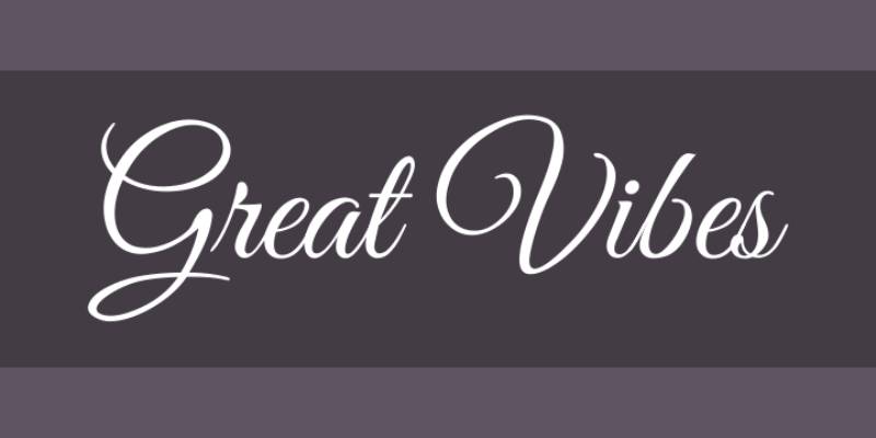
Great Vibes is a calligraphic script font designed by Robert E. Leuschke (TypeSETit) in 2012, released under the SIL Open Font License through Google Fonts. It delivers connected, flowing letterforms with over 2,000 glyphs, including smooth ligatures and swash capitals.
Great Vibes suits wedding invitation headings and couple-name typography because its generous ascenders and elegant descenders replicate formal pen calligraphy at large display sizes. Designers at Bliss & Bone and similar wedding stationery studios regularly list it among their most-used heading scripts.
—
What makes Great Vibes suitable for invitations?
Great Vibes uses high stroke contrast with thick downstrokes and hairline upstrokes, consistent with pointed-pen calligraphy traditions. Its glyph count exceeds 2,000, which provides ligature and alternate character options that reduce repetitive letterform collisions in names and phrases. A 2024 update added Sub-Saharan Latin and Cyrillic support, expanding its use for multilingual stationery.
Key attributes:
| Attribute | Value |
| Classification | Calligraphic script |
| Designer | Robert E. Leuschke (TypeSETit), 2012 |
| Weight range | Regular 400 only |
| Variable font | No |
| Recommended sizes | 36px+ for names; not suitable below 18px |
| Letter-spacing default | 0 (tight natural connections) |
| License | OFL (free for personal and commercial use) |
| Available on | Google Fonts, Adobe Fonts |
| Price | Free |
—
How does Great Vibes perform on printed invitations?
Great Vibes renders well on textured cotton card stock at 36px and above, where its hairline connections remain visible. At smaller sizes, the thin connecting strokes between letters collapse on standard laser printers, making the text appear broken.
It performs best as a single-line name or short-phrase display element, not in multi-line blocks.
—
What are the best pairings for Great Vibes in invitations?
Great Vibes pairs with serif fonts like Cormorant Garamond for a fully formal look, keeping the script as the display element and the serif as the body. It pairs with Josefin Sans when a more modern contrast is needed, letting the calligraphic script stand against a clean geometric body.
—
What are the limitations of Great Vibes for invitations?
Great Vibes is available in a single weight only, offering no variation for hierarchy within the script itself. Its ornate letterforms are not legible at sizes below 18px on screen or below 24px in print.
—
Great Vibes – Recommended Use Cases Within Invitations
- Best for: Couple names, single-line display headlines on wedding stationery
- Avoid for: Body copy, RSVP fine print, digital invitations at small screen sizes
- Optimal weight: Regular 400 (only option)
- Optimal size range: 36px–96px for display use
—
Cormorant Garamond
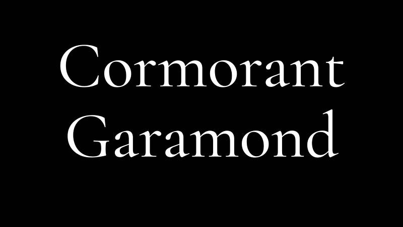
Cormorant Garamond is a display serif typeface designed by Christian Thalmann (Catharsis Fonts) in 2015, available through Google Fonts and Adobe Fonts under the SIL Open Font License. It delivers high-contrast strokes with tall accents and sharp serifs inspired by Claude Garamont’s 16th-century designs.
Cormorant Garamond works best for luxury invitation stationery because its high stroke contrast and dramatic proportions create strong visual presence at headline sizes, with 5 weights and 9 style variants across 45 font files providing extensive design flexibility.
—
What makes Cormorant Garamond suitable for invitations?
Cormorant Garamond has a moderate x-height with long ascenders and descenders, producing a stately, elongated appearance suited to formal printed stationery. Its small caps, ligatures, and old-style figures, all available as OpenType features, allow typographers to add refinement to guest names and date lines without switching to a second typeface. The Light weight (300) is particularly striking in single-color letterpress printing.
Key attributes:
| Attribute | Value |
| Classification | Display serif (Garamond revival) |
| Designer | Christian Thalmann, 2015 |
| Weight range | Light 300 to Bold 700 (5 weights) |
| Variable font | Yes |
| Recommended sizes | 18pt+ for display; not suitable for body text |
| License | OFL (free for personal and commercial use) |
| Available on | Google Fonts, Adobe Fonts |
| Price | Free |
—
How does Cormorant Garamond perform on printed invitations?
At 18pt and above on quality card stock, Cormorant Garamond’s high-contrast strokes produce a refined, almost engraved appearance well suited to formal and luxury stationery. Below 14pt, the hairline strokes lose definition on standard inkjet or offset printing.
The Cormorant Garamond font pairing options are extensive, which gives designers flexibility across different event styles.
—
What are the best pairings for Cormorant Garamond in invitations?
Cormorant Garamond pairs with Montserrat for a high-contrast combination where the geometric sans-serif carries the fine print cleanly. It pairs with EB Garamond when a consistent historical aesthetic is needed throughout a full invitation suite, using Cormorant for display and EB Garamond for body text.
—
What are the limitations of Cormorant Garamond for invitations?
Its high contrast makes it unsuitable for body text at small sizes, and it should not be used below 14pt in print. The dramatic proportions can look overwrought on casual or informal invitations.
—
Cormorant Garamond – Recommended Use Cases Within Invitations
- Best for: Formal wedding headers, luxury event names, letterpress stationery
- Avoid for: Body copy below 14pt, casual birthday or baby shower invitations
- Optimal weight: Light 300 for elegant display; Medium 500 for secondary headings
- Optimal size range: 18pt–60pt
—
Dancing Script
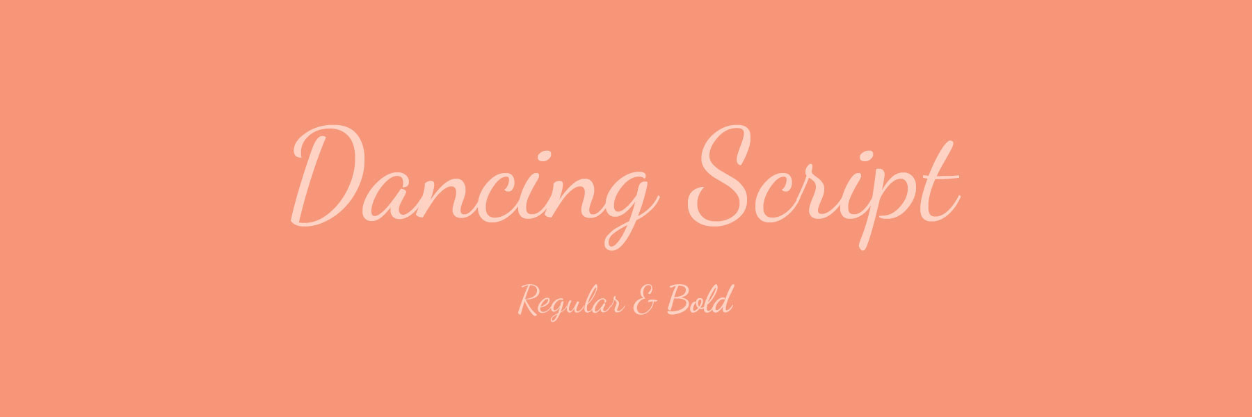
Dancing Script is a casual script typeface designed by Pablo Impallari (Impallari Type), available on Google Fonts under the SIL Open Font License. It features bouncing baseline letterforms with large capitals that dip below the baseline, referencing mid-20th century American casual scripts.
Dancing Script suits informal and semi-formal invitations, including birthday parties, garden weddings, and baby showers, because its variable stroke weight and lively baseline movement read as approachable rather than stiff at display sizes.
—
What makes Dancing Script suitable for invitations?
Dancing Script has moderate stroke contrast with a naturally varied baseline that references handwritten lettering. Its capitals are oversized relative to the lowercase, a structural decision that creates visual energy in single-line name settings. The family supports 4 weights from Regular 400 to Bold 700, enabling basic hierarchy within the script itself.
Key attributes:
| Attribute | Value |
| Classification | Casual script |
| Designer | Pablo Impallari, Impallari Type |
| Weight range | Regular 400 to Bold 700 (4 weights) |
| Variable font | Yes |
| Recommended sizes | 24px+ for names; 16px+ for secondary lines |
| License | OFL (free for personal and commercial use) |
| Available on | Google Fonts |
| Price | Free |
—
How does Dancing Script perform on printed invitations?
Dancing Script prints cleanly at 24px and above on both matte and coated card stock. Its moderate stroke contrast means it holds up better than high-contrast calligraphic scripts on budget printing setups.
It reads less formally than Great Vibes or Tangerine, which makes it a better fit for warm, personal stationery rather than black-tie events.
—
What are the best pairings for Dancing Script in invitations?
Dancing Script pairs with Josefin Sans for a clean contrast between the expressive script and a geometric body typeface, a combination popular in modern wedding stationery. It pairs with Oswald when a slightly bolder, condensed body font is needed for layouts with limited horizontal space.
—
What are the limitations of Dancing Script for invitations?
Dancing Script’s casual character makes it unsuitable for black-tie or strictly formal invitation contexts. Its bouncing baseline can reduce legibility in multi-line settings below 18px.
—
Dancing Script – Recommended Use Cases Within Invitations
- Best for: Birthday party invitations, garden wedding stationery, baby shower cards
- Avoid for: Black-tie event invitations; body text below 16px
- Optimal weight: Regular 400 for names; Bold 700 for event titles
- Optimal size range: 24px–60px for display use
—
Garamond
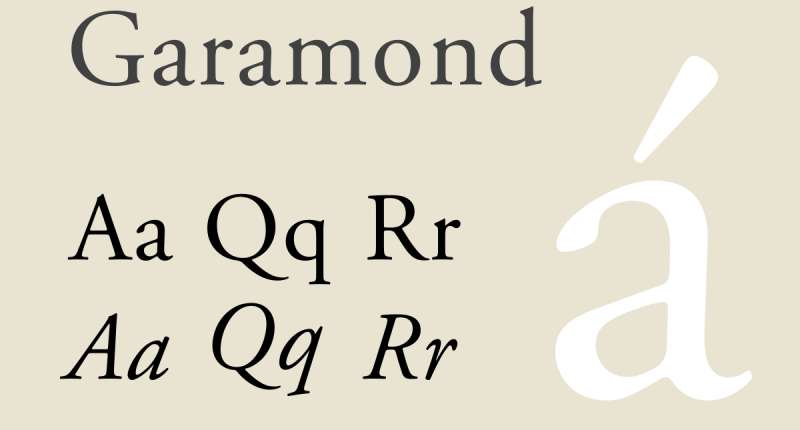
Garamond is an old-style serif typeface with origins in the work of 16th-century Parisian punchcutter Claude Garamont. Multiple digital revivals exist, including EB Garamond (Georg Duffner, 2010) on Google Fonts and Adobe Garamond Pro on Adobe Fonts. It delivers low stroke contrast with small, bracketed serifs optimized for extended text in print.
Garamond works best as a body and supporting text font on formal invitations because its small x-height and gentle stroke variation maintain readability across extended invitation copy, including venue details, RSVP instructions, and dress-code notes.
—
What makes Garamond suitable for invitations?
Garamond’s low stroke contrast and bracketed serifs produce smooth, even texture across blocks of text at 10pt–14pt in print. Its narrow proportions allow more characters per line than most modern serifs, which is practical for invitation copy with full venue addresses and RSVP dates. Adobe Garamond Pro includes expert OpenType features, including small caps and old-style numerals, that are standard expectations in upscale stationery.
Key attributes:
| Attribute | Value |
| Classification | Old-style serif |
| Designer | Claude Garamont (16th c.); EB Garamond by Georg Duffner, 2010 |
| Weight range | Regular 400 to Bold 700 (EB Garamond) |
| Variable font | Yes (EB Garamond) |
| Recommended sizes | 10pt–14pt for body; 18pt+ for headings |
| License | OFL (EB Garamond, free); Commercial (Adobe Garamond Pro) |
| Available on | Google Fonts (EB Garamond), Adobe Fonts |
| Price | Free (EB Garamond); subscription via Adobe Fonts |
—
How does Garamond perform on printed invitations?
Garamond prints with exceptional clarity on quality uncoated paper, where its low stroke contrast shines. On glossy card stock, the delicate serifs can appear overly light without adjusting the print weight.
As a Garamond font pairing choice for supporting text, it consistently outperforms heavier serif options in extended-copy legibility at 10pt–12pt.
—
What are the best pairings for Garamond in invitations?
Garamond pairs with Great Vibes or Tangerine for headline names, letting the script handle display and Garamond carry all body details. It also pairs with Cinzel for a fully serif invitation where the Roman capitals of Cinzel handle major headings and Garamond handles the remaining copy.
—
What are the limitations of Garamond for invitations?
Garamond is a poor choice as a display-only font at headline sizes, where its low contrast can appear weak next to high-contrast script alternatives. EB Garamond’s Bold weight is relatively light compared to commercial versions, which limits its use for emphasis text.
—
Garamond – Recommended Use Cases Within Invitations
- Best for: Formal invitation body copy, RSVP card details, venue and time information
- Avoid for: Primary display headings; glossy card stock without print adjustment
- Optimal weight: Regular 400 for body; Bold 700 for subheadings
- Optimal size range: 10pt–14pt for body; 18pt–28pt for secondary headings
—
Tangerine
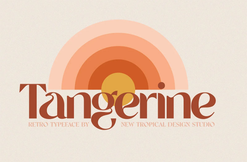
Tangerine is a calligraphic script typeface designed by Toshi Omagari, available through Google Fonts and Adobe Fonts under the SIL Open Font License. It draws from 16th- and 17th-century italic chancery hands, with tall ascenders as its most distinctive structural feature.
Tangerine suits formal invitation headline typography because its tall ascenders and high stroke contrast produce a strong vertical rhythm that reads as classical penmanship at large display sizes.
—
What makes Tangerine suitable for invitations?
Tangerine’s ascenders extend significantly above the cap height, a structural detail borrowed from chancery italic tradition that creates a sense of flowing formality. It comes in Regular and Bold weights, and the Bold variant maintains calligraphic stroke variation while adding presence for larger-format stationery. Standard Latin character coverage applies across both weights.
Key attributes:
| Attribute | Value |
| Classification | Calligraphic script |
| Designer | Toshi Omagari |
| Weight range | Regular 400, Bold 700 |
| Variable font | No |
| Recommended sizes | 36px+ for display; unsuitable below 18px |
| License | OFL (free for personal and commercial use) |
| Available on | Google Fonts, Adobe Fonts |
| Price | Free |
—
How does Tangerine perform on printed invitations?
Tangerine’s high stroke contrast and hairline connections require high-resolution printing (300 dpi minimum) to render correctly. On textured or cotton paper, the hairline strokes can absorb into the paper surface if the ink weight isn’t adjusted.
It performs best as a short display element, one to three words, rather than in multi-line text blocks.
—
What are the best pairings for Tangerine in invitations?
Tangerine pairs with Lora for elegant wedding invitations or formal event posters, using Tangerine for the names and Lora for all supporting text. It pairs with Playfair Display when a fully serif treatment is needed, with Tangerine as the expressive script element and Playfair handling headings.
—
What are the limitations of Tangerine for invitations?
Tangerine is limited to two weights with no variable axis, which restricts hierarchy options within the script. Its ornate letterforms are not legible at sizes below 18px on screen or below 24pt in standard offset printing.
—
Tangerine – Recommended Use Cases Within Invitations
- Best for: Single-line name display on wedding and formal event stationery
- Avoid for: Body text; digital invitations at small screen sizes; budget printing
- Optimal weight: Bold 700 for primary names; Regular 400 for accent phrases
- Optimal size range: 36pt–100pt for display use
—
Cinzel
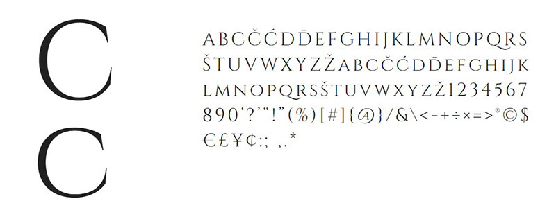
Cinzel is a display serif typeface designed by Natanael Gama, released in 2012 and available on Google Fonts and Adobe Fonts under the SIL Open Font License. It draws from first-century Roman inscriptions on monuments like the Trajan Column, with all-capital letterforms, flared serifs, and high stroke contrast.
Cinzel suits formal and ceremonial invitations because its all-caps structure and Roman proportions deliver strong visual authority at headline sizes, with a large x-height and wide letter spacing that maintain legibility across engraved, embossed, and foil-printed stationery.
—
What makes Cinzel suitable for invitations?
Cinzel is an all-caps typeface, which eliminates mixed-case legibility concerns for event titles and venue names set in capitals. It supports 6 weights from Regular 400 to Black 900, and its variable font format allows precise weight tuning within a single file. Wide apertures and generous letter spacing at default settings produce high legibility even at smaller sizes, unlike most display serifs.
Key attributes:
| Attribute | Value |
| Classification | Display serif (Roman inscription) |
| Designer | Natanael Gama, 2012 |
| Weight range | Regular 400 to Black 900 (6 weights) |
| Variable font | Yes |
| Recommended sizes | 14px+ for labels; 24px+ for headings |
| Letter-spacing default | Wide |
| License | OFL (free for personal and commercial use) |
| Available on | Google Fonts, Adobe Fonts |
| Price | Free |
—
How does Cinzel perform on printed invitations?
Cinzel’s flared serifs and high contrast hold up well in engraving, embossing, and letterpress printing, where the crisp stroke edges are reproduced faithfully in relief. On digital invitations, the wide spacing keeps it legible at 14px and above.
It reads as more architectural and formal than most other fonts on this list, making it better suited to galas, graduations, and corporate events than to intimate personal celebrations.
—
What are the best pairings for Cinzel in invitations?
Cinzel pairs with Garamond for a historically consistent formal suite, using Cinzel for all-caps event titles and Garamond for body copy. It pairs with Lora for a warmer combination, where Lora’s calligraphic warmth softens Cinzel’s architectural rigidity in the body text.
—
What are the limitations of Cinzel for invitations?
Cinzel is all-caps only, which means it cannot be used for mixed-case body text or couple names in traditional capitalization. Its formal, Roman character makes it a poor fit for casual, playful, or warm event styles.
—
Cinzel – Recommended Use Cases Within Invitations
- Best for: Event titles, venue names, and formal headings on gala or graduation invitations
- Avoid for: Couple names in mixed case; casual event stationery
- Optimal weight: Regular 400 for elegance; SemiBold 600 for engraved finishes
- Optimal size range: 14px–48px
—
Bodoni
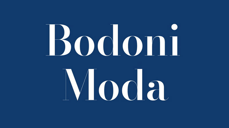
Bodoni is a modern serif typeface originally designed by Giambattista Bodoni in the late 18th century. The digital revival most commonly used today is Bodoni Moda, available on Google Fonts under the SIL Open Font License. It features extreme stroke contrast, hairline serifs, and upright axis stress, which are the defining characteristics of the modern serif classification.
Bodoni suits high-end fashion-adjacent wedding invitations and luxury event stationery because its extreme contrast and strong vertical stress deliver impact at large sizes on premium card stock. Type designer Massimo Vignelli described Bodoni as “one of the most elegant typefaces ever designed.”
—
What makes Bodoni suitable for invitations?
Bodoni’s stroke contrast is among the highest of any commonly used serif, with hairline serifs that are horizontal and unbracketed. This produces a sharp, almost engraved appearance at display sizes, which photographs particularly well for invitation flat-lays. Bodoni Moda on Google Fonts includes optical sizes for display, text, and six-point settings, which gives designers proper rendering at different invitation print sizes.
Key attributes:
| Attribute | Value |
| Classification | Modern serif (Didone) |
| Designer | Giambattista Bodoni (18th c.); Bodoni Moda by Eben Sorkin |
| Weight range | Regular 400 to Black 900 |
| Variable font | Yes (Bodoni Moda) |
| Optical sizes | Yes: 6pt, 11pt, 18pt, 28pt, 48pt, 96pt (Bodoni Moda) |
| Recommended sizes | 18pt+ for invitations; optical size selection recommended |
| License | OFL (Bodoni Moda, free) |
| Available on | Google Fonts (Bodoni Moda), Adobe Fonts |
| Price | Free (Bodoni Moda); subscription via Adobe Fonts |
—
How does Bodoni perform on printed invitations?
Bodoni requires high-quality printing to render correctly. On premium matte or uncoated card stock at 300 dpi and above, the hairline strokes reproduce clearly. On coated glossy paper, ink spread can fill in the hairline serifs.
It is one of the few serif fonts where using the wrong optical size at the wrong print size creates noticeably poor results. Use the display optical size at headline sizes.
—
What are the best pairings for Bodoni in invitations?
Bodoni pairs with Montserrat for a fashion-forward combination that contrasts the serif’s dramatic strokes with a geometric sans-serif body, consistent with luxury editorial design. It also pairs with Futura for a similar Didone-meets-geometric aesthetic, which is standard in high-end fashion house stationery.
—
What are the limitations of Bodoni for invitations?
Bodoni’s hairline strokes fail on budget inkjet or laser printing and on textured paper without adjusted ink settings. It is unsuitable for any invitation body text below 14pt, where the hairlines disappear entirely.
—
Bodoni – Recommended Use Cases Within Invitations
- Best for: Luxury wedding stationery headings, fashion-adjacent event invitations, printed on premium stock
- Avoid for: Body text; budget or inkjet printing; textured paper without print adjustment
- Optimal weight: Regular 400 at display sizes; Bold for emphasis on larger formats
- Optimal size range: 18pt–72pt (use correct optical size)
—
Lora
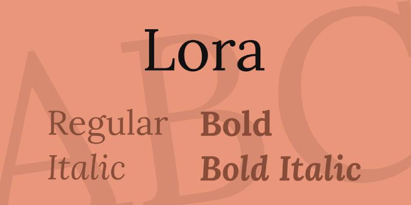
Lora is a contemporary serif typeface designed by Olga Karpushina for Cyreal, released in 2011 and available on Google Fonts under the SIL Open Font License. It features moderate stroke contrast with brushed curves and driving serifs rooted in calligraphic tradition, optimized for screen rendering.
Lora works best as a body and supporting text font on invitations because its wide apertures and moderate x-height maintain clear legibility across both digital and print formats at sizes from 10pt to 28pt.
—
What makes Lora suitable for invitations?
Lora has wide apertures on letters like “c,” “e,” and “a,” which reduce character ambiguity at smaller sizes, a structural advantage when invitation details are set at 10pt–12pt. It supports 9 styles across Regular, Medium, SemiBold, and Bold weights with matching italics, providing enough variation to establish clear typographic hierarchy within the body text alone. Updated to a variable font in 2019, it allows fine-grained weight control.
Key attributes:
| Attribute | Value |
| Classification | Contemporary serif (calligraphic) |
| Designer | Olga Karpushina, Cyreal, 2011 |
| Weight range | Regular 400 to Bold 700 (4 weights + italics) |
| Variable font | Yes (since 2019) |
| Recommended sizes | 10pt–14pt for body; 18pt–28pt for subheadings |
| License | OFL (free for personal and commercial use) |
| Available on | Google Fonts |
| Price | Free |
—
How does Lora perform on printed invitations?
Lora’s moderate contrast means it prints consistently across both inkjet and offset processes without requiring specialist stock. It is one of the most reliable body-text serifs for digital-to-print invitation workflows.
As a Lora font pairing companion to script display fonts, it consistently outperforms higher-contrast serifs in sustained reading at body sizes.
—
What are the best pairings for Lora in invitations?
Lora pairs with Tangerine for a warm, formal invitation suite, using Tangerine for names and Lora for all event details. It pairs with Montserrat when a cleaner, more contemporary contrast is needed between a geometric sans-serif heading and a calligraphic serif body.
—
What are the limitations of Lora for invitations?
Lora’s calligraphic warmth makes it a poor primary display font for high-end formal stationery, where Bodoni or Cormorant Garamond would perform better at headline sizes. Its moderate contrast can appear understated when used as a heading font above 36pt.
—
Lora – Recommended Use Cases Within Invitations
- Best for: Invitation body copy, RSVP card text, secondary headings on semi-formal stationery
- Avoid for: Primary display headlines above 36pt; ultra-formal black-tie event headings
- Optimal weight: Regular 400 for body; Bold 700 for subheadings
- Optimal size range: 10pt–28pt
—
Montserrat
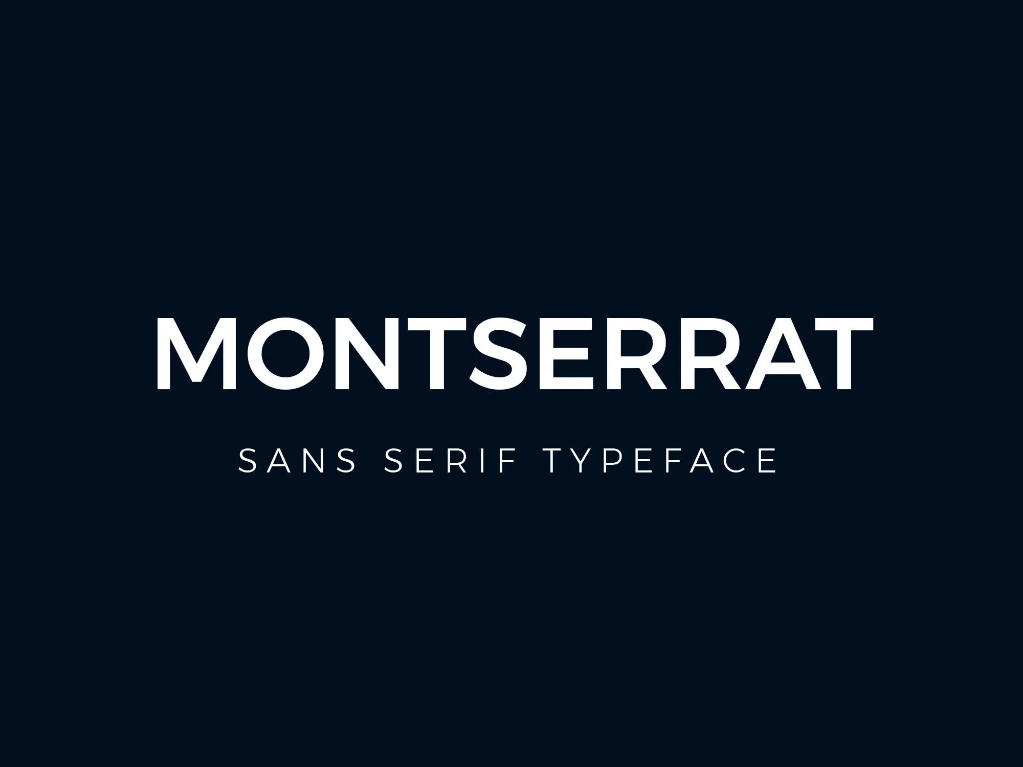
Montserrat is a geometric sans-serif typeface designed by Argentine graphic designer Julieta Ulanovsky, released in 2011 on Google Fonts under the SIL Open Font License. It features even stroke widths, a large x-height, wide apertures, and short descenders across 18 styles and 9 weights from Thin 100 to Black 900.
Montserrat suits modern and minimalist invitation designs because its geometric precision and wide apertures maintain legibility across a full weight range, from hairline thin for delicate stationery to Black 900 for bold event titles.
—
What makes Montserrat suitable for invitations?
Montserrat’s 9-weight range from Thin 100 to Black 900 covers every level of typographic hierarchy on a single invitation card without requiring a second sans-serif. Its large x-height and short descenders produce compact, efficient line spacing, which is useful for invitations with full address and RSVP information on limited card space. Used on over 19 million websites (Wikipedia), its widespread familiarity makes it a reliable default for digital invitations.
Key attributes:
| Attribute | Value |
| Classification | Geometric sans-serif |
| Designer | Julieta Ulanovsky, 2011 |
| Weight range | Thin 100 to Black 900 (9 weights, 18 styles) |
| Variable font | Yes |
| Recommended sizes | 10px–14px for body; 18px+ for headings |
| Letter-spacing default | 0 (normal) |
| License | OFL (free for personal and commercial use) |
| Available on | Google Fonts, Adobe Fonts |
| Price | Free |
—
How does Montserrat perform on printed invitations?
Montserrat’s even stroke width across all letterforms means it prints consistently at any weight on both inkjet and commercial offset processes without stroke degradation. The Light 300 weight is particularly effective for modern minimalist wedding stationery, where it reads as refined without carrying the formal associations of a serif.
You can also explore Montserrat font pairing options for complete invitation suite combinations.
—
What are the best pairings for Montserrat in invitations?
Montserrat pairs with Playfair Display for the most common formal invitation combination: high-contrast transitional serif for display, geometric sans for body text. It pairs with Great Vibes when a calligraphic script is needed for names but a clean, modern body font is preferred for supporting copy.
—
What are the limitations of Montserrat for invitations?
Montserrat’s geometric neutrality can feel too corporate or web-oriented for strictly traditional or romantic stationery, where a serif or script carries the expected formality. Its Thin 100 weight can appear too fragile on textured card stock without adjusting print weight.
—
Montserrat – Recommended Use Cases Within Invitations
- Best for: Modern wedding stationery body copy, digital invitation supporting text, minimalist event cards
- Avoid for: Traditional or romantic formal stationery as the primary display font; textured paper at Thin weight
- Optimal weight: Light 300 for modern stationery; Regular 400 for body; SemiBold 600 for subheadings
- Optimal size range: 10px–14px for body; 18px–36px for headings
—
How to Choose and Pair Fonts for Invitations
Most invitations work best with two typefaces. One expressive font for names and major headings, one neutral font for all supporting details.
The font psychology behind this is straightforward: the display font sets the emotional tone, while the body font needs to disappear and just deliver information cleanly.
Script vs Serif: When to Use Each
Script fonts like Great Vibes, Tangerine, and Dancing Script work well as the expressive element for couple names or event titles.
Serif fonts like Garamond, Lora, and Cormorant Garamond handle body copy and supporting text, where readability matters more than personality. For a deeper look at the technical differences, the serif vs sans-serif fonts comparison is worth reading before committing to a direction.
Font Pairing Rules That Actually Matter
Contrast is the core principle. Two scripts compete. Two geometric sans-serifs collapse hierarchy. The most reliable approach: one expressive font for display, one neutral font for body.
- Pair high-contrast fonts (Bodoni, Cormorant) with low-contrast neutrals (Montserrat, Lora)
- Pair calligraphic scripts with clean serifs or geometric sans-serifs, not with other decorative faces
- Limit the invitation to two typefaces, three at most including an italic variant
A font pairing generator can help test combinations before committing to print. For more pairing guidance, the full guide on pairing fonts covers contrast, x-height alignment, and weight matching in detail.
Print vs Digital Invitations: Different Requirements
High-contrast fonts like Bodoni and Tangerine need high-resolution printing (300 dpi minimum) to render hairline strokes correctly. They lose detail quickly on low-quality printers.
For digital invitations, font spacing becomes more important. Condensed or tightly spaced fonts that look elegant in print can become hard to read at screen sizes below 16px.
Licensing Before Printing
All ten fonts listed here use the SIL Open Font License, which covers personal and commercial use. If you are working with a commercial print studio or selling invitation templates, verify the license terms before production. The font licensing requirements for commercial print work differ from personal use in some foundry agreements, even for OFL fonts distributed through third-party platforms.
For a broader look at fonts suited to formal stationery, the guide on fonts for wedding invitations covers additional options beyond the ten listed here.
What Determines Whether a Font Works on an Invitation?
Not every elegant-looking font translates well to print. The gap between what looks good on screen and what holds up on cardstock is where most invitation typography goes wrong.
The global wedding invitation printing market was valued at $42.90 billion in 2023, projected to reach $65.81 billion by 2032 (The Market Intelligence). That scale reflects how seriously people approach invitation design, and why font selection matters beyond aesthetics.
How does stroke contrast affect invitation print quality?
Stroke contrast is the ratio between a typeface’s thickest and thinnest strokes. It directly determines whether a font survives the printing process.
- High-contrast fonts (Bodoni, Tangerine, Cormorant Garamond): hairline strokes require 300 DPI minimum; fail on inkjet below that threshold
- Moderate-contrast fonts (Lora, Garamond): print consistently across offset, digital, and inkjet processes
- Even-stroke fonts (Montserrat, Dancing Script): most resilient across all print methods and paper stocks
Research on legibility confirms that extreme stroke contrast in typefaces like Bodoni and Didot causes thin strokes to “disappear” at smaller sizes and lower resolutions (Legible Typography research overview). This is not a stylistic limitation. It is a physical one.
Textured and cotton paper compound the problem. Ink absorbs into the paper fibers, which causes hairline strokes to spread slightly. A font that renders cleanly on coated glossy stock may look broken on a linen or cotton invitation card at the same print resolution.
What font size ranges work for invitation body copy vs. display text?
Typography research at the University of Reading confirms that x-height, ascender length, and open counters are the primary determinants of legibility at small sizes.
Two distinct size zones apply to invitation typography:
Display zone (names, titles, headlines): 24pt and above. Scripts and high-contrast serifs perform here. Great Vibes, Tangerine, and Playfair Display are designed for this range.
Body zone (venue, time, RSVP details): 10pt to 14pt in print; 14px to 16px on screen. Fonts with wide apertures and moderate x-height (Lora, Garamond, Montserrat) maintain character distinction at these sizes where decorative fonts fail.
Mixing a script display font with a serif or sans-serif body font is standard invitation typographic practice precisely because no single font performs equally across both zones.
—
How Do Script, Serif, and Sans-Serif Fonts Differ for Invitation Design?
Each classification carries different structural properties that make it appropriate for specific roles on an invitation card. Choosing based on appearance alone, without understanding those structural differences, produces inconsistent results across print runs.
Digital invitations held 60% of the wedding invitations software market share in 2023, while traditional paper invitations grew at a 10% CAGR (Verified Market Reports). Both formats require different font decisions.
| Classification | Print Method Compatibility | Size Range | Hierarchy Role |
| Calligraphic Script | 300 DPI offset or letterpress only | 36pt+ display only | Names, event title |
| Transitional Serif | Offset, high-quality digital | 14pt body; 24pt+ display | Headlines and body |
| Old-Style Serif | All print methods | 10pt–28pt | Body and subheadings |
| Geometric Sans-Serif | All print methods | 10px–36px | Body, details, digital |
Script fonts like Great Vibes, Tangerine, and Dancing Script use connected or flowing letterforms that reference handwriting traditions. Their role on an invitation is confined to display: couple names, event titles, one-line accent phrases. They are not body text fonts.
Serif fonts span the widest range of roles. Garamond and Lora handle body copy at 10pt–14pt. Playfair Display, Cormorant Garamond, and Bodoni function as display serifs at 24pt and above. Cinzel, as an all-caps Roman serif, works specifically for event titles and venue names in capitals.
Montserrat, the only geometric sans-serif in the list, functions as a neutral body companion. Its even stroke widths survive every print process without adjustment. For digital invitations sent via email or viewed on Evite and Paperless Post, it is the most reliable body typeface in the group.
—
What Are the Rules for Pairing Invitation Fonts?
Font pairing is where invitation design either holds together or falls apart. Two well-chosen fonts read as intentional. Two poorly chosen fonts compete for attention and undermine each other.
The luxury invitation market, where bespoke stationery studios like Ceci New York and Paperlust operate, uses typographic contrast as the primary pairing principle across all their formal collections.
Which font pairings work for formal wedding invitations?
Formal wedding stationery consistently follows one structural rule: one expressive font for display, one neutral font for body copy.
Tested pairings for formal contexts:
- Playfair Display (names) + Lato (details): high-contrast transitional serif against a neutral sans-serif; used widely in editorial-adjacent stationery
- Great Vibes (names) + Cormorant Garamond (supporting text): full formal calligraphic suite; both fonts share a European historical reference
- Cinzel (event title in caps) + Garamond (all body copy): consistent Roman aesthetic from title to detail lines
- Tangerine (names) + Lora (venue and time): warm calligraphic script paired with a moderately contrasted calligraphic serif
- Bodoni (headline display) + Montserrat (all body): Didone serif meets geometric sans; standard in fashion-adjacent luxury stationery
The full guide on pairing fonts covers x-height alignment and weight matching in detail, both of which determine whether a pairing looks intentional at the same point size.
The maximum is two typefaces per card. Three is acceptable only if the third is an italic variant of one of the existing two, used for accent phrases like “black tie required” or “and together with their families.”
Which font pairings work for casual and semi-formal event invitations?
For birthday parties, baby showers, garden parties, and casual weddings, the pairing logic stays the same but the display font shifts from calligraphic to casual script.
Casual event pairing rule: Dancing Script replaces Great Vibes or Tangerine. Its bouncing baseline and moderate stroke contrast are more approachable than formal calligraphic scripts.
Two reliable casual combinations:
- Dancing Script + Josefin Sans: geometric sans-serif body gives clean contrast to the lively script headline
- Lora (italic) + Montserrat Regular: both serve body and subheading roles without requiring a script at all, suited to minimal modern event stationery
A font pairing generator allows designers to test combinations at actual invitation sizes before committing to print.
—
How Do Print and Digital Invitation Requirements Differ by Font?
Print and digital invitation formats impose different technical constraints on typography. A font that renders perfectly in a PDF sent to a letterpress studio can fail completely in a browser-based invitation tool.
Print requires 300 DPI minimum for high-quality results. Digital screens display at 72–96 PPI, with modern Retina and high-DPI displays reaching 144–220 PPI (Design Shifu, Pixabay). That gap changes which fonts are viable at which sizes.
What font properties determine print performance?
Three structural attributes determine whether a font holds up in print:
Stroke contrast: High-contrast fonts (Bodoni, Tangerine, Great Vibes) require professional offset or letterpress printing at 300 DPI. On inkjet below 300 DPI, hairline strokes fill in or disappear.
Paper absorption: Textured, cotton, and uncoated stocks absorb ink slightly, spreading thin strokes. Linemark Printing notes that fonts without “ink trap” adjustments can produce different results on porous paper than on coated stock, even at identical DPI settings.
Weight at small sizes: Cormorant Garamond Light (300) and Tangerine Regular produce elegant results at large display sizes but become illegible below 14pt on any print medium. Reserve these for display use only, and switch to Lora or Garamond for all body-copy print below 14pt.
What changes for digital invitation rendering?
Digital invitations distributed through platforms like Evite, Paperless Post, or email have different constraints. 89% of guests now expect digital RSVPs, reducing reliance on traditional mailed invitations (Wedding Venue Owners 2024 statistics).
Font behavior on screen differs from print in three ways:
- Hairline strokes: Tangerine, Great Vibes, and Cormorant Garamond Light look fragile on standard 96 PPI laptop screens below 24px; they render better only on Retina displays
- Variable font advantage: Playfair Display (v2.0 variable) and Montserrat (variable) allow responsive weight adjustment across device sizes without loading multiple font files
- Browser rendering: Canva and Google Docs both support Google Fonts natively, which means all 10 fonts on this list load without embedding issues in web-based invitation tools
For digital-first invitations, Montserrat and Lora are the most reliable choices. Their wide apertures and moderate stroke contrast produce consistent rendering across all screen types without requiring high-DPI displays.
—
What Licensing Rules Apply When Using Invitation Fonts Commercially?
All ten fonts covered in this article use the SIL Open Font License (OFL). Understanding exactly what that covers, and where it stops, determines whether a stationery designer or print studio needs additional licensing.
The OFL FAQ (SIL International, updated November 2023) states that fonts released under the license may be used “for any kind of design work,” including stationery, without additional permission. Logos, posters, business cards, and printed invitations are all explicitly listed as permitted uses.
What does the OFL cover for invitation designers?
The OFL explicitly permits the following for all ten fonts on this list:
- Using the font to design and print commercial invitations for clients
- Selling finished invitation designs (PDFs, printed cards) that were created using the font
- Embedding the font in a delivered print-ready PDF file
- Using the font in digital invitations distributed through email or web platforms
The one restriction that catches designers: the font file itself cannot be sold standalone. You can sell a Canva template that uses Cormorant Garamond. You cannot sell the Cormorant Garamond font file as an individual product, even as part of a font bundle where it is the primary asset.
Where does the OFL stop applying?
Two situations require additional attention beyond the OFL baseline.
Adobe Fonts subscriptions: When a font is accessed via Adobe Fonts rather than downloaded directly from Google Fonts, the license in effect is Adobe’s desktop/web license, not the OFL. The permissions are similar, but the terms differ in scope for web embedding and app use. Designers using Adobe Fonts for commercial stationery should confirm the specific typeface’s Adobe license rather than assuming OFL terms apply.
Third-party platform redistribution: Selling Canva templates on Etsy or Creative Market that embed OFL fonts is permitted, because the font is being used in design work, not sold as a font file. But if the template includes the raw font file as a downloadable asset, that crosses the OFL redistribution boundary. The safest practice is to direct buyers to download fonts directly from Google Fonts rather than bundling the files.
For any font used in commercial stationery work, the full font licensing guide covers these distinctions across OFL, commercial, and subscription license types in more detail.
—
How Does Event Type Determine the Right Font Choice?
Event formality, guest expectations, and print method all shift the appropriate font selection. A typeface that communicates elegance at a black-tie gala signals misalignment on a garden birthday party invitation.
Wedding invitations held the largest share of the luxury invitation market at 45% in 2023, with the fastest growth driven by demand for bespoke, premium designs (Verified Market Reports). That concentration explains why most font guidance focuses on wedding contexts, but the structural principles apply across all event types.
| Event Type | Formality | Display Font | Body Font |
| Black-tie wedding | Formal | Great Vibes / Tangerine | Cormorant Garamond / Garamond |
| Modern minimalist wedding | Semi-formal | Playfair Display | Montserrat / Lora |
| Corporate gala / graduation | Formal | Cinzel (caps only) / Bodoni | Garamond / Montserrat |
| Garden party / casual wedding | Casual | Dancing Script | Lora / Josefin Sans |
| Birthday / baby shower | Informal | Dancing Script / Lora italic | Montserrat |
One structural note on Cinzel: it is an all-caps typeface. This limits its use to event titles, venue names, and dates set in capitals. It cannot be used for couple names in standard mixed-case format, which rules it out as the primary display font for any invitation where names are the central typographic element.
Bodoni is the closest equivalent to Cinzel for formal events that need mixed-case display text. Its extreme stroke contrast and Didone classification carry the same architectural authority without the all-caps restriction.
For designers working across multiple event types, the principle stays consistent: match stroke contrast and formality level of the display font to the event’s dress code. A font that signals “fashion editorial” (Bodoni, Cormorant Garamond) does not belong on a backyard barbecue invitation, just as Dancing Script does not belong on a black-tie gala card.
The guides on fonts for wedding invitations and fonts for formal letters cover additional typefaces that work across overlapping stationery contexts.
FAQ on The Best Fonts For Invitations
What is the best font for wedding invitations?
Playfair Display is the most widely used option for formal wedding stationery. Its high stroke contrast and large x-height read well at display sizes. Pair it with Lato or Montserrat for body copy to create clear typographic hierarchy across the full suite.
Should I use a script or serif font for invitations?
Use a script font for names and headlines, and a serif for supporting text. Scripts like Great Vibes add personality at large sizes but fail below 18pt. Serifs like Garamond handle venue details and RSVP copy without losing legibility.
What fonts are free for invitation design?
All ten fonts covered in this guide are free. Playfair Display, Cormorant Garamond, Great Vibes, Dancing Script, Lora, Tangerine, Cinzel, Garamond (EB Garamond), Bodoni Moda, and Montserrat are all available on Google Fonts under the SIL Open Font License.
Can I use Google Fonts for printed invitations commercially?
Yes. The SIL Open Font License explicitly permits commercial use in printed stationery, including client work. You can sell finished invitations that use these fonts. You cannot sell the raw font files as standalone products.
How many fonts should I use on an invitation?
Two fonts maximum. One expressive display font for names and headings, one neutral font for body copy. A third typeface is only justified when using an italic variant for accent phrases. More than two unrelated fonts creates visual competition.
What is the best font size for invitation body text?
pt to 14pt for printed body copy. Venue names, times, and RSVP details set below 10pt become hard to read on most card stocks. For digital invitations, 14px to 16px is the reliable minimum across standard screen resolutions.
What font works best for baby shower invitations?
Dancing Script is a strong choice. Its bouncing baseline and moderate stroke contrast print cleanly on standard card stock without requiring professional offset presses. Pair it with Montserrat for a clean, readable body that works across both print and digital formats.
What is the difference between a calligraphy font and a script font?
A calligraphy font replicates the thick downstrokes and hairline upstrokes of a nib pen, as seen in Tangerine and Great Vibes. A casual script like Dancing Script references handwriting with more even strokes and a relaxed baseline. Both are script classifications.
Which fonts work for both print and digital invitations?
Montserrat and Lora perform consistently across both formats. Their moderate stroke contrast and wide apertures render well at 72 PPI on screens and at 300 DPI in print. High-contrast fonts like Bodoni and Tangerine are better suited to print only.
What font pairing works for formal event invitations?
Cinzel paired with Garamond is a reliable combination for corporate galas and graduations. Cinzel handles all-caps event titles with authority. Garamond manages body copy cleanly at 10pt to 14pt. Both share a classical Roman reference that reads as consistently formal.
Conclusion
This conclusion is for an article presenting the best fonts for invitations, and the core takeaway is straightforward: font pairing matters more than any single typeface choice.
Playfair Display, Cormorant Garamond, Cinzel, and Dancing Script each serve a specific role. None of them works in isolation.
Match stroke contrast to your print method. Match formality to your event type. Keep the typeface count to two.
Whether you’re designing formal wedding stationery on cotton card stock or a digital baby shower invite, the same structural rules apply: one display font, one body font, no exceptions.
The right script typeface or serif can do a lot of work with very few words. Choose with intention, and the invitation takes care of itself.

Renowned for his expertise in logo design and visual branding, Bogdan has developed a multitude of logos for various clients.
His skills extend to creating posters, vector illustrations, business cards, and brochures. Additionally, Bogdan's UI kits were featured on marketplaces like Visual Hierarchy and UI8.
He also wrote in the past years on sites like Design Your Way, WebDesignerDepot, WPDean, Designmodo, Speckyboy, Slider Revolution, and more.
- The Figma Logo History, Colors, Font, And Meaning - 25 July 2026
- Canva for Teams Review: Is It Worth the Business Plan? - 24 July 2026
- 5 Brand Compliance Checkpoints Every Enterprise Should Automate - 23 July 2026

Bogdan Sandu is a seasoned designer who has been designing websites since 2008. Renowned for his expertise in logo design and visual branding, Bogdan has developed a multitude of logos for various clients. His skills extend to creating posters, vector illustrations, business cards, and brochures. Additionally, Bogdan's UI kits were featured on marketplaces like Visual Hierarchy and UI8. He also wrote in the past years on sites like Design Your Way, WebDesignerDepot, WPDean, Designmodo, Speckyboy, Slider Revolution, and more.
You Might Also Like