


Letter Luxury: The 18 Best Fonts for Letters

Ever found yourself staring at a blank page, the cursor blinking mockingly, as you grapple with choosing the perfect font? Let’s face it, whether it’s a resume that needs to resonate professionalism or an invitation exuding elegance, the typeface sets the tone before a single word is read.
Today, your quest concludes. Say goodbye to the typographical tangle and hello to clarity. I’m diving deep into the digital typography ocean, resurfacing with priceless treasures—examples of the best fonts for letters that assure your message isn’t just seen, but felt.
You’ll step away equipped for every epistolary endeavor, from formal propositions to personal musings.
We’re not just scratching the surface; expect to unearth font legibility jewels, explore typeface styles spanning from serif to sans-serif, and uncover character spacing secrets—ensuring your letters stand out for all the right reasons.
Brace yourself. You’re about to embark on a journey through the nuanced world of elegant typefaces, typography design, and, yes, even a touch of calligraphy authenticity, all meticulously picked to elevate your correspondence game.
The Best Fonts for Letters
| Font Name | Style | Legibility | Design | Best Use Cases |
|---|---|---|---|---|
| Times New Roman | Serif | High | Traditional, Formal | Business, Academic, Official Documents |
| Arial | Sans-serif | High | Modern, Clean | Business, Screen Use, Presentations |
| Helvetica | Sans-serif | High | Neutral, Professional | Signage, Text-heavy Documentation |
| Calibri | Sans-serif | High | Soft, Contemporary | Business Correspondence, Screen Use |
| Garamond | Serif | High | Classic, Elegant | Publishing, Print Media |
| Georgia | Serif | High | Readable, Strong | Web Content, Digital Reading |
| Verdana | Sans-serif | High | Clear, Spacious | Online Texts, Small Screen Readability |
| Cambria | Serif | High | Sturdy, Formal | Business Reports, E-books |
| Book Antiqua | Serif | High | Literary, Traditional | Book Publishing, Academic Works |
| Trebuchet MS | Sans-serif | High | Friendly, Functional | Web Design, Digital Communications |
| Futura | Geometric Sans | Moderate | Modernist, Stylish | Logo Design, Artistic Projects |
| Century Gothic | Sans-serif | Moderate | Geometric, Clean | Safety Communications, Advertisements |
| Lora | Serif | High | Flowing, Contemporary | Creative Writing, Digital Publications |
| Roboto | Sans-serif | High | Geometric, Grotesque | User Interfaces, Tech-related content |
| Open Sans | Sans-serif | High | Neutral, Friendly | Websites, Mobile Apps |
| Proxima Nova | Sans-serif | High | Versatile, Modern | Branding, Web, and Print Design |
| Merriweather | Serif | High | Stylish, Contrast | Editorial Design, E-books |
| Baskerville | Serif | High | Refined, Traditional | Book Publishing, Academic Works |
Most Popular Choices
Times New Roman: Versatility and readability
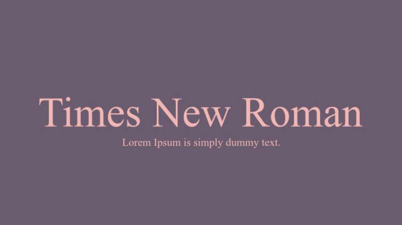
Ah, Times New Roman. It’s the OG of business fonts. This font is like that reliable colleague who’s always on point. It’s not just a classic choice; it’s versatile and super easy to read. Whether you’re drafting a report or a formal proposal, Times New Roman has got your back. It’s the go-to for anything that screams “professional.”
Arial: Modern and clear
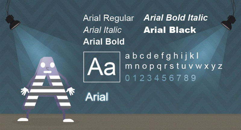
Then there’s Arial. If Times New Roman is the classic suit, Arial is the smart-casual blazer. It’s modern, clean, and keeps things fresh without going overboard. Arial is like the cool, younger sibling in the font family – perfect for businesses that want to keep things professional but with a modern twist.
Helvetica: Professional and clean
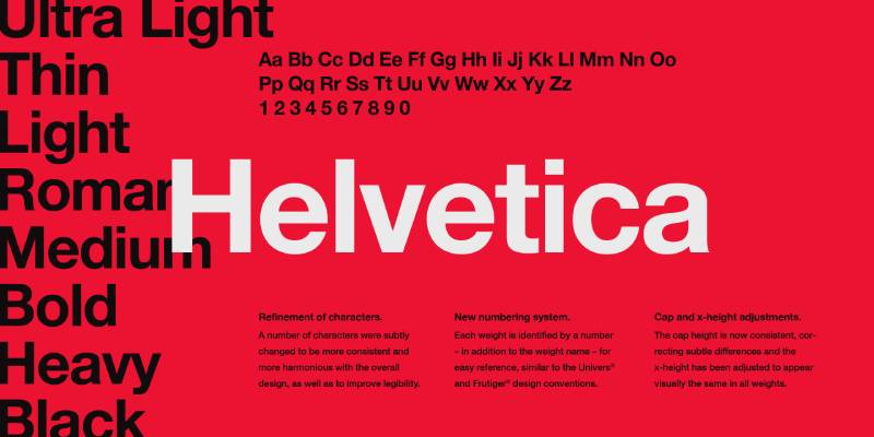
Let’s talk about Helvetica. This font is like the minimalist of the font world. It’s got a super clean look that just screams efficiency and professionalism. Helvetica is the font https://freefontsfamily.com/calibri-font-free-download/you want when your letter needs to be clear, straightforward, and to the point. It’s the white shirt that goes with every suit – simple, yet powerful.
Calibri: Contemporary and easy on the eyes
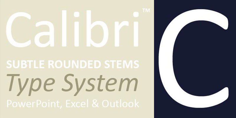
Now, meet Calibri. It’s the friendly face in the crowd. Not too formal, not too casual, it strikes the perfect balance. Calibri is easy on the eyes, making it a great choice for longer reads. Think of it as your go-to for internal communications or when you want your letter to feel approachable yet professional.
Garamond: Classic and elegant
Last but not least, Garamond. This font is like a fine wine – it just gets better with time. It’s classic, elegant, and has a certain timeless appeal. Garamond is perfect for those high-stakes letters where you need to impress. It’s the tailored suit of fonts – it just makes everything look more refined.
Additional Notable Fonts
Georgia: Comfortable for reading, good for digital screens
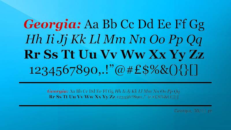
Georgia is like that cozy sweater that’s also surprisingly stylish. It’s super comfortable for reading, especially on digital screens. With its slightly rounded edges and ample spacing, Georgia is a go-to for online business communications. It’s like a friendly handshake in the font world – welcoming yet professional.
Verdana: Clear and simple, excellent for small sizes
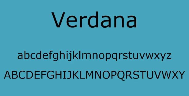
Meet Verdana. This font is like the Swiss Army knife in your toolkit – super practical and versatile. It’s known for its clarity, especially at smaller sizes, which is a lifesaver when you’re dealing with lengthy emails or reports. Verdana doesn’t try to be fancy; it’s straightforward, and that’s what makes it great.
Cambria: Designed for on-screen reading
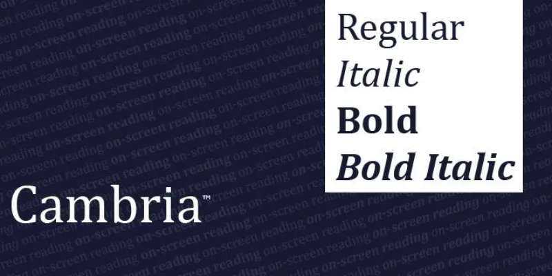
Then there’s Cambria. It’s like the tech-savvy friend who’s always up for a video call. Cambria was specifically designed for on-screen reading. It’s sturdy and legible, which means it holds up well on any digital device. Whether you’re drafting an email or a digital report, Cambria’s got your back.
Book Antiqua: Traditional and readable
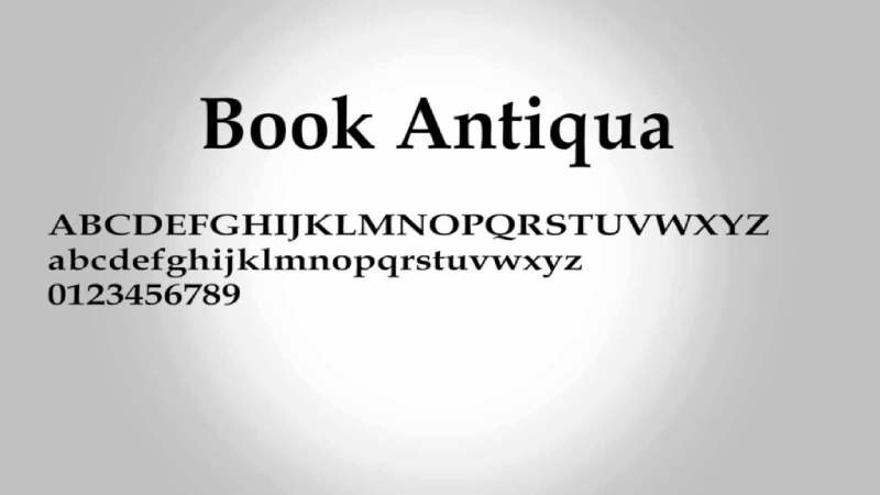
Book Antiqua feels like a throwback to classic literature. It’s traditional, with a touch of the old-school charm. This font is fantastic for businesses that want to project a sense of history and reliability. It’s like that vintage watch – timeless and always in style.
Trebuchet MS: Friendly and versatile
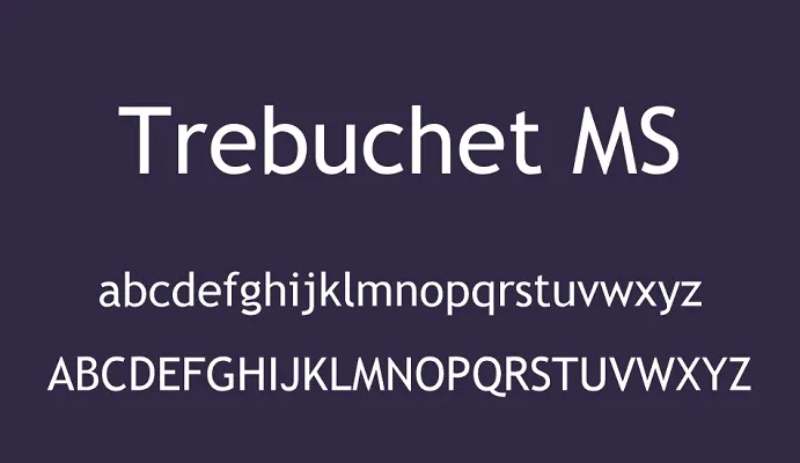
Trebuchet MS is the friendly neighbor of fonts. It’s approachable, versatile, and works great in a variety of contexts. Whether it’s a newsletter or a project proposal, Trebuchet MS makes your text feel accessible and engaging. It’s like wearing a smile through your words.
Futura: Stylish and strong
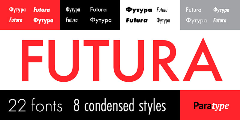
Ah, Futura. This one’s the fashion-forward member of the font family. With its geometric shapes and clean lines, Futura brings a touch of modernity and style. It’s great for businesses that want to come across as chic and forward-thinking. It’s like putting on your best outfit for that special occasion.
Century Gothic: Modern and geometric

Century Gothic is all about geometry and simplicity. It’s like that minimalist home decor – simple yet so impactful. This font is perfect for businesses looking to make a modern, clean statement. It’s cool, it’s sleek, and it makes your letters look like they’re from the future.
Lora: Well-balanced with a touch of elegance
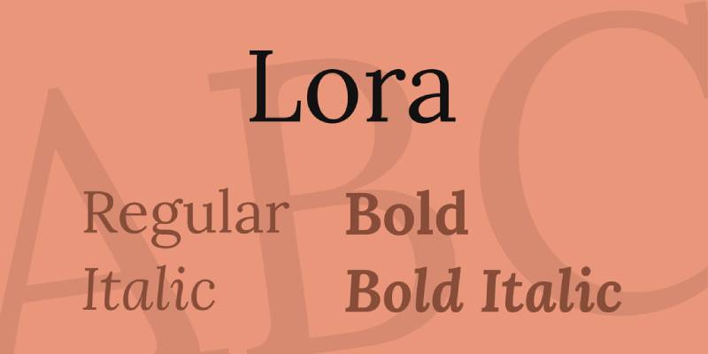
Lora is the hidden gem of fonts. It strikes a beautiful balance between being well-rounded and having just enough flair to be elegant. This font is perfect for businesses that want their letters to have a personal, yet polished touch. It’s like that little black dress – perfect for any occasion.
Roboto: Geometric, open curves, friendly appearance
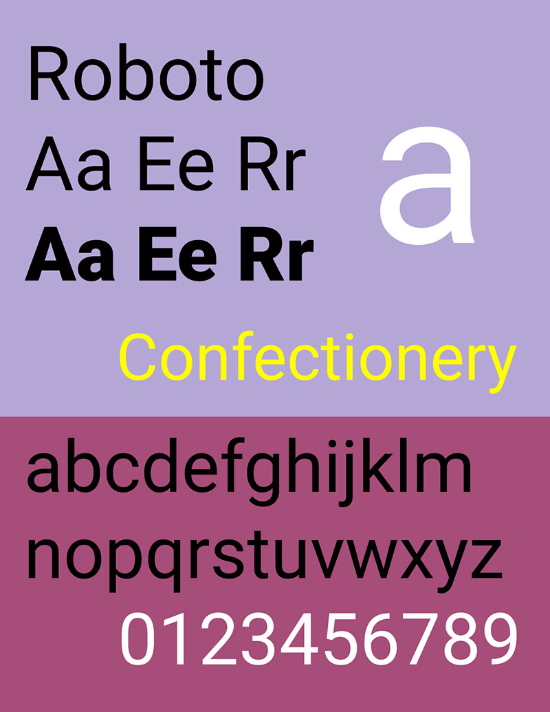
Next up, Roboto. This font is like your techy, geeky buddy who’s also super approachable. With its geometric forms and open curves, Roboto has a friendly appearance that’s perfect for startups and tech companies. It’s modern, it’s user-friendly, and it just makes your letters look cool.
Open Sans: Neutral yet friendly, excellent for web and print
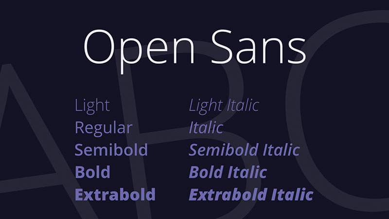
Open Sans is the chameleon of fonts – it fits in everywhere. Neutral yet friendly, it’s excellent for both web and print. Whether it’s a formal report or a casual memo, Open Sans adapts effortlessly. It’s like your favorite everyday wear – it just works.
Proxima Nova: Modern, humanistic, highly readable
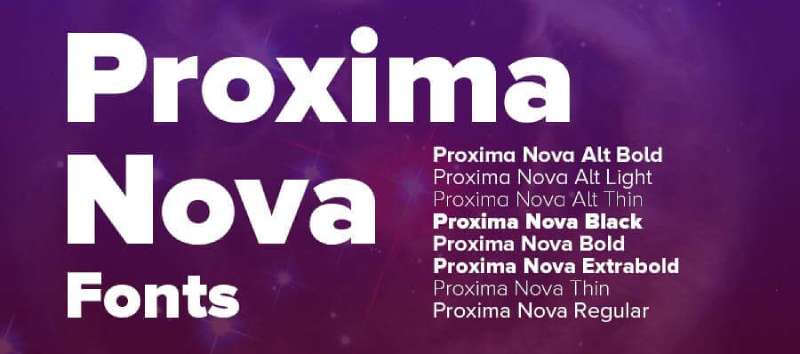
Meet Proxima Nova. This font blends modern proportions with a humanistic touch, making it highly readable and friendly. It’s like that colleague who’s professional yet super relatable. Proxima Nova is perfect for businesses that want a contemporary feel without losing the human touch.
Merriweather: Optimized for screens, good for long reading
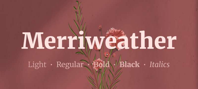
Merriweather is like that ergonomic chair – designed for comfort during long hours. Optimized for screens, it’s great for long reading sessions. If your business communications are lengthy and detailed, Merriweather ensures your readers stay engaged and comfortable.
Complementary Font Pairings
Let’s jazz it up a bit. Pairing fonts is like making a new playlist – you want a vibe that flows. It’s not just about picking the best fonts for letters, it’s about how they jam together. Get this mix right, and you’re on your way to creating something uniquely eye-catching.
Combining Serif and Sans Serif Fonts
Mixing serif and sans-serif fonts is like putting peanut butter with jelly – a match made in heaven. The trick is balance. A serif font like Garamond can pair beautifully with a cleaner sans-serif like Helvetica. It’s like having a conversation between the classic and the modern.
Examples of effective font pairings
Picture this: Times New Roman for your headers, and Arial for your body text. It’s like having a strong, bold voice that smoothly transitions into a casual, friendly chat. These pairings can make your letters not only look good but feel good to read.
Guidelines for pairing fonts
Keep it simple. Two fonts are usually enough. Think contrast but also harmony. Like pairing a bold, attention-grabbing font with a more subdued one for balance. It’s all about creating a visual hierarchy that guides the reader’s eye through your letter.
Understanding Font Types
Serif Fonts
Ever caught yourself admiring a book and thinking, “Wow, these letters look classy”? Chances are, you were looking at a serif font. Picture Times New Roman or Cambria. These fonts have little feet, or serifs, at the ends of their letters. It’s like each letter is wearing tiny shoes!
Serif fonts have a rep for being old-school, but let’s not box them in just yet. They’re not just for the grandpas of the font world. Think about Georgia. It’s like that friend who’s both fun and serious – versatile, right? Serifs are fantastic for print, giving off a traditional, trustworthy vibe. They say, “I’m formal, but I also know how to chill.”
Sans Serif Fonts
Now, flip the script and enter the world of sans serif fonts. No shoes on these letters – they’re going barefoot. These fonts are the clean-cut, minimalistic trendsetters of the font family. Take Arial and Helvetica – they’re like the cool kids on the block, all sleek and modern. And then there’s Calibri, the friendly neighbor, easy on the eyes, and super readable.
Sans serifs are the go-to for digital screens. Why? They’re like the jeans of the font world – versatile, easy, and always in style. Whether it’s a quick email or a flashy website, sans serifs have you covered. They’re the champions of readability, especially on screens where clarity is key.
In the world of best fonts for letters, understanding the difference between serif and sans serif is like knowing your coffee – do you want it black or with milk? It’s all about setting the right tone and making your text not just readable, but memorable.
Criteria for Selecting Fonts
When it comes to picking the best fonts for letters, it’s like choosing the right outfit for an occasion. You wouldn’t wear flip-flops to a job interview, right? Same goes for fonts – the choice you make sets the tone. So, how do you pick the perfect font? Let’s break it down.
Audience Consideration
First up, who are you writing to? Imagine you’re sending a letter to a friend. You’d probably go for something casual, like Calibri or Verdana – fonts that say, “Hey, let’s grab coffee!” But if it’s a business letter, you might suit up with something more formal like Times New Roman or Garamond. These are your power suits of the font world.
Tailoring font choice to the audience’s needs
Think about your readers. Are they skimming through on their phones? Then maybe a sans-serif like Arial or Roboto, known for their clarity on digital screens, is your best bet. It’s all about making your letters as readable and friendly as possible.
Ensuring clarity and legibility
No one likes squinting. So, choose fonts that are easy on the eyes. Sans-serifs are often more legible, especially online. But if you’re going old school with a printed letter, a serif font can be easier to read. It’s like a guide for your eyes, leading you through the text.
Presentation Format
Now, where’s your letter going? Is it an email, a printed letter, or maybe a PDF?
Differences in print vs. screen readability
Print and screen are like two different worlds. On screen, you’re dealing with backlighting. That’s where sans-serif fonts shine. They’re like sunglasses for your eyes, cutting through the glare. But in print, serif fonts take the lead. They’re like a comfy chair for your eyes, making extended reading a breeze.
Font suitability for various formats
Each format has its MVPs. For web and email, it’s all about Arial, Helvetica, or Open Sans. They’re like the universal language of screen readability. For print? Times New Roman and Garamond are the classics. They bring that touch of elegance to your printed words.
Branding and Aesthetics
Fonts aren’t just letters. They’re the voice of your brand.
Aligning font choice with company branding
Your font should match your brand’s personality. Is your brand modern and sleek? Sans-serif fonts like Helvetica or Futura might be your jam. More traditional? Serif fonts like Baskerville or Book Antiqua can bring that timeless feel.
Aesthetic appeal and style consistency
Consistency is key. Stick to one or two font families to keep your look cohesive. It’s like having a signature style. You want your letters to be instantly recognizable, right? Whether it’s the best fonts for letters, emails, or your website, keeping it consistent is what builds your visual identity.
Font Size and Color Considerations
Choosing the best fonts for letters isn’t just about style; size and color play a massive part too. It’s like setting the stage for your content – you want every word to be clear and impactful.
Optimal Font Size
General guidelines for body text and headings
For body text, sizes between 10 and 12 points are the sweet spot – big enough to read comfortably but not so big that it feels shouty. Headings can go bigger, think 14 to 18 points, making them stand out. It’s like having a voice that’s confident but not yelling.
Impact of font size on readability
Size matters. Too small, and you’re squinting. Too big, and it’s overwhelming. It’s all about finding that size that’s just right – easy on the eyes and keeps your reader hooked.
Appropriate Color Usage
Recommended color for formal letters
For formal letters, you can’t go wrong with classic black. It’s like wearing a black tie – sophisticated and professional. But hey, if you want to add a pop of color, go for something subtle. A dark blue or grey can add a touch of personality without going overboard.
Influence of color on legibility and tone
Colors set the mood. Bright colors can be fun but might not always be easy to read. Stick to darker shades for your main text. It’s like setting the right lighting for an event – you want it inviting, not blinding.
Practical Tips for Font Selection
Let’s get real for a sec. Picking the best fonts for letters isn’t just about what looks cool. It’s about making your text sing without hitting a wrong note. So, here are some solid tips to keep your font game strong and on point.
Keeping It Simple
Limiting the number of font types used
Ever seen a letter that looks like a circus of fonts? Yeah, not cool. Stick to one or two fonts max. It’s like seasoning your food – a little goes a long way. A sans-serif like Arial for the body and a serif like Times New Roman for the headings can do wonders. Simple, yet effective.
Avoiding overly decorative or novelty fonts
Listen, I get it. Those funky fonts look fun, but they can be a headache to read. Keep them for party invites, not your business letters. You want your reader to breeze through your text, not get lost in a maze of loops and swirls.
Font Availability and Versatility
Ensuring font accessibility across devices
Ever opened a document on a different device and it looks like an alien language? Yeah, let’s avoid that. Stick to fonts that are widely available across devices. It’s like making sure everyone at the party can enjoy the music, no matter where they’re tuning in from.
Utilizing different font weights and styles
Fonts come in different flavors – bold, italic, light, you name it. Use these to add emphasis or to highlight important points. It’s like using different voice tones – sometimes you need to whisper, and sometimes you need to be loud to get your point across.
Font Consistency Across Branding
Maintaining uniformity in all business documents
Your fonts should match across all your business documents. It’s like having a signature style. Whether it’s a letter, a report, or a presentation, uniformity in fonts makes your brand look put together and professional.
Using brand-specific fonts where appropriate
If your brand has its own font, use it! It’s like wearing your team’s jersey. It shows you’re part of the gang and gives a unique identity to your communications.
Reader Engagement and Font Choice
Choosing fonts that resonate with the target audience
Know your audience. Are they young and trendy or more traditional? Pick fonts that resonate with them. It’s like picking the playlist for your road trip – you gotta play the tunes that everyone enjoys.
Balancing aesthetics and readability
A beautiful font that’s hard to read is a no-go. Balance is key. Your font should be easy on the eyes and pretty to look at. Think of it as the perfect date – good looks and great conversation.
FAQ On The Best Fonts For Letters
What makes a font great for professional correspondence?
It’s all about legibility and subtlety. Crisp serif fonts like Times New Roman speak the language of formality. They’re like the suit and tie of the typography world—timeless. A clean sans-serif like Arial? That’s your smart-casual khaki for those less formal emails.
Why would I choose a script font for a letter?
Imagine receiving a printed letter—it feels personal, right? That’s the power of script fonts. They mimic handwritten notes, adding an intimate touch. Perfect for invitations or thank-you notes, but remember, clarity is key. Overly elaborate loops can confuse more than charm.
Are there any fonts I should always avoid in letters?
Comic Sans walks into a business meeting—it’s immediately asked to leave. Why? It lacks that professional vibe. Fonts with too much flair or those playful designs can come off unserious. They’re fine for your personal diary but not for conveying a message that means business.
How important is font size when choosing a font for letters?
Size matters—you want your words to pop, not strain eyes. Too big, and it screams. Too small, it’s whispering. Around 10-12 points is the sweet spot for most readable fonts. And hey, consider your audience. The older crowd might appreciate a bump in size.
Can the right font increase the readability of my letter?
Absolutely. Fonts like Verdana or Helvetica are superhero names in the readability league. They have clear spacing, and distinct letters—no one’s mistaking that ‘i’ for an ‘l’. Fonts are the silent facilitators of communication; the right choice guides your reader through your thoughts, effortlessly.
What are some best practices for mixing fonts in a letter?
Some call it an art, I call it a balancing act. Pair a serif with a sans-serif to mix tradition with modernity. Two’s company for fonts, three’s a crowd—stick to a duo. Ensure there’s a contrast; a bolder header font with a subtler body text font complements, not clashes.
How does a font’s weight and style affect a letter’s presentation?
Think of weight and style as the voice’s pitch and tone. A bold font for headings catches attention; it’s the firm handshake when you greet someone. Italics can indicate an aside, a whispered hint. Get the combination right, and your letter sings harmony.
What role does font licensing play when selecting fonts?
Legal tunes are the only ones we play. Font licensing matters because creators’ rights deserve respect. Some fonts, like those from Google Fonts, are open-source angels, ready for commercial use. Others? Check the fine print to avoid stepping on legal toes.
In terms of user experience, how do fonts influence the perception of a letter?
Fonts are the unsung heroes of user experience. They wield a psychology brush, painting those first impressions. A good font can make your letter appear more trustworthy, professional, or creative. It sets the mood, frames your content, and in essence, speaks for you before you even begin.
How does font choice relate to branding a company’s written communication?
Spot-on with branding! A consistent font becomes a part of a company’s identity—like a signature scent. It’s all about recognition and perception; typography design working its subtle magic to reinforce your brand’s style and values with every letter you send out.
Conclusion
And there you have it; a curated showcase brimming with typographic talent. We ventured through serif valleys and trekked sans-serif hills, uncovering examples of the best fonts for letters to suit any style—be it the formality of business communication or the intimate flourish of personal notes.
Remember, the choice you make isn’t just about aesthetics; it’s about harnessing font legibility and readability, ensuring your words are not just seen but absorbed. Most importantly, it’s about making those words resonate, crafting an experience as much as a message.
As you step back into the world armed with this knowledge, think of your letters as more than communication; they’re a typography design statement, an invitation into your world. Whether choosing from Google Fonts or pondering Italicized font style, let your letters be the truest representation of you—embrace the type, and make your mark unforgettable.
If you liked this article about the best fonts for letters, you should check out this article about the best fonts for dyslexia.
There are also similar articles discussing the best fonts for menus, the best fonts for PowerPoint presentations, the best fonts for infographics, and the best fonts for Instagram posts.
And let’s not forget about articles on the best fonts for websites, the best fonts for Facebook ads, the best fonts for billboards, and the best fonts for embroidery.
Bogdan Sandu, a seasoned designer with 15 years of diverse experience, has been designing websites since 2008.
Renowned for his expertise in logo design and visual branding, Bogdan has developed a multitude of logos for various clients.
His skills extend to creating posters, vector illustrations, business cards, and brochures. Additionally, Bogdan's UI kits were featured on marketplaces like Visual Hierarchy and UI8.
Latest posts by Bogdan Sandu (see all)
- Bright Color Palettes for Eye-Catching Designs - 18 May 2024
- Venmo’s Visual Voice: What Font Does Venmo Use? - 18 May 2024
- The Hoegaarden Logo History, Colors, Font, And Meaning - 17 May 2024