
Ad Impact: The 19 Best Fonts for Advertising

Imagine this: You’re crafting an ad, and everything’s spot on – the imagery, the message, the vibe. But wait, the font? It’s like a secret ingredient that can make or break your ad’s impact. That’s where the best fonts for advertising come into play.
Think about it. Fonts are more than just letters; they’re the voice of your brand, the subtle nudge that guides a viewer’s emotions. In this piece, we dive deep into the world of typography in marketing, where each typeface tells its own story. We’re talking about visual branding, readability in ads, and how font choice can transform the whole game.
I’ll take you on a journey through the most effective typefaces for sales, blend in some graphic design trends, and touch upon the emotional impact of typography. You’ll learn about the magic behind Helvetica, the classic appeal of Times New Roman, and why Google Fonts might be your new go-to.
The Best Fonts for Advertising
| Font Name | Style | Readability | Best Used For | Notes |
|---|---|---|---|---|
| Baskerville | Transitional Serif | High | Body text, Print | Professional, authoritative |
| Bodoni | Modern Serif | Moderate | Headlines, Posters | Elegant, high-contrast |
| Trajan | Serif | Moderate | Movie Posters, Logos | Stately, upper-case emphasis |
| Playfair Display | Transitional Serif | High | Headlines, Titles | Stylish, good for display |
| Garamond | Old-Style Serif | High | Print, eBooks | Classic, easy on the eyes for long reading |
| Times New Roman | Transitional Serif | High | Newspapers, Academic work | Ubiquitous, familiar to many |
| Minion | Old-Style Serif | High | Body Text, Print | Clean, versatile |
| Copperplate | Gothic Sans-Serif | Moderate | Engravings, Stationary | Professional, all-caps focus |
| Clarendon | Slab Serif | High | Posters, Headlines | Strong presence, good for emphasis |
| Helvetica | Neo-grotesque Sans | High | Signage, Text | Neutral and versatile |
| Futura | Geometric Sans | Moderate | Display, Branding | Modern, clean |
| Gotham | Geometric Sans | High | Signage, Print | Approachable, wide range of weights |
| Roboto | Sans-Serif | High | Digital, Print | Friendly, geometric forms |
| Gill Sans | Humanist Sans-Serif | High | Signage, Text | British, classic elegance |
| Museo Sans | Geometric Sans | High | Digital, Print | Readable, friendly |
| Montserrat | Geometric Sans | High | Web design, Digital | Urban style, good for small text |
| Avenir | Geometric Sans | High | Corporate use, Print | Futuristic, clean |
Top Serif Fonts for Advertising
Classic and Elegant Choices
Alright, let’s jazz things up with some name-dropping. When scouting for the best fonts for advertising, here are a few serif stars to consider:
- Baskerville: This font is like a fine wine, getting better with age. It’s got that traditional elegance but with a modern twist. Perfect for brands that want to say, “We’re classic, but we’re also hip.”
- Bodoni: High contrast and oh-so-sophisticated. It’s the go-to for luxury brands. It’s like wearing a designer suit in the form of a font.
- Trajan: Now, this is what you call monumental. Inspired by Roman square capitals, Trajan is all about making a statement. It’s grand, it’s authoritative – it’s like the font version of a historic monument.
- Playfair Display: Ever wanted a font that screams luxury? Playfair Display is your answer. Its ornate letterforms are perfect for high-end brands looking for that touch of opulence.
Leading Sans Serif Fonts for Effective Ads
Modern and Versatile Selections
Switching gears to sans serif, let’s highlight some fonts that are changing the game in advertising:
- Helvetica: The evergreen, the timeless classic. It’s clean, it’s versatile – it’s like the Swiss Army knife of fonts.
- Futura: This one’s all about geometric shapes and elegance. It’s like the font embodiment of a modern art piece.
- Gotham: Distinctive and contemporary. It’s got a style that says, “I’m unique.”
Other Font Types and Their Uses in Advertising
Unique and Specialized Fonts
Beyond serifs and sans serifs, there’s a whole world of fonts out there:
- Slab Serif Fonts: These are your bold, attention-grabbing friends. Perfect for a headline that needs to stand out.
- Script and Decorative Fonts: For when you need that special touch. They’re like the cherry on top for an ad that needs a bit of flair.
Practical Tips for Choosing the Right Font
Factors to Consider in Font Selection
Choosing the best fonts for advertising isn’t just about what looks good. It’s about what works for your brand, your message, and your audience. It’s a mix of brand identity, readability, and versatility.
The Impact of Font Choice on Marketing Materials
Enhancing Brand Recognition and Appeal
Finally, remember that your font choice can make or break your ad. Consistency across marketing platforms and the role of fonts in creating visually appealing materials – it’s all part of the game.
Top Serif Fonts for Advertising
Talking about best fonts for advertising, there’s this whole universe of serif fonts that have their unique way of whispering (sometimes shouting) to your audience.
Serifs?
Oh, they’re like the tiny feet at the end of letter strokes – classy and traditional but with a power to command attention in the subtlest ways. Let’s jump into some serif stars that can totally transform your ad game.
Classic and Elegant Choices
Baskerville
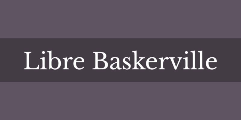
Imagine a font that’s like a bridge between the old and the new. That’s Baskerville for you. It’s got this traditional vibe but doesn’t feel out of place in modern designs. Ideal for brands aiming to strike a balance between classic elegance and contemporary sleekness. It’s like saying, “Hey, we respect the past but we’re totally rocking the present.”
Bodoni
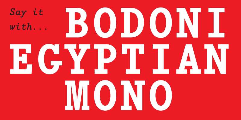
Bodoni is the go-to for luxury and high fashion. It’s all about high contrast – thick and thin strokes playing this beautiful game of cat and mouse. It’s sophisticated, a bit dramatic, and perfect for brands that want to scream luxury without actually screaming.
Trajan
You’ve seen it on movie posters and legal documents. Trajan is like the emperor of serif fonts – bold, authoritative, and with a hint of ancient wisdom. Inspired by Roman square capitals, it’s great for brands that want to exude power and timelessness.
Playfair Display
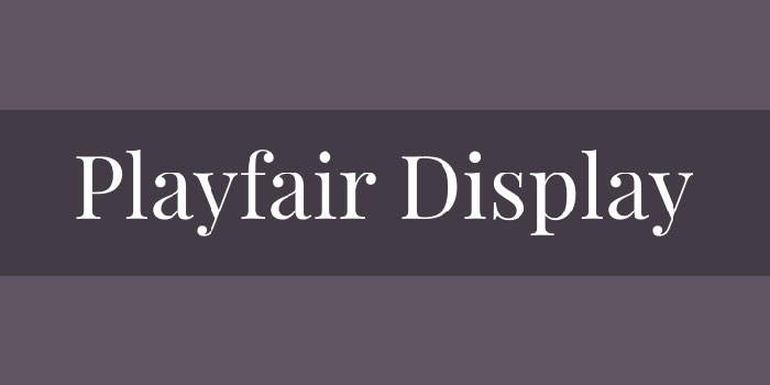
Here’s a font that’s both beautiful and functional. Playfair Display, with its high-contrast letterforms, is a nod to the baroque era but designed for the digital age. It’s for brands that want to look luxurious but also need to be readable on screens.
Garamond
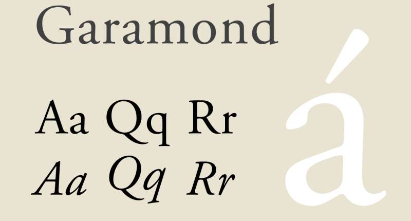
Garamond takes you back – way back to the 16th century. It’s a classic, one that speaks of history, reliability, and a touch of academia. It’s great for traditional brands, educational institutions, or anyone who wants to reflect a heritage-rich persona.
Times New Roman
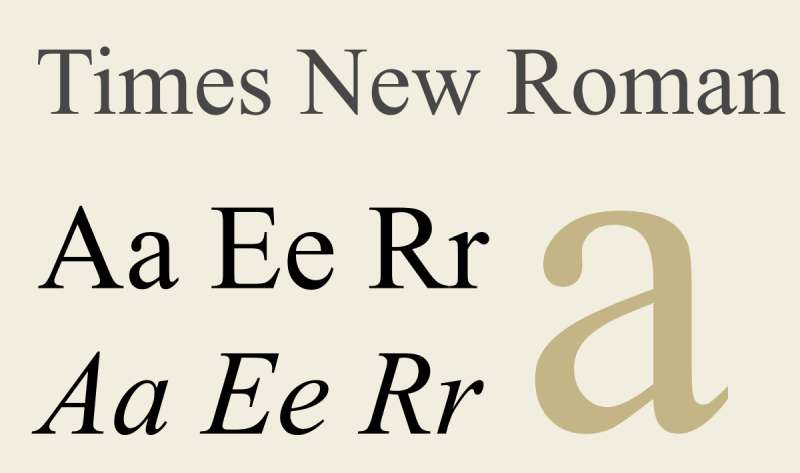
Oh, the good old Times New Roman. It’s like that reliable friend who’s always there for you. Versatile, readable, and familiar – it’s a safe bet for a wide range of advertising needs. It’s a classic choice for those who prefer sticking to the tried and tested paths.
Minion
Minion is like the Renaissance of the font world – inspired by the past but perfectly suited for the present. It’s great for longer texts (think brochures or reports) where you need something that’s easy on the eyes but also carries a touch of sophistication.
Copperplate
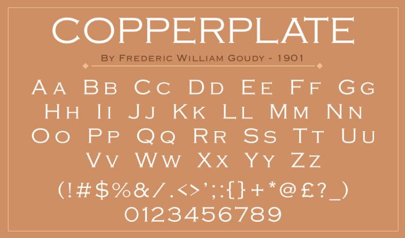
Got something bold to say? Copperplate’s your font. It’s modern, a bit edgy, and loves the spotlight. Mostly used for headlines or logos, it’s for brands that want to make a strong, confident statement.
Clarendon
A mix of strength and elegance, Clarendon is the kind of font that stands out without trying too hard. It’s versatile, great for both text and headlines, and has a history of being used in wanted posters to corporate brochures. Talk about range!
Mafins
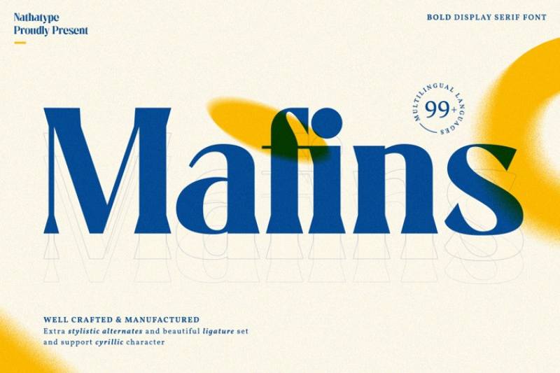
Mafins, stylish and elegant, is like that trendy outfit that looks great in any size. Whether it’s a big billboard or a small business card, Mafins adapts beautifully, making it a versatile choice for various advertising needs.
Monalisa
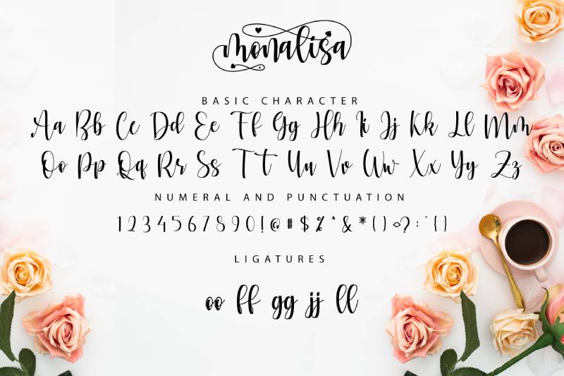
Last but not least, Monalisa. It’s unique, elegant, and has a certain flair that can give any brand a distinctive look. It’s perfect for logos and branding projects where you want to leave a memorable impression.
Leading Sans Serif Fonts for Effective Ads
Jumping into the world of sans serif fonts is like stepping into a futuristic city – sleek, clean, and utterly modern.
When you’re hunting for the best fonts for advertising, sans serif fonts are like your cool, urban friends that know how to make a statement without trying too hard. Let’s take a stroll through this city of fonts and see what makes each of them stand out.
Modern and Versatile Selections
Helvetica
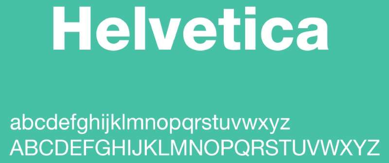
Ah, Helvetica. The king of sans serif fonts. It’s like the bread and butter of typography – simple, versatile, and everyone’s favorite. Helvetica is a safe bet when you want your ads to look timeless and professional. It’s got this way of blending in yet standing out, perfect for any setting – from subway signs to tech ads. It’s like the chameleon of fonts, adapting to any environment it finds itself in.
Futura
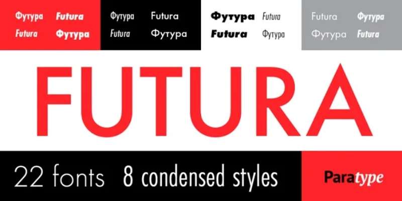
Now, imagine a font that’s all about geometry – sharp lines, perfect circles, and a touch of elegance. That’s Futura. It’s the font that feels like it’s from the future (hence the name). It’s got this clean and crisp vibe that works wonders for brands aiming for a modern, forward-thinking look. It’s like wearing a sleek, tailored suit in the world of typography.
Gotham
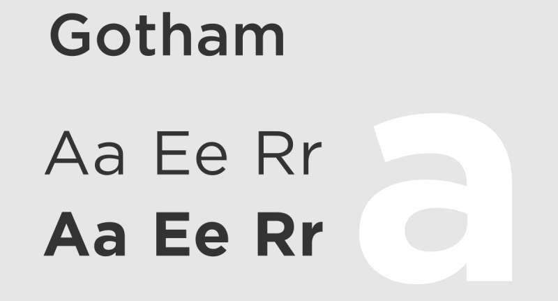
Gotham is the cool, confident city slicker. It’s got a unique character that makes it stand out. Inspired by the architectural lettering of New York City, Gotham is a go-to for ads that need a touch of contemporary style. It’s robust, no-nonsense, and yet has a friendly face. Perfect for campaigns that aim to be grounded yet aspirational.
Roboto
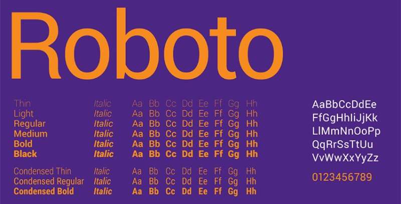
Roboto is like that friend who gets along with everyone. It’s modern, yet approachable. It was actually created for digital screens, so it’s super legible, whether you’re looking at it on a big billboard or a small smartphone screen. It’s like the friendly neighbor of the font world – familiar, reliable, and versatile.
Gill Sans
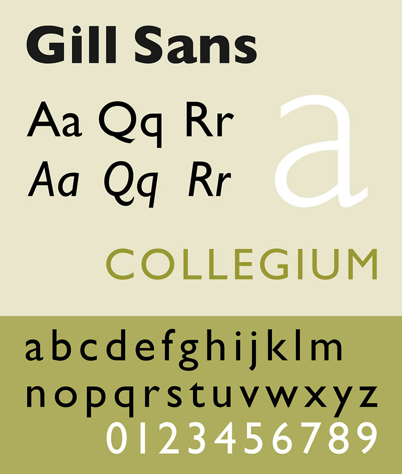
Here’s a font with a friendly feel but with just enough elegance to keep things classy. Gill Sans strikes a balance between being humanistic and geometric. It’s like the font that wears a business casual outfit – not too formal, not too casual, just right for a wide range of advertising needs.
Museo Sans
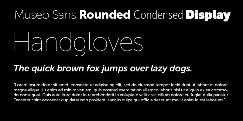
Museo Sans is like a breath of fresh air in the sans serif world. It’s contemporary but has this humanist touch that makes it feel warm and inviting. It’s perfect for brands that want to appear modern yet accessible.
Montserrat
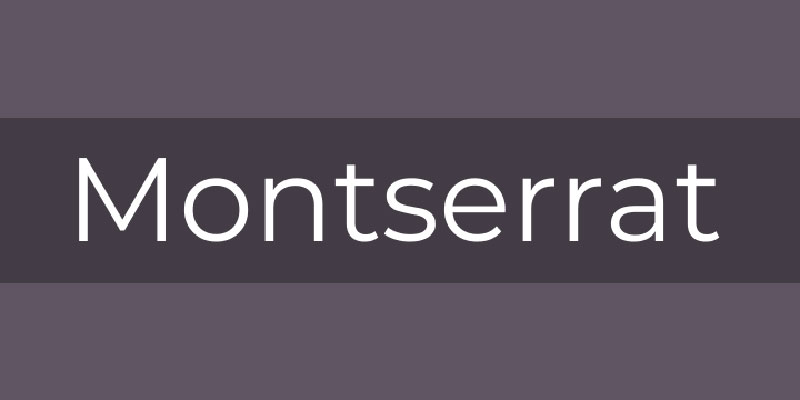
Inspired by the urban typography of Buenos Aires, Montserrat brings a special kind of energy to the table. It’s contemporary, dynamic, and has a certain youthful charm. It’s great for brands that want to appear energetic and bold.
Avenir
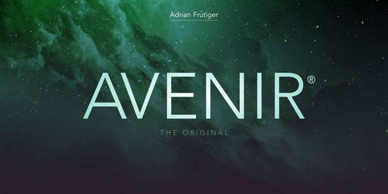
Last but definitely not least, Avenir. The name means ‘future’ in French, and it lives up to it. It’s got elegance, a touch of futurism, and an overall clean look. It’s like the sophisticated, worldly traveler of fonts – great for brands that want to convey a sense of sophistication and innovation.
Other Font Types and Their Uses in Advertising
So, we’ve talked about serif and sans serif fonts, right? But hey, the world of best fonts for advertising isn’t just black and white – there’s a whole spectrum out there. Let’s dive into some other font types that can jazz up your ads in ways you didn’t even think were possible.
Unique and Specialized Fonts
Slab Serif Fonts
Think of slab serif fonts as the cool cousin of traditional serifs. They’re bolder, chunkier, and have a certain ‘oomph’ to them. They scream confidence and are perfect for making a statement. You’ve seen them in online ads, right? They grab your attention and hold it. It’s like they’re saying, “Hey, look at me!” without being too in your face.
Script and Decorative Fonts
Now, let’s chat about script and decorative fonts. They’re like that one person at the party who has a unique style that everyone admires. These fonts add a special touch to your ads, making them feel more personal, more human. They’re great for formal styles or when you want to add a bit of flair. But remember, with great style comes great responsibility – use them sparingly so they don’t overpower your message.
Practical Tips for Choosing the Right Font
Choosing the best fonts for advertising isn’t just about picking the prettiest one. It’s like choosing the right outfit for an occasion – it has to fit well and suit the vibe.
Factors to Consider in Font Selection
Brand Identity and Message
First things first, your font needs to match your brand’s personality. Is your brand fun and quirky? Or is it more serious and professional? The font you choose should reflect that. It’s like giving your brand a voice. You wouldn’t want a serious law firm to sound like a cheerful party host, right?
Target Audience and Readability
Next up, think about who you’re talking to. Your target audience – what would appeal to them? And readability, oh, that’s crucial. If your audience can’t read your message easily, what’s the point? It’s like speaking clearly in a conversation – you want to be understood.
Versatility Across Different Media
Last but not least, think about where your ads will be seen. Billboards, websites, business cards – your font should look good everywhere. It’s like a good pair of jeans that fits well, no matter where you wear them.
The Impact of Font Choice on Marketing Materials
Alright, let’s talk about the big guns – how your choice of font can totally make or break your marketing materials. It’s like picking the right shoes for an outfit – they can either elevate the whole look or just, well, not. Choosing the best fonts for advertising isn’t just about aesthetics; it’s about psychology, brand identity, and so much more.
Enhancing Brand Recognition and Appeal
Consistency in Font Use Across Marketing Platforms
Consistency is key, right? Imagine if every time you met someone, they had a completely different personality. Confusing, huh? Same goes for fonts in your marketing materials. Stick to a consistent font style across all platforms – your website, your ads, your brochures. It’s like creating a signature style that makes your brand instantly recognizable. It’s not just about looking pretty; it’s about being memorable.
The Role of Fonts in Creating Visually Appealing Materials
Now, let’s get into the nitty-gritty of aesthetics. Your font choice is like the seasoning in a dish – it can enhance the flavor or totally ruin it. The right font can draw people in, create an emotional connection, and make your message pop. It’s not just about readability; it’s about creating a feeling. When people see your ad, you want them to feel something, right? That’s where your font choice comes into play. It can make your ad feel elegant, fun, serious, or edgy.
FAQ On The Best Fonts For Advertising
What Determines the Best Fonts for Advertising?
The best fonts for advertising should align with your brand identity, audience preferences, and the message you’re conveying.
It’s about finding that sweet spot where the font style echoes your brand’s personality while being legible and appealing to your target audience. Think of it as matching your brand’s voice with the visual tone of the font.
How Do Font Choices Impact Brand Perception?
Font choices can significantly influence how people perceive your brand. A well-chosen font can evoke emotions and associations – like trust, sophistication, or fun – enhancing your brand’s overall image.
It’s like wearing the right outfit to an interview; it sets the tone and makes a statement about who you are.
Are Serif or Sans Serif Fonts Better for Advertising?
It’s not about one being better than the other; it’s about suitability. Serif fonts often convey tradition and credibility, ideal for formal or luxury brands.
Sans serif fonts, on the other hand, are seen as modern and approachable, great for tech or lifestyle brands. It all boils down to your brand’s character and the message you’re delivering.
What Makes a Font Legible in Advertising?
Legibility in advertising fonts hinges on simplicity and clarity. Fonts that are easy to read at various sizes and distances are crucial.
It’s not just about the style but also the spacing, weight, and contrast of the font against the background. The goal? To ensure your message is easily digestible at a glance.
Can the Wrong Font Choice Negatively Impact an Ad Campaign?
Absolutely, the wrong font can be a campaign’s downfall. It can confuse the message, make the ad look unprofessional, or even turn off the target audience. It’s like mixing up the soundtrack in a movie – the wrong music can totally change the scene’s vibe and meaning.
How Often Should Brands Change Their Advertising Fonts?
Brands should consider changing their advertising fonts only if there’s a significant shift in their branding or audience. Consistency is key in branding, so frequent changes might confuse the audience.
Think of your font as part of your brand’s outfit – change it only when it no longer fits the style you’re aiming for.
Are Custom Fonts Worth the Investment for Advertising?
Investing in custom fonts can be a game-changer for unique brand identity. It sets you apart from competitors and gives your brand a distinct voice.
However, weigh the cost against your marketing goals and brand needs. Sometimes, a well-chosen existing font can do the trick without the extra investment.
What’s the Role of Typography in Digital vs. Print Advertising?
Typography plays different roles in digital and print advertising due to varying viewing experiences. Digital ads need fonts optimized for screen legibility, often simpler and more streamlined.
Print ads allow for more detail and texture in fonts, given the tactile nature of the medium. It’s all about context and medium appropriateness.
How Can I Test the Effectiveness of a Font in My Advertising?
Testing font effectiveness can be done through A/B testing in your campaigns. Use different fonts in similar ads and measure engagement, click-through rates, or conversion rates.
It’s like taste-testing dishes to see which one your dinner guests prefer. Feedback and data are your best guides here.
What Are Some Classic Font Choices for Advertising?
Classic font choices that have stood the test of time include Helvetica for its versatility, Times New Roman for its readability, and Futura for its modernist flair.
These fonts are like the little black dress of typography – timeless, adaptable, and always in style for various advertising needs.
Conclusion
Wrapping things up, when it comes to the best fonts for advertising, it’s all about striking that perfect chord between your brand’s personality and your audience’s expectations. It’s like putting the final piece in a puzzle – the right font can complete the picture and make everything click.
Remember, the font you choose is more than just letters on a screen or paper. It’s the voice of your brand, the silent ambassador that speaks volumes without saying a word. Whether it’s the timeless elegance of a serif font like Garamond or the sleek modernity of a sans serif like Helvetica, each font has its own story, its unique way of connecting with your audience.
So, as you step back and look at your marketing materials, think of your font as the spice in your ad’s recipe. It should complement, not overpower. It should enhance, not distract. Keep in mind the power of typography in marketing, the impact of visual branding, and the crucial role of readability in your designs. Get this right, and you’re not just advertising; you’re communicating in the most visually compelling way possible.
If you liked this article about the best fonts for advertising, you should check out this article about the best fonts for YouTube thumbnails.
There are also similar articles discussing the best fonts for reading, the best fonts for subtitles, the best fonts for resumes, and the best fonts for posters.
And let’s not forget about articles on the best fonts for wedding invitations, the best fonts for graphic design, the best fonts for newsletters, and the best fonts for t-shirts.
Bogdan Sandu, a seasoned designer with 15 years of diverse experience, has been designing websites since 2008.
Renowned for his expertise in logo design and visual branding, Bogdan has developed a multitude of logos for various clients.
His skills extend to creating posters, vector illustrations, business cards, and brochures. Additionally, Bogdan's UI kits were featured on marketplaces like Visual Hierarchy and UI8.
Latest posts by Bogdan Sandu (see all)
- Green Color Palettes for Designers To Use - 11 May 2024
- Digital Style: What Font Does Cash App Use? - 11 May 2024
- The Coors Light Logo History, Colors, Font, And Meaning - 10 May 2024