
The Golden State Warriors Logo History, Colors, Font, and Meaning
Imagine a symbol that captures the essence of dynamism, competition, and unmistakable identity—an emblem that stands out in the bustling realm of professional basketball.
That symbol is the Golden State Warriors logo, a beacon of branding that merges history with modernity, evoking an array of emotions among the fervent Dub Nation.
In this exploration, I’ll unpack the tapestry interwoven into this iconic insignia, guiding you through the evolution that has tracked the Warriors’ triumphs and transformations.
By the closure of our journey, you’ll have discovered the meticulous design philosophy, the strategic nuances of sports marketing, and the potent influence of a logo in shaping a championship team’s image.
Dive into the origins, witness the variations across epochs, and grasp the intricacies that a simple glance might overlook.
Let the logo evolution be your compass to understanding not just a brand identity but a cultural symbol that reverberates through the Chase Center and beyond.
The Meaning Behind the Golden State Warriors Logo
![]()
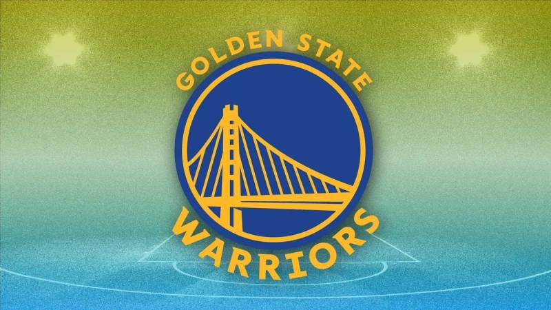
Let me take you on a little trip into the heart of basketball – specifically, the logo that symbolizes one of the NBA’s iconic teams.
This logo? It isn’t just a picture. It’s a story. A statement. A promise.
The Bridge
So you’ve seen that bridge, right? That’s the Bay Bridge. Connecting San Francisco and Oakland, it’s a testament to unity, symbolizing how the team brings together fans from all over the Bay Area.
When you see that bridge, it’s like a warm invite to all the fans, regardless of which part of the Bay they hail from.
The Warrior
Beyond the bridge, there’s a deeper sense of history. The ‘Warrior’ isn’t just a random choice.
It speaks volumes about resilience, power, and a never-give-up attitude. The team’s spirit? It’s encapsulated right there in that word.
The History of the Golden State Warriors Logo
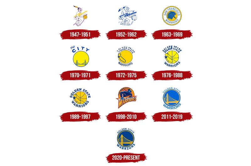
Ah, the good ol’ days. But hey, let’s take a step back and see how this logo has evolved, yeah?
The Beginnings
So way back in the day, there was this whole Native American headdress thing going on. Very different vibe, huh?
Then, as the team moved and times changed, the logo underwent shifts. I mean, change is the only constant, right?
Bay Area Pride
Post the Philly days, the Bay Area got its shining moment. We saw the bridge introduction, and boy, was that a game changer. It gave the logo a fresh identity and a sense of belonging to the Bay Area.
The Colors of the Golden State Warriors Logo
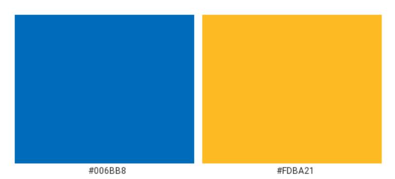
Colors, my friends, they’re not just random choices. They speak. They vibe.
Royal Blue
Royal Blue. Think loyalty, strength, trust. That’s what the Warriors are all about. Standing tall and playing hard.
Golden Yellow
Then there’s the golden yellow – illuminating, full of energy, and oh-so-optimistic! It’s like a burst of sunshine on the court. Radiance, every time they play.
The Font Used in the Golden State Warriors Logo

Typefaces. They’re low-key storytellers. The font in the Warriors logo? Sleek, modern, and absolutely in-your-face!
Clean and Bold
No-nonsense. That’s what it shouts. The boldness represents strength, and its clean lines show finesse and professionalism. A sweet combo if you ask me.
Design Evolution Over Time
From Philadelphia to San Francisco
The team’s journey from Philadelphia to San Francisco is echoed in its design evolution. From more intricate drawings to cleaner, more contemporary designs – it’s been quite a ride.
Modernizing the Emblem
With time, everything gets a bit of a touch-up, right? The logo became sharper, more refined, with clearer graphics and polished designs in recent years.
Fan Perspectives on the Logo
A Badge of Honor
Talk to any hardcore fan and they’ll tell you – wearing that logo is like wearing a badge of honor. It’s not just about basketball; it’s about being part of a larger community.
The Emotional Connect
The bridge, the colors, the font – everything resonates with the fans. It’s like they see a part of themselves in that emblem. And when the team wins or loses, that emblem carries all those emotions.
The Golden State Warriors logo is more than just a symbol; it’s an emotion, a legacy, and an epitome of basketball excellence.
From its colors to its design elements, every detail has a story, a meaning, and a purpose. As the team marches on, this emblem remains a beacon of pride, unity, and undying spirit.
FAQ On The Golden State Warriors Logo
What’s the history behind the Golden State Warriors logo?
The logo’s saga echoes the team’s timeline, shifting from a native American headdress to the iconic Bay Bridge imagery.
It pays homage to the Warriors’ nascency in Philadelphia, through the San Francisco days, and now represents the modern era reflecting the entirety of the Golden State.
Why does it feature the Bay Bridge?
Chosen for its regional significance, the Bay Bridge symbolizes connection—tying the team’s ethos to its Bay Area roots.
This structural marvel stands as an apt metaphor for the Warriors’ binding force within the community, their reach extending beyond a sport, entwining with the locale’s identity.
Has the Warriors logo always been the same?
Not at all. Since their inception in 1946, the Warriors’ crest has undergone several rebrandings. The motifs evolved from geographical nods to the city’s heritage, progressing into the contemporary emblem.
Each iteration marks a logo evolution, reflecting the times and aspirations of the franchise.
What do the colors of the logo symbolize?
The logo’s colors—royal blue and California golden yellow—stand for excellence, nobility, and vitality. They are a vibrant banner under which Warriors fans rally, conveying the vibrancy and energy of the basketball team itself while also acknowledging Californian pride.
How has the logo impacted the Warriors’ brand identity?
Drastically. The crisp, modern graphic design solidified the Warriors’ identity, establishing them as a staple in not just NBA culture, but branding excellence.
Its widespread recognition has turbocharged merchandise sales, and the sports logo has become a defining image of the franchise.
When was the current Golden State Warriors logo introduced?
The present-day insignia made its debut in 2010, ushering in a logo design that balances nostalgic elements with sleek, forward-facing aesthetics. It captivates by reflecting on the past, with an outlook eager for the Warriors’ future glories.
Do fans influence changes in the Warriors logo?
Certainly! Fan sentiment plays a crucial role—even if indirectly. The avid Dub Nation and their passionate reactions inform the franchise’s decisions. After all, the logo is a bastion of the team’s spirit, and ensuring it resonates with the heartbeat of its supporters is paramount.
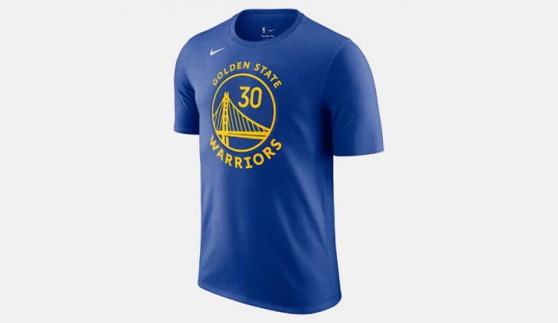
What role does the Warriors logo play in merchandise?
A starring one, without a doubt. As a symbol etched on every conceivable piece of fan gear, from jerseys to memorabilia, it incites sales and personifies the sports merchandise category. Essentially, it stamps Warriors’ authority over a lucrative branding empire.
Are there any legal protections for the Warriors logo?
Absolutely. It’s guarded fiercely through intellectual property laws, fending off unlicensed uses and counterfeit products. Legitimate usage necessitates official licensing, preserving the emblem’s exclusivity, and consequently, its value across all forms of sports marketing.
How is the logo incorporated in game experiences?
Beyond merch, it’s a visual keystone within Chase Center, enhancing the game-day atmosphere and fan immersion.
Projected, emblazoned, and festooned throughout—the logo is omnipresent, orchestrating the fan experience into a ceremonial rally around basketball, history, and community.
Conclusion
In the tapestry that weaves together sport and culture, few threads are as vibrant as the Golden State Warriors logo. Its journey from a simple emblem to an intricate brand identity mirrors the evolution of an era’s spirit, encapsulating triumphs within its folds.
- The Bay Bridge, the connective symbol at the heart of the design, bridges more than waters; it unites a community beneath the golden banner of basketball excellence.
- Each adaptation of the logo has narrated a silent story, a visual chronicle of a team that is as dynamic as the game itself.
As our exploration draws to a close, consider the power distilled in this symbol. It’s an illustration not merely of a basketball team, but also an emblem revered by Dub Nation, and a beacon for aspiring squads the world over. Let the Warriors’ insignia stand as a testament to the gravity a logo holds—a mark that extends beyond merchandise, beyond the court, and into the very pulse of a collective identity.
If you liked this article about the Golden State Warriors logo, you should check out this article about the Chicago Bulls logo.
There are also similar articles discussing the Miami Heat logo, the Houston Rockets logo, the Detroit Pistons logo, and the Milwaukee Bucks logo.
And let’s not forget about articles on the Cleveland Cavaliers logo, the Utah Jazz logo, the Toronto Raptors logo, and the Memphis Grizzlies logo.
Bogdan Sandu, a seasoned designer with 15 years of diverse experience, has been designing websites since 2008.
Renowned for his expertise in logo design and visual branding, Bogdan has developed a multitude of logos for various clients.
His skills extend to creating posters, vector illustrations, business cards, and brochures. Additionally, Bogdan's UI kits were featured on marketplaces like Visual Hierarchy and UI8.
Latest posts by Bogdan Sandu (see all)