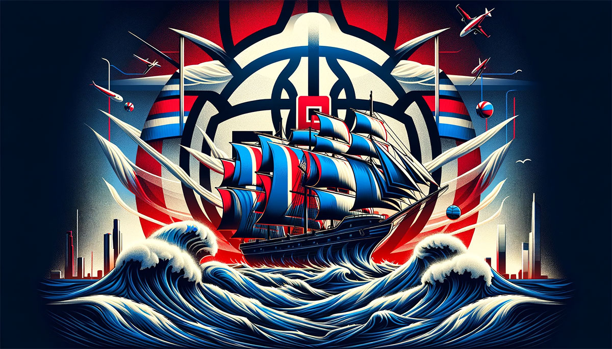
The Los Angeles Clippers logo represents one of professional basketball’s most recognizable brand identities. The current design, unveiled in February 2024, features a navy blue clipper ship enclosed within a compass-inspired “C” shape.
This emblem marks the franchise’s sixth major design iteration since 1970. The team has transformed its visual identity alongside each geographic relocation, from Buffalo to San Diego to Los Angeles.
The 2024 redesign reflects the franchise’s maritime heritage while establishing a modern aesthetic for the Intuit Dome era. Naval blue, ember red, and Pacific blue now define the team’s official palette.
Since the Buffalo Braves’ founding in 1970, the franchise has undergone five complete logo transformations. Each redesign coincided with significant organizational changes, location shifts, or ownership transitions.
What is the Los Angeles Clippers Logo?
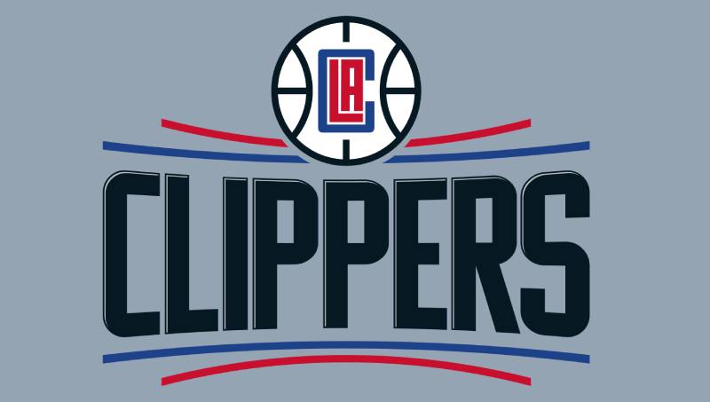
The Los Angeles Clippers logo is a circular emblem featuring a stylized clipper ship within a navy “C” shaped compass, introduced February 26, 2024. The design includes basketball seams on the ship’s hull, with the team name displayed around the perimeter in custom naval-inspired typography.
Design Type: Combination mark with emblem and wordmark elements
Primary Elements:
- Clipper ship silhouette with basketball texture
- Compass-shaped “C” frame
- Circular badge structure
- Custom nautical typeface
Official Introduction Date: February 26, 2024 (for 2024-25 season)
Designer/Agency: Developed through internal collaboration with Gillian Zucker, President of Business Operations
Trademark Status: Registered with USPTO, protected under NBA franchise agreements
Color Palette:
- Naval Blue: #1D428A (Pantone 7687 C)
- Ember Red: #C8102E (Pantone 186 C)
- Pacific Blue: Accent color
- Silver: #BEC0C2 (Pantone Cool Gray 5)
- Black: #000000
Usage Context: Uniforms, court design, merchandise, digital platforms, arena signage, broadcast graphics
How Has the Los Angeles Clippers Logo Evolved Over Time?
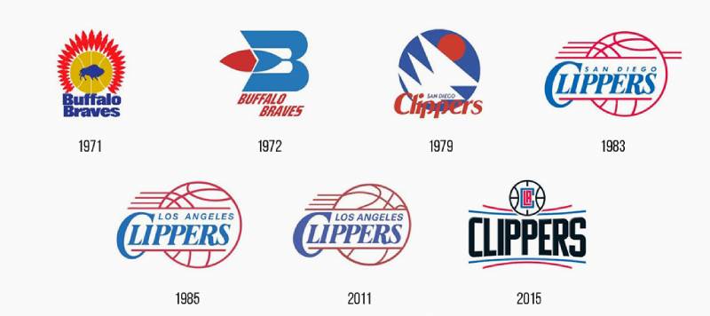
The Clippers brand identity spans five decades with six distinct design eras. Each transformation reflected organizational priorities, from the Buffalo Braves’ Native American imagery to San Diego’s nautical themes to Los Angeles’s modern basketball focus.
The franchise began as an expansion team with regionally specific branding. Geographic relocations necessitated complete visual overhauls rather than incremental updates.
Original Buffalo Braves Logo (1970-1971)
Years Active: 1970-1971
Design Description: Blue bison silhouette with orange basketball and red feathers forming Native American headdress
Color Scheme: Royal blue, orange, red, white
Designer: Unknown
Context: Created for NBA expansion franchise in Buffalo, New York
Key Changes from Previous: Inaugural design, no predecessor
Cultural Significance: Represented Western frontier imagery popular in 1970s sports branding
Buffalo Braves Redesign (1971-1978)
Years Active: 1971-1978
Design Description: Stylized capital “B” with horizontal bar forming red and white feather, vertical bar arched toward center
Color Scheme: Baby blue, red, white
Designer: Unknown
Context: Simplified the original concept while maintaining Native American tribute
Key Changes from Previous: Removed bison and basketball imagery, focused on letter-based design
Cultural Significance: Reflected early 1970s trend toward geometric, modernist sports logos
San Diego Clippers Original Logo (1978-1982)
Years Active: 1978-1982
Design Description: Three overlapping triangular white sails on solid blue circle with red sun
Color Scheme: Baby blue, orange, red, white
Designer: Unknown
Context: Accompanied franchise relocation and name change to “Clippers” referencing San Diego’s maritime history
Key Changes from Previous: Complete departure from Buffalo branding, introduced nautical theme
Cultural Significance: Established clipper ship as central brand metaphor
San Diego Clippers Basketball Logo (1982-1984)
Years Active: 1982-1984
Design Description: Red and white basketball with blue text and horizontal red motion lines
Color Scheme: Royal blue, red, white
Designer: Unknown
Context: Shift toward explicit basketball imagery before Los Angeles move
Key Changes from Previous: Replaced sailing motif with dynamic basketball design
Cultural Significance: Short-lived transitional identity before major market relocation
Los Angeles Clippers Original Logo (1984-2015)
Years Active: 1984-2015 (with modifications in 2010)
Design Description: White basketball with red motion lines, team name wordmark overlay
Color Scheme: Royal blue, red, white (black added in 2010)
Designer: Unknown
Context: Maintained San Diego’s final design while updating text from “San Diego” to “Los Angeles”
Key Changes from Previous: Geographical wordmark change, color intensity adjustments in 2010
Cultural Significance: Longest-running Clippers logo, associated with franchise’s challenging rebuild years
Los Angeles Clippers Compass Logo (2015-2024)
Years Active: 2015-2024
Design Description: Basketball shaped as compass with “LAC” monogram center, curved lines representing ocean horizon
Color Scheme: Red, blue, black, silver
Designer: Internal team collaboration under Steve Ballmer ownership
Context: Major rebrand following Donald Sterling controversy and Ballmer’s purchase
Key Changes from Previous: Introduced modern geometry, minimalist aesthetic, added black as primary color
Cultural Significance: Represented franchise’s attempt to establish new identity separate from past controversies
Los Angeles Clippers Nautical Logo (2024-Present)
Years Active: 2024-Present
Design Description: Clipper ship within compass “C” surrounded by team name in circular badge
Color Scheme: Naval blue, ember red, Pacific blue, silver
Designer: Collaborative effort led by Gillian Zucker and design specialists
Context: Unveiled for Intuit Dome opening, return to maritime roots with modern execution
Key Changes from Previous: Reintroduced ship imagery, custom naval typeface, deeper blue tones
Cultural Significance: Bridges franchise history with contemporary design sensibilities
What Do the Design Elements of the Los Angeles Clippers Logo Mean?
The Los Angeles Clippers logo’s primary element is the clipper ship, which directly references the franchise name. Clippers were fast sailing vessels from the mid-1800s, common in San Diego Harbor where the team played from 1978 to 1984.
The ship’s hull features basketball seams, merging maritime heritage with the sport’s identity. This dual symbolism connects the team’s San Diego origins to its current Los Angeles presence.
The compass structure surrounding the ship emphasizes direction and progress. The “N” marker points north in the full logo, suggesting forward movement and ambition.
Why Did Los Angeles Clippers Choose These Specific Colors?
Naval Blue (#1D428A) serves as the primary color, representing depth, stability, and oceanic heritage.
The shade replaces the previous royal blue, offering a more sophisticated tone. Blue suggests loyalty and trust, key attributes for fan relationships.
Ember Red (#C8102E) provides energetic contrast, evoking passion and competitive intensity.
Red maintains continuity with the franchise’s color history dating to 1971. The hue name “ember” suggests glowing heat rather than aggressive fire.
Pacific Blue references the West Coast geography shared by San Diego and Los Angeles.
This accent color connects the team to California’s coastal identity. It appears subtly in uniform details and court design elements.
Silver (#BEC0C2) adds metallic sophistication and modern polish.
The neutral tone balances the bold primary colors. Silver suggests championship aspirations and premium quality.
What Typography Style Is Used in the Los Angeles Clippers Logo?
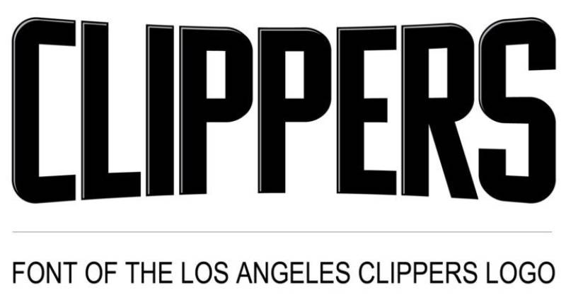
The current Clippers wordmark employs a custom sans-serif font inspired by naval typography traditions.
Letters feature extended proportions with subtle nautical details. The typeface balances legibility with thematic authenticity.
Previous iterations used Baskerville Old Serial Heavy for traditional elegance. The 2024 redesign prioritizes modern clarity over classical formality.
Script lettering appears on uniform designs, recalling the 1987-2015 era. This cursive style provides contrast to the logo’s structured geometry.
What Are the Hidden Meanings in the Los Angeles Clippers Logo?
The compass points align with cardinal directions, with north oriented toward “Los Angeles” in the full logo.
This directionality symbolizes the franchise’s navigation through challenges toward future success. The compass metaphor extends to the team’s journey from Buffalo through San Diego to Los Angeles.
Basketball seams on the ship’s hull merge two core identities without obvious visual competition.
The integration appears seamless, suggesting natural unity between maritime heritage and basketball excellence. Designer intent focused on honoring San Diego fans while engaging Los Angeles supporters.
How Does the Los Angeles Clippers Logo Compare to Competitor Logos?
The Clippers’ nautical theme stands apart from most NBA franchises. While the Boston Celtics logo uses a leprechaun mascot and the Chicago Bulls logo features an aggressive animal, the Clippers employ maritime symbolism.
This distinction addresses a longstanding challenge. The Los Angeles Lakers logo dominates the city’s basketball branding with gold and purple colors, iconic players, and championship success.
The Clippers’ naval blue and ember red palette differentiates from the Lakers’ yellow and purple. Both teams now play in different arenas, with the Clippers at Intuit Dome and Lakers at Crypto.com Arena.
Among NBA logos, the Clippers’ circular badge structure resembles the Golden State Warriors logo and Philadelphia 76ers logo in using full-circumference text treatments.
The ship imagery connects to San Diego’s naval history more explicitly than other location-based logos. The Miami Heat logo suggests climate through a flaming basketball, while the Clippers use literal representation.
What Are the Technical Specifications of the Los Angeles Clippers Logo?
Official Color Codes:
Primary Color: Naval Blue
- Hex: #1D428A
- RGB: (29, 66, 148)
- CMYK: (100, 78, 0, 18)
- Pantone: 7687 C
Secondary Color: Ember Red
- Hex: #C8102E
- RGB: (200, 16, 46)
- CMYK: (2, 100, 85, 6)
- Pantone: 186 C
Accent Color: Silver
- Hex: #BEC0C2
- RGB: (190, 192, 194)
- CMYK: (0, 0, 0, 29)
- Pantone: Cool Gray 5
Accent Color: Black
- Hex: #000000
- RGB: (0, 0, 0)
- CMYK: (75, 68, 67, 90)
Dimensions and Proportions:
The logo maintains a 1:1 aspect ratio in its primary circular form. Minimum reproduction size requires 0.5 inches diameter for print applications to preserve detail clarity.
Clear space specifications mandate distance equal to the height of the letter “C” on all sides. This ensures proper visual separation from other design elements.
Official usage guidelines prohibit color modifications, distortions, or element removal. The ship, compass, and wordmark must appear together in the primary version.
What Cultural Impact Has the Los Angeles Clippers Logo Had?
The 2024 redesign generated mixed reactions from Clippers Nation. Long-time fans appreciated the return to nautical themes honoring San Diego heritage.
Social media discussions highlighted the ship imagery as educational. Many fans admitted not knowing “Clippers” referenced sailing vessels until the logo reveal.
The design coincides with the Intuit Dome opening, marking a fresh chapter. The new arena in Inglewood represents the franchise’s first standalone home facility.
Merchandise sales increased following the February 2024 announcement. The combination of nostalgic elements and modern execution appealed to diverse fan demographics.
How Does the Los Angeles Clippers Logo Fit Into the Overall Brand Identity?
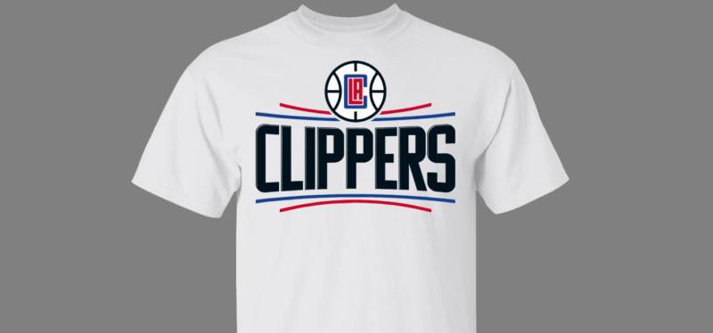
The logo serves as the foundation for comprehensive visual identity. Court design, uniform elements, and arena graphics extend the nautical theme consistently.
Jersey designs incorporate the script lettering from 1987-2015 uniforms. This creates continuity for fans who remember the team’s previous aesthetic era.
The Statement Edition uniforms feature nautical flags spelling “LAC” on side panels. These signal flag references deepen the maritime storytelling beyond the primary mark.
Court design displays the logo at center with north pointing upward. The Inglewood coordinates appear along baselines, grounding the identity in specific geography.
Intuit Dome architecture incorporates subtle nautical elements without overwhelming theming. The balance between brand identity and refined design maintains sophistication.
How Should the Los Angeles Clippers Logo Be Used?
Official Usage Guidelines:
Do maintain proper color specifications using Pantone, RGB, or CMYK values as specified.
Do preserve minimum size requirements to ensure legibility across applications.
Do maintain clear space around the logo equal to the “C” height.
Don’t alter colors, including creating monochrome colors variations without approval.
Don’t distort proportions, stretch, or compress the logo.
Don’t separate elements or use individual components without the complete mark.
Don’t place the logo on busy backgrounds that reduce visibility.
Where to Access Official Logos:
The LA Clippers official website provides approved logo files for media use. High-resolution vector graphics are available in EPS and SVG formats for scalability.
Print design applications require CMYK color profiles, while digital platforms use RGB specifications. Always convert files appropriately for the intended medium.
Licensing Information:
The Los Angeles Clippers logo is protected intellectual property owned by LA Clippers, LLC. Commercial use requires licensing agreements through the NBA’s official merchandise program.
Non-commercial fan art and editorial use follow fair use guidelines. Media organizations receive explicit permissions for coverage purposes.
Trademark Protection Details:
The logo is registered with the United States Patent and Trademark Office. The mark covers sports entertainment services, apparel, and merchandise categories.
NBA franchise agreements provide additional protection layers. The league collectively manages brand integrity across all 30 teams.
FAQ About the Los Angeles Clippers Logo
When was the Los Angeles Clippers logo created?
The current Los Angeles Clippers logo was created and unveiled on February 26, 2024, for implementation during the 2024-25 NBA season. The design process began approximately three years earlier, coinciding with Intuit Dome construction groundbreaking.
Who designed the Los Angeles Clippers logo?
The Los Angeles Clippers logo was designed through a collaborative process led by Gillian Zucker, President of Business Operations for the Clippers and Intuit Dome. The team engaged external design specialists while incorporating extensive fan feedback gathered over multiple years.
What do the colors in the Los Angeles Clippers logo mean?
The Los Angeles Clippers logo colors represent specific attributes: naval blue signifies depth and maritime heritage, ember red conveys passion and competitive energy, Pacific blue references West Coast geography, and silver adds modern sophistication. These colors replace the previous royal blue, creating a more refined palette.
How many times has the Los Angeles Clippers logo been redesigned?
The Los Angeles Clippers logo has been redesigned six times since the franchise’s 1970 founding as the Buffalo Braves. Major redesigns occurred in 1971, 1978, 1982, 1984 (with 2010 modifications), 2015, and 2024. Each transformation typically accompanied organizational changes or geographic relocations.
Where can I download the official Los Angeles Clippers logo?
The official Los Angeles Clippers logo can be downloaded from the team’s official website in approved formats for media and editorial use. High-resolution files are available through the NBA’s official media portal for credentialed journalists and content creators. Commercial licensing requires separate authorization.
Is the Los Angeles Clippers logo trademarked?
Yes, the Los Angeles Clippers logo is trademarked and registered with the United States Patent and Trademark Office. The mark is owned by LA Clippers, LLC and protected under NBA collective franchise agreements. Unauthorized commercial use violates federal trademark law.
What font is used in the Los Angeles Clippers logo?
The Los Angeles Clippers logo uses a custom sans-serif typeface inspired by naval and maritime typography traditions. The font was specifically designed for the 2024 rebrand and is not publicly available. Previous logos used Baskerville Old Serial Heavy.
Why did Los Angeles Clippers choose a ship for their logo?
The Los Angeles Clippers chose a ship for their logo because “Clippers” references fast sailing vessels from the mid-1800s that were common in San Diego Harbor. The team adopted the “Clippers” name in 1978 when the franchise relocated from Buffalo to San Diego, establishing maritime imagery as a core brand element.
Conclusion
The Los Angeles Clippers logo represents a sophisticated evolution of professional basketball branding. The 2024 design successfully merges maritime heritage with contemporary aesthetics through the clipper ship and compass symbolism.
Key attributes include naval blue and ember red color specifications, custom nautical typography, and circular badge structure. These elements create cohesive brand identity across uniforms, court design, and arena environments.
The logo positions the Clippers within the competitive Los Angeles sports landscape while honoring San Diego origins. This dual geographic recognition acknowledges the franchise’s complete history rather than erasing past chapters.
Looking forward, the design establishes visual consistency for the Intuit Dome era and beyond. The timeless nautical theme provides flexibility for future applications while maintaining core brand recognition.
If you liked this article about the Los Angeles Clippers logo, you should check out this article about the Portland Trail Blazers logo.
There are also similar articles discussing the San Antonio Spurs logo, the New Orleans Pelicans logo, the Philadelphia 76ers logo, and the Boston Celtics logo.
And let’s not forget about articles on the Indiana Pacers logo, the Oklahoma City Thunder logo, the Phoenix Suns logo, and the Charlotte Hornets logo.

Renowned for his expertise in logo design and visual branding, Bogdan has developed a multitude of logos for various clients.
His skills extend to creating posters, vector illustrations, business cards, and brochures. Additionally, Bogdan's UI kits were featured on marketplaces like Visual Hierarchy and UI8.
He also wrote in the past years on sites like Design Your Way, WebDesignerDepot, WPDean, Designmodo, Speckyboy, Slider Revolution, and more.
- How to Embed Fonts in PDF for Reliable Printing - 30 September 2026
- How to Create Product Design Principles That Evolve With Your Product - 29 September 2026
- Canva vs Midjourney: AI Design Tools Compared - 28 September 2026

Bogdan Sandu is a seasoned designer who has been designing websites since 2008. Renowned for his expertise in logo design and visual branding, Bogdan has developed a multitude of logos for various clients. His skills extend to creating posters, vector illustrations, business cards, and brochures. Additionally, Bogdan's UI kits were featured on marketplaces like Visual Hierarchy and UI8. He also wrote in the past years on sites like Design Your Way, WebDesignerDepot, WPDean, Designmodo, Speckyboy, Slider Revolution, and more.
You Might Also Like