The Sacramento Kings Logo History, Colors, Font, and Meaning

Imagine a symbol that captures the essence of a city’s heart and the adrenaline of basketball in one visual punch. The Sacramento Kings logo does just that—encapsulating history, energy, and loyalty in its iconic design.
Hovering at the intersection of sports branding and graphic design, this emblem stands as a testament to Sacramento’s NBA spirit. As the league’s colors whirl and dunk into the daily lives of fans, it’s more than just a team’s face—it’s the collective identity of a community.
This article unfurls the story stitched within the seams of the Sacramento Kings branding, guiding you through the evolution and significance of an image that soars beyond the court.
You’ll unpack the layers of design, from the bold purple and silver hues to the regal imagery that declares royalty.
Across the text, anticipate a deep dive into the intricacies of sports emblematic prowess, the ethos of the Kings team crest, and how all this shakes hands with fan culture and sports memorabilia.
By the final line, the hope is to leave you with a richer appreciation of the art that rallies a fanbase and emblazons merchandise shelves.
The Meaning Behind the Sacramento Kings Logo
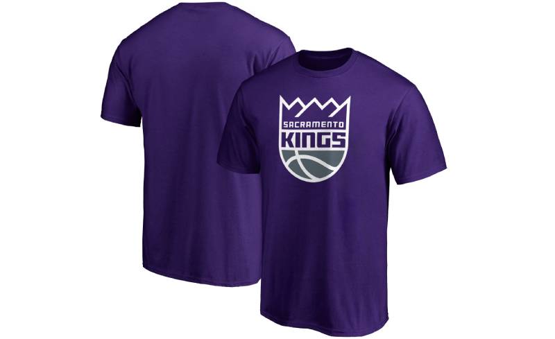
Deep Dive into the Crown
Alright, let’s break it down. That crown on top? It’s not just for show.
It represents royalty, strength, and leadership. The Kings, by name alone, have always pushed that regal vibe, and it’s quite fitting for a team looking to dominate the NBA.
Ball & Blades
Ever noticed the basketball? It’s subtly merged with the crown, symbolizing the essence of the game. But wait, there’s more.
Those little blades or spikes jutting out? It’s about defense and offense – the double-edged sword of basketball. The Kings are here to play, both in offense and defense, and their logo screams that.
The History of the Sacramento Kings Logo
From Royals to Kings
Back in the day, our Kings weren’t always the Kings. They started as the Rochester Royals. The logo then? Way different. As the team evolved, so did their visual identity.
The Evolutionary Timeline
There’s a rich tapestry here, people. From the ’50s to now, the logo has seen several revisions. The transition from the Royals to the Kings brought about bolder colors, sharper design, and that iconic crown we all recognize today.
The Colors of the Sacramento Kings Logo
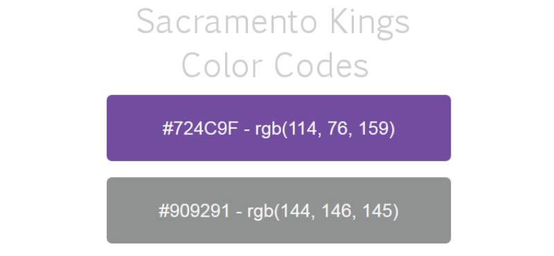
Purple Reign
No, not a typo. We’re talking about the color purple. It symbolizes royalty, power, and ambition. And boy, do the Kings own it. It’s vibrant, it’s loud, and it stands out – just like a King should.
Silver Lining
The addition of silver? It’s not just because it looks cool (even though it does). Silver is about refinement, dignity, and a touch of mystery. It complements that regal purple like peanut butter does with jelly.
The Font Used in the Sacramento Kings Logo
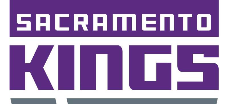
Bold and Decisive
Ever looked at that font and felt a sense of urgency? That’s by design. The font is thick, bold, and quite assertive. It’s like the team’s saying, “We’re here, we’re clear in our intentions, and we’re going for the win.”
Simplicity in Style
While it’s bold, it’s also simple. No crazy curls or twirls. It’s straightforward and effective, which kind of sums up basketball when you think about it.
Symbolism in Placement
The Ball’s the Star
You might’ve noticed, the basketball is dead center, right? That’s no accident. It’s the heart of the game, the heart of the team, and the heart of the logo. Everything revolves around it, and rightfully so.
Crowning Glory
The crown, loftily placed on top, isn’t just about royalty. It’s a testament to aspirations, the team’s goals, their drive to be at the pinnacle of the NBA universe.
Pop Culture and the Sacramento Kings Logo
Sneakerheads Rejoice
This logo hasn’t just stayed on the court. It’s made its way into the streets! On caps, tees, and especially sneakers. The color combo and the design make for some fire streetwear.
Influencing Art
You’d be surprised how often the logo finds its way into murals, tattoos, and digital art. Its unique design and color palette make it an interesting subject for creative expression.
FAQ On The Sacramento Kings Logo
What is the significance of the Sacramento Kings logo?
The Sacramento Kings logo isn’t just a graphic; it’s a vibrant symbol that reflects the team’s essence and connects with the city’s spirit.
Its regal components are nods to royalty, while the distinctive purple and silver color scheme represents the team’s unique identity within the NBA.
When was the Sacramento Kings logo created?
The current iteration of the Sacramento Kings logo was unveiled in 2016. This marked a new chapter in the franchise’s branding, blending modern design elements with a respect for the team’s storied past, a balance of freshness and historical homage that captures the attention of fans and the city alike.
Has the Sacramento Kings logo changed over time?
Yes, the Sacramento Kings logo has gone through several redesigns since the team’s inception. With each iteration, the logo’s evolution reflects shifts in design trends, ownership, and the team’s connection with Sacramento’s community and fan culture.
Who designed the Sacramento Kings logo?
The 2016 redesign of the Sacramento Kings logo was crafted by a collaboration between the team’s creative department and an external branding agency.
Together, they finessed a logo that elevates the team’s visual identity to match the energy of NBA basketball and the Kings’ dynamism.
What do the colors in the Sacramento Kings logo represent?
Key to the Sacramento Kings logo are the colors: purple and silver. Purple embodies royalty, mystery, and the passionate spirit of the fans, while silver adds a touch of sophistication and modernity, reflecting the team’s forward-thinking approach to basketball and the sports marketing arena.
Is the Sacramento Kings logo featured on merchandise?
Absolutely, the Sacramento Kings logo is emblazoned on a wide array of sports merchandise. From jerseys to hats, memorabilia, and casual fan gear, the emblem is a beacon for supporters, signaling allegiance and community pride across various products.
Can the Sacramento Kings logo be used commercially?
The Sacramento Kings logo is subject to copyright and trademark laws. Its commercial use is restricted and requires licensing agreements to ensure protection of the team’s brand identity. Unauthorized use could lead to legal consequences, steering clear of infringement is a must.
What was the inspiration behind the Sacramento Kings logo?
The inspiration is twofold: paying homage to the team’s royal naming convention and reflecting its Sacramento roots.
Elements such as the lion and crown are nods to kingly imagery while integrating a modern flair to cater to the team’s fan gear and broader basketball emblem significance.
How does the Sacramento Kings logo connect with local fans?
The logo serves as a rallying symbol for Sacramento’s ardent supporters. Its design elements bond with local iconography and become a visual chant for the Kings’ community, echoing through merchandise, banners, and the electrifying atmosphere of the Golden 1 Center.
What are the legal considerations for using the Sacramento Kings logo?
Legally, the Sacramento Kings logo falls under logo trademark regulations. Usage for any public, commercial, or promotional purposes mandates permission from the NBA or the Sacramento Kings organization.
Such measures safeguard the logo’s integrity and the team’s branding efforts within the commercial landscape.
Conclusion
In the realm of design, the Sacramento Kings logo stands as a beacon of cultural synthesis, marrying metropolitan pride with the kinetic energy of basketball. It is a visual lexicon that speaks of loyalty, heritage, and the future in equal measure. Through the course of this exploration, the emblem’s nuances have been unspooled, revealing the tapestry of identity behind the regal symbol.
- A testament to the city and its fans
- A continuous dialogue between tradition and innovation
- An anchor in the sea of NBA sports marketing
As the curtain falls on our discussion, it’s clear that this logo is no mere graphical exercise; it is the heartbeat of a franchise beating in sync with the pulse of Sacramento. It shapes the fabric of fandom, emblazoning everything from jerseys to the digital frontiers of social media, etching itself indelibly into the collective memory of the basketball world. This logo transcends aesthetics, becoming part of the lexicon of the game itself.
If you liked this article about the Sacramento Kings logo, you should check out this article about the Dallas Mavericks logo.
There are also similar articles discussing the Washington Wizards logo, the Atlanta Hawks logo, the Brooklyn Nets logo, and the New York Knicks logo.
And let’s not forget about articles on the Orlando Magic logo, the Denver Nuggets logo, the Los Angeles Lakers logo, and the Minnesota Timberwolves logo.
Bogdan Sandu, a seasoned designer with 15 years of diverse experience, has been designing websites since 2008.
Renowned for his expertise in logo design and visual branding, Bogdan has developed a multitude of logos for various clients.
His skills extend to creating posters, vector illustrations, business cards, and brochures. Additionally, Bogdan's UI kits were featured on marketplaces like Visual Hierarchy and UI8.
Latest posts by Bogdan Sandu (see all)