Hunger doesn’t wait for a slow interface to catch up.
Nearly 70% of online orders get abandoned before checkout, and food apps carry some of the least patient users in retail (Baymard Institute, 2024). That statistic gets tossed around across ecommerce generally, but food ordering is where it bites hardest. Nobody scrolling for dinner has the patience an apparel shopper does.
Good food app design decides whether that order gets finished or the app gets closed.
It shows up in small places. A menu photo that loads a beat too slow. A modifier screen that hides the “add to cart” button below the fold. A checkout screen that forces an account before anyone’s ready to commit to anything.
None of it is decoration. Every screen either moves a hungry, distracted person a step closer to a placed order, or hands them a reason to close the app and try somewhere else instead.
What Is Food App Design
Screens, flows, taps. Strip away the vocabulary and that’s what food app design actually comes down to, the process behind every menu browse, every order customization, every payment screen, every delivery ping that lands on someone’s phone.
It sits somewhere between interface design and behavioral psychology, chasing one outcome only: get someone from a hungry impulse to a placed order with as little friction in between as possible.
Line it up against other app categories and the difference gets obvious fast. A fitness app leans on progress rings and streaks, gamifying repetition to keep someone coming back. Finance apps live or die on trust: account balances, a two-factor prompt before anyone touches a real dollar figure.
Food app design doesn’t share either of those priorities. It runs on one clock, how hungry is this person right now, and how many taps sit between them and dinner.
In practice, that covers a specific set of screens and flows:
- Menu browsing and category structure
- Product cards, photos, and customization screens
- Cart, checkout, and payment flow
- Live order tracking and delivery status
- Onboarding, search, and personalization layers
It does not cover kitchen logistics, delivery routing, or driver dispatch systems. Those live on the backend, not the screen.
Food and beverage consistently posts the highest online conversion rate of any major retail category, with multiple industry benchmarks putting it in the roughly 4.5% to 6% range, well ahead of apparel, home goods, or luxury (Dynamic Yield; Smart Insights ecommerce conversion benchmarks). It also tends to post the highest add-to-cart rate among tracked verticals, typically in the 10% to 13% range depending on the year and dataset (Dynamic Yield ecommerce benchmarks). People convert fast in this category when the design gets out of their way. They leave just as fast when it doesn’t.
How Does Navigation Structure Affect Food App Design
Most successful food ordering apps use a bottom tab bar instead of a hamburger menu, and there’s a real reason for that beyond taste. It comes down to where a thumb naturally sits on a phone.
Tab Bar vs Side Menu Patterns

Steven Hoober’s original mobile usage research, built from more than 1,300 real-world observations of people actually using their phones, found that 49% of people hold and operate their phone with one hand.
A separate, widely-cited extension of that work puts thumb-driven taps at roughly 75% of all mobile interactions, regardless of how the phone is being held.
The bottom third of a screen sits inside that natural one-handed thumb zone, while the top third typically requires a grip shift or a second hand to reach comfortably (Hoober’s thumb-zone research). Bottom-positioned navigation reliably captures the large majority of navigation taps in usability studies, even when a top bar or side drawer is sitting right there as an alternative.
DoorDash and Uber Eats both run a five-tab bottom bar: Home, Search, Cart, Orders, Account. Nothing that matters is hidden behind a drawer icon.
| Pattern | Reachability | Best For |
|---|---|---|
| Bottom tab bar | High one-handed reach | 3-5 core sections used every session |
| Hamburger menu | Requires grip shift or two hands | Rarely-used settings, legal pages |
For a broader set of real patterns beyond food ordering, this roundup of mobile tab UI design is worth a look.
Depth and Tap-Count Standards
Cart access should never sit more than one tap away from any screen in the app. A persistent floating cart bar, showing item count and running total, keeps that promise without forcing a user back to the home screen.
In practice: home to a menu item lands around two taps, menu item into the cart takes one, and cart through to a confirmed order runs three to four. Every extra screen between a craving and a confirmed order is a chance for someone to close the app and order somewhere else.
How Should Menu and Product Pages Be Designed
A product card has about half a second to make its case before someone’s thumb scrolls past it. That’s not really an exaggeration, it’s close to how people actually behave when they’re scanning a menu on a phone.
Product Card Anatomy

A working product card usually needs an image, a name, a price, a rating or badge, and some small signal that the dish can be customized, roughly in that order of what a thumb notices first.
| Element | Purpose |
|---|---|
| Photo | First visual signal, drives the initial decision |
| Price | Sets expectation before a tap |
| Rating or badge | Social proof, reduces hesitation |
Photos aren’t decoration on these cards, they carry most of the buying decision on their own. Cornell University research on menu evaluations found that adding a photo to a menu item increased its sales by 6.5% on average. Grubhub tells its restaurant partners that photos can lift online orders by 30% or more, and a Snappr-commissioned Google survey of 600 US consumers found that viewing pictures mattered more to ordering decisions than reading descriptions did.
Most food apps arrange product cards in a single scrolling column, following the same list UI design for mobile apps pattern already familiar from inboxes and news feeds.
A clear visual hierarchy on the card matters more than any single element does on its own. Price and photo should register before rating, and rating before a modifier badge that nobody actually reads first anyway.
Customization and Modifier Screens

Chipotle’s app is built almost entirely around one modifier screen, where a burrito bowl gets assembled ingredient by ingredient before it ever reaches a cart. That screen works because it reveals choices in order, protein, then rice, then toppings, instead of dumping every option onto one page at once.
Most food apps end up needing the same handful of modifier categories: size or portion, required add-ons (a burger needs a bun, there’s no getting around that one), optional add-ons like extra cheese, and a spice level or prep-notes field for whatever a photo can’t capture.
Required selections should block the “add to cart” button until they’re made. Optional ones never should.
How Does Search and Filtering Improve Food App Design

Not everybody wants to browse. Some people already know exactly what they’re craving and just want the app to get out of the way. That’s what search and filtering are for, letting someone skip the menu scroll and land on a specific dish, cuisine, or dietary need in one move.
The Baymard Institute’s large-scale search usability research spans dozens of documented guidelines covering everything from poor typo handling to missing filters, built from testing across major ecommerce and ordering sites. A search bar with no typo tolerance turns “buritto” into a dead end instead of a burrito. Autocomplete closes that gap by suggesting matches while the user is still typing, before the query is even finished.
The filters that actually carry weight in food ordering are fairly predictable: cuisine type, price range, delivery time, dietary restriction (vegan, gluten-free, halal), and a rating threshold. DoorDash and Zomato both surface dietary filters as a horizontal chip row directly under the search bar, not buried inside a secondary filter panel.
An empty search result should never be a dead page. Showing close matches or popular items nearby keeps a hungry user inside the ordering flow instead of pushing them to close the app. For more patterns on how this gets handled across mobile apps generally, see this collection on search UI design.
What Makes an Effective Cart and Checkout Flow

Checkout is where food apps lose orders they already won. The Baymard Institute’s 2024 US survey (n=4,329) breaks down exactly why, and an effective checkout in food app design basically means answering that list directly: show the full order, show the full price, and cut the steps between cart and confirmation as far down as they’ll go.
| Reason for abandonment | Share of shoppers |
|---|---|
| Extra costs too high | 39% |
| Delivery too slow | 21% |
| Forced account creation | 19% |
| Checkout too long or complicated | 18% |
| Couldn’t see total cost upfront | 14% |
Single-Page vs Multi-Step Checkout
Single-page checkout puts address, payment, and tip all on one scrollable screen. It works best for repeat orders where the details are already saved and there’s nothing new to fill in. Multi-step checkout splits the same information across separate screens instead, address, then payment, then review, and tends to suit first-time users who are entering everything fresh.
Domino’s and most major delivery apps default to guest checkout, letting a first-time user pay without creating an account first. The Baymard data above shows exactly why that matters: nearly one in five shoppers walks away when an account gets forced on them.
Fee and Price Transparency

A real-time price breakdown, subtotal, delivery fee, service fee, tax, and tip, needs to update as soon as an item gets added, not just show up correct on the final screen.
Hidden fees are the single largest fixable cause of checkout abandonment in the data above, cited by 39% of shoppers. Showing the full total before the final “place order” tap removes the one surprise most likely to kill an otherwise completed cart.
How Should Order Tracking and Delivery Status Be Displayed
Nobody wants a vague “your order is on its way” message once they’re actually hungry and watching the clock. They want to know where the food is, right now, not roughly when it might show up.
Domino’s Pizza Tracker, launched in 2008, remains one of the most referenced examples in the category: a staged progress bar showing prep, bake, box, and delivery, updated automatically from the store’s own systems. Since its debut, Domino’s says the Tracker has followed more than 2.5 billion orders. Uber Eats and DoorDash both extend that same idea with a live map, showing the courier’s actual GPS position moving toward the customer’s address.
A tracking screen that’s doing its job shows the current stage (confirmed, preparing, out for delivery, arrived), a live map or staged progress indicator, an ETA that actually updates instead of sitting static from the moment the order was placed, and some way to reach the driver or leave delivery instructions.
Real-time delivery tracking has become a baseline expectation rather than a nice-to-have. Research on ecommerce delivery preferences found that 88% of consumers say real-time tracking is critical to a positive delivery experience, and an inaccurate ETA tends to be a bigger trust problem than a delay that’s simply communicated honestly.
“Where is my order” inquiries are consistently one of the largest single categories of contact volume for ecommerce and delivery businesses, with industry benchmarks commonly citing a range from roughly a quarter to more than a third of total support contacts during normal operations, rising well beyond that during peak periods. Real-time tracking and dynamic ETA updates cut that volume down directly.
What Role Does Onboarding Play in Food App Design

First impressions in food ordering happen fast, and most apps don’t get a second one. Mobile apps in general lose the large majority of their users within the first 90 days, and food tech apps sit inside a category where that churn tends to run even higher (CleverTap retention research).
Onboarding is the stretch of screens between a fresh download and a placed order, and in this category specifically, it needs to ask for less than it’s tempted to. Zomato lets first-time users share their location two ways, GPS detection or manual entry, rather than blocking the entire app behind a single permission prompt.
Social login moves the needle here more than most other signup mechanics. A large majority of internet users say it feels like a trustworthy way to register compared with filling out a form from scratch, and it’s been shown to lift registration rates by up to 50% in some implementations, commonly landing somewhere around 20% to 40% depending on how it’s built.
A short, single-field email or social signup screen converts far better than a multi-field registration form. For visual reference points on how that screen typically gets built, this set of mobile login form design examples covers the pattern well.
None of this is unique to food ordering. The broader principles behind onboarding app design apply here too. They just get compressed into a shorter window, because a hungry user has a lot less patience than someone setting up a budgeting app at their own pace.
How Should Visual Design and Food Photography Be Handled
A dish either looks worth ordering in the first half-second or it doesn’t, and that gets decided almost entirely by photography, color, and type, not by copy.
Food Photography Standards

Consistency across the menu matters more than any single hero shot. That means the same light source and background across every item, sharp focus on the dish itself instead of the plate or table setting, and no stock photography, because a mismatch between the picture and what actually shows up at the door kills trust fast.
| Angle | Best For |
|---|---|
| 45 degrees | Plated entrees, general versatility |
| Overhead (90 degrees) | Flat items like pizza, salads |
| Straight-on (0 degrees) | Tall items like burgers, layered drinks |
Restaurant teams increasingly prototype menu layouts in Figma before shipping them, checking how a photo grid holds up across different screen sizes.
Color and Typography Choices

A 2025 study on food ordering interfaces published in the International Journal of Innovative Research in Science, Engineering and Technology (IJIRSET) found that warm colors like red and yellow measurably increased order conversion and created a stronger sense of urgency than cool-toned interfaces, based on heatmap analysis and order-completion testing. The same study found cool colors like blue and green tended to encourage longer browsing and healthier choices instead of faster conversion.
That’s part of why McDonald’s, Burger King, and most quick-service apps lean on red and orange rather than blue or green in their primary interface color.
Two choices end up mattering more than the rest: the primary accent color, which drives urgency and usually gets matched to the brand, and the price and label typography, which needs to stay legible at small sizes rather than just look good on a mockup.
The psychology behind these choices is well documented. Anyone building menu screens benefits from understanding the basics of color psychology before locking in a palette.
Font choice matters just as much as color does. A roundup of fonts for apps is a useful reference point for picking something legible at the small sizes a price tag or allergen label actually renders at.
How Does Personalization Improve Food App Design
31% of diners say they use a restaurant app specifically because of the personalization it offers, according to Tillster’s 2026 survey of diner preferences. That’s a meaningful chunk of a user base making a choice based on how well the software remembers them, order history, location, whatever they picked last time, and using that to shorten the path back to a dish they already like.
The same survey found 62% of diners want a menu that filters to a price point they set, and 57% want the app to auto-save their customized orders for next time.
Starbucks runs one of the most cited personalization systems in the category. Its recommendation engine surfaces suggestions based on purchase history, weather, and time of day, and the program reported 35.5 million 90-day active Rewards members in the US as of Q1 FY26 (Starbucks investor release, January 29, 2026).
It pays off fastest in a few specific spots: reorder shortcuts sitting right on the home screen, restaurants surfaced by location without anyone having to search for them, and dietary preferences that carry over from one session to the next instead of resetting every time.
Restaurants that offer a branded mobile app see a 112% increase in reorder rates compared to those without one, per Restroworks’ 2025 analysis of restaurant app adoption data.
What Accessibility Standards Apply to Food App Design
Text and price labels need a contrast ratio of at least 4.5:1 against their background for normal-sized text, per WCAG 2.1 Level AA, the W3C’s own published standard. Large text (18pt and up, or 14pt bold) gets a slightly lower bar at 3:1, and interactive elements like buttons and form borders need at least 3:1 as well.
Beyond color, three other things need direct attention: tap targets on modifier buttons and quantity steppers sized for a thumb instead of a cursor, screen reader labels on every product photo and dietary icon (not just the obvious ones), and alt text on allergen and dietary badges, since an icon on its own means nothing to a screen reader.
Meeting the numeric ratio is the floor, not the ceiling. Strong contrast between text and background helps every user read a menu faster, not just the ones the guideline was written for.
How Does App Performance Affect Food App Design
A slow app doesn’t get a second chance from someone who’s already hungry.
53% of mobile users abandon a page that takes longer than three seconds to load, based on Google’s mobile research as reported by Marketing Dive (2016), and food ordering carries even less patience than casual browsing does.
Swiggy’s engineering team cut its iOS cold start time down enough to make the app launch 12 times faster, after profiling found that roughly 90% of load delay sat inside a single post-launch phase (Swiggy Bytes, the company’s own engineering blog, 2019).
The weight usually sits in a few predictable places: uncompressed menu photos (images account for a large share of average page weight on their own), blocking network calls on the home screen before anything can render, and no cached fallback for a bad connection.
Skeleton-style loading placeholders are widely reported to be perceived as noticeably faster than spinners for an identical actual load time, based on general UI research into perceived performance. That’s not a real speed gain, it’s a perception one. But for an app competing on how fast someone gets from craving to cart, perception is most of the battle.
What Are Common Food App Design Mistakes
Most food app failures trace back to a small set of repeatable, avoidable choices.
| Mistake | Consequence |
|---|---|
| Fees revealed only at final checkout | Trust erosion, abandoned orders |
| Menu with no filtering on 50+ items | Decision fatigue, higher bounce |
| Inconsistent modifier UI across restaurants | Wrong orders, support tickets |
| Static delivery window instead of live tracking | Unnecessary “where is my order” contact |
Fee transparency isn’t a minor detail. In November 2025, the City of Chicago settled its lawsuit alleging DoorDash concealed the true extent of its delivery and service fees and advertised “free delivery” that wasn’t actually free. DoorDash agreed to pay $18 million, without admitting wrongdoing, to resolve the case, a settlement later referenced in a Federal Register rulemaking on delivery-fee transparency (April 2026).
A menu with no category structure or filters forces someone to scroll past dozens of items before finding what they actually want, exactly the friction a search and filter layer exists to remove.
Inconsistent modifier screens are the quieter version of the same problem. When one restaurant’s “extra spicy” sits in a different spot than another’s, the user has to relearn the interface on every single order.
What Are Real-World Examples of Food App Design
The largest food ordering platforms differ less in what they offer and more in how each individual screen gets built.
| Platform | Checkout Default | Personalization Layer |
|---|---|---|
| DoorDash | Guest checkout, account optional | DashPass-linked reorder suggestions |
| Uber Eats | One-tap saved payment | Reorder carousel on home screen |
| Zomato | Guest checkout with saved address | Dietary badge filtering by default |
Scale is part of why these three patterns get studied so closely. DoorDash held roughly a 53% share of the US food delivery market in 2021, up from under 20% in 2018, according to Bloomberg Second Measure data. DoorDash and Uber Eats together controlled close to 80% of the US market that year, per McKinsey.
None of the three reinvented the underlying flow: browse, customize, pay, track. They differ in execution details, how fast the modifier screen loads, how obvious the guest checkout option is, how relevant the reorder suggestions feel on day one.
For a broader set of screen-level references beyond food ordering specifically, this collection of user interface design examples is a useful place to see how the same principles play out in other categories.
A Few More Food App Design Examples
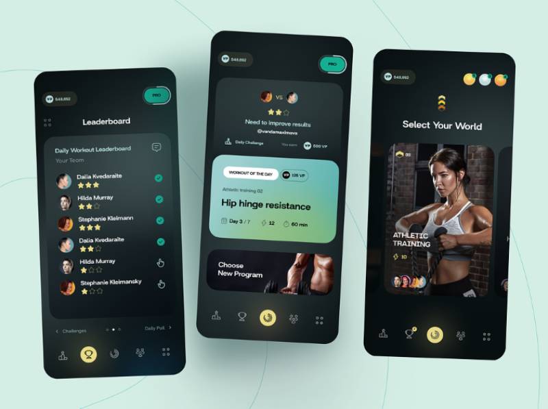
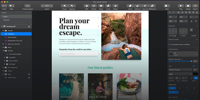
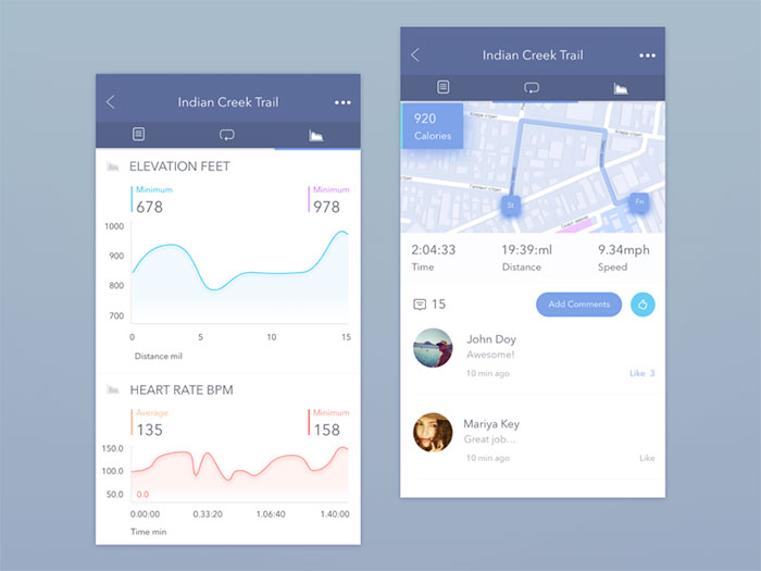
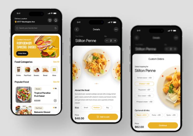
The concepts below are design explorations rather than shipped products, which is what makes them worth a scroll after the platform comparison above: none of them are working around an existing restaurant integration or a fee structure legal already signed off on. Watch how each one handles the menu photo grid, where the cart sits, and how early the price shows up.


FAQ on Food App Design
Native app or mobile website, which is better for food ordering?
Depends who’s asking. For repeat customers, native wins pretty clearly, push notifications, saved payment details, and offline caching that a mobile website just can’t match. A responsive site still does the job fine for first-time visitors arriving from search or a shared link, though.
How much does food app design typically cost?
Scope drives the number more than anything else. A basic MVP with the core ordering screens usually lands somewhere in the lower five figures. A full build with live tracking, personalization, and a restaurant dashboard can move well into six figures.
What payment methods should a food ordering app support?
Credit and debit cards are the baseline, no way around that one. Digital wallets like Apple Pay speed up checkout noticeably, and buy-now-pay-later can reduce abandonment on larger orders. Cash on delivery still matters a lot in several markets outside the US.
How do food apps handle promo codes and discounts?
A dedicated promo field at checkout beats one buried inside the menu. Auto-applying eligible discounts removes a manual step for the user, and showing the exact savings builds more trust than folding it quietly into the total at the end.
Should a food app support group ordering?
It lets several people add items to one shared cart from separate devices, handy for office lunches or shared households. It does add real complexity to the cart logic behind the scenes, but it can meaningfully raise average order value.
How do food apps handle out-of-stock menu items?
Grey out the item with a clear “sold out” label rather than making it vanish, so people aren’t left confused when a favorite disappears without warning. Some apps go a step further and suggest a substitute instead of leaving the slot empty.
What’s the ideal app icon design for a food ordering app?
Simple beats detailed at small sizes, every time. Most major players use one bold shape or letter on a saturated background, since icons are competing hard for attention on a crowded home screen next to a dozen others.
Should a food app display calorie or nutritional information?
Where regulation requires it, yes, no question. It builds trust with health-conscious users even in places where it isn’t legally required. Keeping it a secondary detail, visible on tap rather than sitting on the main product card, avoids cluttering the browsing experience for everyone else.
When should a food app send push notifications?
Order-status updates are always welcome, people expect those. Promotional pushes work a lot better when they’re tied to behavior, an idle cart, a past order’s usual time, that sort of thing. A fixed daily blast just trains people to ignore them after a week or two.
How do food apps handle refunds and order cancellations?
A self-service cancellation window, open before a restaurant starts prepping the order, avoids a pile of unnecessary support tickets. Once preparation actually begins, refunds typically route through a support flow instead.
Conclusion
Food app design succeeds or fails on sequencing, not on any single screen.
Fix the checkout flow before touching a color palette. A guest option and a visible total recover more lost orders than a redesigned icon ever will.
Navigation and onboarding come next, since both decide whether a first-time visitor turns into a repeat customer or just disappears.
Photography, personalization, and accessibility work all matter. But they compound gains on top of a foundation that already converts, and building them first just wastes the investment.
Run one test before any redesign: time how long a first-time user needs to place a single order, start to finish. Anything past ninety seconds tells you exactly where the next sprint belongs.

Renowned for his expertise in logo design and visual branding, Bogdan has developed a multitude of logos for various clients.
His skills extend to creating posters, vector illustrations, business cards, and brochures. Additionally, Bogdan's UI kits were featured on marketplaces like Visual Hierarchy and UI8.
He also wrote in the past years on sites like Design Your Way, WebDesignerDepot, WPDean, Designmodo, Speckyboy, Slider Revolution, and more.
- Canva vs PowerPoint: Which Is Better for Presentations? - 22 September 2026
- How to Install Fonts on Mac (Step-by-Step Guide) - 20 September 2026
- From Mockup to Code: How AI-Augmented Development Speeds Up the Design Handoff - 19 September 2026

Bogdan Sandu is a seasoned designer who has been designing websites since 2008. Renowned for his expertise in logo design and visual branding, Bogdan has developed a multitude of logos for various clients. His skills extend to creating posters, vector illustrations, business cards, and brochures. Additionally, Bogdan's UI kits were featured on marketplaces like Visual Hierarchy and UI8. He also wrote in the past years on sites like Design Your Way, WebDesignerDepot, WPDean, Designmodo, Speckyboy, Slider Revolution, and more.
You Might Also Like