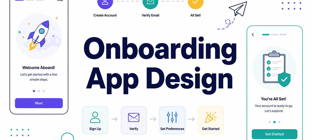
Most people decide whether an app deserves a second tap within seconds of opening it, long before they’ve explored a single feature.
80% of users abandon an app entirely if they don’t quickly understand how to use it or see its value, according to Usetiful’s 2025 mobile onboarding analysis. That number alone explains why onboarding app design ends up deciding whether a product survives its first week, not the roadmap behind it.
Every welcome screen, permission prompt, and empty state either earns a returning user or quietly loses one. Get onboarding right and activation, retention, and revenue tend to follow on their own. Get it wrong and a genuinely well-built product may never get the chance to prove that to anyone.
What Is Onboarding App Design
Most apps lose the majority of their new users right at this stage. The global average onboarding completion rate after 30 days sits at just 8.4%, and over 90% of installs never make it through onboarding at all, based on AppsFlyer benchmark data compiled by Digia.tech (2026).
What that stage actually covers is the stretch between download and the moment a first-time user gets real value out of the app: welcome screens, permission requests, setup steps, the whole run-up to the “aha” point. It’s a narrow slice of UX design, not the whole product experience.
Onboarding sits at a specific point in the user lifecycle, right between install and activation. Everything after that belongs to general product UX.
Treat onboarding as decoration, a slideshow before the “real” app starts, and it will act like decoration. Users skip it, or worse, they bounce before finishing it.
What Are the Core Components of an Onboarding Flow
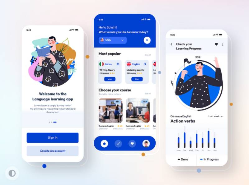
Every onboarding flow draws from the same small pool of screens: a welcome screen, a permission prompt, account setup, tutorial overlays, empty states, progress indicators, and a visible way out. Nothing exotic, and that’s kind of the point.
Each one does a single job on its own. Stacking too many of them back to back is usually what drags completion rates down, not any individual screen being bad.
| Component | Job | Common mistake |
|---|---|---|
| Welcome screen | Set expectations and tone | Three slides before any tap |
| Permission prompt | Request camera, location, or push access | Asking for everything at once |
| Empty state | Guide the first action on a blank screen | Leaving it blank with no prompt |
| Progress indicator | Show how many steps remain | No feedback on remaining effort |
Account setup earns extra attention because it’s the one screen most apps can’t skip outright. Basing it on tested mobile login form design patterns keeps the field count low and the tap targets big enough for a thumb to actually hit.
Permission Request Screens
Timing decides the outcome here, not the wording on the button. A prompt fired with zero context converts worse than the identical prompt shown right before the feature that actually needs it.
Batch pulled this from over 800 billion messages sent across roughly 10,000 apps for its 2025 benchmark. The global push opt-in rate lands at 61% overall, split between 67% on Android and 56% on iOS.
That gap is a platform-default story, not a user-preference one. iOS has required explicit opt-in for years now. Android didn’t catch up to the same model until Android 13.
Progress Indicators and Step Counters
Step counters (something as simple as “2 of 5”) make a flow feel shorter than it actually is, and progress bars pair naturally with any checklist-style onboarding. A visible exit or skip path matters just as much, built the same way as any other mobile menus and buttons element, so users never feel trapped inside the flow.
Checklist-based onboarding, usually presented as a scannable list UI design for mobile apps, averages a completion rate of just 19.2% across the 188 companies Userpilot studied in 2025, with a median sitting much lower at 10.1%.
That gap between the average and the median is telling. A small number of well-built checklists are dragging the average upward. Most fall well short of it, which is the more honest number to plan around.
What Types of Onboarding Patterns Exist
Functional walkthroughs, benefit-led sequences, progressive disclosure spread across sessions, and gamified onboarding cover most of what you’ll actually run into. Picking the wrong one for the app category is a real design mistake, not a minor styling choice you can fix in a later sprint.
Functional vs Benefit-Oriented Sequences
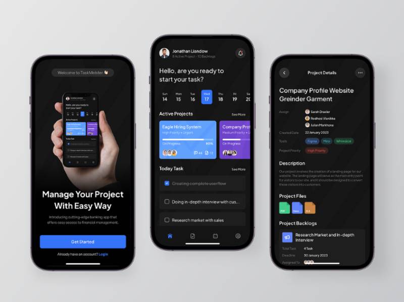
Functional onboarding walks a user through features one at a time: tooltips pointing at buttons, a short caption under each icon. It’s the more common default, mostly because it’s the easiest to build.
Benefit-oriented onboarding flips that order. Instead of explaining how something works, it opens with what the user gets out of it, and only gets to the how afterward, if it bothers at all.
Duolingo used to ask for an email address before a user even reached their first lesson. Once they moved sign-up to after that first interactive lesson, next-day retention jumped 20%, according to StriveCloud’s analysis of the redesign.
Progressive Disclosure Across Sessions
Progressive disclosure spreads onboarding across more than one session instead of dumping everything on a user during day one.
Core actions get introduced in session one. Secondary features only surface once a user is getting close to actually needing them, which keeps the early screens from turning into a feature dump.
Gamified variants build on top of this same structure, layering in badges, streaks, and progress bars.
Duolingo retains 55% of daily active users month over month, a figure that outpaces most competitors in mobile education, per Propel’s breakdown of the app’s retention system.
What UX Principles Reduce Onboarding Friction
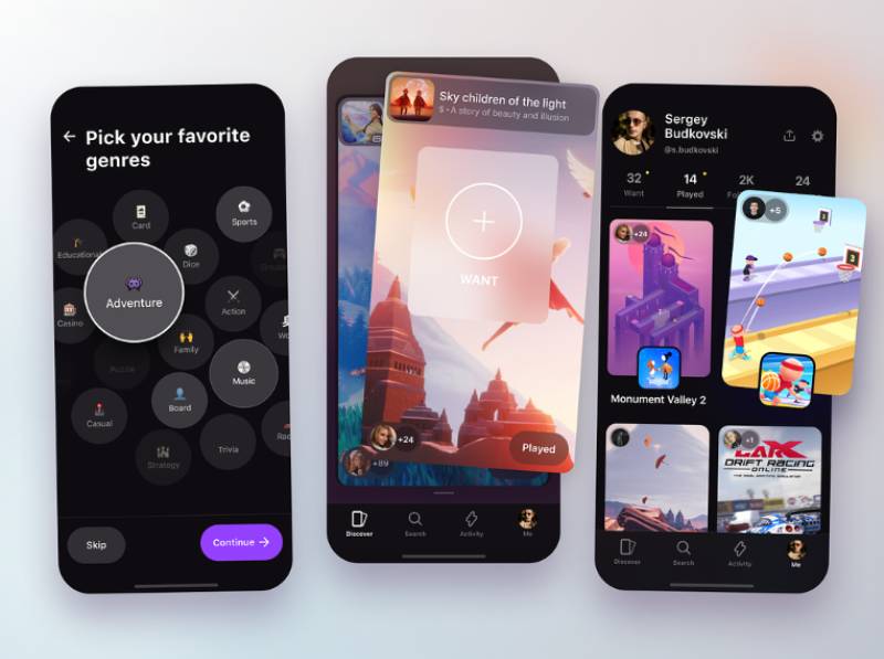
Cutting cognitive load, trimming form fields, deferring account creation, and writing microcopy that actually says what happens next: these four do most of the heavy lifting, and in roughly that order of impact.
| Principle | What it fixes |
|---|---|
| Cognitive load reduction | Too many decisions on one screen |
| Field minimization | Long, mandatory signup forms |
| Deferred account creation | Forced login before any value shown |
| Clear microcopy | Ambiguous next steps |
Nielsen Norman Group’s research on mobile onboarding lands on a blunt recommendation: skip onboarding screens entirely unless the app genuinely needs some information upfront, the functionality is tied closely to personal context, or it’s introducing a workflow nobody already has a mental model for.
Field count matters more than screen count. Baymard Institute’s checkout research, a pattern that carries over directly to signup and account-setup screens, found the average flow contains 11.3 form fields as of 2024. Cutting unnecessary fields, not adding more screens to spread them out, is what actually reduces abandonment.
Deferred account creation lets people poke around before committing to a login. Wayfair, Etsy, and Depop all delay forced sign-up this way, using a category picker in the first session to seed the home feed with relevant items instead (UXCam, 2026).
How Is Onboarding Success Measured
Activation rate, time to value, drop-off rate by screen, Day 1/7/30 retention, and checklist completion rate: those five numbers cover most of what a team actually needs to track.
Activation rate tracks the share of new users who complete a defined core action, not just the ones who sit through a tutorial. Time to value measures how fast a user reaches that core action. Drop-off rate needs to be tracked screen by screen, not just at the finish line, since that’s where the real signal hides. Day 1, Day 7, and Day 30 retention numbers tell you whether onboarding’s gains actually stick around or fade by the second week.
Apps running onboarding campaigns saw 20% next-day returns, compared with a 16% baseline across all apps in Q2 2024, based on Airship benchmark data reported by eMarketer.
Linkrunner’s diagnostic framework treats a completion rate above 60% as strong and anything below 40% as a sign users are abandoning the flow before finding core functionality.
Teams tracking these numbers typically pair funnel analytics tools like Amplitude or Mixpanel with session replay on the specific screens where drop-off spikes. For a wider set of benchmark figures across the field, our UX design statistics roundup covers adjacent metrics beyond onboarding alone.
How Does Personalization Improve Onboarding
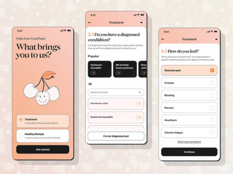
Personalized onboarding branches the flow based on quiz answers, signup source, or device, instead of showing every user the same five screens.
Health and fitness apps lean on this hardest. A fitness app design built around a body-metrics quiz, the approach MyFitnessPal and Strava both use, can justify 5 to 7 onboarding questions because each answer visibly shapes the plan the user receives next (UXCam, 2026).
The trade-off here is speed. Every question added buys some personalization but costs completion time, so each one has to earn its place on screen.
Trainual, a SaaS onboarding and training platform built for C-suite and operations buyers, rebuilt its in-app guidance around what its target users actually wanted, swapping generic hotspots for tailored guidance instead. Activation rose 100% and conversion rose 80% after the change, according to Appcues’ documented customer case study. (A separate, smaller example: Pinterest’s own onboarding team improved activation among users abroad by 5 to 10% through a single localization experiment, according to Appcues’ account of that work.)
What Are the Differences Between Mobile and Web App Onboarding
Mobile onboarding has to work inside a small screen, with touch input and app-store permission rules shaping almost every decision. Web is looser: more screen room, more input methods, and no OS-level permission dialog standing between the app and the user.
| Factor | Mobile app | Web app |
|---|---|---|
| Screen space | Limited, single-column | Flexible, adapts to viewport |
| Navigation | Touch and gesture-based | Mouse, keyboard, and touch |
| Permissions | OS-level prompts (camera, location, push) | Browser-level, fewer required |
| Design guidance | Apple Human Interface Guidelines, Material Design | No single OS-wide standard |
Text has to work harder on mobile. Smaller viewports call for shorter copy and larger, more legible fonts for mobile apps, since a paragraph that reads fine on a desktop monitor turns into a wall of text on a five-inch screen.
Android and iOS diverge on permission defaults, too. Following the shift to Android 13, Android opt-in rates fell from 85% to 67% within a year, while iOS declined only slightly, from 58% to 56% (Batch, 2025).
Design guidance splits by platform as well. Apple’s Human Interface Guidelines and Google’s Material Design set different expectations for onboarding, which is one reason an Android UI design and an iOS flow rarely share the same layout, even inside the same product.
Web onboarding, by contrast, can collect more detailed information upfront. There’s no thumb-typing tax, and no app-store review process shaping what’s allowed on screen.
What Common Design Mistakes Cause Onboarding Failure
Excessive slides before any interaction, mandatory account creation before any value is shown, every permission requested at once, inconsistent progress feedback: these four mistakes account for most onboarding failures.
74% of potential customers abandon an app entirely when they hit friction right at the start, according to Reteno’s 2025 analysis of onboarding flows.
- Slideshow tutorials before the first tap
- Signup forms that gate basic functionality
- Every permission prompt firing at launch
- No indication of how many steps remain
Instagram lets people browse content before requiring a login, a try-before-you-buy pattern that proves the app’s value before it asks for a commitment.
One-click social login fixes the account-creation mistake specifically. Reteno’s data shows it can lift completion rates by 60% compared to a standard email and password form.
How Is Onboarding Design Tested and Optimized
Teams test onboarding the way they’d test any conversion flow. Pick one variable, split the traffic, and check the results against a defined activation event, not against a vague sense that something “feels smoother.”
| Method | What it reveals |
|---|---|
| A/B testing | Which variant of a screen converts better |
| Funnel analysis | Exactly where users drop off, step by step |
| Session replay | What a user was doing right before they left |
PayU automated its merchant identity verification with AU10TIX. That cut average ID verification time to about six seconds and lifted conversion by up to 25 percentage points, depending on the onboarding flow. It’s a good reminder that fixing one slow, manual step can outperform redesigning every screen around it.
Session replay tools earn their keep after funnel data has already flagged a drop-off, not as a stand-in for the funnel data itself. Used before that point, they’re mostly noise.
Watching five or ten recordings at that step is usually enough to tell whether users are confused, stuck on an actual error, or just not seeing the button they need to tap.
FullStory expanded its free tier to 30,000 sessions a month in August 2025, a shift that put session replay within reach of teams who previously could only afford spot-checking a handful of recordings.
How Onboarding Design Differs Across Industries
Industry constraints reshape onboarding more than brand preference does.
A fintech app can’t legally skip identity verification. Gaming sits at the opposite end, with no regulatory limits at all, to the point where a tutorial level can replace the entire concept of onboarding.
| Industry | Main constraint | Typical pattern |
|---|---|---|
| Fintech | Identity verification, compliance | Progressive KYC, inline verification |
| SaaS | Multi-user setup | Workspace naming, teammate invites |
| Gaming | No regulatory limits | Tutorial level replaces onboarding screens |
| Ecommerce | Purchase intent varies by visit | Guest browsing before account creation |
Fintech Compliance Screens
Fintech onboarding has to collect identity documents, run compliance checks, and confirm the user is who they claim to be, none of which is optional.
Signicat’s research across 7,600 consumers puts the average drop-off rate for financial services onboarding at 68%, according to Qubstudio’s analysis of the study. That constraint shapes a lot of what finance app design has to work around, since the verification steps can be resequenced but never removed.
Wise shows an exact fee and exchange-rate calculation before asking for any personal information at all. Revolut takes a different approach, allowing limited account access before full KYC is complete, so users can explore the product before committing to verification.
SaaS Workspace Setup Flows
SaaS onboarding has to solve something a personal app never does: getting more than one person set up before the account feels usable.
That usually means naming the workspace or organization first, then inviting teammates before the account feels like it’s actually being used. Somewhere in there, connecting at least one integration to pull in existing data tends to matter just as much as the first two steps combined.
B2B SaaS products activate just 37.5% of new signups on average, based on Userpilot’s benchmark of 62 companies from 2024. Roughly two in three signups never reach core value, which is why business app design treats the setup sequence as a product problem rather than a styling one.
What Accessibility Standards Apply to Onboarding Design
WCAG 2.2 is the modern baseline for accessible onboarding, and it covers more ground than most teams expect: minimum touch target sizes, single-pointer alternatives to gestures, screen reader support across every step of the flow.
| Requirement | Standard | Applies to |
|---|---|---|
| Touch target size | 24×24 CSS pixels minimum (WCAG 2.2, Level AA) | Buttons, checkboxes, skip links |
| Dragging movements | Single-pointer alternative required | Swipe-based tutorials, sliders |
| Orientation | Must not lock to one display orientation | Full-screen welcome and quiz screens |
Platform guidance actually goes further than the WCAG minimum here. Apple’s Human Interface Guidelines call for a 44×44 point touch target, and Material Design recommends 48×48 density-independent pixels, both bigger than the WCAG floor.
The European Accessibility Act took effect on June 28, 2025, making digital accessibility a legal requirement for many products and services sold inside the EU. The technical benchmark regulators currently point to is EN 301 549, and its latest published version incorporates WCAG 2.1 Level AA, not WCAG 2.2. A WCAG 2.2-aligned update to that standard is in draft, but it hadn’t been formally adopted as of mid-2026. In practice, teams already building toward WCAG 2.2 are covering the legal minimum and then some.
Screen reader compatibility matters just as much as sizing does. Every progress indicator, skip button, and empty-state prompt needs a label a screen reader can actually announce, not just a visual cue that sighted users take for granted.
Reduced-motion settings deserve the same level of attention. Progress bar animations and any celebratory effect on a completed checklist should respect a user’s system-level motion preference instead of overriding it.
Which Tools Are Used to Design and Manage Onboarding
Most onboarding work draws from three layers of tooling. Design and prototyping covers Figma for screens and handoff, plus Framer when a prototype needs to actually feel interactive.
No-code flow builders like Appcues, Userpilot, and Pendo handle tooltips, checklists, and tours without needing engineering time for every tweak. Analytics rounds it out, with Amplitude and Mixpanel covering funnels, retention, and the kind of dashboard UI design that surfaces exactly where drop-off is happening by screen.
For teams focused on mobile growth as well as onboarding, ASO tools can complement this stack by tracking app-store visibility, keyword performance, and conversion before users even enter the onboarding flow.
Implementation speed varies sharply between these categories. Lighter-weight tools like Userpilot, Mixpanel, or Heap can typically go live in about 4 to 6 weeks. Heavier platforms such as Amplitude, WalkMe, and Pendo often need three months or more of engineering and stakeholder time, per Chameleon’s tool-comparison data.
Pricing follows a similar split. Pendo’s annual cost runs from roughly $15,000 to over $140,000 depending on monthly active users, based on Vendr pricing data, well above what most no-code builders charge.
Picking a tool is less about features and more about who owns the change. If engineering has to ship every onboarding tweak, a no-code builder tends to pay for itself within the first redesign.
When Should Onboarding Screens Be Skipped or Minimized
Tutorials don’t actually improve task performance, according to Nielsen Norman Group. In a quantitative usability test with 70 users across four mobile apps using deck-of-cards tutorials, people who read the tutorials completed tasks no more successfully than people who skipped them entirely.
That finding argues for skipping onboarding outright in specific situations, not just trimming it down. That’s especially true when the interface is self-explanatory and follows conventions people already know, or when the “returning” user isn’t a first-timer at all. Contextual tips delivered right at the moment of use often teach the same thing for a lot less cost than a full walkthrough.
Any.do skipped onboarding prompts for its visual customization options, letting users discover and adjust theme settings inside the app itself instead of front-loading them into a walkthrough, per Nielsen Norman Group’s own case review.
The threshold is simple to state, even if it’s hard to measure precisely. If onboarding drop-off runs higher than the drop-off a user would show by skipping straight into a confusing app, onboarding itself is the problem, not the solution.
Onboarding App Design Examples
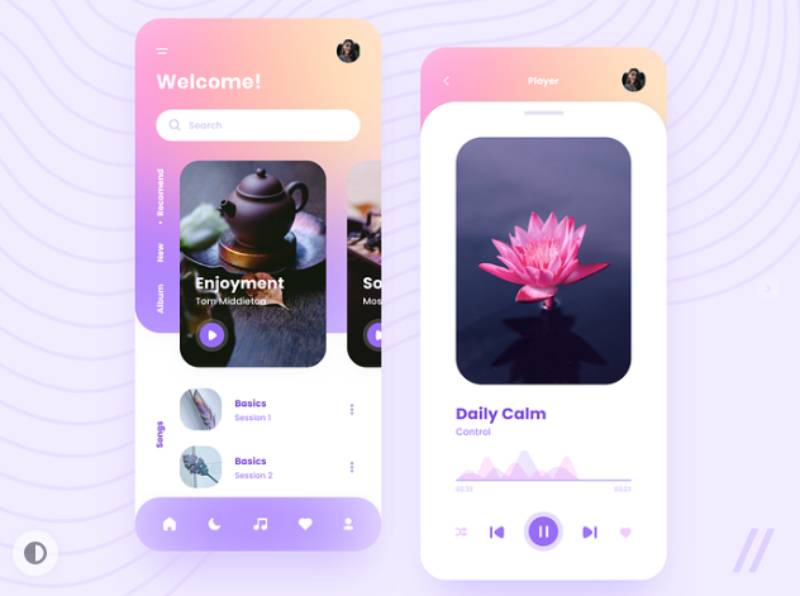
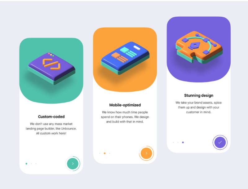
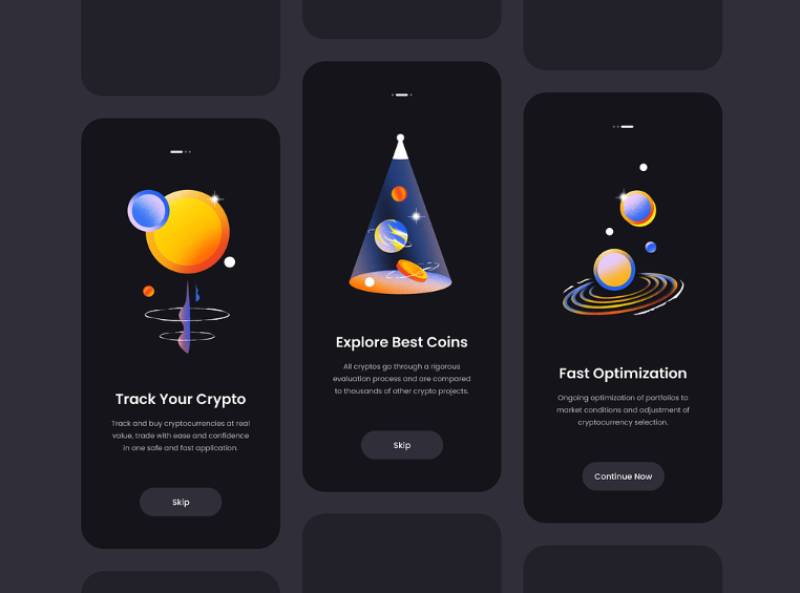
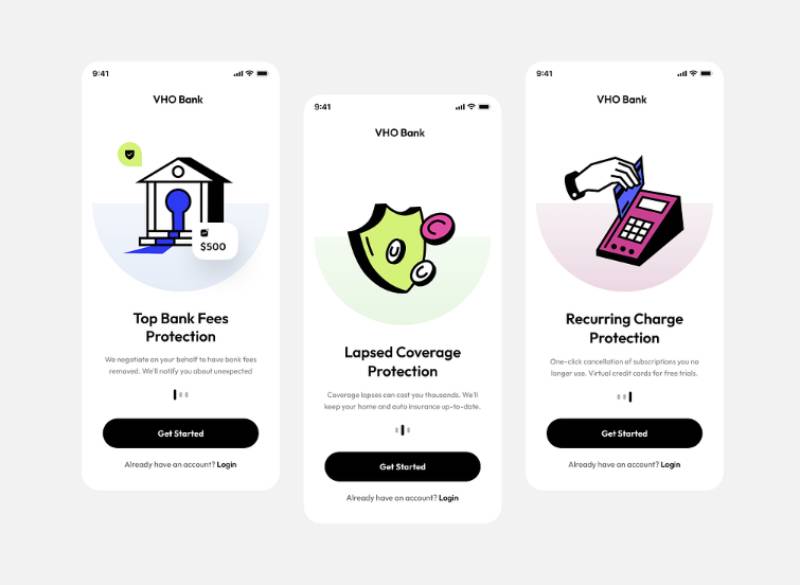
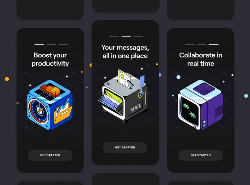
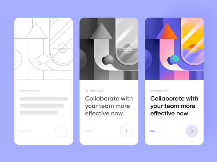
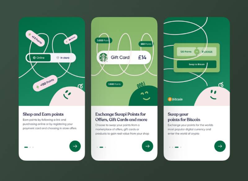
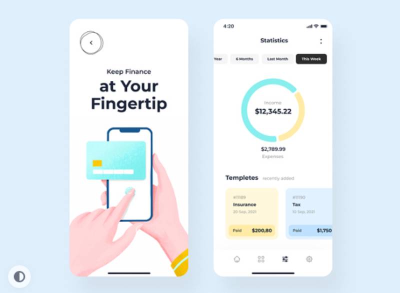
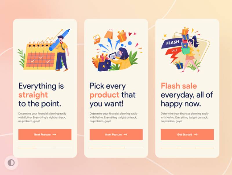
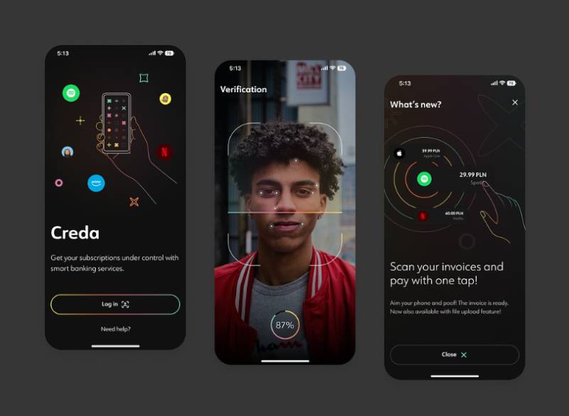
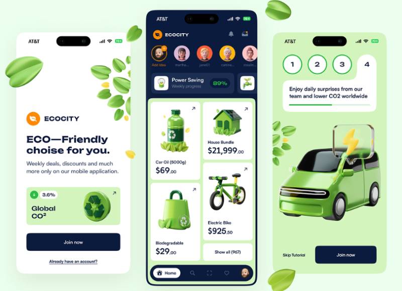
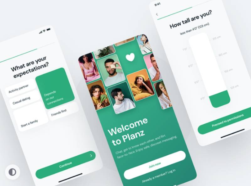
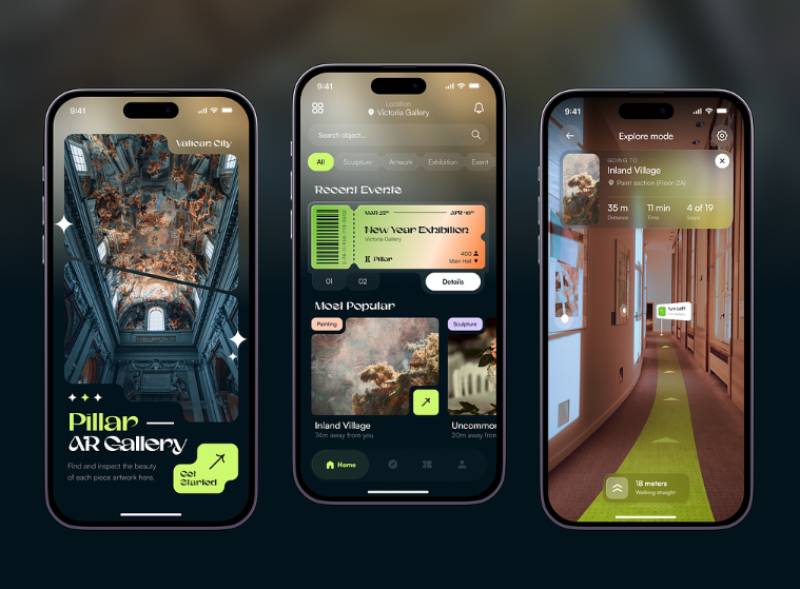
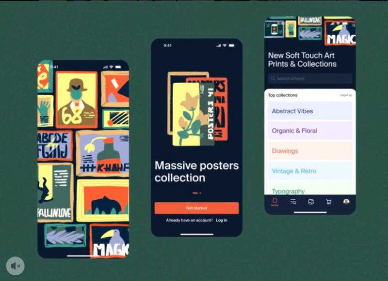
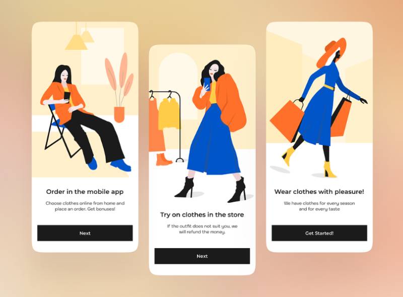
The concepts below are design explorations rather than shipped flows, which is what makes them a useful counterpoint to the benchmarks above: none of them are carrying a compliance step, a legacy signup form, or an activation metric someone has to defend. Watch how many screens land before the first tap, where the skip path sits, and whether the permission prompt arrives with any context attached.
FAQ on Onboarding App Design
What Is the Ideal Number of Onboarding Screens
There’s no universal number. Utility apps often need three to five screens, while personalization-heavy health and fitness apps can justify 25 to 30 without hurting completion, as long as every screen visibly shapes what the user sees next.
What Is the Difference Between Onboarding and a Product Tour
A product tour is just one piece of onboarding, a guided walkthrough of specific UI elements, not the whole thing. Onboarding covers the entire first-run experience, from install all the way to first real value. Every product tour counts as onboarding. Not every onboarding flow needs a tour at all.
What Is an Aha Moment in Onboarding
Slack’s early growth team used a specific benchmark: 2,000 messages sent inside a workspace. That’s their aha moment, the exact action where a new user first experiences real value from the product. Naming that event turns a vague activation rate into something an actual team can design toward.
What Is Progressive Profiling in Onboarding
Instead of front-loading one long signup form, progressive profiling spreads that same information gathering across multiple sessions. Each interaction adds a single data point, so the profile builds up over time while the initial screen count and form fields stay low.
How Does Onboarding Differ for Returning Users Versus First-Time Users
First-time users need context and orientation, plain and simple. Returning users want the opposite: speed, continuity, and absolutely no repeated walkthrough. Good onboarding design checks account state and skips the intro screens entirely for anyone who’s already been through them once.
What Is the Difference Between a Tooltip and a Walkthrough
A walkthrough strings several tooltips or screens together into one guided path, and it’s usually shown upfront rather than triggered by anything the user actually does. A tooltip, by contrast, is smaller: one contextual hint, tied to a single UI element, that shows up exactly when it’s relevant.
How Often Should an Onboarding Flow Be Redesigned
Treat onboarding as a living system, not a one-time build. Review completion and drop-off data on a quarterly basis, and redesign fully whenever the core product changes enough that the original flow no longer matches what a new user actually sees first.
Does Dark Mode Affect Onboarding Screen Design
Yes. Contrast ratios, illustration colors, and empty-state graphics that work fine in light mode can fail accessibility checks once you flip to dark mode. Onboarding screens need their own dark-mode pass, not an automatic color inversion, especially around permission prompts and progress indicators.
What Is the Difference Between Onboarding and User Activation
User activation is the outcome: a measurable action that proves a user reached core value. Onboarding is everything leading up to that, the actual screens and prompts a person walks through. Strong onboarding design is how a team engineers a higher activation rate. It isn’t the metric itself.
Can AI Personalize Onboarding Automatically
Increasingly, yes. AI-driven onboarding tools can read a user’s signup source, device, or early taps and adjust screen order or copy in real time, moving personalization from a fixed quiz branch toward a continuously adapting flow with no added manual configuration.
Conclusion
Onboarding app design rewards restraint more than cleverness. If a team can only fix one thing this quarter, cut form fields and defer permissions before anyone touches an illustration.
Screen-by-screen drop-off data should decide what gets removed first, not opinions from a design review.
Expect the first redesign to underperform, honestly. Most teams need two or three iterations before completion rates stabilize, mostly because the initial version rarely gets the activation event right on the first try.
Before shipping the next version, commit to a named owner for the flow instead of a shared responsibility, and to a fixed review date tied to a cohort of new users.
Treat onboarding as a product with a maintenance schedule, not a launch checklist to close and forget about.

Renowned for his expertise in logo design and visual branding, Bogdan has developed a multitude of logos for various clients.
His skills extend to creating posters, vector illustrations, business cards, and brochures. Additionally, Bogdan's UI kits were featured on marketplaces like Visual Hierarchy and UI8.
He also wrote in the past years on sites like Design Your Way, WebDesignerDepot, WPDean, Designmodo, Speckyboy, Slider Revolution, and more.
- The Substack Logo History, Colors, Font, And Meaning - 2 October 2026
- How UX Design Impacts SaaS User Retention and Churn - 1 October 2026
- How to Embed Fonts in PDF for Reliable Printing - 30 September 2026

Bogdan Sandu is a seasoned designer who has been designing websites since 2008. Renowned for his expertise in logo design and visual branding, Bogdan has developed a multitude of logos for various clients. His skills extend to creating posters, vector illustrations, business cards, and brochures. Additionally, Bogdan's UI kits were featured on marketplaces like Visual Hierarchy and UI8. He also wrote in the past years on sites like Design Your Way, WebDesignerDepot, WPDean, Designmodo, Speckyboy, Slider Revolution, and more.
You Might Also Like