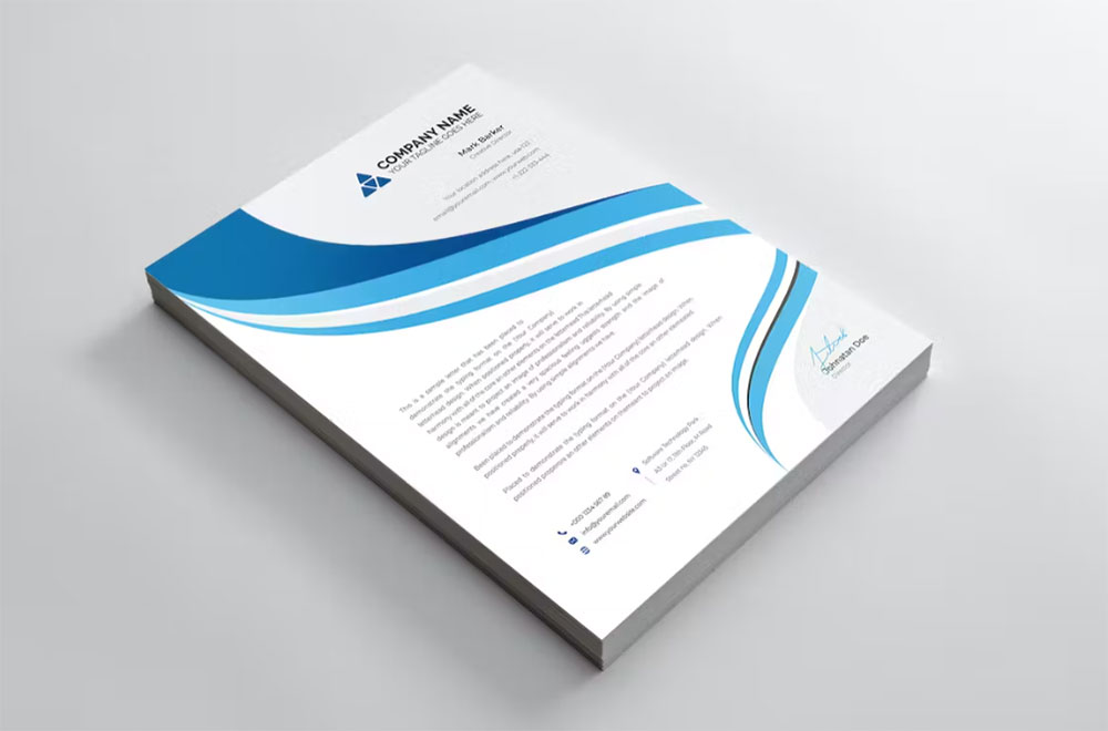
Letterhead Leadership: The 10 Best Fonts for Letterheads
Imagine this: You’ve crafted a stunning letterhead design, but something feels off. The font. It’s not just a detail; it’s the make-or-break of your brand’s first impression. That’s where the quest for the best fonts for letterhead begins.
In a world where every pixel speaks volumes about your brand identity, choosing the right font isn’t just a design choice; it’s a business strategy.
I’ve dived deep into the realms of typography, from the elegance of Serif to the sleek appeal of Sans-Serif, to bring you the insider scoop on font selection.
This article isn’t just a list; it’s a journey through typography in corporate identity and the impact of font choice on branding.
By the end, you’ll not only have a handful of top font recommendations but also a keen understanding of how font pairing for business stationery and letterhead typography trends can elevate your brand.
Whether you’re a fan of Helvetica’s clarity or Times New Roman’s authority, this guide has got you covered. Get ready to transform your letterheads from mundane to memorable.
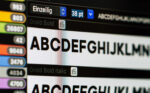
The Best Fonts for Letterheads
| Font Name | Design Style | Readability | Best for | Notes |
|---|---|---|---|---|
| Quilty Light | Decorative | Moderate | Creative industries | Light and expressive |
| Karoll Modern Serif | Modern/Decorative | High | Professional/Modern | High contrast strokes |
| Addington | Transitional Serif | High | Corporate/Legal | Sophisticated, old-style |
| Garamond | Old-style Serif | High | Publishing/Traditional | Classic and elegant |
| Times New Roman | Transitional Serif | Very High | Business/General Use | Ubiquitous and formal |
| Quiche Sans | Display Sans-serif | Moderate | Fashion/Luxury Brands | High contrast and chic |
| Mansory | Geometric Sans | Moderate | Tech/Modern Businesses | Clean, modern look |
| Hanken Sans Typeface | Neo-grotesque Sans | High | Startups/Modern usage | Simple and clear |
| Helvetica | Neo-grotesque Sans | Very High | Corporate/Universal Use | Neutral and versatile |
| Arial | Grotesque Sans | Very High | Business/General Use | Widely available & legible |
Recommended Fonts for Business Letters
Let’s dive into the heart of the matter: finding the best fonts for letterhead. It’s like setting the stage for your brand’s voice to be heard, loud and clear.
Top Serif Fonts
Quilty Light
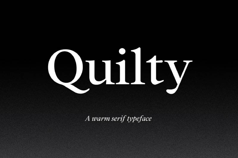
It’s like the soft-spoken genius in the room. Elegant, yet understated. Perfect for when you want sophistication without shouting it from the rooftops.
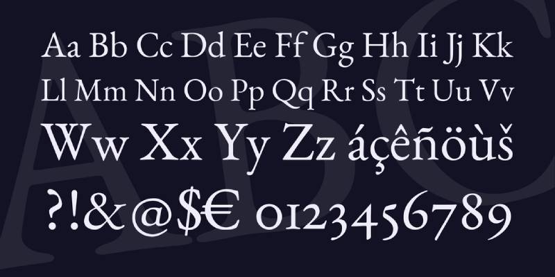
Karoll Modern Serif
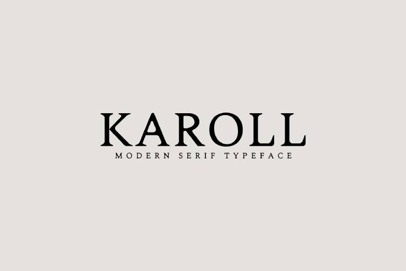
Imagine a bridge between old-school charm and contemporary chic. This font says, “We respect tradition, but we’re not stuck in the past.”
Addington
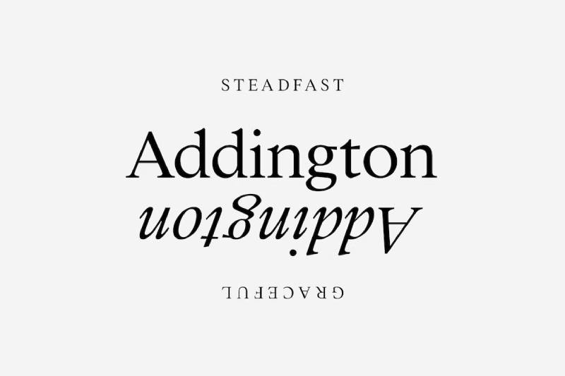
It’s the quintessential professional. Think of it as your go-to for legal documents or high-end business proposals. It’s like wearing a sharp suit to a business meeting.
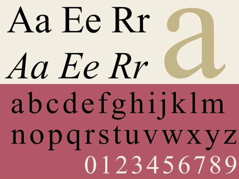
Garamond
A classic. It’s like that timeless piece of advice you got from your mentor. Reliable, respected, and always in style.
Times New Roman
The old faithful. If fonts were people, Times New Roman would be that dependable friend who’s always there, rain or shine.
Top Sans-Serif Fonts
Quiche Sans
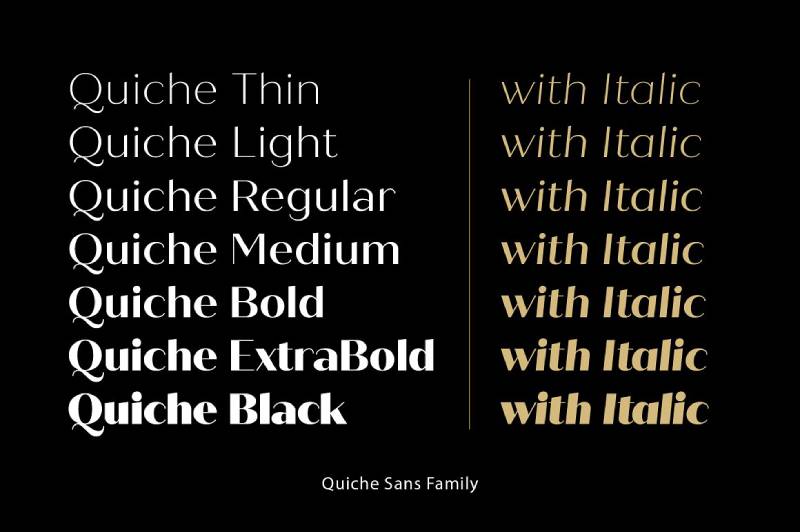
It’s sleek, it’s modern, it’s the font equivalent of a minimalist, high-tech office space. Ideal for forward-thinking companies.
Mansory
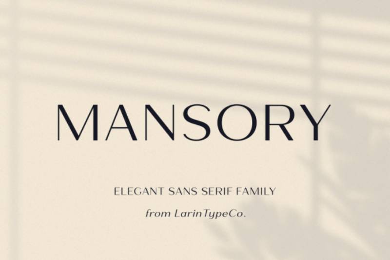
Bold without being overbearing. Mansory is like that person who commands attention just by walking into a room.
Hanken Sans Typeface
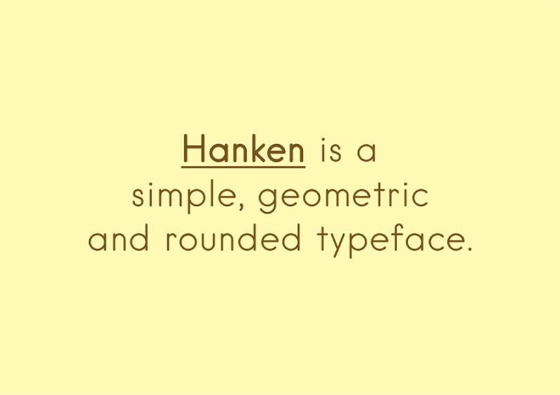
Clean lines, no fuss. It’s like the straightforward, no-nonsense advice you appreciate from your best friend.
Helvetica
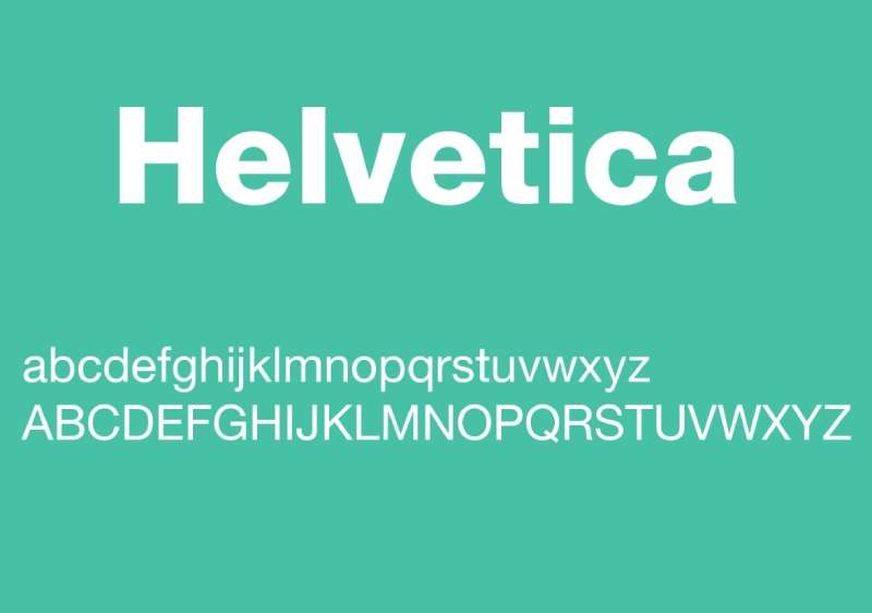
The king of Sans-Serif. Helvetica is like the popular kid in school who somehow manages to be friends with everyone.
Arial
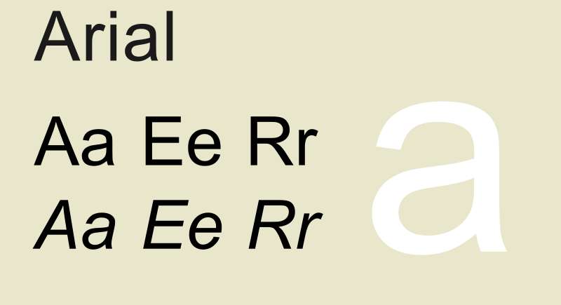
Think of Arial as the younger sibling of Helvetica. It’s familiar, friendly, and versatile – a safe bet for almost any business communication.
Deciding Between Serif and Sans-Serif Fonts
Serif or Sans-Serif? That’s like the eternal coffee vs. tea debate in the design world. When it comes to best fonts for letterhead, the choice isn’t just about looks; it’s about the message you want to convey.
Characteristics of Serif Fonts
Think of Serif fonts as the old souls of typography. They’ve got these tiny feet (serifs) at the ends of their letters. Why does that matter? Because these small lines add a traditional, almost authoritative vibe to your letterhead. Picture Times New Roman or Garamond – they’re like that one friend who’s always reliable. Serif fonts are great when you want to say, “Hey, we’re established, professional, and trustworthy.”
Characteristics of Sans-Serif Fonts
Now, let’s talk Sans-Serif. Sans-Serif fonts are the cool kids on the block. No feet, no frills. They’re clean, modern, and have a way of saying, “We’re up with the times.” Fonts like Helvetica and Arial are like your tech-savvy friend who knows all the latest trends. Sans-Serif is your go-to when you want your letterhead to scream innovation and accessibility.
Factors Influencing Font Selection
When picking the best fonts for letterhead, it’s not just about serif or sans-serif. Context is king. Let’s break it down.
Context and Purpose of the Letter
Formality of the Content
Is your letter a formal invitation to a black-tie event or a friendly newsletter? The tone dictates the font. Formality screams for Serif’s sophistication, while a more casual, friendly message might lean towards Sans-Serif.
Target Audience and Industry
Who’s reading your letter? Tech gurus or art historians? Different crowds, different styles. If you’re in a tech-savvy industry, Sans-Serif is your friend. More traditional fields might prefer the classic touch of Serif.
Brand Identity and Values
Alignment with Company’s Style
Your font should fit your brand like a glove. If your brand is about cutting-edge innovation, a modern Sans-Serif aligns perfectly. But if you’re all about heritage and trust, then Serif’s your guy.
Conveying the Right Message
Fonts speak louder than words. Serif might whisper “elegance” and “reliability,” while Sans-Serif shouts “modern” and “approachable.” Pick the whisper or the shout that tells your brand’s story best.
Designing a Cohesive Letterhead
Creating a letterhead that speaks your brand’s language, now that’s an art. It’s more than just slapping on the best fonts for letterhead and calling it a day. It’s about crafting a visual symphony where every element sings in harmony.
Incorporating Brand Elements
Color Schemes
Colors are like the mood music of your design. They set the tone. Choose colors that resonate with your brand’s vibe. Are you all about zen and calmness? Go for cool blues or soothing greens. Bold and energetic? Hit up those reds and oranges.
Logo Integration
Your logo is the star of the show. It’s like your brand’s selfie – make it count. Place it where it’s visible but not screaming for attention. It’s about balance. You want people to notice it, but not get distracted from the content.
Layout and Typography
Header and Footer Design
Think of these spaces like the bookends of your design. They hold everything together. Keep them clean, organized, and in line with your overall design theme. They’re like the quiet guardians of your letterhead’s aesthetics.
Readability and Spacing
Ever read a letter where everything’s crammed together? Yeah, not fun. Give your words some breathing room. Play around with spacing. Make sure it’s easy on the eyes. Comfortable reading is key.
Practical Tips for Font Usage
Alright, let’s get down to the nitty-gritty of using the best fonts for letterhead. It’s not just what you say, but how you visually say it.
Readability and Size Considerations
Choosing Legible Font Sizes
Size matters. Too small, and you’re squinting. Too big, and it’s like someone’s shouting at you. Find that sweet spot where it’s easy to read, but still looks sleek.
Avoiding Overly Decorative Fonts
Keep it simple. You’re not writing a fairy tale. Overly decorative fonts can be a nightmare to read. Stick to clean, professional fonts that make reading a breeze.
Consistency Across Business Stationery
Matching Fonts with Other Business Materials
Your letterhead, business cards, brochures – they’re a family. Keep the font consistent across all your materials. It’s like having a signature style. It makes you memorable.
Creating a Unified Brand Experience
Every piece of your stationery is a piece of your brand puzzle. When they all fit together seamlessly, that’s when the magic happens. It’s about creating a unified experience that makes your brand stick in people’s minds.
Avoiding Common Mistakes
When it comes to nailing that perfect letterhead design, it’s easy to slip up. I’ve seen it all – from the “trying too hard” to the “oops, that’s unreadable.” So, let’s steer clear of those common pitfalls and focus on how to get the best fonts for letterhead just right.
Overemphasis on Originality
It’s cool to be unique, but with letterheads, there’s a fine line between ‘distinctly you’ and ‘what were they thinking?’
Balancing Uniqueness with Professionalism
Your letterhead isn’t the place for experimental fonts that look like they belong in a sci-fi movie. Stick to something a bit more grounded. Remember, professional doesn’t have to mean boring. It’s about finding a font that’s both unique and readable.
Examples of Fonts That Strike This Balance
Think Garamond or Helvetica. They’re like those classic sneakers that somehow fit in everywhere – from a business meeting to a casual brunch.
Misuse of Typeface Styles
Fonts have personalities. Use them wrong, and it’s like wearing flip-flops to a job interview. Not a great look.
Inappropriate Use of All Caps
ALL CAPS IS LIKE YELLING. It’s intense and can be hard to read in long stretches. Use it sparingly, like for headers or to highlight something super important.
Selecting Fonts That Don’t Align with the Content’s Tone
Your font should match the vibe of your content. A playful font for a serious legal document? Nope. A super formal font for a friendly newsletter? Also nope. It’s all about matching the mood.
FAQ On Best Fonts For Letterhead
What Makes a Font Suitable for a Letterhead?
Letterheads are all about first impressions. A suitable font should embody your brand’s personality while maintaining readability. Think about whether a modern, sleek Sans-Serif like Helvetica aligns with your brand, or if a traditional, authoritative Serif like Times New Roman is more your vibe.
How Do I Choose Between Serif and Sans-Serif Fonts?
Consider your brand’s character and the message you’re sending. Serif fonts, like Garamond, radiate professionalism and tradition, perfect for law firms or financial institutions. Sans-Serif fonts, think Arial, offer a clean, contemporary feel, great for tech companies or creative agencies.
Are Custom Fonts a Good Choice for Letterheads?
Custom fonts can set you apart, giving a unique touch to your letterhead. However, they should be easy to read and reflect your brand’s identity. Remember, the uniqueness of a font like Quiche Sans should never compromise the clarity of your message.
Can I Use Multiple Fonts in My Letterhead Design?
Yes, but with caution. Pairing fonts can add dynamic appeal, but overdoing it leads to clutter. Stick to two fonts max. Maybe a strong Serif for headers and a subtle Sans-Serif for body text. It’s like pairing wine with a meal – find complementary flavors.
What Are Common Mistakes to Avoid with Letterhead Fonts?
Avoid overly decorative or trendy fonts that compromise readability. Steer clear of inconsistent font sizes and styles – consistency is key. Remember, your letterhead should speak professionalism, not a design experiment gone wild.
How Important is Font Size on a Letterhead?
Font size is crucial for readability. Your header might pop with a larger size, but the body text should be comfortably readable, typically around 10-12 points. It’s like setting the volume on your TV – not too loud, not too soft.
What’s the Best Font for a Traditional Business Letterhead?
For traditional business letterheads, classic Serif fonts like Times New Roman or Garamond are your best bets. They evoke a sense of formality and credibility that’s hard to beat in more conservative industries.
Can the Font on My Letterhead Affect My Brand Image?
Absolutely. Fonts carry emotional weight. A Serif font can convey trust and stability, while a Sans-Serif can project modernity and approachability. It’s like choosing the right outfit for an interview – it says a lot about you.
How Do I Test the Effectiveness of My Letterhead Font?
Print it out! See how it looks on paper, not just on screen. Share it with others for feedback. Does it convey your brand message? Is it legible at all sizes? It’s like taste-testing a recipe before serving it.
Is It Okay to Use the Same Font as My Logo in My Letterhead?
Sure, it can create a cohesive brand experience. But, if your logo font isn’t readable in longer text, consider a complementary font for the body. It’s about creating a harmonious visual flow that reinforces your brand identity.
Conclusion
Wrapping it all up, when we’re talking about the best fonts for letterhead, it’s more than just picking pretty letters. It’s about crafting an identity, a voice for your brand that resonates through every word. Whether you lean towards the timeless elegance of Serif fonts like Garamond or the crisp modernity of Sans-Serif champs like Helvetica, remember, consistency is your best friend.
Your letterhead is the handshake before the meeting, the first impression that can set the stage for everything that follows. It’s not just a piece of paper; it’s a statement. So, choose fonts that not only look good but feel right. Think about your brand’s personality, the message you want to send, and how your font choice can make that connection with your reader.
If you liked this article about the best fonts for letterhead, you should check out this article about the best fonts for brochures.
There are also similar articles discussing the best fonts for Photoshop, the best fonts for engraving, the best fonts for ADHD, and the best fonts for monograms.
And let’s not forget about articles on the best fonts for Android, the best fonts for signs, the best fonts for quotes, and the best fonts for email signatures.
Bogdan Sandu, a seasoned designer with 15 years of diverse experience, has been designing websites since 2008.
Renowned for his expertise in logo design and visual branding, Bogdan has developed a multitude of logos for various clients.
His skills extend to creating posters, vector illustrations, business cards, and brochures. Additionally, Bogdan's UI kits were featured on marketplaces like Visual Hierarchy and UI8.
Latest posts by Bogdan Sandu (see all)
- The Bethesda Logo History, Colors, Font, And Meaning - 28 April 2024
- Out of This World: Space Color Palettes for Cosmic Designs - 28 April 2024
- The Bungie Logo History, Colors, Font, And Meaning - 27 April 2024