The wrong font can kill a quote before anyone reads it.
Typography shapes how words land. A motivational quote in a clunky typeface feels hollow. The same words in the right serif font or script typeface carry genuine weight.
Choosing the best fonts for quotes isn’t about personal taste. It’s about matching font classification, stroke contrast, and weight range to the specific context — whether that’s an Instagram quote card, a print poster, or an editorial pull quote.
This article covers 10 typefaces that consistently deliver across quote design contexts, from elegant calligraphy fonts like Dancing Script and Great Vibes to display serifs like Playfair Display and Abril Fatface.
Each font is assessed on structure, legibility, licensing, and real pairing options — so you leave with a decision, not a longer reading list.
The Best Fonts For Quotes
Picking a font for quote design is trickier than it looks. The wrong typeface kills the mood before anyone reads a single word. Serif, script, display — each category serves a different purpose, and knowing which one to reach for can make or break the final result.
The 10 fonts below cover the full range: elegant serifs for literary quotes, expressive scripts for social posts, clean sans-serifs for bold typographic statements, and display weights for posters that need to stop the scroll.
—
Playfair Display

Playfair Display is a transitional serif typeface designed by Claus Eggers Sørensen between 2005 and 2015, available through Google Fonts and Adobe Fonts. It renders quote text with high stroke contrast and strong typographic presence at display sizes.
Playfair Display suits headline-scale quotes because its high contrast between thick vertical strokes and delicate hairlines reads as authoritative at 28px and above. The font ranks #18 in Google Fonts popularity, with a variable font version (Playfair 2.2) that adds weight, width, and optical size axes simultaneously.
What makes Playfair Display suitable for quotes?
The stroke contrast ratio is pronounced: thick verticals against near-hairline horizontals. This creates visual drama that works at poster scale and in social media quote graphics. The x-height is generous, which keeps letterforms readable even when quotes are set at moderate sizes around 20px–32px.
The italic cut draws from Baskerville-era tradition, giving pull quotes and attribution lines a distinct, expressive character without switching typefaces.
Key attributes:
| Attribute | Value |
| Classification | Transitional serif |
| Designer | Claus Eggers Sørensen, 2005–2015 |
| Weight range | Regular 400 – Black 900 (+ italics) |
| Variable font | Yes (weight, width, optical size axes) |
| Recommended sizes | 20px+ for quotes; 36px+ for display |
| License | OFL (free for personal and commercial use) |
| Available on | Google Fonts, Adobe Fonts |
| Price | Free |
How does Playfair Display perform at display sizes for quotes?
At 32px and above, the hairline strokes render cleanly on high-DPI screens. On low-DPI displays below 20px, those hairlines thin out and legibility drops. The variable font version allows optical size tuning to compensate.
The Black 900 weight works particularly well for single short quotes on dark backgrounds, where the heavy verticals create strong contrast even against rich imagery.
What are the best pairings for Playfair Display in quote design?
Playfair Display pairs with Montserrat for maximum weight contrast between the serif quote and a clean sans-serif attribution line. It also works well with Lato when a warmer, softer tone is needed for the body or attribution text. The Montserrat pairing is the more widely used combination in editorial and social media design.
What are the limitations of Playfair Display for quotes?
Hairline strokes disappear below 16px, making it a poor fit for small quote overlays on mobile. It comes in one optical range — the display variant — so it requires careful size management to maintain legibility across breakpoints.
Playfair Display — Recommended Use Cases Within Quote Design
- Best for: Quote posters, editorial pull quotes, Instagram carousel slides, book cover excerpts
- Avoid for: Small caption quotes below 14px, reversed-out text on textured low-contrast backgrounds
- Optimal weight: Regular 400 for body quote text; Bold 700–Black 900 for short statement quotes
- Optimal size range: 24px–72px
—
Lora
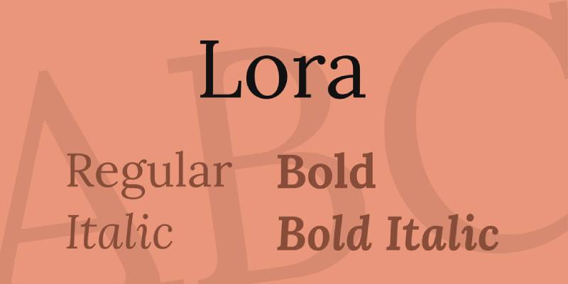
Lora is a contemporary calligraphic serif designed by Cyreal and published through Google Fonts. It handles sustained reading in quote-heavy layouts through moderate stroke contrast and carefully spaced letterforms.
Lora works best for body-length quotes because its brushed curves and open counters maintain readability at 16px–20px without requiring adjusted tracking. It currently ranks #34 on Google Fonts by popularity.
What makes Lora suitable for quotes?
Moderate stroke contrast (lower than Playfair Display, higher than most text serifs) means Lora reads clearly at body sizes on standard screens. Its calligraphic terminals give attribution lines and multi-line quotes a literary quality without the fragility of high-contrast display serifs.
The italic cuts are notably expressive — cupped serifs and swash-adjacent curves make italicized quotes look intentional rather than incidental. This matters for quote cards where the italic is the entire typographic statement.
Key attributes:
| Attribute | Value |
| Classification | Calligraphic serif |
| Designer | Cyreal |
| Weight range | Regular 400 – Bold 700 (4 weights with italics) |
| Variable font | Yes (weight axis) |
| Recommended sizes | 16px–20px for body quotes; 28px–48px for display |
| License | OFL (free for personal and commercial use) |
| Available on | Google Fonts, Adobe Fonts |
| Price | Free |
How does Lora perform in multi-line quote layouts?
Set at 16px–20px with line-height 1.5–1.7, Lora maintains comfortable reading rhythm across 3–5 line quotes. Open counters in letters like “e” and “a” prevent crowding at body sizes on both desktop and mobile viewports.
Most editorial sites using Lora pair it with a sans-serif heading (like Montserrat or Inter) and reserve Lora specifically for quote blocks and body text, which keeps hierarchy clear without visual competition.
What are the best pairings for Lora in quote design?
Lora pairs with Playfair Display when a serif-on-serif hierarchy is needed — Playfair handles the display heading, Lora handles the quote body. It also pairs with Montserrat for a classic editorial contrast where the geometric sans-serif frames the quote and Lora carries it. The Montserrat pairing is more common in web design; Playfair is more common in print-style layouts.
What are the limitations of Lora for quotes?
Lora’s weight range tops out at Bold 700, which limits its use for bold statement quotes that need heavier display weights. It also lacks a Black weight, so it cannot carry the visual impact that Playfair Display or Abril Fatface deliver at large sizes.
Lora — Recommended Use Cases Within Quote Design
- Best for: Multi-line body quotes, blog post pull quotes, literary quote cards, ebook quote pages
- Avoid for: Single-word or one-line bold statement quotes where display weight is needed
- Optimal weight: Regular 400 or Italic 400 for quote body; Bold 700 for attribution
- Optimal size range: 16px–48px
—
Cormorant Garamond
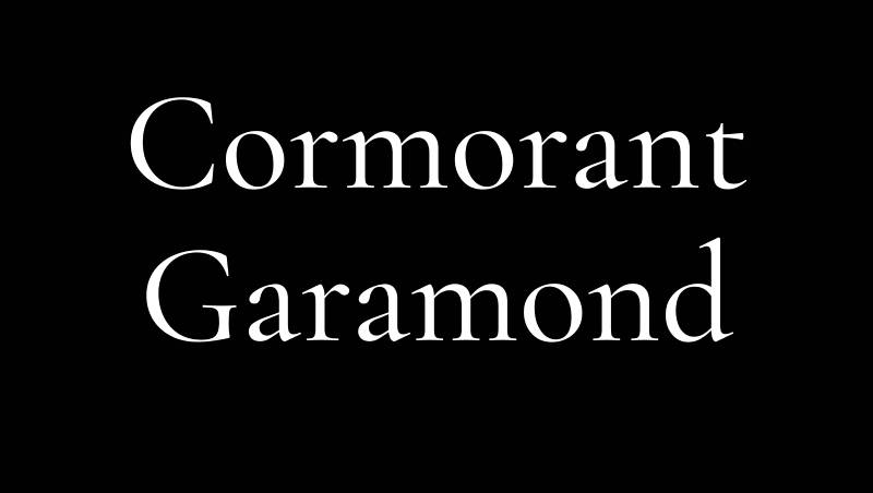
Cormorant Garamond is a display serif designed by Christian Thalmann (Catharsis Fonts), released under the SIL Open Font License and available on Google Fonts. It delivers Garamond-style proportions with significantly higher stroke contrast, optimized for large-format quote display.
Cormorant Garamond suits editorial headline quotes and luxury brand quote graphics because its hairline-to-thick stroke ratio is among the most extreme of any free serif — creating unmistakable visual drama at sizes above 20px.
What makes Cormorant Garamond suitable for quotes?
The font spans 45 files across 9 styles and 5 weights (Light through Bold), with a true italic that follows Renaissance cursive logic rather than simply slanting the roman. That italic is particularly useful for quote design — it reads as a distinct, intentional letterform, not a default fallback.
The Light weight at large display sizes (48px+) creates striking contrast against clean backgrounds. OpenType features include ligatures, stylistic alternates, and small caps — useful for setting quote attribution in a visually distinct way without switching fonts.
Key attributes:
| Attribute | Value |
| Classification | Display serif (Garamond revival) |
| Designer | Christian Thalmann (Catharsis Fonts) |
| Weight range | Light 300 – Bold 700 (5 weights + italics) |
| Variable font | Yes |
| Recommended sizes | 20px+ for quotes; 36px+ optimal |
| License | OFL (free for personal and commercial use) |
| Available on | Google Fonts, Adobe Fonts |
| Price | Free |
How does Cormorant Garamond perform at display sizes?
At 36px and above, the high stroke contrast renders with genuine impact — hairlines are delicate enough to feel refined, verticals heavy enough to anchor the composition. Below 18px, the hairlines collapse on standard screens and text becomes difficult to read.
Luxury and fashion brands (including wedding invitation designers and editorial art directors) frequently use Cormorant for quote overlays on photography, where the font’s thinness complements rather than fights the image.
What are the best pairings for Cormorant Garamond in quote design?
Cormorant Garamond pairs with Josefin Sans for geometric contrast that emphasizes the serif’s organic curves. It pairs with Montserrat when a more neutral, widely recognized sans-serif is needed for attribution or surrounding copy. The Josefin Sans pairing is considered the more visually distinctive combination for quote posters.
What are the limitations of Cormorant Garamond for quotes?
It is strictly a display typeface. Setting quote body text below 18px with Cormorant causes hairlines to disappear on non-retina screens. It also lacks a Black or Heavy weight — maximum output tops at Bold 700 — which limits its use for bold impact quotes where Abril Fatface or Playfair Display Black would be more effective.
Cormorant Garamond — Recommended Use Cases Within Quote Design
- Best for: Luxury brand quote graphics, wedding quote prints, editorial hero quotes at 48px+, quote overlays on photography
- Avoid for: Body-length quotes below 20px, quotes on low-contrast or textured backgrounds
- Optimal weight: Light 300 or Regular 400 at large sizes; SemiBold 600 for bold statements
- Optimal size range: 32px–96px
—
Dancing Script
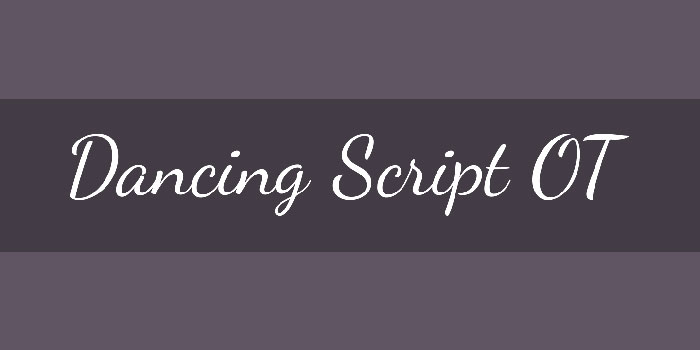
Dancing Script is a casual script font designed by Impallari Type, published under the SIL Open Font License and available on Google Fonts. Its letterforms bounce rhythmically between baselines, referencing 1950s casual scripts like Murray Hill and Mistral.
Dancing Script works for informal and motivational quote graphics because its variable weight axis (400–700) allows control over visual emphasis without switching to a different typeface.
What makes Dancing Script suitable for quotes?
The design feature that matters most for quote design: capitals extend below the baseline. This creates a flowing, connected appearance when quotes open with a capital letter — common in formatted quote cards. The letterforms are connected, which means single-line quotes read as one continuous visual unit rather than isolated characters.
Available in 4 weights (Regular 400, Medium 500, SemiBold 600, Bold 700) as a variable font, which allows precise control over how much visual weight the quote carries relative to the surrounding layout.
Key attributes:
| Attribute | Value |
| Classification | Casual script |
| Designer | Impallari Type (Pablo Impallari) |
| Weight range | Regular 400 – Bold 700 (variable) |
| Variable font | Yes (weight axis) |
| Recommended sizes | 24px+ for quotes; avoid below 18px |
| License | OFL (free for personal and commercial use) |
| Available on | Google Fonts |
| Price | Free |
How does Dancing Script perform for social media quote graphics?
The bouncing baseline and slightly varying letter sizes create an informal, personal energy that works well for Instagram quote posts, Pinterest boards, and motivational content. At Bold 700, it carries enough visual weight to hold a short quote independently on a simple background.
The connected letterforms make it less suited for multi-line quotes — line breaks interrupt the flow. Short quotes of 5–12 words perform best.
What are the best pairings for Dancing Script in quote design?
Dancing Script pairs with Montserrat for a high-contrast combination where the geometric sans-serif attribution sits cleanly below the flowing script quote. It also pairs with Lora when a slightly warmer, more literary tone is needed for the supporting text. Montserrat is the more commonly used pairing in social media design contexts.
What are the limitations of Dancing Script for quotes?
Connected letterforms reduce legibility for multi-line quotes, especially when line spacing is tight. The casual character also makes it inappropriate for serious or formal quote contexts — academic citations, business publications, or memorial content. It does not include a true italic, since the entire design is already script-style.
Dancing Script — Recommended Use Cases Within Quote Design
- Best for: Short motivational quotes (5–12 words), Instagram and Pinterest quote graphics, greeting card quotes
- Avoid for: Multi-line quotes, formal or academic quote contexts, text below 18px
- Optimal weight: SemiBold 600 or Bold 700 for single-line quotes; Regular 400 for lighter decorative use
- Optimal size range: 24px–64px
—
Montserrat
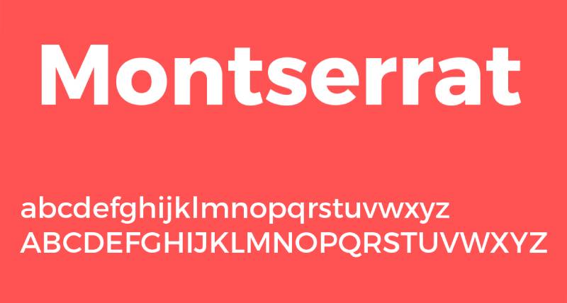
Montserrat is a geometric sans-serif font designed by Julieta Ulanovsky, released in 2011 through Google Fonts. It draws from the urban signage and posters of the historic Montserrat neighborhood in Buenos Aires.
Montserrat suits bold, clean quote graphics because its uniform stroke widths and wide apertures maintain legibility across 9 weights — from Thin 100 to Black 900. It is the fourth most popular font on Google Fonts, used on over 19 million websites.
What makes Montserrat suitable for quotes?
Montserrat has a large x-height and short descenders — both structural attributes that increase readability at smaller display sizes common in social media graphics. The 9-weight range (plus matching italics across all weights) means a single typeface family can handle both the quote body and the attribution without introducing a second font.
At Black 900, Montserrat functions as a pure display weight for short, punchy quotes. At Regular 400 or Medium 500, it handles attribution, context lines, and secondary text. A single variable font file covers the full range.
Key attributes:
| Attribute | Value |
| Classification | Geometric sans-serif |
| Designer | Julieta Ulanovsky, 2011 |
| Weight range | Thin 100 – Black 900 (9 weights + italics) |
| Variable font | Yes |
| Recommended sizes | 14px+ for body; 24px+ for display quotes |
| Letter-spacing default | Standard; slight positive tracking recommended at display sizes |
| License | OFL (free for personal and commercial use) |
| Available on | Google Fonts, Adobe Fonts |
| Price | Free |
How does Montserrat perform in quote design at various sizes?
At Black 900 and 48px+, Montserrat creates strong typographic hierarchy for statement quotes — bold enough to stand independently on a minimal background. At Regular 400 and 16px–18px, it delivers clean, neutral attribution text that doesn’t compete with a serif or script primary quote font.
Wide apertures in letters like “c,” “e,” and “a” prevent misreads at smaller sizes on mobile screens, which matters for quotes used in Stories or short-form video captions.
What are the best pairings for Montserrat in quote design?
Montserrat pairs with Lora for a standard editorial contrast — Montserrat handles the surrounding interface and attribution, Lora carries the quote body. It also pairs with Cormorant Garamond for a sharper serif-vs-geometric contrast that suits luxury and fashion quote contexts. The Lora pairing is the more neutral all-purpose choice.
What are the limitations of Montserrat for quotes?
As a geometric sans-serif, Montserrat lacks the warmth and personality that script or serif fonts bring to emotionally charged quotes. Using it for long literary or poetic quotes in isolation can feel sterile. It works better as part of a pairing system than as the sole typeface for quote-focused design.
Montserrat — Recommended Use Cases Within Quote Design
- Best for: Bold short statement quotes, quote card attribution, social media graphic framing text, minimalist quote posters
- Avoid for: Romantic or emotionally expressive quotes where warmth is needed
- Optimal weight: Black 900 for quote statements; Light 300 or Regular 400 for attribution
- Optimal size range: 16px–96px depending on weight
—
Great Vibes
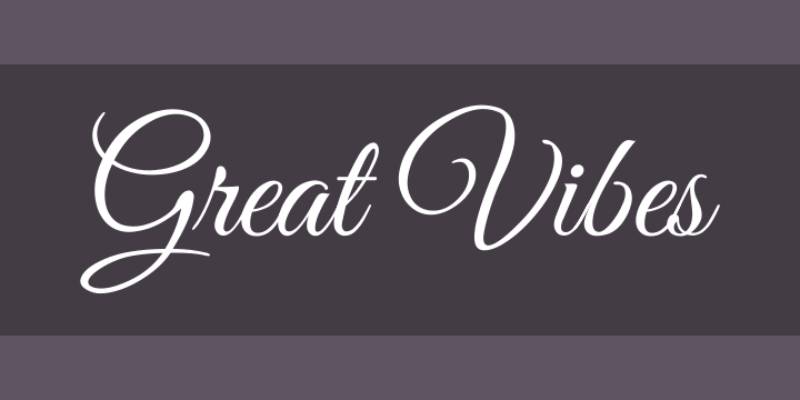
Great Vibes is a calligraphic script typeface designed by Robert E. Leuschke (TypeSETit), released in 2012 under the SIL Open Font License, available on Google Fonts and Adobe Fonts. It delivers flowing connected letterforms with cleanly looping ascenders and descenders suited to formal quote applications.
Great Vibes optimizes for elegant single-line quotes and invitation-style quote graphics because its swash capitals and continuous letter connections create an unbroken visual flow across the width of a composition.
What makes Great Vibes suitable for quotes?
The letterform structure is specifically calligraphic — not casual like Dancing Script, but formally scripted with consistent pen-angle implied by the stroke modulation. Swash capitals add visual flair at the beginning of quote lines without requiring any special character input.
It is a single-weight font (Regular 400 only), which keeps its use case narrow but clearly defined: short, elegant quotes on clean backgrounds where the script itself carries all the visual weight.
Key attributes:
| Attribute | Value |
| Classification | Calligraphic script |
| Designer | Robert E. Leuschke (TypeSETit), 2012 |
| Weight range | Regular 400 only |
| Variable font | No |
| Recommended sizes | 28px+ for quotes; 48px+ for poster applications |
| License | OFL (free for personal and commercial use) |
| Available on | Google Fonts, Adobe Fonts |
| Price | Free |
How does Great Vibes perform in formal quote contexts?
The continuous stroke connections render best at 32px and above. Below 24px, the fine connecting strokes between letters merge and legibility drops. At 48px–72px on a light background, the looping ascenders and descenders create elegant whitespace rhythm.
It is widely used in wedding stationery, anniversary quote graphics, and formal event design — contexts where a formal calligraphic script signals elegance without the cost of custom hand lettering.
What are the best pairings for Great Vibes in quote design?
Great Vibes pairs with Montserrat for a high-contrast script-plus-geometric combination where the sans-serif attribution sits below the flowing script quote. It also works with Cormorant Garamond in lighter weights when a fully elegant, serif-supported formal layout is needed. The Montserrat pairing is significantly more common in practical design.
What are the limitations of Great Vibes for quotes?
Single weight only — no Bold, SemiBold, or heavier variant exists. This means Great Vibes cannot adapt to different visual weight requirements and is not suitable for contexts where quote emphasis needs to shift. Multi-line quotes also suffer from poor inter-line rhythm at this weight.
Great Vibes — Recommended Use Cases Within Quote Design
- Best for: Short formal quotes (under 8 words), wedding and event quote graphics, single-line quote overlays on photography
- Avoid for: Multi-line quotes, contexts requiring bold emphasis, small-size quote captions
- Optimal weight: Regular 400 (only available weight)
- Optimal size range: 32px–96px on light or neutral backgrounds
—
Merriweather
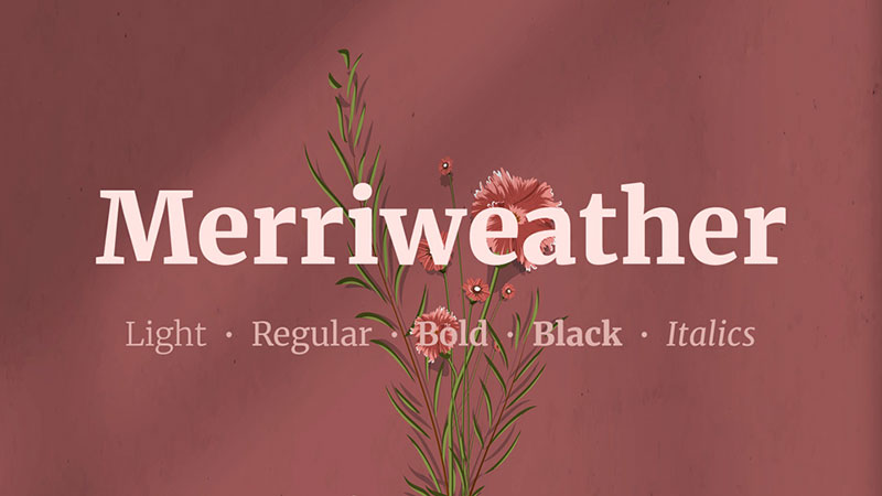
Merriweather is a screen-optimized serif designed by Eben Sorkin (Sorkin Type) and released through Google Fonts. The design brief was explicit: build a serif readable at 14px–18px on standard-density screens — a harder target than it sounds for a serif typeface.
Merriweather suits body-length quote blocks on websites and digital publications because its generous x-height, slightly condensed letterforms, and sturdy serifs hold up at small sizes where most display serifs fail.
What makes Merriweather suitable for quotes?
The x-height is large relative to cap height, which increases perceived size at a given point value. Slightly condensed proportions mean more characters fit per line without sacrificing inter-letter spacing — useful for multi-line quotes in narrow column layouts.
The variable font implementation includes optical size, width, and weight axes simultaneously — a rare combination that allows fine-tuning from caption-scale quote attribution up to heading-scale introductory quotes within a single file.
Key attributes:
| Attribute | Value |
| Classification | Screen-optimized serif |
| Designer | Eben Sorkin (Sorkin Type), 2011 |
| Weight range | Light 300 – Black 900 (4 static weights + italics; variable covers full range) |
| Variable font | Yes (weight, width, optical size axes) |
| Optical sizes | Yes (via opsz axis in variable version) |
| Recommended sizes | 14px–18px for body quotes; 28px+ for display quotes |
| License | OFL (free for personal and commercial use) |
| Available on | Google Fonts, Adobe Fonts |
| Price | Free |
How does Merriweather perform in web quote blocks?
At 16px–18px with 1.6 line-height, Merriweather maintains comfortable reading rhythm in multi-paragraph quote sections — an area where Playfair Display and Cormorant Garamond fall apart. The TTFA hinting improves rendering quality specifically on Windows browsers, which are historically less forgiving with serif fonts.
Online newspaper and blog publishers frequently use Merriweather for blockquotes and pull quotes because the font’s sturdiness at body size reduces the need to increase quote font size just to restore legibility.
What are the best pairings for Merriweather in quote design?
Merriweather pairs with Lora — though this is a more unusual serif-on-serif pairing where Merriweather handles body quotes and Lora handles pull quotes for its warmer calligraphic character. More standardly, it pairs with Montserrat for a clean sans-serif heading and geometric framing around Merriweather quote body text.
What are the limitations of Merriweather for quotes?
Merriweather’s sturdy, slightly condensed design lacks the elegance and drama of display serifs. For quote posters, luxury branding, or any context where the font’s personality is a central design element, it reads as utilitarian rather than expressive. It is optimized for function, not visual impact.
Merriweather — Recommended Use Cases Within Quote Design
- Best for: Website blockquotes, blog pull quotes, digital magazine quote sections, long multi-line quotes on screen
- Avoid for: Quote posters requiring visual drama; luxury or fashion brand quote graphics
- Optimal weight: Regular 400 for body quotes; Bold 700 for short display quotes
- Optimal size range: 14px–36px
—
Abril Fatface
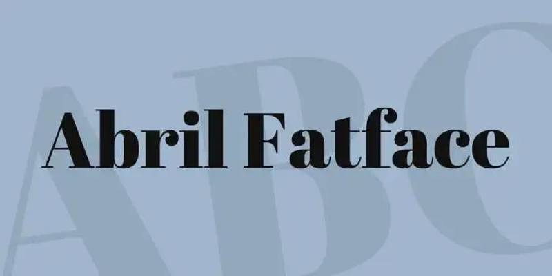
Abril Fatface is a display serif designed by Veronika Burian and José Scaglione at TypeTogether, released in 2011 under the SIL Open Font License. It is the display weight from the broader Abril family system (18 styles total), modeled on 19th-century European advertising poster typography with classic Didone proportions.
Abril Fatface suits bold, short impact quotes because its extreme stroke contrast — thick verticals against near-invisible hairlines — creates maximum visual weight from a single weight font. No other free font in this category delivers comparable impact.
What makes Abril Fatface suitable for quotes?
The Didone proportions create an extreme thick-to-thin ratio: the vertical strokes are heavy enough to anchor a composition, the hairline horizontals fine enough to feel refined rather than clunky. This makes it distinct from generic bold display fonts.
The font is available in Regular 400 only. That constraint is a feature for quote design — there is no hierarchy decision to make. Abril Fatface is always the attention-capture layer; secondary text gets paired from a different family entirely.
Key attributes:
| Attribute | Value |
| Classification | Display serif (Didone) |
| Designer | Veronika Burian and José Scaglione (TypeTogether), 2011 |
| Weight range | Regular 400 only (display weight) |
| Variable font | No |
| Recommended sizes | 36px+ for quotes; 60px+ for poster applications |
| License | OFL (free for personal and commercial use) |
| Available on | Google Fonts |
| Price | Free |
How does Abril Fatface perform for impact quote posters?
At 60px+, the thick verticals create strong visual anchoring on both light and dark backgrounds. The Didone hairlines are finer than Playfair Display’s at equivalent sizes, giving it a more editorial, poster-print quality. It’s the kind of font that reads as designed rather than defaulted.
It was originally designed for newspapers and magazine headers — use cases where a quote or headline needed to stop the reader’s eye before they moved on. That original intent translates directly to social media quote graphics.
What are the best pairings for Abril Fatface in quote design?
Abril Fatface pairs with Lora for editorial-style quote layouts where the serif headline quote and serif attribution share a typographic language without competing. It pairs with Montserrat when the attribution or surrounding text needs maximum contrast and neutrality. The Montserrat pairing is more common in digital design; Lora works better in print contexts.
What are the limitations of Abril Fatface for quotes?
Single weight only, and exclusively a display size typeface — hairlines disappear below 24px and the design becomes unreadable below 18px. It cannot be used for multi-line body quotes without losing legibility at standard web reading sizes. The full Abril family (including text weights) requires a separate font or paid licensing for the non-OFL variants.
Abril Fatface — Recommended Use Cases Within Quote Design
- Best for: Short 3–7 word statement quotes, quote poster headlines, social media quote graphics at large sizes
- Avoid for: Multi-line quotes, body-length quote text, any quote below 24px
- Optimal weight: Regular 400 (only available weight)
- Optimal size range: 36px–120px
—
Garamond

EB Garamond is an open-source revival of the 16th-century Garamond typefaces, designed by Georg Duffner and Octavio Pardo, available on Google Fonts. It is text-optimized rather than display-optimized — built for reading comfort across body sizes rather than headline drama.
EB Garamond suits literary, academic, and book-excerpt quote contexts because it carries the historical authority of Garamond proportions with screen-rendering improvements that the original metal type never needed to consider.
What makes EB Garamond suitable for quotes?
Lower stroke contrast than Cormorant Garamond or Playfair Display means letterforms remain intact at 14px–18px on screen without hairlines disappearing. The moderate x-height and long ascenders give multi-line quotes an open, airy rhythm that suits literary content.
The italic is a true cursive — not an oblique slant — which makes italicized quote bodies feel intentional and classical. This matters particularly for book excerpts and poetry quotes where the italic is the dominant typographic choice.
Key attributes:
| Attribute | Value |
| Classification | Old-style serif (Garamond revival) |
| Designer | Georg Duffner and Octavio Pardo |
| Weight range | Regular 400 – ExtraBold 800 (with italics) |
| Variable font | Yes |
| Recommended sizes | 14px–20px for body quotes; 28px+ for display |
| License | OFL (free for personal and commercial use) |
| Available on | Google Fonts |
| Price | Free |
How does EB Garamond perform for literary and academic quotes?
At 16px–18px, EB Garamond renders with the warmth and authority associated with classical publishing. Academic papers, book review sites, and literary blogs use it specifically for blockquotes and pull quotes where the font’s historical character reinforces the credibility of the sourced text.
The ExtraBold 800 weight (available in the variable version) allows occasional bold emphasis within a quote for specific word stress — less common in other old-style serif families.
What are the best pairings for EB Garamond in quote design?
EB Garamond pairs with Montserrat for contrast between old-style serif quotes and a geometric sans-serif frame — a pairing used frequently in literary magazine web design. It pairs with Libre Baskerville for a warmer, screen-optimized transitional serif attribution when the design calls for a fully serif typographic system. The Montserrat pairing is more widely used in digital publishing.
What are the limitations of EB Garamond for quotes?
As an old-style serif, EB Garamond lacks the visual drama needed for bold impact quotes, social media graphics, or poster typography where attention capture is the primary goal. It reads as scholarly and understated — useful in the right context, limiting in others. The font also requires careful line-height management (1.6–1.8 recommended) to prevent the long ascenders from colliding with descenders in tight multi-line quote settings.
EB Garamond — Recommended Use Cases Within Quote Design
- Best for: Literary quotes, book excerpt blocks, academic citation graphics, poetry quote cards
- Avoid for: Bold impact social media quotes, poster typography requiring visual drama
- Optimal weight: Regular 400 or Italic 400 for quote body; Medium 500 for attribution
- Optimal size range: 14px–36px
—
Libre Baskerville
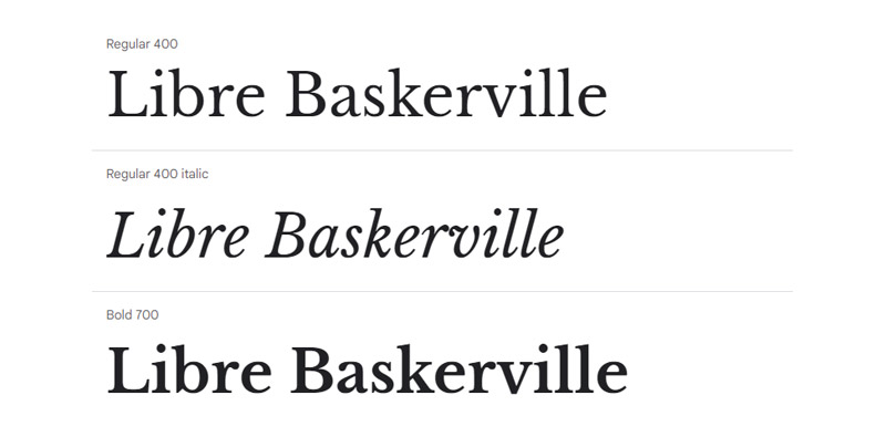
Libre Baskerville is a screen-optimized revival of Baskerville, designed by Pablo Impallari and Rodrigo Fuenzalida, released under the SIL Open Font License and available on Google Fonts. It was specifically adapted from the American Type Founders’ 1941 Baskerville version for improved legibility at web body sizes.
Libre Baskerville works best for professional quote blocks in editorial and corporate contexts because its transitional serif proportions balance classical authority with practical screen readability.
What makes Libre Baskerville suitable for quotes?
Higher stroke contrast than EB Garamond but lower than Playfair Display — Libre Baskerville occupies the middle ground between purely text-optimized and purely display-optimized serifs. This makes it the more versatile choice across quote size ranges (16px body text up to 36px display quotes).
The family includes Regular, Italic, and Bold — three weights that cover all practical quote hierarchy needs: italic for the quote body, regular for attribution, bold for emphasized or short statement quotes.
Key attributes:
| Attribute | Value |
| Classification | Transitional serif (Baskerville revival) |
| Designer | Pablo Impallari and Rodrigo Fuenzalida |
| Weight range | Regular 400, Italic 400, Bold 700 |
| Variable font | No |
| Recommended sizes | 16px–20px for body quotes; 24px–36px for display |
| License | OFL (free for personal and commercial use) |
| Available on | Google Fonts |
| Price | Free |
How does Libre Baskerville perform in professional quote design?
The screen-optimized version of Baskerville’s proportions means it renders clearly at 16px on both Windows and macOS without the hinting issues that affect many classical serif revivals. The transitional structure gives it more visual authority than EB Garamond at equivalent sizes, while remaining more approachable than Cormorant Garamond’s dramatic hairlines.
Publications, corporate communication sites, and professional blogs favor Libre Baskerville for blockquotes precisely because it reads as credible and established without requiring any visual explanation.
What are the best pairings for Libre Baskerville in quote design?
Libre Baskerville pairs with Montserrat for the most common professional editorial combination — geometric sans-serif framing around a transitional serif quote. It also pairs with Lora in a serif-on-serif system where Lora’s calligraphic warmth contrasts with Baskerville’s cooler, more rational structure. The Montserrat pairing covers the widest range of professional use cases.
What are the limitations of Libre Baskerville for quotes?
The family includes only 3 styles — Regular, Italic, Bold — with no variable font or extended weight range. Designers needing SemiBold or Black weights for large-format quote headlines must switch to a different typeface. It also lacks the visual personality of Playfair Display or Cormorant Garamond for contexts where the font itself is a design statement.
Libre Baskerville — Recommended Use Cases Within Quote Design
- Best for: Professional editorial quote blocks, corporate website blockquotes, professional presentation quote slides, news publication pull quotes
- Avoid for: Bold impact poster quotes, luxury or fashion brand quote graphics where visual drama is required
- Optimal weight: Italic 400 for quote body; Regular 400 for attribution; Bold 700 for short emphasis quotes
- Optimal size range: 16px–36px
What Makes a Font Work for Quote Design?
Two structural attributes determine whether a font works for quotes: x-height and stroke contrast. Everything else — personality, historical origin, platform availability — comes second.
A 2024 study by Cooreman and Beier (Royal Danish Academy) confirmed that x-height fraction is the single most critical factor for legibility in time-sensitive reading contexts. For quote design, where a reader absorbs text in seconds, this matters directly.
Stroke contrast determines how a font behaves at scale. High contrast (thick verticals, hairline horizontals) produces drama at 48px but collapses at 14px. Low contrast holds at body sizes but loses presence in poster-scale quote graphics. Neither is better. They serve different quote formats.
Weight range is the third structural criterion. A font with only one weight (Great Vibes, Abril Fatface) limits hierarchy options — you cannot shift from a bold quote body to a lighter attribution without switching typefaces entirely. Fonts with 4–9 weights (Lora, Montserrat) handle the full quote layout from a single family.
Optimizing spacing can make smaller characters up to 20% easier to read compared to default settings, according to research cited in the International Journal of Research and Innovation in Social Science (2024). For multi-line quote blocks, letter-spacing defaults matter as much as typeface choice.
Font classification maps directly to quote type. The table below covers the practical decision framework:
| Classification | Quote Type | Key Structural Reason |
| Transitional serif | Literary, editorial | True italic, moderate x-height, screen-viable contrast |
| Display serif (Didone) | Short bold statements | Extreme stroke contrast; visible only at 36px+ |
| Calligraphic script | Formal, romantic | Connected letterforms; single or limited weights |
| Geometric sans-serif | Motivational, minimal | Large x-height; wide apertures; full weight range |
Font readability studies confirm that switching to a more appropriate typeface for the context produces up to a 35% boost in reading speed while retaining comprehension, according to MIT research covered by Readable (2023).
The right classification, matched to quote type and output format, is the decision that makes or breaks quote typography. Individual font selection comes after.
—
Which Font Classification Works Best for Each Type of Quote?
Classification determines personality, legibility range, and hierarchy options before any specific font is chosen. Getting this right eliminates most bad quote typography decisions.
Serif Fonts for Literary and Editorial Quotes
Best classification for sustained reading and authority. Transitional serifs like Playfair Display and Lora deliver the true italic cuts that make multi-line quote bodies look intentional, not incidental.
Serif typefaces consistently score higher on signals of tradition and authority in typography perception research (Vistaprint / Journal of Consumer Psychology). For book excerpts, academic citations, and editorial pull quotes, this matters.
- Playfair Display: high stroke contrast, works at 24px–72px, Black 900 weight for short statements
- Lora: calligraphic warmth, screen-optimized at 16px–20px, expressive italic for quote bodies
- EB Garamond: old-style proportions, literary character, true cursive italic
- Libre Baskerville: transitional structure, screen-hinted, 3 clean weights for full hierarchy
The New York Times, The Atlantic, and most major literary publications default to transitional serifs for their pull quote and blockquote typography. Not by accident.
Script Fonts for Romantic and Informal Quotes
Legibility constraint is the defining issue with script typefaces. Connected letterforms read cleanly on a single line. Across three lines, the breaks interrupt flow and comprehension drops.
Dancing Script’s bouncing baseline and below-baseline capitals create a continuous visual unit for short quotes of 5–12 words. Great Vibes delivers formal calligraphic authority for wedding and event design through cleanly looping ascenders. Both are single-context fonts.
The practical limits are fixed:
- Below 24px: connecting strokes collapse and become illegible on screen
- Multi-line: rhythm breaks at every line return
- Single weight (Great Vibes): no hierarchy control without switching fonts
Script fonts for quotes work. They just have a narrow operating window. Short, single-line, large-format applications only.
Display Fonts for Short Statement Quotes
Abril Fatface carries 19th-century European advertising poster DNA directly into quote poster design. Veronika Burian and José Scaglione at TypeTogether built it specifically for editorial contexts where a headline quote needs to stop the reader before they move on.
At 60px+, the Didone thick-to-thin ratio renders with genuine visual drama on both light and dark backgrounds. This is one of the few free fonts where the stroke contrast equals paid premium display typefaces.
Geometric sans-serifs (Montserrat) serve a different function: they handle the bold statement quote that needs maximum clarity without serif ornament. Montserrat has accumulated 3 trillion all-time views on Google Fonts (Photutorial, 2025) — its legibility at large sizes and across devices is proven at scale.
| Font | Quote Length | Minimum Size | Max Impact |
| Abril Fatface | 3–7 words | 36px | 60px–120px |
| Cormorant Garamond | 5–12 words | 20px | 48px–96px |
| Montserrat Black | Any length | 14px | 48px+ |
| Dancing Script Bold | 5–12 words | 24px | 36px–64px |
—
How Does Font Choice Affect Quote Legibility on Social Media and Print?
The same font behaves differently across output contexts. A hairline serif that renders beautifully on a 300 DPI print poster becomes illegible on a 96 DPI mobile screen at the same apparent size.
79% of websites crawled in 2024 used either self-hosted fonts, Google web fonts, or both, according to the HTTP Archive Web Almanac 2024. Quote graphics created for web and social media share the same rendering environment — screen DPI matters for font selection decisions.
Font Performance on Social Media Quote Graphics
Low-DPI constraint: Instagram, Pinterest, and TikTok graphics display at 72–96 DPI on most devices. High-contrast display serifs lose their hairlines entirely below 24px in this environment.
Practical rules by platform canvas:
- Instagram 1080×1080 (square): Montserrat Black 900 or Playfair Display Bold at 80px–120px for short quotes; Lora at 40px–60px for multi-line
- Pinterest 1000×1500 (tall): Cormorant Garamond at 64px+ holds on the tall canvas; Dancing Script Bold at 48px+ for short romantic quotes
- Stories / TikTok 1080×1920: High-contrast serifs struggle; Montserrat or Merriweather at 36px+ are safer
Canva’s rendering engine applies slight anti-aliasing that softens hairlines further compared to Figma’s direct rendering. Cormorant Garamond in Canva looks visibly lighter than the same settings in Figma or Illustrator. Test before finalizing.
Variable fonts are increasingly the practical solution for multi-platform quote design. In 2024, variable fonts were used on 33% of desktop pages and 34% of mobile pages, up from 28% in 2022, according to HTTP Archive. A single variable file (Playfair 2.2, Merriweather, Montserrat) covers all weight and optical size needs across platforms without loading multiple static files.
Font Performance on Print Quote Posters
Print at 300 DPI recovers every detail that screen rendering loses. Fonts that feel limited on screen become their full selves in print.
High-contrast serifs regain full legibility at print DPI. Cormorant Garamond Light at 36pt in print delivers hairlines so fine they read as refined rather than fragile. Abril Fatface at 72pt reproduces the full Didone drama that low-DPI screens flatten.
Three structural advantages in print that don’t exist on screen:
- No pixel grid: curves render as true curves, not staircase approximations
- No hinting dependency: screen-hinting quality (which varies by font) becomes irrelevant
- No WOFF2 weight limit: full OpenType feature sets (small caps, ligatures, alternates) are available
Vogue, one of the most typography-forward print publications, uses high-contrast serif display fonts for quote overlays precisely because print DPI makes them viable. The same fonts in their digital edition switch to heavier weights to compensate for screen rendering.
—
What Are the Best Font Pairings for Quote Design?
Font pairing for quote design follows one structural rule: contrast must exist in exactly one dimension — classification, weight, or width. Contrast across all three creates visual noise. Contrast in none creates monotony.
According to HTTP Archive Web Almanac 2024, approximately 39% of desktop websites use both Google Fonts and self-hosted fonts simultaneously. Most are implementing pairing systems, not single-font designs. The pairing decision is routine, not exceptional.
The three dominant pairing patterns in quote design:
- Serif quote + geometric sans attribution: Most widely used. Playfair Display Bold / Montserrat Light, Lora Italic / Montserrat Regular, EB Garamond / Montserrat
- Script quote + neutral sans attribution: Dancing Script Bold / Montserrat Regular, Great Vibes / Josefin Sans Light
- Display serif + text serif attribution: Abril Fatface / Lora Regular, Cormorant Garamond Light / EB Garamond
A 2026 typography trend analysis (IKA Agency) confirms that the dominant professional approach now combines a serif headline with a humanist sans-serif body — a pattern that scores high on both authority and readability simultaneously.
The table below covers the most-used combinations with use case context:
| Primary (Quote) | Secondary (Attribution) | Best Use Case |
| Playfair Display Bold | Montserrat Light | Editorial, Instagram carousels |
| Lora Italic | Montserrat Regular | Blog blockquotes, literary graphics |
| Cormorant Garamond Light | Josefin Sans Light | Luxury branding, wedding prints |
| Dancing Script Bold | Montserrat Regular | Motivational social posts |
| Abril Fatface | Lora Regular | Poster quotes, print editorial |
Same-family pairings (italic body quote + regular attribution within a single font) work well for Montserrat and Merriweather, where the weight range is wide enough to create hierarchy without a second typeface. This is the simpler solution for designers who want visual consistency over contrast.
For rapid pairing decisions across the fonts covered in this article, a font pairing generator removes the trial-and-error step by showing live combinations instantly. When pairing manually, check that the x-height of both fonts is close — mismatched x-heights make pairings look accidental even when weights are well-chosen.
A practical note on pairing fonts: two typefaces are almost always enough. Three is a ceiling, not a target. Quote design that uses Playfair Display for the quote, Montserrat for attribution, and a third decorative font for context or hashtag becomes visually competitive rather than hierarchically clear.
—
How Do Font Licensing and Availability Affect Quote Design Projects?
All 10 fonts covered in this article use the SIL Open Font License (OFL). This is the most permissive open-source license available for typography.
Google Fonts appeared on about 54% of desktop sites and 47% of mobile sites in 2024, according to the 2025 Web Almanac, and its entire library ships under the OFL or Apache 2.0 license. Both permit commercial use without fees, attribution requirements, or expiration dates.
What the SIL OFL permits:
- Personal and commercial use in any project
- Embedding in websites, apps, PDFs, and printed materials
- Selling designs that include the font (Etsy printables, client deliverables)
- Modification and redistribution of the font file itself
What the SIL OFL restricts:
- Selling the font file by itself as a standalone product
- Using the Reserved Font Name in modified versions without explicit permission
The restriction designers most commonly misunderstand: you can sell an Etsy quote printable that uses Playfair Display. You cannot sell a font bundle that includes Playfair Display as one of the items. The license covers the design product, not the font file itself.
Platform-specific embedding rules still apply regardless of OFL permissions. Canva’s terms restrict users from extracting fonts from the platform — you cannot download a Canva design, extract the font file, and use it separately. The OFL covers your use of the font file you downloaded directly from Google Fonts or Font Squirrel, not what Canva serves through its interface.
Font licensing verification sources:
- Google Fonts specimen page (each font shows its exact license)
- Font licensing resource for understanding commercial vs. personal use distinctions
- Font Squirrel license checker for any font not sourced directly from Google
One practical difference between Google Fonts and Adobe Fonts for quote designers: Adobe Fonts gives access to premium typefaces (including full commercial Abril family with 18 styles) through a Creative Cloud subscription. The OFL version on Google Fonts covers only Abril Fatface (one display weight). If you need the full Abril text weights for a quote-heavy editorial project, Adobe Fonts is the source.
—
How Does Typography Hierarchy Work in Quote Card and Poster Design?
Quote card typography operates on a three-level hierarchy: primary quote text, attribution line, and supporting context (hashtag, source URL, or brand name). Each level must be visually distinct. If two levels look similar, the hierarchy collapses and the reader doesn’t know where to focus.
Typography design experts at Inkbot Design (2026) confirm the practical limit: three font families maximum per design — one for headings, one for body text, one for accents or pull quotes. For quote card design, that maps directly: one for the quote, one for attribution, and the brand element handled through weight or size variation of either.
Size Ratios and Weight Contrast in Quote Layouts
Attribution at 40%–60% of quote text size — this is the ratio that creates clear hierarchy without the attribution feeling like a footnote or competing with the quote body.
Practical size examples:
- Quote at 48px / Attribution at 20px–28px / Brand element at 14px–16px
- Quote at 72px / Attribution at 30px–36px / Source at 18px–20px
- Quote at 32px (multi-line) / Attribution at 16px / Context at 12px
Weight contrast within a single font family handles hierarchy without a second typeface. Montserrat Black 900 for the quote body, Montserrat Light 300 for attribution — same family, maximum contrast. Playfair Display Bold 700 with Playfair Display Regular 400 italic for the source attribution follows the same logic.
Letter-Spacing and Leading Adjustments
All-caps attribution lines require positive tracking. Set at default spacing, all-caps text in Regular weight reads as one visual block rather than individual words. Adding 0.05em–0.1em of letter-spacing separates the characters and restores readability.
Large display quotes above 60px benefit from slightly reduced tracking (negative 0.01em to -0.02em). At display sizes, default spacing creates visible gaps between characters that break the visual cohesion of a short quote.
Switching to a more appropriate typeface for the context can boost reading speed by up to 35% (MIT / Readable, 2023). Letter-spacing and leading adjustments in quote design compound that effect — correct spacing on the right font produces measurably faster, more accurate reading than the same font with default settings.
For multi-line quote bodies, set line-height at 1.4–1.6. Below 1.4, ascenders and descenders from adjacent lines come close enough to create visual crowding. Above 1.6, the quote body loses its sense of continuity and reads as separate lines rather than a unified statement.
Real-world reference: Vogue’s digital editorial team uses 19px body type with tight tracking on headline quotes — the minimum readable size at screen DPI, with letter-spacing adjusted specifically to compensate for the high-contrast serif they use at that scale. The font specification stays constant; the spacing changes by context.
FAQ on The Best Fonts For Quotes
What is the best font for quotes overall?
Playfair Display is the most versatile choice. Its transitional serif structure, high stroke contrast, and weight range from Regular 400 to Black 900 make it suitable for editorial pull quotes, Instagram graphics, and print posters at sizes from 24px upward.
What font is used for motivational quotes?
Montserrat dominates motivational quote design. Its geometric sans-serif structure, large x-height, and 9-weight range from Thin to Black deliver clean, bold typography for social media graphics. Abril Fatface works well for short, punchy 3–7 word statements at display sizes.
What is the best Google Font for quote cards?
Lora is the strongest Google Fonts option for quote cards. Its calligraphic serif structure reads clearly at 16px–48px, the italic cut is expressive enough to carry a full quote body, and the OFL license covers all commercial use.
What font is best for Instagram quote posts?
Montserrat Black 900 at 80px–120px handles short quotes on 1080×1080 canvases. For multi-line quotes, Lora Italic at 40px–60px maintains readability. Pair either with Montserrat Light for attribution text to keep hierarchy clear.
Are script fonts good for quotes?
Script fonts work for short quotes only. Dancing Script and Great Vibes perform best at 5–12 words on a single line, at 28px or above. Connected letterforms break across multiple lines, reducing legibility significantly. Avoid script fonts for body-length quote text.
What is the most elegant font for quotes?
Cormorant Garamond Light delivers the highest perceived elegance of any free typeface. Its extreme Garamond-style stroke contrast, true Renaissance italic, and delicate hairlines at display sizes make it the standard choice for luxury branding and wedding quote graphics.
Can I use these fonts commercially for Etsy printables?
Yes. All 10 fonts in this article use the SIL Open Font License, which permits commercial use in products you sell, including Etsy printables, client deliverables, and branded materials. The only restriction is selling the font file itself as a standalone product.
What font pairs well with Playfair Display for quotes?
Montserrat is the most used pairing. Playfair Display Bold handles the quote body; Montserrat Light handles attribution. The geometric sans-serif contrasts cleanly against the transitional serif. For warmer layouts, Lora Regular works as a softer secondary option.
What size should quote fonts be on social media graphics?
On Instagram 1080×1080, quote text works at 60px–120px depending on length. Attribution sits at 20px–36px. On Pinterest’s tall canvas, scale up by 20%–30%. Below 24px, high-contrast display serifs like Cormorant Garamond lose their hairline strokes on standard screens.
What is the difference between serif and sans-serif fonts for quotes?
Serif fonts signal authority and tradition — better for literary, academic, and editorial quotes. Sans-serif fonts signal clarity and modernity — better for bold motivational statements. Studies show serif typefaces score higher on trust perception, while sans-serifs score higher on perceived modernity.
Conclusion
This conclusion is for an article presenting the best fonts for quotes — and the core takeaway is simple: font classification drives every good decision in quote typography.
Transitional serifs like Merriweather and Libre Baskerville handle sustained reading. High-contrast display faces handle short, bold statements. Script typefaces serve one narrow context and do it well.
Stroke contrast, x-height, and weight range determine whether a typeface works at 16px on mobile or 96px on a print poster. Aesthetic preference comes after those structural filters.
Every font covered here is free under the SIL Open Font License — usable in Etsy printables, client work, and commercial publications without restrictions.
Pick the classification that matches your quote type. Then let the font pairing and size hierarchy do the rest.

Renowned for his expertise in logo design and visual branding, Bogdan has developed a multitude of logos for various clients.
His skills extend to creating posters, vector illustrations, business cards, and brochures. Additionally, Bogdan's UI kits were featured on marketplaces like Visual Hierarchy and UI8.
He also wrote in the past years on sites like Design Your Way, WebDesignerDepot, WPDean, Designmodo, Speckyboy, Slider Revolution, and more.
- Best Visual Regression Testing Tools for Web and App Design in 2026 - 13 October 2026
- Jujutsu Kaisen Font Generator - 12 October 2026
- The Windsurf Logo History, Colors, Font, And Meaning - 10 October 2026

Bogdan Sandu is a seasoned designer who has been designing websites since 2008. Renowned for his expertise in logo design and visual branding, Bogdan has developed a multitude of logos for various clients. His skills extend to creating posters, vector illustrations, business cards, and brochures. Additionally, Bogdan's UI kits were featured on marketplaces like Visual Hierarchy and UI8. He also wrote in the past years on sites like Design Your Way, WebDesignerDepot, WPDean, Designmodo, Speckyboy, Slider Revolution, and more.
You Might Also Like