The wrong typeface can make a well-designed brochure look cheap. The right one does the opposite.
Choosing the best fonts for brochures comes down to more than personal taste. Print typography has real constraints: stroke contrast, x-height, paper stock, and ink behavior all determine whether a typeface holds up or falls apart at 10pt on an offset press.
This guide covers 10 typefaces that consistently perform in print-based brochure design, from classic serif fonts like Garamond and Bodoni to geometric sans-serifs like Futura and Montserrat.
You will learn which fonts suit which brochure formats, how to build a readable typographic hierarchy, what mistakes to avoid, and where to source each typeface legally for commercial print runs.
The Best Fonts For Brochures
Brochure typography is one of those things that either works or doesn’t. The wrong typeface choice can undermine an otherwise solid layout. The right one makes the whole thing feel intentional. Below are 10 fonts that consistently perform well in print-based brochure design, each selected for structural reasons rather than trends.
—
Garamond
Garamond is an old-style serif font originally cut by French type designer Claude Garamond in the 1530s–1545s, with the most widely used digital revival, Adobe Garamond, released by Robert Slimbach for Adobe Originals in 1989.
Garamond suits brochure body text because its low stroke contrast and angled stress reduce reading fatigue across longer passages. Vogue magazine used Garamond for decades in editorial body text, demonstrating its reliability in high-volume print contexts.
What makes Garamond suitable for brochures?
Garamond uses diagonal stress and bracketed serifs, which guide the eye along lines of text at print sizes of 9pt–12pt. Its x-height is moderate, allowing tight leading without crowding. The balanced stroke contrast keeps hairlines visible even on uncoated paper stock.
Key attributes:
| Attribute | Value |
| Classification | Old-style serif (Garalde) |
| Designer | Claude Garamond, 1530s; digitized by Robert Slimbach, 1989 |
| Weight range | Regular, Semibold, Bold (Adobe Garamond) |
| Optical sizes | Yes (Adobe Garamond Premier Pro: Caption, Regular, Subhead, Display) |
| Recommended sizes | 9pt–12pt body text; 18pt+ headings |
| License | Commercial (Adobe Fonts subscription); EB Garamond is OFL/free |
| Available on | Adobe Fonts; EB Garamond on Google Fonts |
| Price | Included in Adobe subscription; EB Garamond is free |
How does Garamond perform in brochure body text?
Garamond renders clearly on coated and uncoated paper at 9pt–12pt. Its bracketed serifs hold up in offset printing, where ink spread can soften hairlines in high-contrast Didone faces. The optical size variants in Adobe Garamond Premier Pro allow you to match stroke weight to point size, which is critical for dense multi-column brochure layouts.
What are the best pairings for Garamond in brochures?
Garamond pairs with Futura for strong serif-to-geometric contrast in heading-to-body hierarchies, and with Gill Sans when a warmer, more humanist feel is needed for supporting text. The Garamond-plus-Futura pairing is standard practice in mid-century editorial design and still reads as clean in print.
What are the limitations of Garamond for brochures?
Adobe Garamond’s limited weight range (no true Heavy or Black weight) restricts its use as a standalone headline font in high-contrast brochure designs. The free EB Garamond version lacks the optical size variants needed for professional small-text settings below 9pt.
Garamond – Recommended Use Cases Within Brochure Design
- Best for: Body copy in corporate, academic, and luxury brochures; long-form descriptive text
- Avoid for: Standalone headline use without a heavier companion; reversed-out text on dark backgrounds below 11pt
- Optimal weight: Regular for body text; Semibold for subheadings
- Optimal size range: 9pt–12pt body; 18pt–36pt headings
—
Helvetica
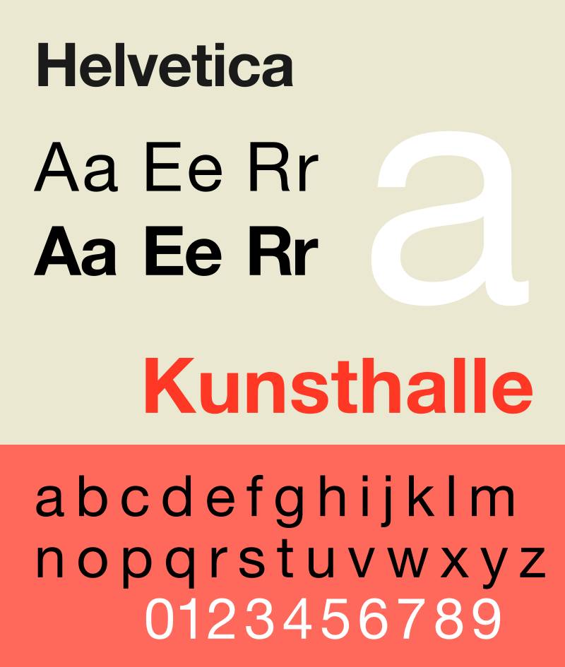
Helvetica is a neo-grotesque sans-serif font designed by Max Miedinger with Eduard Hoffmann at Haas Type Foundry in 1957, released under Linotype as Helvetica in 1960. It is one of the most widely deployed typefaces in corporate print history.
Helvetica works best for brochure headings and structural labels because its stroke terminals sit on perfect horizontals and verticals, giving it a crisp, high-contrast appearance at 18pt and above. The NYC Subway system has used it for decades as a wayfinding typeface, demonstrating its legibility under high-read-speed conditions.
What makes Helvetica suitable for brochures?
Neue Helvetica (1983 revision) supports 51 weights and widths with a rationalized numbering system, from 25 Ultra Light to 95 Extra Black. This range lets designers build a complete typographic hierarchy within a single typeface family. Its tight default letter-spacing is optimized for display sizes; body text requires manual tracking adjustment at sizes below 10pt.
Key attributes:
| Attribute | Value |
| Classification | Neo-grotesque sans-serif |
| Designer | Max Miedinger, Eduard Hoffmann, 1957 |
| Weight range | 25 Ultra Light to 95 Extra Black (Neue Helvetica, 51 styles) |
| Letter-spacing default | Tight (requires +10 to +20 tracking for body text below 10pt) |
| Recommended sizes | 14pt+ for body text; 24pt+ for headlines |
| License | Commercial (Linotype/Monotype) |
| Available on | Adobe Fonts, Linotype, Monotype |
| Price | Paid; included in some Adobe Fonts subscriptions |
How does Helvetica perform in brochure design?
At display sizes (18pt+), Helvetica’s horizontal stroke terminals produce sharp, clean print output on both coated and uncoated stock. Below 12pt, its narrow apertures in letters like “c” and “e” reduce legibility. Neue Helvetica eText addresses this with wider spacing and a taller x-height, but it is a separate purchase.
What are the best pairings for Helvetica in brochures?
Helvetica pairs with Garamond for classic sans-serif-to-serif contrast, a combination used by designer Massimo Vignelli across decades of print work. It also pairs with Georgia when a warmer serif body text is needed without the formality of Garamond’s old-style construction.
What are the limitations of Helvetica for brochures?
Helvetica’s narrow apertures limit legibility at body text sizes below 12pt, making it a poor choice for dense, small-text brochure formats. Licensing costs for the full Neue Helvetica family are significant compared to free alternatives with similar structural properties.
Helvetica – Recommended Use Cases Within Brochure Design
- Best for: Corporate brochure headlines, section labels, callout text, and structural navigation
- Avoid for: Body text below 12pt; brochures where legibility at small sizes is required
- Optimal weight: 55 Roman for body (if used); 75 Bold for headings
- Optimal size range: 18pt–48pt headings; 14pt+ if used for body text
—
Futura
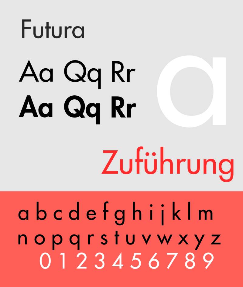
Futura is a geometric sans-serif font designed by Paul Renner and released by the Bauer Type Foundry in Frankfurt in 1927. It uses near-perfect circles, triangles, and squares as the basis for its letterforms.
Futura suits brochure headlines because its near-even stroke weight and geometric construction hold up at large print sizes without optical distortion. Louis Vuitton, FedEx, and Volkswagen have all used Futura in print collateral, demonstrating its adaptability across different brand positioning contexts.
What makes Futura suitable for brochures?
Futura’s stroke contrast is minimal (near-zero), meaning its letterforms do not lose definition when printed at low resolution or on matte paper. Its tall ascenders and low x-height suit headline hierarchies where visual distinction between heading and body text is needed. The Futura Now family (Monotype, 2020) adds 102 styles, including variable weight and optical size variants.
Key attributes:
| Attribute | Value |
| Classification | Geometric sans-serif |
| Designer | Paul Renner, 1927 (Bauer Type Foundry) |
| Weight range | Light to Extra Bold (original); Futura Now adds 102 styles |
| Variable font | Yes (Futura Now, 2020) |
| Recommended sizes | 10pt–14pt body text; 24pt+ headings |
| Letter-spacing default | Wide (especially in Light weights) |
| License | Commercial (Bauer Types / Monotype) |
| Available on | Adobe Fonts, Monotype, MyFonts |
| Price | Paid; included in some Adobe Fonts subscriptions |
How does Futura perform in brochure heading design?
Futura’s uniform stroke weight makes it one of the most reliable typefaces for large-format print headings, where ink spread on coated stock can distort high-contrast serifs. At body text sizes below 10pt, its low x-height reduces legibility. It performs best between 14pt and 72pt in brochure contexts.
What are the best pairings for Futura in brochures?
Futura pairs with Garamond for the classic geometric-sans-to-old-style-serif contrast that has defined print hierarchy for decades, and with Bodoni when a high-contrast, fashion-adjacent aesthetic is needed for the full layout. The Futura-plus-Garamond combination is the more conventional pairing for corporate brochures.
What are the limitations of Futura for brochures?
Futura’s low x-height makes it difficult to read at body text sizes below 10pt. Its geometric purity gives it a cold quality that may not suit brochures requiring a warm or approachable tone, such as healthcare or community service collateral.
Futura – Recommended Use Cases Within Brochure Design
- Best for: Brochure headings, section titles, pull quotes, and cover typography in corporate or luxury contexts
- Avoid for: Body text below 10pt; healthcare or nonprofit brochures that need a warmer tone
- Optimal weight: Book or Medium for body text (if used); Bold or ExtraBold for headlines
- Optimal size range: 14pt–72pt
—
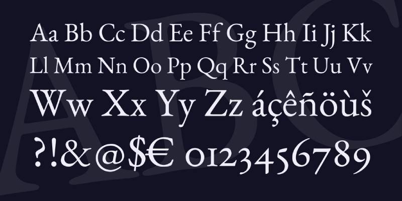
Bodoni

Bodoni is a Didone (modern) serif typeface originally created by Italian typographer Giambattista Bodoni in 1798, characterized by extreme contrast between thick vertical strokes and hairline horizontals. The most used digital revivals include ITC Bodoni (1994) and Bauer Bodoni (1926, digitized by Linotype).
Bodoni works best for brochure cover headlines and luxury-positioned display text because its high stroke contrast creates strong visual impact at large print sizes. Vogue has used Bodoni in its masthead for decades, and Zara rebranded with a Bodoni-style typeface in 2019 across 2,000+ retail locations.
What makes Bodoni suitable for brochures?
Bodoni’s stroke contrast ratio between thick stems and hairline serifs is among the highest of any widely available typeface. ITC Bodoni addresses the “dazzle effect” (where alternating thick-thin strokes impair reading) by offering three optical sizes: 6pt (text), 12pt (standard reading), and 72pt (display). Using the correct optical size for the intended print size is the key technical requirement for professional results.
Key attributes:
| Attribute | Value |
| Classification | Didone (modern) serif |
| Designer | Giambattista Bodoni, 1798; ITC revival by Sumner Stone, Jim Parkinson, Janice Fishman, 1994 |
| Optical sizes | Yes (ITC Bodoni: 6, 12, 72) |
| Recommended sizes | 12pt+ for body (using text optical size); 36pt+ for display |
| License | Commercial; Bodoni Moda on Google Fonts is OFL/free |
| Available on | Adobe Fonts, Monotype, Google Fonts (Bodoni Moda) |
| Price | Paid (ITC/Bauer); Bodoni Moda is free |
How does Bodoni perform in luxury brochure design?
On high-gloss coated paper, Bodoni’s hairline strokes print with precision and create a high-contrast print impression that signals premium positioning. On uncoated or matte stock, hairlines can soften or disappear below 14pt. Bodoni is best reserved for display-only roles in brochures printed on coated stock.
What are the best pairings for Bodoni in brochures?
Bodoni pairs with Futura for a geometric sans-to-Didone serif combination that maximizes typographic contrast (Massimo Vignelli used this pairing throughout his career). It also pairs with Gill Sans when a slightly warmer, more British-inflected body text is needed alongside Bodoni headlines.
What are the limitations of Bodoni for brochures?
Bodoni’s extreme stroke contrast causes legibility problems at body text sizes below 12pt, especially on uncoated paper or in reversed-out (white-on-dark) settings. Versions without optical size variants, such as standard Bodoni MT bundled with Windows, are unsuitable for professional print use at small sizes.
Bodoni – Recommended Use Cases Within Brochure Design
- Best for: Cover headlines, luxury brand brochures, fashion and lifestyle collateral, pull quotes at 36pt+
- Avoid for: Body text; brochures printed on uncoated stock; reversed-out text below 18pt
- Optimal weight: Regular or Bold for display use
- Optimal size range: 36pt–96pt for display; 12pt+ for body (ITC Bodoni 12 optical size only)
—
Playfair Display
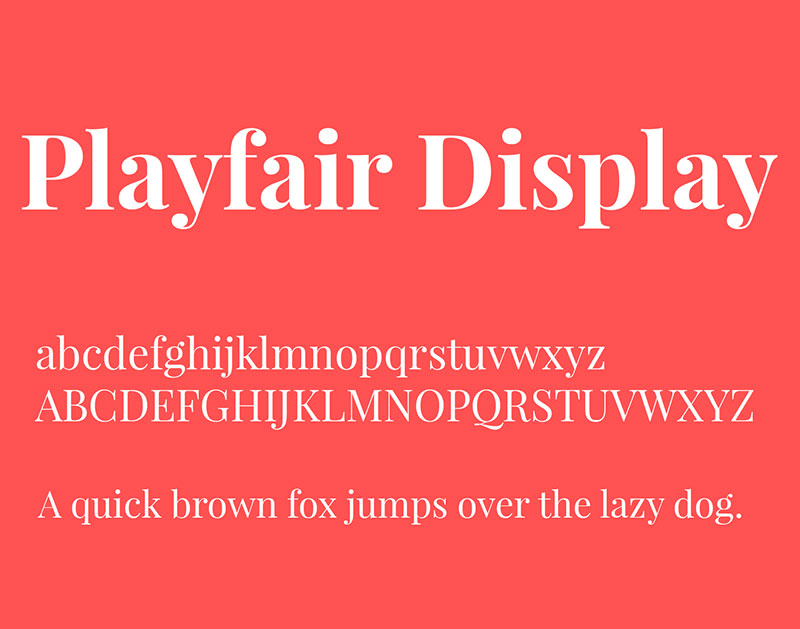
Playfair Display is a transitional serif typeface designed by Claus Eggers Sørensen, released through Google Fonts in 2011 and updated to a variable font format in 2022 (v2.0). It is inspired by the high-contrast typefaces of the European Enlightenment, particularly those of John Baskerville.
Playfair Display works for brochure headlines because its high stroke contrast and open counters create strong typographic hierarchy at 24pt and above. Its variable font format (width axis: Semi-Condensed to Semi-Expanded; weight axis: Regular to Black) provides layout flexibility within a single file.
What makes Playfair Display suitable for brochures?
Playfair Display has a large x-height and open counters, which maintain legibility even when the typeface is set at large headline sizes on lower-resolution print. Its ink-trap details and swash alternates add visual interest in display contexts. The variable font axis allows weight adjustment from Regular (400) to Black (900) without loading separate font files.
Key attributes:
| Attribute | Value |
| Classification | Transitional serif |
| Designer | Claus Eggers Sørensen, 2011 |
| Weight range | Regular 400 to Black 900 |
| Variable font | Yes (Weight + Width + Optical Size axes, v2.0 2022) |
| Optical sizes | Yes (Needlepoint, Hairline, Titling, Display, Headline, Trumpet) |
| Recommended sizes | 24pt+ for headlines; not recommended below 18pt |
| License | OFL (free for commercial use) |
| Available on | Google Fonts, Adobe Fonts |
| Price | Free |
How does Playfair Display perform in editorial brochure layouts?
Playfair Display’s high stroke contrast delivers strong visual impact in editorial-style brochure layouts at 36pt and above. Its delicate hairlines require high-resolution output (300 DPI minimum for offset print). At sizes below 18pt, its thin strokes risk disappearing on uncoated paper or low-resolution digital print.
What are the best pairings for Playfair Display in brochures?
Playfair Display pairs with Montserrat for the most common high-contrast editorial pairing (serif headline plus geometric sans body), and with Source Sans Pro for a slightly more neutral, professional body text option. The Playfair-Montserrat pairing is standard in fashion, travel, and lifestyle brochures.
What are the limitations of Playfair Display for brochures?
Playfair Display is a display-only typeface and is not suitable for body text below 18pt. Its high stroke contrast amplifies the dazzle effect at smaller sizes, and its hairlines require high-quality print output to render correctly.
Playfair Display – Recommended Use Cases Within Brochure Design
- Best for: Cover headlines, editorial section titles, luxury brochure headers, pull quotes at 36pt+
- Avoid for: Body text at any size; print jobs below 300 DPI; matte or uncoated stock at small sizes
- Optimal weight: Bold 700 or Black 900 for headlines; Regular 400 for large subheadings
- Optimal size range: 24pt–96pt
—
Montserrat
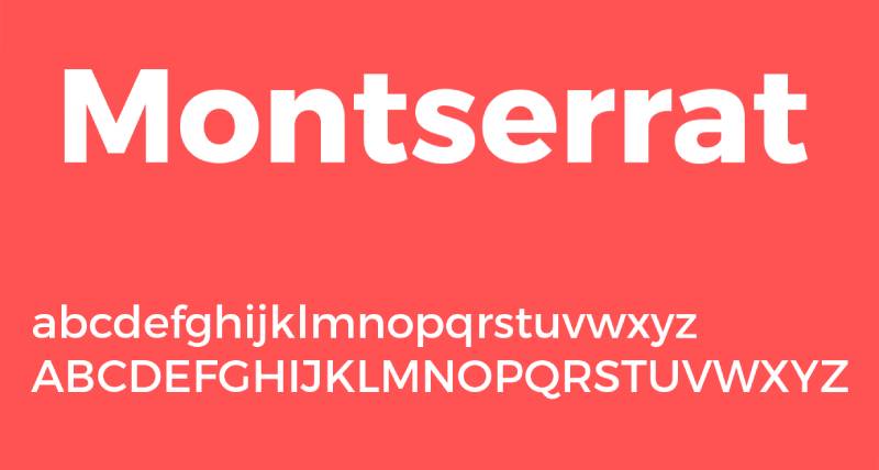
Montserrat is a geometric sans-serif font designed by Argentine designer Julieta Ulanovsky, first released through Google Fonts in 2011 under the SIL Open Font License. It is deployed on over 19 million websites, according to Google Fonts analytics data.
Montserrat suits brochure subheadings and structural labels because its large x-height, wide apertures, and short descenders maintain legibility at sizes as small as 9pt in print. Its 9 weights (Thin 100 to Black 900, with matching italics across 18 styles) support a complete typographic hierarchy within a single family.
What makes Montserrat suitable for brochures?
Montserrat’s large x-height is the primary structural factor that supports its readability at small print sizes. Wide apertures in letters like “c,” “e,” and “a” reduce character confusion at 9pt–12pt. Short descenders allow tighter leading without characters from adjacent lines overlapping, which is useful in compact brochure column layouts.
Key attributes:
| Attribute | Value |
| Classification | Geometric sans-serif |
| Designer | Julieta Ulanovsky, 2011 |
| Weight range | Thin 100 to Black 900 (9 weights, 18 styles) |
| Variable font | Yes (weight axis) |
| Letter-spacing default | Wide (looser than Helvetica at equivalent sizes) |
| License | OFL (free for commercial use) |
| Available on | Google Fonts, Adobe Fonts |
| Price | Free |
How does Montserrat perform at brochure body text sizes?
Montserrat’s wide apertures and generous spacing keep letterforms distinct at 9pt–12pt in offset print. At body text sizes, its even stroke width (geometric construction) can feel monotonous over long passages; this is better addressed by using Montserrat for structural text (labels, captions, callouts) rather than extended body copy. For body copy of more than 3–4 lines, pair it with a serif.
What are the best pairings for Montserrat in brochures?
Montserrat pairs with Merriweather for a clean geometric-sans-to-humanist-serif combination suited to content-heavy brochures, and with Playfair Display when a high-contrast editorial look is required for luxury or lifestyle positioning. Merriweather pairing is the more conventional choice for corporate and informational brochures.
What are the limitations of Montserrat for brochures?
Montserrat’s geometric uniformity makes it feel flat over extended body text passages beyond 4–5 lines. Its wide letter-spacing (looser default than Helvetica) increases character count per line, which can cause layout issues in narrow column brochure formats.
Montserrat – Recommended Use Cases Within Brochure Design
- Best for: Subheadings, callout text, captions, navigation labels, and structural brochure elements
- Avoid for: Extended body copy exceeding 5 lines; narrow column layouts
- Optimal weight: SemiBold 600 for subheadings; Regular 400 for captions and labels
- Optimal size range: 9pt–24pt
—
Gill Sans
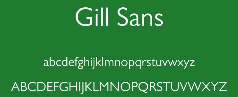
Gill Sans is a humanist sans-serif typeface designed by Eric Gill and released by Monotype in 1928. It combines geometric structure with classical Roman letter proportions, giving it a distinctly British quality that sets it apart from Swiss grotesques like Helvetica.
Gill Sans works for brochure body text and subheadings because its lighter weights have open counters and moderate stroke contrast that maintain legibility at 9pt–12pt in magazine and book contexts. The LNER railway used Gill Sans across all print collateral from 1929 onward, covering timetables, menus, and station signage, demonstrating its range across small and large print sizes.
What makes Gill Sans suitable for brochures?
Gill Sans has humanist letter construction, meaning its letterforms draw from classical Roman proportions rather than strict geometry. This gives it warmer, more varied strokes than purely geometric sans-serifs. Its lighter weights (Light, Regular) are effective for body text in brochures where a professional but approachable tone is needed. The Gill Sans Nova family (expanded 2015, 43 fonts) adds condensed weights and display styles not available in the original release.
Key attributes:
| Attribute | Value |
| Classification | Humanist sans-serif |
| Designer | Eric Gill, 1928 (Monotype) |
| Weight range | Light to Ultra Bold (original 15 styles); Gill Sans Nova: 43 fonts |
| Recommended sizes | 9pt–12pt body text; 18pt+ headings |
| License | Commercial (Monotype); bundled with some Apple and Microsoft systems |
| Available on | Adobe Fonts, Monotype; system font on macOS |
| Price | Paid (full family); free on macOS as system font |
How does Gill Sans perform in multi-page brochure layouts?
Gill Sans renders clearly at 9pt–14pt in offset print, making it one of the few sans-serif typefaces suitable for extended body text in multi-page brochures. Its bolder weights (Bold, Extra Bold) produce good contrast at display sizes but lack the geometric precision of Futura or Helvetica for very large headline use.
What are the best pairings for Gill Sans in brochures?
Gill Sans pairs with Merriweather for a humanist-sans-to-humanist-serif combination where both typefaces share warm, open letterforms. It also pairs with Bodoni when maximum contrast between heading and body is the priority, using Bodoni for headlines and Gill Sans Regular for body text.
What are the limitations of Gill Sans for brochures?
Gill Sans has documented inconsistencies in its letterforms (the “w” and some uppercase characters show uneven stroke weights across weights) that become visible at very large display sizes above 72pt. Its limited non-Latin character support also restricts use in multilingual brochure projects.
Gill Sans – Recommended Use Cases Within Brochure Design
- Best for: Body text in corporate and institutional brochures; subheadings in government and nonprofit print materials
- Avoid for: Display use above 72pt; multilingual brochures requiring extended Latin or non-Latin scripts
- Optimal weight: Light or Regular for body text; Bold for subheadings
- Optimal size range: 9pt–14pt body; 18pt–48pt subheadings
—
Merriweather
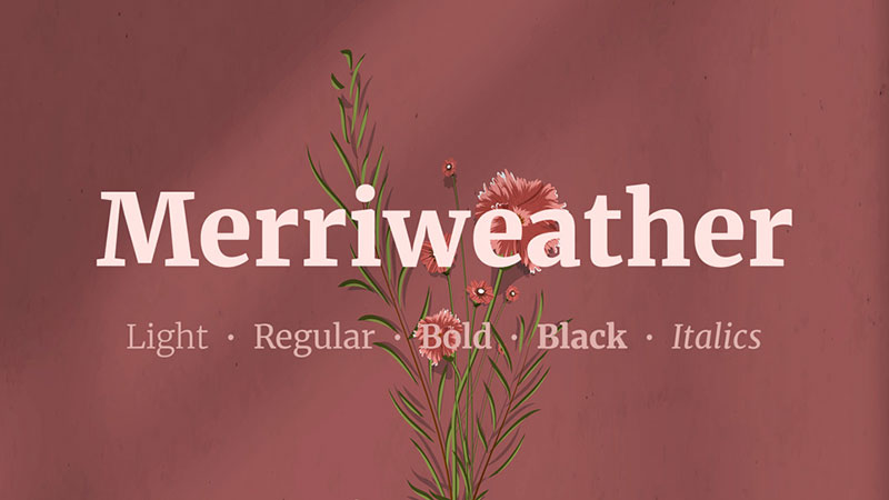
Merriweather is a humanist serif font designed by Eben Sorkin and released through Google Fonts in 2011 under the SIL Open Font License. It was designed specifically for on-screen readability, with a large x-height, open counters, and thick serifs.
Merriweather suits brochure body text because its large x-height and thick slab-adjacent serifs hold their shape at 9pt–12pt in both digital and offset print. According to Google Fonts analytics, Merriweather is one of the top 10 most-used Google Fonts, demonstrating widespread adoption in professional design contexts.
What makes Merriweather suitable for brochures?
Merriweather’s x-height is significantly larger than most traditional book serifs, which means letterforms remain distinct at smaller print sizes. Its serifs are thicker than those in old-style or Didone faces, making them more resistant to ink spread on uncoated paper. The family includes 4 weights (Light, Regular, Bold, Black) with matching italics, covering standard hierarchy needs in a brochure layout.
Key attributes:
| Attribute | Value |
| Classification | Humanist serif |
| Designer | Eben Sorkin, 2011 |
| Weight range | Light 300 to Black 900 (4 weights with italics) |
| Variable font | Yes |
| Recommended sizes | 9pt–14pt body text; 20pt+ headings |
| License | OFL (free for commercial use) |
| Available on | Google Fonts, Adobe Fonts |
| Price | Free |
How does Merriweather perform in body-text-heavy brochures?
Merriweather’s thick serifs and large x-height make it one of the most reliable free serif options for body text in both uncoated and coated print. Its slightly condensed letterforms allow more characters per line than Garamond at equivalent sizes, which helps in compact tri-fold brochure column layouts. The Black 900 weight is too heavy for body text but works well for bold callout lines.
What are the best pairings for Merriweather in brochures?
Merriweather pairs with Montserrat for the most common free-font brochure combination, where Montserrat handles headings and Merriweather handles body text. It also pairs with Gill Sans when a purely British-inflected, humanist aesthetic is needed across the full layout.
What are the limitations of Merriweather for brochures?
Merriweather’s 4-weight range is narrower than premium serif options like Adobe Garamond Premier Pro, limiting typographic hierarchy in complex layouts that need more than 2–3 weight levels. Its large x-height gives it a contemporary feel that may not align with formal or traditional brochure aesthetics.
Merriweather – Recommended Use Cases Within Brochure Design
- Best for: Body text in content-heavy brochures; uncoated paper print; free-font brochure systems
- Avoid for: Formal or traditional brochures that require a classical old-style serif; display use above 36pt
- Optimal weight: Regular for body text; Bold for subheadings
- Optimal size range: 9pt–14pt body; 20pt–36pt subheadings
—
Bebas Neue
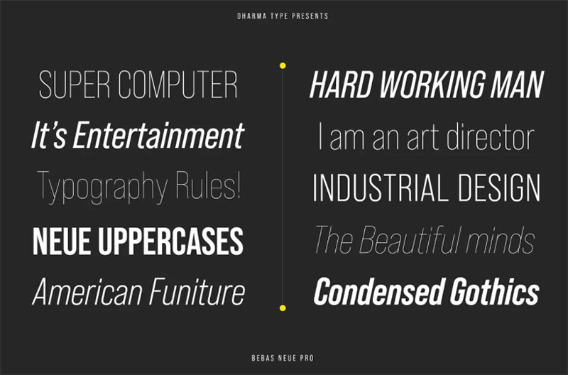
Bebas Neue is a geometric display font designed by Ryoichi Tsunekawa and released by Flat-It in 2010 as an extension of the original Bebas typeface. It is all-caps only, with zero stroke contrast and high x-height uppercase letterforms.
Bebas Neue works for brochure section titles and cover headlines because its all-caps geometric construction delivers maximum visual impact at 36pt and above. Flipsnack’s typography guidelines list it as one of the top display fonts for promotional brochures, particularly for short, high-impact statements.
What makes Bebas Neue suitable for brochures?
Bebas Neue’s stroke weight is near-uniform (low contrast), making it highly resistant to ink spread and print degradation at large sizes. Its condensed proportions allow long headline phrases to fit within a single line without reducing type size. The Pro version (released by Flat-It) added lowercase support, which the original lacked entirely.
Key attributes:
| Attribute | Value |
| Classification | Geometric display sans-serif (all-caps) |
| Designer | Ryoichi Tsunekawa, 2010 (Flat-It) |
| Weight range | Thin to Bold (Bebas Neue Pro); Regular only in free version |
| Letter-spacing default | Tight |
| Recommended sizes | 36pt+ only; not suitable for body text |
| License | OFL (free version); Bebas Neue Pro is commercial |
| Available on | Google Fonts (free version), Adobe Fonts (Pro) |
| Price | Free (regular weight); Pro version is paid |
How does Bebas Neue perform as a brochure headline font?
Bebas Neue’s condensed all-caps structure creates strong vertical rhythm in brochure cover designs and section headers. Its near-zero stroke contrast means it prints cleanly at any size on any paper stock, including uncoated newsprint. Letter-spacing should be opened by +20 to +50 tracking units at display sizes to avoid crowding between capitalized letterforms.
What are the best pairings for Bebas Neue in brochures?
Bebas Neue pairs with Lato for the most referenced free-font brochure combination (bold geometric headline plus neutral humanist body), and with Merriweather when a serif body text is preferred for higher-end collateral. The Bebas-Lato pairing is standard in promotional and event brochure design.
What are the limitations of Bebas Neue for brochures?
Bebas Neue (free version) has only a single weight and no lowercase characters, making it unsuitable for anything beyond short headline text. The all-caps construction limits its use to 2–5 word statements; longer phrases set in all-caps reduce reading speed significantly.
Bebas Neue – Recommended Use Cases Within Brochure Design
- Best for: Cover headlines, section titles, promotional event brochures, short callout statements
- Avoid for: Body text; subheadings longer than 5 words; formal or luxury brochures
- Optimal weight: Regular (free version); Bold (Pro) for emphasis
- Optimal size range: 36pt–120pt
—
Lora
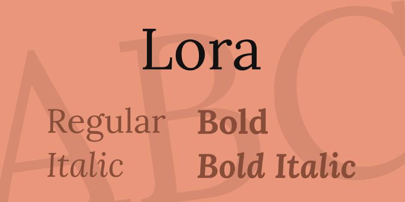
Lora is a contemporary serif font designed by Olga Karpushina at Cyreal and released through Google Fonts in 2011. It has calligraphic roots, combining moderate stroke contrast with well-defined serifs suited for both screen and print use.
Lora suits brochure body text and subheadings because its moderate stroke contrast and calligraphic construction give it warmth that purely geometric or transitional serifs lack. SwiftPublisher lists Lora as one of the top serif choices for marketing brochures, noting its effective pairing with sans-serif headline fonts.
What makes Lora suitable for brochures?
Lora’s moderate stroke contrast (higher than Merriweather, lower than Garamond) makes it adaptable to both body text and large heading use within the same brochure layout. Its calligraphic brush-influenced construction gives organic variation to letterforms that makes extended body text passages more readable than purely mechanical serifs. Available in 4 weights (Regular to Bold) with matching italics.
Key attributes:
| Attribute | Value |
| Classification | Contemporary calligraphic serif |
| Designer | Olga Karpushina (Cyreal), 2011 |
| Weight range | Regular 400 to Bold 700 (with matching italics) |
| Variable font | Yes |
| Recommended sizes | 10pt–14pt body text; 18pt+ headings |
| License | OFL (free for commercial use) |
| Available on | Google Fonts, Adobe Fonts |
| Price | Free |
How does Lora perform in mixed-use brochure layouts?
Lora’s moderate stroke contrast allows it to function as both a body text serif (10pt–14pt) and a headline serif (18pt–36pt) within the same layout, reducing the need for a second typeface in single-family brochure systems. At 10pt on uncoated paper, its serifs hold their form better than high-contrast faces like Bodoni. Its italics are among the most expressive of any free Google Fonts serif, making them useful for pull quotes and emphasized callouts.
What are the best pairings for Lora in brochures?
Lora pairs with Montserrat for the standard geometric-sans-to-calligraphic-serif combination that balances structure with warmth. It also pairs with Raleway when a more decorative, fashion-adjacent sans-serif heading is needed above Lora body text.
What are the limitations of Lora for brochures?
Lora’s weight range (Regular to Bold only) limits its use in brochures requiring more than two levels of typographic hierarchy. There is no Light or Black weight available, so designers cannot use it for very fine caption text or very heavy display use within the same family.
Lora – Recommended Use Cases Within Brochure Design
- Best for: Body text and subheadings in lifestyle, travel, and wellness brochures; pull quotes and emphasized callouts in italic
- Avoid for: Brochures requiring 3+ weight levels within a single font family; very small text below 9pt
- Optimal weight: Regular for body text; Bold for subheadings
- Optimal size range: 10pt–14pt body; 18pt–36pt headings
What Makes a Font Work in Print?
Print typography operates under different physical constraints than screen design. A typeface that looks clean on a monitor can fail completely when ink meets paper, because the rendering process is entirely different.
47% of customers cite brochure distribution as a key factor in their purchase decision, according to ZipDo’s print marketing research. Getting the font right is not a secondary concern.
Four structural factors determine whether a typeface is print-ready:
- Stroke contrast: the ratio between thick and thin strokes in a letterform. High contrast faces like Bodoni require 300 DPI minimum to hold their hairlines in offset printing
- X-height: the height of lowercase letters relative to capitals. A 2025 study in the Journal of Vision (Sawyer et al., N=60) found readers read at 248 WPM with larger x-heights vs. 232 WPM with smaller ones at small print sizes
- Optical sizes: separate font files drawn for specific size ranges. A display-optimized file used at 9pt produces hairlines that disappear under ink spread on uncoated stock
- Aperture width: the openness of letters like “c,” “e,” and “a.” Tight apertures (Helvetica) reduce legibility below 12pt in print
Paper stock changes the equation. Uncoated paper absorbs ink into fiber, causing dot gain that softens hairlines and thins serifs. Coated stock keeps ink on the surface, preserving fine detail at smaller sizes.
| Paper Type | Dot Gain | Min Recommended DPI | Effect on High-Contrast Fonts |
| Coated gloss | Low | 300 DPI | Hairlines hold at 10pt+ |
| Coated matte | Low-medium | 300 DPI | Hairlines hold at 12pt+ |
| Uncoated | High | 266 DPI minimum | Hairlines soften; avoid below 14pt |
| Newsprint | Very high | 200-250 DPI | High-contrast faces unusable at text sizes |
ISO 12647-2:2013 sets the international standard for offset printing on coated and uncoated paper. Standard commercial offset runs use a 150 LPI halftone screen, which means 300 DPI source files are the floor, not the target.
The practical takeaway: choose your paper stock before finalizing font selection. A Bodoni headline that prints beautifully on coated gloss becomes illegible on the same brochure printed on uncoated recycled stock.
—
How Do You Build a Font Hierarchy in a Brochure Layout?
Typographic hierarchy in a brochure is not about using multiple fonts. It is about making the reader’s eye move in a controlled sequence through the information. Most brochures fail at this because designers add fonts instead of adding contrast.
Monotype’s 2024 Font Use and Forecasting Survey found that 76% of designers prioritize readability and accessibility as their top criteria when selecting fonts, above aesthetics or brand alignment.
Serif and Sans-Serif Combinations for Brochures
The strongest brochure hierarchies pair a serif body text with a sans-serif heading. The structural contrast between the two classifications does most of the visual separation work.
Why it works structurally: Serifs add horizontal weight to baseline and cap-height, guiding the eye across lines. Sans-serifs, stripped of that visual noise, read faster at large sizes. The two classifications compete at the same size but complement each other when size differentiation is applied.
Proven combinations from the 10 fonts covered:
- Futura (headings) + Garamond (body): geometric neutrality against old-style warmth
- Montserrat (headings) + Merriweather (body): the most-used free pairing in editorial print
- Bebas Neue (cover title) + Lora (body): maximum display impact with calligraphic body warmth
- Playfair Display (headlines) + Gill Sans (body): high-contrast serif against humanist sans
The x-height of paired fonts should be visually compatible at the sizes you are using them. Pairing Garamond (moderate x-height) with Bebas Neue (all-caps, no x-height reference) at similar scales creates visual imbalance. Size differentiation compensates, but it is cleaner to match proportions from the start.
A one-size rule: use no more than 2 typeface families in a single brochure. Everything else is weight and size variation. More than two families reads as inconsistency, not richness.
Single-Family Systems: When One Typeface Is Enough
Neue Helvetica’s 51-style range (25 Ultra Light to 95 Extra Black) is the clearest example. A brochure using only Helvetica Neue can achieve 4+ levels of hierarchy through weight and size variation alone, with zero risk of pairing conflicts.
Single-family systems work when:
- The typeface supports at least 5 distinct weights
- The brand identity calls for neutral, systematic presentation
- Print production needs to be consistent across multiple print vendors
Montserrat (9 weights, 18 styles) and Gill Sans Nova (43 fonts) are the two free or low-cost options that support single-family systems. Garamond, Lora, and Bebas Neue do not. Their weight ranges are too narrow to cover full brochure hierarchy without a second family.
| Font | Weights Available | Single-Family System? | Minimum Second Font Needed |
| Helvetica Neue | 51 styles | Yes | No |
| Montserrat | 18 styles | Yes | No (if serif body not needed) |
| Gill Sans Nova | 43 fonts | Yes | No |
| Bodoni (ITC) | 3 optical sizes | No | Sans-serif for body text |
| Bebas Neue | 1 weight (free) | No | Required for any body text |
The healthcare sector provides a clear real-world example: a typography overhaul documented by Celerart showed that implementing a structured 2-font system (serif + sans-serif) increased brand recognition in patient surveys by 41% within six months, while internal print costs dropped 28% from eliminating ad-hoc font licensing decisions.
—
How Does Brochure Type Affect Font Choice?
The format and purpose of a brochure are structural constraints, not aesthetic preferences. A font that works in a bifold corporate brochure can actively undermine a tri-fold event flyer.
Print marketing delivers engagement rates that exceed digital options, according to ZipDo research, and 45% of consumers prefer receiving printed brochures over digital ones (World Metrics, 2024). The format-to-font match determines whether that engagement converts.
Tri-fold brochures: column widths are typically 3.5 inches or less. Short descenders and wide apertures are required. Montserrat and Merriweather both meet this. Garamond’s moderate x-height and longer descenders require careful leading adjustment in narrow columns.
Corporate brochures: weight range and neutrality matter more than expressiveness. Helvetica and Gill Sans both cover headings, body text, captions, and footnotes within a single family. Bodoni and Playfair Display are wrong choices here. Their display focus pulls attention away from content.
Luxury brochures: Bodoni and Playfair Display are the correct choices. Both require coated stock and 300 DPI minimum output. Both perform their function only at 18pt and above. Pair them with a neutral humanist serif for body text (Garamond, Lora) rather than a sans-serif, which reads as inconsistent in luxury contexts.
Promotional and event brochures: Bebas Neue at 48pt–96pt for cover and section titles. Pair with Lato or Merriweather for body. These layouts are headline-driven. Body text is secondary. Font licensing matters here: Bebas Neue’s free version covers one weight. If multiple weights are needed, the Pro version requires purchase.
Healthcare and nonprofit brochures: humanist typefaces only. Gill Sans and Lora. Never geometric neutrality (Futura, Bebas Neue) and never high-contrast display faces (Bodoni). Older patients in healthcare typography research consistently preferred serif faces, associating them with established institutions. Younger patients (25-45) rated legibility as their top priority, which both Gill Sans and Lora satisfy.
—
What Are the Most Common Font Mistakes in Brochure Design?
Most brochure typography errors are not aesthetic. They are structural: using the wrong optical size, the wrong paper combination, or a font whose license does not cover the print run.
Print marketing has a 70-80% higher recall rate than digital advertising (Persuasion Nation, citing industry research). A legibility failure in the typeface directly attacks that recall advantage.
Mistake 1: Display optical sizes at body text sizes. Bodoni and Playfair Display are drawn for large print. Their hairlines are optimized to look refined at 36pt+. Set at 10pt, those hairlines become invisible on uncoated stock. The fix: ITC Bodoni 12 for standard reading sizes; ITC Bodoni 6 for small text.
Mistake 2: All-caps body text. Bebas Neue (all-caps only in the free version) should never appear in running text. All-caps reduces reading speed by approximately 13-20% compared to mixed case, according to legibility research cited in the ARVO Journal of Vision 2025 study. Three words maximum in all-caps display type. Beyond that, use mixed case.
Mistake 3: Font selection by screen appearance. Helvetica looks clean on screen at 14px. Helvetica’s narrow apertures make it difficult to read in print at 10pt. The rule: always proof fonts in print at the intended output size before finalizing the layout. Screen and print rendering are different processes.
Mistake 4: Pairing two geometric sans-serifs. Futura and Montserrat at similar weights produce zero contrast. Both are geometric. Both have similar stroke widths. The eye cannot distinguish hierarchy levels. If you pair two sans-serifs, one must be geometric and one must be humanist (e.g., Futura headlines + Gill Sans body).
Mistake 5: Ignoring print licensing. A desktop license covers printing to a personal or office printer. Commercial print runs (brochures sent to an offset printer for 5,000+ copies) require verification that the EULA covers commercial print use. OFL fonts (Montserrat, Merriweather, Lora, Playfair Display) have no such restriction. Adobe Fonts subscription covers commercial print. Helvetica and Futura commercial licenses require direct purchase from Linotype or Monotype.
The Fontspring and Monotype licensing guide confirms that font licensing fees range from under $20 to hundreds of dollars per weight per user, making free OFL alternatives financially significant for multi-designer studios.
—
Where Do You Get These Fonts and What Do They Cost?
Font sourcing splits cleanly into two categories: free OFL fonts from Google Fonts and paid fonts from commercial foundries or subscription services. The choice affects budget, license terms, and which optical size variants are available.
According to the 2025 Web Almanac, Google Fonts is used on roughly 54% of desktop websites globally, making its OFL typefaces the most widely deployed commercial-use fonts available.
Free OFL Fonts From This List
All of these are free for commercial print use with no restrictions under the SIL Open Font License:
- Montserrat (Google Fonts): 18 styles, variable font, no print run limits
- Merriweather (Google Fonts): 4 weights with italics, variable font
- Playfair Display (Google Fonts): variable font with optical size axis since v2.0, 2022
- Lora (Google Fonts): 4 weights with italics, variable font
- EB Garamond (Google Fonts): free alternative to Adobe Garamond, lacks optical size variants
- Bebas Neue (Google Fonts): single weight only; Pro version (multiple weights) requires purchase
Free does not mean identical to the commercial version. EB Garamond lacks the optical size variants that make Adobe Garamond Premier Pro perform correctly at 9pt. For body text below 11pt, the commercial version is worth the cost.
Adobe Fonts Subscription Coverage
Adobe Creative Cloud (All Apps) includes access to the full Adobe Fonts library. This covers Garamond, Helvetica (various cuts), Futura, Bodoni, and Gill Sans for desktop and print use.
Key restriction: Adobe Fonts access ends when the subscription lapses. Any print files using Adobe Fonts become unlicensed if the subscription is cancelled. For long-term brand assets, a perpetual license from the foundry is more secure.
Adobe Fonts explicitly covers logos, print work, web design, and video. It does not cover embedding fonts into software applications or products for resale. For brochure design, the subscription license is sufficient.
Commercial One-Time Purchase Options
| Font | Source | License Type | Approx. Cost (per weight) |
| Neue Helvetica | Linotype / Monotype | Commercial perpetual | $35-$65 per style |
| Bauer Bodoni | Linotype | Commercial perpetual | $30-$55 per style |
| Gill Sans Nova | Monotype | Commercial perpetual | $40-$70 per style |
| Futura (Bauer) | MyFonts / Monotype | Commercial perpetual | $30-$60 per style |
| ITC Bodoni | Monotype | Commercial perpetual | $35-$75 per style |
Perpetual licenses are per-user, per-style purchases. A 3-designer studio using Neue Helvetica across 5 weights pays for 15 licenses. For large teams, Adobe Fonts subscription math often favors the monthly model.
For font licensing in commercial print work, the key distinction is between desktop licenses (covers office printing) and commercial print licenses (covers offset print runs sent to a third-party printer). Most foundry EULAs treat both the same for standard print use, but always verify before submitting files to a commercial printer. A $120 per-weight licensing error becomes expensive at 10,000 brochure print runs.
The practical recommendation: start with Google Fonts OFL options for variable and multi-weight needs (Montserrat, Merriweather, Lora, Playfair Display). Move to Adobe Fonts subscription when Garamond Premier Pro optical sizes, Helvetica Neue, or Gill Sans Nova are needed. Purchase perpetual licenses for long-term brand fonts used across multiple years of print collateral.
FAQ on The Best Fonts For Brochures
What is the best font for brochures?
There is no single answer. Garamond works for corporate body text, Futura for modern headings, and Playfair Display for luxury covers. The best choice depends on paper stock, brochure format, and the tone the design needs to communicate to the reader.
Should I use a serif or sans-serif font for a brochure?
Both work. Serif fonts like Garamond and Merriweather suit body text in corporate and formal brochures. Sans-serif fonts like Montserrat and Helvetica work better for headings and modern layouts. Pairing one of each gives the strongest typographic hierarchy.
How many fonts should a brochure use?
Two typeface families maximum. One for headings, one for body text. More than two reads as inconsistency rather than variety. Within each family, use weight and size variation to create hierarchy without adding more typefaces to the layout.
What font size should body text be in a brochure?
Between 9pt and 12pt for standard body text in offset print. Below 9pt, most typefaces lose legibility regardless of x-height. For tri-fold brochures with narrow columns, 10pt is the practical minimum. Always proof at the intended print size before finalizing the layout.
What is the best free font for brochure design?
Montserrat and Merriweather are the strongest free pairing. Both are available on Google Fonts under the SIL Open Font License, covering unlimited commercial print runs. Playfair Display and Lora are also free and work well in editorial and lifestyle brochure layouts.
Can I use Google Fonts in a commercial brochure?
Yes. All Google Fonts are licensed under the OFL or Apache 2.0 license, both of which permit commercial use with no print run restrictions. You can use Montserrat, Merriweather, Lora, and Playfair Display in client brochures, offset print jobs, and branded collateral without additional licensing fees.
What fonts do professional designers use for brochures?
Garamond, Helvetica Neue, Futura, and Gill Sans appear most frequently in professional corporate brochure typography. Bodoni and Playfair Display are standard in luxury and fashion contexts. Montserrat has become the default geometric sans-serif choice for mid-budget print work due to its free commercial license.
What is the best font for a tri-fold brochure?
Montserrat and Merriweather. Tri-fold columns are typically 3.5 inches wide, requiring fonts with short descenders and wide apertures. Both typefaces handle narrow column layouts cleanly at 10pt–12pt. Avoid high-contrast display faces like Bodoni in tri-fold body text; their hairlines deteriorate in tight columns.
How does paper stock affect font choice in brochures?
Significantly. Uncoated paper absorbs ink into fiber, causing dot gain that softens hairlines and thin serifs. High-contrast faces like Bodoni and Playfair Display require coated stock at 300 DPI minimum. Merriweather and Gill Sans are safer choices for uncoated paper due to their thicker, more robust serif construction.
What fonts should I avoid in brochure design?
Avoid display-only fonts in body text. Bebas Neue is all-caps and unsuitable for running text. Bodoni below 14pt on uncoated stock produces illegible hairlines. Pairing two geometric sans-serifs like Futura and Montserrat at similar weights creates no contrast. Script fonts rarely survive offset printing at small sizes.
Conclusion
This conclusion is for an article presenting the best fonts for brochures, and the core point is simple: typeface selection in print is a technical decision, not just a visual one.
Stroke contrast, x-height, optical sizes, and paper stock determine whether a font performs or fails at press. Garamond and Merriweather hold up in body text. Bodoni and Playfair Display belong on coated stock at display sizes. Bebas Neue stays on covers.
Font pairing and weight contrast do more for typographic hierarchy than adding extra typefaces. Two families, used with intention, cover every level a brochure needs.
Licensing matters too. Free OFL options from Google Fonts cover most professional print work. Commercial fonts require verified desktop and print licensing before files go to an offset printer.
Pick the right typeface for the format, the stock, and the audience. Everything else follows.
Renowned for his expertise in logo design and visual branding, Bogdan has developed a multitude of logos for various clients.
His skills extend to creating posters, vector illustrations, business cards, and brochures. Additionally, Bogdan's UI kits were featured on marketplaces like Visual Hierarchy and UI8.
He also wrote in the past years on sites like Design Your Way, WebDesignerDepot, WPDean, Designmodo, Speckyboy, Slider Revolution, and more.
- The Airtable Logo History, Colors, Font, And Meaning - 12 July 2026
- How to Blur Background in Canva: A Quick Tutorial - 11 July 2026
- Typography Trends - 10 July 2026
Bogdan Sandu is a seasoned designer who has been designing websites since 2008. Renowned for his expertise in logo design and visual branding, Bogdan has developed a multitude of logos for various clients. His skills extend to creating posters, vector illustrations, business cards, and brochures. Additionally, Bogdan's UI kits were featured on marketplaces like Visual Hierarchy and UI8. He also wrote in the past years on sites like Design Your Way, WebDesignerDepot, WPDean, Designmodo, Speckyboy, Slider Revolution, and more.
You Might Also Like